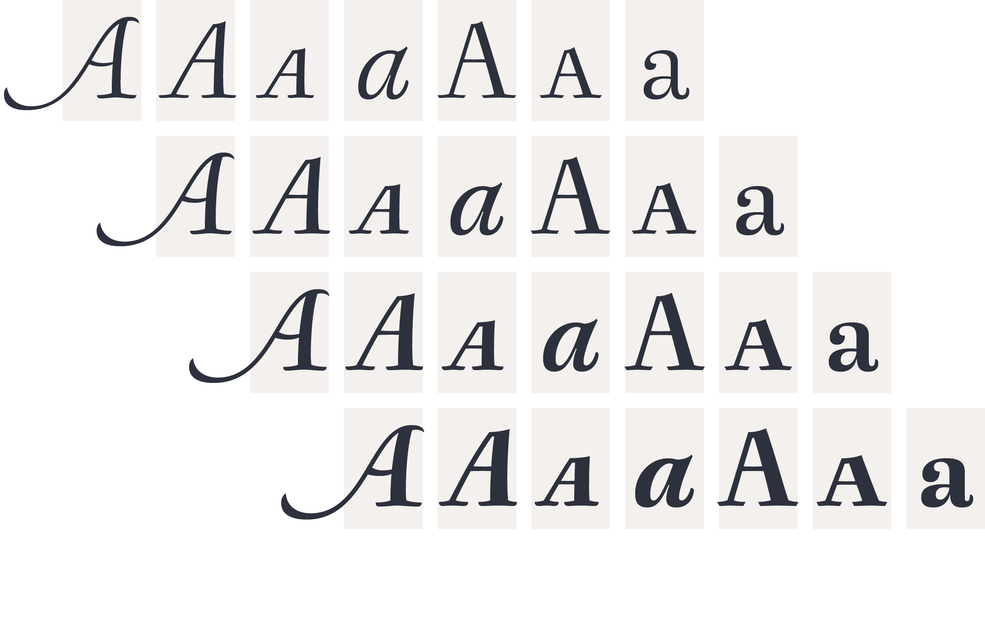
When composing literary texts, you need the right combination of comfort in reading and a lyric spirit. This helps keep readers in the delicate atmosphere in which novels and tales can display all their charm. Meet Berenjena, a typeface that will give your text a slightly spicy atmosphere. Most typefaces created for books cannot reach a good balance between legibility and expression. Either they are too expressive so they tire the eyes of the reader, or they are dull and reading becomes a tedious task. Chilean type designer Javier Quintana Godoy created the text typeface Berenjena bearing in mind this idea of subtle balance. Berenjena (Spanish for aubergine or eggplant) gives your text that spicy environment in which wordshapes are easy to read while letterforms maintain their capricious feeling. It comes in roman and cursive, both with smallcaps, all declined in four weights.
Berenjena includes all the usual OT contextual sorts plus several elegant ligatures, wonderful swashes, all sorts of figures, and more. Berenjena will help you create a unique atmosphere, giving your designs a strongly individual character.
Neoclassical inspiration


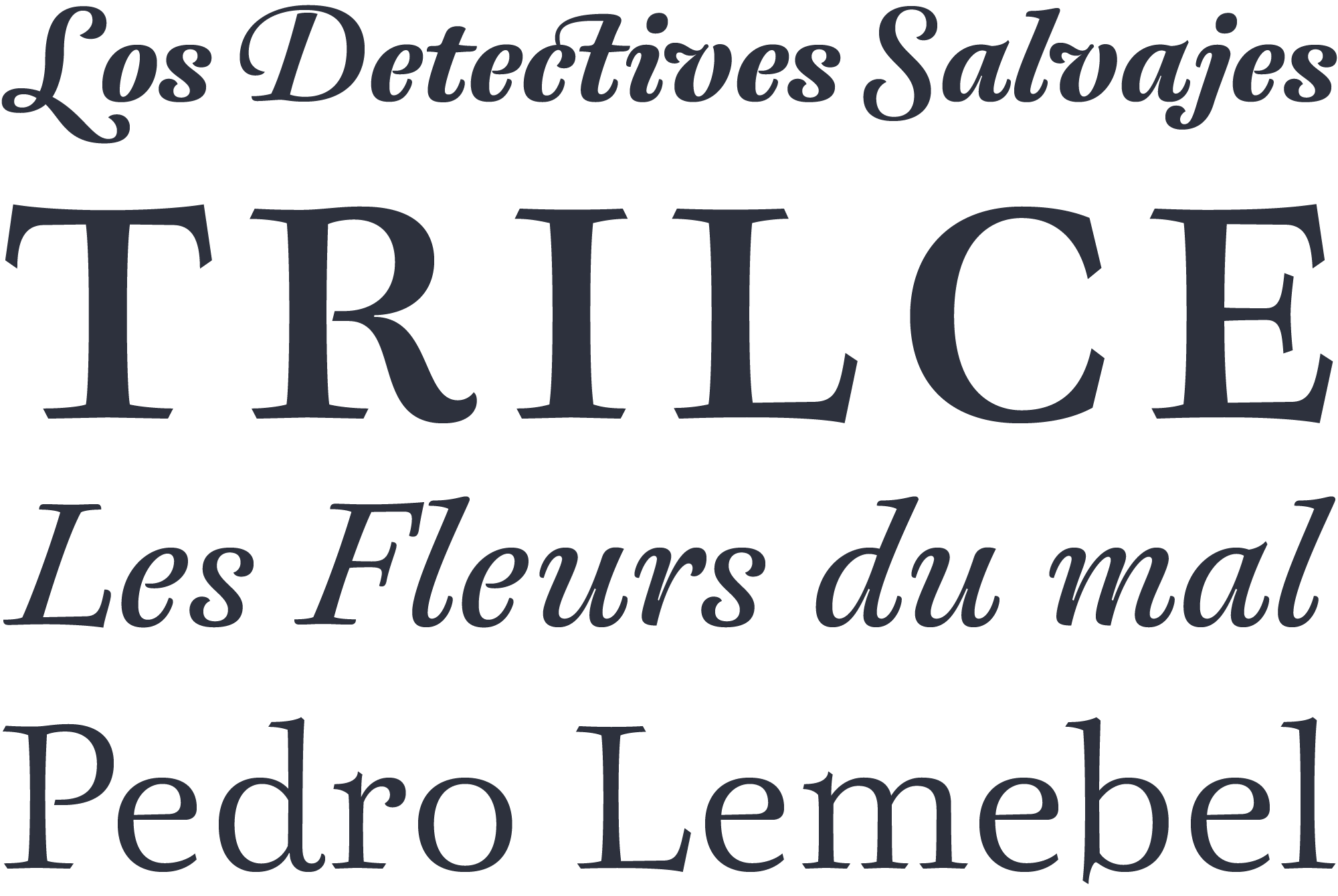
The letterforms of Berenjena link to the Neoclassical style of middle 18th century, in particular to the work of English calligrapher & printer John Baskerville. However Javier Quintana didn’t intend to make a historical interpretation, as František Štorm did with his wonderful Baskerville Ten Pro type. Javier wanted to recreate Baskerville’s fine sense of politeness into a new, contemporary design that could built a more serene rhythm, flowing & tender.
The influence of vernacular lettering & street sign paining
Even within its Neo Classical style Berenjena succeeds in exploring expressive details that can be seen in some streets signs in Santiago de Chile. Most of those signs are made by self-taught letter artists who usually work far from the strict conventions of formal calligraphy. The challenge while designing Berenjena was creating a good type for immersive reading, while some details refer to that manual freedom in vernacular street signs.

Photo by Diego Olivares
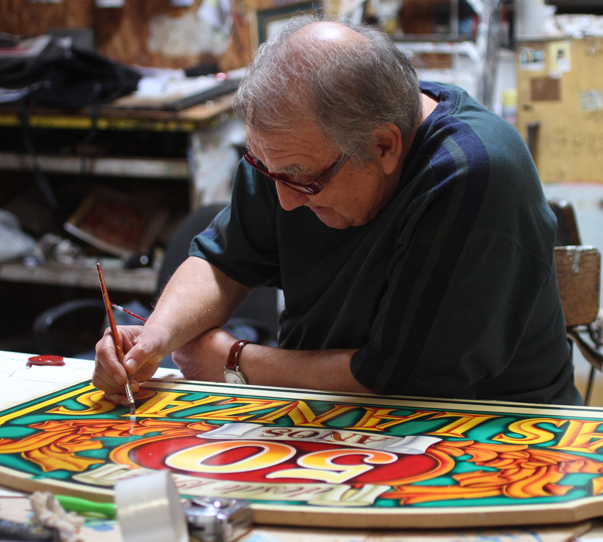
Photo by Diego Olivares
A nice sample of current vernacular lettering is the work of Nicolo Montoni, a letter artist from Santiago town center. He’s been painting letter signs for more than 50 years. Don Nicolo is also a skilled illustrator so he can draw a good variety of letter designs, some of them pretty ornamented. Certain ending strokes & details in Nicolo’s letters are the result of a classic idea on how to trace a letter with a brush, which has been in turn inspiration for some details in Berenjena.
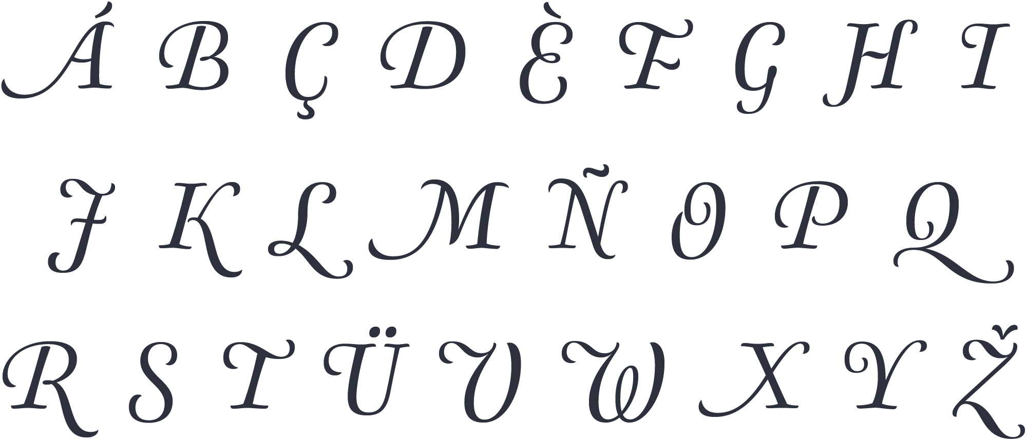
Pleasant marriage of legibility & flair
This subtle influence can be seen in diverse glyphs of Berenjena, and particulary in its beautiful caps italics swashes.
A versatile type family
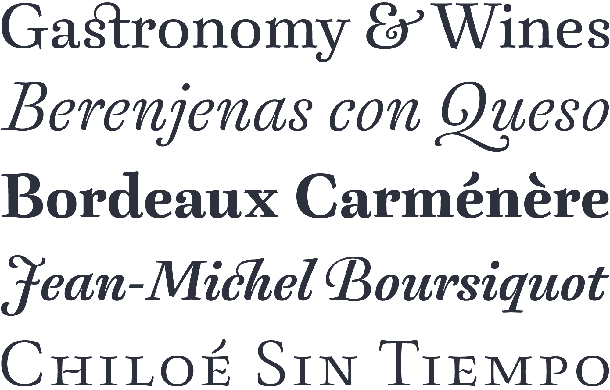
Berenjena’s poetic atmosphere encourages its use in literary texts, either immersed & profound, or incidental & casual. However its friendly letterforms are also appropriate for delicate ephemera such packs & labels of the food industry & wines!