Notes from the archive: Twists of fate and the fame of Nicolaes Briot
In the final decades of the 19th century, two men made a pact regarding the Amsterdam Municipal Archives. As they made their way through the archives, whenever Nicolaas De Roever would come across something of interest to his friend, Adriaan de Vries, he would pass him a note; likewise, when De Vries found something interesting for De Roever, he would return the favour. De Roever’s topics included applied arts, as well as printing and everything associated with book production. Thirty notes concern Christoffel van Dijck, the famed Dutch punch cutter who is generally considered the first world-class Dutch type designer. A handful notes mention another, earlier, punch cutter, the little-known Nicolaes Briot of the Sint Antoniebreestraat in Amsterdam.
Since the events of history are themselves coincidences, how great is the coincidence of the survival of a record, especially in a topic as esoteric as typography? Somehow, chance has dictated that somebody like me, who is neither a designer nor a historian, is writing about the great, forgotten typeface designer Nicolaes Briot and several coincidences leading to the possible revival of his name. Like De Roever and De Vries, I find myself passing notes in a great archive beyond my understanding.
A designer’s request
This is a story that found me. An Argentine friend who designs letters asked me to translate an obscure Dutch text in the yearbook for an association interested in the history of Amsterdam. The yearbook was from 1907. Slightly larger than my hand, the pages were beige with age, the spine was beginning to unravel and the paper covers were tearing at the creases. It concerned topics such as monuments and building codes in the Golden Age. I turned to the page the designer had indicated I should start translating:
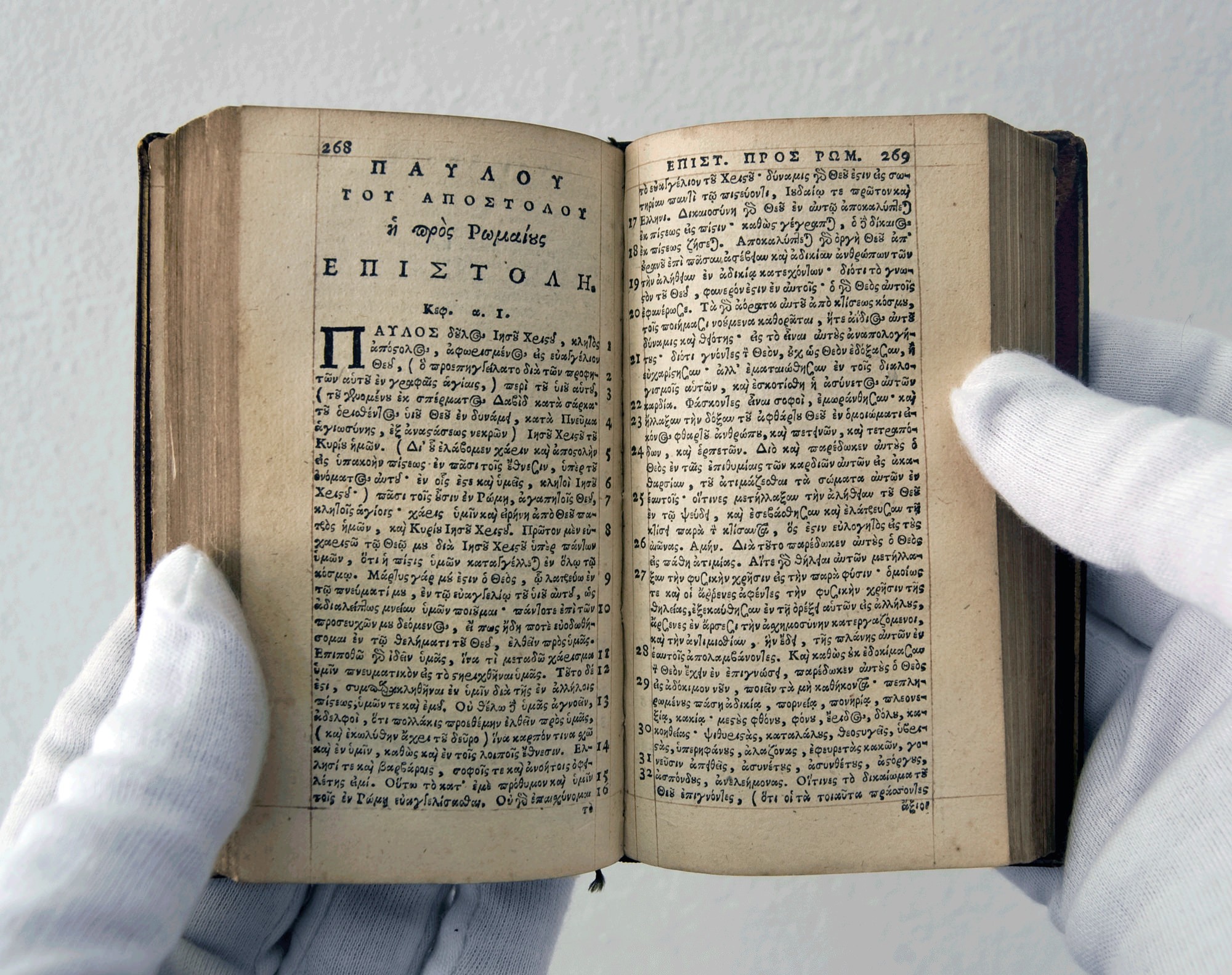
Nicolaas Briot & Jacques Carpentier, type founders and their relation to certain Amsterdam Printers (1615–1640) By J. W. Enschedé
Of the industries whose products are seen and yet generally unappreciated, that of type foundries must certainly be included; its products, typefaces, are hidden in the work of the printer. This was the case to such an extent in Amsterdam that Moes’s and Dr. Burger’s research about the 16th century did not find anything in this area; De amsterdamsche boekdrukkers en uitgevers in de zestiende eeuw (Printers and Publishers of Amsterdam in the 16th Century) notes a type founder [1] by name, Jan Theuniszoon, for the first time in 1600. Other mentions of his name are so scarce, the momentary curiosity sparked by the discovery cannot be satisfied further.
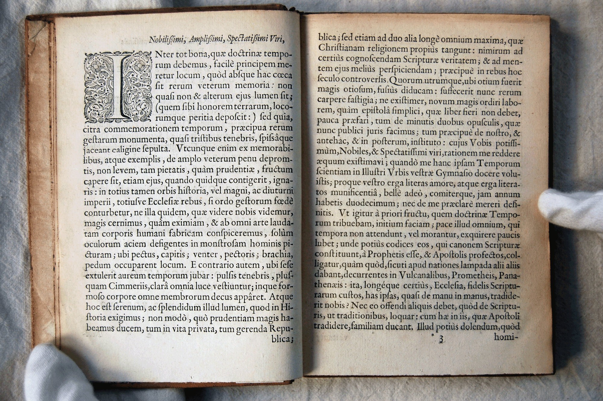
Thanks to notes taken by De Roever in the notary archives at that time, there is somewhat more knowledge regarding Briot and Carpentier, though far from enough for a somewhat precise idea of their activities. These notary excerpts form the basis of this contribution, which I wish to emphasize here, not in the least to be released from endless references to him, but especially to say on my part how much the local history of Amsterdam owes to the indefatigable efforts of Amsterdam’s previous archivist. Quite a few book titles are cited: I should mention here, that perhaps none of these titles was copied from the book itself. Bibliographies and our own working apparatus have been consulted assiduously, so not only is the spelling of those titles irregular, but no responsibility can be assumed for diplomatic accuracy.
The text by this mysterious citizen of Amsterdam, with its antiquated style, enumerations of lists of books, addresses of ancient houses which did not have numbers but names like the bookseller who lived “at the Golden A.B.C.”, conjured in my mind the images of slow ships with billowing sails leaving the bustling port of Amsterdam through the great bay of the Zuider Zee, Jews and Armenians selling exotic spices and printing religious works, steep wooden staircases in old red brick houses, painted tiles encircling fireplaces.
The Mexican connection
“It was the only document I could find on Briot anywhere,” explained my Argentinean friend, Alejandro Lo Celso, over a cup of coffee at a street-side café in Mexico City’s fashionable Condesa neighborhood. “And so I ordered it, even though it was in Dutch.” This Briot had been a punchcutter, and Lo Celso had become aware of his existence through the book Early Type Specimens in the Plantin-Moretus Museum by John A. Lane.
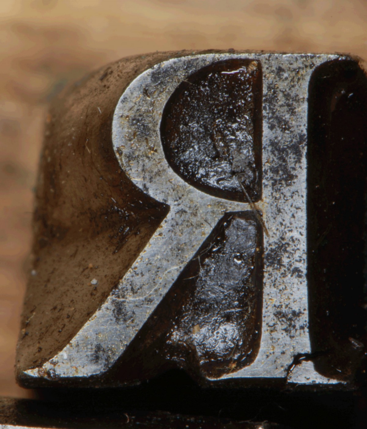
I would learn that the materials used in printing could pass through the centuries from one company to another, since technology in those times did not change as swiftly as it tends to now, and a quality product could remain in use for ages if tended to with care. In the course of this process, the names of the people who had cut the original punches could easily be forgotten. Later I would also learn that a few of Briot’s punches still existed in the museum bearing the name of the Enschedés, the illustrious family of printers which included the author of the article I had translated, Jan Willem Enschedé.
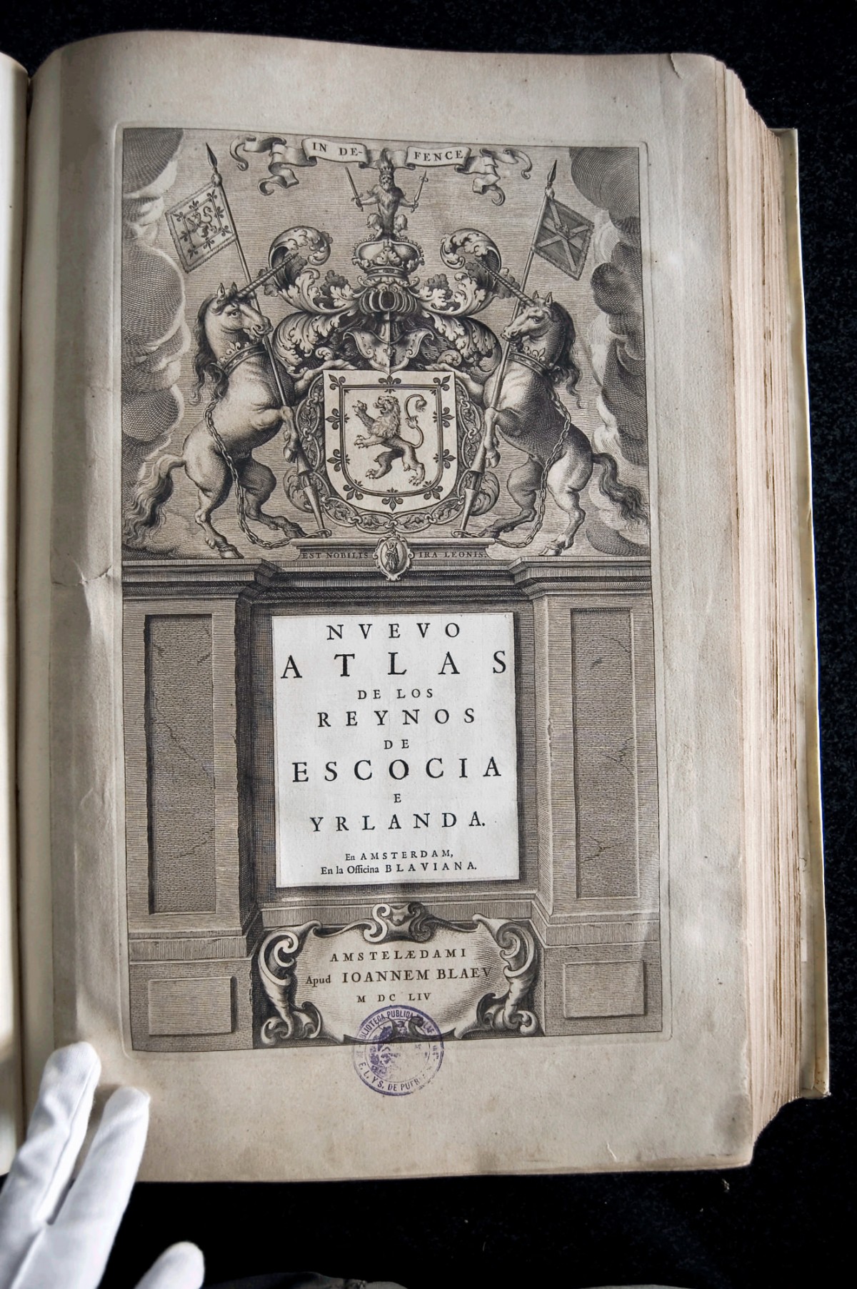
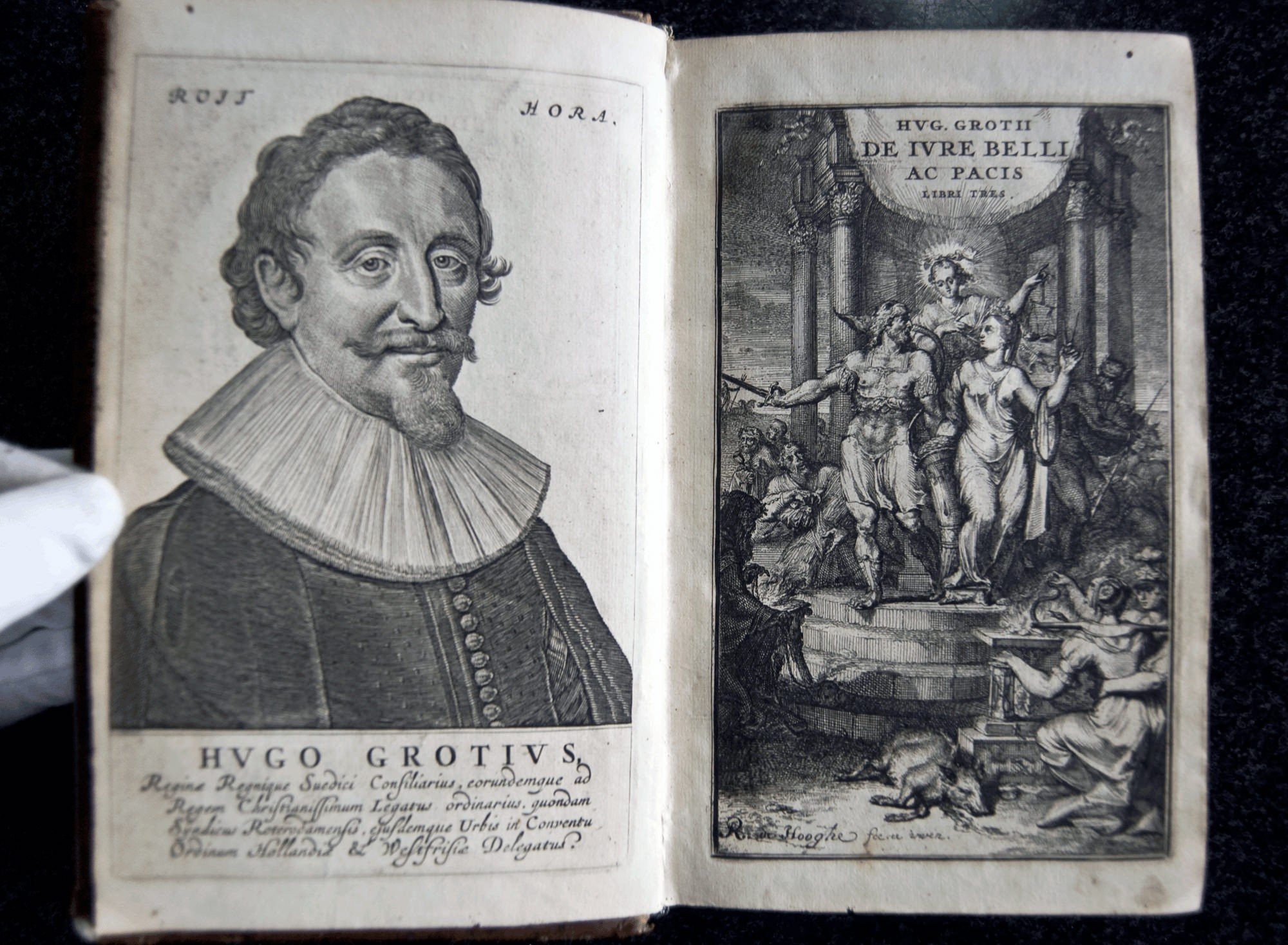
Shuffling books over the table, Lo Celso said that Briot was the first great punch cutter of the Netherlands and therefore, in objective terms, the founder of Dutch typographic tradition. He had died young and was practically unknown. Briot had designed types used by Willem Blaeu, the famous printer of the Dutch Golden Age whose printing office would produce the fabulous Atlas Maior, eight volumes of a book so large and valuable, it was delivered to its buyers in its own special cabinet. Blaeu spared no cost, said Lo Celso. Since his atlas was the best publication of his time, with its colored maps and ornate engravings, it stood to reason that Briot was the best punch cutter available in Amsterdam, given Blaeu’s exacting nature. Lo Celso finds nothing as tragic as a type designer who dies too young, hence not getting the recognition they deserve. He maintains his composure, but it is clear that the idea affects him deeply. He told me secretly (I would learn that secrecy is important among type designers) that he would revive the letters of this lost Dutchman and try to regain Briot’s proper place in history. And he wanted my help in doing this. Somehow, the idea struck me as interesting. Inevitably, I would discover that this journey could only lead to one person.
A type of historian
Apparently, the type design historian is a very rare creature. According to type historian James Mosley, at any given moment of time in history, there may be five or six type historians who work at the highest level, a state which the modest Mosley might typify as being a serious type historian.
“First of all, it requires an exceptional eye to be able to identify and recognize types, which very few people have. Then it requires exceptional historical knowledge to understand the context in which they were created. Finally, you need an exceptional analytical mind to be able to order all that information,” explains Mosley amiably. “John Lane is certainly one of those six.”
I imagined the others walking through long corridors of musty books, like characters in a novel. And maybe they leave strings behind for others to find as they walk through their typographic labyrinths. My faulty computer screen flickered as a long, chiseled bearded face with books in the background and an open door behind him appeared in a yellowish tinted frame. When it comes to Nicolaes Briot, all roads lead to this man, John Lane. This holds true to such an extent, nobody else will even talk about Nicolaes Briot, as if it would be disrespectful.
“The problem with historical archives is that you get a random selection of information, not necessarily the information you need,” says Lane from the confines of my computer. “I know, for example, that one of Briot’s sons died of polio and that the disease started in his left leg. I don’t know how Briot died.”
Lane has found about 100 documents relating to Briot, but not one mentions his age. John Lane’s knowledge of Briot started long ago, before he even went to England, reading the works of famed type historian Harry Carter while still living in the United States. At the end of the Seventies, Lane had finished his bachelor’s degree in physics. He had worked at a printing press at Yale as a student, and thus became interested in type; an article of Carter’s on optical corrections for size in typography especially inspired him. As a physics student, Lane learned how to program, and between 1980 and 1982 he was able to combine his knowledge of type with his technical background. He worked with the first digital type design program, Ikarus, for a company called Autologic, many of whose employees went on to form the core of Adobe’s typographic department, says the American freelance researcher.
Sinuous, hopeful searches
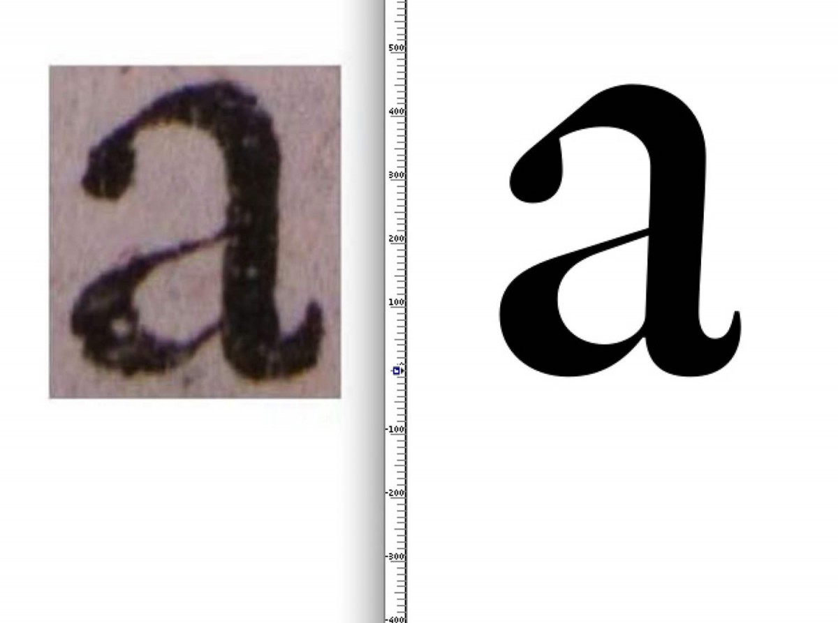
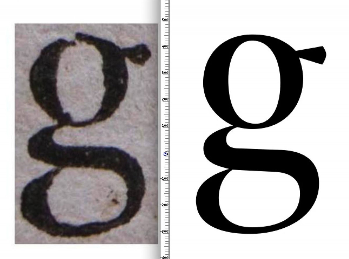
But the owners of Autologic were primarily interested in copying types and making them available to the market, an activity that Lane did not find fulfilling. He took the money he had saved working for Autologic and left for England, where he encountered James Mosley. Mosley, then a professor at Reading University, became a mentor to Lane. In one of his publications he suggested that the main model for William Caslon’s first great Roman type was a Dutch type being used in England in the 18th century, and that the same Dutch punch cutter had cut a set of Roman capitals surviving at the Enschedé type foundry. Lane had taken an interest in the Fell English (14 point) Roman that the University Press at Oxford had acquired from Holland, and thought a Clein Canon (28 point) Roman in the specimens of Amsterdam-based type founder Dirck Voskens might have been executed by the same hand. In his lectures, Mosley also showed some other sizes that he had not mentioned in print, but he cautiously made no attempt to name the cutter. Harry Carter seems to have suspected that Briot cut some of these types, but never found the time to study them in detail. He had mentioned Briot in connection with Fell English and some unspecified large Romans used by the Blaeu family. Lane began to wonder if Nicolaes Briot cut both the types he was studying and those mentioned by Mosley, and he has since gathered enough evidence to confidently attribute them to Briot.
Lane, who has lived in the Netherlands since 1990, holds a flyer up to the screen bearing the date of Thursday, November 21, 1985, announcing a lecture he would give about Briot at the annual meeting of the Printing Historical Society. “That’s how long things can take when there’s no money,” sighs Lane.
The road to the discovery of the connection between Briot and Caslon passed through Cambridge, where the freelance researcher visited David McKitterick at the University Library and examined a collection of fragments of unidentified type specimens from the 17th century. Lane managed to link 32 of these fragments to a 17th century type founder in Amsterdam, Jaques Vallet, into whose hands Briot’s punches and matrices fell after Briot’s death in 1626. Vallet had sold the Fell English Roman matrices to Oxford, and here in the specimen fragments were three of the larger sizes that had intrigued Mosley and Lane.
A missing link from Granjon to Caslon
Caslon is not the only type with a strong Briot influence, says Lane. The work of Nicholas Kis, known through the poorly named Janson font, also owes much to Briot’s style. “Histories of Dutch typography usually begin with Van Dijck,” comments Lane. “But Briot is really the link between the styles of [the earlier] Granjon and Van den Keere and [the later] Van Dijck, Kis and Caslon. Voskens is another famous Amsterdam type founding family (with five punch cutters in three generations), but in the 1670s Dirk Voskens acquired both Vallet’s foundry and the in-house foundry of the Blaeu printing office, uniting most of Briot’s materials and casting many of his types.”
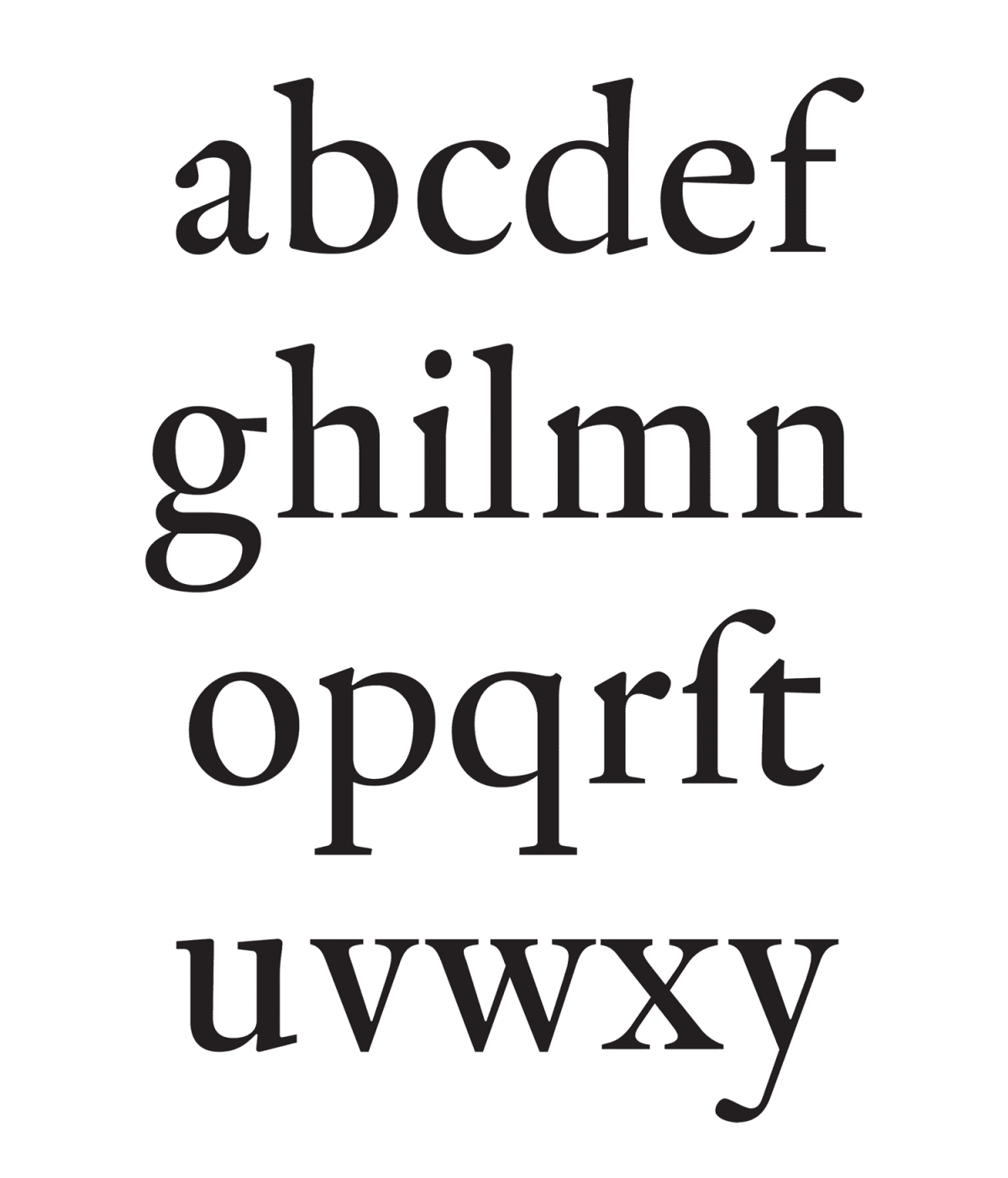
In Briot, the characteristics of the Dutch style, large x-height, sharp contrasts between thick and thin, and slightly bolder letter are consolidated. And Briot is only part of John Lane’s improbable dream of a catalogue of all Dutch types of the Golden Age.
The end of the beginning
One’s place in history is a fragile thing. A person’s work may or may not survive due to an endless string of coincidences. In the late 16th century, a talented young man called Nicolaes Briot left Huy in Belgium for the Netherlands. He contributed to some of the greatest editions of his era. He left his mark on some of the great type designers in history and disappeared from the historical record for centuries, with nothing to show for his existence other than an occasional footnote or perhaps a comment stuck on a yellowing document in the archivist’s cursive script.
But times also change. The craft of which Briot was a part is finally dying. According to Mosley, there are now only two people in the world who can cut punches and he does not know who will carry on this technical knowledge after they are gone. February 22, 2011, saw the most extensive treatment of Briot in the history of typography as John Lane devoted his Justin Howes Memorial lecture to Briot and the Dutch type foundries of the Golden Age.
Meanwhile, far away on the Río de la Plata in Argentina, Alejandro Lo Celso is immersing himself in the process of digitally reviving Nicolaes Briot’s work in collaboration with Lane. And even I, sitting here in Mexico City, far behind deadline for Typo, am a very small part of this story now, as I pass on the notes of the archivists. History is a puzzle that is never finished. The isolated comments left by De Roever and De Vries, Jan-Willem Enschedé and Harry Carter, the fragments of unidentified type specimens in the Cambridge library, the punches never displayed in the Enschedé museum, are now finally being connected. And after almost four centuries, a mysterious punch cutter of the Dutch Golden Age, Nicolaes Briot, is stepping into the light.
Feike de Jong es filosofo, investigador, artista, gestor cultural y periodista con enfoque urbano. Reside en la Ciudad de México. Ganó el Premio Alemán de Periodismo Walter Reuter en 2010. En el 2009 emprendió una expedición periodística/urbanística de 51 días rodeando, a pié, el perímetro de 800 kms que rodea la zona conurbada de la Ciudad de México. Desde entonces se ha dedicado a la investigación y difusión sobre las orillas de la megalopolis del Valle de México en colaboraciones con organizaciones como el Museo Rufino Tamayo, la UNAM, el UAM Azcapotzalco, la Universidad de York en Canada y Ogino Knauss en Italia. Ha escrito para medios nacionales e internacionales como Forbes México, the Guardian y the Atlantic. Sus fotos han salido en medios como Arquine y The Guardian. Expuso como artista en el Paraninfo de la Universidad del País Vasco en Bilbao y está gestionando un proyecto de arte colectivo alrededor del limite de la isla de Tenochtitlán. Ha tocado saxofón y flauta con el grupo La Redada en festivales como Trópico en Acapulco, el Worldwide Festival en Séte, Francia y Braille Satellite en Vilnius. Tiene maestría de filosofía de la Universidad de Nijmegen en Holanda y es miembro del Círculo de Tipógrafos de México.