News 2022 |
|
Hello. Here we are again with our occasional newsletter. We got a new typeface, a long-awaited type extension, new trial fonts of our entire type library and a couple of blog posts you can’t miss. Happy holidays! |

|
|
New release: Carolinéale designed by Francis Ramel |
|
After being born from a research project on Carolingian minuscule, Carolinéale has undergone a seven-year process to evolve into a versatile sanserif of contemporary elegance. However, its voice still conveys a subtle touch of history. Endowed with all the type goodies the discerning designer may need, Carolinéale is both a comfortable text face and a powerful display type that will stimulate readers at large sizes. |
|
Test Carolinéale Read the story |
|
|
New extension: Borges 3.0 designed by Alejandro Lo Celso |
|
Our classic text family has been extended generously: It now speaks more than 200 languages, has full figures series, extended monetaries, many ligatures and more. Borges includes six comprehensive weights of roman & cursive with corresponding smallcaps, all designed for comfy reading. |
|
|
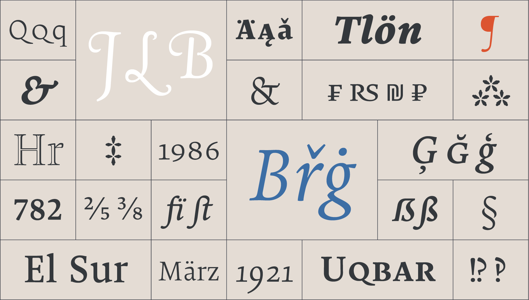
New: Trial fonts! |
|
It took us a while, but we did it: We have created test fonts from our entire font library, which are freely downloadable. Now you can try any of our fonts whenever and however you want. Enjoy. |
|
|
Recent @ the Scriptorium blog |
|
|
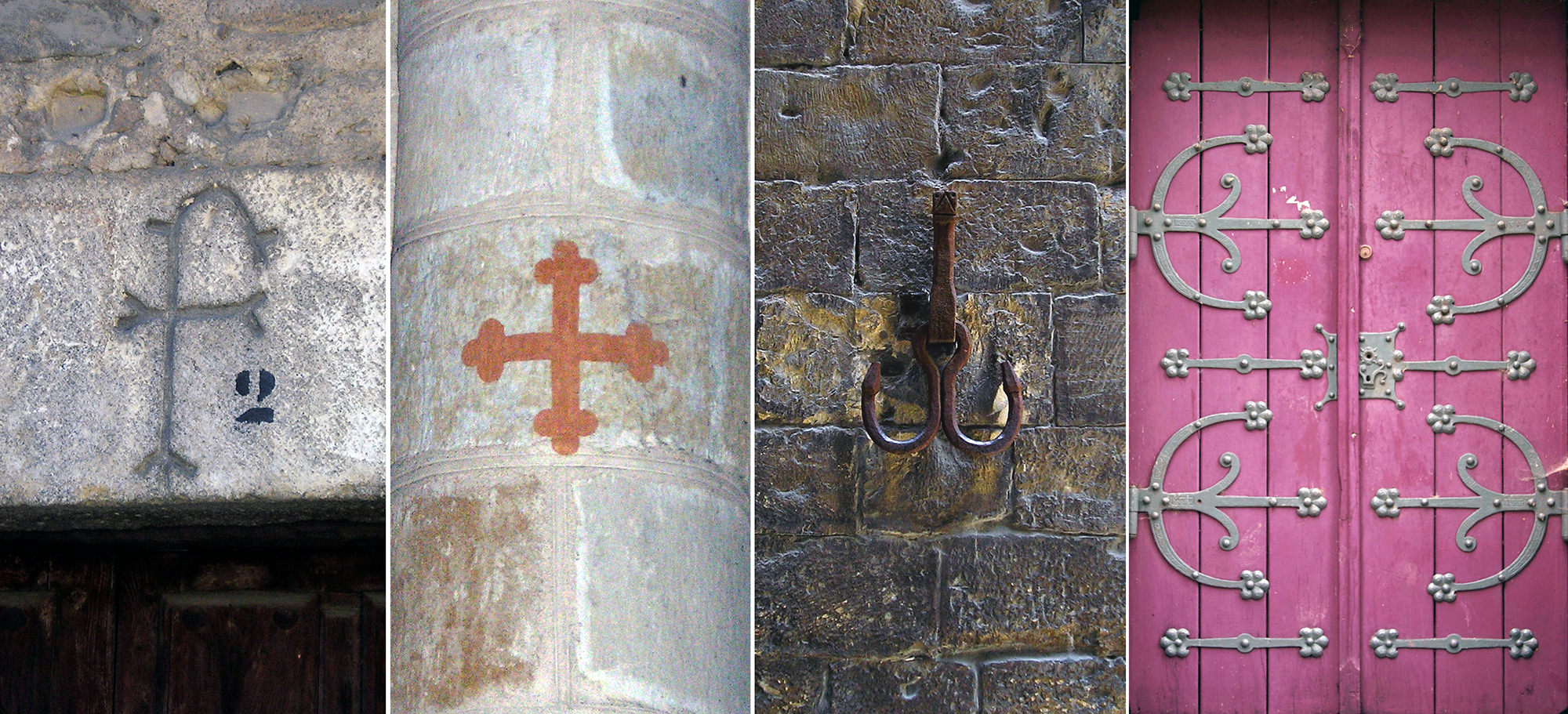
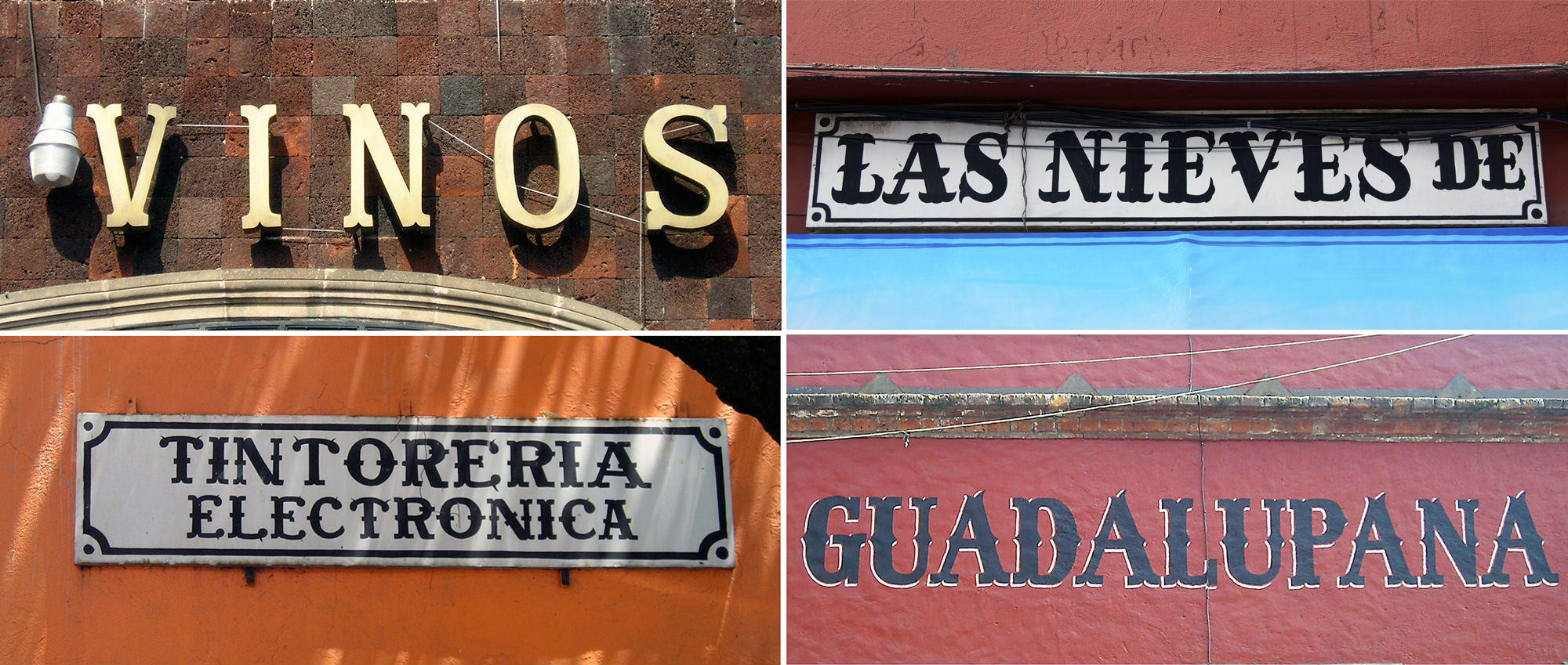
With hollow feet and harlequin hats: |
|
Tuscan letters, those ornamental objects, delicate or extravagant, that inhabit streets and font catalogs of all times, never lose an iota of expression. A product of decorative ingenuity, Tuscan vernaculars dress the street signs all over the world. However, this decorative ubiquity, notorious and implausible, alarms many. Fortunately, like a healing balm, the author will deploy her original hypothesis, suspiciously unexplored, of how the Tuscan style would have been born from a mischievous interpretation of the stone inscriptions, wrongly called ‘lapidary’. |
|
Read Article part 1 Read Article part 2 |
|
|
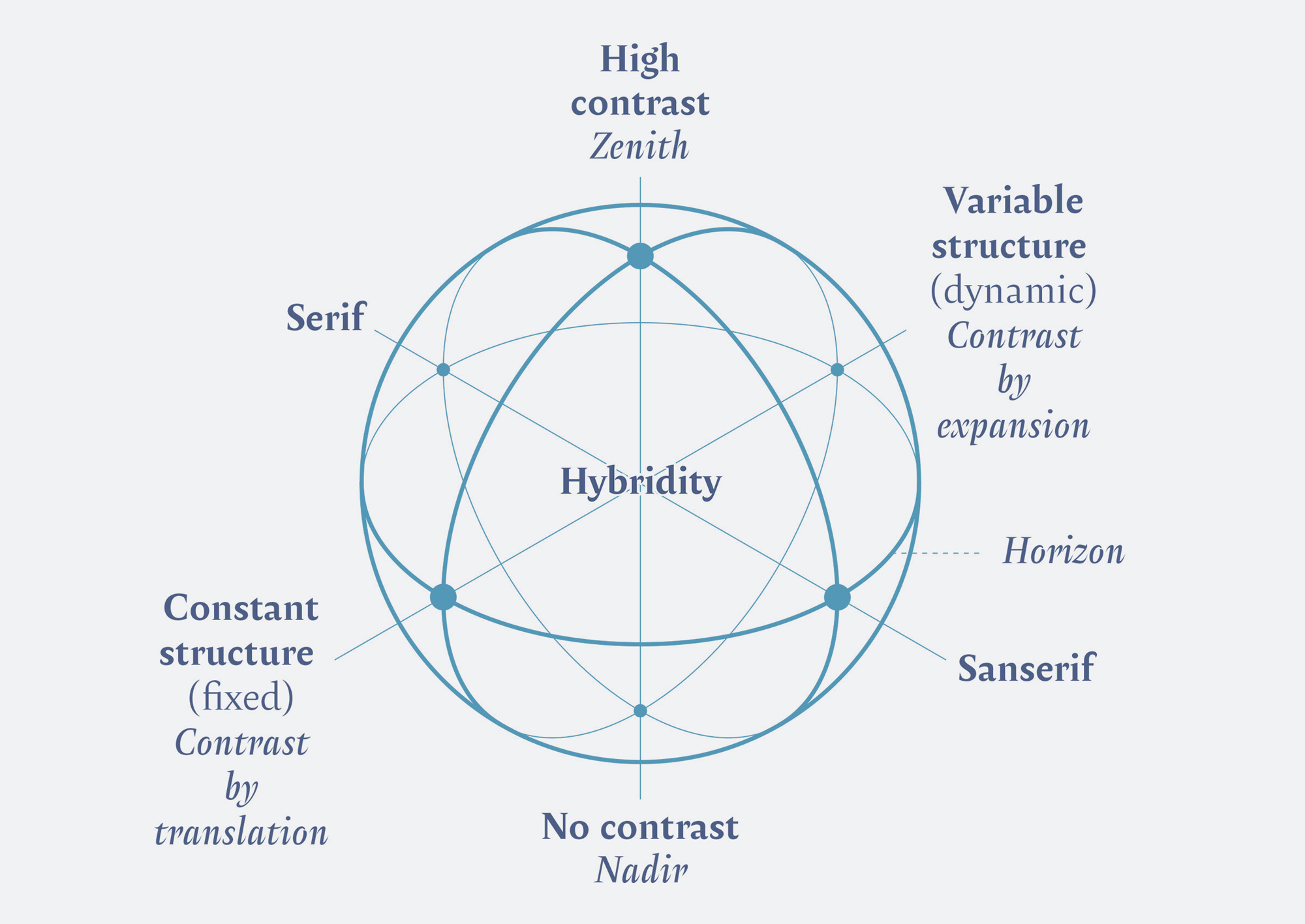
The Typographic Vault by Francisco Gálvez Pizarro |
|
In case you missed it. In this article Francisco rethinks the values of preceding type classifications and reinterprets them in a new model, an original instrument to situate and study the diversity of today’s types. |
|
|
You may also like |


|
|
|
|
|
|
See this email in your browser of preference. You’ve been sent this newsletter because you have signed up for our mail list or you have licensed some of our fonts. You can unsubscribe at any time by clicking on the link below. |