[ Note: best read on a computer screen. ]
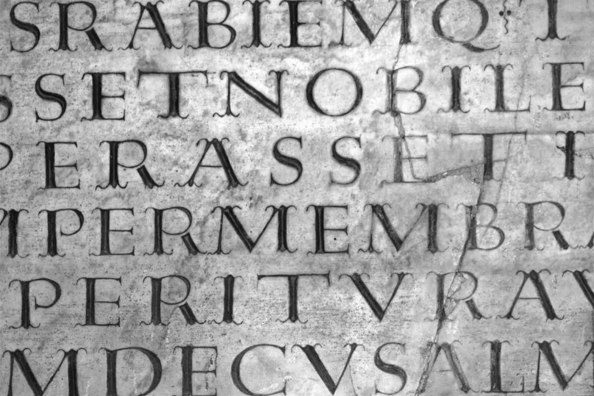
Headstones in the Huaquechula cemetery, Puebla, Mexico, using various Tuscan styles. In fact, this is one of the towns most visited by tourists to admire the ofrendas (‘offerings’) that families make on the Day of the Dead, which is perhaps the most culturally significant celebration in the country.
Initial thoughts
Cemeteries are that kind of taboo places, which produce in all of us some sort of inner tension or secret cataclysm. It’s not that we don’t know it: we are all going to die one day, whether we accept it or not. But almost nobody likes to remember it. And everyone chooses to continue distracting themselves with the minutiae of their lives, kicking the ball forward, let’s say, to a nebulous and as undefined future as possible. Which is why none of this prevents us from wondering what happens to the anatomy of letters in cemeteries.
A couple of clarifications are in order. For example, we mistakenly call letters engraved on stone stelae “lapidary”, when, on the one hand, there is an infinite diversity of epigraphic inscriptions on stone that are not gravestones; and, on the other hand, within the lapidary practice in cemeteries, there is an enormous variety of lettering styles. In fact, practically all the styles that have been practised in printing have, sooner or later, also been carved in stone. Not to mention that it was on stone that our uppercase letters evolved, and from uppercase letters came lowercase letters, which evolved on flexible supports. And here I think: the shape of the letter should not be conditioned by the support on which it is materialised. Rather, any shape should be able to be engraved on any material, as long as the person doing it has the necessary skill.
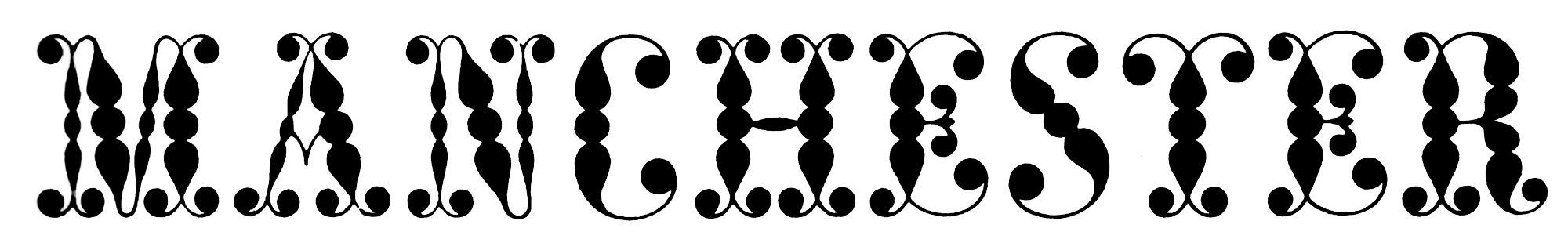
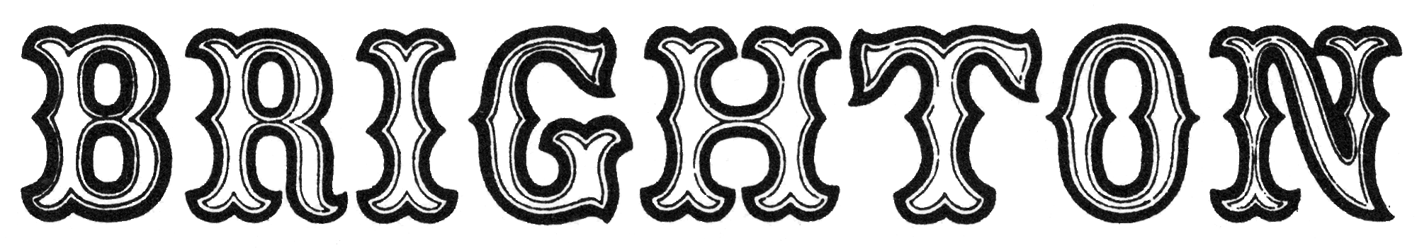
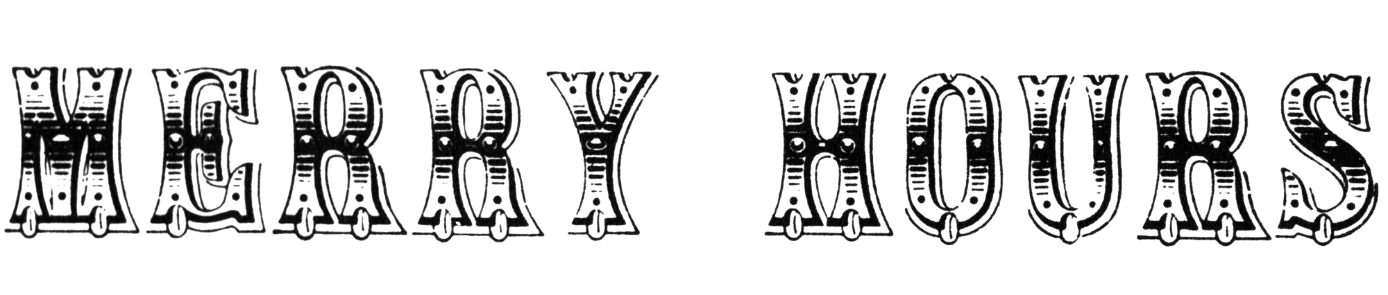
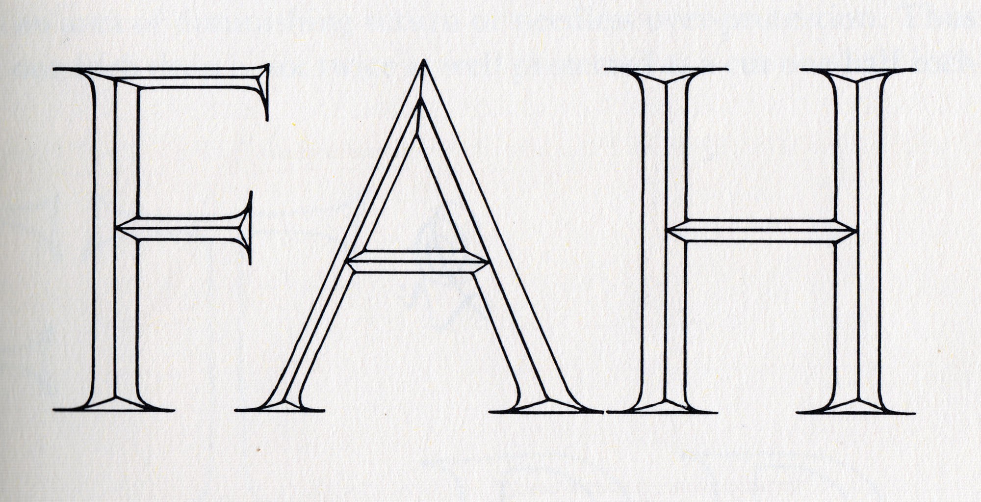
However, and returning to the subject: of the enormous diversity of styles of decorative letters, it is a bit surprising the great ubiquity of a specific ornamental genre, the so-called Tuscan letters.
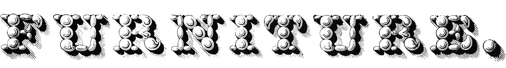
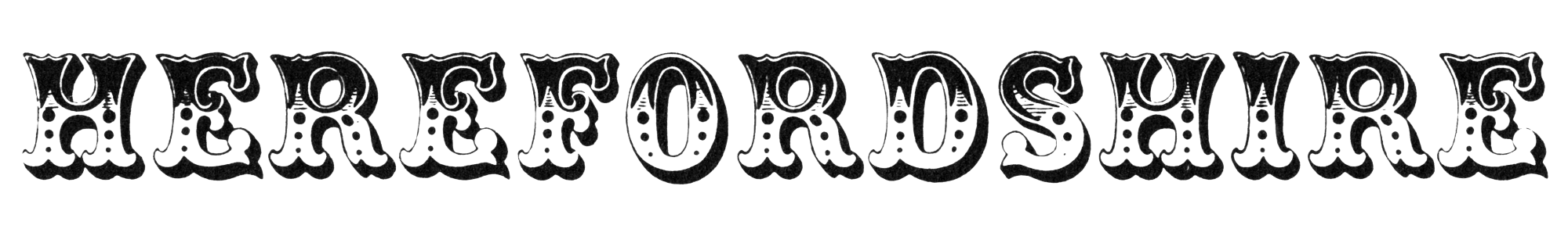
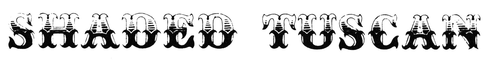
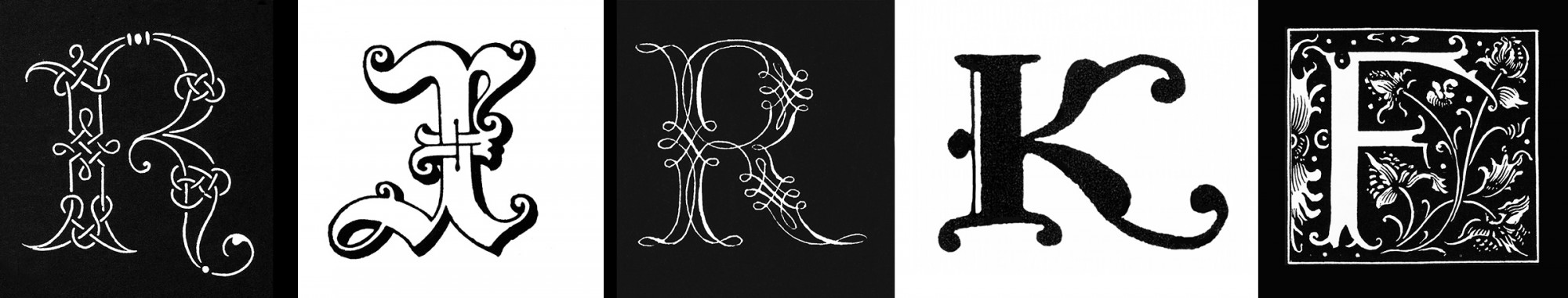
Basically, a typeface is considered Tuscan when its serifs are bi- or tri-furcated (sometimes with a greater number of extensions) to achieve a certain degree of fantasy or ornamentation. The examples are infinite since, apart from the terminals, all the other elements of the anatomy of a letter can vary: the strokes contrast, the ratio of proportions, the absence / presence of diamonds and other elements within the strokes, shadows, textures and other external additions.
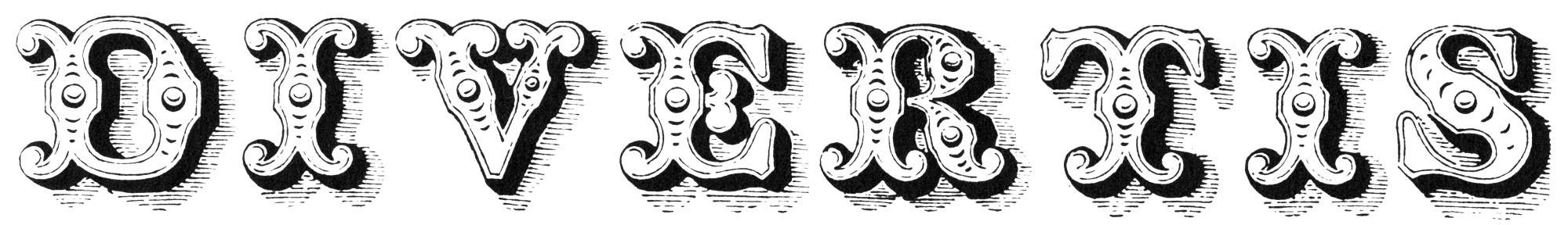
Tuscan Italic type, William Thorowgood, 1825.
Tuscan reversed, Thorowgood, 1834.
Tuscan ornamented nº 3, Vincent Figgins, c.1846.
Three-line pica Tuscan ornamented, Caslon, 1849.
No one knows for sure the origin of the term Tuscan in typography. Nicolete Gray, a passionate researcher of decorative lettering, suggests that it may have been invented by Victorian type founders, there being no historical trace of such a designation 1. Remember that Tuscan, the cultured and literary language of Alighieri, Boccaccio and Petrarch, is the one that eventually prevailed over the other dialects of northern Italy, and it is therefore likely that ‘Tuscan’ was a generic name given to everything that was believed to come from that region. 2
On the other hand, Tuscan is only a name. We do not know with historical rigour whether it is legitimate to call it Tuscan or whether the style would have been born in Tuscany, although we could well imagine that, northern Italy having been for so long the fundamental source of all artistic novelty, in the eyes of the rest of the continent, it is likely that any innovation devoid of name or place of origin would be called Italian or Tuscan. We already know that all roads lead to Rome (or Florence) and that the traces of the Roman Empire throughout its territory are still warm.
Indeed, at the dawn of the 19th century, with all the proliferation of new type styles to satisfy the advertising industry’s voracious appetite for novelty, the Tuscan style was already a well-assimilated style among printers and type founders.
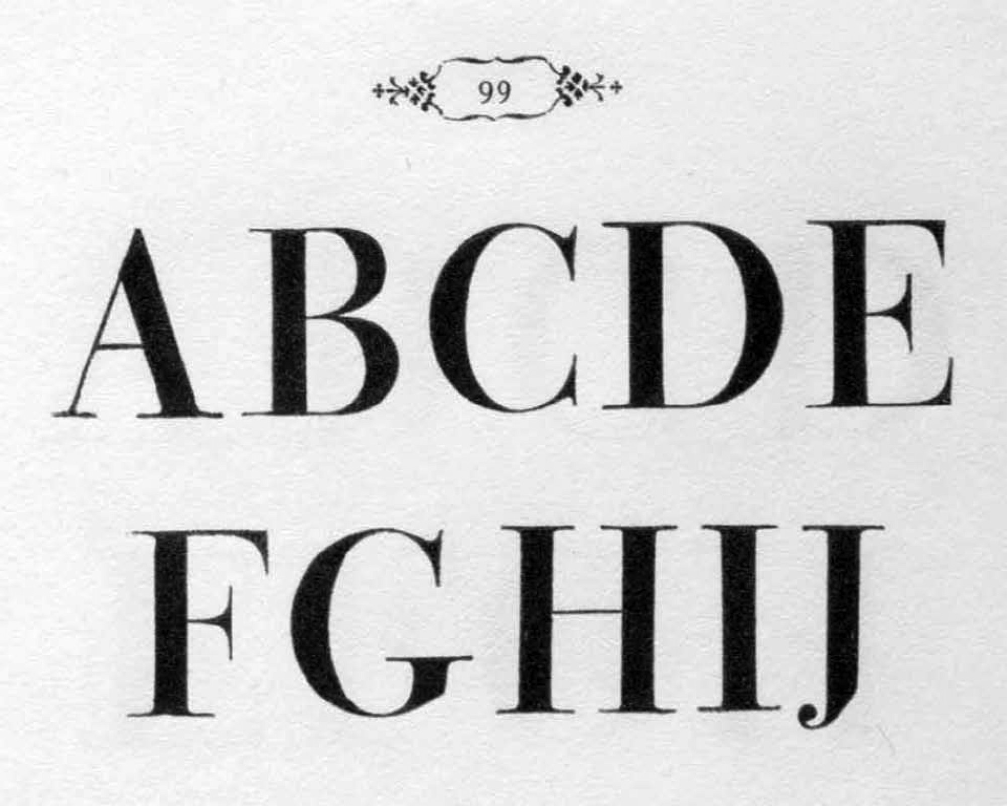
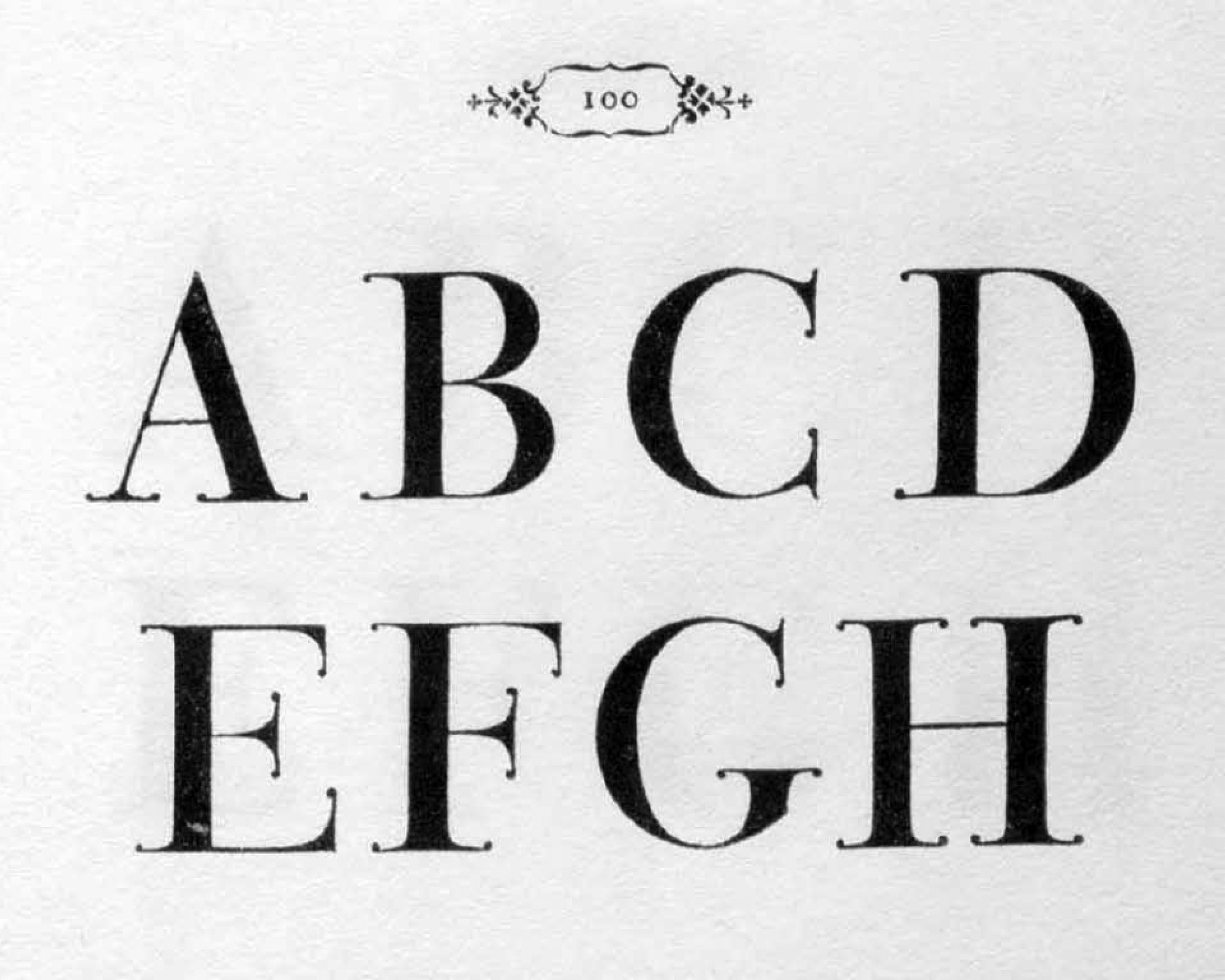
Already at the end of the 18th century it was clear that, even in the context of a supposedly rationalist and geometric typeface, such as that of Giambattista Bodoni, serifs could be minimally “flowered” and therefore give an impression of black tie attire, let’s say. In Margherita Bodoni’s *Manuale Tipografico* of 1801, the style that appears on page 99 is transformed into an evocation of Tuscan on page 100, with virtually no adjustment of the proportions of the letters.
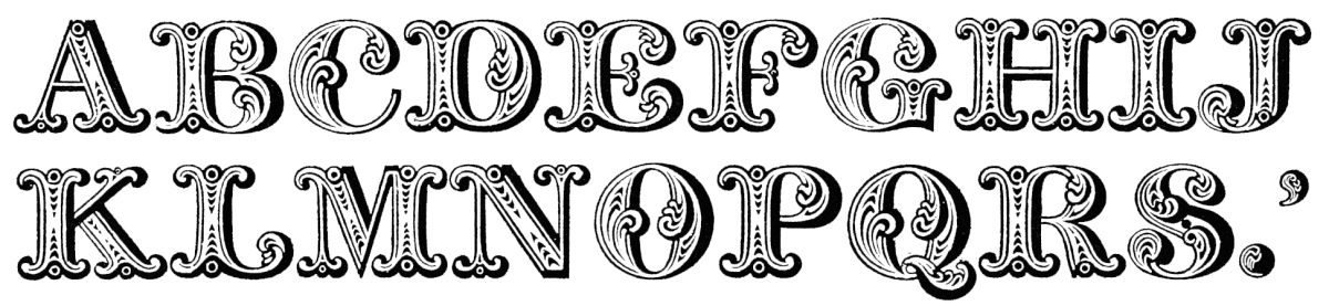
Vincent Figgins’ well-known Tuscan, published around 1817 under the vague name of ‘Four lines pica Ornamented No. 2’, had pronounced contrast, bifurcated serifs, circles at joints, a play of textures, inner line at the edge, feathers in the thick strokes, and even a shadow, for good measure. It is supposed to have been available as a wood type, but there is no evidence. Image taken from Figgins’ specimen of 1815. 3
Victorian Tuscans
For those of us who love letters (nothing better than the French term amateur) and in particular ornamental ones, Nicolete Gray’s magnificent book Nineteenth Century Ornamented Typefaces continues to be the fundamental reference, generous in images, historical rigor, minutiae and passion. 4 One of the appendices to that volume is dedicated to Tuscan letters in particular and, to my knowledge, it is the only document devoted to the history of the style.
This type style, with flared terminals and faceted strokes with sometimes concave sides, is what was called ‘Tuscan’ in the early 19th century.
Gray’s research shows how the first Tuscan typefaces produced in the 19th century were rather discreet, even what was called Tuscan was a style that today we would call flared serif, i.e. with terminals that suggest serifs but do not actually draw them, let alone bifurcated serifs or the like. But the style caught on, and dozens of variations and transformations quickly followed, to the point of blurring the boundaries of what was Tuscan and what was not, which is something very common in the history of typeface design.
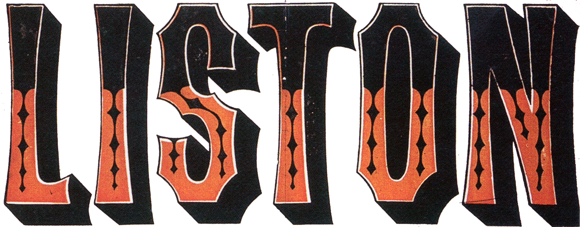

At first, bifurcated serifs were barely hinted at. But by 1860 the experimentation in ornamental lettering, made of wood or cast in metal, was such that letters had already become tree branches, vines, floral tablecloths, bones, geometric bars and even clouds. And Tuscan letters did not escape this process.
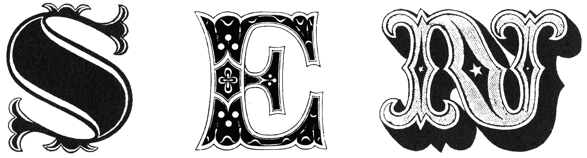
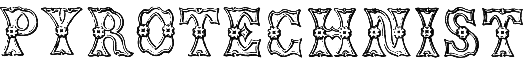
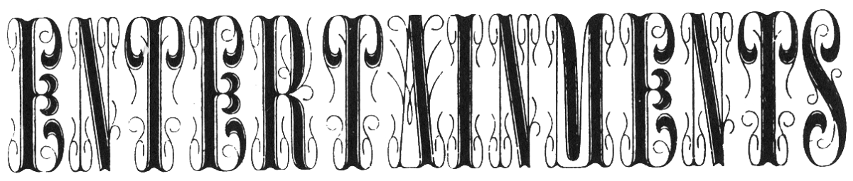
English Tuscan initials, more glitzy than discreet: Letter S, Tuscan Open by William Thorowgood, 1825. Letter E, by Marr, 1853. Letter N, by Wood & Sharwoods, 1842.
Five-line small pica Tuscan ornamented, Figgins, 1843.
Tipo “Lord Mayor” from Wood’s Typographical Advertiser, 1862.
Tuscan ornamented nº 1, Figgins, 1846. An example of what Nicolete Gray would call ‘semi-Tuscan’.
Canon Ornamented nº 2, Thorowgood, 1834.
A special mention should be made of the certain Tuscans generally associated with the billboards of shows and circuses in particular. However, this seems to be an imprint of the 20th century. Circus posters from earlier times do not show a particular use of Tuscans, but of other styles. However, in the collective imagination of circus posters those textured Tuscan letters, divided vertically into shadow and light, are often the first style to be evoked. 6
Two-line small pica Tuscan nº 9, Miller & Richard, 1857.
Two-line great primer ornamented nº 8, Miller & Richard, 1857.
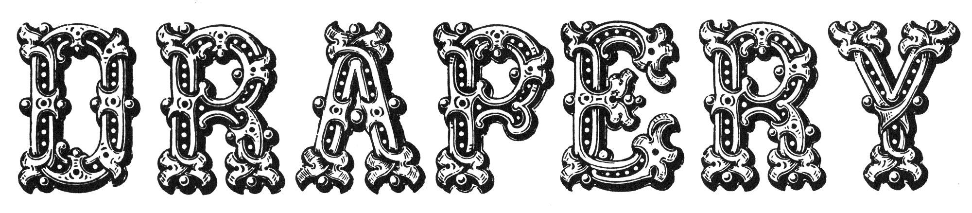
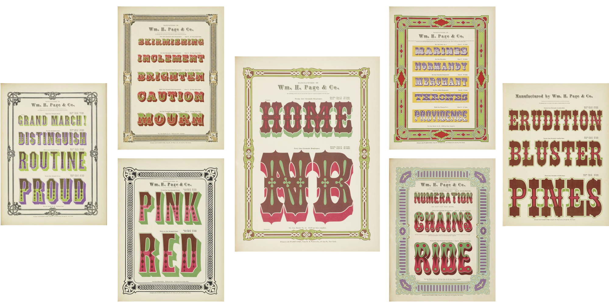
Successful examples of nineteenth-century decorative letters, expressive and multicolored, among them several Tuscan, are those attested by the Specimens of Chromatic Wood Type and Borders of William Page’s wood type company, printed in 1874. These singular prints represent a moment of glory in the (very Victorian) search for expression and ornamentation in type, often happily embraced in the design of posters, billboards and other ephemera. 7
In the footsteps of the Tuscan style
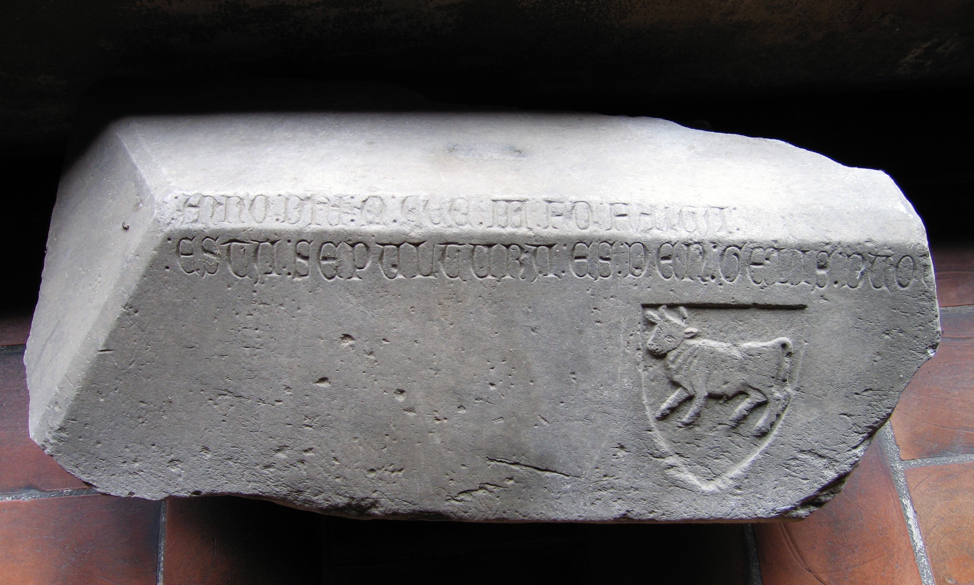
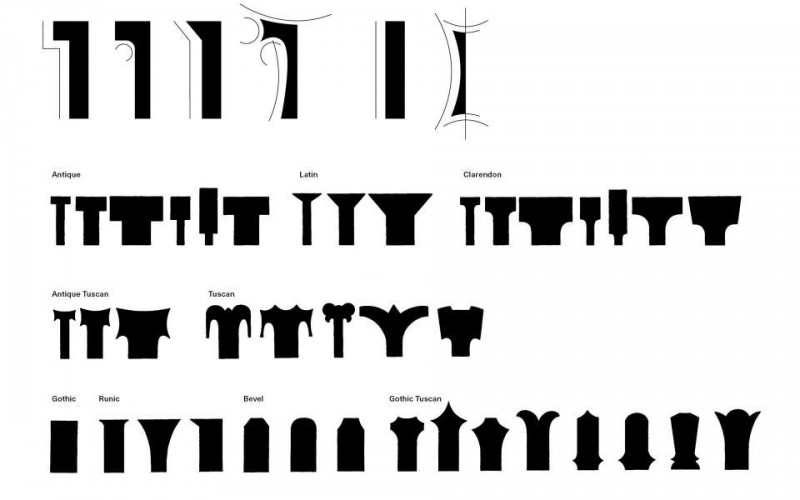
In his highly regarded book American Wood Type: 1828-1900 Rob Roy Kelly suggests a theory of how Tuscans would have evolved from the transformation of serifs from Roman, Antique, or Gothic, the three now well-assimilated plain faced styles. 8
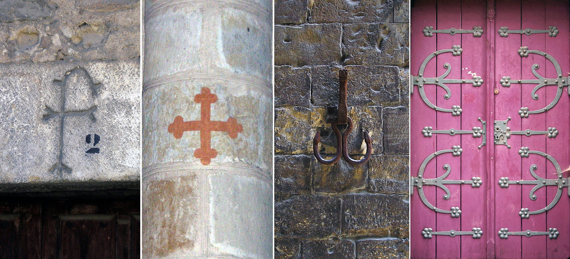
B. Occitan cross, Saint Sernin basilica, Toulouse, France.
C. Mooring piece on a quay on the Arno river, Florence.
D. Side door of a church in Metz, France.
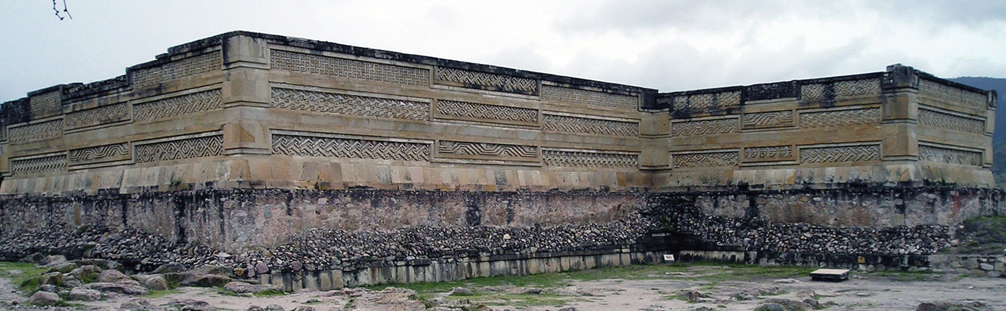
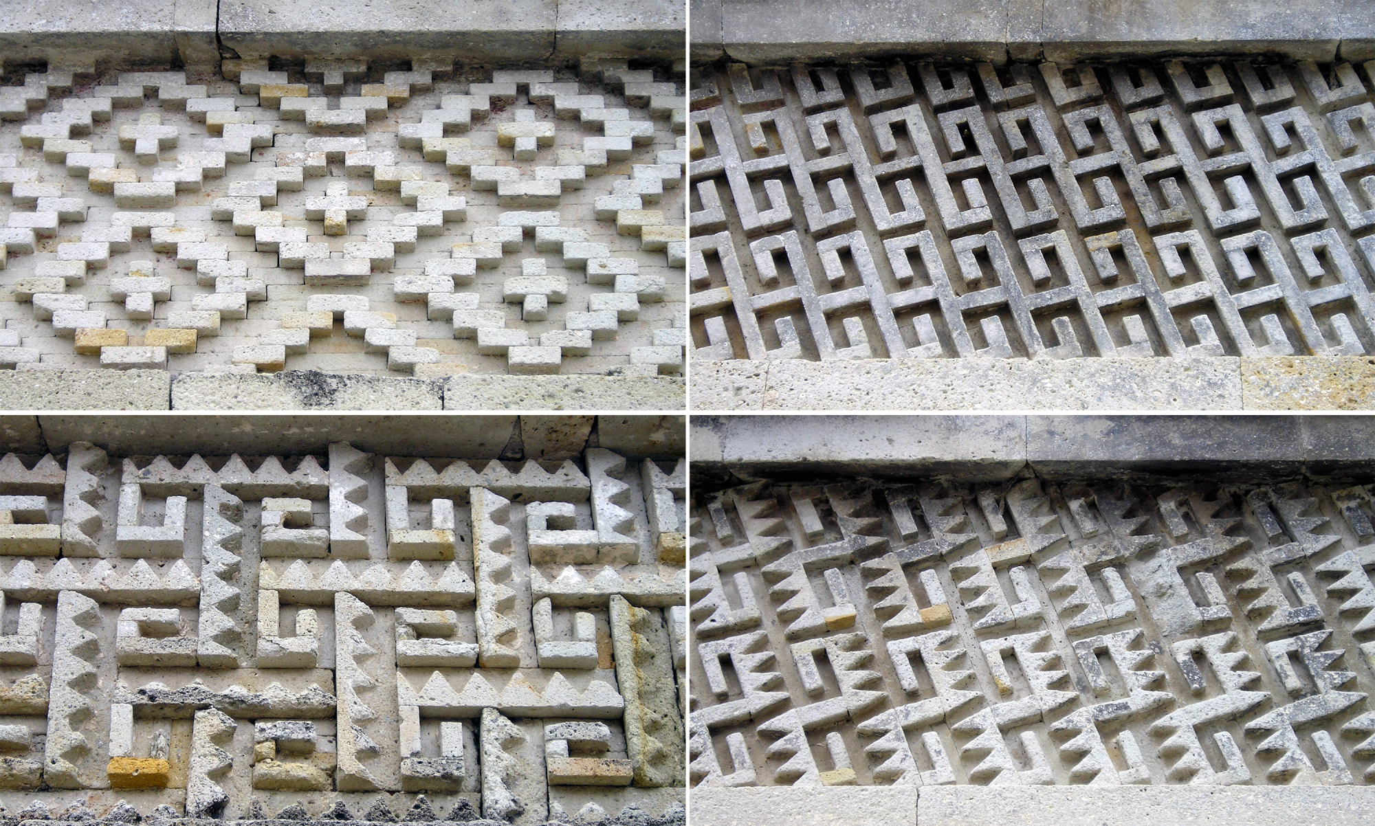
However, the hypothesis that printing type forms evolved in an endogamous or self-referential fashion, without any major connection with other forms visible on public thoroughfares, with other elements also natural to architecture and the decorative arts such as cabinetmaking or ornamental ironwork or, certainly, the lapidary inscriptions in cemeteries, seems limited or even naive to me. Given the nature of the great diversity of supports and materials on which we humans have engraved letters, as well as an infinite number of other expressive elements, and given the natural interrelation and interweaving of styles that has been observed in the history of calligraphy, lettering and typography, a hypothesis that links the manifestation of Tuscan letters with the entirety of visual expression would, I think, make more good sense.
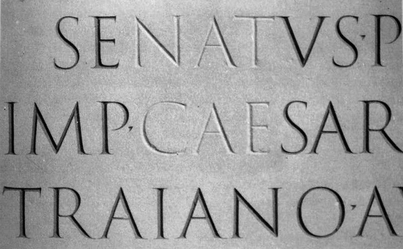
As Father Edward Catich demonstrated around 1968, the flat-tipped brush in the hands of the imperial calligraphers is what gave rise to the serif and the anatomy of the Roman capital, with its modulation of thin and thick strokes.

Cavus feet II. Two modern interpretations of old styles, both by Robert Slimbach for Adobe: Jenson on the left, Garamond on the right. The sinuous concavity at the base of serifs, in both capital I and lowercase n, evokes that original concavity of brush capitals. One of the characteristics of the old style that will later be replaced by the modern flat-footed style.
On the other hand, the tendency for terminals to bifurcate is a common feature in the flowering of all decorative styles and occurs naturally in the history of ornamental genres.
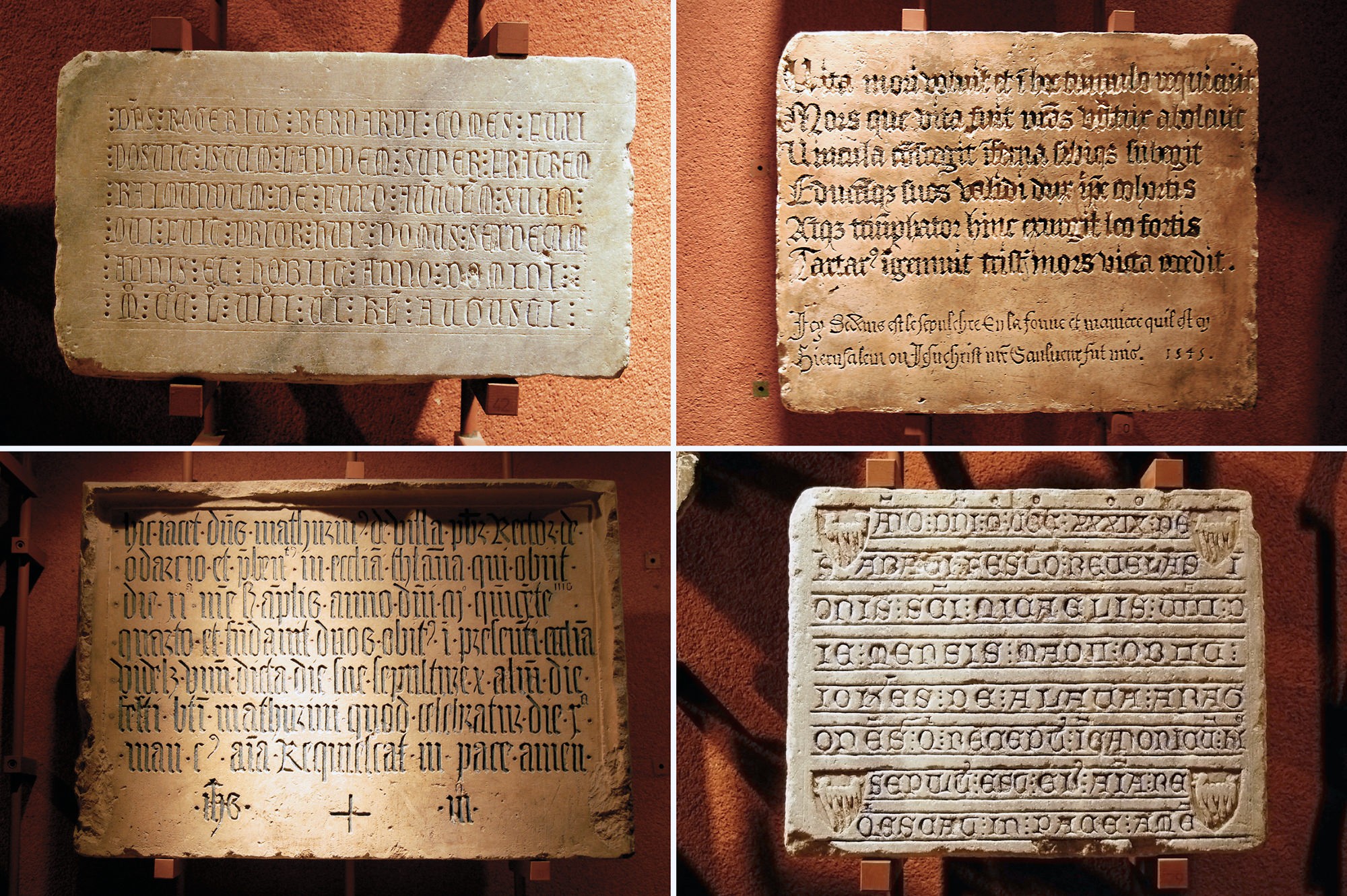
Epiphanies at the cemetery
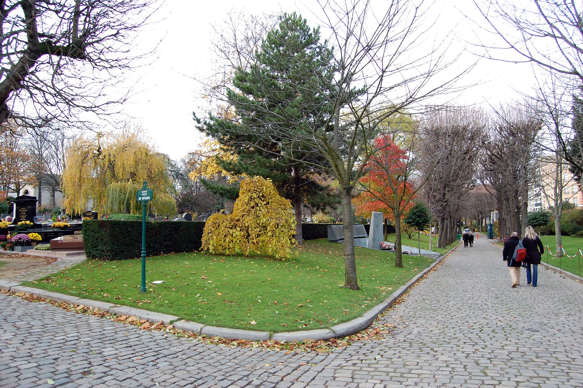
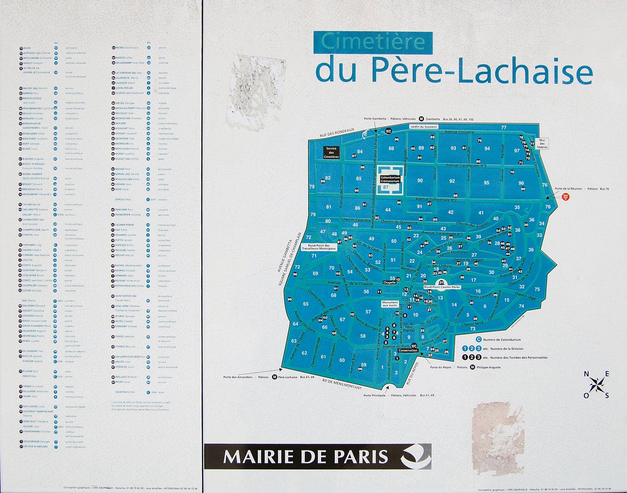
There are two ways to circumnavigate the Père Lachaise cemetery in Paris: go to the official map at the entrance of the grounds to locate the celebrity grave or graves to visit, or, if you have the time, wander the streets indefinitely and be surprised by a famous surname or a moving epitaph.
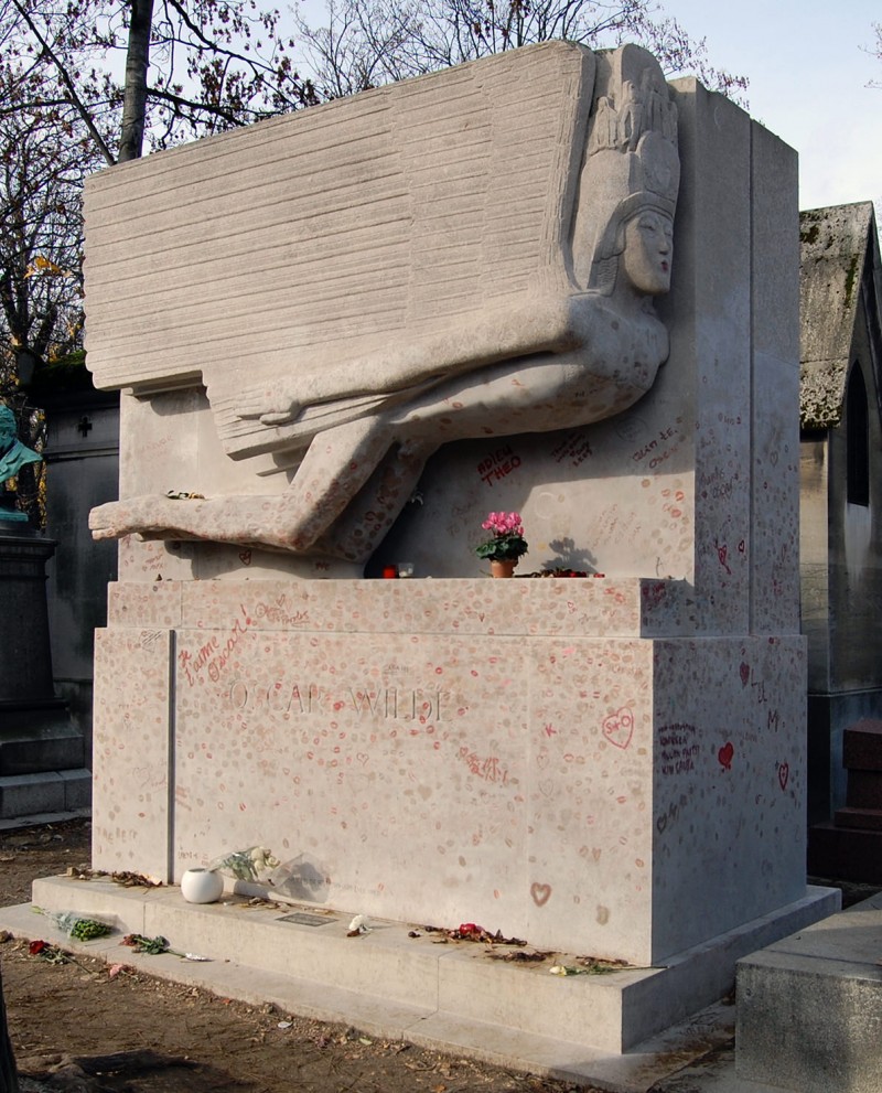
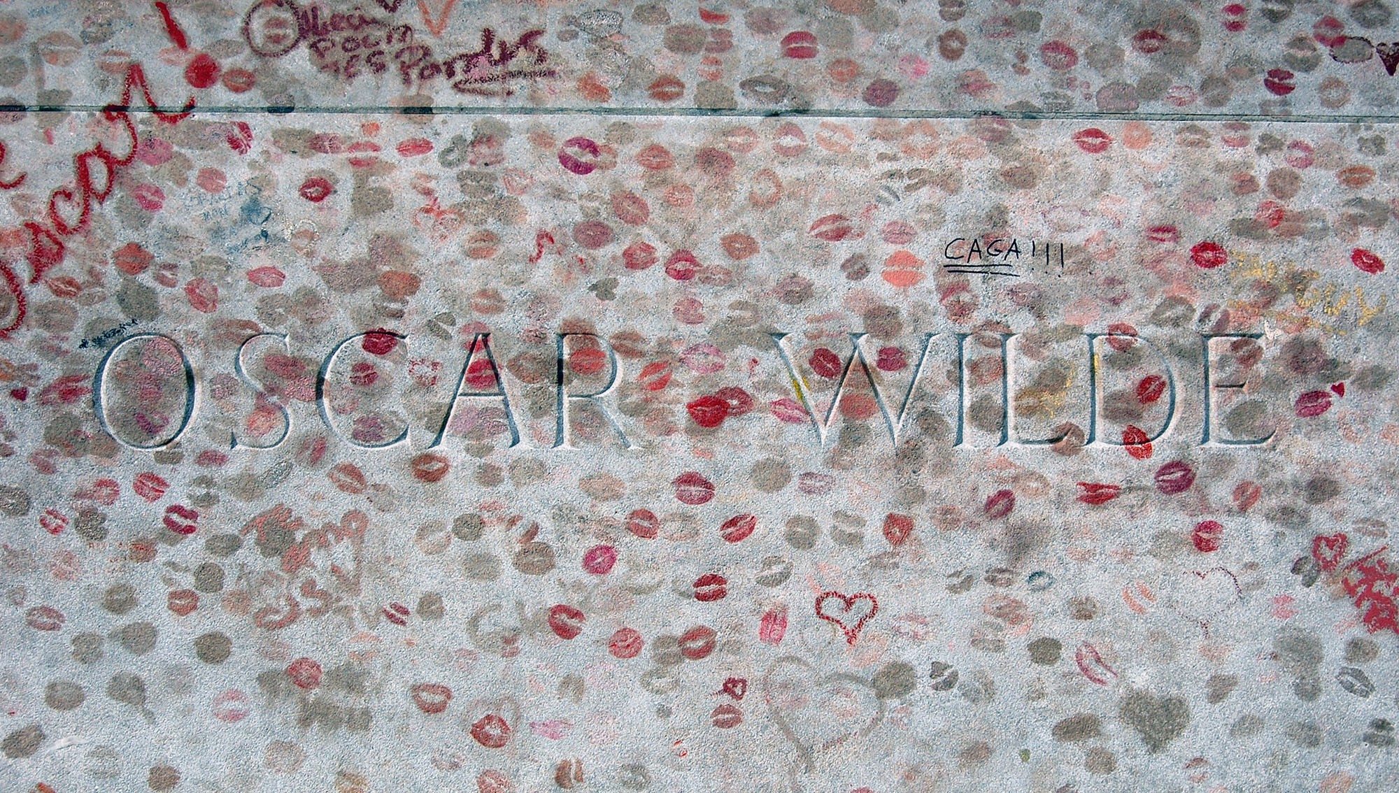
Oscar Wilde’s grave is undoubtedly one of the most popular. The modernist sculpture of his pantheon is striking from a distance, but up close, the endless palimpsest of personal lipstick kisses is overwhelming. Part of the ultra-tomb folklore of celebrity.
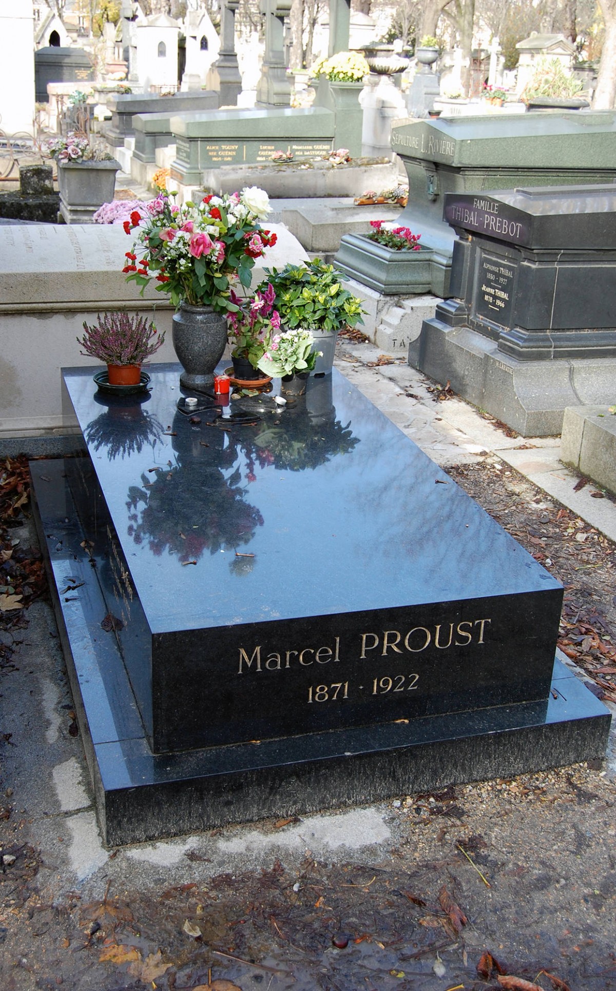
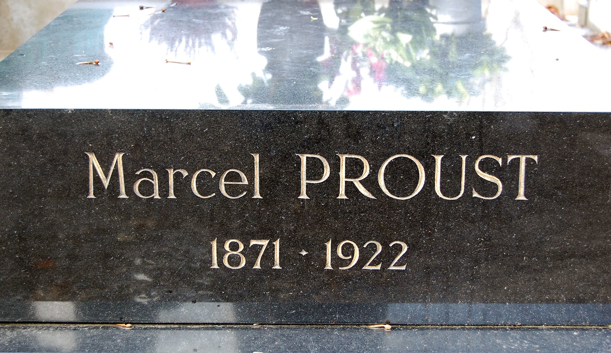
Marcel Proust’s grave, on the other hand, almost goes unnoticed, more in keeping with the novelist’s introspective profile.
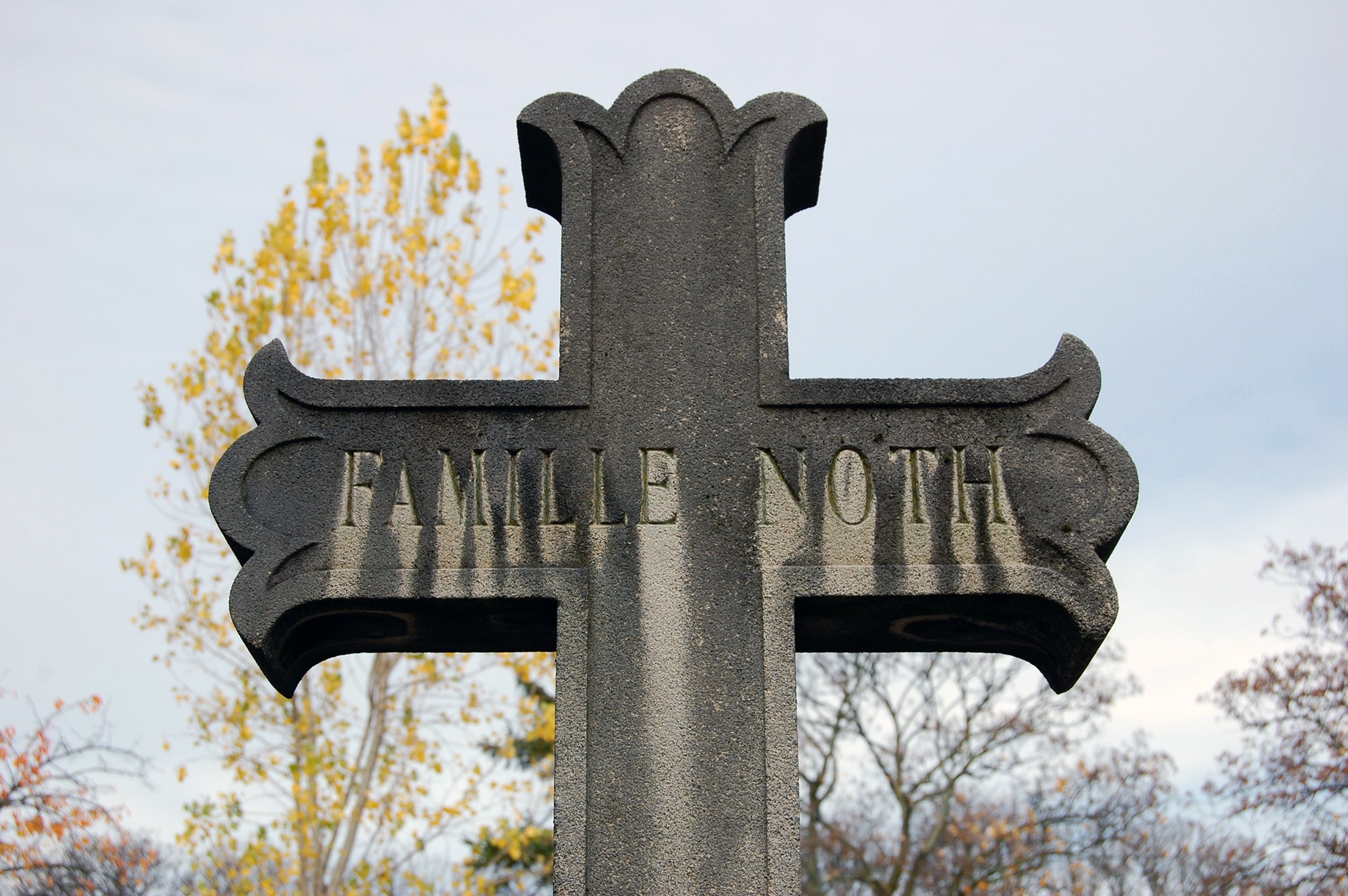
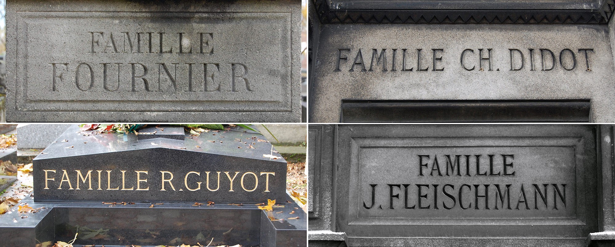
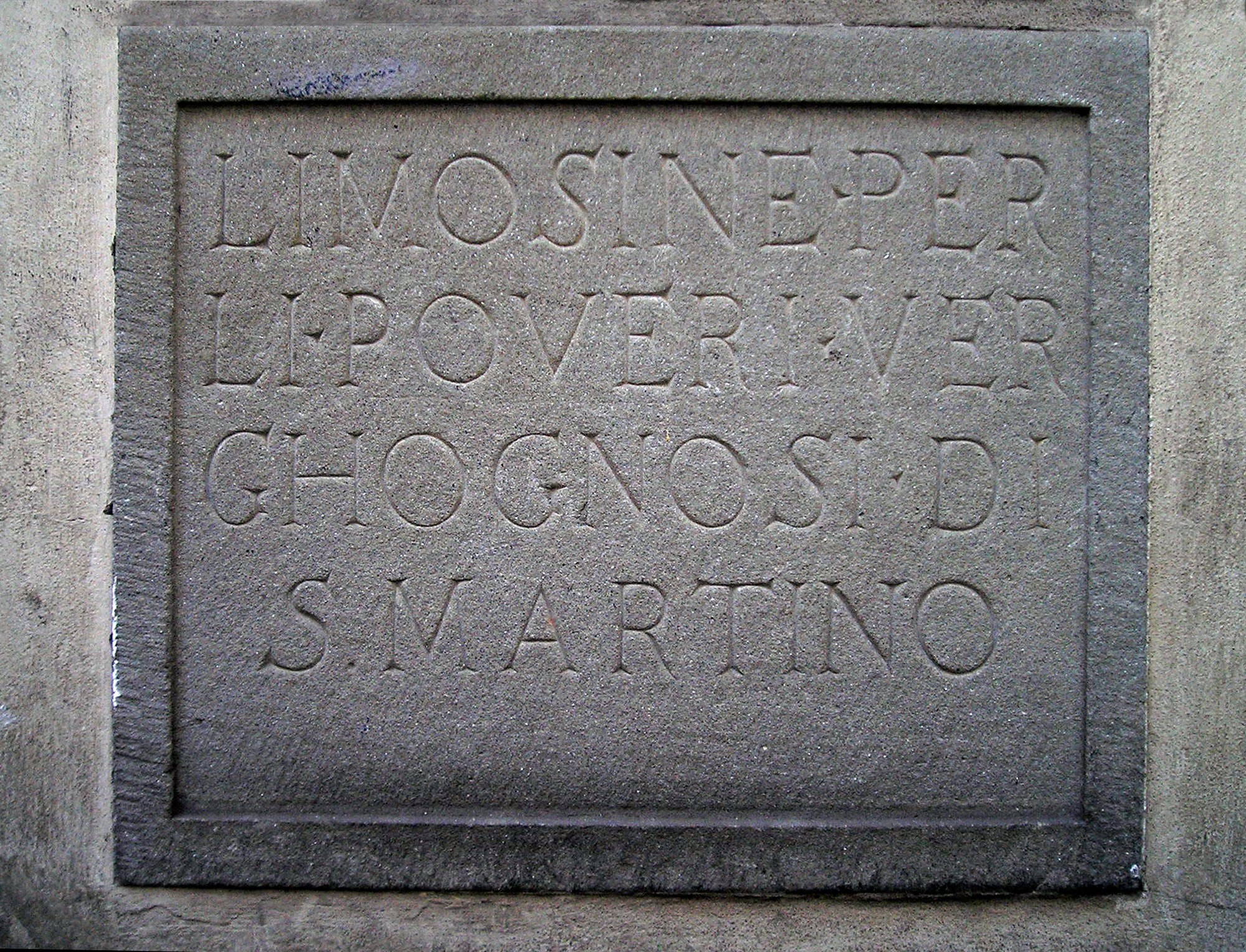
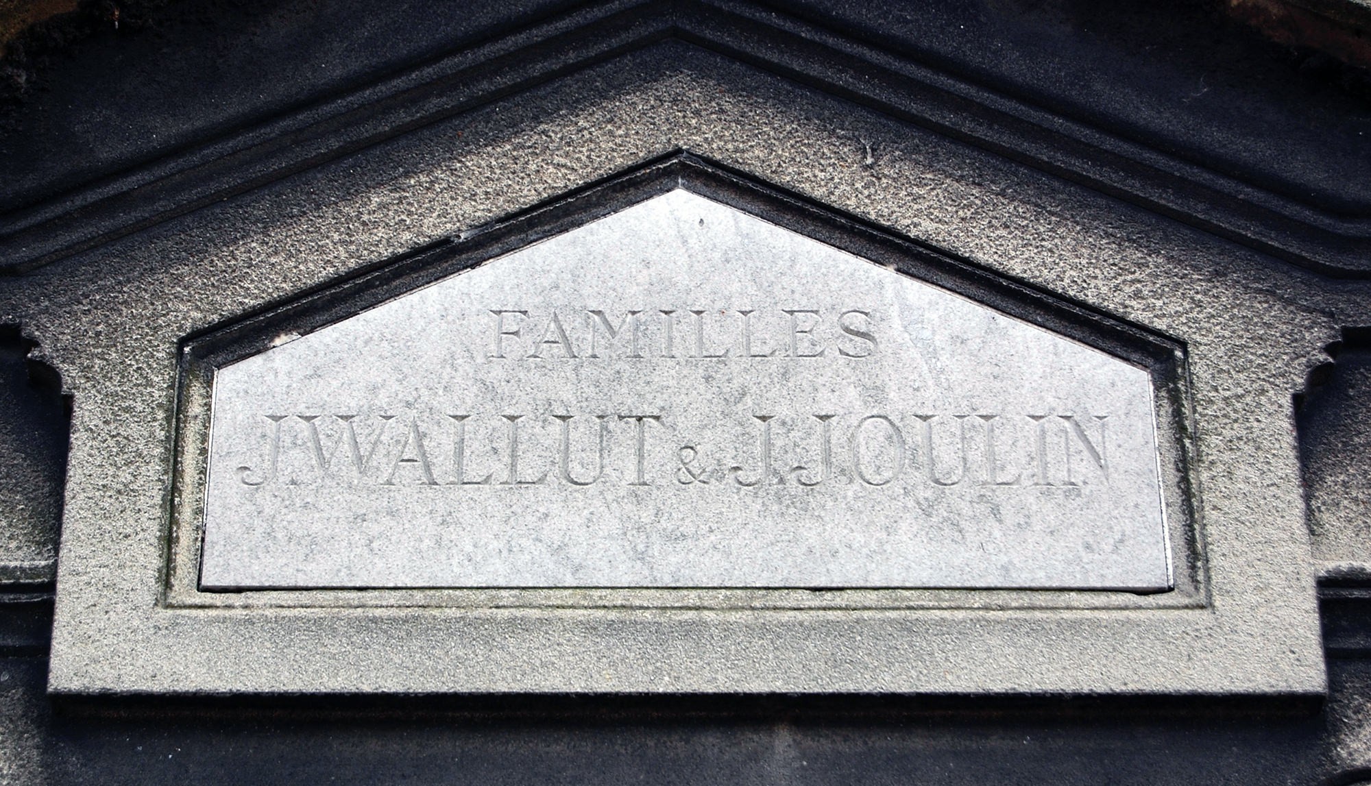
Not to mention family names celebrated in the history of typography — which probably do not correspond to the family of the particular typographer, but the thrill of reading those names is the same.
Angles and serifs
Close observation of the anatomy of letters engraved in stone (or wood) yields some conclusions that are somewhat obvious, but not often discussed. The first has to do with the importance of serifs in the recognition of letterforms. This semi-truth, historically present in the intuition of typographers, though very little supported by the results of empirical tests carried out by psychologists of perception dedicated to the research of legibility, can be linked to certain scientific findings on the physiology of our cerebral cortex, for example those of David Hubel and Torsten Wiesel in the 1970s. 9

However, the letter is not a sum of angles and shapes but a small totality. Just as we do not read isolated letters but words and sets of words, in the same way our eyes, our brain, our experience, capture shapes and their interrelationships in an intelligent, holistic way, using very subtle mechanisms of prediction, selection and discarding, which collaborate at various levels of perception in the very complex and fast task of extracting meaning from a text.
From one cemetery to the other, and vice versa
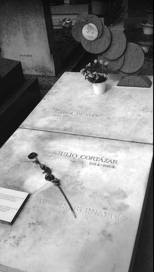
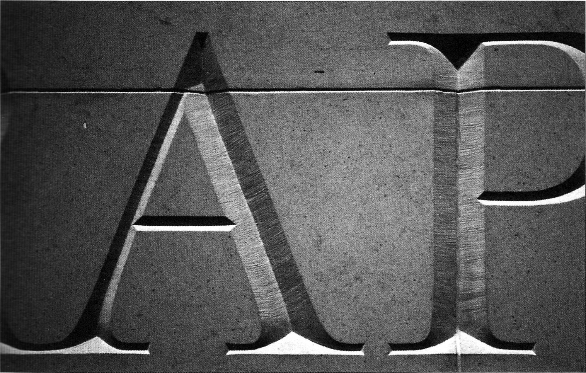
In fact, part of my epiphany took place some time before in another Parisian cemetery, Montparnasse, in front of the tomb of Julio Cortázar, a must for an admiring reader. His name, as well as the names of his two beloved wives, 11 are carved in an informal Roman capital letter (typical of that cemetery) on the horizontal face of the white stone platform. As the tomb is not very high off the ground, it offers visitors an angle of view of the names that allows them to scrutinise the dark marks left by time and the accumulation of dust inside the letters. In this way, the angles at which the inner faces of the signs meet are more pronounced and produce the illusion of a Tuscan letter, with bifurcated serifs. In fact, thanks to the high contrast in tone between the engraving and the stone, it is easy to imagine that the letters J U L I C T are made directly in the Tuscan style.
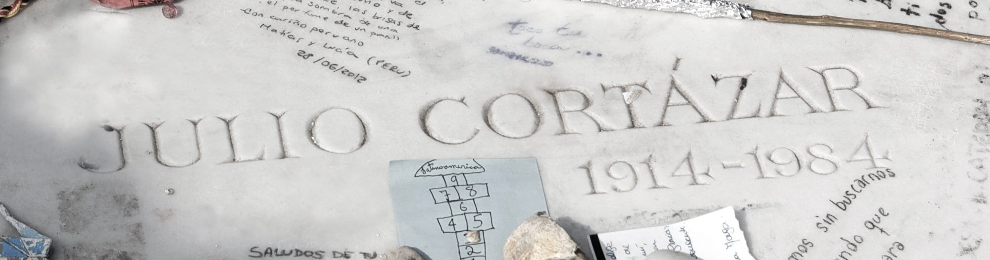
At this angle of the photo, the upper serifs are visually more dominant than the lower ones, but if one stands at the opposite angle, the relationship is reversed. This also suggests the hypothesis that the resulting three-dimensionality of an epigraphic inscription allows a moving reader to witness the subtle (yet fantastic) transformation of its inner anatomy as his point of view changes. Lapidary epitaphs are the monumental form of lead type. That which evokes the perennial is engraved with relief.
Clearly the Tuscan are letters in themselves, not evocations of other letters. Borrowing Eric Gill’s phrase: they are things, not images of things. And they have long since earned their place among the decorative genres. But where did they come from, and what was the first example?
Nicolete Gray again tries to shed light on this subject by tracing the primordial traces of Tuscan. She says that they are linked to ancient Greek inscriptions and in turn to the cuneiform script, with its characteristic forked terminals. None of this is strange, knowing that in writing new styles always come from the combination of already established styles
Filocalus: the great forerunner
The archaeologist Giampaolo Virga in his online text “La Calligrafia Damasiana” states that ‘Pope Damasus ascended the throne of Peter in 366. A difficult period for the early Church, at that time prey to strong tensions on the heresy front. By reaffirming the supremacy of the Roman Apostolic See, Damasus can be considered the first patron pope in history. Concerned for the better preservation of the burial places of the early Christian martyrs, he had restoration and extension work carried out in many cemeteries.’ 14
The crystallisation of a more formal and refined Tuscan style would fall to the figure of Furius Dionysius Philocalus, a talented Roman calligrapher and epigrapher active in the second half of the 4th century, and who was the most important scribe of Pope Damasus. Thomas Noble has said that “In several cases, our clue to Damasus’ responsibility for the relevant inscriptions is his Philocalian letters. (…) Philocalus created a particularly beautiful and distinctive letterform.” 15
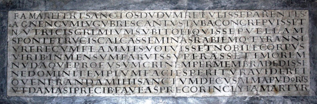
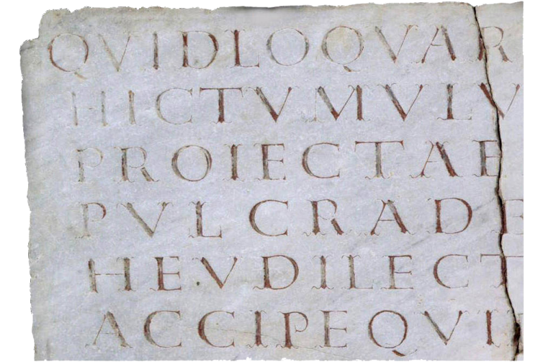
A poet, Pope Damasus composed verses in honour of the martyrs to give them a dignified burial. To this end, he commissioned Filocalus to create a unique style of calligraphy to be transcribed on their tombstones. Top image: celebrated inscription dedicated to Saint Agnes at Saint Agnes Outside the Walls in Rome. Bottom right: detail close-up of the same inscription. Bottom left: detail of inscription, papal chapel at the cemetery of San Callisto, Rome.
For the same reason, according to Virga, this calligraphy is called Damasian or Philocalian. Very wide Tuscan capitals, with trifurcated serifs, very elegant and sometimes painted in red and black. And Virga concludes: ‘When we come across an example of a tombstone with an epigraph in Damasian characters, we can say with great probability that we are close to a tomb where a martyr rests’.
And again Nicolete Gray: in her text “The Filocalian Letter” 16 stresses the importance of further study of Philocalus’ work as one of the most unique letterform artists of all time. According to Gray, the surviving evidence of his work has been researched by great scholars of all times, and in the 1950s definitive studies were made of both his inscriptions and copies of a lost manuscript. In Gray’s words: “(…) the fragmentary knowledge which we have of the work of Filocalus immediately establishes him as very remarkable. The names of both Roman and medieval practitioners of lettering are known, but of none do their works give us any clear impression of personality. Filocalus is comparable rather to the great printers, or to such modern artists as Rudolf Koch or Eric Gill; like them his work has the quality of originality, in his case in a very high degree, which marks it as the product of the conscious artist.” 17
Continue to the second and last part of the article.
Teresita Schultz de Carabobo is an Argentine renown enthomologist. In leisure moments she passionately devotes herself to the criticism of the typographic arts. Her texts distill a slightly acrid humor, perhaps due to her great fondness for tasting teas.
- Nicolete Gray, Nineteenth Century Ornamented Typefaces, Faber and Faber, London, 1976. In the first appendix, devoted to the Tuscan letters ↩
- In the same way it is said that Egyptian typefaces are so called, absurdly, because at the time when they became fashionable, in the early nineteenth century, everything that had to do with Ancient Egypt was also in vogue, after Napoleon’s campaigns in that country from 1798 on, and his return to Paris with the looted treasures. ↩
- Berthold Wolpe (editor), Vincent Figgins Type Specimens - 1801 and 1815, Printing Historical Society, London, 1967. ↩
- The original edition dates from 1938 but the revised and enlarged Faber and Faber from 1976 is the most complete and also the most beautiful. Nicolete Gray, Nineteenth Century Ornamented Typefaces, Faber and Faber, London, 1976. ↩
- Image taken from Michael Twyman, Printing 1770-1970, British Library, Oak Knoll and University of Reading, 1970 and 1998. ↩
- A good reference for the topic: In his article “Leeds Playbills website” Nick Sherman discusses an attractive show poster collection project from Leeds (GB), with its extensive use of wood type - http://woodtyper.com/917. ↩
- For more information visit: https://publicdomainreview.org/collection/specimens-of-chromatic-wood-type-and-borders-1874/ ↩
- Retrieved on 11/14/2020 from: https://woodtype.org/blogs/news/91-antique-tuscans-in-america. ↩
- For those interested, here is a friendly introduction: https://knowingneurons.com/2014/10/29/hubel-and-wiesel-the-neural-basis-of-visual-perception/. ↩
- Edward Catich, The Origin of the Serif. Brush Writing & Roman Letters, St Ambrose University, Iowa 1991. First edition 1968 ↩
- Carol Dunlop, the American writer who was Cortázar’s last companion, who died in 1982, and Aurora Bernárdez, Cortázar’s first wife, who died in 2014, her remains exhumed at Père Lachaise and gathered in the writer’s tomb in Montparnasse ↩
- Source: https://www.flickr.com/photos/stewf/48385062881/in/album-72157709910968801/ ↩
- Michael Harvey, Adventures with Letters. A Memoir by Michael Harvey, 47 editions, Sheffield, GB, 2012. ↩
- Giampaolo Virga, “La Calligrafia Damasiana”, blog Allontanarsi dalla linea gialla (Moving away from the yellow line. August 17, 2017. My translation.) ↩
- Thomas F. X. Noble, “The Multiple Meanings of Papal Inscriptions in Late Antiquity and the Early Middle Ages”, in The Early Reception and Appropriation of the Apostle Peter (60-800 CE), pp.58-80. https://doi.org/10.1163/9789004425682_005. Retrieved from the internet on October 1st 2020. ↩
- Gray, Nicolete (1956). “The Filocalian Letter”. Papers of the British School at Rome 24: 5-13. ↩
- Nicolete Gray, The Philocalian Letter, British School at Rome, 1956. Published online by Cambridge University Press: 09 August 2013. https://doi.org/10.1017/S0068246200006747 Copyright © British School at Rome 1956. ↩