Read the first part of this article.
[ Note: best read on a computer screen. ]
Ubiquity and variety
After the theoretical and historical considerations of the first part, I would like to take a brief look at the vernacular aspect of this ubiquitous typographic genre.
The world is full of beautiful examples of Tuscans, almost always with local nuances. So let us continue with a brief tour of some of the corners of the world that offer very special Tuscan letterforms, I think, to let us be carried away by their spontaneous frankness.
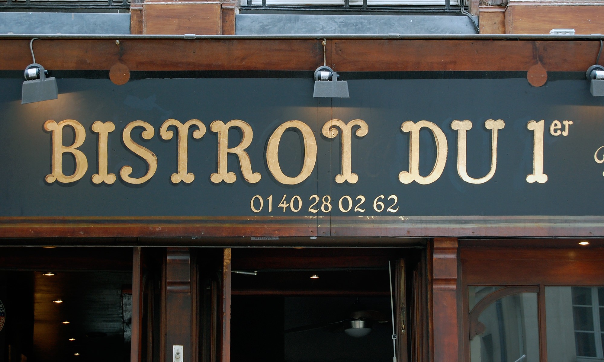
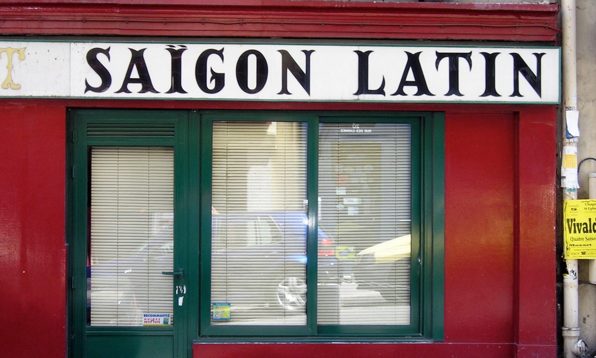
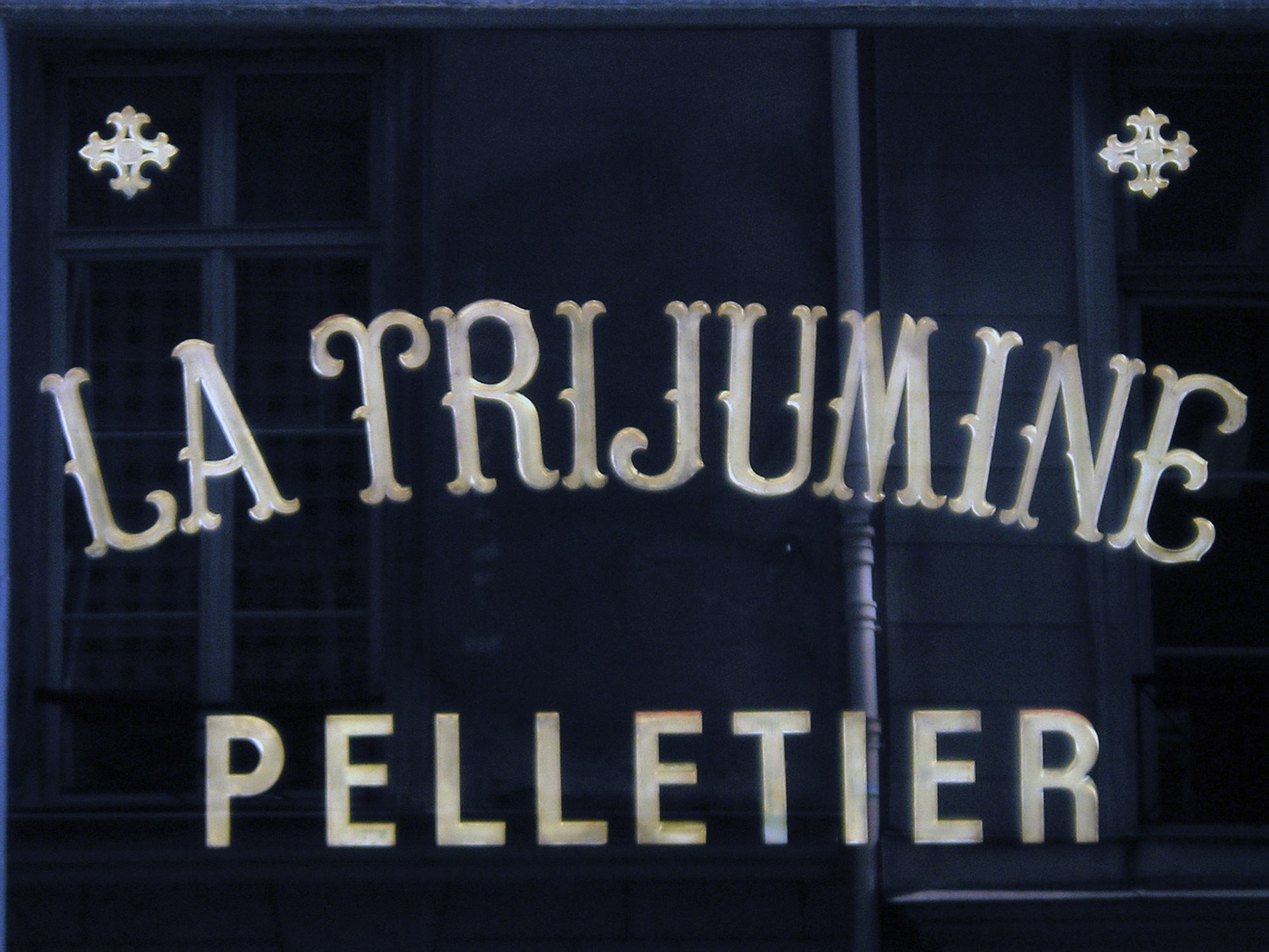
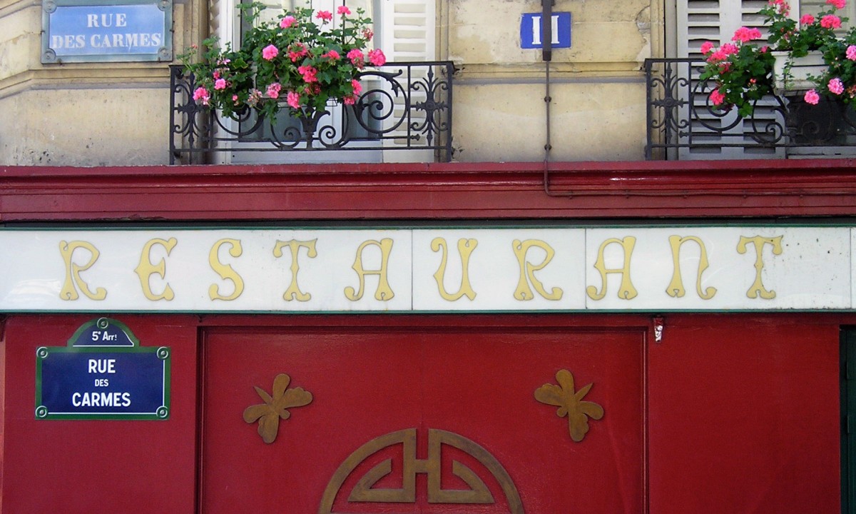
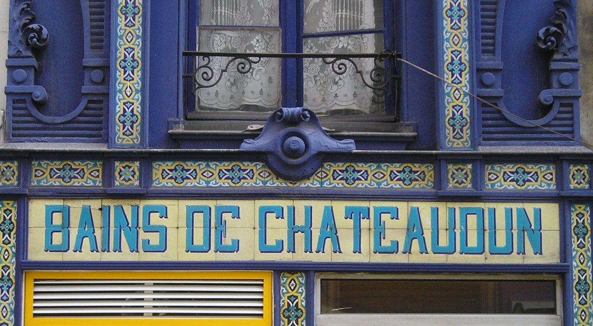
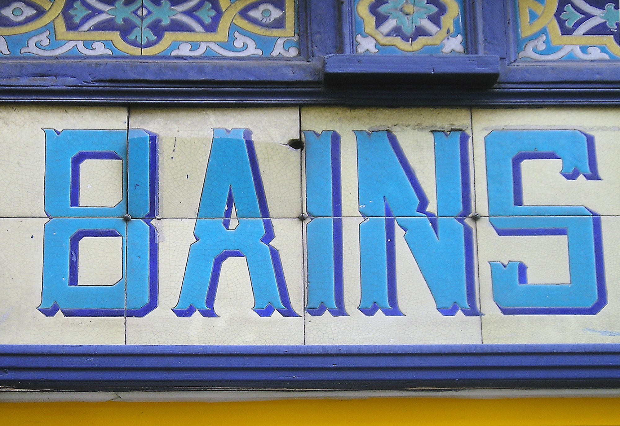
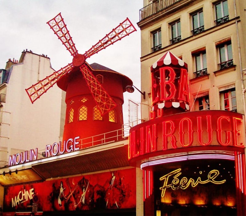
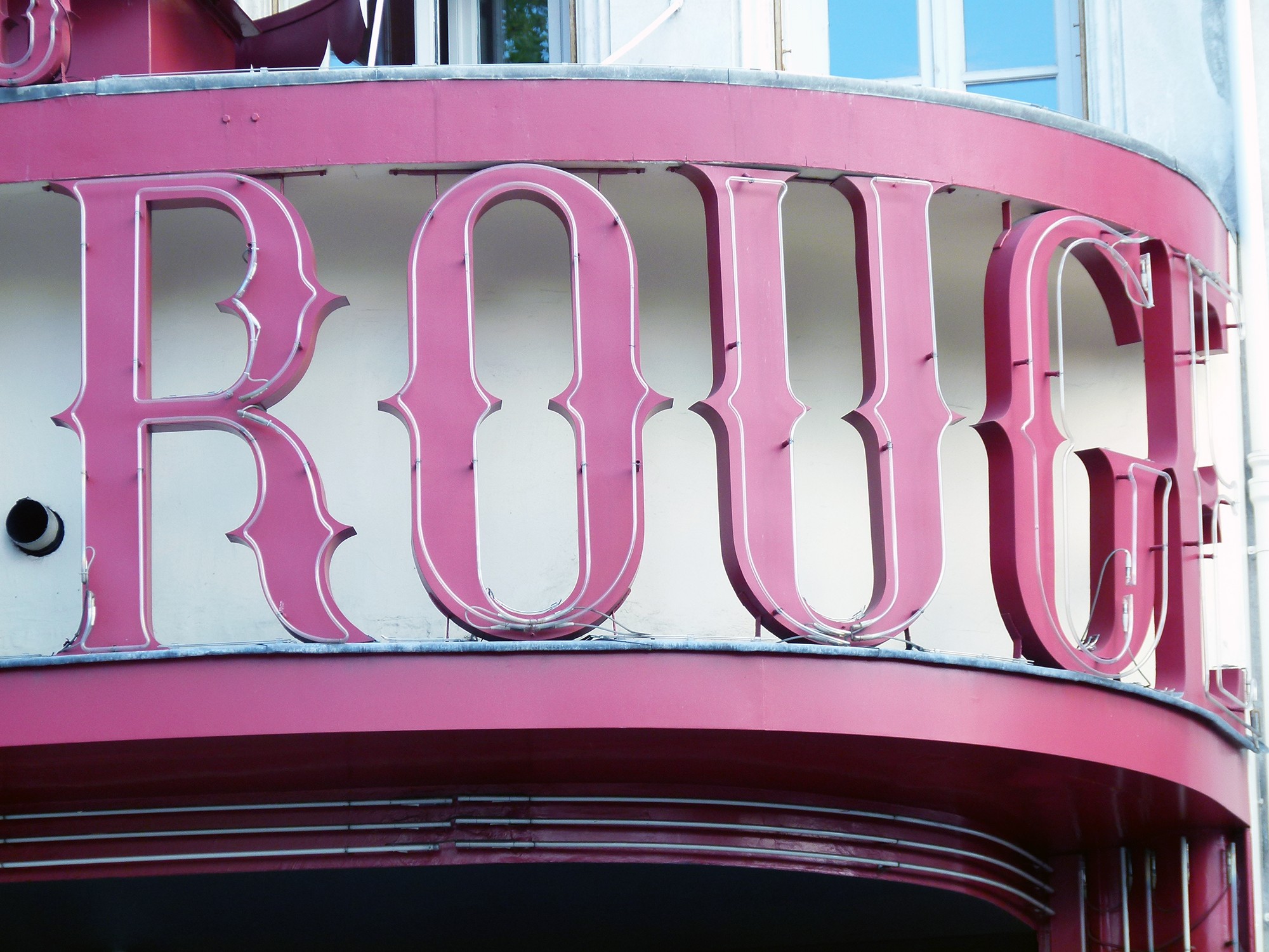
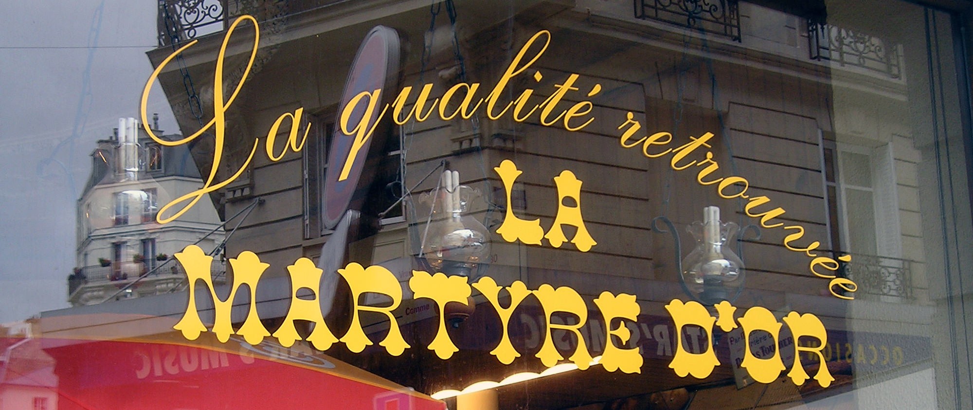
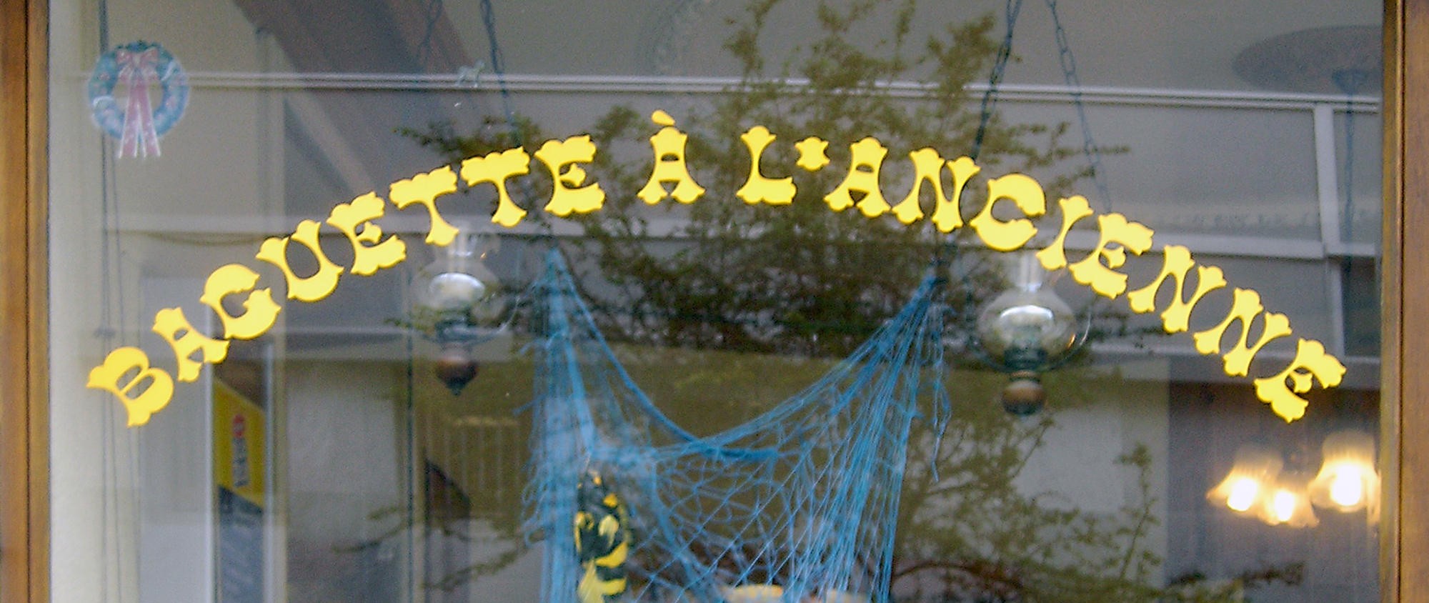
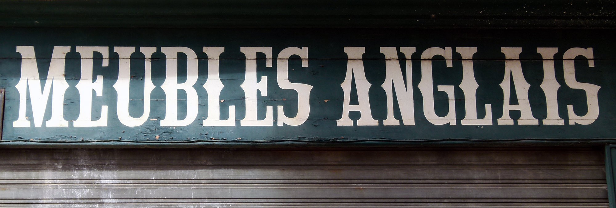
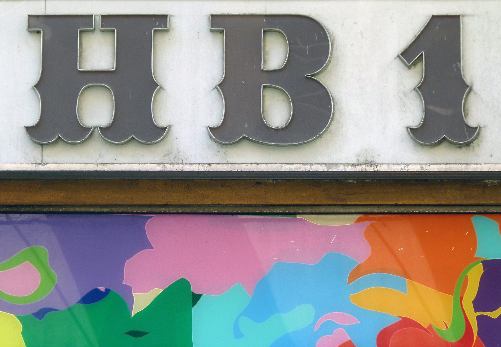
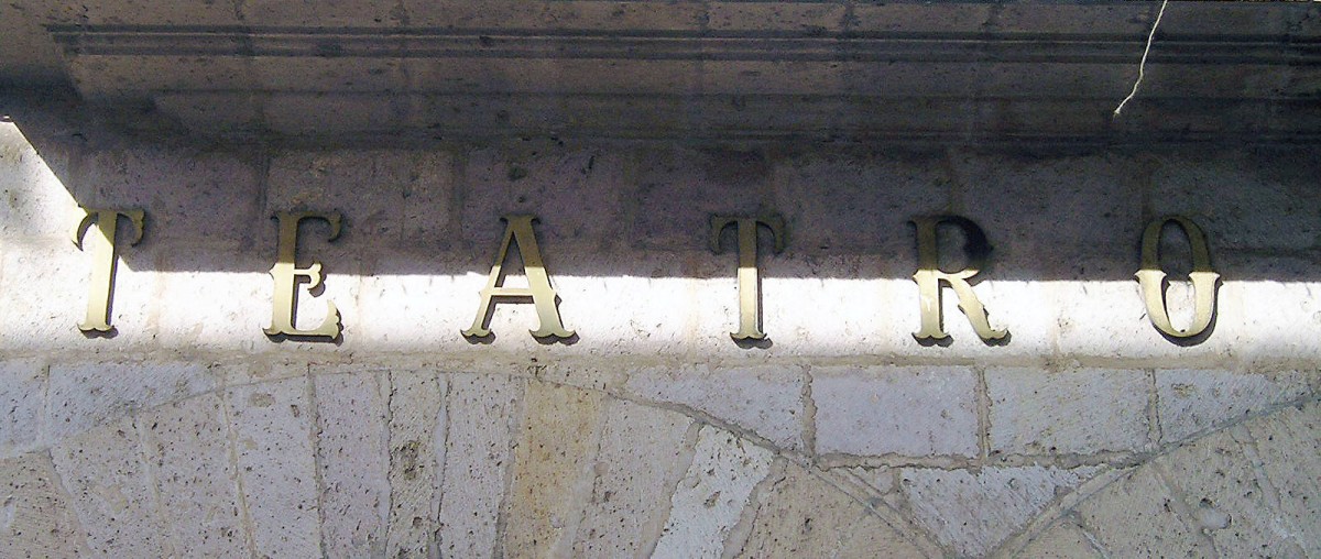
Paris: casual elegance
In general, street signs can be of two types, hand-drawn or typographic, almost always based on catalogue fonts. In Paris, there is a proliferation of hand-drawn Tuscans, sometimes executed in a haphazard manner.

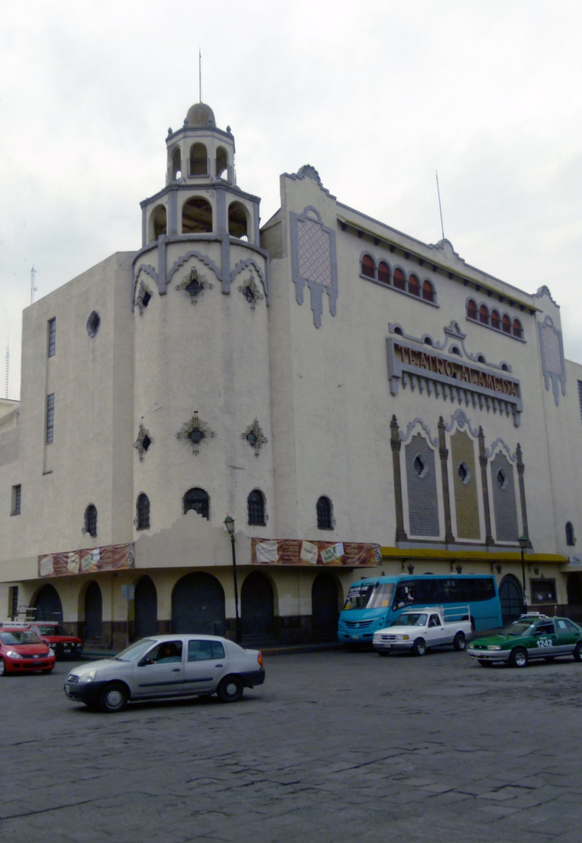
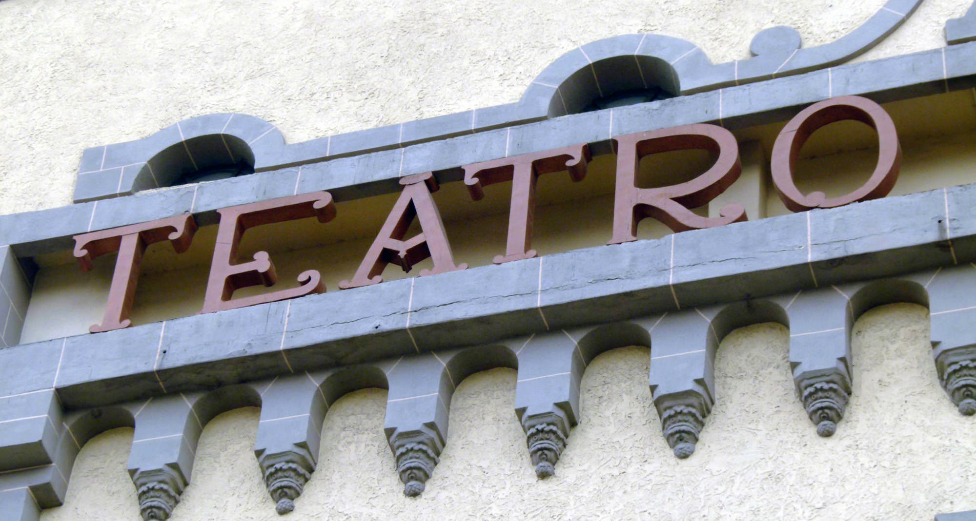
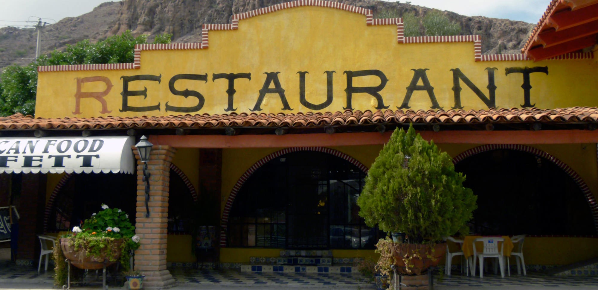
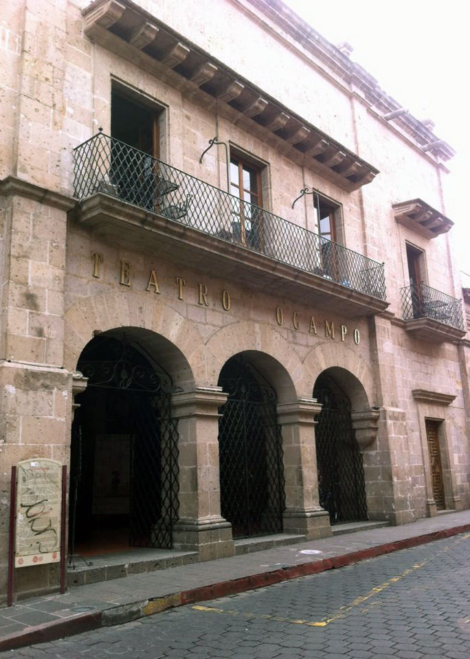
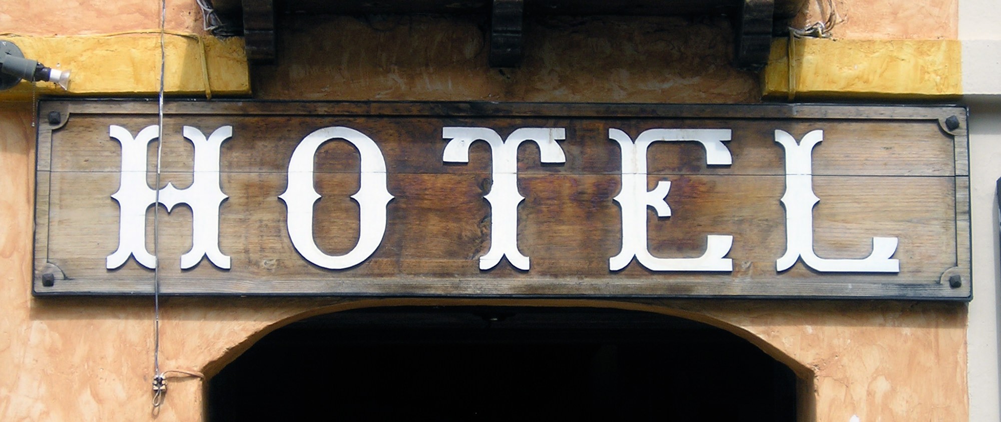
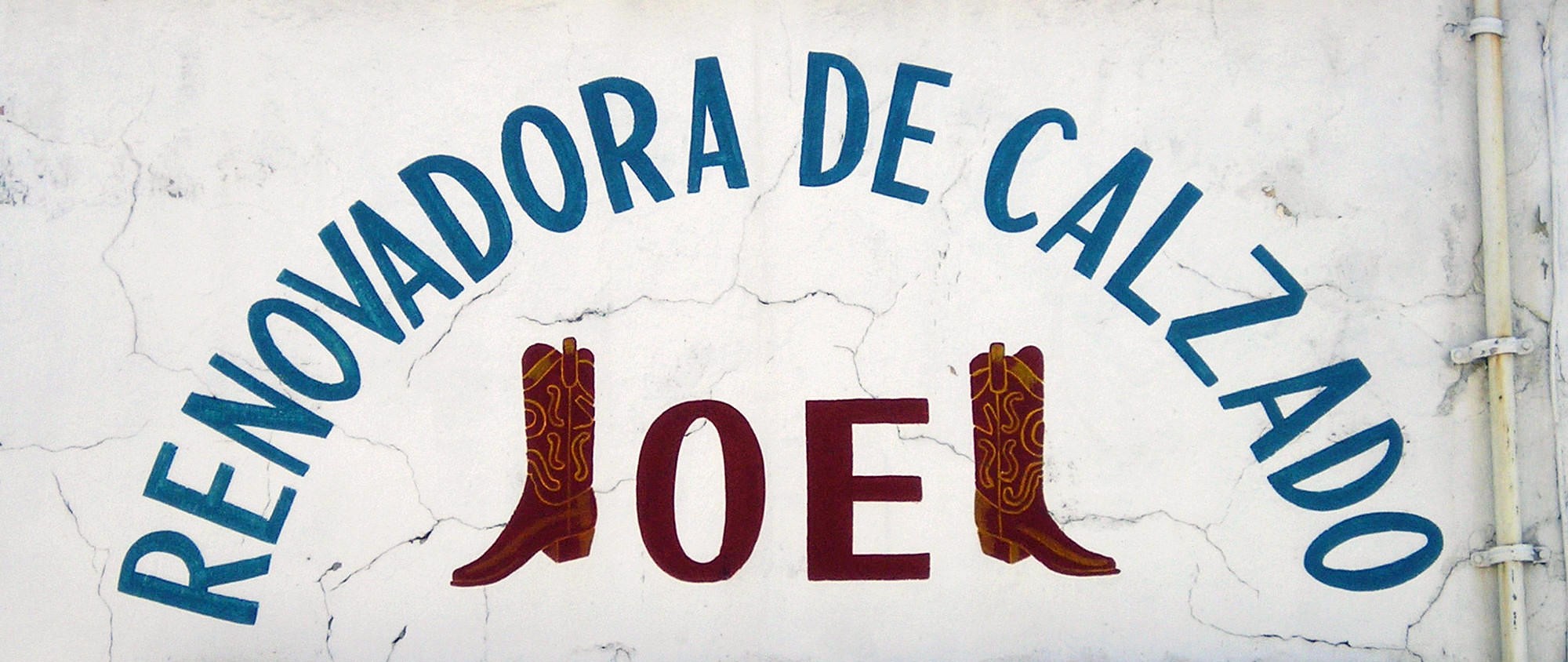
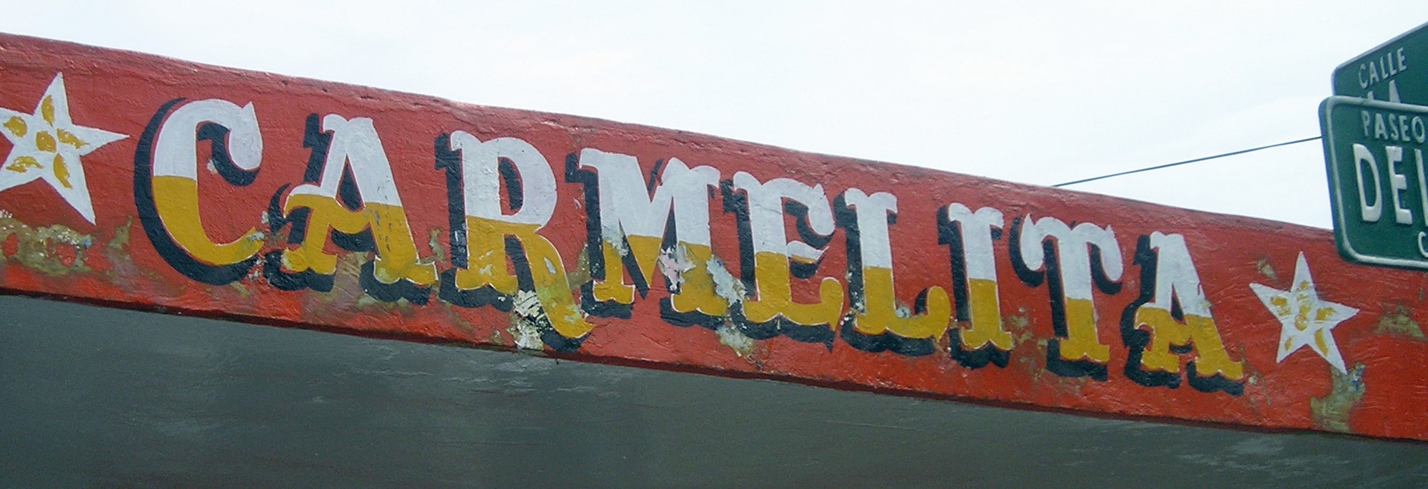
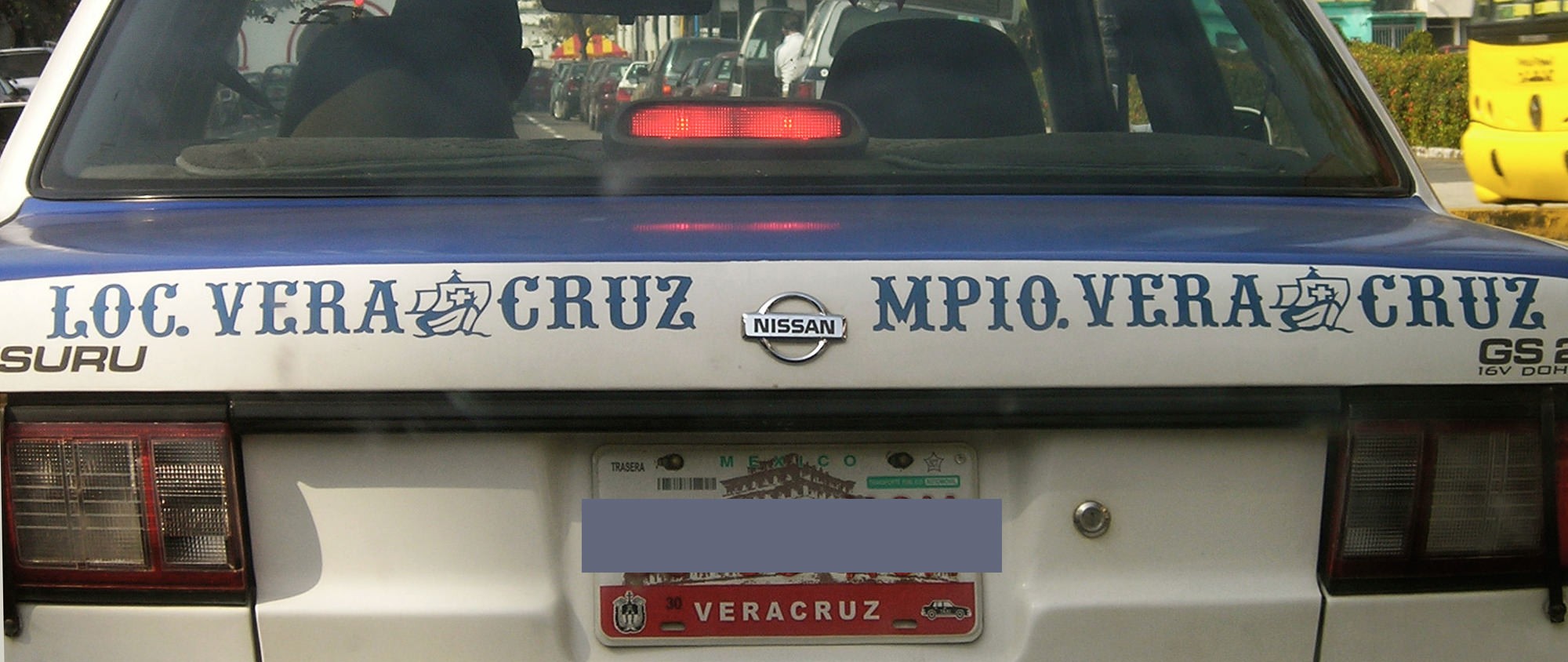
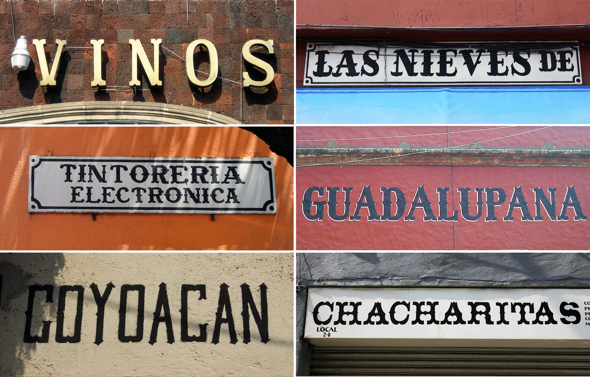
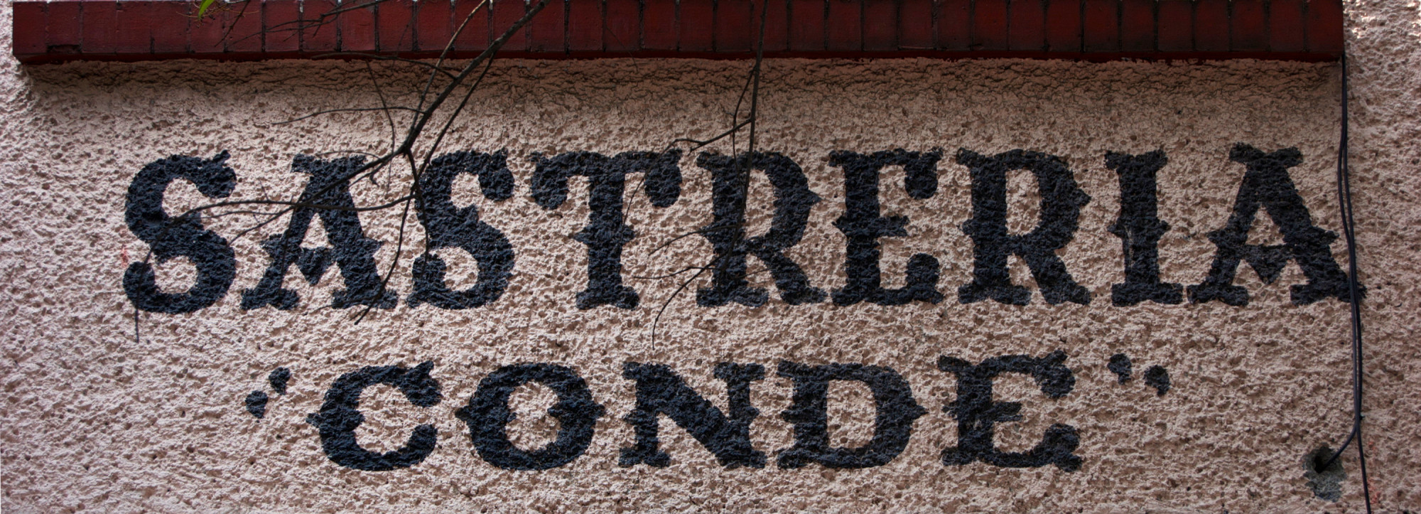
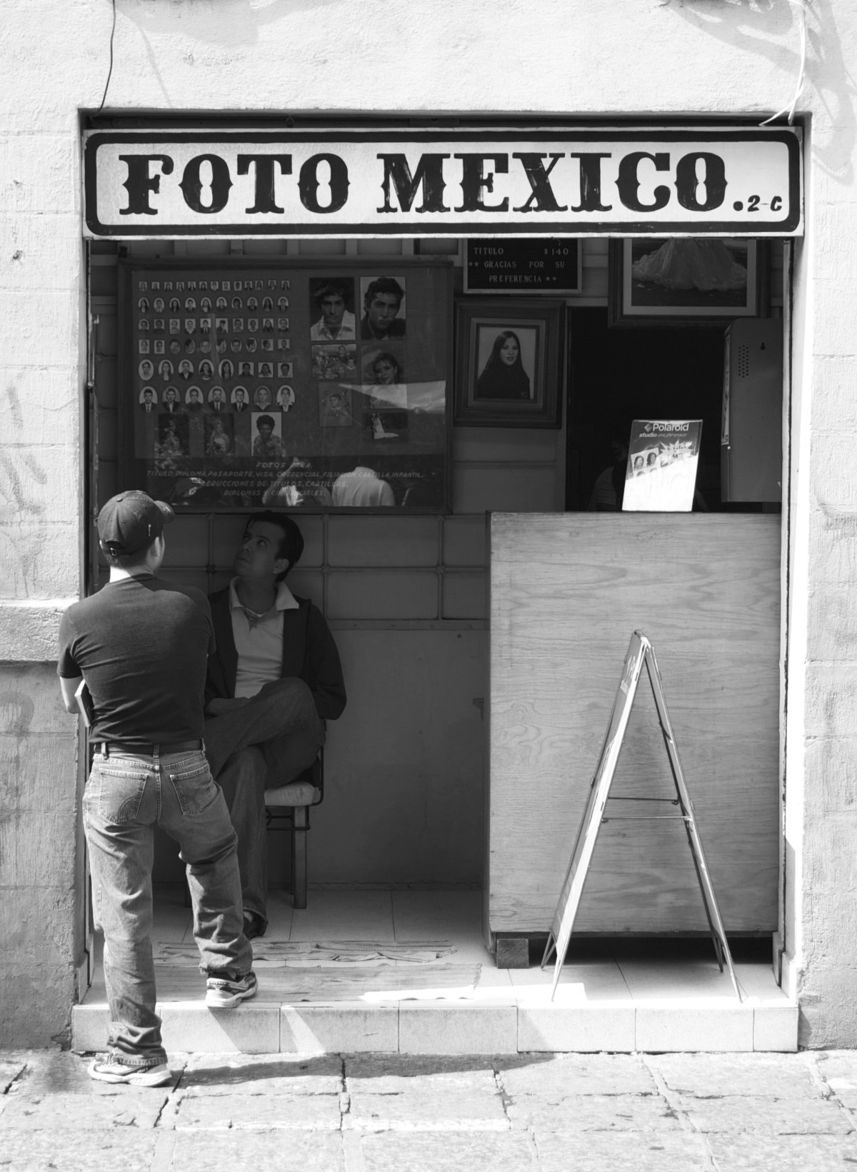
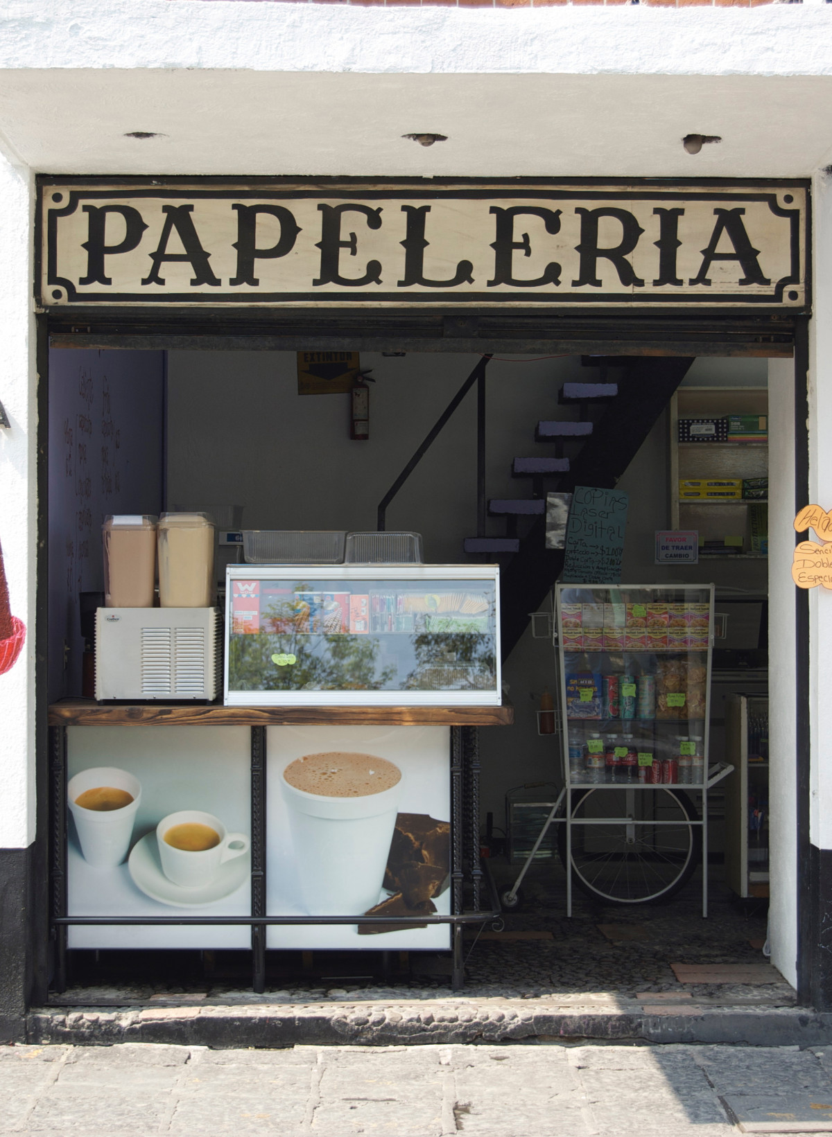
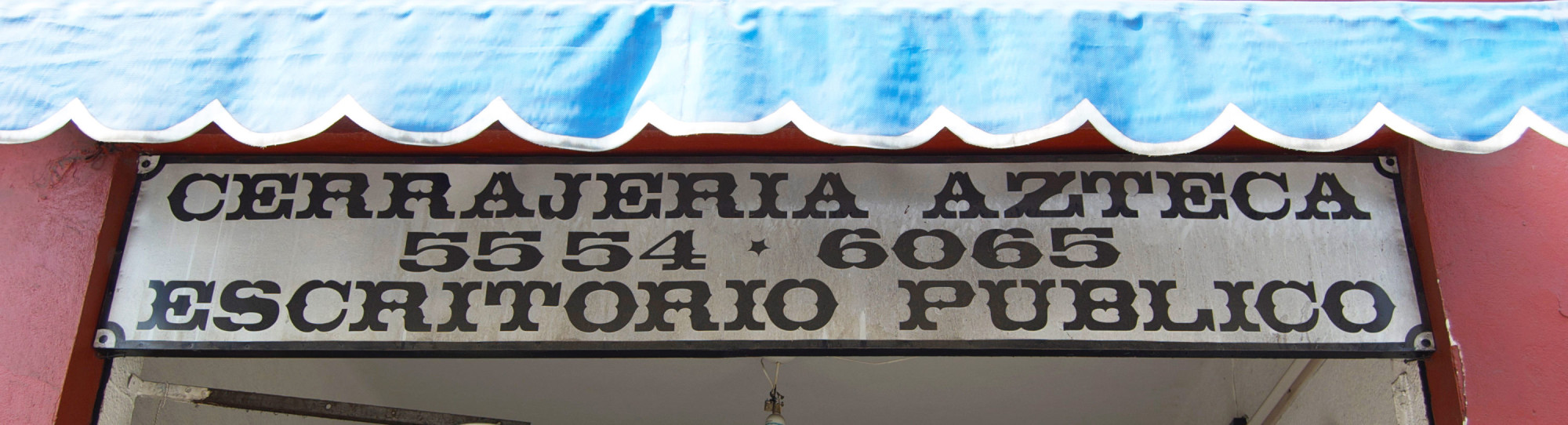
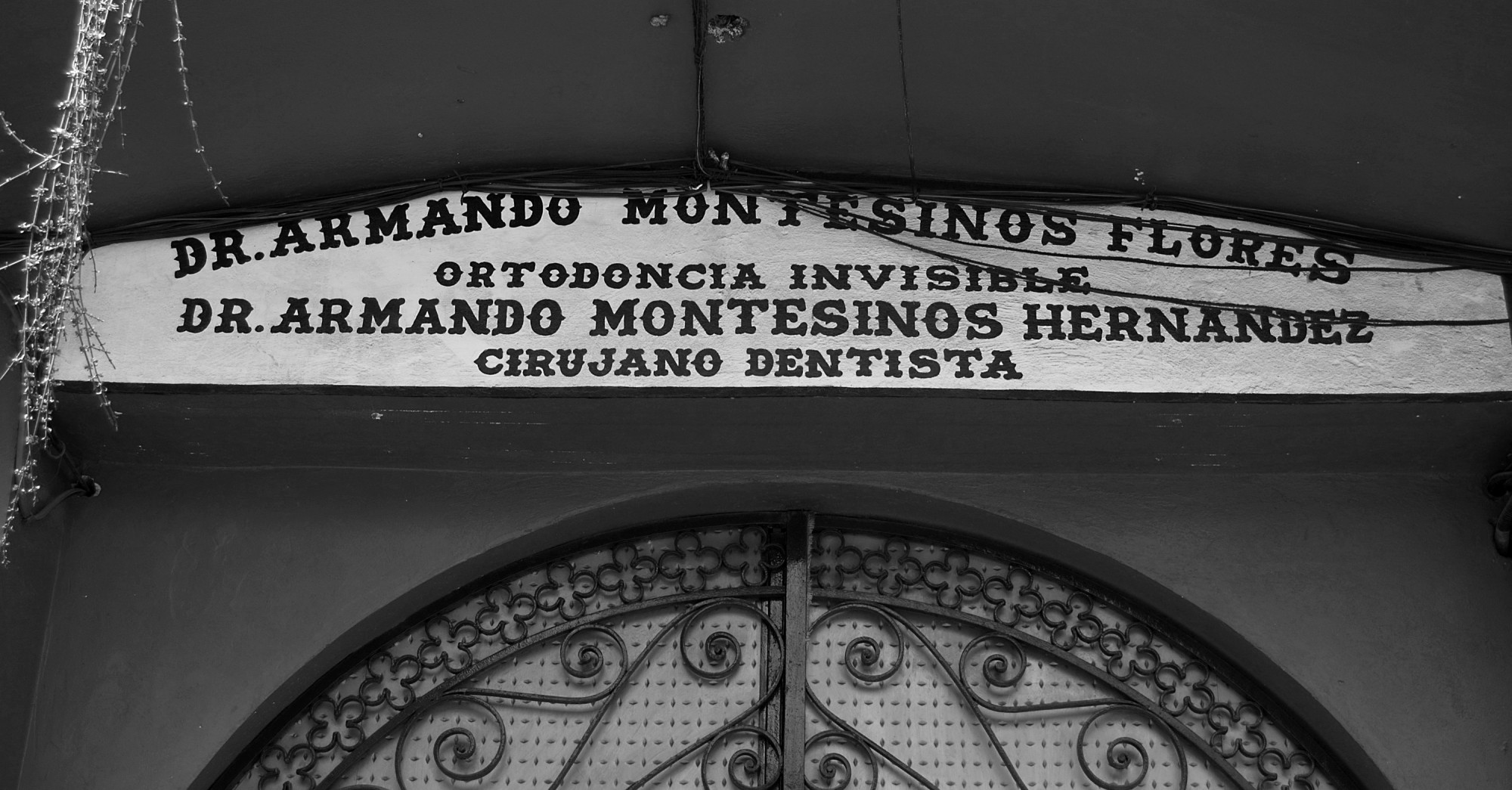
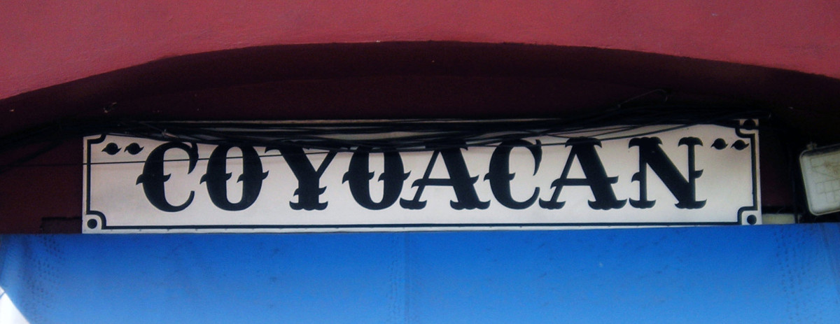
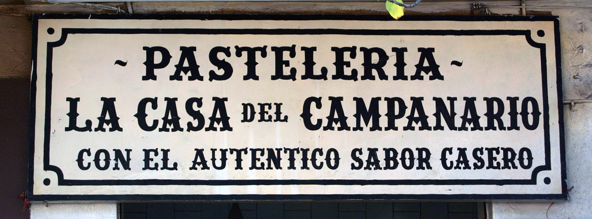
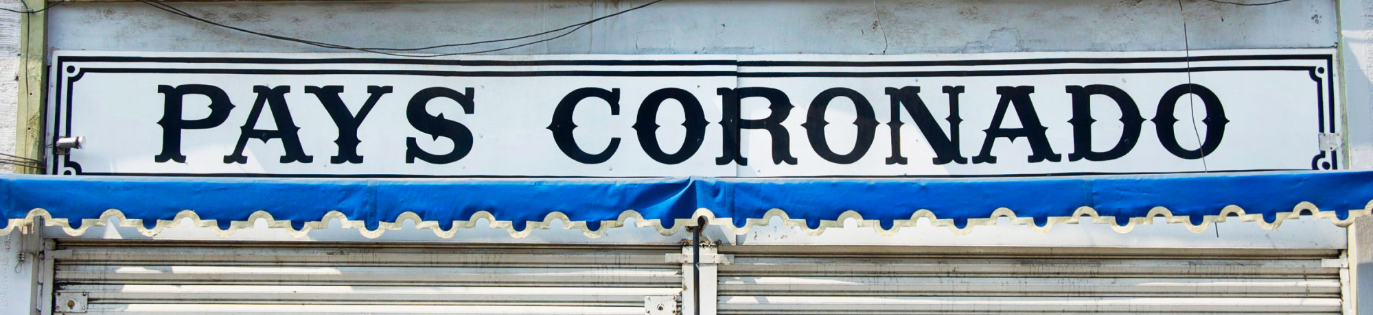
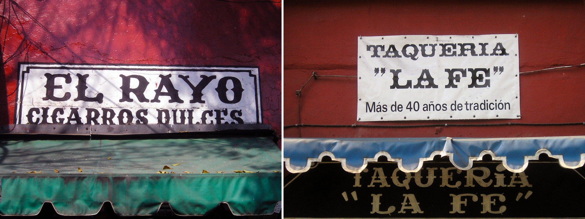
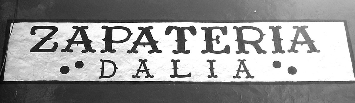
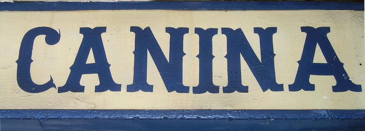
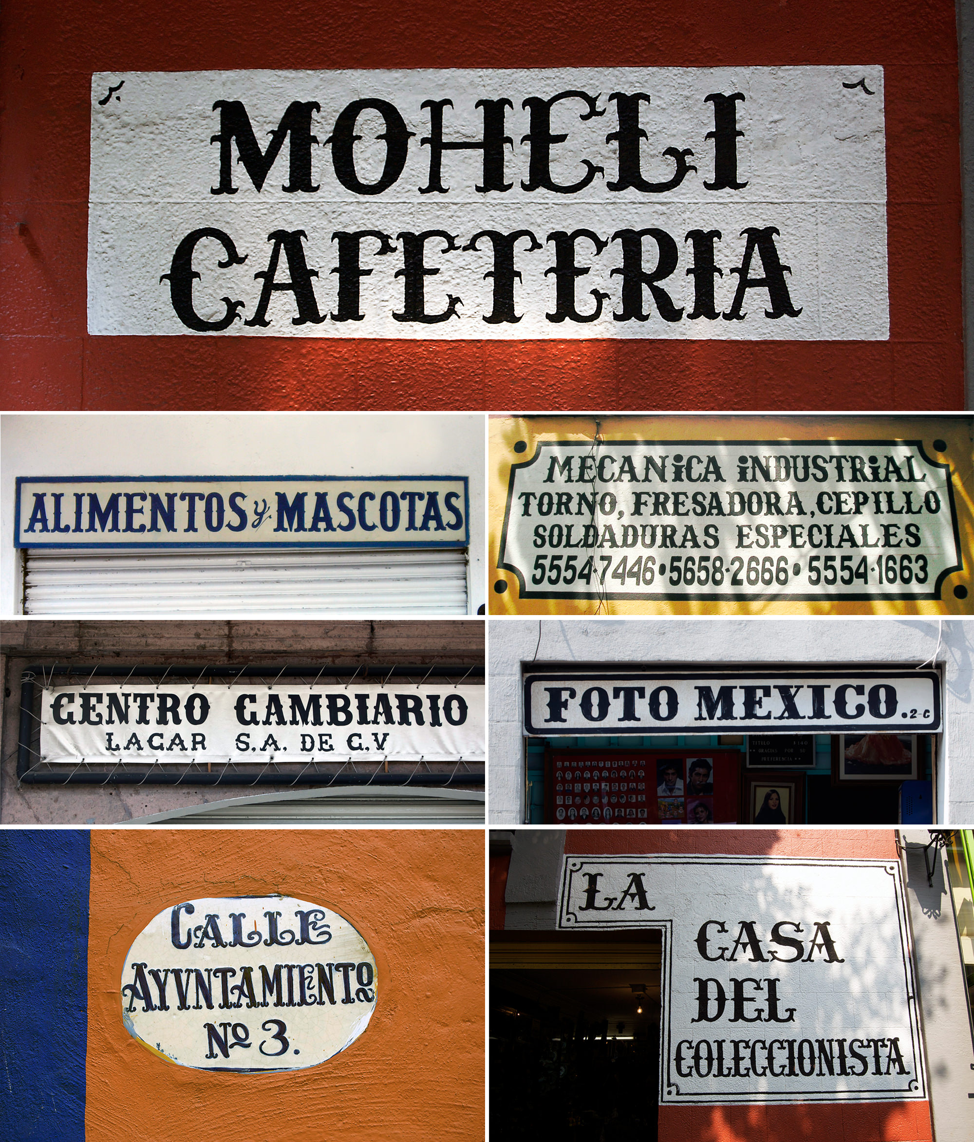
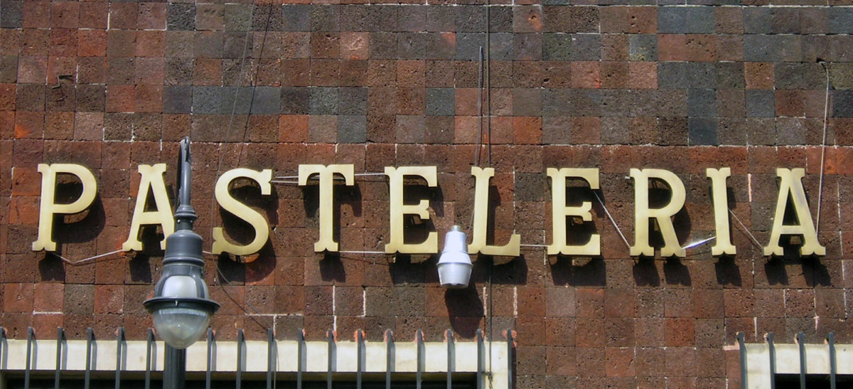
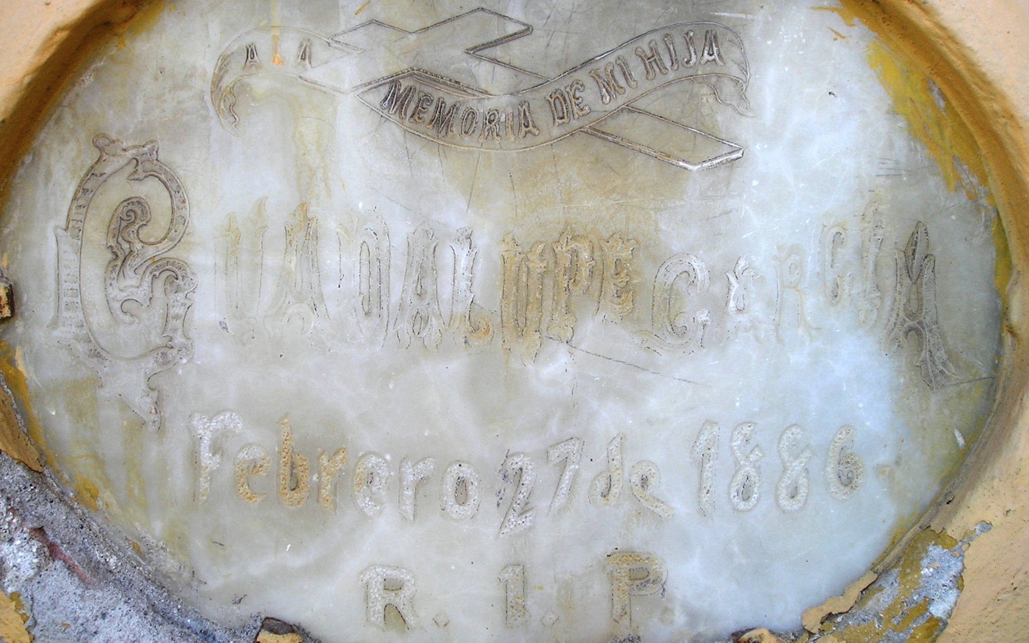
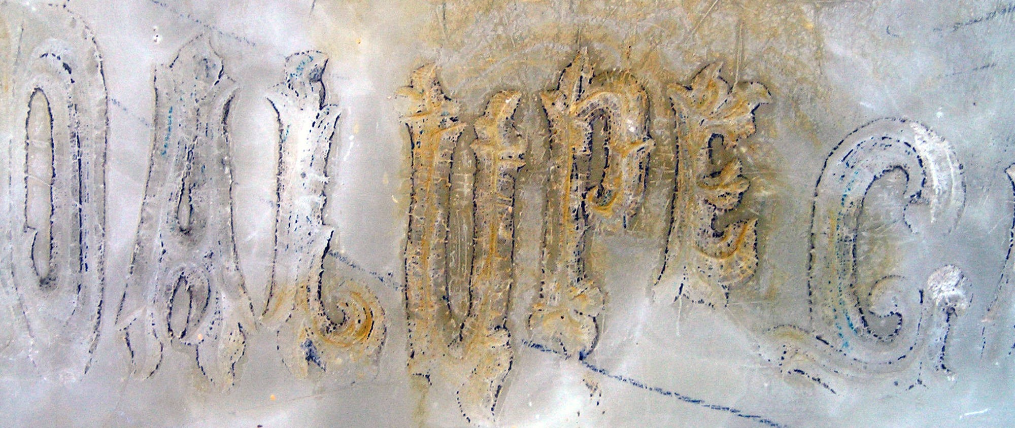
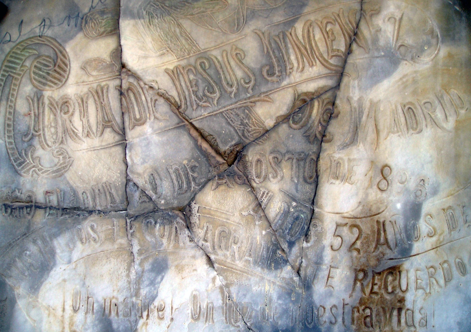
Mexico’s magic towns and letters
Latin America as a whole and Mexico in particular are always an infinite source of vernacular letterforms, both local interpretations of European traditions as well as local vintages. Here are some examples of interesting Mexican Tuscans.

In a pioneering research on the use of Tuscan styles in Brazil in the 19th c., Priscila L. Farias & Edna Cunha Lima conclude: 2 “The impact of the branching serifs, divided stems and voluminous shapes of the tuscan letters in South America graphic memory can be verified by the current presence of forms reminiscent of their anatomy in the repertoire of popular sign painters. Some examples of this are the traditional lettering styles still found in Colombian rural transport system known as chivas, in Brazilian Amazon boats, and in Argentinean filetado porteño, typical of Buenos Aires, reinforcing the notion of a transnational, shared taste.”
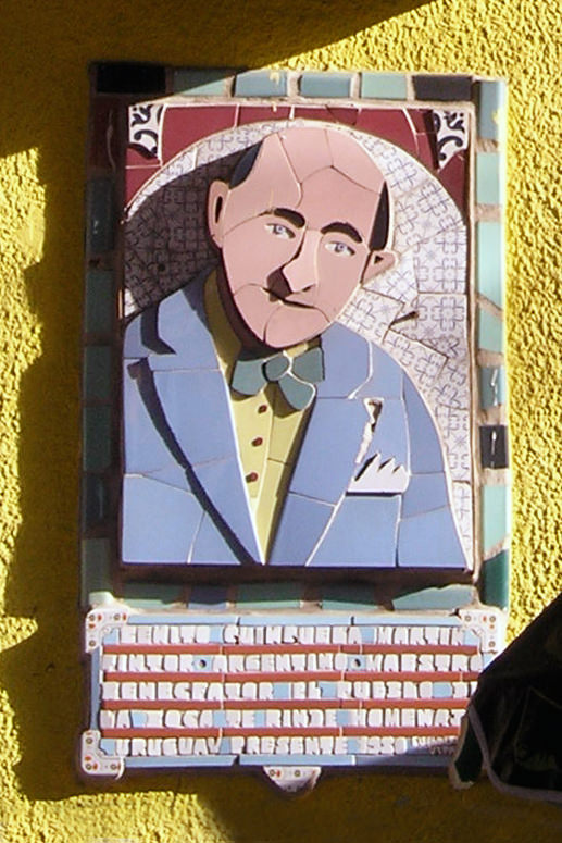
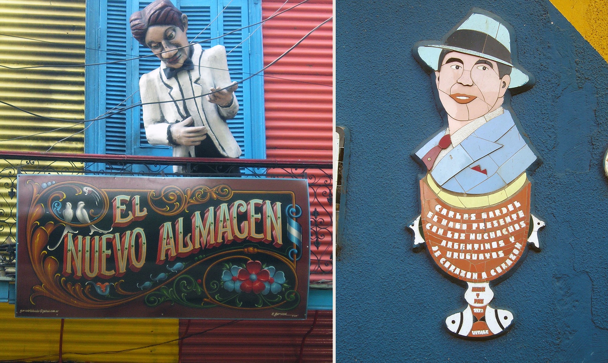
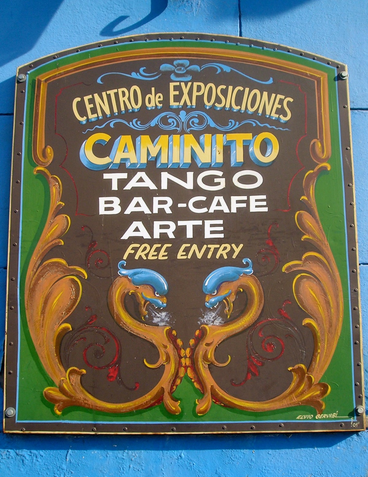
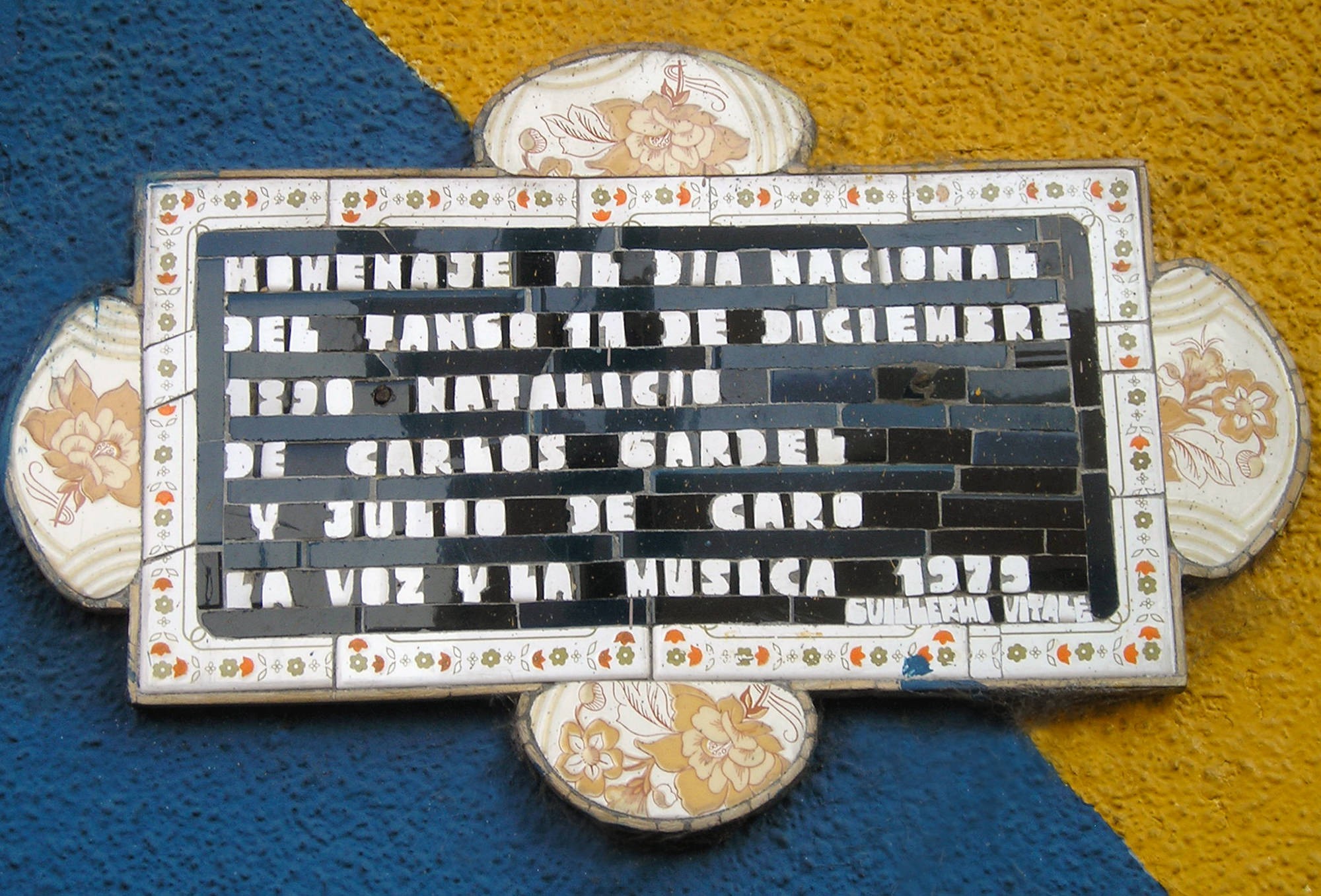
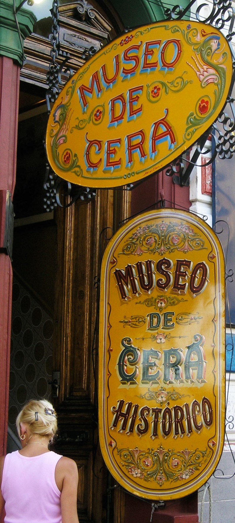
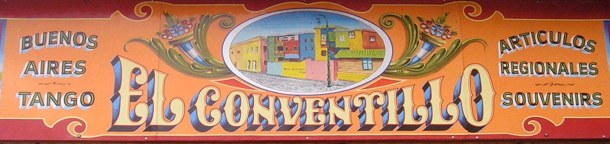
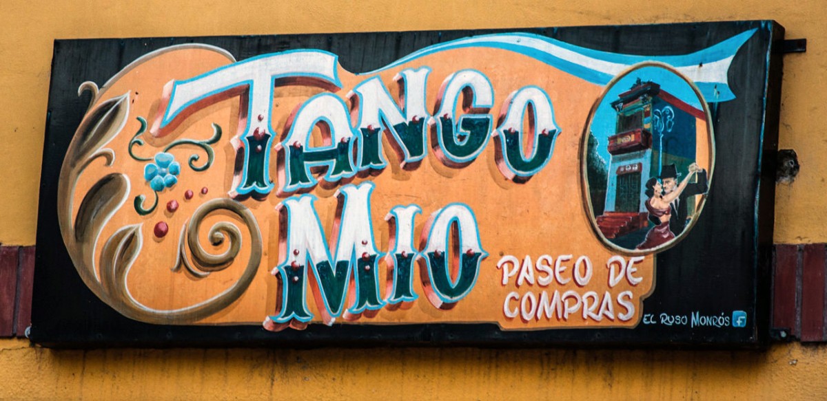
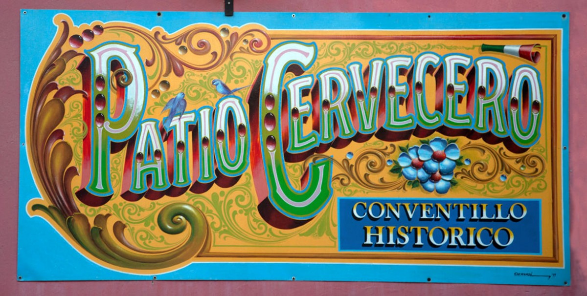
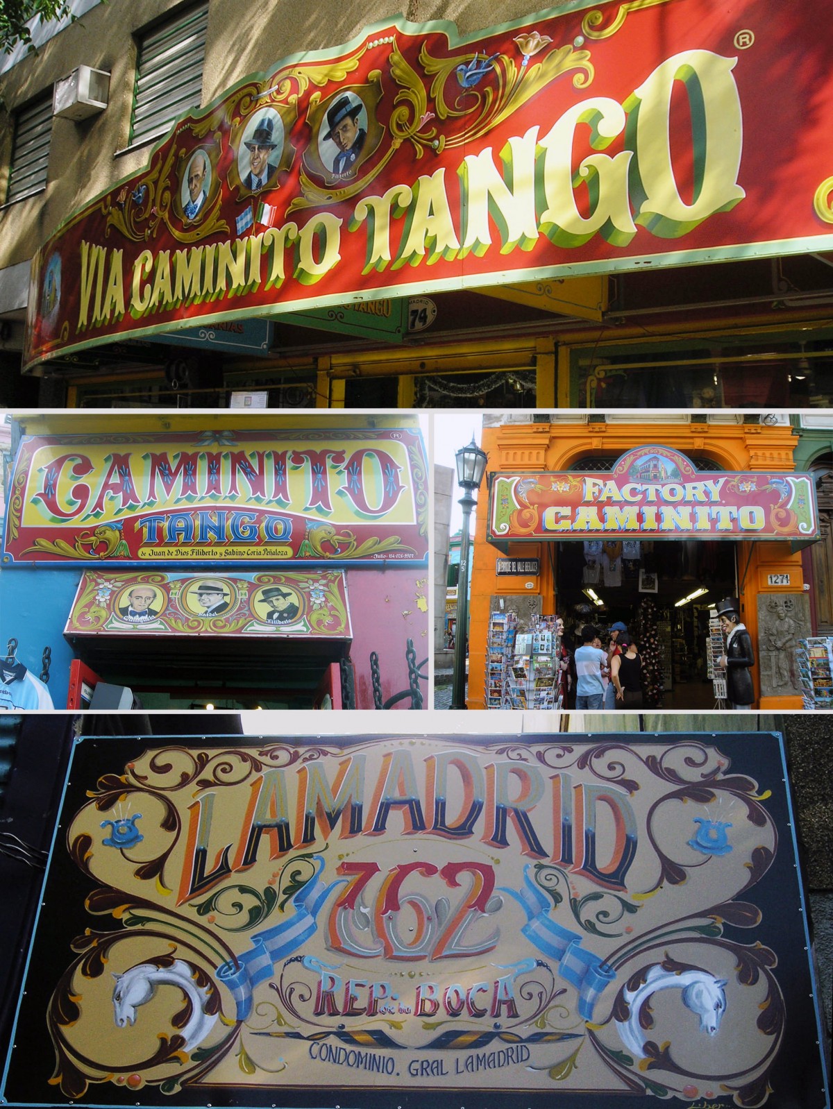
‘Fileteado’ in La Boca, Buenos Aires
Caminito, the famous tourist promenade in the La Boca neighborhood, south of the city of Buenos Aires, adopted what is called fileteado porteño, a technique that exists in other popular cultures but here with very own characteristics. There is also a series of historical signs in the mosaic technique, of great subtlety, to recall significant figures of the culture.
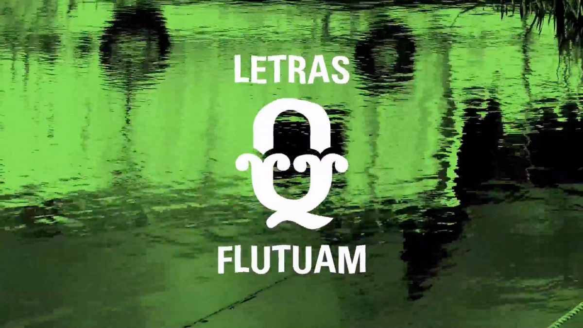
Tuscans from the Amazon
The São Paulo designer Fernanda Martins conducted significant field research into the work of boat letterers in the Amazon region, which included the production in 2014 of an excellent video record called “Floating Letters”. In both the photographic survey and the video, the preponderance of a singular ornamental style is evident: three-dimensional letters, most of the time subdivided in two halves using various colours and always with Tuscan serifs. Martins carried out her research in several towns in the area, observing the particular work of each sign-maker. It is disturbing to note the coincidence in stylistic preference when it comes to painting the names of the boats, all in this three-dimensional Tuscan style.


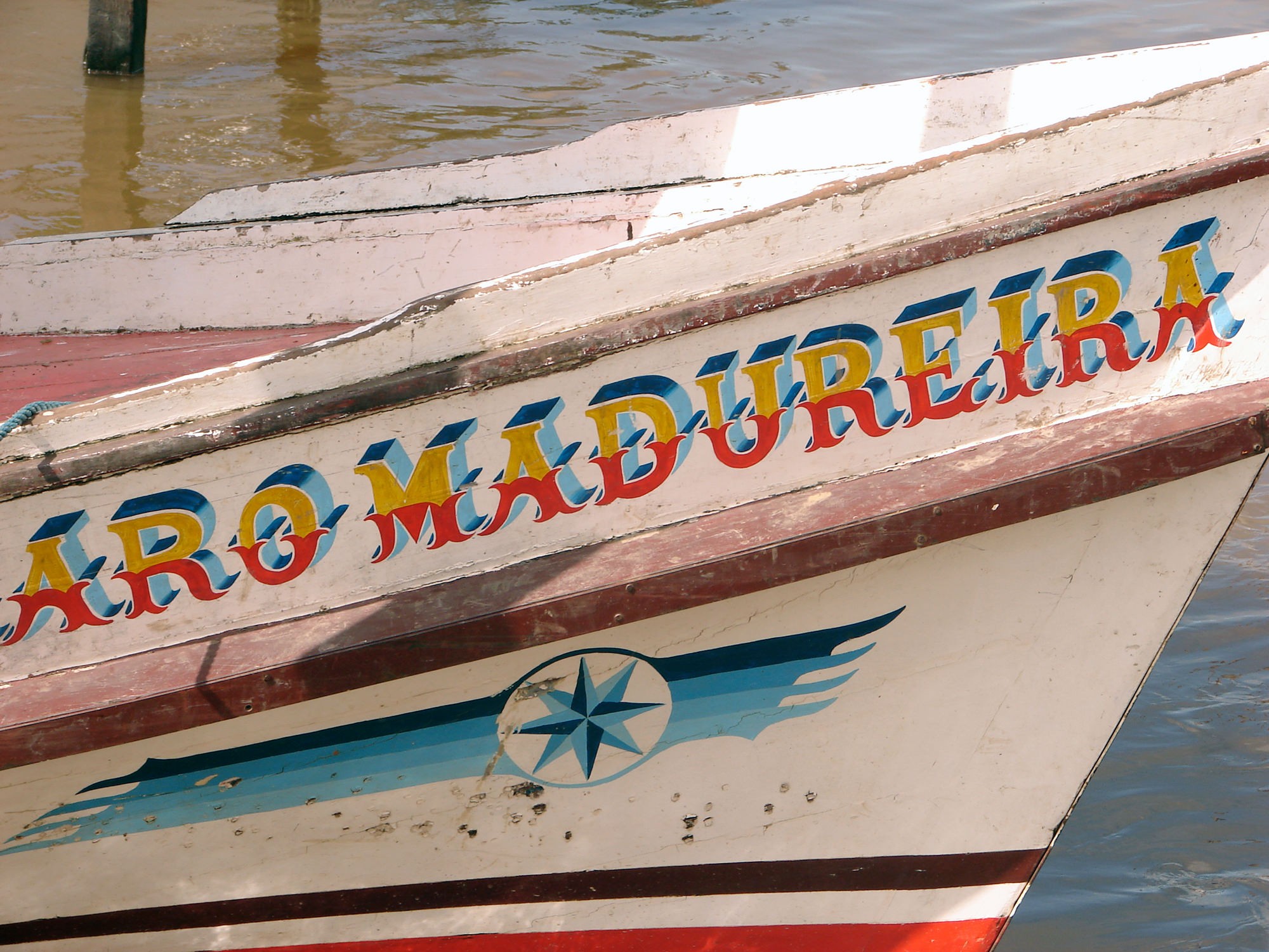

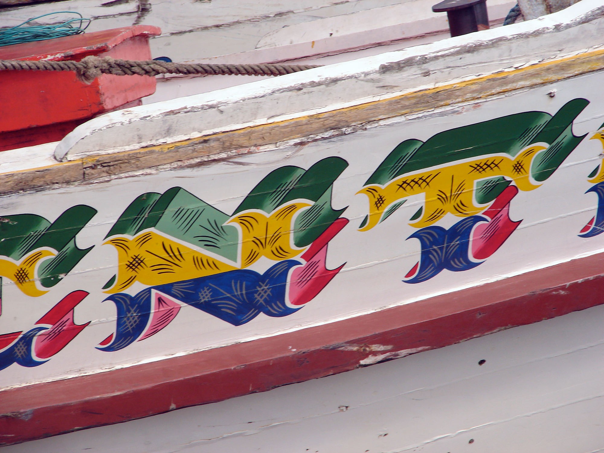
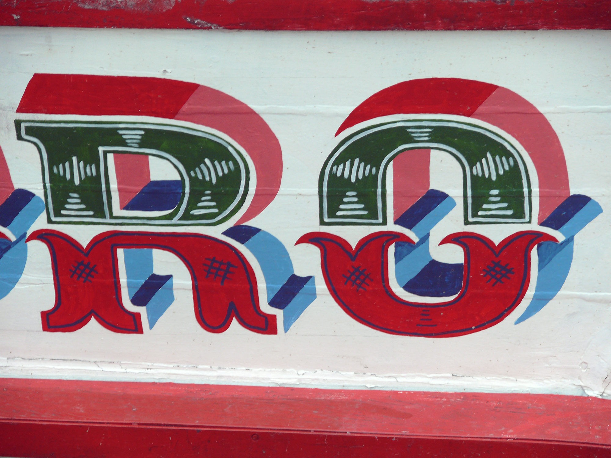
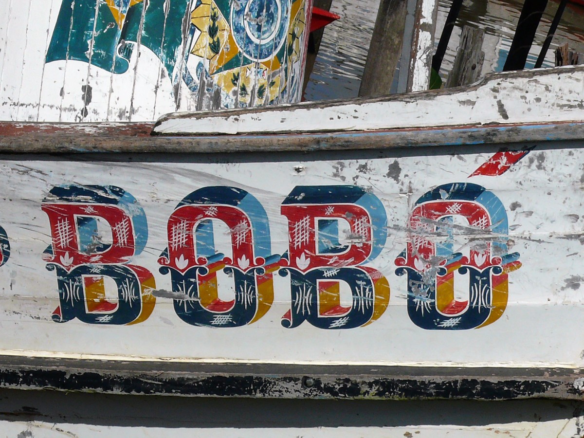

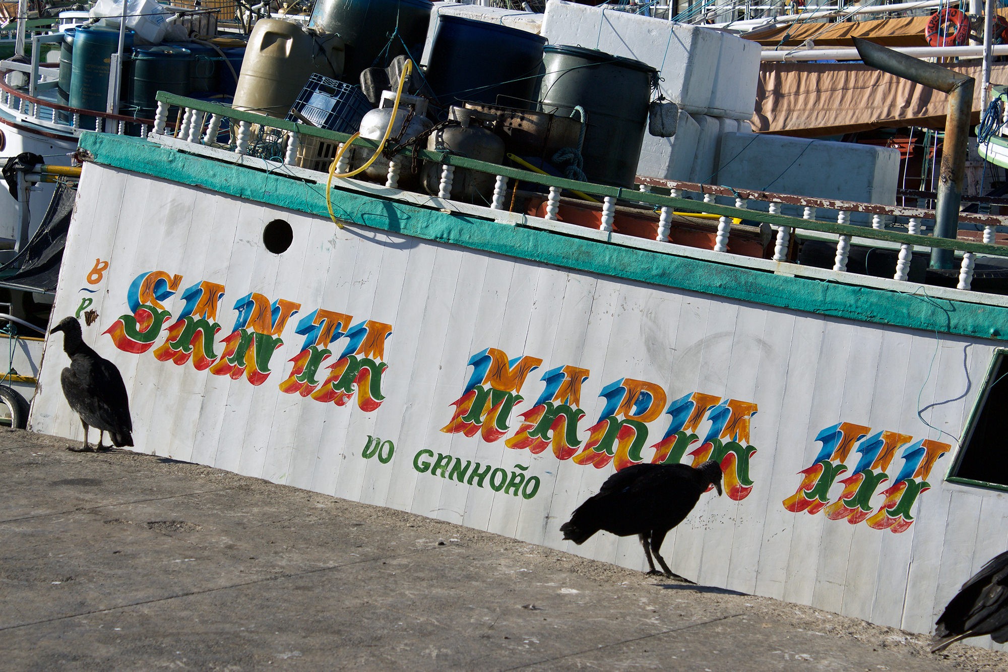
All boat photos by (and courtesy of) Fernanda Martins, except for the first in the series, by Nailana Thiely.
What would we do without decorative lettering? It is clear that the Tuscan letters occupy a very special place among the expressive typographic possibilities. And whether handmade lettering or digital type, whether near or far from the deceased, they are more alive than ever.
References
Berry / Johnson / Jaspert, The Encyclopaedia of Type Faces, Blandford, London 1962 (third edition).
Edward Catich, The Origin of the Serif. Brush Writing & Roman Letters, St Ambrose University, Iowa 1991. (First edition 1968.)
Priscila Lena Farias & Edna Cunha Lima, “Transatlantic eccentricities: tuscan typefaces as an example of transnational typographic taste” in Communication Design, Vol. 4, Nros 1–2, may–nov. 2016, pp 4-20 (UK: Taylor & Francis group).
Nicolete Gray, Nineteenth Century Ornamented Typefaces, Faber and Faber, London 1976.
Michael Harvey, Adventures with Letters. A Memoir by Michael Harvey, 47 editions, Sheffield [GB] 2012.
Rob Roy Kelly, American Wood Type: 1828-1900, New York, 1969.
Stanley Morison, Politics and Script (Aspects of authority and freedom in the development of Graeco-Latin script from the sixth-century BC), Oxford University Press, 1972.
Catalogue Ornamental Type, Pepin Press, Amsterdam 1999. (First edition 1996.)
Berthold Wolpe (editor), Vincent Figgins Type Specimens — 1801 and 1815, Printing Historical Society, London 1967.
Internet references
Stephen Coles, photo album at https://www.flickr.com/photos/stewf/48385062881/in/album-72157709910968801/
Kate Fehlhaber, “Hubel and Wiesel & the Neural Basis of Visual Perception”, https://knowingneurons.com/2014/10/29/hubel-and-wiesel-the-neural-basis-of-visual-perception/
Nicolete Gray, “The Filocalian Letter”, British School at Rome, 1956. Published on line by the Cambridge University Press: 09 agosto 2013. https://doi.org/10.1017/S0068246200006747
Fernanda Martins, Floating Letters video as presented at the ATypI São Paulo, April 5th 2016. https://bit.ly/3kIJrI3.
Thomas F. X. Noble, “The Multiple Meanings of Papal Inscriptions in Late Antiquity and the Early Middle Ages”, in The Early Reception and Appropriation of the Apostle Peter (60-800 CE), pp.58–80. https://doi.org/10.1163/9789004425682_005.
Nick Sherman, “Leeds Playbills website”, http://woodtyper.com/917
Giampaolo Virga, “La Calligrafia Damasiana”, blog Allontanarsi dalla linea gialla (“Moving away from the yellow line”). https://allontanarsidallalineagialla.blogspot.com/2017/08/la-calligrafia-damasiana.html
Unsigned blog article from WoodType.org: https://woodtype.org/blogs/news/91-antique-tuscans-in-america
Teresita Schultz de Carabobo is an Argentine renown enthomologist. In leisure moments she passionately devotes herself to the criticism of the typographic arts. Her texts distill a slightly acrid humor, perhaps due to her great fondness for tasting teas.
- Nicolete Gray, “The Tuscan Letter and an analysis of the Victorian contribution” appendix one to Nineteenth Century Ornamented Typefaces pp.157-161, Faber & Faber, London, 1976 ↩
- Priscila Lena Farias & Edna Cunha Lima,“Transatlantic eccentricities: tuscan typefaces as an example of transnational typographic taste” in Communication Design, Vol. 4, Nros 1–2, mayo–nov. 2016, pp 4-20. ↩
- Video available at: https://bit.ly/3kIJrI3. ↩