Lire cet article dans sa version originale française.
Lee este artículo en español.
A source
The Carolingian manuscripts of Gregorian chant present on their pages mysterious signs, inscribed above the Latin text. These are the earliest forms of melody notation. These more than thousand-year-old signs, called neumes, are still used today. Their computer-assisted composition is a real typographical challenge, our digital tools not being at all adapted to this type of inscription. When I started my post-Masters at the ANRT, my project was to find a typographic solution to resolve this situation with elegance and consistency.
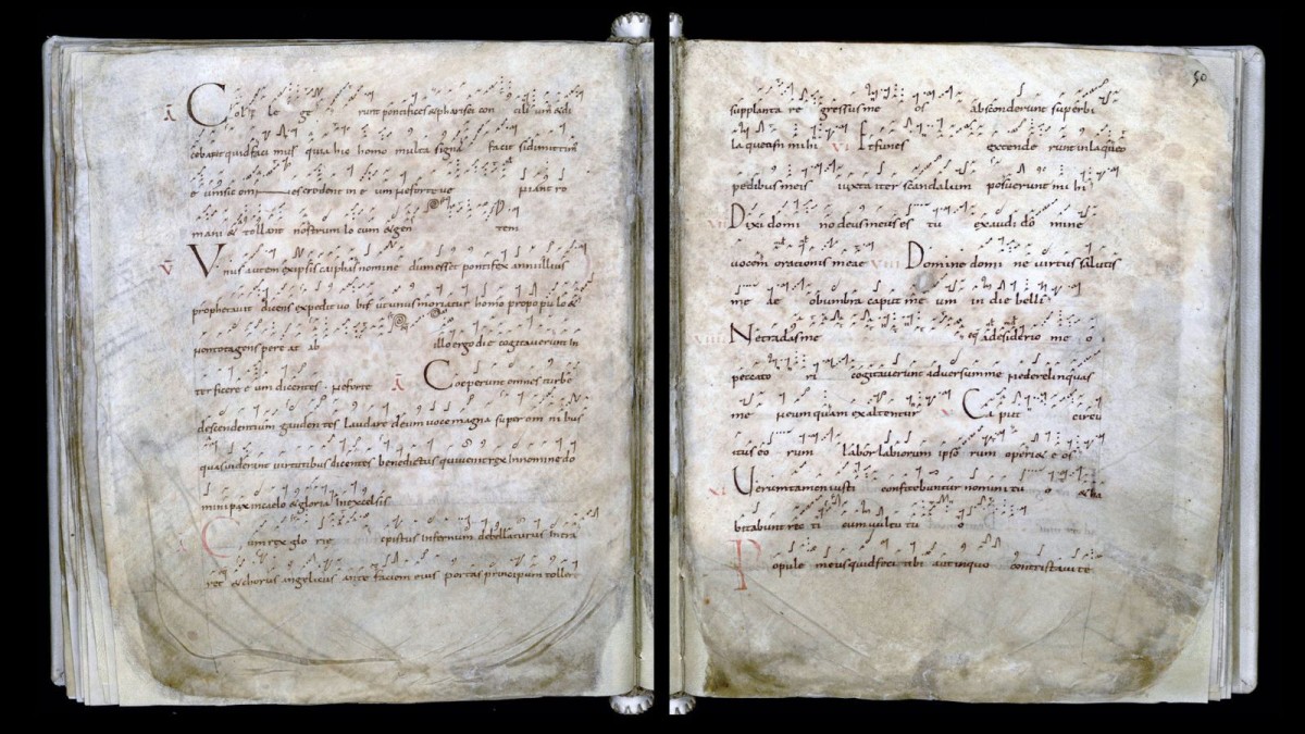
I then proposed a more contemporary typographical interpretation of musical signs (more precisely of the signs known as “Metz” and “Saint-Gall”), inspired by the Carolingian layout, but also by their current version, most often drawn in felt-tip pen or in a ballpoint pen. I then digitized everything, integrated the thing into a typographic file respecting a precise nomenclature, in order to be able to compose with the character in a software dedicated to the engraving of scores: Grégorio 1.
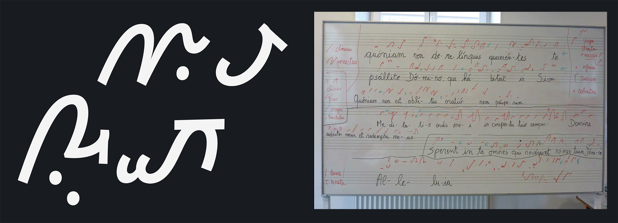
In the same movement, I decided to accompany the neumes with an alphabetic character based on similar principles: historical structure, monolinear approach. Both a Caroline minuscule and a sanserif (“linéale” in French); it was the birth of Carolinéale. 2
A script
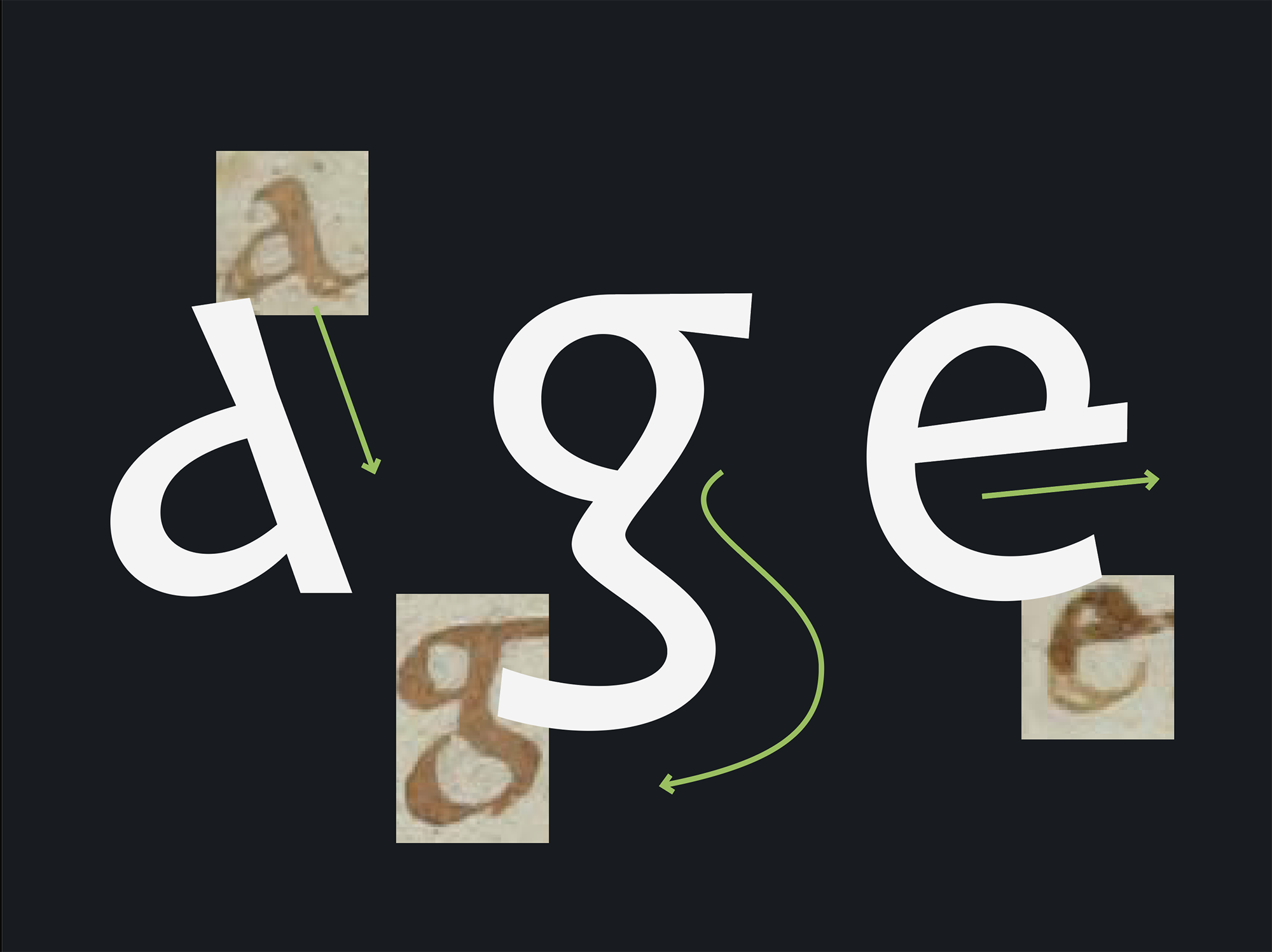
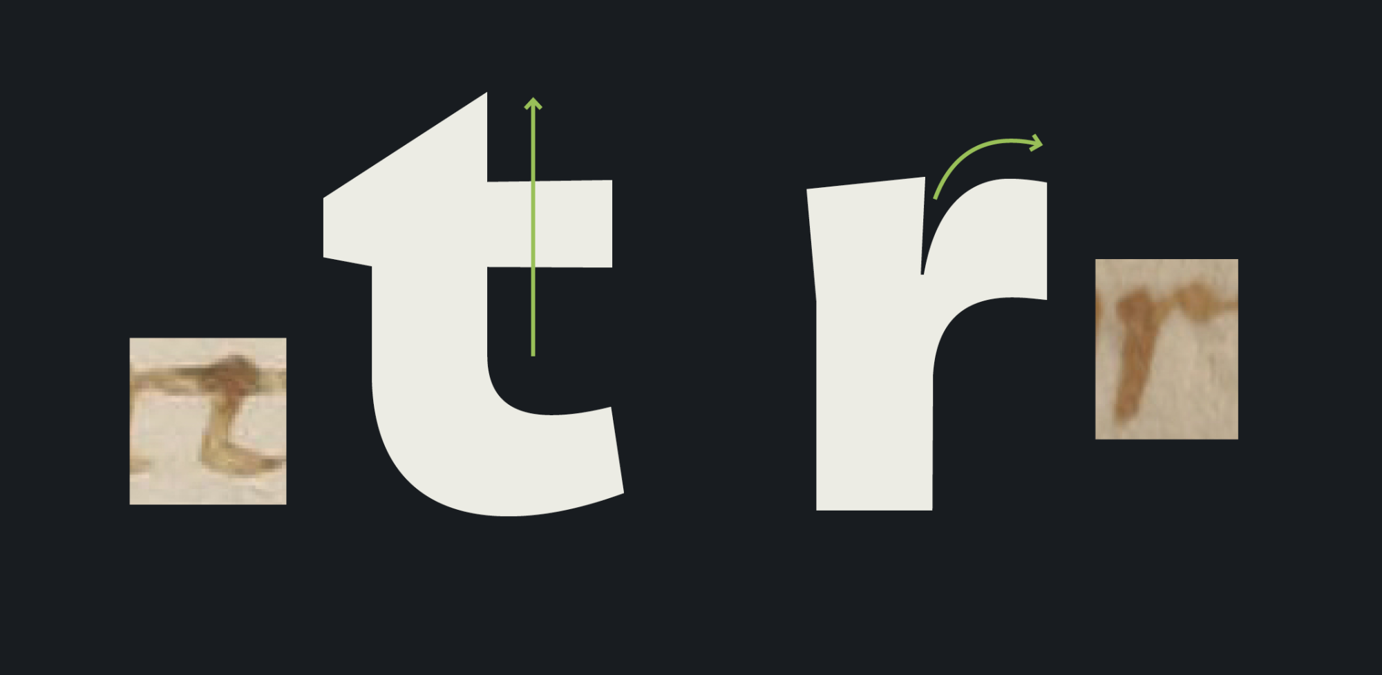
The text of the ninth-century chant manuscripts is written in remarkable form. The calligraphy used is relatively recent for the time. It is called Caroline minuscule, since it is Charlemagne who is at the initiative.
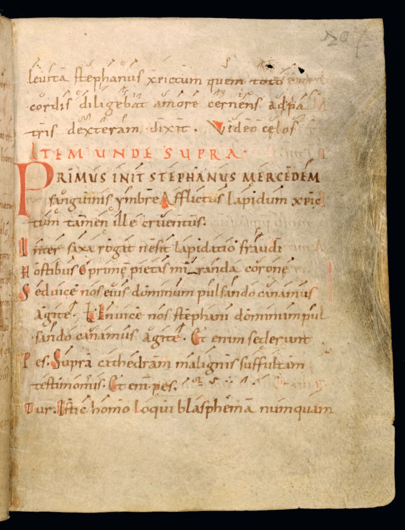
Developed slowly, the Caroline minuscule only found its stability in the 9th century, gradually getting rid of the presence of Merovingian characters. With the rise of the Carolingian scriptoria, writing improved its readability and spread beyond the borders of the empire. The calligraphic origin of this scriptural form draws its sources from the uncial and semi-uncial writings that precede it.
A roman
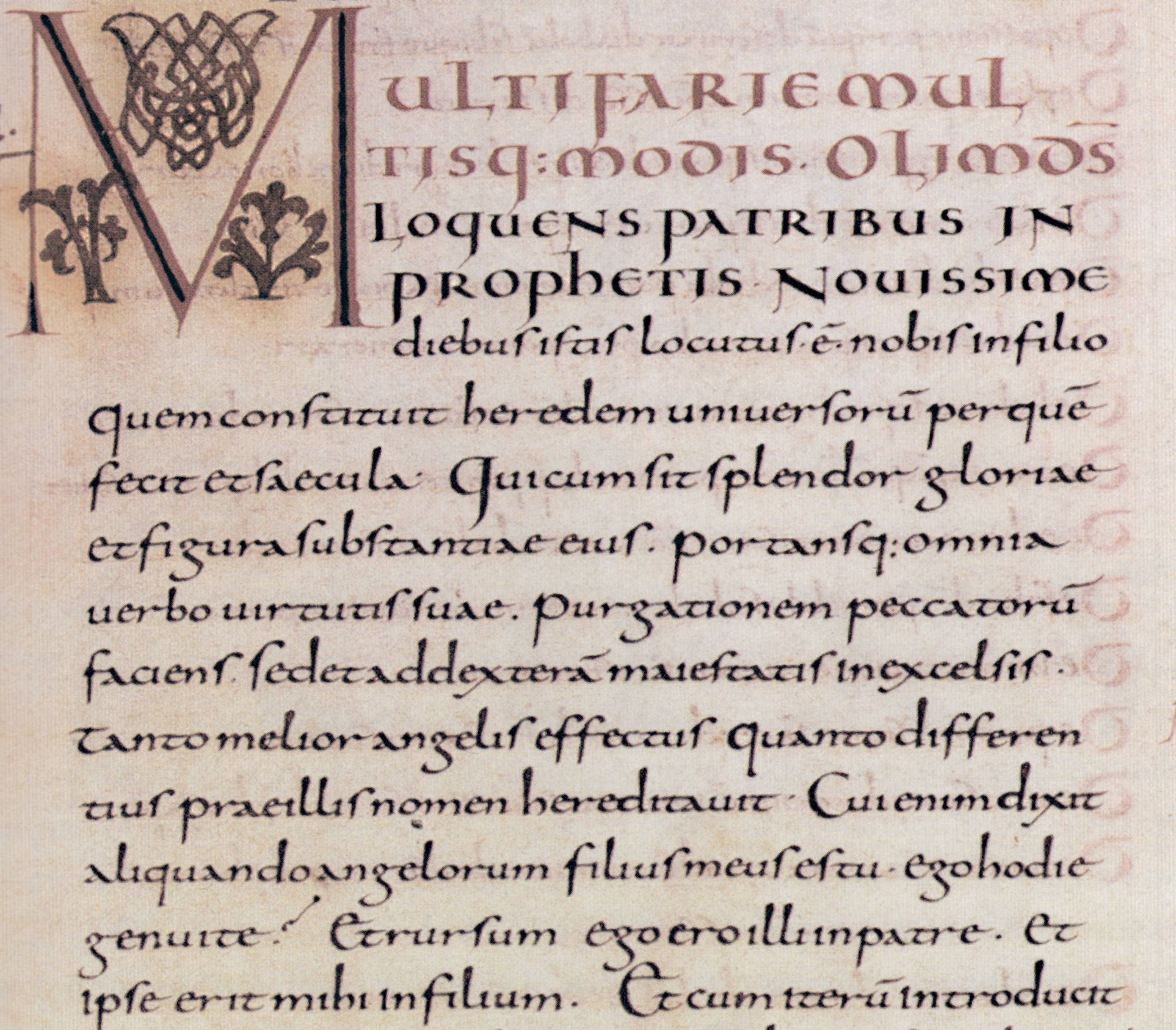
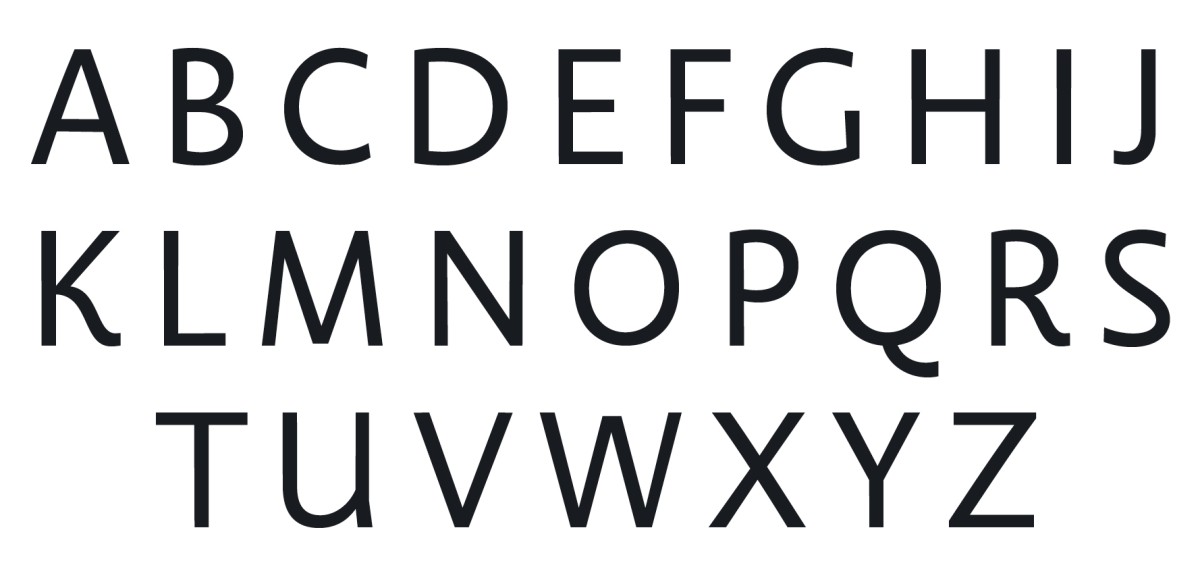
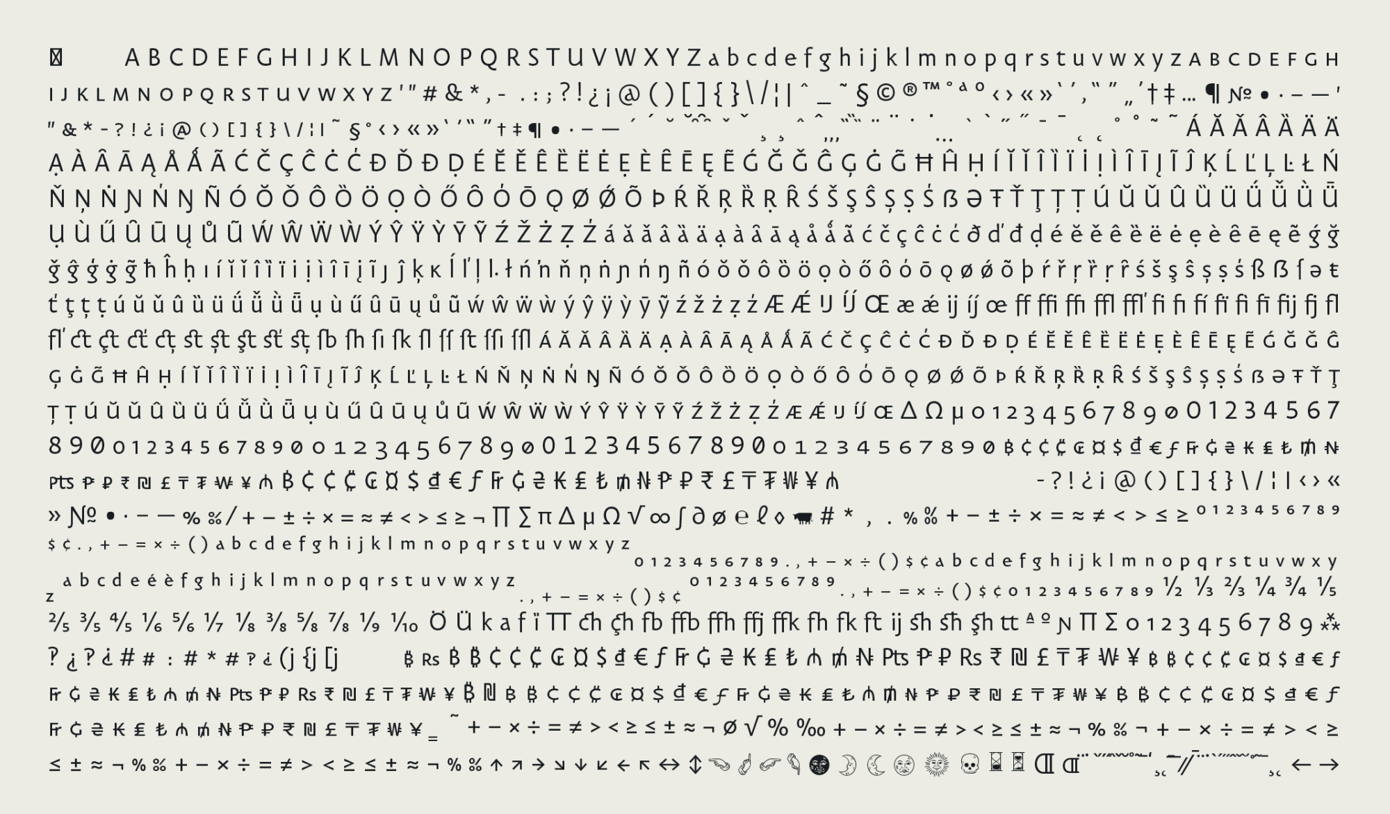
The roman font of Carolinéale is based on the most symptomatic forms of the Carolingian minuscule. More precisely, is based on the writing of the scriptoria manuscripts of the Rhine basin, produced between the 9th and 10th centuries.
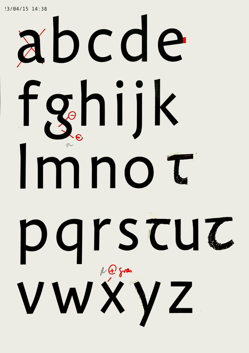
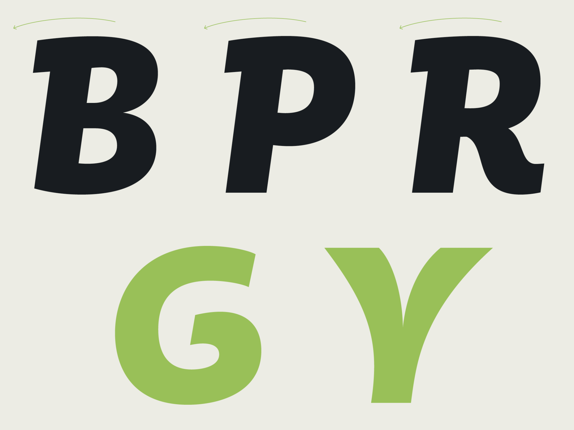
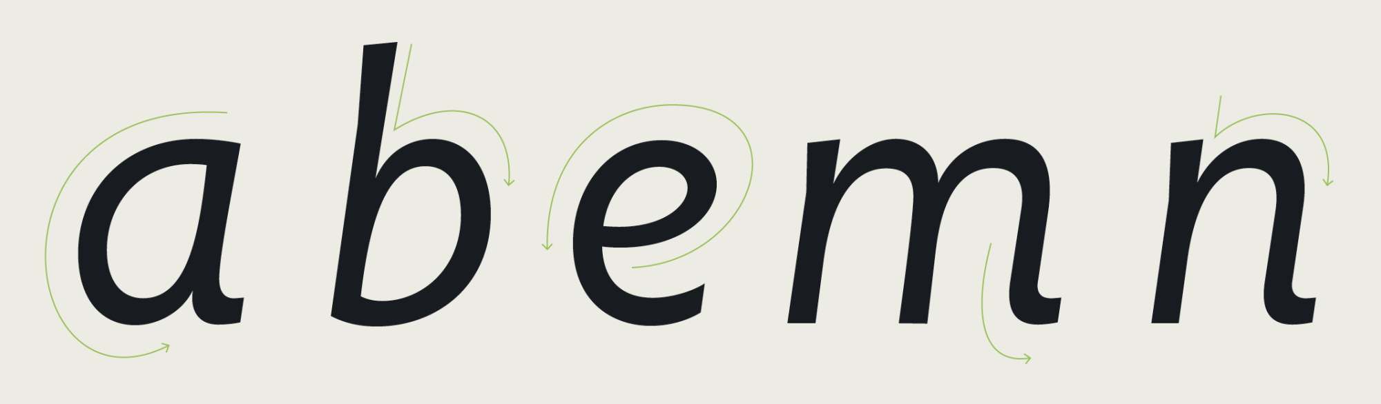
I tried to offer a monolinear and subjective interpretation, which seeks to keep its DNA, while remaining as stable, readable and contemporary as possible. The Carolineal glyphs all have in their constructions a more or less present trace of a handwritten origin. Each sign seeks to find a satisfactory point of balance, somewhere between the vocabulary of a contemporary sanserif and that of medieval calligraphy.
Carolinéale Regular with some ligatures.
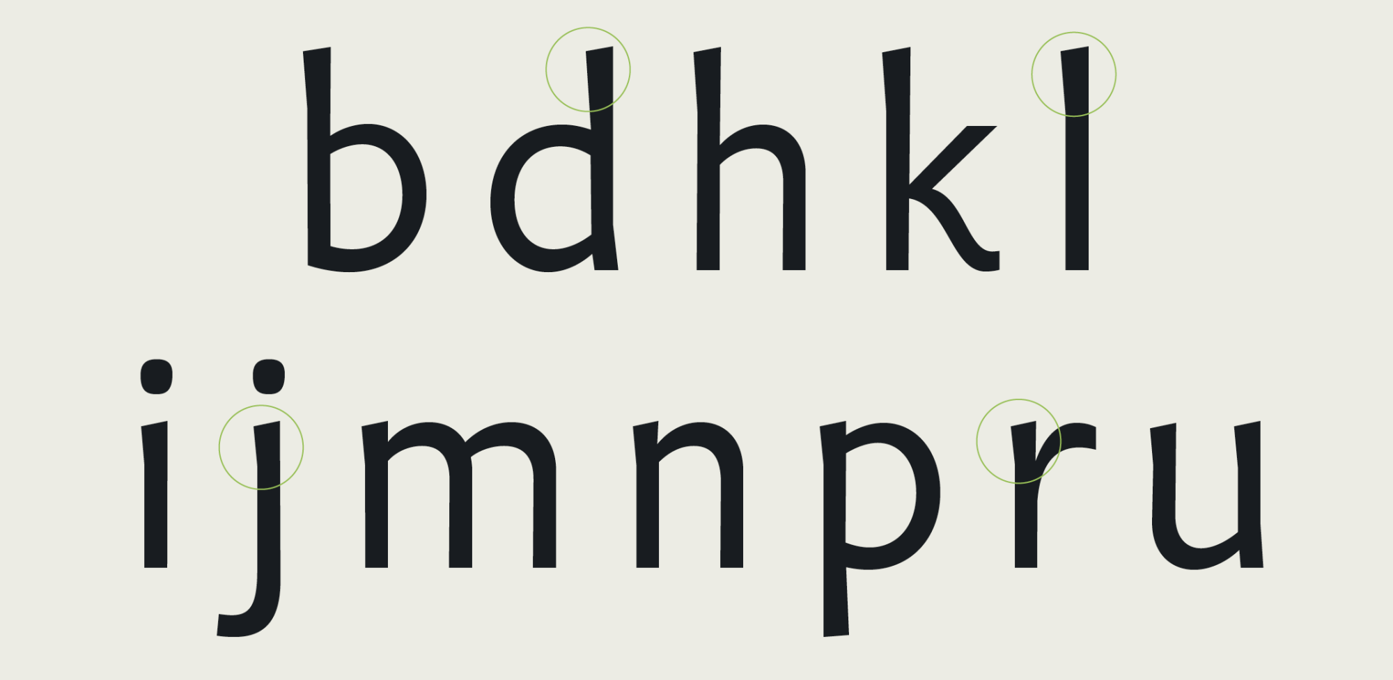
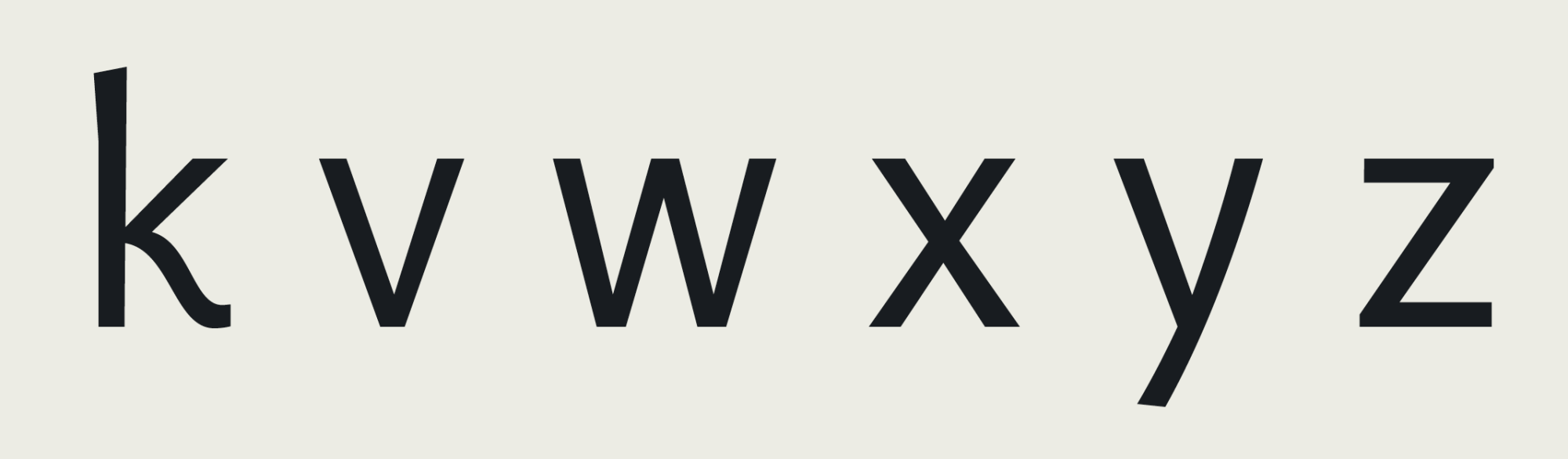
The calligraphic traces of Carolinéale are also balanced by more current forms. I tried to find a balance between lines that could seem relatively experimental and more stable elements. I then paid particular attention to the rhythm of the blanks, in order to allow Carolinéale to be both very comfortable for reading long texts and also stimulating for the eyes, when used in large body.
A family
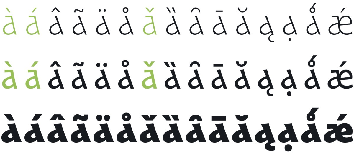
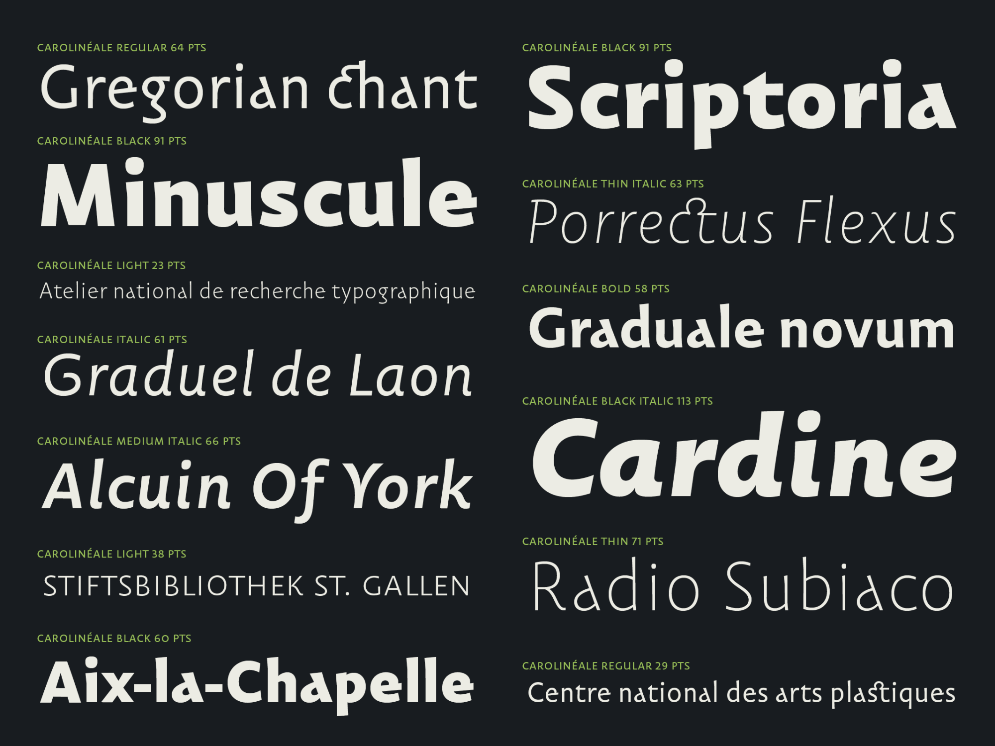
Carolinéale has several carefully distributed and differentiated weights, ranging from thin to black, in order to respond to all editorial situations. The addition of these weights also moves the character away from its historical sources: while the existence of “dark” Carolingian lower case letters is undeniable, a thin version is more fanciful and does not particularly find a medieval equivalent. The same goes for bringing everything together as one and the same family, one and the same whole.
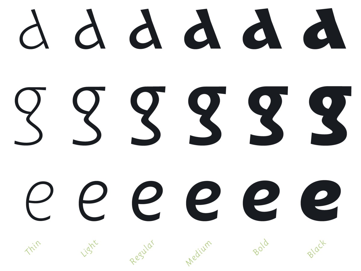
Drawing the Black weight was a particular challenge. The development of this extreme weight constantly requires finding the best formal compromises to maintain legibility in small bodies while preserving the character's DNA.
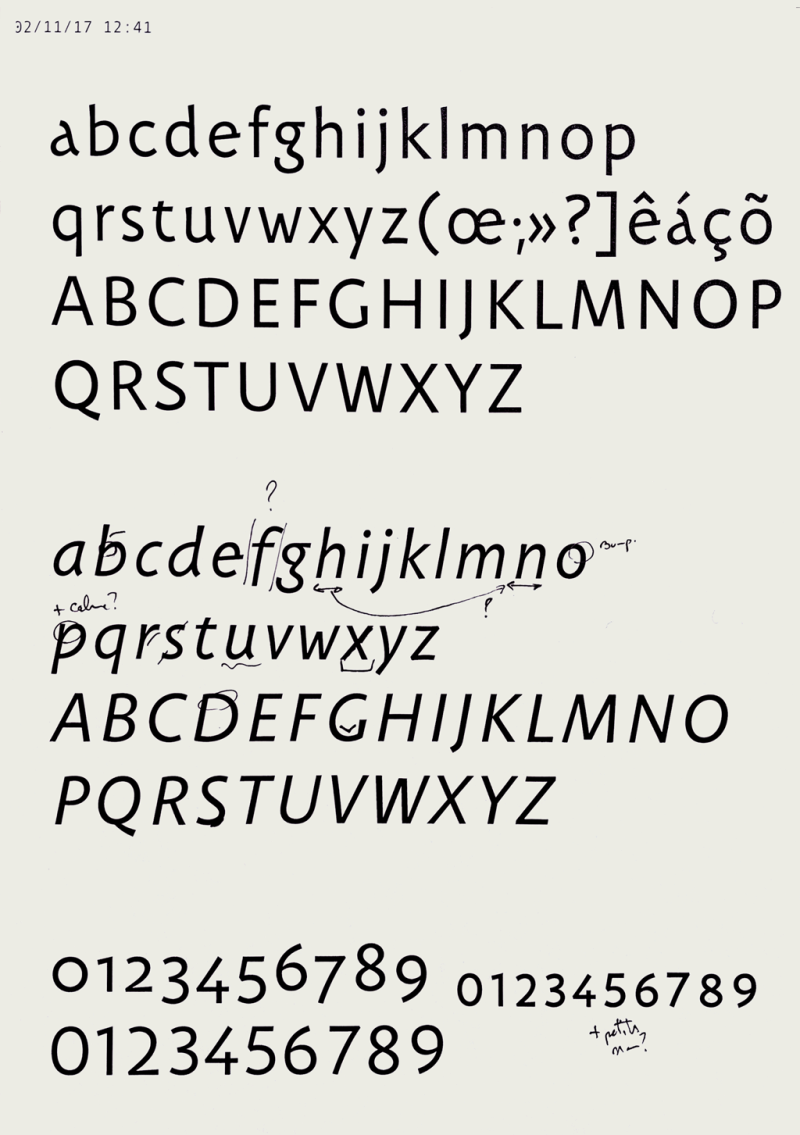
An italic
Strictly speaking, italics are absent in the Middle Ages. 3 In order to imagine an italic for Carolinéale, I therefore had to base myself on a purely speculative thought exercise : What could have been the form of an italic for the Carolingian minuscule if it had also emerged in the 9th century? And from this uchronic italic, what could I keep to draw my own italic?
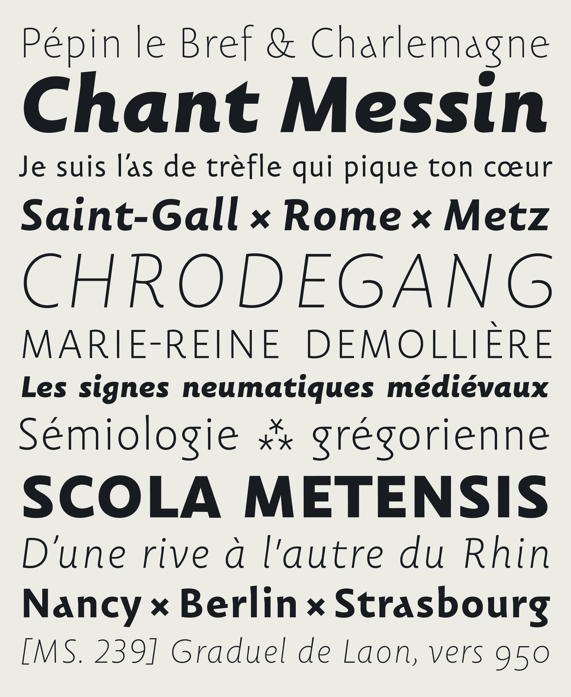
The Carolinéale italic is thought of as a companion to the roman. It seeks to distinguish itself and bring a new voice at the sentence level, while preserving harmony and coherence at the paragraph level. Each member of the duo seeks to express their own tone and to be immediately identifiable, without breaking the rhythm of the reading. I tried to ensure that the letters of Carolinéale italic express themselves in their own logic, resulting from a more vivid, organic and lively form. The texts composed with the italic of Carolinéale therefore seem more fluid and more rhythmic than their Roman equivalent.
Finally, Carolinéale italic is even more openly anachronistic than the roman. Its inspirations come in particular from the Anglo-Saxon humanist cursive sanserifs of the early 20th century. 4 Above all, I tried to ensure that the italic conveyed a certain feeling of sympathy, joviality, warmth.
A chorus
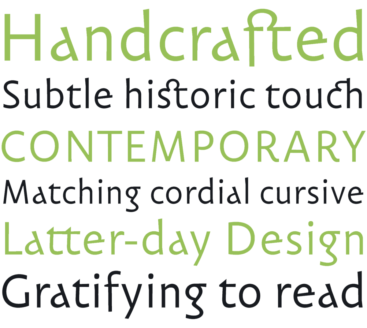
Ultimately, I sought in designing the different styles of Carolinéale to find a point of balance between the calm and stability of contemporary linéales and the energy and warmth of Carolingian calligraphic writing. It is this point of balance that has driven every decision in the design of the entire typeface family.
At the time of their publication, it seems to me that the various styles of Carolinéale do indeed sing in chorus, just as the Carolingian cantors sang together. I believe that their different voices complement each other and form a singular proposal: a humanist sans with contemporary elegance and historical flavor.
I hope that this proposed type design, matured over seven years, will resonate with some minds, and that it will be able to express itself on a few screens, a few pages, a few walls or some other medium that I still dare not imagine. Bon voyage.
Lire cet article dans sa version originale française.
Lee este artículo en español.
Francis Ramel is a graphic & type designer based in Strasbourg, on the French side of the Rhine. He specializes in type design, editorial design and visual identities for cultural fields. He started his career as an editorial designer for Maison Moderne, an independent publishing house in Luxembourg where he designed magazines and brochures. In 2013 he co-founded Nouvelle étiquette, where he co-designed several projects from exhibition catalogues to complete visual identities. In 2014 he joined the ANRT, Atelier Nacional de Recherche Typographique (Nancy, FR) where he focused on the early medieval musical notations. In 2017 the research was funded by the French National Center for Visual Arts. Carolinéale, the resulting typeface of that project was published by PampaType. Francis is a contributing type designer at PampaType. Since 2016 he’s been helping to expand the character sets of the foundry’s catalogue. In collaboration with Alejandro and within Nouvelle étiquette, Francis also designed a custom type family for the Cathedral of Metz, as part of a public commission from the French Ministry of Culture. Francis continues his graphic design activity now through ramel·luzoir, a contemporary art and graphic studio ran together with Julie Luzoir.
- Two musical notations (Metz and Saint-Gall) have been considered in this framework. An update of Carolinéale integrating these signs is envisaged in the more or less near future. ↩
- I owe this name to Gerard Unger, the renowned Dutch type designer, who slipped it to me while he was attending my presentation at the end of my post-Masters at the ANRT. ↩
- The concept is purely typographical and was introduced at the very end of the 15th century by Francesco Griffo da Bologna. ↩
- One thinks in particular of the work of Frederic W. Goudy on his Goudy Sans. ↩