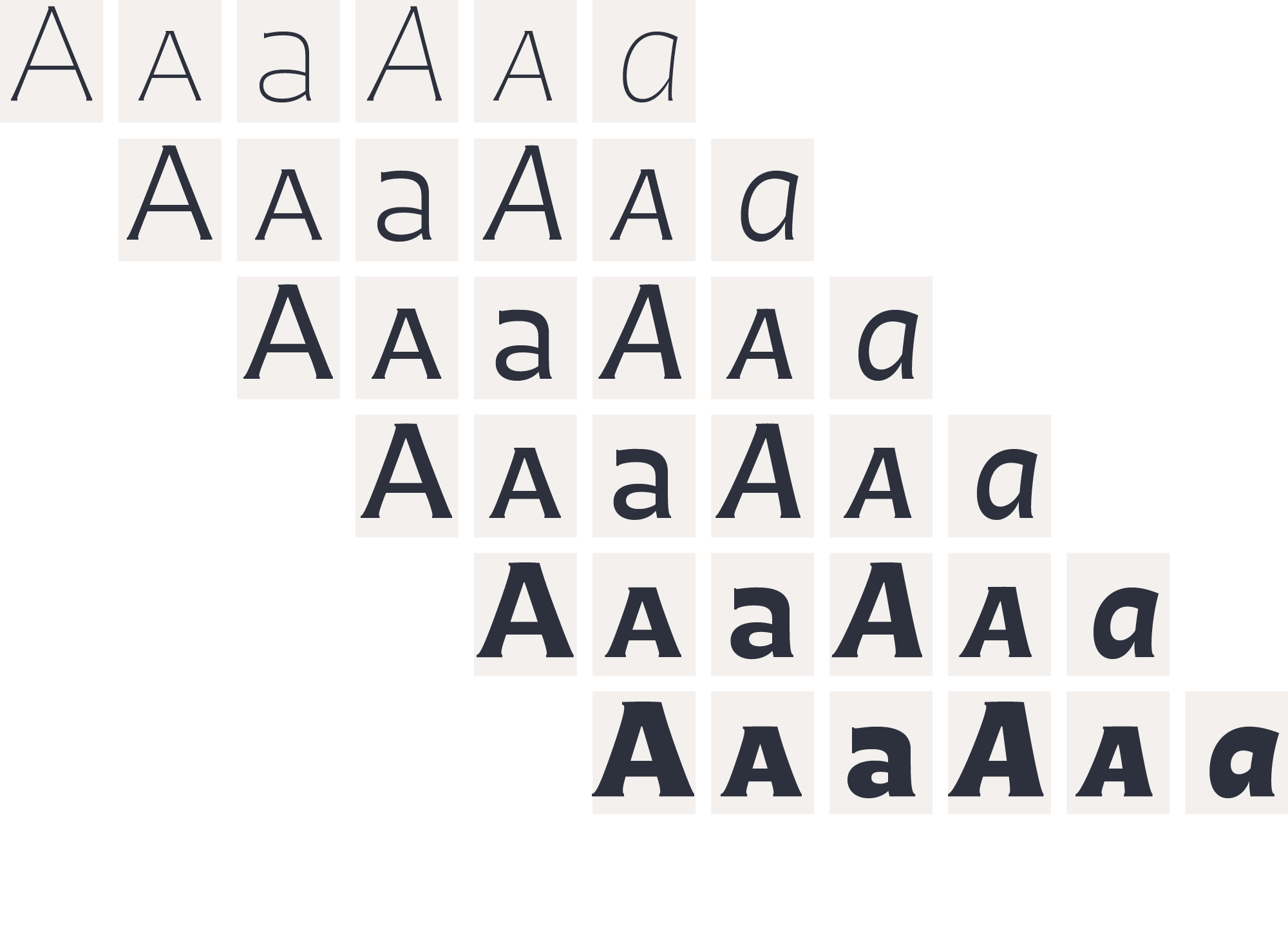
Highly legible & charming?
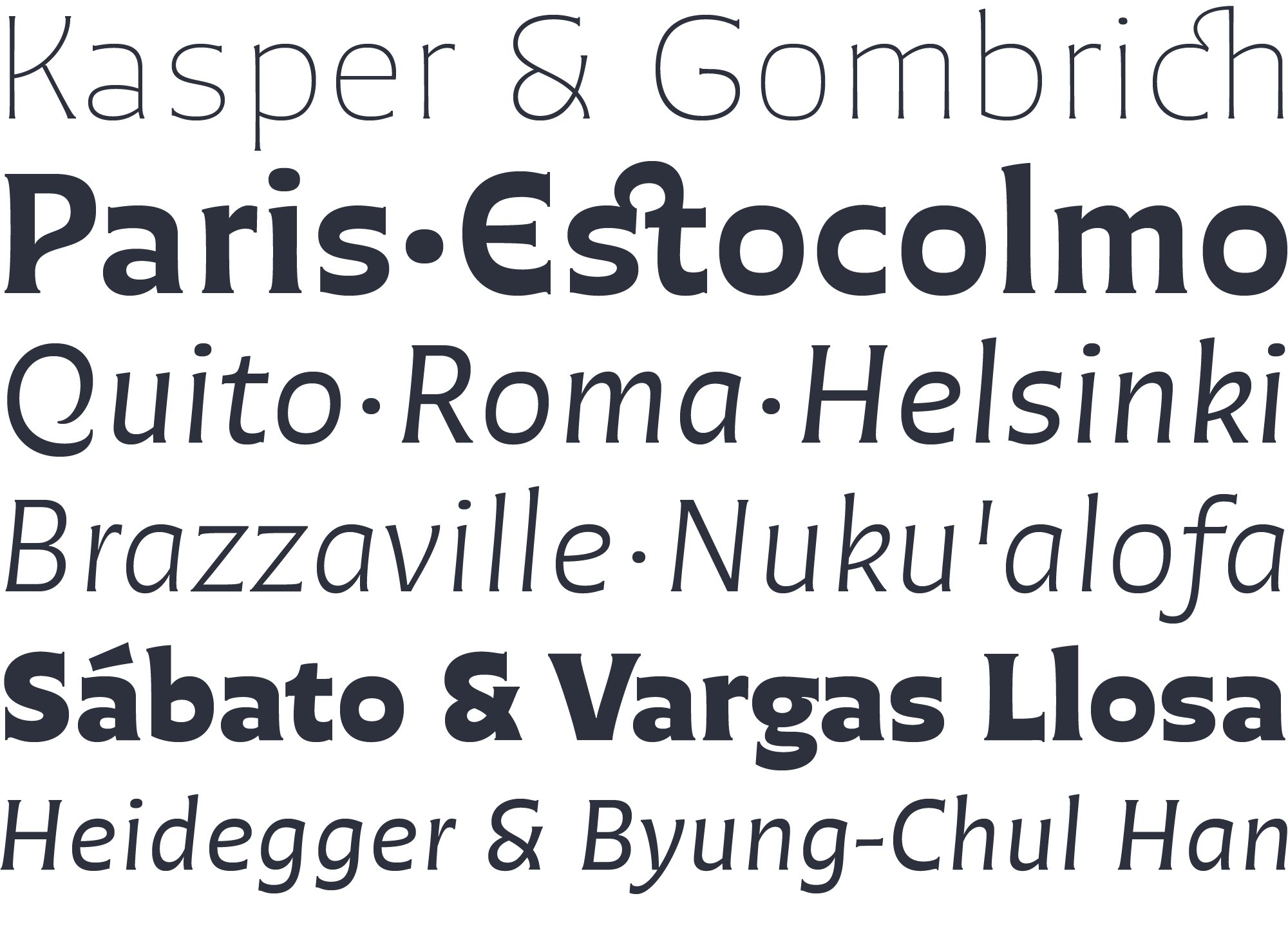
Chercán is a spirited type created with a delicate sense of how readability doesn’t need to be dull. It wears a unique voice, the result of combining a sober sense of functionality with a charming soul. Its endurance and its open counters allow for a comfortable reading in small text.
Reverse contrast
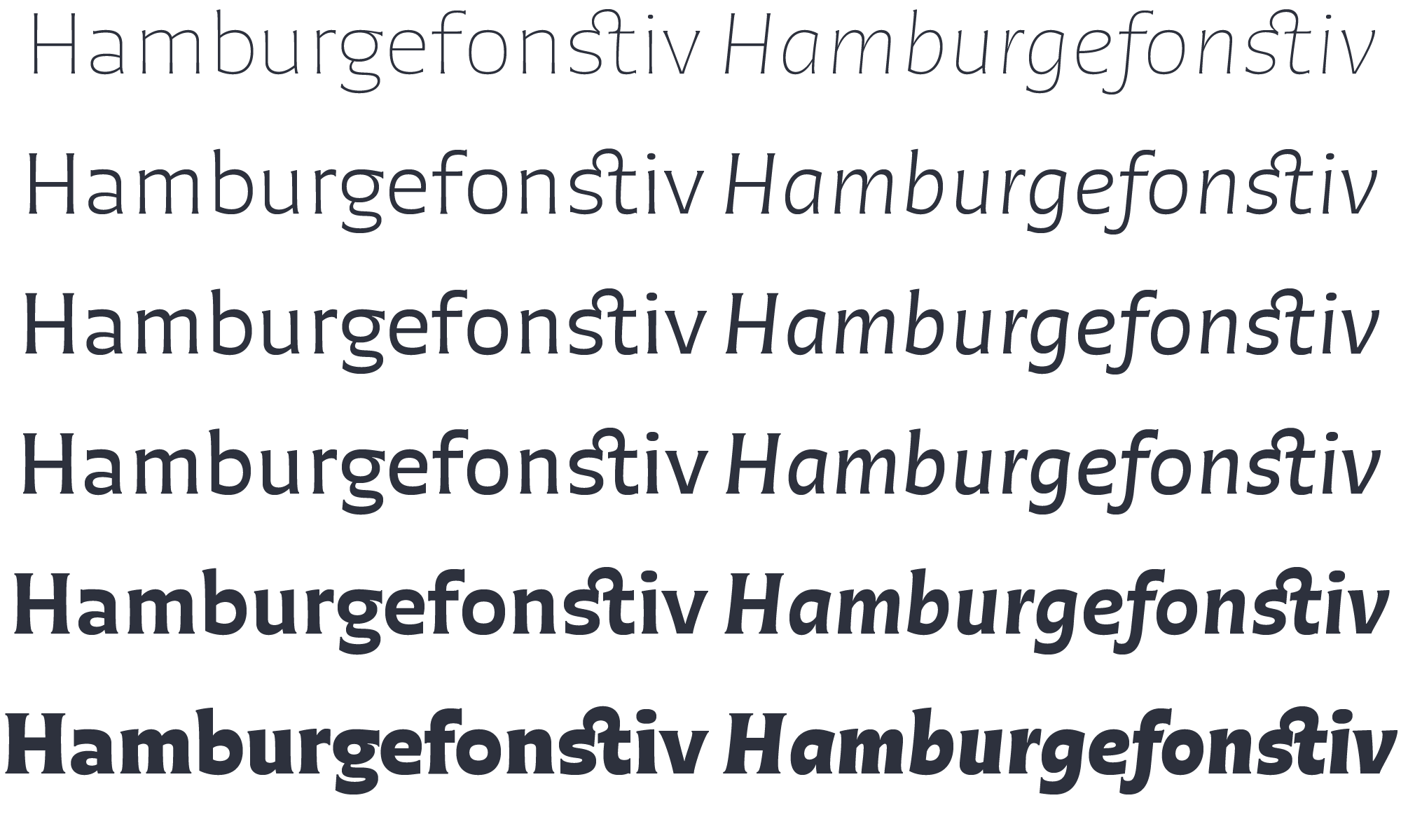
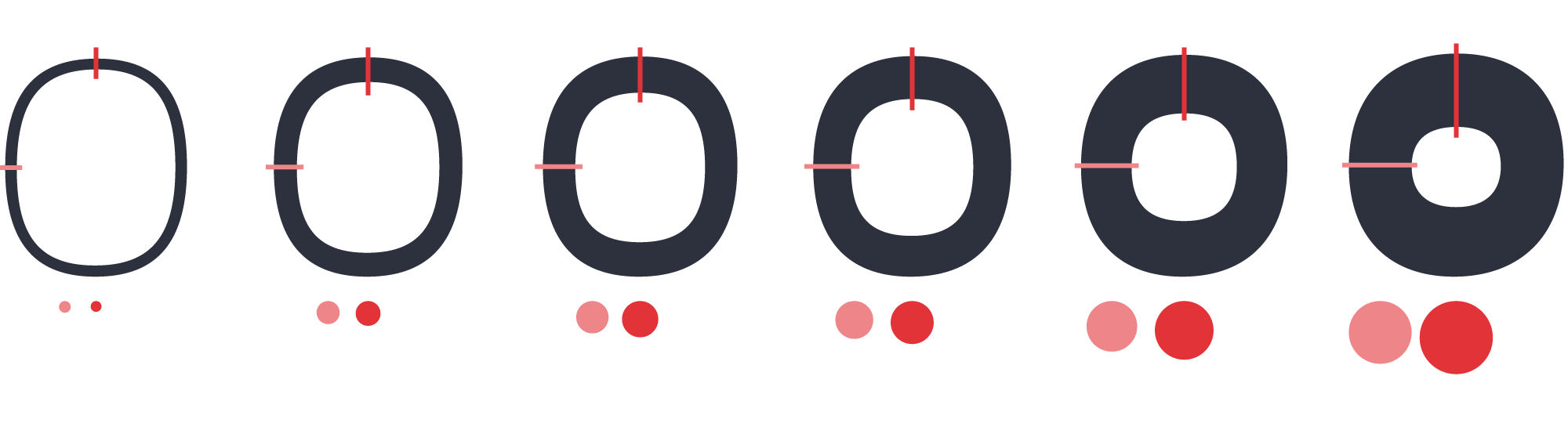
Chercán has a slight inverted modulation of thick & thin strokes. This reverse contrast grows while weight increases. This is a key feature to friendliness and gives it a contemporary feel too. Other typefaces with reverse contrast are under preparation at PampaType.
Inspirations
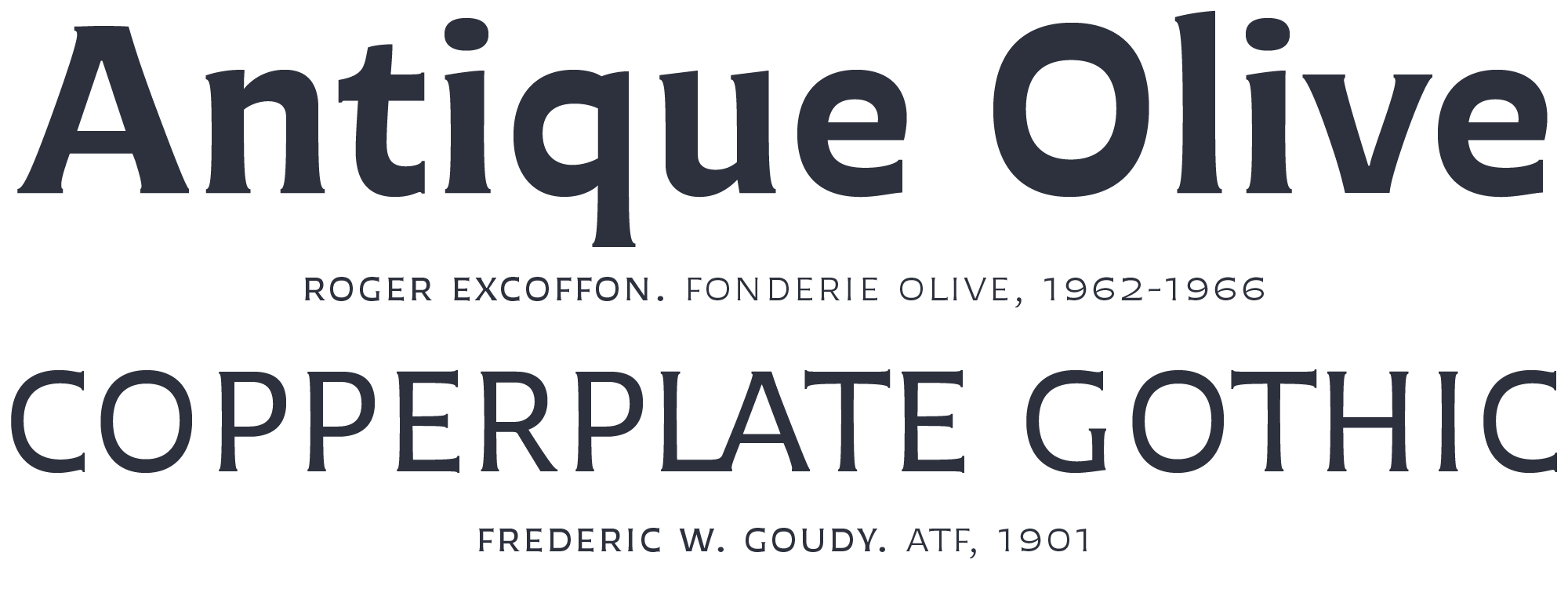
Chercán occupies a unique place in the contemporary type design shelf, by exquisitely combining versatility, legibility, spiciness, and elegance. Its balanced rhythm is the result of a slow pairing of qualities found in old classics admired by Francisco Gálvez, such as Copperplate by Frederic Goudy, and Antique Olive by Roger Excoffon.
Refined & informal
Due to its legibility and the even grey it gains in long texts, Chercán is good for immersive reading. It is also ideal for texts that need an informal atmosphere without loosing authority.
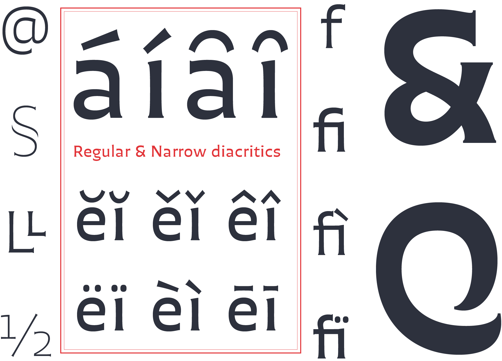
OpenType fully equipped
Chercán is full of typographic goodies. For a better view of Chercán download our print & screen specimens from this site. Meet Chercán, an original type family from PampaType.