Introduction
When judging the quality of typefaces, Harry Carter has emphasised the importance of primarily considering the function they convey. Thus he distinguishes three scales that define the three main areas in which type can perform: small text, medium text, and display sizes.1 However it seems clear that there has been a common tendency within the typeface community in discussing visual aspects of typefaces while showing them in big sizes. And that appears a natural practice. Otherwise, it would not be possible to talk about details such as serifs, joinings, strokes’ modulation or counterforms. But when considering text typefaces in such a display situation, I believe, we overlook what actually happens in reality. In a text scale relationships between shapes in text occur in a completely different manner than in that of display sizes. This might be seen in the use punchcutters have made of the traditional method of optical scaling: because different perceptive levels were demanding different expressive solutions, distinctive letterforms were developed for their different sizes.
What we do then when considering typefaces in that way is to focus on the design of letterforms. What we do not do is to talk about concatenations of letters, text-line colour, relationships of shapes within words, linguistic implications of a written language on type design, black and white balance. In other words, we do not talk about a dimension that may be called the dimension of type rhythm.
To create awareness in this regard has been the main purpose of this essay. Considering that rhythm constitutes an essential dimension through which we experience life, I have tried to follow a basic path from biological basis of rhythm, then its implications in other domains like music or visual language, and finally the different dimension of rhythm in the area of typography and type design.
Also a preliminary area of reading process has been included as a series of (rather) speculations on certain relations between our need of articulating rhythm and the way we read. My approach has been mainly reflexive and my method the interaction with type and typography literature, as well as with some of other disciplines in which rhythm is usually taken as an intrinsic property of the matter.
a. The dimension of rhythm
Rhythm is in harmony with nature and exists with manifold efficcacy and form within all living creatures and within the phenomena of movement which surround us –in the regularity of our heart and pulse beats, in our breathing, or in the repetition of forms with like effects in plants of the samekind– everywhere we feel the rhythmical law of renewal. Walter Kaech
The word ‘rhythm’ under different domains
Although the idea of rhythm seems to be clearly underlaying type design, as it seems to be in relation to all visual disciplines; and although most of us would easily make use of the term, presumably agreeing on a general idea of it in type and typography, not much has been said about rhythm in the vast literature of printing and typography. A first approach would apparently reveal the simple fact that although the nature of the word ‘rhythm’ is metaphorical when applied to visual domains, its meaningful sense for describing and qualifying should not be played down in the type design domain.
However it actually lacks the precision and usefulness it seems to enjoy within the world where the term comes from: music. Music unfolds in time, so rhythm is one of the constitutive aspects of music. Even in other domains (like dancing, drama, ceremonies and diverse human performances) the concept of ‘rhythm’ is also used in a vague sense, although the coincidences between all fields while defining the concept is impressive.
But a preliminary reading along some literature on music principles will complicate a bit more this scenario in showing that also in the world of sounds some foreign terms, which might come from visual disciplines for instance, are equally needed in order to thus embody more complex levels of discourse. Hence there naturally seems to be an overlapping in the use some human disciplines make of language; disciplines in which the dimension of time appears to represent a more or less abstract though fundamental structure of reference.
Time, motion, periodicity
Rhythm is organised movement in time. Carl Schachter
Time is the measure of motion. To speak of time is also to speak of motion, since motion is time’s intrinsic correlate. In David Epstein’s words: “We all live, and consequently move, within time and through time (…) Time itself moves with an unidirectional arrow that points only forward.”2 And motion is basically understood by using time as its index. The reverse of this correlation is in fact equally true: time is only experienced and, then understood, through motion. Motion in turn is the essence of life itself. All living organisms move. Motion is probably the most defining aspect of life.
Thus rhythm in human movement may essentially be described as “consisting of the arrangement of components into sequential pattern of series of patterns.”3
These physically produced patterns of rhythm are evident in repetitive working actions, such as sawing or hammering or in the characteristic ‘dotted skipping’ pattern while walking, which is related to our ‘two-legged’ body structure. According to scientists, engineers and artisans a rhythmic application of force is the most efficient way to transfer energy to a given body. Scientists sense of the word ‘rhythmic’ is distinctively related to periodicity, in other words ‘the cyclic recurrence of an event at regular intervals’. Periodicity comes then from the need of demarcating time, which points out the fact that time, since it is unavailable to the senses, depends on physical phenomena from the spatial world as the means (mainly aural and visual) for its demarcation. The poetically attractive idea of Heraclitus about time as a flowing river into one could never step in the same place twice (neither the river nor one is the same anymore), explains Epstein, is not useful in terms of human interaction with time. For time to be used, it must be demarcated, quantified, divided into units. Only via these units we can visualise time meaningfully and use it with certain precision.
The control of motion is thus efficiently taken, with minimal expenditure of energy, by mechanisms that divide movement into equal (periodic) units.4
A group of three people trying to move a heavy object will coordinate their efforts in a rhythmic way, chanting ‘one-two-three-heave!’ to concentrate everyone’s energies at the same moment. For Epstein those efforts would be completely inefficient if the periodic motion would be temporally uncoordinated (one of the three movers making the ‘heave’ too soon). Such aperiodicity would spoil the momentum of motion, and the energy of the group moving the object would dissipate. Periodicity is thus an important factor in the temporal functioning of the physical world. In fact much of it does display periodic movement, from electron spin in the subatomic universe to the revolutions of the planets on their axes and within their orbits.
Biological basis of rhythm
Periodicity is implanted in our nature in such a manner that it would be difficult for us to distinguish with pleasure any other order in music. Riepel (1775)
It is in this regard in which the most physical sense of rhythm comes up. All human rhythms are expressed in co-ordinated psycho-biological processes, that are also affected by the rhythms of our natural environment (seasonal, lunar, rhythms of the day/night cycle which also relate to the cyclical nature of ecological processes). “In physiological studies rhythm, cycle and periodicity in particular are investigated in studies of breathing, pulse rate, brain waves, neuromuscular coordination, muscular exertion and menstruation.5
The periodic way in which our biological timing mechanisms function is seen in music theory as the quintessential element that controls our sense of pulse, and pulse is the very first aspect of tempo. Tempo is constituted by means of pulse. Periodicity, pulse, and tempo have in music an extreme importance: how musicians function neurobiologically affects how they think, compose, and perform music. Similarly Swiss calligrapher and author Walter Kaech asserts: “The artist acts above all emotionally, and when he find the harmonious effect of the proportion of ‘the golden mean’, while correcting his work, he does not take the result as being a scientific perception. For the rhythmic law lives in him, since he too is a part of nature.” 6
Internal rhythm in human body thus becomes so complex and motley that it constitutes in fact the raison d’être of body motion performance. In words of E.T. Hall: “Rhythmic patterns may turn out to be one of the most important personality traits that differentiates one individual from the next”. 7
Such a statement would seem obviously relevant when considering human body performances (of dancers or actors for instance), but it could also be profitable to apply it metaphorically to typeface design. Rhythm, as a quality of typography, could thus result in a powerful tool for describing, judging and designing type. Then that idea of individuality founded upon inner, physical rhythmic patterns could also be regarded as constitutive aspect in relation to the ‘personality’ of typefaces.8 To contribute to such a consciousness has been a substantial aim of this essay, particularly through the third section.
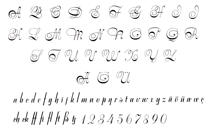
Scholar and calligrapher Edward Catich, in his brilliant book The origin of the serif, has talked about the essential importance our kinesthetic sense (the sense that makes us aware of our own motion) has in the development of calligraphy, and the role it has historically performed in the evolution of majuscules into minuscules (fig. A): “Kinesthesis is a bodily sense, served by a special system of nerves, by which the patterns of muscle movements are controlled. It is the sense that guides gestures of all kinds from dancing to winding a watch. In writing it enables the hand to trace letters even when the eyes are shut.” 9
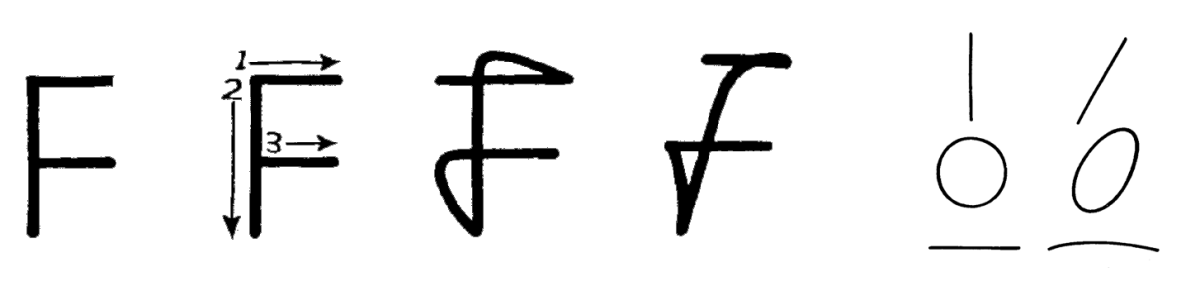
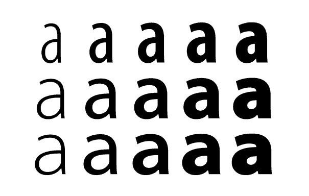
Figure B. Ovals, curves,and slanted lines are more natural and easier to trace than circles, horizontal and vertical lines.
Also some movements are easier to make than others (fig.B), which would explain how our cursive writing slants to the right. These biological aspects of calligraphy will be mentioned again when discussing the relations between handwriting and typeforms.
Rhythm in poetry
Of course a more complete idea of rhythm could not avoid poetry, a domain in which the concept seems to be constitutive too: “the patterned recurrence, within a certain range of regularity, of specific language features, usually features of sound”.10
Derek Attridge provides also an interesting definition that could satisfactorily perform in every domain (even in typeface design): “Rhythm is a patterning of energy simultaneously produced and perceived; a series of alternations of build-up and release, movement and counter-movement, tending toward regularity but complicated by constant variations and local inflections.”11
Despite its difficulty to be defined, as it is in every field, rhythm in poetry is easily discriminated by the ear and the mind since it has a psychological basis. It is thus universally agreed to involve qualities of movements, repetition and pattern. But although the idea of rhythm seems to be more evident in poetry, everybody would further accept that rhythm is a substantial quality to be found in every piece of literature, and thus we can talk about ‘prose poem’.
Rhythm in speech
On the other hand spoken language tends to be different. D.W. Harding defines the experience of rhythm in speech as “the experience of perceptually immediate grouping or unity in a sequence of impressions, together with a differentiation of the component members of the group.”12
Harding points out another interesting fact: once a rhythmization process in a certain form has been established it normally recurs in the same form. It would be worth to relate this ‘habit’ condition in speech with its equivalent in reading. Also Harding suggests that the subjective experience of differentiating and grouping in a sequence of sounds that are all alike and follow each other at precisely regular intervals (for instance the experience of hearing the ticking of a clock as tick-tock-tick-tock instead of tick-tick-tick-tick) is an exceptionally subjective experience which constitutes the basis of the singular individuality already mentioned above. But this cannot be applied to language: “In speaking and listening and reading we are not creating rhythmic patterns at our own sweet will, the basic features of the spoken language control our rhythmizing while we speak, and the rhythms we perceive as listeners or silent readers are guided, and sometimes closely controlled, by object ive features of the sound sequences and by the usages of the particular language.” 13
Rhythm in visual language
Accepting then this preliminary distinction between rhythm in language and rhythm in other domains, one obvious difference between spoken and graphic language comes up. Like music, speech also clearly unfolds in time, while the same idea of time in visual language seems (say) virtual. This may explain the complex asymmetries between both spoken and graphic language studied by linguists.14 The written and the listened word necessarily refer to each other as both sides of the same coin, since it is in the vast domain of language where all our human communication is experienced. But although it is through a complex interrelation between visual and aural dimensions that most of our messages take place nowadays, it seems evident each dimension enjoys a completely different nature involving different senses and consequently different skills.
The linguist John Mountford points out that “writing differs from speech in that it is not learned spontaneously”. A person is born with a faculty for acquiring language spontaneously in the medium of speech, but it can not be acquired spontaneously in the medium of writing; nor can domain of spoken language be extended spontaneously to the domain of writing. We all have to be taught to read.15
Then in an intuitive attempt of approaching the issue of demarcating time to graphic language it might be worth borrowing Michael Twyman’s idea of text as a form of ‘interrupted linearity’.16 The compulsory need of ‘breaking’ the text-line might be seen as an artificial device to actually keep the ‘linearity of time’ physically possible when reading. Thus getting closer to typography, the idea of time appears taken for granted when thinking of the act of reading. Time, sequence, and period are concepts that can be then applied with some objectivity. But the virtual nature of time referred to a broader field of visual communication seems even more evident when considering the fact that reader’s grasping could be oriented (think of a sequence of sections within a publication) but it could by no means be controlled by a given order. The dimension of time is individually experienced in the subjective domain of the reader. A magazine or a newspaper may be structured in a particular hierarchy of sections and even suggesting a particular reading order, but the way the reader will go through the pages is completely unpredictable.17
That idea of a subjective experience built up upon a material, external structure seems to be underlying in all domains, and constitutes a basic principle in how typography works, as it will be commented later.
b. Type & language
Type is idealised writing, and its normal function is to record idealised speech. Robert Bringhurst
The need of exploring the reading process
The way we read has been profoundly covered by psychology and psychobiology research, and certainly profusely referred to in specific literature. But although during the last decades many questions have found satisfactory answers, many others still remain obscure.
It is not a purpose, in this brief essay, to attempt a discussion about the reading process, but to bring some basic concepts that could allow us to better understand how we read.
This short overview of some widely recognised literature on the subject has also been the search of a possible relation between the process of reading and our (presumably biological) tendency of articulating rhythm while perceptually interacting with patterns.
As mentioned above, we all tend to immediately discriminate rhythm in most of our perceptive experiences, like when listening to music, or similarly in our interaction with the physical world in which our preference for rhythmic movements seems to be a smart means of applying the line of least resistance.
But in such a preliminary approach, I have not found a clear connection between the reading process and what Harding has said about the control exerted by the features of spoken language on our perception of rhythm (see Rhythm in speech, p.8). However, despite beginning from different models for explaining reading, all psychologists seem to agree on the importance our inner speech (the interior spelling we undertake when reading) would have as a helpful factor in effective comprehension. Thus our interaction with texts is conveyed as an internal experience of assimilation of meaning, a process in which our short-term memory appears to perform a fundamental role.
Reading as visual grasping
Typography by its double nature (visual and linguistic) demands to be distinctively considered from one viewpoint at a time. Just the simple exercise of trying to concentrate in the meaning of words while reading a text and appreciating the shapes of letterforms at the same time results in an obvious impossibility. It is clear each activity implies intellectual processes of a completely different nature.18
Some recent psychological studies have pointed out a critic conflict that usually appears in considering how we read: the simple fact that words cannot be taken as common visual objects.19
Undoubtedly the primary threshold relates to visual perception, in other words to psychobiology. Thus while explaining word identification the psychologist Frank Smith distinguishes three different and interdependent approaches: a whole-word identification, a letter-by-letter identification, and an intermediate position of spelling patterns (identification of letter clusters). None of them can explain the whole process on its own, since according to experiments, and although contradictory, each model seems to be very reasonable in different points.20
Words, like letters, may be directly identified from the distinctive features that are in front of our eyes as printed information. Then an immediate word identification is carried when certain “feature analysis allocates a visual configuration to the feature list of a word category in cognitive structure, without the intermediate step of letter identification” (italic mine).[Smith 1994, p.130 (see note 3).]
In fact, for the skilled reader the process of identifying words appears to be a very small part of the whole mental effort involved in reading.21 Orthographic redundancy (relationship among letters –or letter features in words– that are expectable according to the use of the particular language)22 is conveyed in this process in such a way that the alternatives of possible letter combinations are reduced to a very narrow set.23
That is how reading becomes a fast and efficient process. However it seems impossible to identify a word and its component letters simultaneously. The difference between word and letter identification is precisely the category system that is involved (the way in which “featural information is allocated”). If the reader is to identify letters, then the visual information is tested on the basis of the feature lists for the 26 correspondent categories, while if the reader is to recognise words that visual information is tested according to the feature lists for words, and then letter identification has nothing to do with it. Other models of the reading process differ in this point sustaining the idea of both word and letter identification as parallel and complementary activities. Otherwise it would not be possible, according to them, to recognise irregular words so fluently.24
Reading as a mental activity
However reading is not just a mere grasping or ‘picking-up’ of shapes but a more intricate process of multiple nature. According to Kenneth S. Goodman: “Readers are users of language who process graphic, syntactic and semantic information simultaneously. (…) They develop strategies for the efficient sampling of the graphic signal in relation to the syntax of their language and the particular concepts and experiences with which the passage is concerned.” [Kenneth S. Goodman, “Psycholinguistic universals in the reading process”, The journal of typographic research, vol.III, 1970, p.103.]
Another essential difference between speech and written language is that speech relies on situational context, while in written language there is an unknown audience that responds to the writer in generating contexts through the language and thus replacing those that are absent. So readers carry on cycles of sampling, predicting, testing and confirming as strategies for bringing in “the most reliable prediction with the minimum use of the information available”.25
Rayner & Pollatsek have described the word encoding process as involving three systems: a direct visual route (graphemic level), a spelling-to-sound route (phonemic level), and a morphemic-decomposition route; that is, a direct route and two more constructive processes.26
Goodman in turn distinguishes three cue systems that function “simultaneously and interdependently”. The starting point is graphophonic: the reader reacts to graphic sequences and would use the correspondences between the graphic and phonological levels of his language.27 A second cue system is syntactic: the reader starts to recognise and predict structures using pattern markers so he arrives at meaning. And the third cue system is semantic: the reader must be able to give semantic input so he can derive meaning from the text.28
These different cycles overlap and interact with each other in a very efficient way so that enables the reader to acquire a fluent rhythm across the text line. This rhythm is patterned through a particular inner subvocalisation (also called phonological recoding or simply internal speech) articulated by the flowing of words and according to both their sound and their linguistic features within the particular language.
Language and the line of least resistance
Entre deux mots il faut choisir le moindre. Paul Valéry
American researcher Georges Kingsley Zipf (1902-1950) spent a long time of his life analysing and classifying the words James Joyce used in his huge novel Ulysses. He concluded that the words less frequently employed were the longest ones, as well as those that possessed the most complex phonetic structure.
From a neurobiological threshold, psycholinguist François Richaudeau has pointed out the natural relation between our biological tendency, as living beings, towards the line of least resistance (la loi du moindre effort) and the use we make of language. Thus, according to his view, the shortest words will be those emitted, understood and read with the minimum effort, and also the most frequently employed due to their more profound presence (incrustation) in our memory. This explains our preference, between two words meaning alike, for the shorter one; and the process of shortening taken with some words from which we use just the beginning of them (thus stylographe has become stylo; or in colloquial French: psychologue has become psy, or écologiste, écolo). Similarly the acronyms follow, in which we use the initials of words to refer a whole composition (like in AIDS, UNESCO or UFO).[François Richaudaux, Des neurones, des mots, et des pixels, Atelier Perrousaux, La Tuilière, 1999, p.73.]
Such strategies, based on general biological laws, would constantly surround the intellectual activities implied in our linguistic performance. In the same way, the development of prediction tactics while reading may be explained by certain behaviour towards exploration, a characteristic that is common to all living creatures. Thus the mental modules’ functions and the line of least resistance would be at the basis of a syntactic route code (code de la route syntaxique) that generates the rules of syntax.
Reading timing and typography
Differently, the use of the term ‘rhythm’ in typography seems to allow us to better denote, to some extent, the very concrete idea of time that is involved in reading. But although it would seem unreasonable to avoid any connection between a reader’s singular, inner rhythm and a purely visual typographic rhythm, to think of a measurable or describable relationship between them would appear completely inaccessible. Just as inaccessible would be to attempt a comprehension of the whole reading process without the discrimination of those three different levels of mental activity involved. The need of a structural model for explaining such complex procedures seems unavoidable.
In this respect borrowing concepts from music could be profitable again. The music theorist David Epstein sustains the idea of a double nature of time, and thus time would yield two modes of structure: clocklike organisation (chronometric time) and organisation that is unique to a particular experience (integral time). “Both modes run simultaneously, in some respects serving to reinforce one another, in other situations achieving dissonant opposition by being out of phase.”[Epstein 1995, p.10 (see note 4).] Chronometric time, by its periodic nature, is structured by constant factors while integral time is structured by elements intrinsic to its unique situation.
This dualism in time might be useful when applied to the reading process. Typography can be metaphorically thought as the clocklike organisation while the singular reader’s experience could be seen as that convergence of the particular factors within his/her reading situation. To assume the existence of these two complementary/supplementary dimensions of time and their relationship in the context of reading would provide support to different points. first of all there is the general acceptability of rules in legibility and readability. A basic consistency could not be sustained without a common perceptual behaviour among readers. And in fact discrimin-ability between subjective and shared experience markedly is a delicate point in legibility tests. As it has been referred to by Goodman: “the essential characteristics of the reading process are universal”.29
And secondly, there is the fact that even in front of exactly the same layout of a printed material, two different readers will bear certain grasping activities which are peculiar to each. Accepting this dual idea of time applied to reading, then typography as a visual device would demand the articulation of a purely visual rhythm which is reliable in our need of a regular, stable, ‘linear’ structure from which to start our sampling, selecting and predicting strategies; in other words, a chronometric, constant factor. And on the other hand, the act carried by a singular reader, from his subjective acquaintance and inner, rhythmical procedures would rely on his/her integral, unique experience of reading. In this regard, the phonological role of our internal subvocalisation is thought of being to “hold information about temporal order in working memory (short-term memory) and to provide prosodic cues useful in comprehending the text”.[Rayner & Pollatsek 1989, p.216.]
Languages and rhythm
As we have just seen with Goodman, the fundamental aspects of the reading process are universal. It is because reading has a psychobiological basis shared by all humans. Also its semantic aspects “cannot vary to any extent from one language to another, for the key question is how much background the reader brings to the specific reading”.30 Hence the reading process would be much the same for all languages with only minor variations to adapt the singular characteristics of the orthographic and grammatical structures of the language.[Thus inflections in English grammar for instance are relatively unimportant, though positions in patterns are significant. In a more inflected language (such as Italian or Spanish, in which vowels articulate the flowing of words) readers might find it relevant to make a stronger use of inflectional cues.]
These characteristics conform the rhythm of the language, which points out the fact that the concept of rhythm in typography does not only touch on visual shapes (as it could be primarily understood) but also on the features of language. Through its visual materiality typography conveys text. And whichever dimension considered, spoken or written, language has a rhythmic structure by its own. In this sense, there would not be one rhythm for language, but one singular rhythm for each different language around the world. So when we say typography conveys language, we should also be aware of the fact that language as an abstract, ‘neutral’ system does not exist but in the need of linguists of having a purely theoretical device. A pragmatic consideration of language will necessarily fall into singularities, it is in one particular language. Distinctive characters, certain concatenations of letters, frequency of vowels in relation to consonants, different use of diacritical and prosodic marks, frequent word-features such as suffixes, prefixes and endings, are all orthographic elements that visually express distinctiveness of each language’s pattern.
In this respect, French type designer Ladislas Mandel has explicitly called for the preservation of cultural identities that he ascribes to written language, in the gradually shrinking world of today: “Even apparently the most functional, writing has a cultural dimension, some call it ‘aesthetic’, which, since it is linked to a language, is a genuine function that underlies the others. An alphabet reflecting the cultural identity of the reader, used in texts related to his language, often is a capital factor for good legibility. There is a French dimension of writing that cannot disappear as long as we think and speak in French. (…) Man is not more universal than the land that feeds him. He is the result of a particular biological, social and cultural environment, in which he evolves and whose prime sign is the language, under both its forms written and spoken” (translation mine).31
Typography can be seen as a serial killer of minor languages. Fred Smeijers
On the other hand, historical controversies about the coexistence, in the German typographic landscape, of roman and fraktur type forms, could also be taken as an example in appreciating how national identities might be expressed through typography. In a controversial essay Philipp Bertheau has proposed direct relationships between the specific legibility qualities of fraktur to written German, and the evolution of linguistic features of that language.
Thus the tendency of giving word emphasis to the root syllable, and consequently weakening the other syllables from which vowels have tended to be lost, has been a common practice since the establishment of New High German at the end of fifteenth and beginnings of the sixteenth century. Then, according to Bertheau, while the general retaining of consonants in German has resulted in words combining one vowel with eight or even nine consonants (schimpfst, schnarchst, schrumpfst…), the natural move in Romance languages towards the Humanistic minuscule may be explained, in contrast, by their absence of any emphasis on syllables.32
Also explicitly, diacritics are another important factor in how spoken languages are distinctively expressed through type. Most of them were originated in the need of medieval copists of abbreviating words or saving space, and since then employed for all languages written in Latin script with the only exception of English. They have been used for modifying vowels (vowel quantity or vowel quality), to indicate syllabic stress, diaeresis, or for modifying consonant pronunciation.
Unfortunately diacritics have represented an obstacle to compatibility in transliteration between several Roman alphabets, first of all because the standard uses of diacritics naturally are not uniform, and secondly because of the unwillingness of English-speaking peoples to accept such foreign marks.33
Thus Louis Marck has also criticised the general disuse of diacritical marks in English-speaking countries, and carried a vindication for better knowledge and international acceptance of diacritics as a very important part of the official spelling of various languages. The constantly incorrect reproduction of German, Polish or Czech names for instance, particularly in the media, has traditionally generated conflicts of misidentification, mispronunciation, improper informational storage and retrieval processes.34
Robert Bringhurst in turn has claimed against a “typographic ethnocentricity and racism” that have thrived in the last hundred years, and have kept its “narrow-mindedness” institutionalised through the working of machines. Now he enthusiastically sees in digital type the opportunity of easily recovering the use of all intrinsic features of written languages and even recommends the remapping of the personal keyboard for those willing to work within multilingual documents.35
On the other hand, in their exhaustive book Typographia polyglotta[Sadek & Zhukov, Typographia polyglotta: a comparative study in multilingual typesetting, ATypI & The Cooper Union, New York, 1991.] George Sadek and Maxim Zhukov have also suggested an inner relationship between the distinctive characteristics of languages’ speeches and their graphic expressions in writing. Thus the clustering of consonants in German (rpfl, ndfr, dsch, rchz) reflect the characteristic hardness of the Teutonic speech. The highly syncopated rhythm of Hungarian speech can be seen in some spiky letters concatenations (cs, sz, gy, gj), in some endings (-ák, -ág, -ék, -ég, -ók, -ult), and in frequent diacritics such as the single and double acute accents or the diereses. And while the melodiousness of Portuguese is expressed through distinctive combinations of vowels (ãe, ão, õe, eja, uai, eu…), in finnish the frequent doubling of letters (ii, yy, ää, öö, kk, tt), the over occurrence of a’s, and the general lengthiness of words give to its text an impression of thoughtful and balanced genre of speech. All distinctive orthographic elements of a written language would be part of what has been referred to by Wellisch as 'graphotactics', meaning the groups of combinations of characters normally expected in a language and which would condition, in turn, the approach type designers also have to the alphabet.36
In my opinion, this last statement appears acceptably reasonable, however it seems immediately difficult to try to specify in which particular situations those strategies would be present, without an extensive and thorough comparative observation of cases. Southall asserts that that some typeface designs look much better in certain languages than in others is mainly due to the way the type designer has developed the letter fitting of the fonts.37
But the simple fact that copies of text in diverse languages look so different, even set in the same typeface with the same parameters (the comparative method used by Sadek & Zhukov), still makes it an intricate problem to discriminate whether a copy looks better than others because of the characteristics of the typeface used or because that specific language looks better than others.
Furthermore, some particular letter concatenations and frequencies of characters undoubtedly appear to be peculiarities of a language (‘graphotactically’ relevant), but what is usually taken as a harmonic overall hallmark of a particular language is sometimes also a characteristic of many others. On the other hand, it seems unlikely to conclusively state that only the letter fitting of a face could make such a strong difference in the overall look of a text from one language to another.
This matter will be tackled again later on when discussing the importance letter spacing would have in typographic rhythm. But for the purpose of this essay, I think this issue of distinctive visual behaviours of languages might be definitely understood as another fundamental dimension of rhythm in type design. How type designers create and space letterforms should not disregard a consideration of these matters.
c. Rhythm in type design
Each alphabet has its own rhythmical pattern. Each individual character is a variation on a basic dance step. These different patterns strung together into a complex choreography of words, sentences, paragraphs, and pages. Sumner Stone
The term ‘rhythm’ in typography
As pointed out before the term rhythm has been widely used throughout the literature of typography in describing typeface and typographic design, although used in different senses and under a cloud of imprecision. Thus Robert Bringhurst employs the name “Rhythm and Proportion” for a whole chapter of his brilliant book The Elements of Typographic Style, referring to commonly accepted rules on typographic setting. Expressions such as ‘horizontal’ or ‘vertical motion’, or ‘harmony and counterpoint’ connote a slightly lyric (though valuably pedagogic) approach, in which the word rhythm also performs an important role. Other words like movement, phase, time, intervals, in a clearly metaphorical manner, point out a presumably human need of relating different domains of diverse nature.38
Tango type by Colin Brignall, 1975.

Rhapsodie type, by Ilse Schüle, 1951.
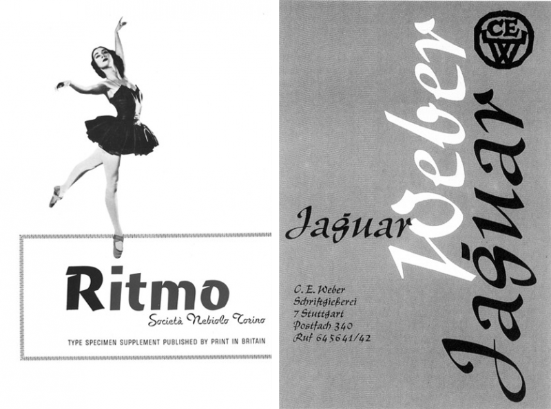
Over time several typefaces have also been emphatically named with a rhetorical idea of rhythm in mind, associating their visual qualities with typical values of music, dance, or even various elements of nature. Thus Allegro (Hans Bohn, 1937), Ballade (Paul Renner, 1937), Cascade Script (Matthew Carter, 1966), Falcon (W.A. Dwiggins, 1961), Jaguar (Georg Trump, 1964), Leopard (Christof Gassner, 1976), Rhapsodie (Ilse Schüle, 1951), Ritmo (Aldo Novarese, 1955), Rondo (Dick Dooijes & Stephan Schlesinger, 1948), Symphonie (Bauer Type Foundry), Bernhard Tango (Lucian Bernhard, 1933), Tango (Colin Brignall, 1975), Tornade (Jean Larcher, 1974), Veloz (Jean Larcher, 1987). Clearly diverse allusions such as informality, leisure, speed, elegance, fun, freedom, freshness, etc. are intended, while in every case these types (by coincidence?) seem to be more appropiate for display situations rather than for text settings, where readability is a priority. Their names appear to emphasise a particularly rhythmical quality of the typeface.
As mentioned above, many authors have made use of the term ‘rhythm’ for describing or qualifying type design. But probably nobody has profoundly assume the importance of the idea of a dimension of rhythm in type design as André Gürtler and Christian Mengelt.39 For them quality in typefaces may be assessed in three fundamental aspects: the stroke-end form, the proportions’ relationships between stroke-weight and counter, and the character width. The latter is thought of being the responsable for the overall rhythm of a typeface, which in turn can be judged from two different viewpoints: a stroke-rhythm, founded in the balance or unbalance of the sequence of vertical main strokes; and a white-rhythm, founded in the relationship between counters and letterspace.
Adobe Myriad MM, by Twombly & Slimbach, 1992 /94, was provided with fifteen basic ‘ready-for-interpolation’ alternatives of weight and width.
However, since all these elements are intrinsically related throughout a face (the width depends on the typeform, the counters on the letter strokes and so on) the resultant rhythm is also dependent upon those interrelated aspects. Thus the rhythm of a seriffed type differs from that of a sans, the rhythm of a bold type from that of a light type, and the rhythm of an expanded type from that of a condensed type.
For Martin Solomon, typographer and teacher at Parsons School of Art in New York, rhythm in typographic design can be easily associated, again, with music. Rhythm is probably the typographic attribute that is closest to biological motions in nature, and it is determined by certain variations which create a relation of intensity between all typographic elements. Typography being an “art of images distributed in a module of time”, the function of rhythm for him is to straighten all visual relationships throughout a typographic composition. Thus the organisation of typographic rhythm is close to music in the sense that a visual tone may be said to be established through both values: shapes (black) and space (white). That is type style and body size on one hand; and letter fitting, word spacing, and leading on the other one. The overall arrangement of space particularly determines a tempo in reading. And although “rhythm has to do with repetition”, and thus just one letter cannot create rhythm, while facing the structure of a letter, a sense of rhythm is fundamental for acquiring a good typeface.40
The rhythm of a letterform
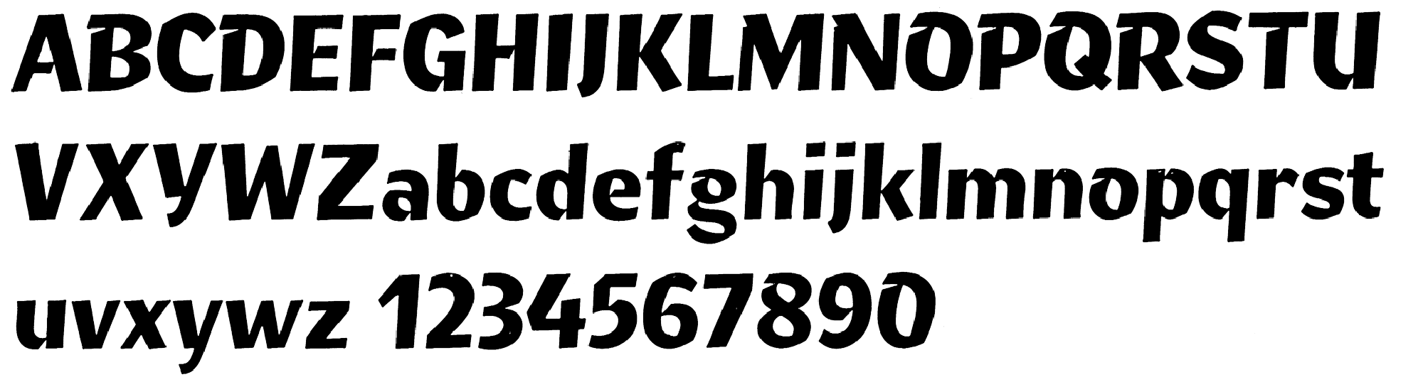
It is here where the term ‘rhythm’ in type design conforms the generally accepted idea of ‘consistency’ expectable in a typeface. It seems an obvious assumption that rhythm is a constitutive element in type design, as understood under its sense of pattern and tendency to regularity. The matter of style, the aesthetic principles that governs the design of a typeface and that give it that ‘consistency’ are naturally taken for granted when talking about a typeface. In fact they probably are the first principle in judging its quality. The simple idea of having typeforms that do not match each other in style seems to be something we would immediately discard. In a compilation of type families Herbert Spencer and Colin Forbes include a face called Ernie Foyle ‘designed’ by David Tuhill, a sort of ‘anti-consistent’ attempt made with twenty-six different typefaces.41
Similarly some of the ‘post-modern’ attempts made up during the early 1990s, with the revolutionary proliferation of dtp technology among graphic designers, called for ideas such as ‘imperfection’, ‘deconstruction’, or even ‘metamorphosis’. Arbitrary Sans (Barry Deck, 1992), Dead History (P. Scott Makela, 1990), Extended Maxm!x (Max Kisman, 1991), Fudoni (a ‘cut-&-paste’ transposition between Futura and Bodoni, Max Kisman, 1990), Keedy Sans and Hard Times (Jeffery Keedy, 1989 & 1990), ocr-Alexczyk (Alexander Branczyk, 1992), Prototype (Jonathan Barnbrook, 1990), probably are the most representative attempts of this group.
Such heterogeneous families would not be used for performing in text by anybody with a bit of criterion. A typeface family is a family precisely because each one of the members is in tune with the rest of the series. The concept of family implies an idea of ‘system’, and demands some sort of consistency (or ‘harmony’) to be verified throughout the whole group. The Caslonian or Granjonian idea of having completely different designs for different body sizes is justified by a (perhaps exaggerated) consciousness about the interaction with the technical limitations of the typefounding trade of that moment: for them to feel all sizes alike it was necessary to make them different.42
In this sense, optical scale in type design seems to be, at the end of the day, a matter of readability, which actually reaffirms the need of formal consistency of the family in the eyes of the reader. Fred Smeijers basically refers of linearity as the simple enlargement or reduction from a unique master font to better maintain uniformity throughout a whole family.43
Thus his theory about the customary use of counterpunching technique in the 16 th century, instead of the traditionally accepted conception of engraving, finds strong, material proofs. Making counterpunches would have constituted an enormously valuable method to typefounders for being able to repeat some inner shapes of types punch by punch.44 Such a repetition of shapes (again, according to the reasonable line of least resistance) would also assure the maintenance of the rhythmic quality throughout the text line. Once more rhythm would appear to be a natural result of our tendency towards the minimum effort.
That consistency or visual uniformity, desirable in a typeface family, seems mainly reached through the regularity of relationships between all elements of which one could separately think of: height, width, weight, direction, and standing of each sign in relation to the rest. Referring to lettering in general, Edward Johnston would define “the beauty of uniformity as the assimilation of the corresponding parts –bodies, limbs, heads– and as the family likeness, of the different letters, so that they go well together”.45
In Frutiger’s words: “the secret of a good text face lies in the fine coordination of the letters to form a community that is rich in contrast, while still retaining a family likeness”.46
The subtlety of rhythm appears to requiere a certain stability of material. Edward Johnston
Type designer Sumner Stone talks about an outer and an inner structure of a type family.47 The outer structure is defined by distinctive elements such as bowls, serifs, joins, and arches. The inner structure of a typeface is harder to define and it is connected, for him, with the mysterious relationship existing “between the rhythms of the writing hand and the rhythms of the reading eye” which comes from the former craft to type design: calligraphy.
“To a calligrapher, the primary component of letters is movement”. Here it would be worth to remind the preliminary concepts of this essay about time and motion as correlate dimensions in our life. When writing, the calligrapher gives the shapes a flowing rhythm that results from the same rhythmical motion of simply tracing the letters in a regular and harmonic manner. Stone refers to this as the “constellation of kinesthetics of the fingers, hand, wrist, and arm in making the shapes for each letter.” (Finding or not a conscious root for type design in handwriting has always been cause of polemic, as it will be referred later.)
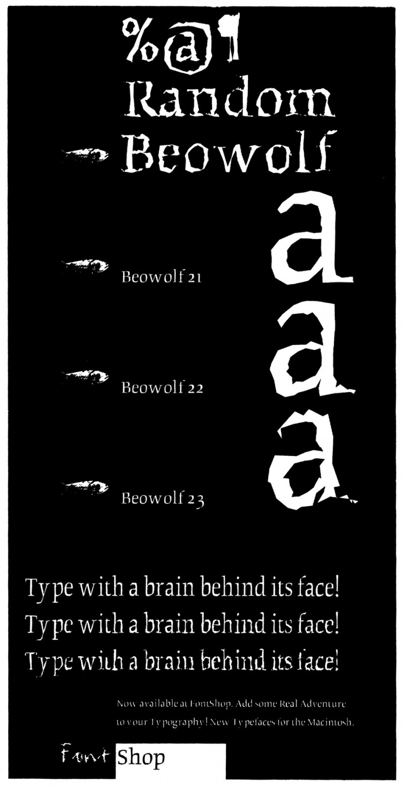
But for rhythm to be established it seems necessary to bear some kind of variety. While referring to versal capitals but also to general lettering Edward Johnston himself would distinguish a good variety as without irregularity that is caused by interruption or loss of freedom. “There is a variety both readable and beautiful but it is founded on uniformity (and sincerity).”48 “Such variety is found in the best work; it adds a liveliness and charm which are quite lacking where there is unnecessary or mechanical repetition.”49 When considering typography such concept of mechanical repetition must be evidently taken for granted. (Unless we consider experiences like Beowolf, designed by Erik van Blockland and Just van Rossum, where an intentioned irregularity is artificially given to letterforms by a randomising algorithm.)
Action and counteraction as the results of creative forces form the wave of water as well as the appearance of the lettering. Walter Kaech
Walter Kaech precisely stresses the value of the hand-written letter against the designed form : “No type-set line can bear comparison in rhythmical strength with the aspect of the written line." Though (…) "we notice in type-set letters a certain harmonious effect, given by the proportional balance of spaces, yet the rigid repetitive effect of absolutely equal characters cannot give to the whole appearance the liveliness of rhythmical undulations”.50 And also: “the apparent similarity in the rhythmical course of things is thus of an optical and not of a mathematical kind, as also beauty in nature is of a dynamic and not of a static kind.”51
Similarly for Jan van Krimpen work done by hand and mechanical outcomes are two essentially different things.
We should never forget this and also “we should let them remain different: the one makes things; for the other designs have to be made”.52
In turn Robert Bringhurst also assumes that the digital typographer cannot aim the liveliness of a manuscript page, although he can ‘move the type a step’ toward that direction.53 With that step he mainly means the kerning of a font, which should be always edited before working with it in order to rearrange some particular relations between letters. Letter spacing turns out to be, for him, a definitive factor in the quality of the overall typographic rhythm (see Letter spacing).
On lettering again Kaech would point out a fundamental difference between a natural and an artificial kind of rhythm: “The rhythmical intermittent movement or intermittent form carries within itself the temporal as well as the spatial successions which are contained in all natural symmetry.”54
This symmetry is not a mirror-like flip of shapes but the manifold symmetry as found in nature. Thus, as we do not find the right half of a man’s face mirror-alike with the left half, and as the leaves of the same tree are very similar but not exactly equal, similarly in lettering a well formed O, traced with full freedom, will bear a natural symmetry in its representation. But a mirror-like symmetrical O, in which the left half is a reversed form of the right half, will look optically awkward as a consequence of the elimination of the rhythmical movement.
Rhythm is thus conceived by Kaech as a quality of irregularity, linked to the wavering movements found in nature, rather than a pattern based on a uniform repetition of components.55
As it happens, for Sumner Stone the repetition of shapes is, of course, needed in typography; but to make the individual letterforms better work together “in a satisfying and comfortable rhythm” it is necessary to introduce some adjustments in the outer structure.
Here it would be useful, I believe, to cite professor A. N. Whitehead referring his lucid observations upon the behaviour of rhythm in nature: “(…) A rhythm involves a pattern and to that extent is always self-identical. But no rhythm can be a mere pattern; for the rhythmic quality depends equally upon the differences involved in each exhibition of the pattern. The essence of rhythm is the fusion of sameness and novelty; so that the whole never loses the essential unity of the pattern, while the parts exhibit the contrast arising from the novelty of their detail. A mere recurrence kills rhythm as surely does a mere confusion of differences. A crystal lacks rhythm from excess of pattern, while a fog is unrhythmic in that it exhibits a patternless confusion of detail. Again there are gradations of rhythm. The more perfect rhythm is built upon component rhythms. A subordinate part with crystalline excess of pattern or with foggy confusion weakens the rhythm. Thus every great rhythm presupposes lesser rhythms without which it could not be. No rhythm can be founded upon mere confusion or mere sameness.”56
Isolated or integrated, these component forms are identified by Kaech as the basic rhythmical elements of lettering:

Similarly, the contrasts of movement while writing: “to condense and to expand, to limit and to open, to swing out and to confine” must be considered elements of rhythmical unity.57
Edward Catich58 has equally discriminated, for his theory about how stone epigraphic inscriptions were previously written with a brush, all different strokes that were (and are) used in calligraphy:
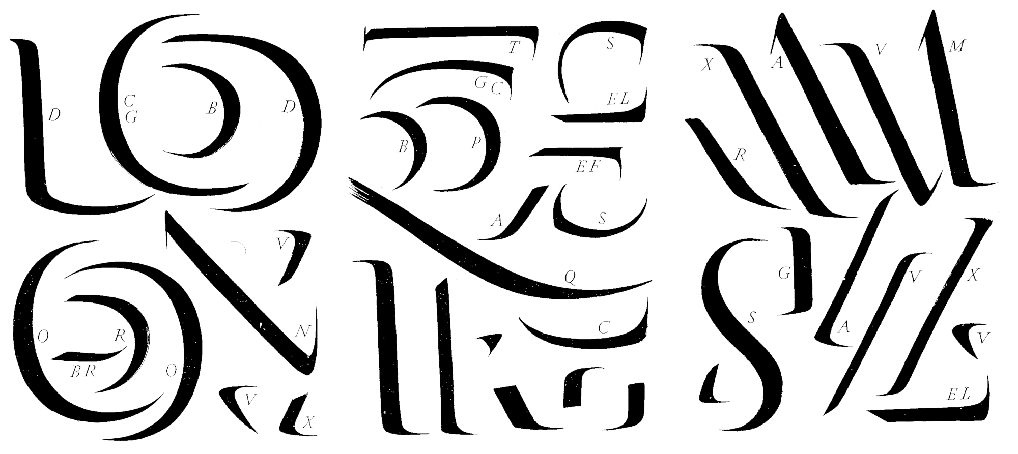
However Kaech elaborates an integrated idea of rhythm, that seems to be a natural conception considering his approach from lettering. Other people, like David Kindersley or Sumner Stone, presumably approach the task of spacing with a similar idea of rhythm in mind, linking it to the physics of handwriting and calligraphy. Using a single tool in a rhythmical manner to write the words produces a visual regularity that can be appreciated not only in the flowing of strokes, their beginnings and endings, ligatures and other features, but also in the flowing of spaces between the strokes.

When describing different kind of symbols, Frutiger introduces the concept of dualistic signs59 by referring to the idea that through all our feelings and thoughts for understanding humankind there always runs the recurrent conception of dualism. Thus the basic division of masculine or feminine, or our conscious activity during the day in opposition to our subconscious absence across the night, represent the fundamental conditions in which we experience life.
Similar correlations might also be established with our nervous system, in regard of the way our brain works, through rudimentary (although intricately related) electric impulses of binary nature.60 The universe of black and white then appears to be an obvious correlate in typography, as a consequence of both, the way visual impressions fixate in our retina and the mental apprehension our brain elaborates from it. The substance of type, thus manifested in the most extreme contrast possible, black and white, then conforms the primary dimension from which rhythm is built up.
Handwriting vs. typeform
Other than allusive names, rhythm is also conveyed as a clear quality of movement, though in a less rhetoric manner, in many other contemporary text typefaces that enjoy a sort of ‘forward’ movement (Flora, Sasoon Primary, or Thesis to mention some very different examples). A rhythmic quality seems to be reached either through a resemblance of handwriting, or through an upright emulation of italic forms.


However, emphasised or not in type design, rhythm seems to be an inherent element in typography. Just the mere interaction between roman and italic undoubtedly constitutes a rhythmic relationship in the page. As a resemblance of handwriting the italic has assumed, since its introduction as a complementary type to roman by Robert Estienne in the beginning of the sixteenth century, a second voice in the type stage. It might be worth here to remember the controversial issue that Stanley Morison voiced in The Fleuron61 about a new “ideal italic”, through which he claimed that a more logical companion for a roman would be, instead of the traditional italic, a sloped roman. What actually is the substantial difference between a cursive italic and a sloped version of an upright face?
A sloped roman, the DTL digital interpretation of Van Krimpen’s Romulus, 1931, and a cursive italic, Slimbach’s Giovanni of 1991.
Probably a natural preference of typographers to keep using the traditional cursive style might be thought as the main reason for understanding why Morison had later reconsidered his argument as a ‘fallacy’ (although his article could meanwhile influence highly reputable type designers, like Van Krimpen). But it is not presumably an exaggeration to affirm that what may be called the ‘inner rhythm’ of a cursive italic, subtlety linked to handwriting as its historical heir, must be underlying as a significant aspect of what constitutes our conception of an italic.

Similarly, an obvious visual correlate of rhythm and tempo in type is to be found in the use of different weights, within one or two typefaces, that can also be combined into the page to organise the reading in a contrasting, rhythmical flow.
On the other hand, and although the Francesco Griffo types (particularly Bembo) have been recognised as the first ‘sculpted’ shapes, getting away from the scribes’ calligraphic tradition, the connection between handwriting and type design seems completely natural for some theorists.62 This is, I believe, another intrinsic aspect of rhythm.

Letters are sheer form and writing is rhythm. The self-taught designer Gerrit Noordzij who taught at the Royal Academy of Art (KABK) between 1960 and 1990 has constituted the lead reference and the principal enthusiast of a “type school” from The Hague. In his revealing book The stroke of the pen he sustains an ‘embryological’ approach to look at lettershapes. Based on the general idea that the broad nibbed pen has resulted the leading tool in developing our letters he follows an archeological path back on the historic evolution of handwriting. There are for him two opposite ways of modulating letterforms: translation and expansion. In its ‘mathematical’ meaning translation is to be understood through a vector whose length is the width of the pen and its direction the slant of it (a pen on which pressure would not influence the width of the stroke). Expansion on the other hand is the expansion of the strokes caused by the pressure put on a flexible pen. And there would have apparently been a Western preference in gradually changing from translation to expansion.
Kaech also stresses the value of the broad nib pen as the tool that gives the desirable rhythmical contrast between thin upstroke and thick upstroke, or between pressure and release of pressure.63 In turn English design theorist and editor Robin Kinross has carried on an interesting discussion on Noordzij’s ideas64 arguing against the principles upon which he has constructed his pedagogic model. Kinross has criticised his conception of typography as “writing with prefabricated letters” referring it as a weak-point. After five hundred years of type making from Gutenberg onwards such a ‘broad pen-centred’ explanation of typography for him cannot refer to production anymore. In Kinross’ view the fundamental difference between writing and typography is that in writing “you have the text in your head and you make that text visible in unique letters” which spontaneously vary according the flowing of text and your intentions within it. On the other hand when composing typography “you don’t know what the text will be”. Noordzij immediately returned to the attack by pointing out that if it is possible to think of a category of writing, then handwriting and typography would be, as different modes of producing text, subsets of that category. So being both an arrangement of letters in a sequence, handwriting and typography differ only in the fact that handwriting supposes a human hand intervention.65
However seeing or not in handwriting a genealogical origin for typography it seems that it should have been only through calligraphy –through the patient dedication of scribe– that writing acquired a foundational quality of rhythmic pattern. And, following this scheme, typography would have simply inherited it through early printing when borrowing the letter shapes from bookhand.
This pattern supposes, again, the existence of a basic sequence of shapes –stems, arms, serifs, ears, bars– in a rhythmic interaction of forms and counterforms that manifests through the small, primary universe of black and white. With this perspective the discussion upon the arrangement of white, in regard of the overall rhythm, turns out to be as important as the design of letters is.
Letter spacing
Letters do not live in isolation. They are the elements of meaning, the components of visible language, and their spatial relationship with each other is crucial, not only for the rapid recognition of words by the reader but the regularity of texture that is essential if the reader’s comprehension is to be maintained for a long period. Walter Tracy
According to Walter Tracy the fitting of letters, the arrangement of the exact amount of space to each side of them, so when they are set together forming words they look balanced, is an essential part of type design, and should clearly constitute an inescapable task of the process.66 He refers to W. A. Dwiggins as a type designer who was consciously concerned with the fitting of his typefaces. Dwiggins believed in the possibility of a fitting formula that could be applied to any type family, with a final optical adjustment in each case. His basic system of relating letters by their similar shapes, let him solve their fitting by establishing proportional standards (once more: the line of least resistance). Thus solving the space for n, would allow you to solve it also in h, i, j, l, m, and in the stem sides of b, d, k, p, and q as well; the fitting of o can give you the basis for a, c, and e, etc. Tracy himself has been for a general formula of combining optical sensibility and logic. He also proposes a grouping of letters according to their structural form: “letters with a straight upright stroke (B D E F H I J K L M N P R U- b d h i j k l m n p q r u), letters with a round stroke (C D G O P Q - b c d e o p q), triangular letters (A V W X Y - v w x y) and the ‘odd’ ones (S T Z - a f g s t z).” His method bases the spacing of capitals on H. The optical compensation of space between four H’s, meaning that interior and side spaces look the same, gives the width for these letters and all uppercases with a straight vertical stroke (Fig. a). Next step has to include O in the same way, optically determining its correct width (Fig. b). Another test has to be done with a double O inserted between the H’s, so the new combination reviews the former ones (Fig. c). With these two widths it is possible for him to develop the rest of the letter spacing, assigning one standard side space (there are five different spaces for capitals, six for lowercases) to each letter according to its formal group. Again H and O must be used to check the actual width of every character after the process, so it can be finally fixed optically (Fig. d).
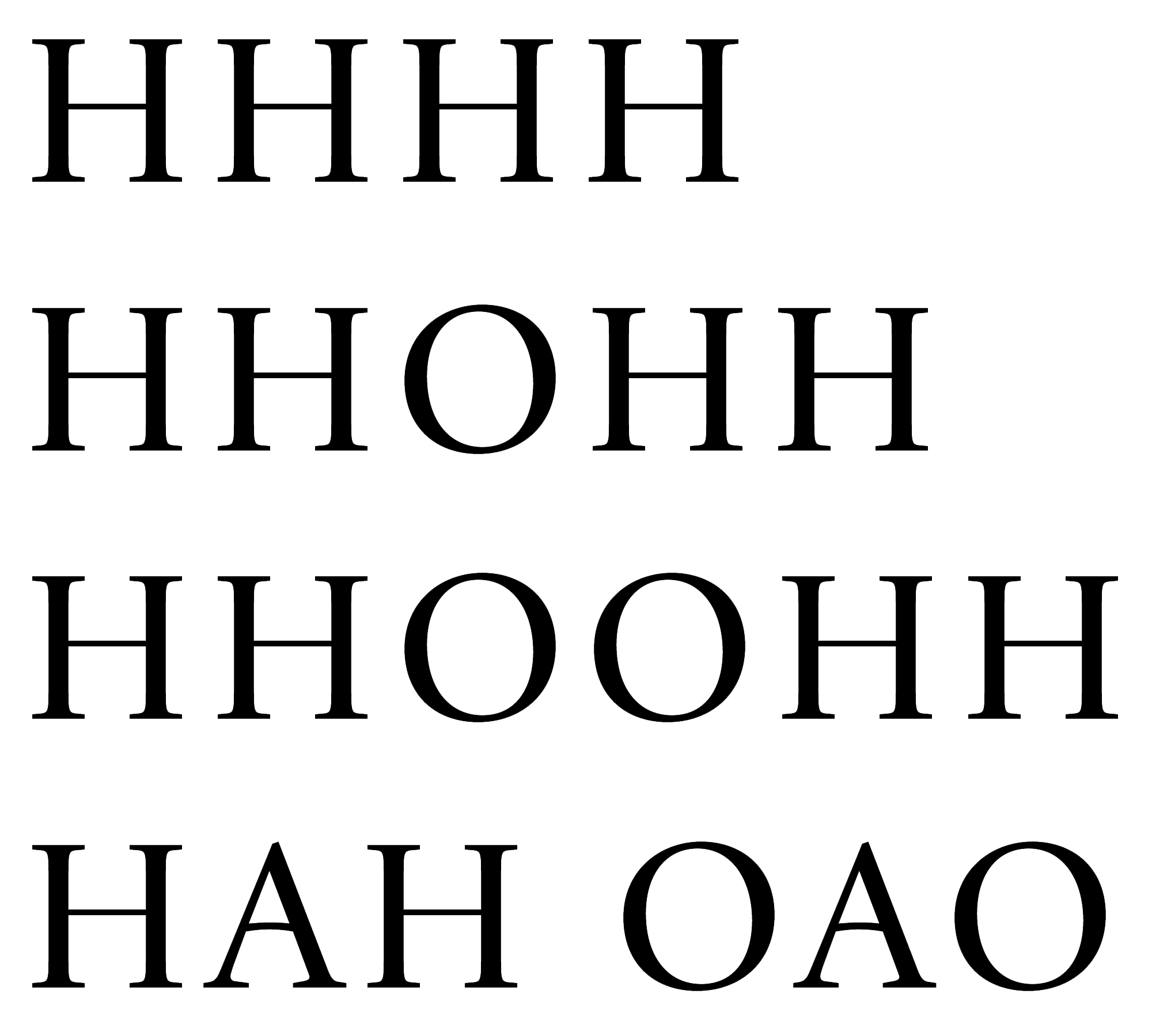
For lowercases the process is exactly the same, being n and o the initial features for the standard. Tracy specifies some differences in respect to the sanserifs, where side spaces might need be shortened according to the absence of serifs. “The essential thing is that the space between letters should never be greater than the space inside n or m.”67
This approach of letter spacing clearly defines the importance of inner space in the construction of typographical rhythm. The need of compensating different side shapes of the letters according to a proportional standard space, which is defined as a real situation from which to develop a system, seems to be the most intelligent way to give regularity of colour or weight to the text line. Tracy carries on with the numerals and diacritical marks and finally suggests that his method should not be taken as a definitive one, and it should rather be revised under a general “aesthetic judgement.”
Moreover, the whole typeface must be proved in real situations of language, that is, in composed texts. The setting of text in a particular language to which the designer is familiar, allows him to better control the letters’ relationships, thanks to the natural (for him) linguistic featuring of words68
The success or failure of a type is very much a question of getting a good balance of white inside and outside the letters. Harry Carter
There seems to be a universal agreement among approaches to letter fitting in considering optical compensation as the best possible method to reach black & white balance. One of them has been exposed by Geoffrey Dowding69 when touching on the spacing of capitals, although his efforts are not much concerned with type design since his book (like most of the others) is about arrangement of text and display typography. But what definitely gives a text block on a page is the possibility of appreciating in the colour and rhythm qualities of a typeface. Harry Carter has asserted that a good spacing between letters, which constitutes a basic need in text type, is also intrinsically related with a good spacing between lines.
Thus “a letter is well matched with its body when the vertical and horizontal spacing give an even texture to the page”.70 In his well-known discussion about optical scale in typeface design, Harry Carter in turn suggested a method for spacing letters. A justifier making the matrices for a metal fount would have taken m or ffi as a startpoint of intervals between the strokes. Then letters with double upright strokes (n, u, h, fi) should have a wider interval than m (“the right amount wider to make a pleasant alphabet”); and similarly, the whites of d, o, p are a little wider than the white in n. Thus spacing of m, n, and o constituted the key for a skilled punchcutter to provide an evenly-spaced fount. Again this view seems to be clearly linked with rhythm in the sense that no other particular parts of letter shapes are considered for establishing proportional spaces but the upright strokes. All vertical stems, in their condition of acting as units of a pattern (think of the need in music of quantifying time into segments), actually are to build up rhythm across the text line. There is no other reason than a rhythmical one behind the need of creating an even texture in type design, stroke by stroke, white by white. Form and counterform are thus conceived as the ‘basic step of a dance’ (following Sumner Stone’s metaphor).

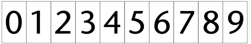
An evident incidence of spacing in typographic rhythmic pattern might also be appreciated in monospaced typefaces, like the ones designed for typewriters or early video-text devices, in which the technical limitation of having exactly equal widths for all characters of the alphabet generates an obvious distorsion of rhythm. In this ‘grid’ approach, the mere recurrence of letters with the same width imposes the need of expanding letters (i, j, l, t) and compressing others (m, w) to better balance within the fixed width. This monotonous lack of rhythm reaffirms the idea of a rhythm built up upon spaces that are proportional to shapes; in other words, the regularity made of diversity and difference, already discussed (in The rhythm of a letterform, p.21). The same problem is to be found in normal faces with the figures. The need of composing tables or tabular lists with numerals has historically demanded type designers to arrange a fixed width for the whole set of figures; although according to Tracy, in some cases, type designers (like Matthew Carter with his typeface Galliard) were allowed to provide a special set with proportional spaces (generally non-ranging figures).
Another interesting approach to letter fitting has been made by British stone carver and type designer David Kindersley. When asked to develop an alphabet system for the public street signage in Cambridge, his thorough sense of rhythm (no doubt due to his mastery in lettering) pushed him into a restless search towards an ideal technique of letter spacing. This process has been fully described in his text An essay in optical letter spacing.71 Kindersley attempted several systems of spacing letters, by finding their ‘optical centres’ through a photo-electric cell device (then photocomposition being the current technology), or by searching their ‘centre of gravity’ by eye. Similar to Tracy’s approach, his method for capitals fitting is based on a basic, harmonious spacing of OIIIO and subsequently placing in turn all other characters into the place of the second I, starting by the most critical uppercase: L. The spacing of the lowercases follow a technique of scaling the values of the capitals by taking the x-high of letters as a constant factor. Thus for T it should be taken a lowercase value when followed by another lowercase without a stem in the left side. And so on.
Finally, Kaech has also talked about an ideal way to space letters, from his most calligraphic point of view. Thus, O, again, should be taken as the reference letter to organize the width of all the others, as well as for its inner spaces. From his classical humanistic perspective, linked to the ideas of the Renaissance, Kaech discovers that the proportions of the ‘golden mean’, as a human emulation of the gradations that can be found in nature, underlie all the relations that are harmonious between signs and their arrangement in space.
In this frame, spacing also for him should be given the same importance than letterforms, since form and counterform of writing as well as the proportions of space within and between the letters give to lettering the desirable tension on its rhythmical course: In consequence, we recognise rhythm and proportion in lettering as two inseparable terms, because they interact upon each other. Rhythm and proportion together form the basis for the harmonious aspect of the page.72
If page harmony continues to be a goal in contemporary graphic and typographic design, all these considerations about letterforms and the layout of the space, that is, the fundamental elements for the construction of rhythm in the text, should be taken as fully applicable knowledge.
Conclusions
Not many new statements seem to come up as a conclusion of such introspective discussion. Typography taken as a heir of handwriting, rhythm appears to then be an inherent quality of type, as a result of the rhythmic way in which the hand naturally traced the letterforms.That rhythmic manner, founded upon the ‘space-and-time’ flowing of forms and counterforms, established the natural pattern of writing that typography has taken since the middle fifteenth century. That pattern seems to be, as it is in other human domains of expression, a basic psycho-biological device we need for interacting with the world.
However, rhythm in typefaces designed for immersive reading seems to be the result of a very subtle balance between regularity and novelty, as it manifests itself in other arts and in nature. Actually emphatic ideas of rhythm, like the ones sustained in some display typefaces, clearly do not enjoy legibility in text sizes. Thus rhythm and readability appear to be inherent correlates within type design, achieved through inextricable balance.
The consideration of both graphic and linguistic dimensions of rhythm in the domain of type design, I think, could be, in the future, another instrument to judge, discuss and objectify quality in the design of typefaces for text.
References
Attridge Derek, Poethic rhythm (an introduction), Cambridge University Press, Cambridge, 1995.
Bertheau Philipp Th., “The German language and the two faces of its script: a genuine expression of European culture?” in: Bain, Peter & Paul Shaw (eds.), Blackletter: type and national identity, The Herb Lubalin Study Center & The Cooper Union, Princeton Architectural Press, ny, 1998, pp.22-31.
Bringhurst Robert, The Elements of Typographic Style, Hartley & Marks, Vancouver, 1997 (first edition 1992).
—— “Editing the Pretext”, Journal of Scholarly Publishing, April 2000, pp.113-125.
The New Encyclopædia Britannica, vol.X, Ready reference (15th edition), Chicago, 1986.
Carter Harry, “Optical scale in type founding”, Printing Historical Society Bulletin, no.13, 1984, pp.144-148 (first published in Typography 4, 1937).
Carter Matthew, “Galliard: a modern revival”, Visible Language, vol.XIX, no.1, Winter 1985, pp.77-97.
Catich Edward M., The origin of the serif – brush writing and Roman letters, Catfish Press, Iowa, 1968 (Second edition 1991).
Couper-Kuhlen Elizabeth, English speech rhythm (form and function in everyday verbal interaction), John Benjamins Publishing Company, Amsterdam / Philadelphia, 1993.
Epstein David, Shaping time (music, the brain, and performance), Schirmer Books, New York, 1995.
Friedl Friedrich, Nicolaus Ott and Bernard Stein, Typo, an encyclopedic survey of type design and techniques throughout history, Black Dog & Leventhal, Köln, 1998.
Frutiger Adrian, Signs and symbols: their design and meaning, Ebury Press, London, 1998 (first edition: Der Mensch und seine Zeichen, 1978, 1979, & 1981).
Goodman Kenneth S., “Psycholinguistic universals in the reading process”, The journal of typographic research, vol.III, 1970, pp.103-110.
Goodridge Janet, Rhythm and timing of movement in performance (drama, dance and ceremony), Jessica Kingsley Publishers, London & Philadelphia, 1999.
Gürtler André and Christian Mengelt, “Fundamental research methods and form innovations in type design compared to technological developments in type production”, Visible Language, vol.XIX, no.1, Winter 1985, pp.123-147.
Hall Edward T, The Dance of Life, Doubleday, New York, 1983.
Harding Denys Clement Wyatt, Words into rhythm (English speech rhythm in verse and prose), Cambridge University Press, Cambridge, 1976.
Johnston Edward, Writing & Illuminating & Lettering, John Hogg, London, 1906.
Kaech Walter, Rhythm and proportion in lettering / Rhythmus und Proportion in der Schrift, Oltren & Freiburg in Breisgau, Walter Verlag, 1956.
Lommen Mathieu and Peter Verheul, Haagse letters, Uitgeverij de Buitenkant, 1996, The Hague.
Mandel Ladislas, Écritures, miroir des hommes et des sociétés, Atelier Perrousseaux, La Tuilière (France), 1998.
Marck Louis, “Some thoughts on the use and disuse of diacritics”, Visible Language, vol.IV, Autumn 1971, pp.317-326.
Mountford John, “Some psycholinguistic components of initial standard literacy”, The journal of typographic research, vol.III, 1970, pp.295-306.
Noordzij Gerrit, The stroke of the pen: fundamental aspects of Western writing, Koninklijke Akademie van Beeldende Kunsten, The Hague, 1982.
Rayner Keith & Alexander Pollatsek, The psychology of reading, Prentice Hall, New Jersey, 1989.
Read Herbert, The contrary experience (autobiographies), Horizon Press, New York, 1963.
Richaudaux François, Des neurones, des mots, et des pixels, Atelier Perrousaux, La Tuilière (France), 1999.
Skillin Marjorie E., Robert M. Gay et alt., Words into type, Prentice Hall, New Jersey, 1974.
Smith Frank, Understanding reading (fifth edition), Lawrence Erlbaum Associates, Hillsdale NJ/Hove, 1994.
Solomon Martin, “El ritmo”, TipoGráfica / comunicación para diseñadores, no.11, 1988, pp.26-31.
Southall Richard, “A survey of type design techniques before 1978”, Typography Papers, no.2, 1997, pp.31-59.
—— “Shape and appearance in type design”, in J.H. Miller (ed.), Protext III: Proceedings of the Third International Conference on text processing systems, Boole, 1986.
Spencer Herbert and Colin Forbes, New alphabets A to Z, Lund Humphries, London, 1973.
Stone Sumner, On Stone, the art and use of typography on the personal computer, Bedford Arts, San Francisco, 1991.
Tracy Walter, Letters of credit (a view of type design), Gordon Fraser, London, 1986.
Twyman Michael, “The graphic presentation of language”, Information Design Journal, vol.III, no.1, pp.2-22.
Wellisch Hans H., The conversion of scripts – Its nature, history and utilization, John Wiley & Sons, New York, 1978.
Whitehead A.N., An enquiry concerning the principles of natural knowledge, Cambridge University Press, 1919.
- Carter Harry, “Optical scale in type founding”, Printing Historical Society Bulletin, no.13, 1984 (first published in Typography 4, 1937), p.144. ↩
- David Epstein, Shaping Time (Music, the Brain, and Performance), Schirmer Books, New York, 1995, p.17. ↩
- Janet Goodridge, Rhythm and timing of movement in performance (Drama, Dance & Ceremony), Jessica Kingsley Publishers, 1999, London & Philadelphia, p.35. ↩
- In fact some authors have suggested that such periodic controls may constitute an evolutionary adaptive/survival strategy, being superior in this regard to aperiodic mechanisms and thus more prepared to prevail. ↩
- Goodridge 1999, p.37 (see note 5). However our “internal rhythms are generally less noticeable except during strenuous exertion, or unless things go wrong”; alterations of rhythmic patterns of movement always appear during illness. ↩
- Walter Kaech, Rhythm and proportion in lettering/Rhythmus und Proportion in der Schrift, Oltren & Freiburg in Breisgau, Walter Verlag, 1956, p.64. ↩
- E.T. Hall, The Dance of Life, Doubleday, New York, 1983. ↩
- Qualifying type design appears to be, among others, a task traditionally left for the grey area of designers’ sensibility. Thus the lack of a proper characterisation of different weights within a type family, or a more dynamic criterion for classifying typefaces, or better methodological devices for analysing legibility in text faces. Where design could not borrow methods from science, or apply the technical know-how inherited from the arts & crafts, then the sensibility of designer seems to have been present to counteract the vacuousness. In a moment like this when type design seems to enjoy a more professional reputation, and when computing turns out to be a systematic knowledge that must be acquired, those matters still remain in a grey area. ↩
- Edward M. Catich, The origin of the serif – brush writing and Roman letters, Catfish Press, Iowa, 1968, p.20. ↩
- The New Encyclopædia Britannica, vol.x, Ready reference (15 th edition), Chicago, 1986, pp.33-34. ↩
- Derek Attridge, Poetic Rhythm (an introduction), Cambridge University Press, 1995. ↩
- D.W. Harding, Words into rhythm (English speech rhythm in verse & prose), Cambridge University Press, 1976, p.6. ↩
- Harding 1976, p.6 (see note 14). ↩
- It would probably have the same nature of the astrophysics’ drama of explaining the relation between both dimensions of space and time. ↩
- There are for Mountford actually five psycholinguistic factors in learning reading: knowledge of a standard language, knowledge of a standard orthography, knowledge of ‘technical concepts of literacy’ (it is the vocabulary of reading and writing children have to become aware of: ‘letter’, ‘word’, ‘to read’, ‘to spell’…), linguistic habitudes of literacy, and basic skills of reading and writing (John Mountford, “Some psycholinguistic components of initial standard literacy”, The journal of typographic research, vol. III, 1969, p.301). ↩
- Michael Twyman, “The graphic presentation of language”, Information Design Journal, vol.III, no.1, 1981, pp.2-22. ↩
- The literature in editorial design concerning ‘how’ to predict reader’s reactions is actually quite ambiguous and lacks a basic consistency. Thus the industry of advertising in newspapers has been traditionally built up on the doubtful idea that advertisements placed on odd pages are ‘more readable’ (and subsequently more expensive). This artificial conception is presumably justified in the need of having a differential list of costs (and a bit of sophistication) to offer to the market. It is very likely that the reader grasps on his own will despite any rhythmical sequence displayed. Moreover, it is reasonable to think of that pattern as a basic structure whose function is to provide a sort of surface for the surfer. Transparency and clarity would turn out to be important qualities in such a pattern. ↩
- This could perhaps give an explanation of the usual gap between what is considered the natural domain of type designers (letterforms) and the study of the reading process in the context of psychology of perception: on one hand, why legibility research usually falls in innocence when it does not treat typefaces from a more knowledgeable point of view; psychologists without designers’ assistance are by no means aware of the formal aspects of typefaces. And on the other hand, why type designers generally approach the matter so intuitively, usually without considering psychology background nor its scientific research protocols. ↩
- So according to William Banks and David Krajicek (“Perception”, Annual review of psychology, 1991, no.42, pp.305-331) there mainly subsist three approaches in current thinking about perception: Artificial Intelligence (ai), Neuroscience, and the descendants of Gestalt tradition (including the work of J.J. Gibson and his derivatives commonly known as Ecological Perception). Each of these approaches is incomplete nor each of them can stand alone as a theoretical basis for understanding perception. There has been several attempts from the late 1980’s to integrate these different models, but how we see and identify objects still remains a very difficult question to answer. ↩
- Frank Smith, Understanding reading (fifth edition), Lawrence Erlbaum Associates, Hillsdale NJ/Hove, 1994, p.130. Actually Smith tends to suggest a forth approach that could combine the others without dramatic contradiction. ↩
- Keith Rayner & Alexander Pollatsek, The psychology of reading, Prentice Hall, New Jersey, 1989, p.108. ↩
- Which have been called ‘graphotactics’ (see Languages and rhythm). ↩
- Thus words can be recognised from as little visual information as one or two letters in isolation, and letters in words may be identified before the same letters could be discriminated in isolation. Smith 1994, p.125. ↩
- Rayner & Pollatsek 1989, p.109. ↩
- Goodman 1970, p.104 (see note 9). It is noticeable that this strategy relies again on our biological principle of the line of least resistance. ↩
- To this respect it seems that processing of words whose access depends strongly on the more constructive routes would not be so automatic as it normally is (Rayner & Pollatsek 1989, p.109). ↩
- Goodman 1970, p.106. This step has been just referred to with the theories of letter, word, or pattern recognition described by Smith. ↩
- Goodman 1970, p.107. ↩
- Goodman 1970, p.103 (see note 9). ↩
- Goodman 1970, p.109. ↩
- Ladislas Mandel, Écritures, miroir des hommes et des sociétés, Atelier Perroussaux, La Tulière (France), 1998, p.177. Literary: “L’écriture, même la plus fonctionnelle en apparence, possède una dimension culturelle, que d’aucun diront «esthétique», qui, lors qu’elle est liée à une langue, est un véritable fonction qui sous-tend toutes les autres. Une écriture reflétant l’identité culturelle du lecteur pour des textes liés à sa langue est un factor souvent capital pour la bonne lisibilité. Il existe une dimension française de l’écriture, qui ne pourra disparaître tant que nous penserons et parlerons français. (…) L’homme n’est pas plus universel que la terre qui le nourrit. Il est toujours le produit d’une environnement biologique, social et culturel particulier dans lequel il évolue et dont le premier signe est le langage, sous sa forme parlée et écrite”. ↩
- For Bertheau the classic tension of roman type lies in the formal opposition between straight stroke and rounded stroke. So the dominant x-height in Italian word patterns, for instance, mainly caused by the higher frequency of vowels in comparison to consonants, would generate a uniform text-line with a flowing of short words with large counters. But the longer German words, usually compound nouns, cannot for him enjoy legibility when set in roman type. That is how the visual behaviour of typeforms would find a raison d’être in the linguistic behaviour of the languages historically conveyed by them. Philipp Th. Bertheau, “The German language and the two faces of its script: a genuine expression of European culture?” in Bain, Peter & Paul Shaw (eds.), Blackletter: type and national identity, The Herb Lubalin Study Center & The Cooper Union, Princeton Architectural Press, NY, 1998, pp.22-31. ↩
- Hans H. Wellisch, The conversion of scripts, John Wiley, New York, 1978, pp.52-53. ↩
- Louis Marck, “Some thoughts on the use and disuse of diacritics”, Visible Language, vol.IV, otoño 1971, pp.317-326. ↩
- Bringhurst Robert, The Elements of Typographic Style (second edition), Hartley & Marks, Vancouver, 1997, pp.89-90. ↩
- Wellisch 1978, p.17. Literary: “The set of rules governing the permissible and nonpermissible letter concatenations of an orthography form its graphotactics.” ↩
- Richard Southall, “A survey of type design techniques before 1978”, Typography Papers, no.2, 1997, p.35. ↩
- Again I think it is where language manifests itself as the powerful tool that underlies our perception, conception and experience of life. ↩
- Gürtler André and Christian Mengelt, “Fundamental research methods and form innovations in type design compared to technological developments in type production”, Visible Language, vol.XIX, no.1, Winter 1985, p.143. ↩
- Solomon Martin, “El ritmo”, TipoGráfica, no.11, 1988, pp.26-31. ↩
- Herbert Spencer and Colin Forbes, New alphabets A to Z, Lund Humphries, London, 1973 (no page numbers). ↩
- Harry Carter has mentioned that Caslon went so far as to acquire an older set of types for one of his bodies, the Canon size by Joseph Moxon. Harry Carter, “Optical scale in typefounding”, Printing Historical Society Bulletin, no.13, 1984, p.144). ↩
- Fred Smeijers, Counterpunch, Hyphen Press, London, 1996, p.133. ↩
- Thus “… in one set by Claude Garamond, the counter of the lowercase q appears ten times. It takes some time to cut a counterpunch and hit it ten times into another piece of steel. But it takes much longer to dig out ten equal counters” (Smeijers 1996, p.118). ↩
- Edward Johnston, Writing & Illuminating & Lettering, John Hogg, London, 1906, p.254. ↩
- Adrian Frutiger, Signs and symbols: their design and meaning, Ebury Press, London, 1998, p.173. ↩
- Sumner Stone, On Stone, the art and use of typography on the personal computer, Bedford Arts, San Francisco, 1991, p.13. ↩
- Johnston 1906, p.255. ↩
- Johnston 1906, p.210. ↩
- Kaech 1956, p.13. ↩
- Kaech 1956, p.12. ↩
- Jan Van Krimpen, A letter to Philip Hofer on certain problems connected with the mechanical cutting of punches, David R. Godine, Boston, 1972, p.29 (in “Introduction and Commentary”). ↩
- Robert Bringhurst, “Editing the Pretext”, Journal of Scholarly Publishing, April 2000, p.119. ↩
- Kaech 1956, p.12 (see note 6). ↩
- Actually Kaech compares the vivacity of lettering with the wavering of water. ↩
- A.N. Whitehead, An enquiry concerning the principles of natural knowledge, Cambridge University Press, 1919, p.198. ↩
- Kaech 1956, p.21 (see note 6). ↩
- Catich 1968 (see note 9). ↩
- Frutiger Adrian 1998, p.73. ↩
- Another relation could also be sustained between the black & white dimension of type and the task of bitmap fonts, in which the basic element (a pixel) comes to existence through one of two possible states (on and off). Southall has described how the changeover of techniques of producing type has affected the results and the approaches of type designers, focusing on both bitmap and outline manipulation of type (Richard Southall, “Shape and appearance in type design”, in J.H. Miller (ed.) Protext III: Proceedings of the Third International; Conference on text processing systems, Boole, 1986, pp.75-86). But this temptation finds its limit if we consider that bitmap technology is just another stage in the context of techniques’ evolution. ↩
- Stanley Morison, “Towards an ideal italic”, The Fleuron V, 1926, pp.93-129. ↩
- While distinguishing stages of work, curiously Van Krimpen compares type design with other crafts: “the first stage, being nearest the conception (…) is the best. Here our craft differs from music: what the composer hears, before he has written one single note on his paper, is the music; and so the conception, going before the notation, is completely interior. There is, however, in this respect, a great similarity of type design and sculpture: as long as what the sculptor sees with his mind’s eye has not gotten forms in some matter, that is equally rebellious as I have said the familiar letter forms to be, there is nothing”. Van Krimpen 1972, p.29 (in The facsimile). See note 16. ↩
- Kaech 1956, p.22 (see note 8). ↩
- Robin Kinross, “Type as critique”, Typography Papers, no.2, 1997, pp.77-87. ↩
- Gerrit Noordzij, “Reply to Robin Kinross”, Typography Papers, no.2, 1997, pp.89-90. ↩
- Tracy Walter, Letters of credit (a view of type design), Gordon Fraser, London, 1986, p.71. ↩
- Tracy Walter 1986, p.75. ↩
- This issue naturally links the matter with the linguistic ‘graphotactics’ discussed above. ↩
- Geoffrey Dowding, Finer points in the spacing and arrangement of type, Wace & Co., London, 1966. ↩
- Carter Harry 1984, p.146. ↩
- David Kindersley, An essay in optical letter spacing and its mechanical application, Wynkyn de Worde Society, London, 1963. ↩
- Kaech 1956, p.23 (see note 8). ↩