Introduction
The idea of tackling a particular group of type designs inside the whole universe of typeface families, seems to demand by itself a constitutive argument. In fact, this can in advance be thought as the essential device of the act of classifying types: how to group species by comparing and contrasting their constitutive aspects. But since these aspects can be considered from their historic, stylistic, technological or (more frequently) formal qualities, the resulting classification moreover accounts for the idea of a particular approach.1 Thus the history of classification of typefaces can be thought as the history of the successive attempts to deal with the new variety of typeforms through an innovative point of view.2
But let us face our own topic. The title of this essay is the result of a particular discernment among some typeface families according to a particular, small universe. This universe clearly involves concepts such as: family and subfamilies, superfamily, patterns, interrelation, declension of a basic form, alternation, program, series.3 ‘Seriales’ is in fact the name proposed by Muriel Paris in her Le petit manuel de composition typographique (edited by the author, Paris, 1999) for describing these new families that contain more than one style (also ‘multiform’). It is basically: sans and serif, though some families have introduced intermediate, blended subfamilies or simply alternative subfamilies. Thus for instance Otl Aicher developed for his Rotis four groups: Grotesque, Semi-grotesque, Semi-antiqua and Antiqua; besides of its Sans and Serif, Stone also has a third face called Informal; and the vast program Thesis by Lucas de Groot involves three systems as well: TheSans, TheSerif and TheMix. Then it results reasonable to support that we are facing a new subject matter.
It is intended in this work to offer a discussion on this kind of families. But since each case is a particular one, as well as its circumstance, the purpose has mainly been to try to find what type designers’ impetus could be behind their designs. Although many type families will be mentioned here, only some of them have been considered more relevant for this discussion.

“Bernhard roman is frankly a precious type” said Stanley Morison in The Fleuron VII. And added “it can join the collection of types called a complete fount”. Bernhard roman, italic and script were produced by Bauer Giesserei in 1930. It probably was an inspiration for Jan Van Krimpen.
First precedents: Bernhard and Van Krimpen
Probably the earliest idea of conceiving a ‘serial’ type family has been the ambitious Romulus typeface designed by Jan Van Krimpen for the firms Enschedé and Monotype at the beginning of the 1930s. But as Walter Tracy suggested 4, he was probably influenced by the faces of the German designer Lucien Bernhard, which had received a very favourable comment by Stanley Morison in The Fleuron.5 Advised by Beatrice Warde, who persuaded him to change his original name (Epiphania), Van Krimpen started the Romulus roman alphabet in 1932, based on the fine drawings of his own Lutetia (1924). This first member of the family was a success, though due to its lack of contrast between strokes its shapes were more beautiful in display sizes. But immediately a sloped roman became, influenced by at that time a very revealing Morison’s opinion according to which a more logical companion for a roman type would be, instead of the historic italic, a sloped roman.6 Later on when Morison and Van Krimpen seemed to agree that the sloped roman was a fallacy, Van Krimpen was too busy with the next member of the family: a script type he called Cancelleresca bastarda, a graceful swashed face that has been widely used in fine books for collectors since it appeared in 1937. 7 The following colours in the scheme, a semi-bold and a semi-bold condensed, have been more criticised than acclaimed since Van Krimpen’s purpose of creating them is not very clear. Though the semi-bold condensed alphabet is a finer design, it does not seem that they perform well as companions of the other members of the family. But considering that at that time the idea of a series of interrelating alphabets was still rare, perhaps our contemporary viewpoint is demanding too much consistency in his work.
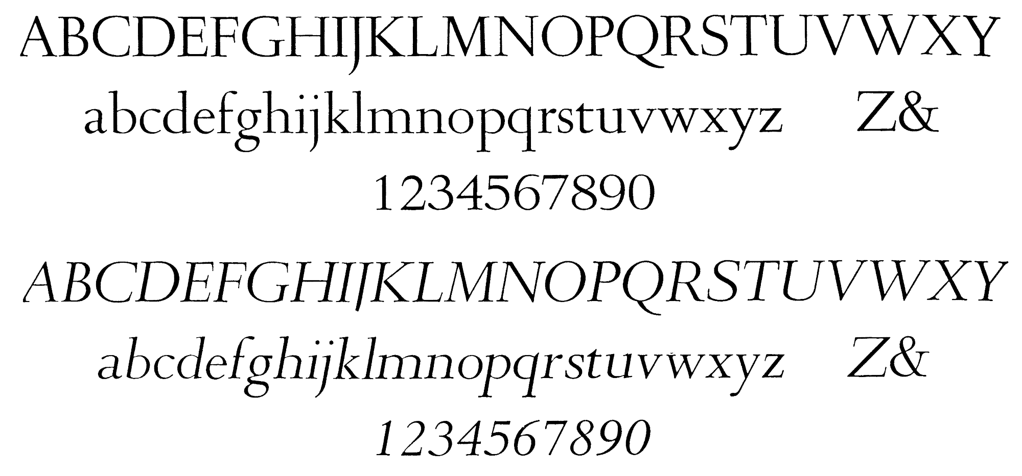

Cancelleresca Bastarda, companion to Romulus, 1934. Not far from Van Krimpen's personal handwriting.

Romulus roman and greek synopsis.
Once again, the intended similarity in the treatment of shapes that Van Krimpen put on his Greek version has been criticised as well.8 But then became the Romulus Sans-serif faces: light, normal, semi-bold and bold, which are undoubtedly interesting designs since they are the first attempt to suit a roman face with a sans. Van Krimpen gave to these types a monoline effect and obtained a four-scaled system of proportions, though he did not apply the system to the ‘x’ high of lowercases, so the counters of the bold weight result too small. At this point Van Krimpen has demonstrated to be really innovative, though the Enschedé Foundry probably was not so confident about it and the four colours he drew were actually produced after his death. Finally, the last member of the family was the Romulus Open Capitals, beautifully made by P. H. Raedisch, the famous punch-cutter at Enschedé foundry, who engraved a white line in the large sizes of roman capitals.

Romulus Sans in its four weights.

Romulus Open Capitals.
First related sans and serif: Unger and Benguiat
Although it is reasonable to think that type designers have historically been exploring the formal possibilities of their own designs, for instance by adding or subtracting serifs to their drawings, or speculating with different extensions of their alphabets (something that has become a natural practice with computers since the 1980s), it must be said that there had had no cases of ‘serial’ typeface families (in sans and serif declension) until the Dutch type designer Gerard Unger designed his Demos for Hell in 1976. Its rounded-off forms account for the low resolution of electronic environments at that time and has three weights: medium, medium italic and bold. The following year Hell manufactured a sans family related to Demos: Praxis. It has a strong character and consists of four weights: light, medium, bold and heavy. It was suggested to make an italic for the font by electronic slanting, though in 1980 Flora was born as a genuine italic for Praxis. It has two colours (medium and bold) and its cursive rhythm is inspired in F.H.E. Schneidler’s Graphik (1934) and Unger’s lettering experiments. Although Demos, Praxis and Flora were not originally conceived as a serial family, they can be thus considered since they are the first contemporary attempt.

Gerard Unger's pioneer design, Demos, 1976. Together with Praxis and Flora [here below] it might be considered the first contemporary ‘serial’ type family.

Praxis, 1977.

Flora, 1980.
A second attempt was immediately made by the New Yorker type designer Ed(ward) Benguiat. Commissioned by ITC in 1978, he designed a type very personal in shapes and with a clear ‘Art Nouveau’ reminiscence, including a wide range of colours.9 In 1979 he developed a complementary sans version called Benguiat Gothic (with eight weights), which consists of a monoline typeface with round strokes, like a ‘bond’ structure of the serif version. Lowercases a, e and g, and capitals are particularly distinguishable.
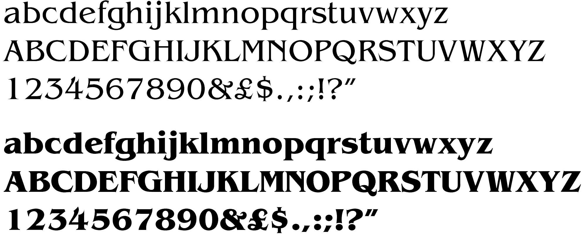

ITC Benguiat Gothic, 1979.
A technology-concerned approach: Lucida
The Lucida family (serif and sans) is the result of the work of two partners: Kris Holmes and Charles Bigelow. After researching on legibility in low resolution devices, they developed the type to strictly match the limitations of laser printers.10 This quality is expressed in the characteristics of sturdiness (“erosion-resistant serifs”), simplicity (“polygonal” shapes for avoiding the noise of printer marks), rationality (modular and predictable units for the raster) and averaging (screen resolution resistance). Bigelow (also designer of Apple Chicago and Apple Geneva) is a professor of digital typography at Stanford University and has been prolific in articles through the 1980s, when changes in technology succeeded each other at a dizzy space. In fact the serifed subfamily had to be provided in specific point sizes (6, 7, 8, 9, 10, 11, 12, 14, 18 and 24) which indicates the very first limitations of DTP publishing.
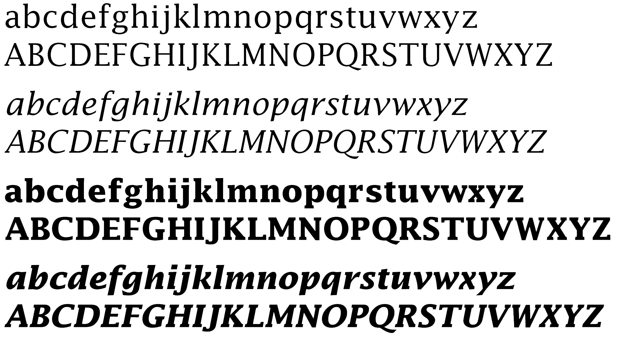
In terms of aesthetics the type is an interesting example for analysing, since its forms suppose to be the result of an interaction between those technical needs and particular purposes of the designers in relating the type to historical issues. Thus Kris Holmes, while describing the text ‘colour’ of Lucida, mentions as an inspiration Jan Tschichold’s singular taste on “open text rhythms” of 16th century book types. And later on she touches on Francesco Griffo’s type cuts to historically support the fact that the capitals of Lucida are slightly shorter than the ascenders.11 The simplicity of Lucida Sans is personally more suitable in the roman than in the italic. Perhaps the angle used in the italic sans, which seems to be the same than that of the serif version, results here in a slightly forced situation and also accounts for a very ‘speedy’ effect. On the other hand, the serif italic colour naturally combines modularity and angularity and of course a handwriting atmosphere is better achieved. The family has been developed until 1995 with more than fifty different variations.
A 'genetic' approach: Stone
Sumner Stone developed his family of types as being director of typography at Adobe Systems Inc. in California between 1985 and 1989, period during which the desktop publishing was born and rapidly spread out. For this circumstance and also for his historical consciousness, probably related to his background on both calligraphy and sociology, he has been one of the most relevant references in digital typography in the 1990s. In his book On Stone, the art and use of typography on the personal computer (Bedford Arts, San Francisco, 1991) he exposes some interesting points of view on the history of letterforms and on computer technology, as well as a good comment on the evolution of typographic techniques.12
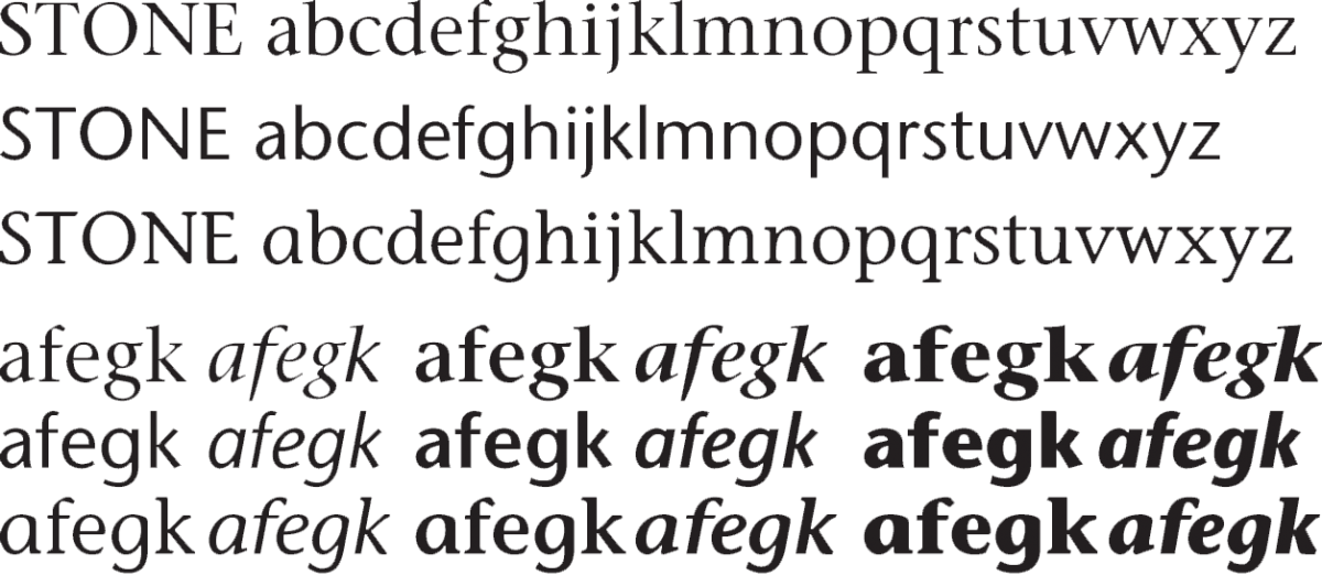
The Stone family, thus the first original typeface of Adobe Systems, consists of three sub-families: Serif, Sans and Informal, in roman and italic alphabets, all of them declinated in three weights: medium, semi-bold and bold. This first idea of a superfamily cannot be but the result of the ‘biological’ nature of Stone’s approach. He talks about the ‘family trees of letterforms’, remembering the D.B. Updike’s subtitle for his Printing types: “A study in survivals” (which touches on the Darwinian idea of ‘the survival of the fittest’). New types come from old types in a way that it is reminiscent to the relationship between child and parent. Maybe for this reason, he says, the history of typeforms has frequently used the language of biological evolution. It results of particular interest the harmonic proportions of lowercases in the sans version, specially in the medium weight. An innovative aspect of the family is also the introduction of an informal face, which basically consists of an italic form adapted to an upright structure. This is more visible when taking a look at the informal italic. Then the strategy has been to leave without serif some parts of letters where it would be expected to have. This version of the family has not probably been used as much as its companions but it has undoubtedly constituted an influential face since it opened some new room for type designers to experiment.13
The really huge variety of new faces that appeared in the late 80s and the 90s with the introduction of Macintosh, and which impetuously developed under more irrational paradigms such as illegibility, fusion, metamorphose, fun, imitation, irony, scepticism, has been frequently seen as a return to (instead of functional) an ‘emotional’ or ‘pictorial’ typography. However some type designers have kept their purposes on text reading (it is a purely ‘functional’ area) and have reached very good results that also became very popular in the market. Probably one of the most rational approaches has been done in Germany: the Rotis program.
The philosophy of austerity: Rotis
“The crisis of modernism lies in the fact that thought and criteria concerned with making are replaced by an aesthetic vision” (Otl Aicher).
Perhaps nobody as the German designer Otl Aicher has performed in visual communication with such a committed ideological way of thinking, whose origins go back to his participation in the aggressive times of the Hochschule für Gestaltung in Ulm, from which he was a founder member in the early 1950s. His extremely radical points of view, some times also obstinately polemic, have been reflected in his book The world as design (1991), a very interesting collection of essays rich in political and cultural opinions. It was unfortunately set in his cold Rotis Sans, without uppercases and alternative colours (say) bold or italic, which obscures the book’s readability.14 Of course it would be hardly possible to inscribe this phenomenon under the category of “third modernism” for which Aicher had spent his life toiling away.15

This very German aseptic idea of design was the axis of the concept of a ‘third modernism’ he passionately defended against cosmetic design and aestheticism, and is visible not only in his work but also in the particular integrity of his life. In the middle 80s Aicher was commissioned by the printing firm of Maack in Lüdenscheid to settle in Rotis and develop a typeface family that could cope with a new high standard of “recognizability, legibility and reading speed”. The result of that project is well known, though it would be hardly possible to surely ascribe this success to real advantages of the design. Perhaps the very promoted methodical nature of such a rational approach that resulted in a typographic program of serifed, sanserifed and hybrid faces constituted by itself a loud promotion for the fonts.16
The entire system has four variants: sans, semi-sans, serif and semi-serif (in the original names: grotesque, semigrotesque, antiqua and semiantiqua) and dissimilar alternatives in weights. Of the whole family the semi-serif personally seems to me the best balanced face since its slight contrast between thicks and thins tempers the general stiffness of the structure. Unfortunately this subfamily lacks of the wider variety of the sans and semisans versions. In the general design it is distinguishable the c and particularly the e, which seems to flaunt a very high waist, as it would be an old fashioned man who has tightened his belt too close to his neck, expressing that holistic, strict approach to life.
Other related sans and serif families
Particularly Stone and Rotis have been the inspiration for several ‘serial’ type families, since the idea of creating compatible and interrelated serif and sans faces became a natural event in type design. The following are some examples:
Quay (1985) and ITC Quay Sans (1990) designed by David Quay (UK).
Corporate A.S.E. (1985-1989) designed by Kurt Wiedemann (Germany) . As a part of a corporate identity project for Mercedes Benz, he developed three interrelated typeface families, and associated the ‘serial’ nature of the program to the three classic orders: Doric, Ionic, and Corinth.
Officina Sans and Serif (1990) designed by Erik Spiekermann with Just van Rossum (Germany). One of the most successful types of the 1990s.
Scala (1991), Scala Sans (1993) and Scala Jewels (1996) designed by Martin Majoor (The Netherlands). Scala Jewels is a curious program of four decorated typeface based on the capitals of Scala bold. It includes Crystal, Diamond, Pearl and Saphyr.
Thesis (1994) the hugest type program ever made, composed by Luc(as) de Groot (Germany), between 1989 and 1994. The family is divided in three sub groups: TheSans, TheSerif, and TheMix and consists of eight different colours, which results in 144 alphabets. The signs are particularly ‘rhythmic’ and have a forward stress.
Le Monde (1995) originally designed by Jean-François Porchez (France) for the famous newspaper, but expanded afterwards in some alternatives: Le Monde Sans, Le Monde Titre, Le Monde livre, etc.
Quadraat and Quadraat Sans (1992) designed by Fred Smeijers (The Netherlands).
Conclusion
It would be difficult to register all cases of ‘serial’ type families around the world, but at least a representative overview has been intended here. As a conclusive thought, I would like to stress again on the idea that the concept of ‘serial’ naturally suits type design, mainly for two reasons.
Firstly following my initial speculation according to which this would be an inherent aspect of its nature: type design has a ‘serial’ nature by itself. Letterforms one by one have to match the desirable uniformity inside the alphabet, and the different alphabets that compose a fount have to be interrelated as well. The resulting total spirit we call ‘consistency’ constitutes one of the basic parameters to judge the quality of a typeface. Then the idea of ‘series’ would be an inherent aspect, regardless of the direction in which the series can be extended: weights, serifed, un-serifed or mix versions, condensed or expanded, ornaments, math signs, phonetic or musical notation systems, alternatives characters, swashes and ligatures, in sum: series extended through all kinds of qualities of typeforms. In fact type designers have nowadays to deal with an enormous amount of signs. Not only because of the standardised wider characters sets, due to the increase of cultural and language exchange in the world, but also because perhaps there seems to be a non-written rule about how a contemporary typeface family should be in terms of the alternatives it offers. A complete font is not today a real complete font if it does not include, apart from lowercases, caps and their italics, also small caps, ranging and non-ranging figures and all the correspondent weights, usually not less than four (something that is not a big dealt since type design softwares developed algorithms of interpolation).
And here the second reason for explaining the success of ‘serial’ ideas in type design comes up: the possibilities offered by computer technology. Thus let us take as an example Thesis, made by Luc de Groot. It has probably reached the limits of designers’ endurance, since 144 alternatives in just a type family does not seem to be a universe of clear references.17 But such a vast program, even though carried on in a long period of time, would be inconceivable without computers.
Adobe’s Multiple Master is another example of ‘serialisation’ allowed by technology: how to exploit as a typesetting tool the idea of manipulating a wide range of alternatives (in weight, in style, or even in ‘body’ sizes), although the limits are already established by the designer.
The computer technology has then been having a decisive roll in this new concept of ‘superfamilies’. Words as ‘program’, ‘series’, ‘sequence’, ‘variations’ perfectly suit the logical world of computing.18 However, if this approach to type design, which can be seen as a ‘boom’ of the last fifteen years, will remain in the future or will be remembered as a characteristic of our age, would be difficult to assure.
References
Aicher Otl, The world as design, Ernst & Sohn, Berlin, 1994.
Bigelow Charles and Jonathan Seybold, “Technology and the aesthetics of type – maintaining the tradition in the age of electronics”, The Seybold Report, vol.10, no 24, 1981, pp.3-16.
Friedl Friedrich, Nicolaus Ott and Bernard Stein, Typo, an encyclopedic survey of type design and techniques throughout history, Black Dog & Leventhal, Köln, 1998.
Holmes Kris, “Lucida: the first original typeface designed for laser printers”. Baseline, no 6, 1985, pp 12–13.
Krimpen Jan Van, A letter to Philip Hofer on certain problems connected with the mechanical cutting of punches, a facsimile reproduction with an introduction and commentary by John Dreyfus, David R. Godine, Boston, 1972.
The aesthetic world of Jan Van Krimpen, book designer and typographer, brochure of an exhibition, Museum of the book, The Hague, 1995.
Lucida, the first typeface family designed for Laser Printers, presentation of the typeface by Imagen, Santa Clara (CA), 1985.
Morison Stanley, “Type reviews: Bernhard roman, italic and script”, The Fleuron, number VII, 1930.
Morison Stanley, “Towards an ideal italic”, The Fleuron, number V, 1926.
Mosley James, “New approaches to the classification of typefaces”, The British Printer, March 1960.
Paris Muriel, Le Petit Manuel de Composition Typographique, edited by the author, Paris, 1999.
Stone Sumner, On Stone, the art and use of typography on the personal computer, Bedford Arts, San Francisco, 1991.
Tracy Walter, Letters of credit (a view of type design), Gordon Fraser, London, 1986.
Wiedemann Kurt, Corporate A.S.E. – Eine Schrift-Trilogie im klassischen Kanon für den Einsatz in den elektronischen Medien und für die Ansprüche einer corporate culture, Stuttgart, 1990 (leaflet provided by Christopher Burke).
- Thus James Mosley, in his article “New approaches of classification of typefaces” (The British Printer, 1960), emphasises the need of revising and re-standardising the actual terminology used to describe typefaces, something that could be successfully instrumented by users of types. This very concrete desirability of achieving a more precise set of words in order to describe all the specimens and trying to avoid the natural asymmetry between countries, languages and different historical interpretations, indicates the insufficiency of every past attempt.. ↩
- That variety is the result of successive changes in technology and the desirable constant sense of improvement of type designers. Hence since we are day by day dealing with new types the problem does not seem to have a definitive solution. Moreover, those different approaches to classification of typefaces have added more complexity to the subject, which would allow us to suggest that typeface classification is something ‘alive’ that asks for a constant process of updating and rethinking. ↩
- It would however be possible to say that these concepts are inherent to type design, since each individual letter is a note in harmony with the whole melody or, in Sumner Stone’s words, “a variation on a basic dance step”. Though more apparent this idea, which is a clear heritage of the “writing hand” of calligraphers and scribes, is still constitutive of type design in terms of uniformity: each sign has been made by the same tool or, at least, there is a common principle that governs the ‘consistency’ of the whole alphabet. ↩
- Walter Tracy, Letters of credit, a view of type design, Gordon Fraser, London, 1986, p.108. ↩
- Stanley Morison, “Type reviews: the Bernhard roman, italic and script”, The Fleuron VII, 1930, p.189-90. ↩
- Morison extensively exposed it in his famous article “Towards an ideal italic” that appeared in The Fleuron V, 1926, pp.93-129. ↩
- But unfortunately the technical limitations of metal setting prevented the original plan from keeping. In order to be practical while setting, the very long ascenders and descenders of Cancelleresca made Van Krimpen decide to place the type in a different body (one-quarter larger) than that of the corresponding size of the roman. This could allow the typographer to keep constant the height of types in the text line. But some sizes could not have companions because it would have resulted in “unnatural sizes”. So the costs of cutting the fonts in a wider quantity of sizes caused the Cancelleresca family to be used more as an individual type rather than a member of the family. ↩
- He denied to recognise the different origin between the roman and Greek alphabets and thus unnaturally modified the calligraphic spirit of some Greek letters. Moreover the proximity between both alphabets in proportions, weight and shapes, made them confusing to use in the same text. ↩
- With the condensed versions completed in 1979 there were twelve colours altogether: book, book italic, medium, medium italic, bold, bold italic, book condensed, book condensed italic, medium condensed, medium condensed italic, bold condensed and bold condensed italic. ↩
- Though the manufacturer Imagen was happy to say that the typeface could survive almost every kind of process. ↩
- Holmes Kris, “Lucida: the first original typeface designed for laser printers”, Baseline no. 6, 1986, pp.12-13. ↩
- Though, it must be said, the section dedicated to promote the use of his own typeface is slightly insistent. ↩
- The idea of an informal kind of typeface is although not very clear as he seems to assume, even though he derives it from the idea of an informal writing (he mentions typewriters and personal documents). ↩
- The reason for this definitely ‘anti-functional’ idea has to be found in the dogmatic respect the editors gave to Aicher’s preference of lowercases: “Perhaps it underlined his scorn for the pompous” says Norman Foster in his preface. ↩
- Thus, when he precisely refers to Norman Foster’s buildings, he supports: “…there is a new sort of aesthetic. It also appeals to the mind. These buildings can be read, understood. You discover them. What you see is what it is because it is more reasonable than the other way round. You discover ideas, logic, wit. It is not pure mood aesthetics, dull feeling. There is also no zeitgeist expressed here, no world feeling, one sees one of the best possible solutions to a set of questions”. ↩
- On describing that project nothing really essential has been said in his book, except that he was aware about the impossibility of controlling two decisive factors in every future composition: distance of reader and free space. ↩
- So the users have to know very well the specimen in order to manage such a variety of alternatives and then to be able to take real advantage of them. ↩
- If we think of people like Peter Karow, Charles Bigelow or Donald Knuth, who in some way can be considered as authorities in the field, they have had a clearly mathematical or computing approach to type design. And in fact, the incorporation of this relatively new knowledge (mathematics, computing, programming) has apparently contributed to a more ‘professional’ idea of the trade. Maybe this is also the reason why ‘serial’ typefaces families have become so popular. ↩