Thanks to the visit of Thomas, I understood that the work they do is difficult to do, that they rather do it as a team, and that it requires a degree of coordination, concentration and persistence that is only possible in long hours of coexistence. In addition to dialogues around typography, we exchanged mates and delicious coffees which Thomas personally used to prepare with great affection.
In his book Detail in typography Jost Hochuli states that ‘our letters have grown slowly’ (2008), referring to a clearly long process through the centuries. Talking with Thomas and being close to the PampaType typographers has made this prayer acquire a particular dimension, which places my attention on the singularity of the complex and permanently revised relationship among the letters, the space between them, the word, the textlines, and its distances.
AP: Thomas, first of all I’d like to tell you that I really enjoyed meeting you and seeing you working every day during these four months, partially sharing our daily spaces. I would like to know how your typographical training was before PampaType.
TB: I started my studies at Estienne in DMA Typographism (diploma of Métiers d’Art) where I could understand the basic concepts of type design with Franck Jalleau and Michel Derre. At that time I did not understand the purpose of the creation of fonts and I found that this discipline required a lot of time and that is also repetitive. This put into question the pleasure I felt when I drew letterforms. Coming from the world of graffiti, I used to focus only on the formal aspect of the text while not taking into account the need for uniformity from one letter to another.
After obtaining my DMA, I went to the ESAD in Amiens in graphic design. Surprisingly, it was at this school where I could really unlock my potential as a letter designer. This discipline became a real passion for me. I think it took me a while to understand what I had learned from Estienne. So I got my DNAP in Amiens without being able to continue the Master there. I think my profile was not adequate with the training they propose. My teacher in typography took me to an internship in his graphic design studio and suggested that I could combine travel and professional experiences. This idea really pleased me and I made sure to get internships in different parts of the world.
I did an internship with Xavier Dupré in Cambodia. And now I developed this internship for four months in Córdoba, Argentina, in PampaType. The idea has been to meet and work with designers of different types of visions and, later, to forge my own conception of the discipline.
How did you know about this possibility of doing an internship with Alejandro Lo Celso?
I met PampaType’s work two years ago on the Internet and I always liked their approach to letters. I try to conceive timeless characters that do not forget the history and the sensitivity letters could have before our nowadays’ digital vectors, and therefore, letters whcih do not follow a perishable trend. In that sense, I found the work of PampaType very interesting. So I sent my CV and my portfolio, and later we could agree on the work modalities and the tasks that I could develop during the internship.
What were those tasks finally? I know you were working on an extension of Rayuela: What procedures did you find most challenging? How do you feel modifying something that was created by another typographer?
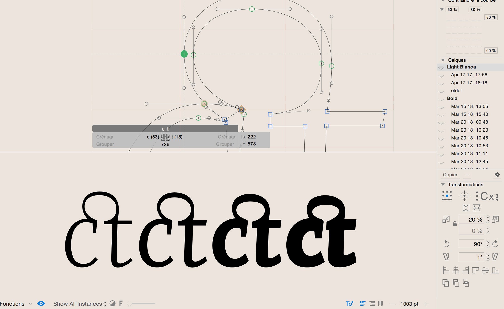
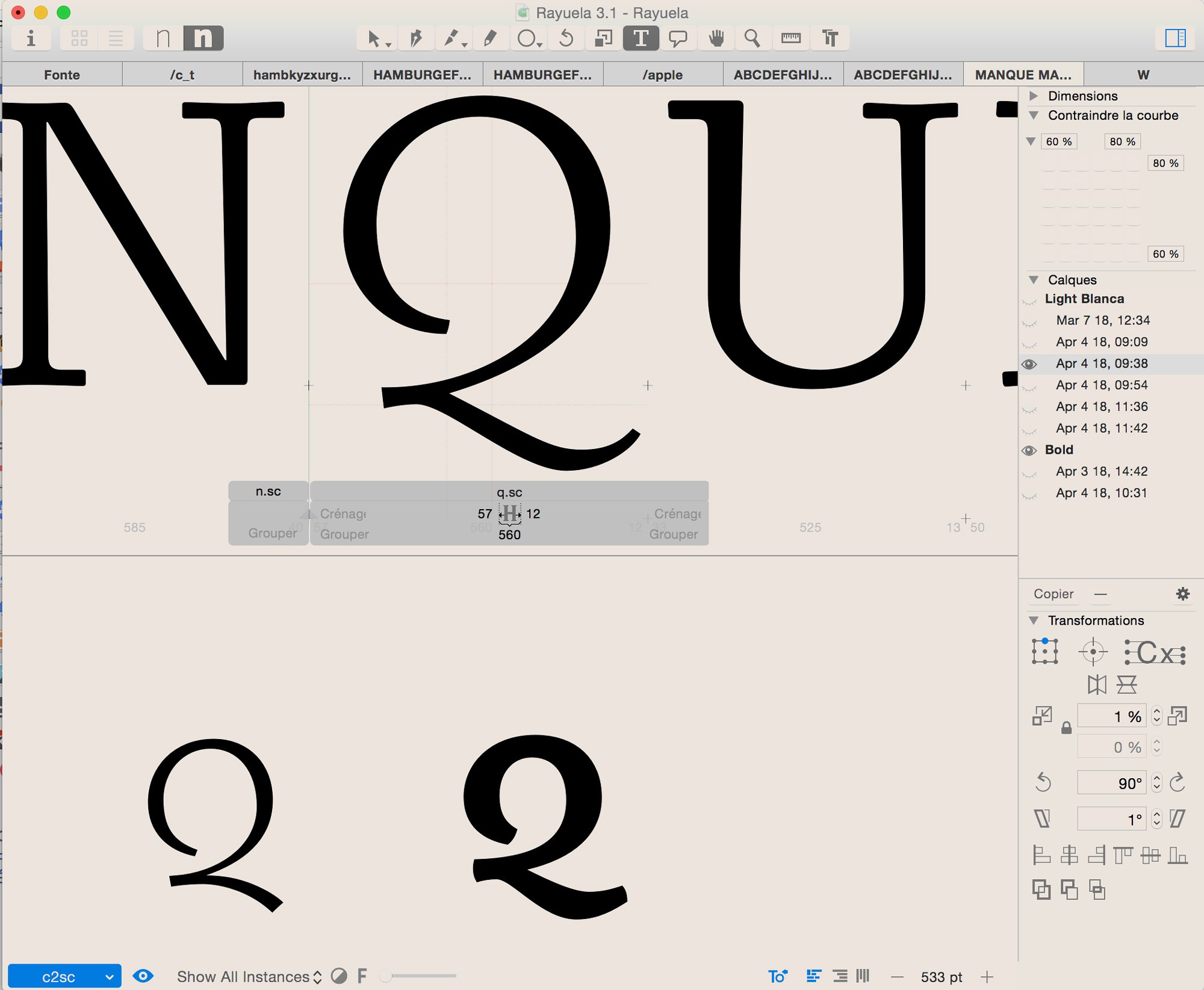
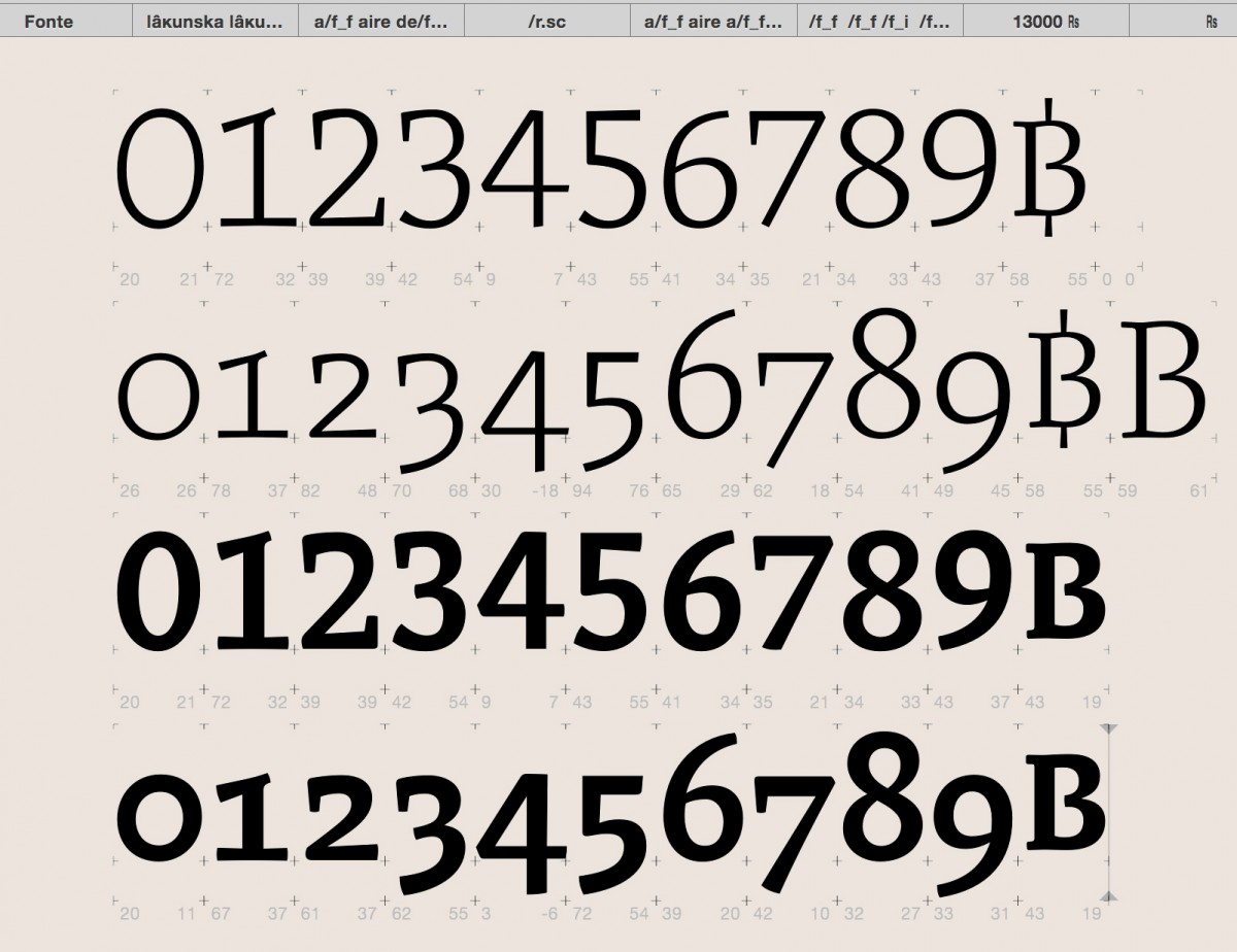
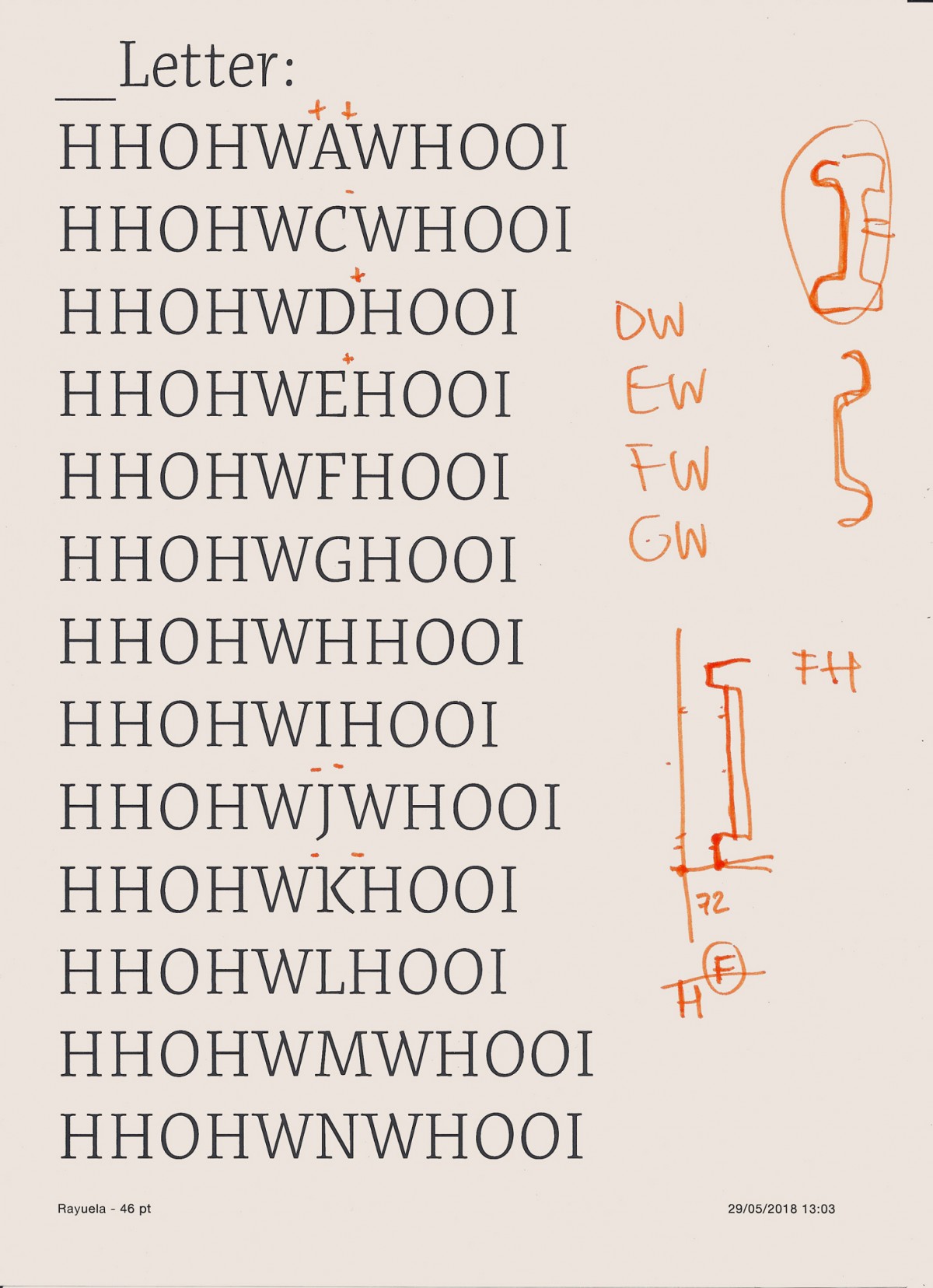
The tasks that I carried in PampaType were more of a technical nature. On the one hand, I learned to make two weights of the same family compatible to make an interpolation. This exercise was very significant to me. The number of nodes, the direction as well as the starting point of a vector must be identical from one master to the other within every glyph. Sometimes, when a glyph design is not the same in the light version than in the heavy, for legibility or even design reasons, it becomes necessary to make a precise optical correction in the interpolation.
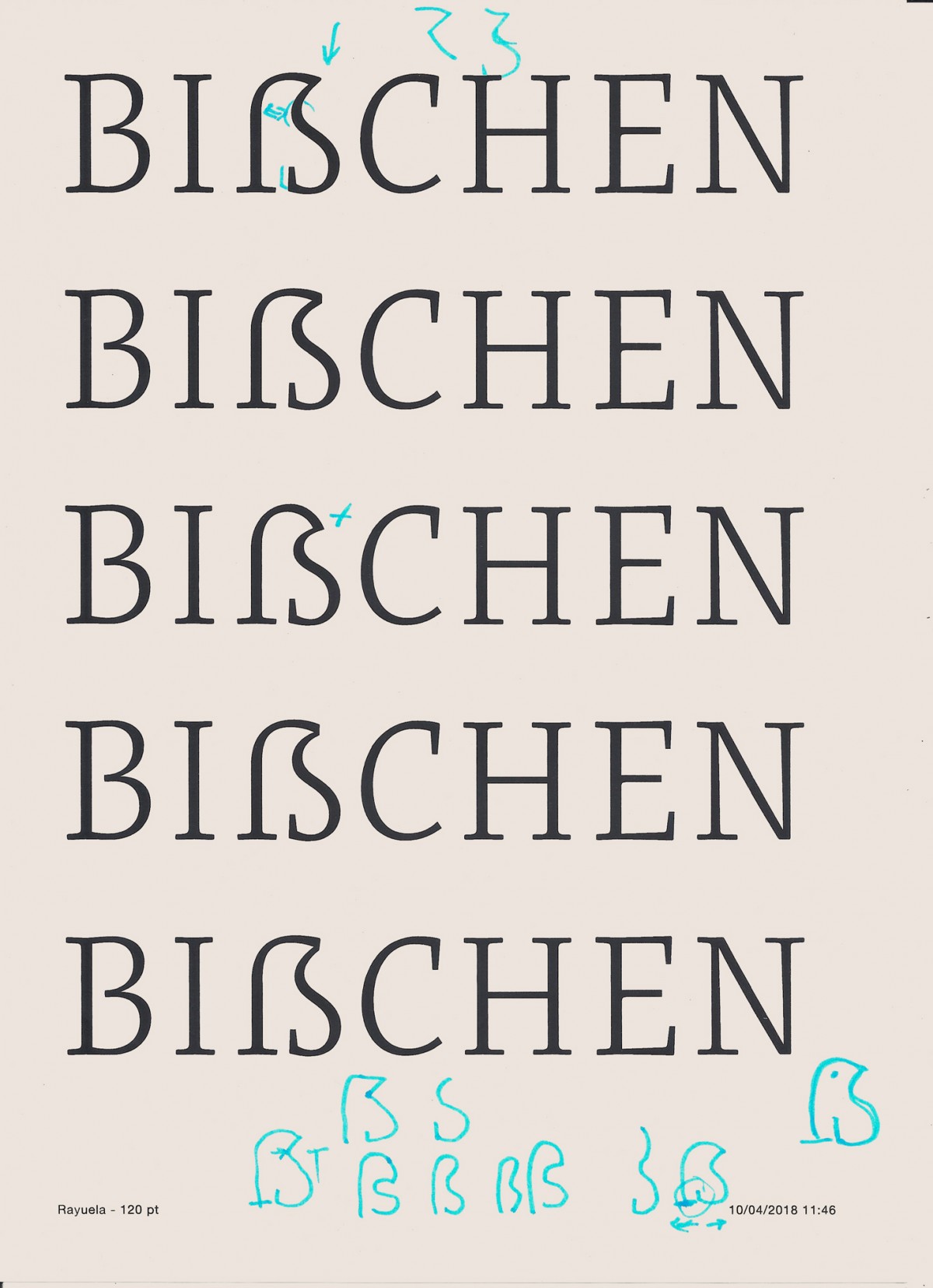
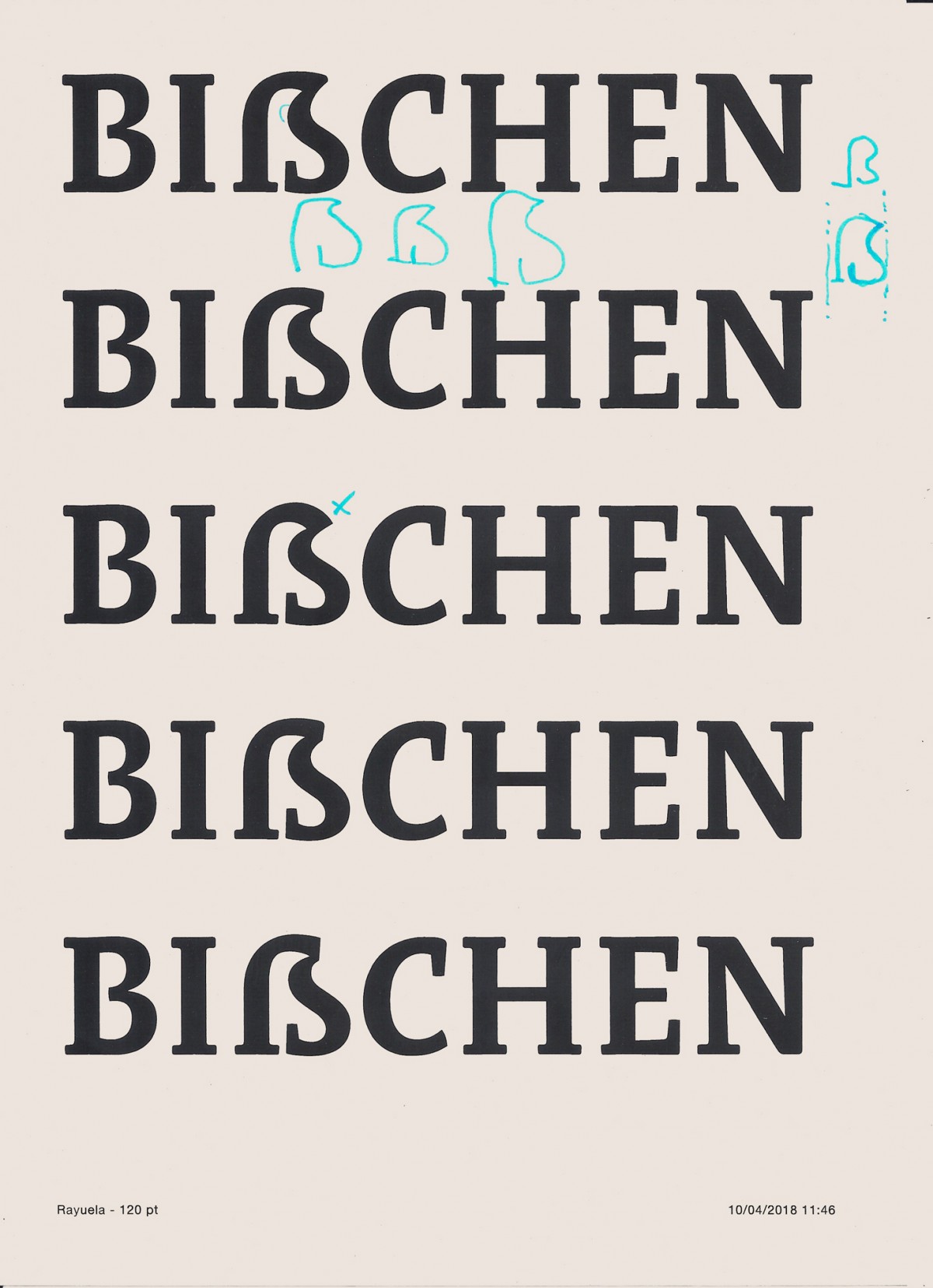
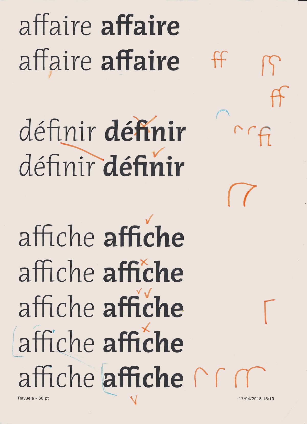
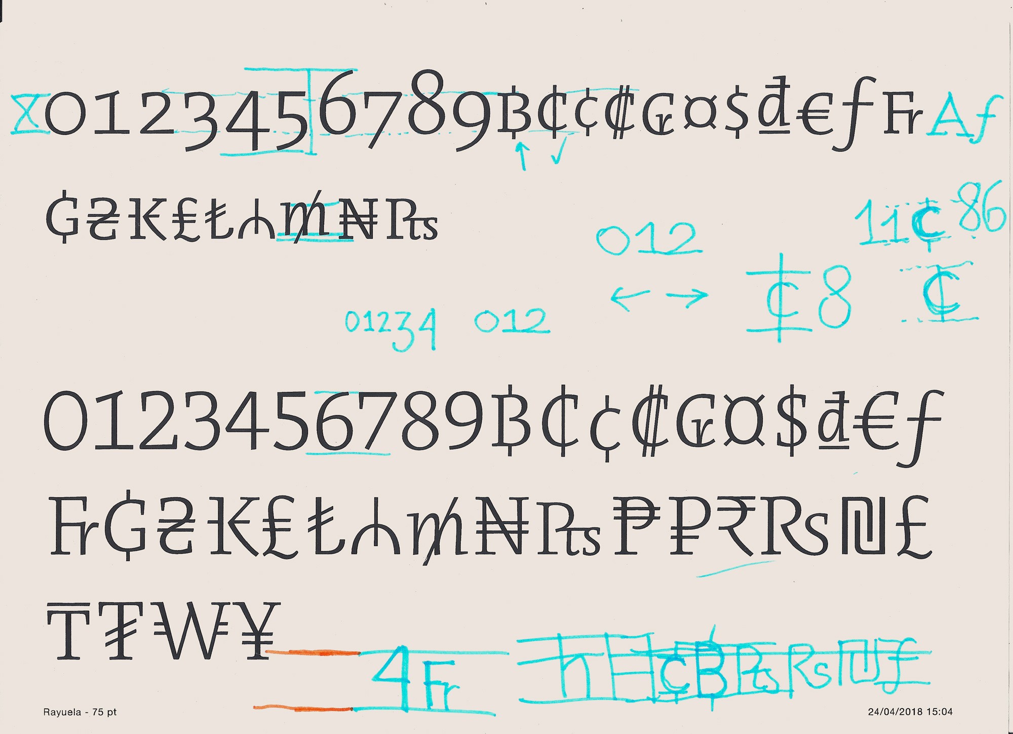
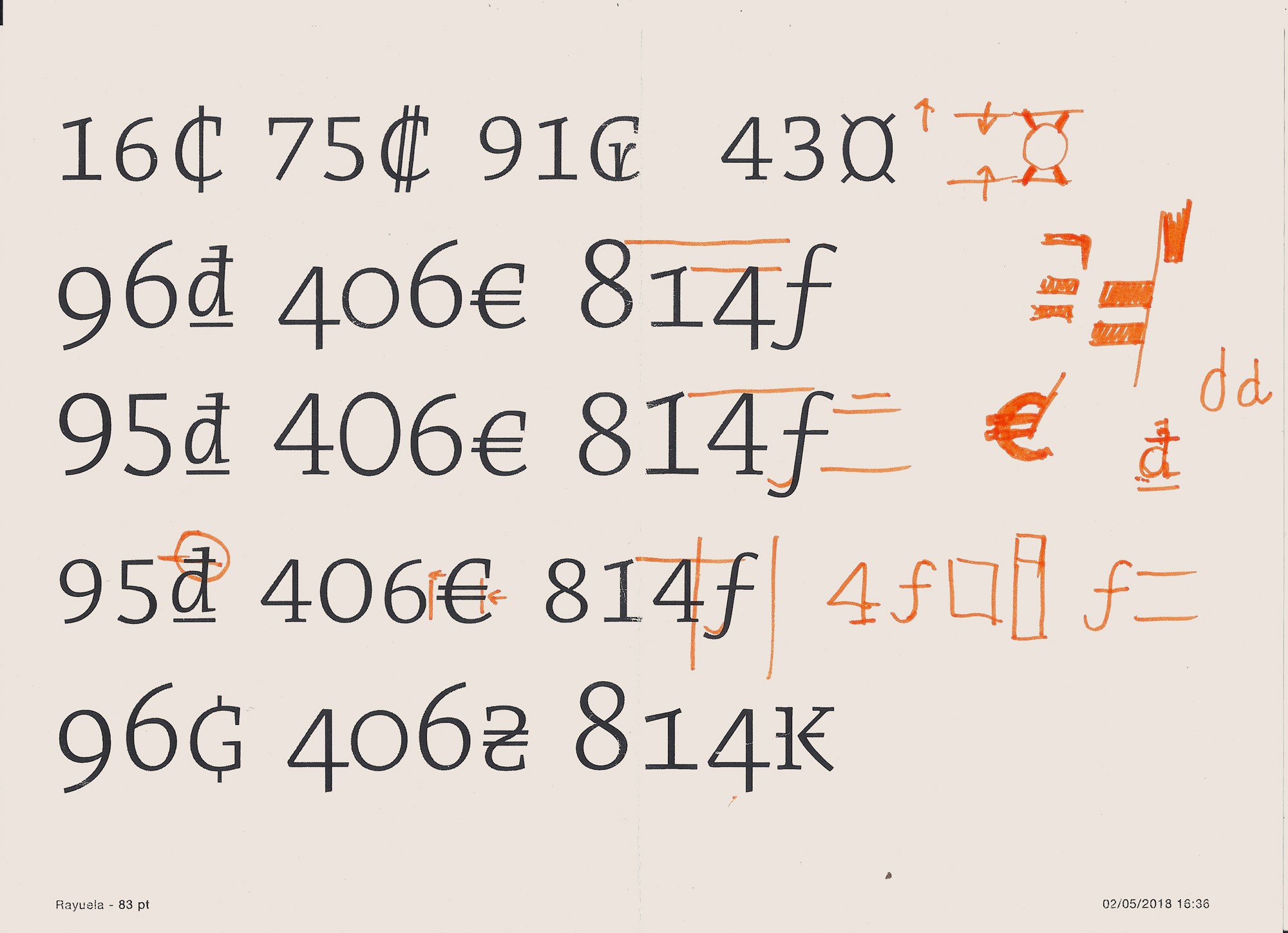
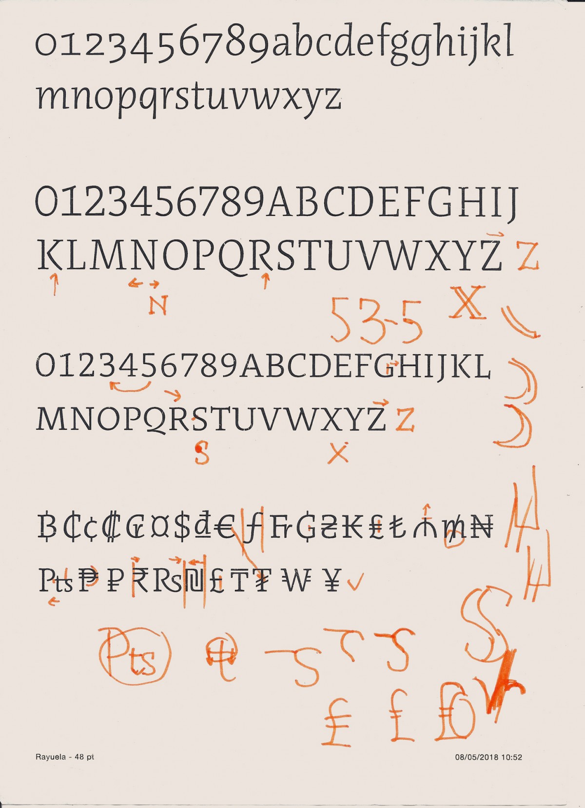
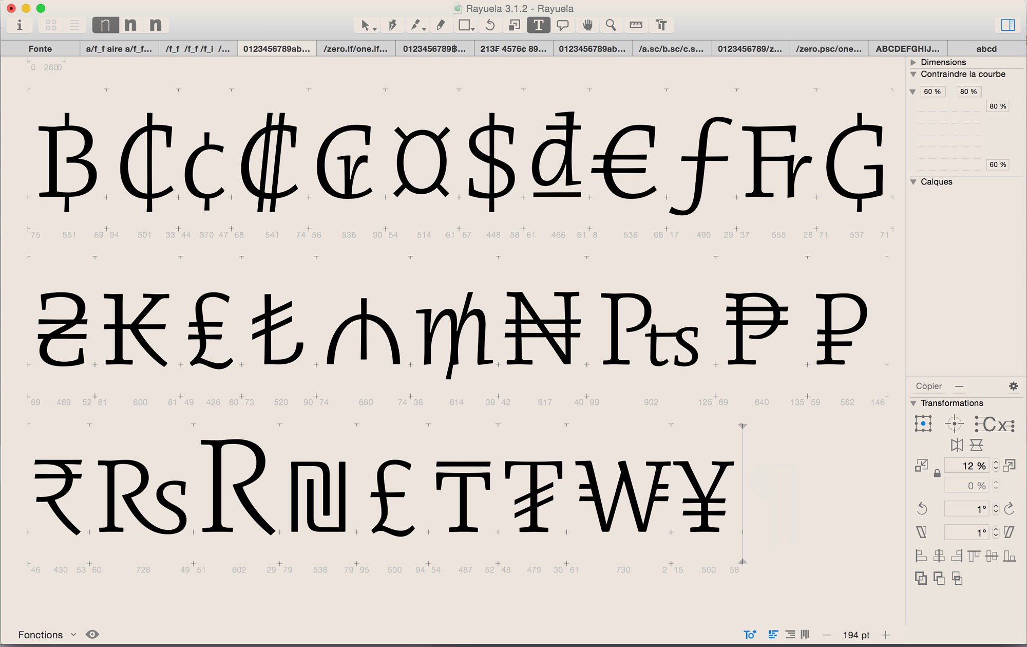
I could also draw monetary signs, special ligatures such as ct and st, and even rectify or adjust some Rayuela characters drawn years ago in PampaType, regarding the shape, style, sensitivity, details. It is a unique opportunity because it is never easy to work on a design that is not your own. It is necessary to observe every detail and then use forms of other signs, combine them with other forms, especially in constant iteration with the designer (Alejandro Lo Celso) who points out the design problems. The learning process that this exercise allows for is very interesting: it makes you consider the curves, the counterforms, to move the nodes and the handlers of one or two units, quickly improving the typographic precision.
Rayuela is a typeface with sensitive forms, with a singular stress in cursiveness. It is already complex for its hybrid aspect, but also its shapes change from one weight to another. Its appearance is very dry and tense in the light version, the angles are sharp and marked, while in the heavier tend to be rounded and the whole becomes softer. It is an interesting family because of this, because the sensations are different from one weight to another.
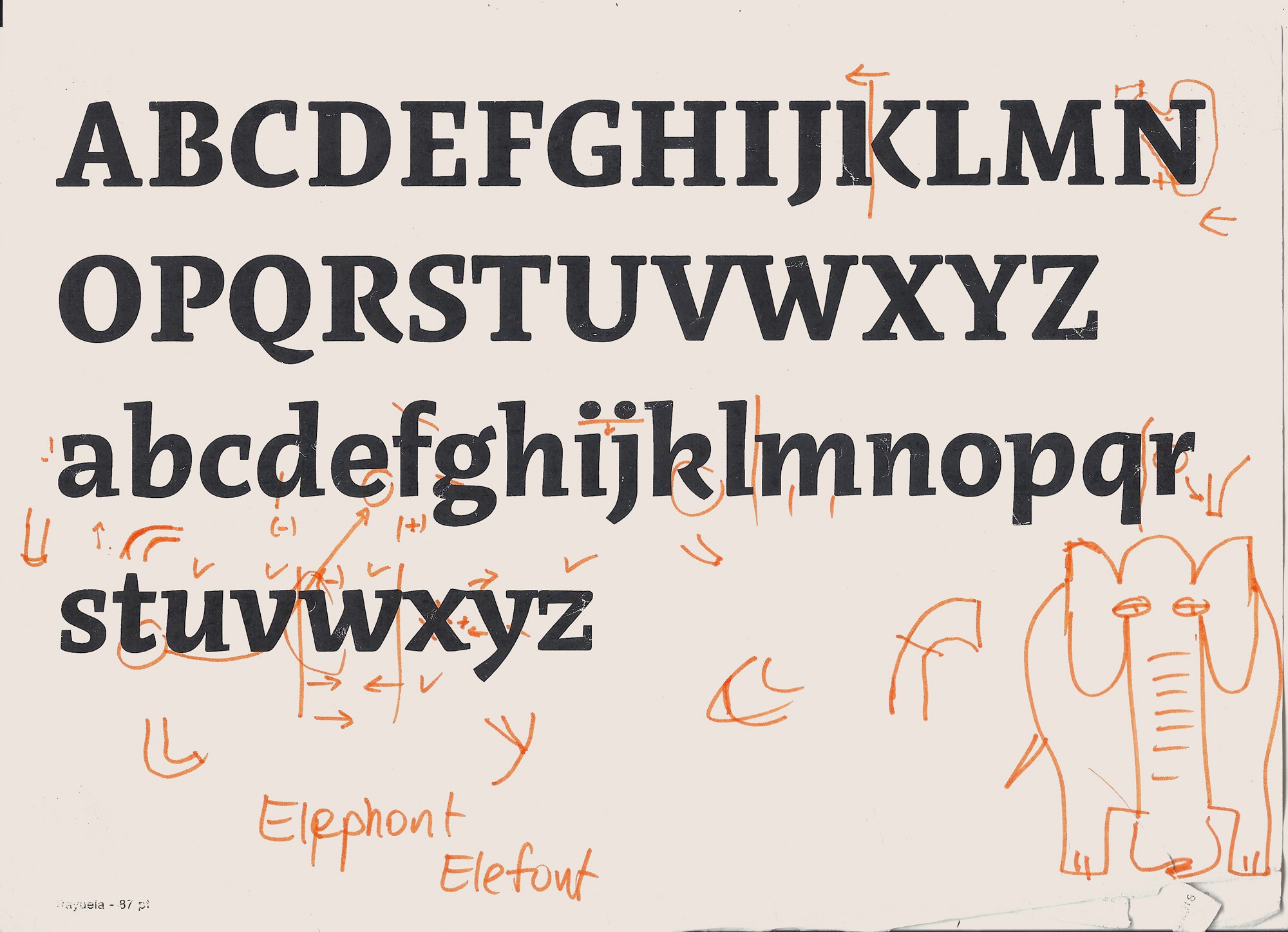
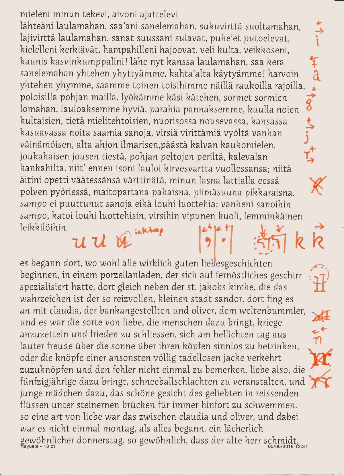
I also learned how to make a good spacing between letters. Before arriving at PampaType, I used to think that I knew how to do a proper spacing, but I realized that it was a more complex task that required time and concentration. It is essential to print regularly, set a rather generous space and then tighten it gradually to get the most interesting spacing for the type. In short, a well-drawn character badly spaced makes it ultimately bad; a bad spacing ends up affecting the drawing and the rhythm.
Then there is the kerning (the setting of specific pairs between characters) that must be added to the spacing. This time it is about rectifying the spacing in letter combinations that create countershapes that are too large or too small. A very repetitive but essential task to make the character functional. This step is also an opportunity to review everything and sometimes modify some details so that the kerning is perfect.
Did your training as a student allow you to carry out these tasks or did you have to learn many new things? What was the most significant thing about your experience working with Alejandro and Guido? How did this modify your knowledge as a type designer?
I think that my training as a student really did not open the way to the technical aspects of type design. When I was in Estienne’s DMA typography, the learning was really centered on the drawing of the letter, to understand the flowing typographic forms of calligraphy. The courses were divided into two parts, learning the historical calligraphic models and then digitizing the reinterpretations of these historical models. When scanning, we tried to find an appropriate medium term between the over simplification of some complex forms and the sustaining of the original gestures and the sensitivity of the texture that was being considered.
It is obvious that I learned a big deal during this internship in both fields, type design and production. Because Alejandro Lo Celso and Guido Ferreyra have constantly pushed me to find problems of drawing, logic puzzles in the forms or homogeneity in some details, and I learned about the long production work. My stay in Argentina reassured me a lot about this typographic challenge. Before I was afraid of having to face the development of a character, I had difficulties to solve issues of kerning, spacing, interpolation... I had asked myself many questions about all this, but without getting definitive answers. This internship helped me to understand the whole process of creating a character and thus pass through each of these stages without fear.
Thank you Thomas, for your careful disposition towards dialogue. I hope that in the future you can return and continue with the experience started. ¡Hasta pronto!
Alejandra Perié (Posadas, Misiones, AR 1970) holds a PhD in Fine Arts (UCLM, Spain), is an artist, researcher and teacher. She studies multiple relationships between art and design from socio-aesthetic perspectives. She currently lives and works in Córdoba. She has a degree in Painting and a PhD in Fine Arts from the University of Castilla La Mancha. She completed and passed her postdoctoral studies at the CEA, Córdoba, 2016. She is a Professor in the Bachelor's Degree in the Department of Visual Arts, Faculty of Arts, UNC and in the Bachelor's Degree in Design, Faculty of Art and Design, Provincial University of Córdoba. She teaches postgraduate courses at the Faculty of Arts, UNC and at other universities. She is a visual artist and designer and coordinates two studios called Alfar Ap-press and Alfar Textil. Her artistic practice links, in the last section, painting, textile work, typography, handmade printing and other related practices. The production of these studies has been exhibited in different exhibitions and spaces in Córdoba and Argentina. She has published several books related to art, design, iconicity and metasemiosis, such as: Fernando Fraenza and Alejandra Perié, Design: from meaning to action, Editorial Brujas, 2015; Alejandra Perié and Fraenza Fernando, Painting and surroundings. For, or towards, a critique of the art institution in Córdoba, Editorial Brujas, 2020. She has participated as a jury in various editions of the Art Fair in Córdoba city.
alejandraperie.com.ar
IG @periemaria
[email protected]