‘Writing only speaks of the past to bury it. It is a tomb in this double sense that, by the same text, it honors and eliminates’. 1
Michel de Certeau, The Writing of History), 1975.
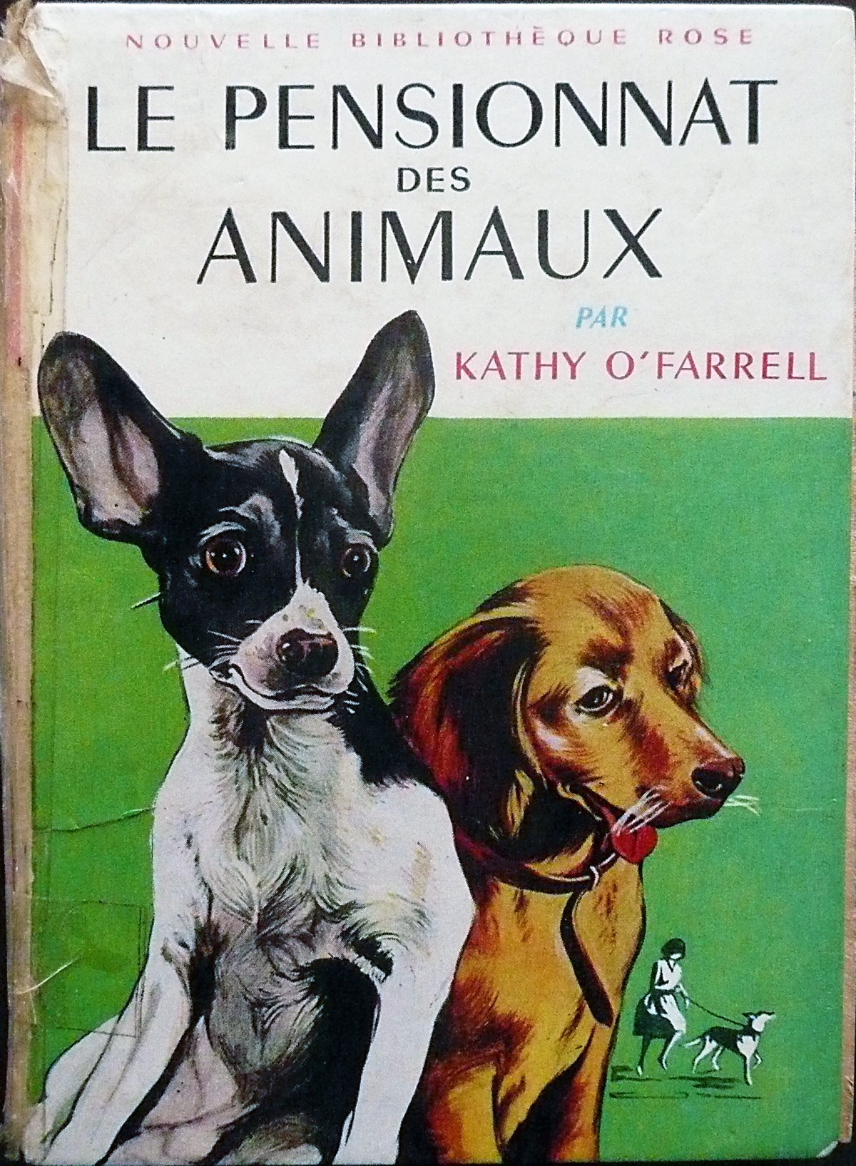
Kathy O’Farrell’s Animal Boarding School, small illustrated volume of the New Pink Library, was one of my favorite books. I forgot in what circumstances it appeared in my life as a child, but he never left me over the removals, resistant, despite its very poor condition — the cover is detached from the back, the inside separated into three parts, formerly patched with Scotch tape; it continues to accompany me. I have read it many times: it tells the story of the five children of the Collins family, living in a small English village, and their efforts to collect, save, and feed several animals. Very quickly, they found a club, the Friends of the Beasts. The first decision they take, spontaneously, is the creation of a badge, the stylized silhouette of a cat: “You make two rounds for the head and the body, you add two ears, a tail and mustaches. Nothing easier. Besides, we will have to deal with cats.”
Beyond the moving power of this collective action, modest but carrier of respect and hope, I capture, re-reading, the index of a future interest for a very old practice (draw, repeat, dispose of , share a sign), long before a journey without a real vocation begins, which has been invented as it goes on as possibilities, opportunities, and forks.
When Jérôme Knebusch invited me to write a text for the new edition of the catalog Pangramme: learning type design, intended to complete the ‘Bibliography in images’, composed of covers of books forming a combinatorics among many others about the scripts, typography and type design, I was confident, excessively, in my ability to sketch a micro-historiography of these objects with multiple forms —monograph, manual, collection, facsimile, catalog, conspectus, atlas… Wasted effort, I had to give up this too complex essay after several unsatisfactory approaches. Therefore, I want to apologize for the autobiographical evocation that replaces it. Beyond the personal testimony, it tries to recreate an experience made of contiguous activities, between teaching, research and publishing, from which the books form the faithful wake.
At the beginning of the 1990s, the higher technical certificate in visual communication at the Estienne school was devoid of any historical initiation. It was as if, from the outset, our professors took it for granted: We were students who were sufficiently learned to master all the subtleties of genres and typographic uses, or we had to rapidly acquire this culture by our own. The book that mattered most to us, while desktop publishing was slowly gaining ground, was the Mecanorma catalog, in which we selected and photocopied models of alphabets for our projects.
My readings really started in the most appropriate setting of the option Typographic creation of the higher diploma of applied arts (or ‘DSAA typo’) a training that the typographer Franck Jalleau and the calligrapher Michel Derre had just founded in the Estienne school, and in which some of his professors, Catherine Ballestero, Jean-Louis Estève and Francis Freisz contributed too. This new curriculum did not include a history course, but Catherine’s contribution was essential to make us understand the affinities between literature, poetry and typography. We also participate from time to time in intense seminars led by Gérard Blanchard, a spirit always open to the ramifications and connections that enthusiastically prepared his work Help for the choice of type 2 and provided references. During this decisive period, some important books were published, such as Calligraphy by Claude Mediavilla and especially The Gutenberg Effect (L'effet Gutenberg) by Fernand Baudin, whose overall qualities and open erudition impressed me deeply.
In 1997, besides my work as a graphic designer, I returned to Estienne to teach the history of writing and typography in this same course, without asking too much about how to do it or how to transmit it to the students. It was enough to be one, barely older, by their side. Exploring the school’s abundant library with the help of its head, Anouk Seng, who gradually gave me her confidence, significantly expanded our playing field and knowledge. I organized presentations that allowed us to appreciate the material and typographic qualities of the original editions of Aldo Manucio, the Estienne’s, Fournier the Younger, Bodoni, as well as a large number of foundry catalogues, type specimens and publications such as Arts et métiers graphiques or Caractère Noël. In addition, several readings followed, especially those of the Anglo-Saxon studies among the most prominent (Printing Types by Daniel Berkely Updike, The Nymph and the Grot by James Mosley, Modern Typography by Robin Kinross) or less known (Five Hundred Years of Book Design by Alan Bartram, Nineteenth century ornamented types and title pages by Nicolete Gray).
In addition, it was possible to benefit from an annual visit to the Reserve of rare books of the National Library of France (privilege then exceptional without having to justify a university research work), to discover some incunabula of Sweynheim and Pannartz or Jenson. We were also able to consult a series of albums ordered by century and by country, all the photos taken for editorial reproduction, of pages extracted from works of the Reserve. This visual anthology, of which each volume constituted a virtual opening, was very useful to take advantage of a variety of styles and typographical arrangements according to the foliations.
Effect of resonance, began a small library of divulgation that could serve as a relay of the big, promotion after promotion. I assigned each person a specific theme (a punch-cutter, a printer, a work) or a larger one (an editorial or graphic genre, a period) that became an essay, from the bibliographic and iconographic collection to the configuration of the page, the printing and manufacturing of a few copies. This initiative lasted eight or nine years. And then I left.


There were also meetings: with Isabella Checcaglini, a passionate student on Mallarmé, who made an effort to recompose and print the various sonnets with tact and the benevolent help of Jean-Louis Estève in the Estienne’s graphic experimentation laboratory, it was decisive. He promoted the creation in 2007 of the Bibliothèque Typographique, at the end of a memorable multidisciplinary symposium at the Institut memories of contemporary publishing, entitled ‘The book and its design’. This collection that she gave birth in her young house, Ypsilon Éditeur, motivated us to publish, with the complicity of Pauline Nuñez, translations of the works of Gerrit Noordzij, Eric Gill, Robert Bringhurst, Cyrus Highsmith, as well as several studies and collaborative essays on designers and typefaces. It was a joyful and difficult adventure.
At the same time, my progress continued at the Amiens school of art and design, thanks to Patrick Doan, a former DSAA student who became a teacher, and Barbara Dennys, its director. We then undertook a series of actions, including the creation of a specialized documentation fund whose growth is guaranteed through donations and purchases, under the effective leadership of Peggy Letuppe. In the process of cataloging, it is accessible to the students of each course (National Diploma of Art, National Higher Diploma of Plastic Expression, Postgraduate of Typography and Language), nurturing thematic sessions, projects that associate history and practice, and research projects. We hope to gradually develop levels of learning towards this faceted literature, difficult to understand without penetrating the passages and accesses.


With the support of the school, I was able to get involved in 2010 in a doctoral thesis at the Department of Typography and Graphic Communication of the University of Reading. This work, provoked by the studies of Jeanne Veyrin-Forrer and André Jammes on the typefaces and books of the Didot family, deals with the origins and development of the ‘modern’ types in France and Great Britain, from the end of the 18th century to early nineteenth. This has considerably transformed my relationship with the discipline, given the immense diversity of material resources necessary for its development over four years, disseminated in various libraries, archives, public and private collections, or thankfully digitized and accessible online, as in Gallica. The frequent exchanges with the team of supervisors, especially with James Mosley, whose requirement of precision and probity, the passion for pointing out the errors in solidly established studies, the approches, the printed statements in bad faith, trained me to read and look better, detect and link the scattered and ignored traces that unleash the set of meanings and the ‘profane dismantling of historical fiction’. However, even completed, defended, stored on a shelf, condemned to oblivion as sporadic consultation, a thesis is not a book, at most its suspended promise, or a deposit of mobile configurations, an ideal platform for sending essays, magazines or collections.
In twenty-five years, places, media, situations were deployed to revitalize a pedagogy of typography, here and in other places. In the Internet age, access to knowledge hitherto unprecedented in its reach and speed, sites, blogs, forums and social networks are involved in providing this pedagogy in everyday life. And the books continue to appear, resolutely marking the states of an infinite learning: fetishes, golems, safeguards.
Sébastien Morlighem (1971) is a French teacher and researcher in typography and graphic design. He has also had various artistic activities: Painter, graphic designer, illustrator, typographer, writer, publisher, and creator of a record label. A founder of the Bibliothèque typographique for Ypsilon Éditeur, he has coauthored several books & written many articles, and has also curated several conferences & exhibitions on graphic design, typography, & type design. He holds a PhD from the University of Reading (UK).
- In the original: ‘L’écriture ne parle du passé que pour l’enterrer. Elle est un tombeau en ce double sens que, par le même texte, elle honore et elle élimine’. Michel de Certeau, ‘L’écriture de l’histoire’, 1975. ↩
- Original title: Aide au choix de la typo-graphie. Cours supérieur à l'usage des personnes qui pratiquent PAO (mac et PC), Communication & Langages, 1998. ↩