Metz, Sunday, February 28, 2016
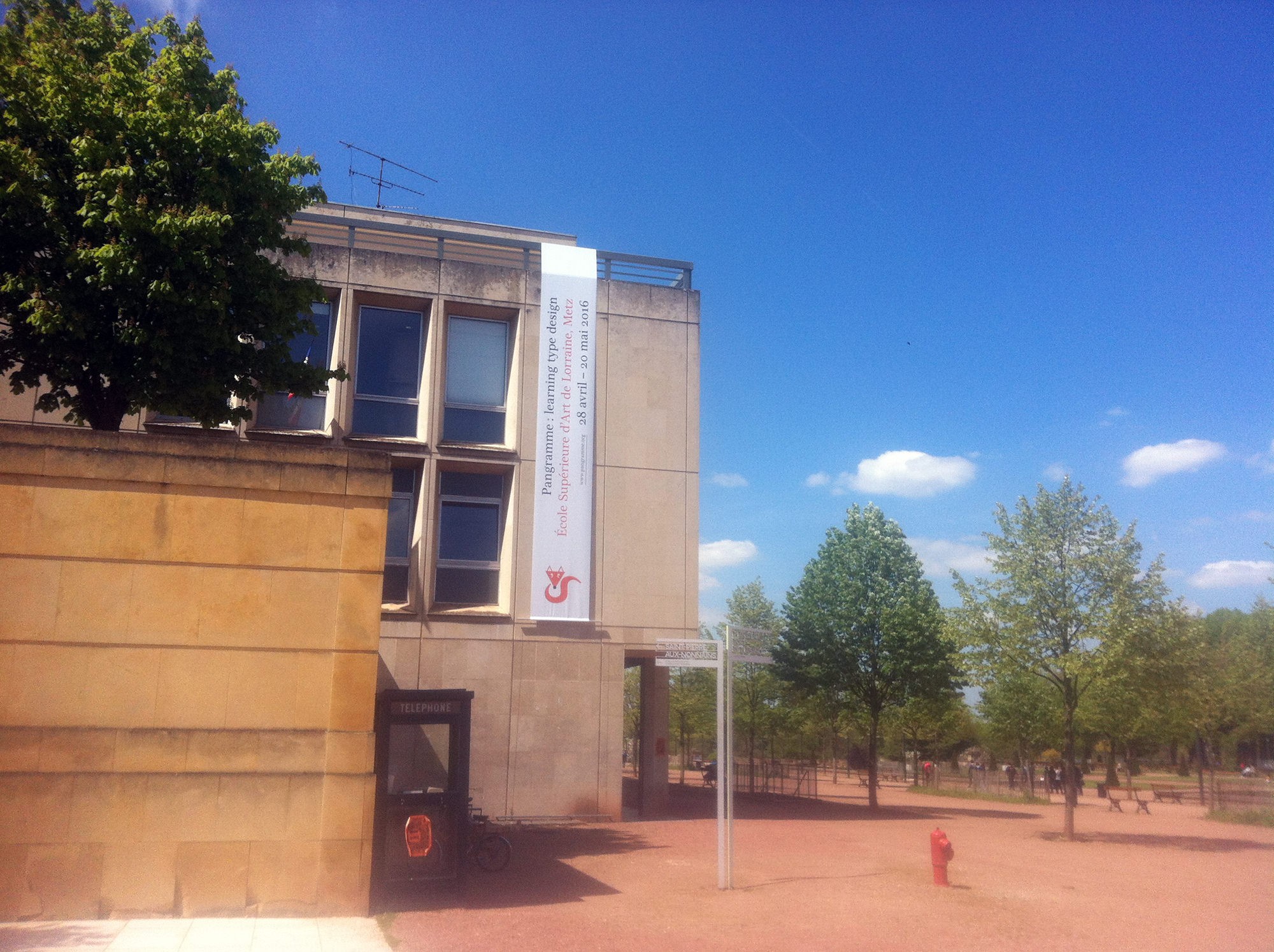
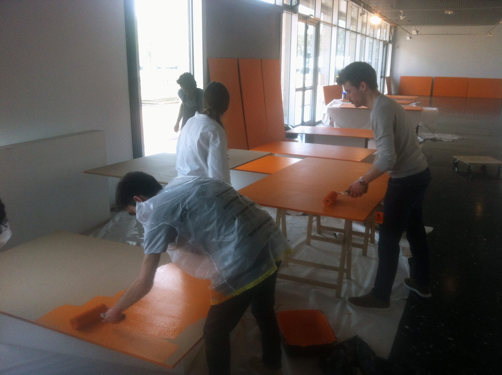
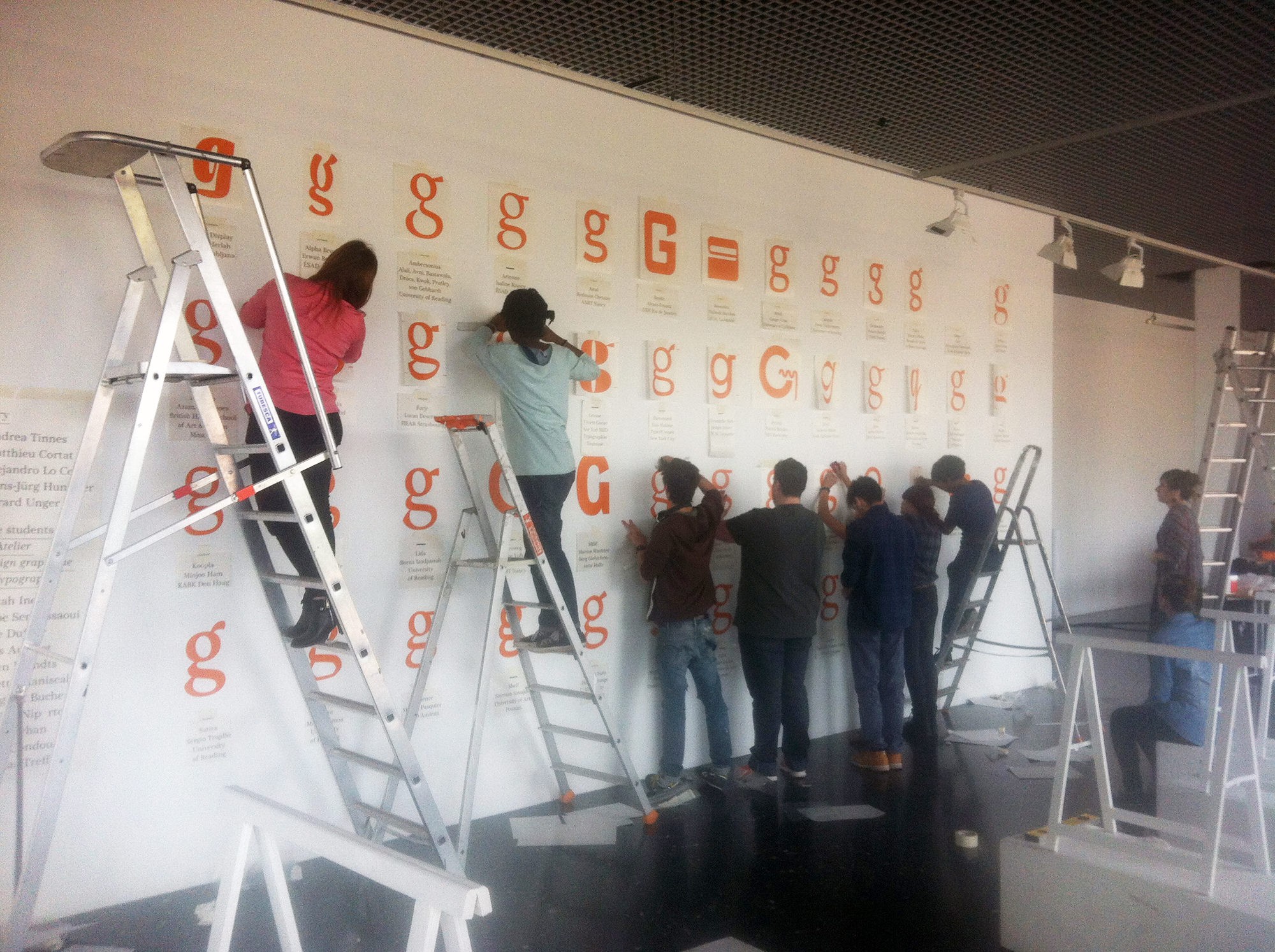
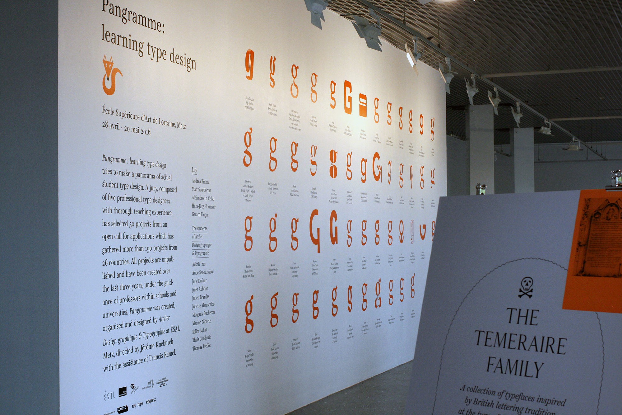
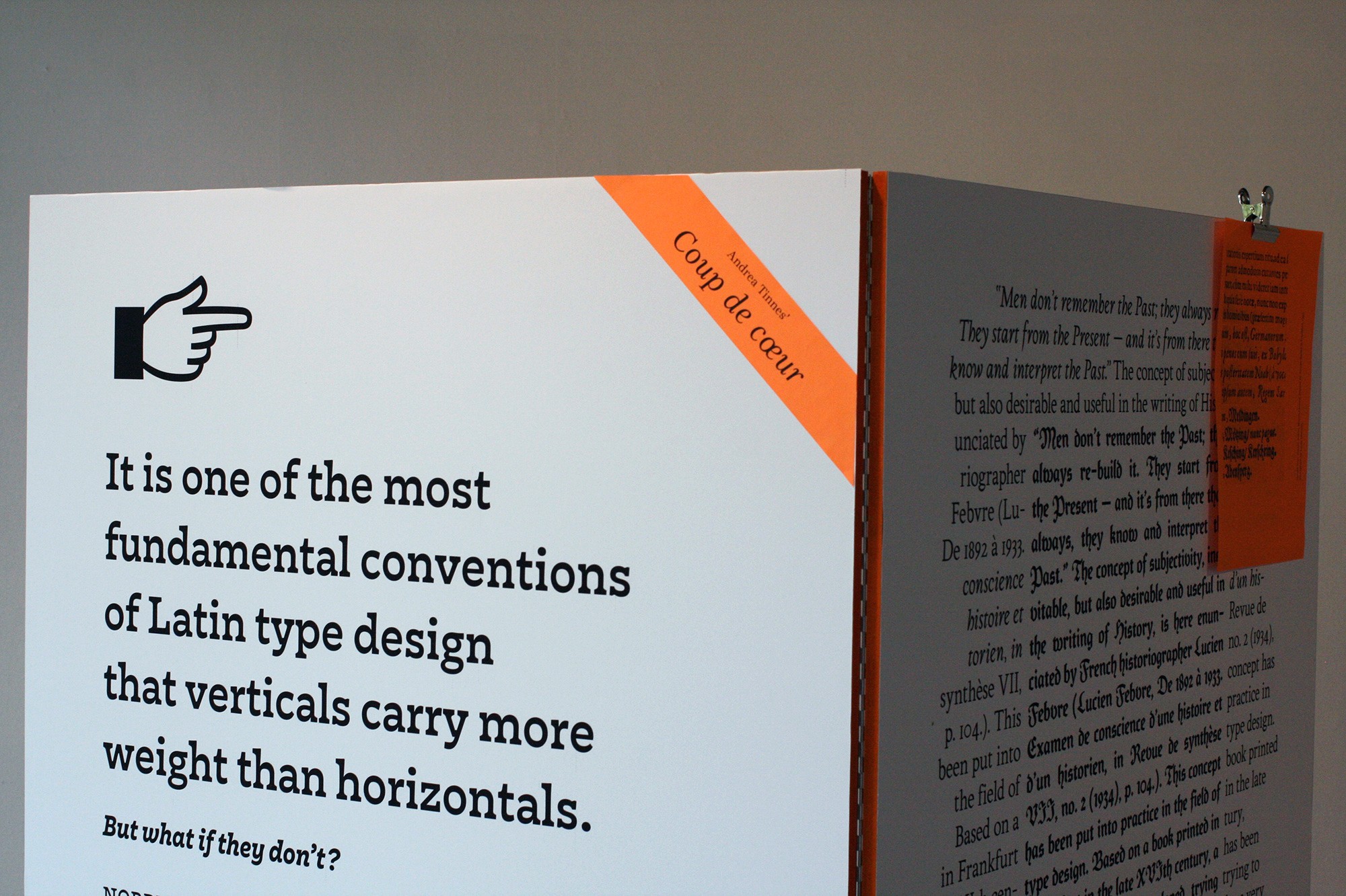
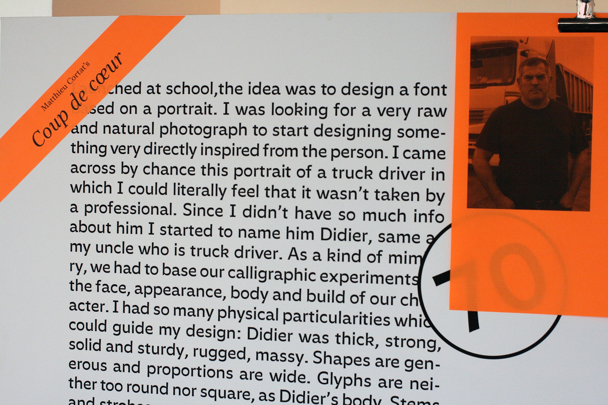
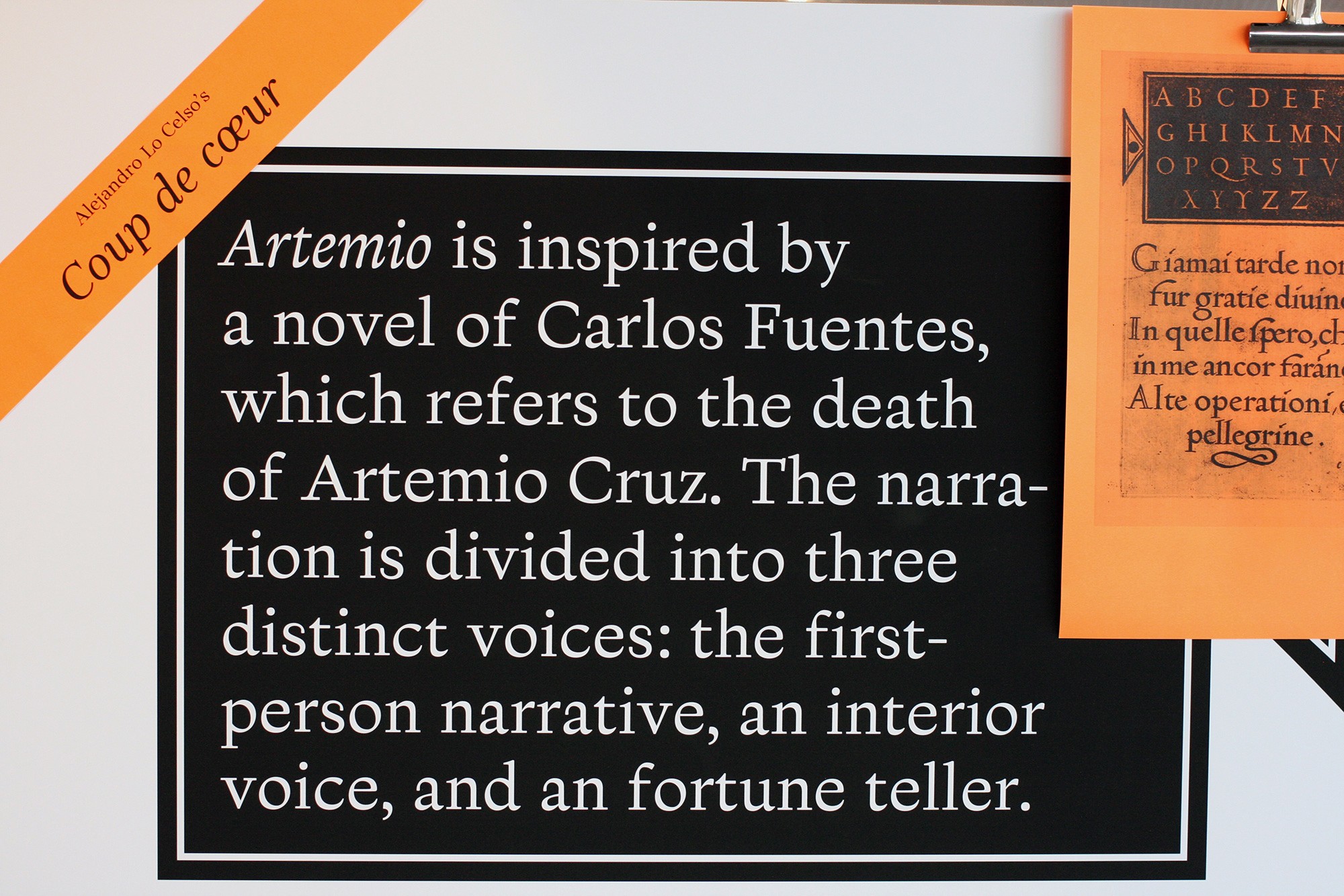
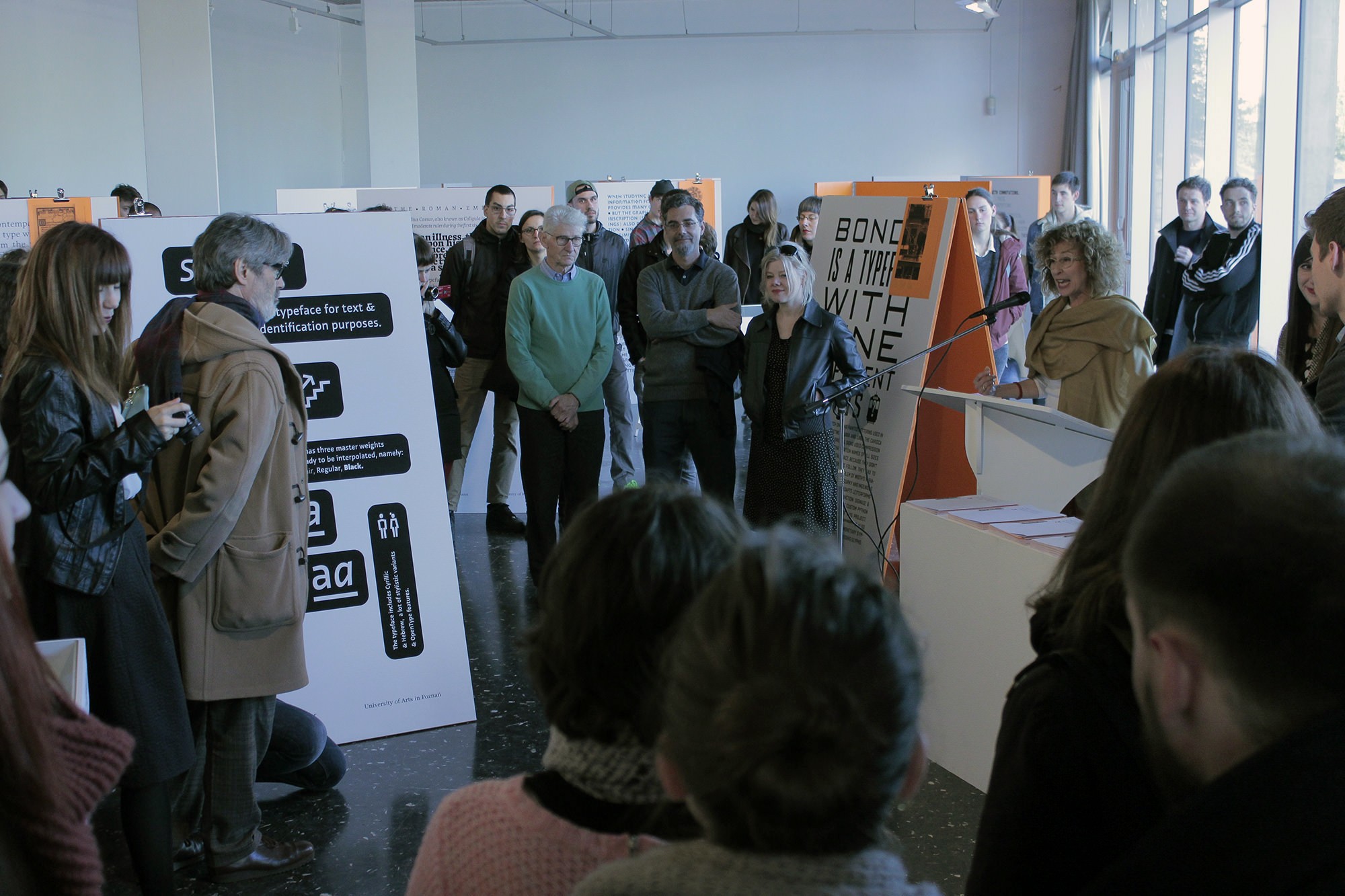
In a few hours, the call for applications for the first edition of Pangramme: learning type design will be completed, an international exhibition of student type designs that will be opened at the art school of Lorraine in Metz two months later. Pangramme’s ambition is to draw a current picture of type design learning: Each school communicates on its own scale and it becomes difficult to get an overview of everything that is produced. Jérôme Knebusch took the initiative of this project and brought together a prestigious jury composed of Andrea Tinnes (Germany), Alejandro Lo Celso (Argentina), Matthieu Cortat (France), Hans-Jürg Hunziker (Switzerland), and Gerard Unger (Netherlands), who will be responsible for reviewing the designs and awarding honorable mentions and favorites. It is late and fifty files have already been sent: An honorable figure, given the relative confidentiality of the event, announced just a few weeks before. In the last hours, the counter panics: dozens of mails flocking, bringing the total to 194 files filed from 25 different countries. Such a success, superior to the most optimistic forecasts, upsets planned organization: the team will have to be strengthened to deal with the coming weeks, all this documentation.
The singularity of the Pangramme exhibition is to present only typefaces made by students, designed during the last three years, and unpublished. Its success reflects the extraordinary vitality of type design in art and design schools around the world: An inconceivable situation even a decade ago.
Curricula offering a specialization in typeface design have indeed multiplied. Introductory workshops within the 1st cycle, masters courses,
research programmes, several formats have developed, combining different levels of expertise. It’s not just about specific training (quite a few of those programmes are), but also short courses or workshops taking place within general training courses, in which typeface design is frequently called. It’s a great thing to sensitize graphic design students to the drawing of letterforms: These are two different but perfectly complementary practices. At the end of introductions of this sort, some students can continue in this path (and develop a project until their diploma, there are many examples here), and everyone will probably get a better understanding of the forms they handle on a daily basis, having apprehended
from within the structure of typographic letterforms.
What does one learn by drawing one’s first alphabet?
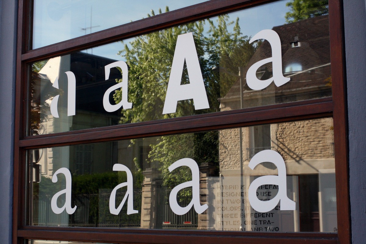
First, a pure drawing, black and white, where attention is focused on the tension between empty and full, form and counterform. ‘cartainly the most brittle of all the arts’ said Tschichold. It is difficult to grasp from the outset the importance of the white, of the space between the letters and inside the letters, which is absolutely decisive for the appearance of the typeface. Little by little the eye manages to judge the curves, find the right rhythm, the good balance.
It is also experiencing the perception of these forms at different scales: From an extreme level of detail offered by vectors’ description to a display size or sometimes a very small print.
Finally, in the drawing of letterforms, hundreds of small local decisions, which must form a coherent whole. A ‘beautiful set of letters’ rather than a ‘set of beautiful letters’, according to Matthew Carter’s formula. There are enough similarities for the letteforms to emit a common identity, but enough differences to avoid confusion: A paradoxical dynamic that each character solves in its own way.
It is not so simple
Most of the time this learning is done in a progressive way, and the ‘first design’ is the martyr of these successive discoveries: It often knows a thousand versions, returns back, abandonments, or revelations. We cannot anticipate these episodes so much we do not know, at the beginning of the trip, what will be done. Peter Bil'ak, to illustrate this phenomenon, borrows from the composer Brian Eno the metaphor of the gardener and the architect. The gardener’s work develops organically: ‘Feed simple things to greater complexity, plant the seeds carefully and help them reach their full potential’.
Conversely, ‘an architect traditionally begins with a concept, first developing the whole idea, working from top to bottom’. 1 He applies a program in which most developments are anticipated — which requires a greater experience or, at least, having already been there. These two approaches are equal; they only correspond to different working dynamics. Peter Bil'ak, in the text quoted above, says, for example, that he has conceived his character Fedra as a gardener, as you go, and Greta as an architect, on a pre-established plan. 2
In either of the courses the pitfalls are numerous
One of them is the specificity of the creation of typographic characters, which, unlike most other fields of design, can be exercised without any sponsor or constraint of any kind. The cost of producing a digital font is now very low, and its diffusion hardly more expensive: it is mostly a matter of time, basically. Taken in this long process, and because of the fascination to see gradually appear their own personality, it happens that we lose sight of the starting point, and especially the destination of this design.
But without reason or a real context of use, a typeface (one more) does not weigh much.
Another trick is to surrender to fascination, an obsessive strand, to shape a complete tool. Capitals, minuscules, numbers, punctuation, then all the accents, ligatures, small capitals… We arrive quickly to hundreds of glyphs. And why not other scripts? The character sets of digital fonts are always provided with all sorts of features and the potential encoding of tens of thousands of characters (the Unicode has more than 120 000 to date). Not to mention families, whose size also increases: It is not uncommon to see families today exceed the hundred styles, combining all widths, weights, slopes, grades, etc. Here again, we must be careful to properly size the project, not to get lost in an accommodating proliferation, made of interpolation and utopian ubiquity. On this point, the technological advances and the progress of the font editor applications do nothing to calm the expansionist ardor of type designers.
Finally, the elephant in the room: How to be original when there are so many fonts out there? An argument that is frequently heard, and not always unfounded. On this subject, Peter Bil'ak himself states, in a brief, provocative text entitled We don’t need new fonts, Many people drawing type today have solid drawing skills, but no desire to advance the field (let alone rebel against it) by creating original solutions. Can we call them type designers? I think, at least not any more than we can call every fast, accurate typist a writer. Content is at least as important as form, the ideas we express as important as how we express them. "3
Because, of course, we’ll always need new fonts. And there are many fields to be explored, to be conquered: Unknown historical models to be rescued, for example, or writing systems that are little or not transcribed typographically. In order to envision those fields you have to start an adventure, consult files, go where others have not yet arrived. Closer to home, even in the current frenzy around emojis, there are potential typographical questions. To do that, you have to take risks, but what are the risks? Failure is a component of learning, an essential driving force, as in Samuel Beckett’s famous phrase used for the title of this text. 4 The real failure actually is not taking any risks.
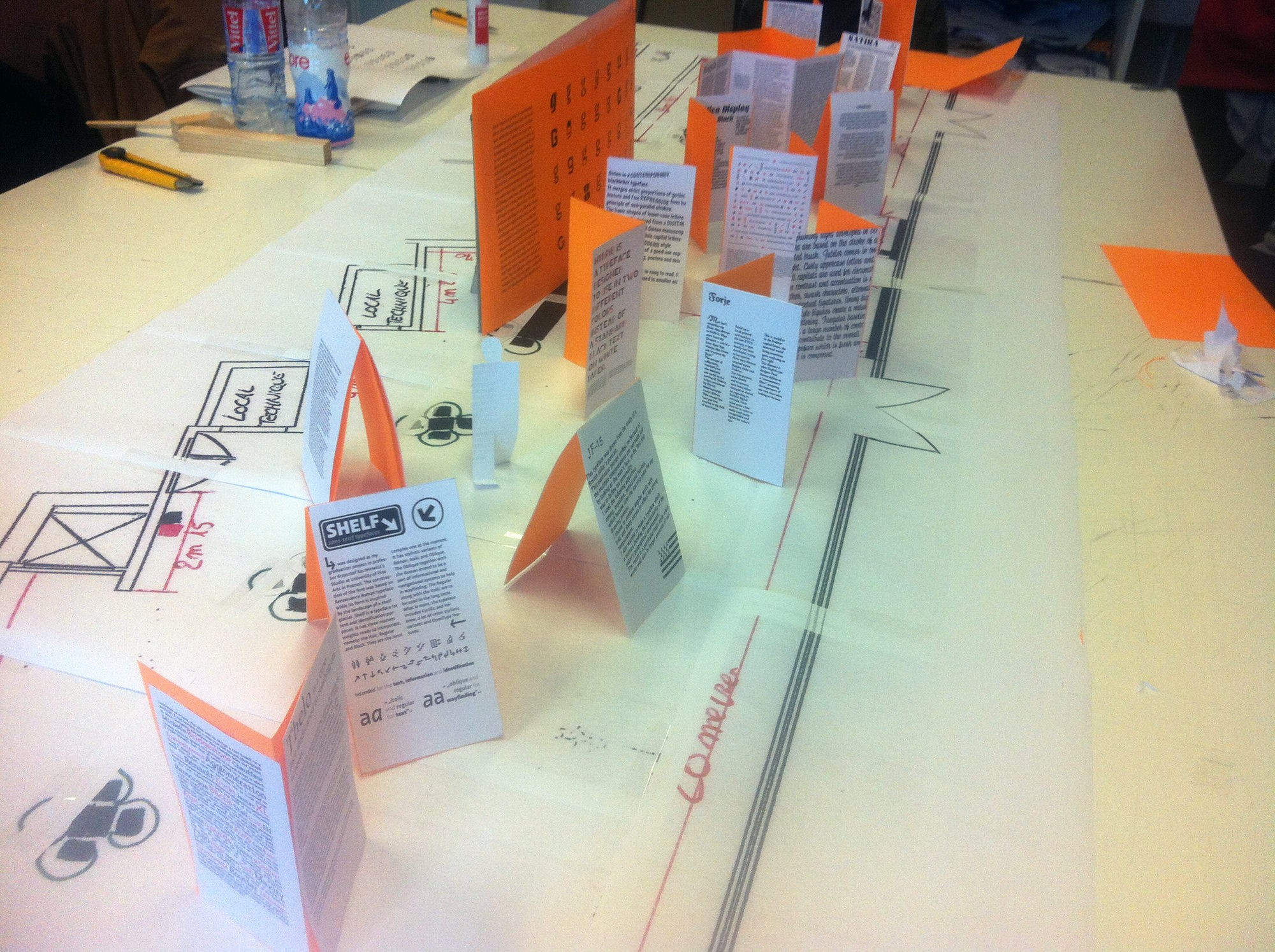
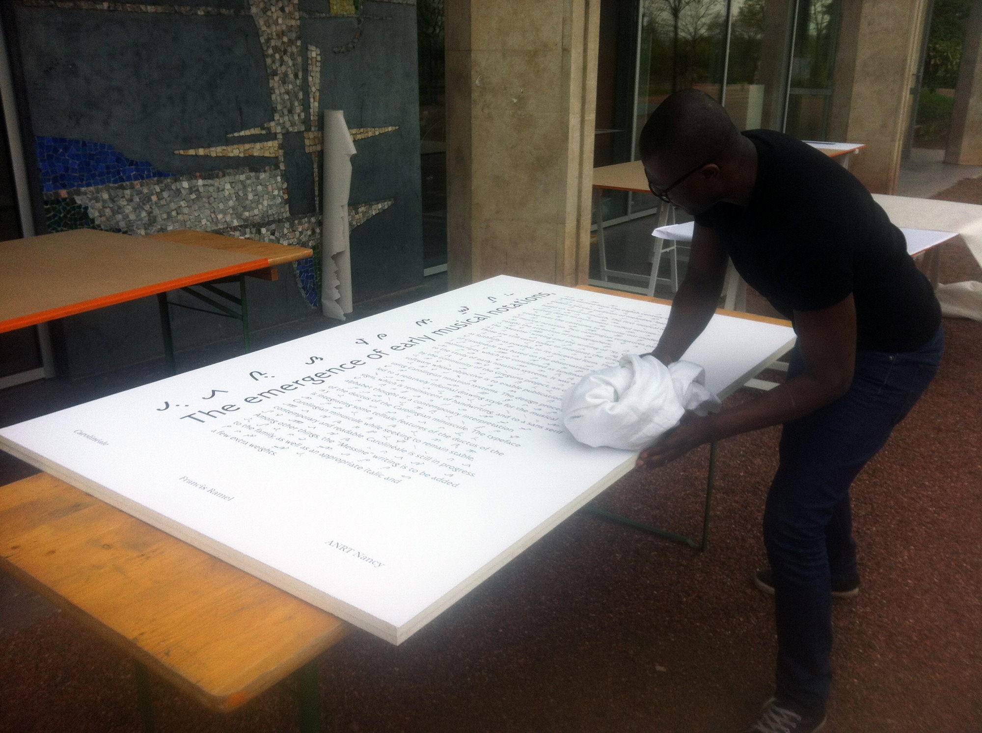
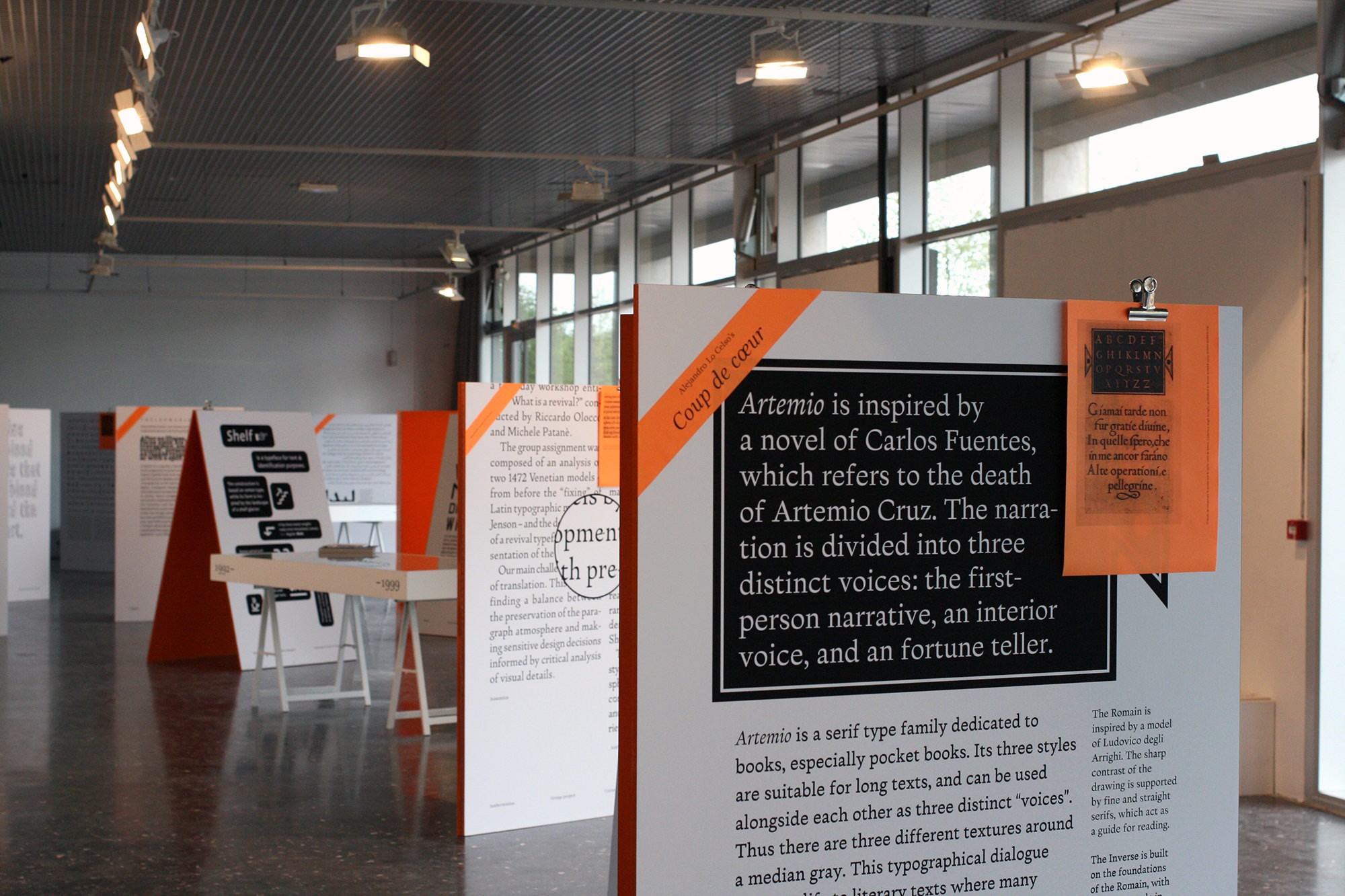
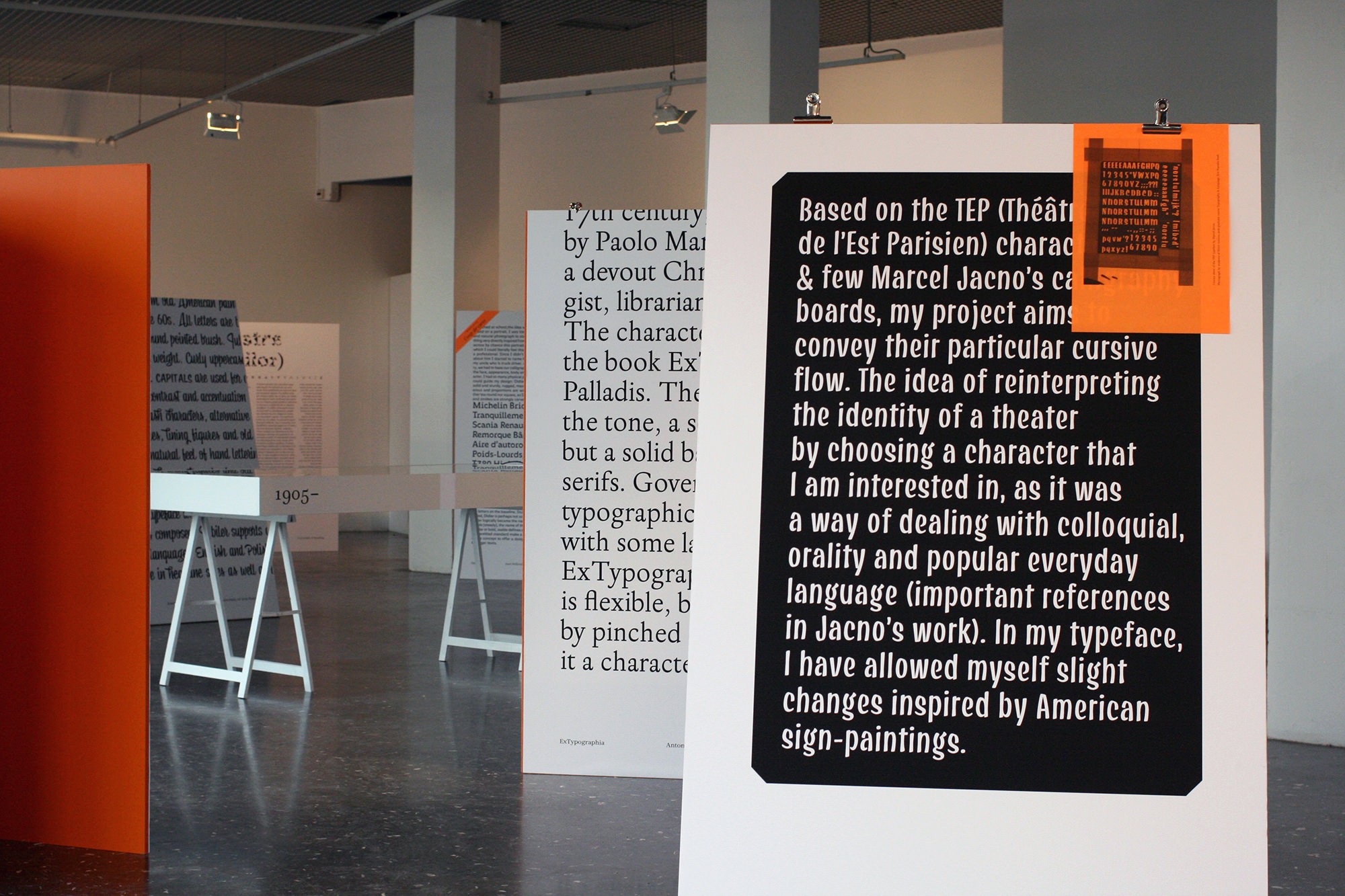
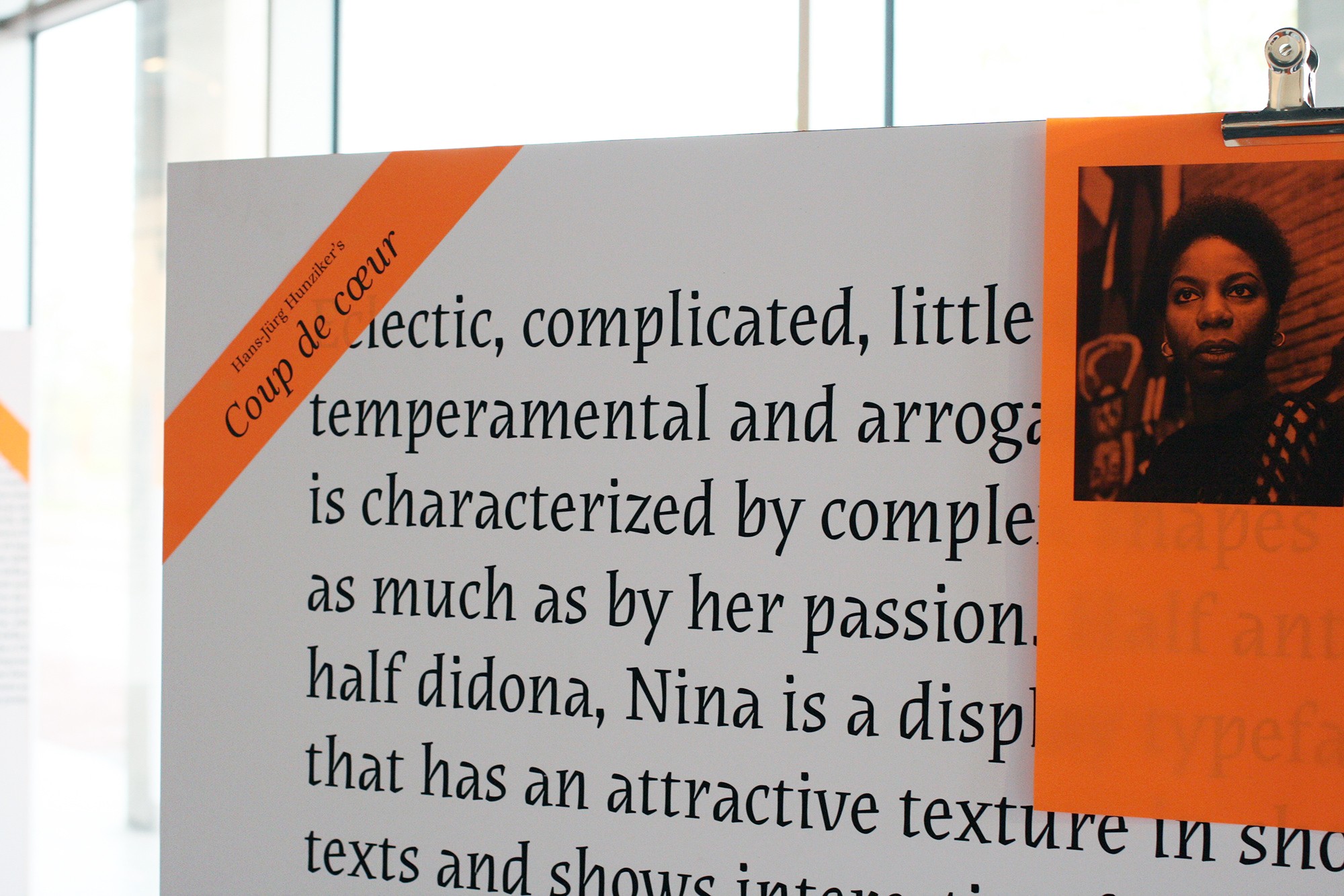
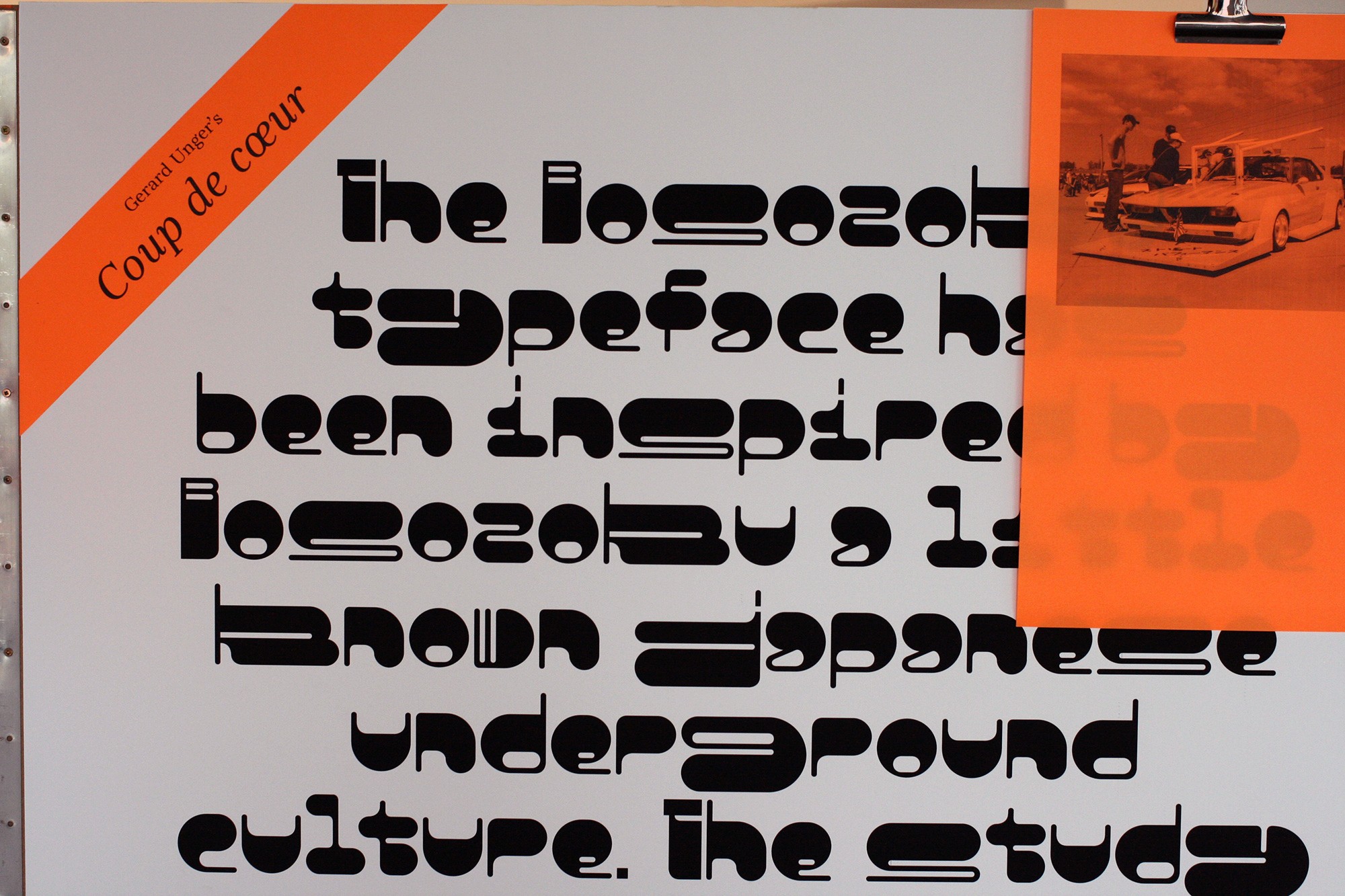
The type works presented in the exhibition and in the Pangramme catalogue correspond to a little more than a quarter of the files originally received. The typefaces called ‘experimental’ were the most numerous, but also the least experienced: many were discarded in the first selection. At the other end of the spectrum, the so-called bred-&-butter types have the most entries, followed by revivals (adaptations of historical types). Projects that show a greater maturity (often produced in postgraduate courses or specialized masters), but sometimes a little less originality: Some revivals, for example, are literal reiterations that show a lack of own point of view. In types for immersive reading, we note that the vast majority are serif styles, and that among them, the didones are a minority. No doubt this is related to learning: It is easier to understand the complexity of type design by employing serifs. Calligraphy is usually a gateway to identify fundamental principles. This may explain why the didones, which do not respond to a calligraphic rhythm, are underrepresented.
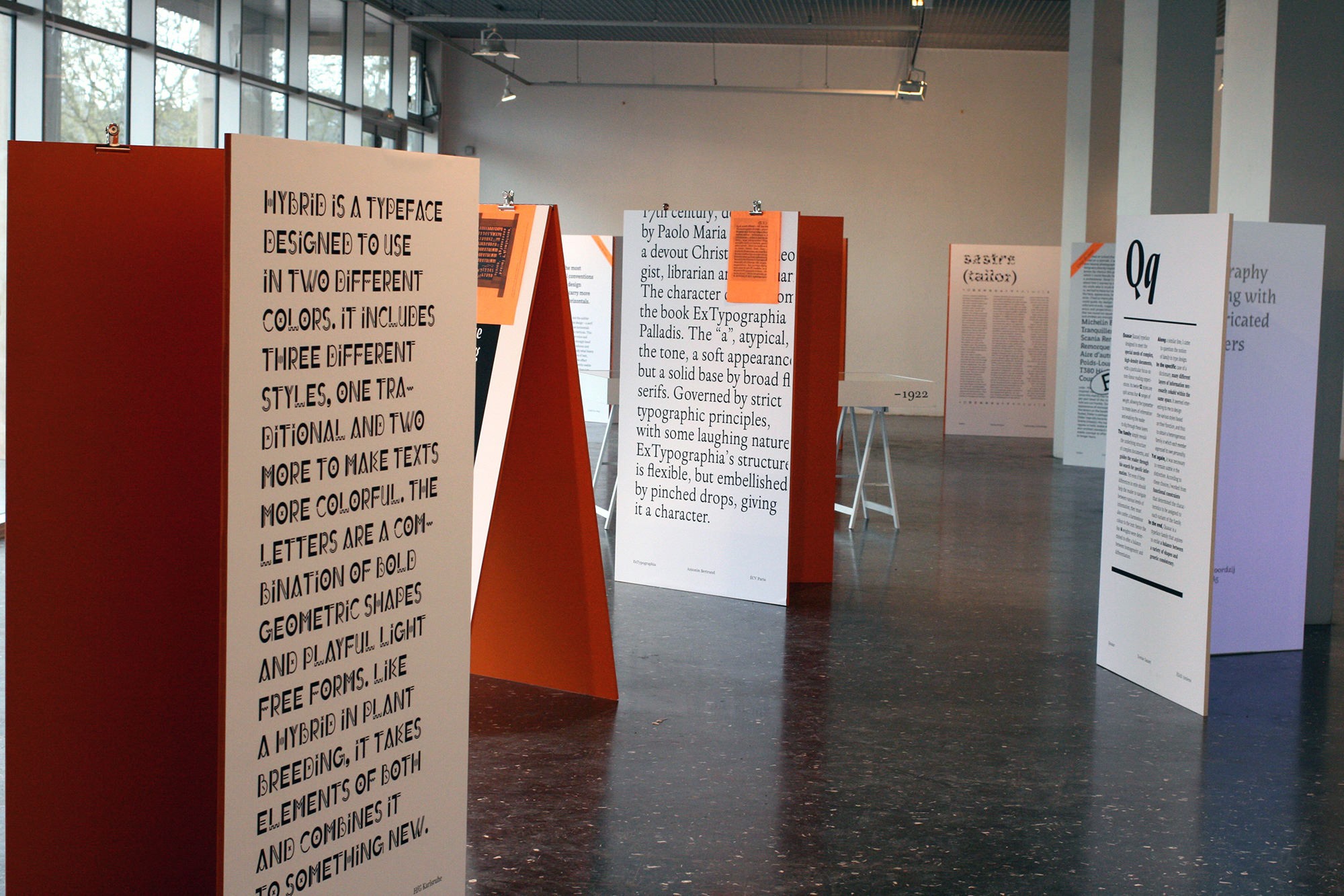
Between the experimental types and the bred-&-butter types, all the nuances are possible: The great variety of styles presented here defies any attempt at synthesis. Most of them are probably works of ‘gardeners’, learning projects: They are not necessarily the first fonts of their authors, but often their first major project. Some have been published since then, but many will undoubtedly remain unpublished: All, in any case, reflect remarkable paths and promise a bright future to typeface design.
Download freely the Pangramme catalogue and the pamphlets (available in French and German for the moment) here. Or acquire the printed catalogue in the PampaType store.

Thomas Huot-Marchand is a French type designer, graphic designer, and teacher. He is the current director of the ANRT, atelier national de recherche typographique (national institut for typographic research), in Nancy (FR). Among his typefaces, Minuscule occupies a singular place as a typeface designed for tiny bodies.
- Peter Bil'ak, Designing Type Systems, published originally in ilovetypography.com, 2012. ↩
- Another example of organic development is the project Messine made by the students of ESAL, Metz, throughout type design worshops with Alejandro Lo Celso and Jérôme Knebusch. ↩
- Peter Bil'ak, We don’t need new fonts, 2011. Written for the editorial of the magazine 8 Faces, N ° 3, 2011. ↩
- ‘Ever failed. No matter. Try again. Fail again. Fail better.’ Samuel Beckett, Worstward Ho, London, Calder, 1983. ↩