Introduction
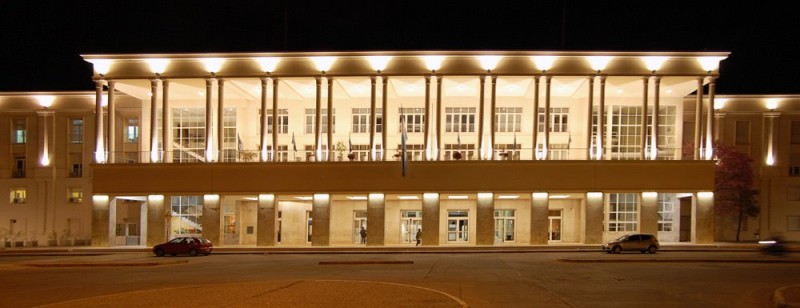
The Universidad Nacional de Córdoba is an institution with deep roots. At its origin, more than four centuries ago, one finds the Jesuit enthusiasm fighting with the Pope for serious differences in how to interact with the souls of the ‘New continent’. The Jesuits were finally expelled from the Americas by the Spanish king in 1767, but their work remain for some a precedent of peaceful and constructive coexistence. In 1918 rebel students of the UNC gave birth to the Reforma Universitaria, an event that would change the history of higher education throughout the continent. Since then students, teachers and university personnel take part in the government of the house, thus putting an end to the usual authoritarianism.
In 2015 the design department from institutional communication at UNC called us to discuss the possibility of a proprietary typeface for the house. Pretty flattered, we placed hands at work. Three years later the Reforma type family sees the light.
Following the spirit of celebration that has guided this iniciative, as well as the Argentinean traditional policy of open, public, and free education, «sharing» has been the cornerstone of this project. This article is written a few steps before the actual release of the fonts. We hope the project meets public acceptance and as the fonts are widely spread users feel satisfied with them.
A bit of context
Argentineans are proud of their relative intellectual independency and their sense of irreverence, which probably track back to the old Gauchos and their rebel attitude: They could not belong to a sacred land whose natives have been blindly extincted, nor they could embrace the desperate promises offered by hungry settlers. This struggle between memory and forgetness, perhaps inherently human, go throughout all our history and go across our national expectations. We are people of contrast. And because of our recent history we have a strong conscience about our own rights. 1
Public education values
Certain awareness of independence as something you have to struggle for set up a scenario for a slow consolidation of a public, laic, free education policy, as the means to guarantee people’s literacy and their chance for a future. Public education is thus motive for pride in this country. It is the opportunity for all, wealthy or vulnerable, to access higher education, providing them a sense of belonging to a community where justice and equal opportunities excel, where diversity of thoughts is welcome, where one can acquire or consolidate a scale of values. 2
From this perspective we faced the development of a typeface for the Universidad Nacional de Córdoba, trying to convey into the design the nature of these values.
Design commission
The graphic designers of the institutional communication office conform a small department with intense activity, a big output, and a broad influence on the university communication. They are aware of the importance of type as a tool of daily use, and they were enthusiastic agents across the design process of Reforma, facilitating the dialogue with authorities and contributing to the acceptance of the project.
The brief included a few keywords that became the foundations of the project.
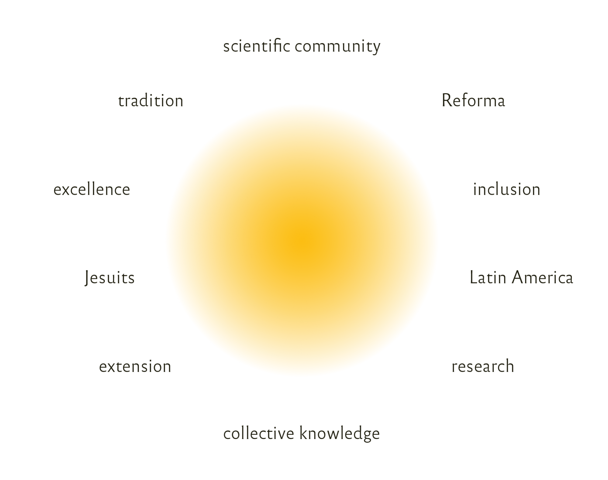
The new typeface had to convey four premises wich became the conceptual keywords of the project:
– 1. Plurality
– 2. Intellectual heritage
– 3. Versatility
– 4. Free availability
1. Plurality
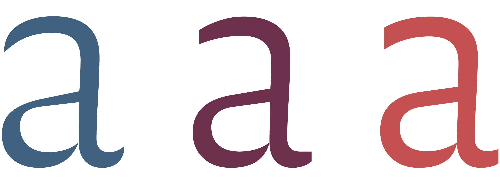
The word ‘university’ comes from the Latin voice universus meaning ‘whole, entire’. The acceptance of multiple voices, that is ‘plurality’, is a quintessential value to democracy, and moreover to the life of an educational institution. All the opinions shall be respected and taken into account. We thought this value should be expressed through the articulation of, not a single style, but a family of different styles. This in turn helped us address another design premise: versatility.
2. Intellectual heritage
In order to convey a historic protagonism of four centuries, we suggested that the design should evoke qualities such as dignity, sobriety, and authority. However some people in the UNC feared that this «authority» feeling could not represent the current university life of nowadays, identified with a democratic practice, social knowledge, horizontal exchange, and equal opportunities. Therefore, we set out to make an effort in the interpretation of classic Roman letterforms, sober and dignified, with a sense of true friendliness.
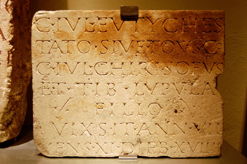
We usually see ancient inscriptions unpainted but in fact they did not look like this one at the time. The discovery of ink pigments inside letters suggested researchers not only that letters were painted after they were carved, but also that, before carving, a calligrapher would write the message using brush and ink. Only once the text was perfect then the carver would proceed to engrave. 3
3. Versatility
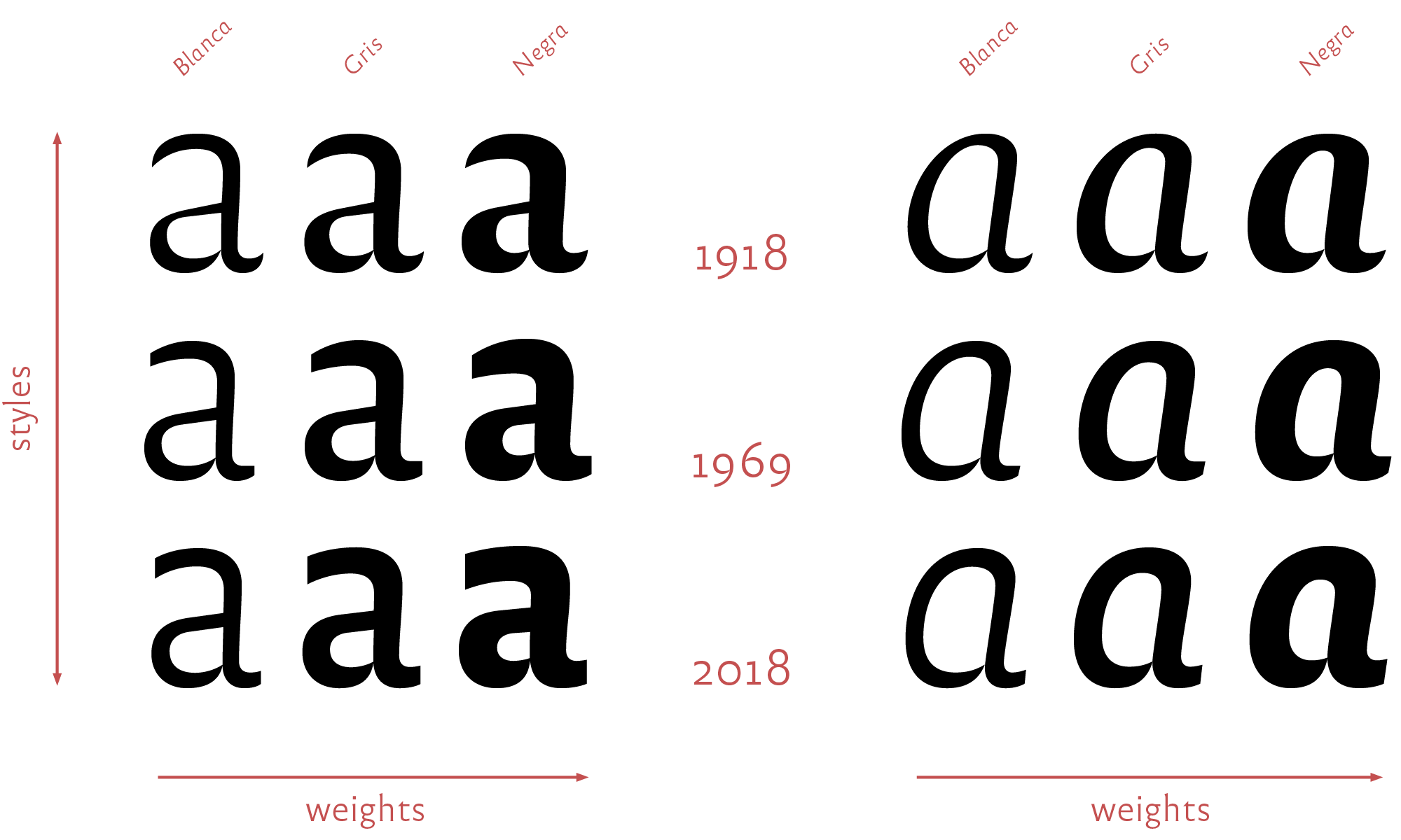
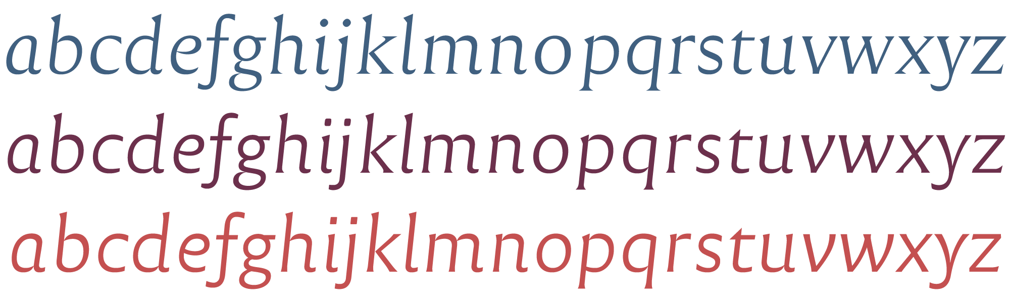
In order to face a wide variety of applications, in the sense of supports (transferring methods, printing technics, screens) as well as tones (style voices, reading atmospheres) we aimed at a multi-style family. Thus Reforma is composed of three subfamilies from classic serif to modern sanserif, all three adaptings finely –we hope– to a wide range of bodies from display to immersive text.
4. Free availability
In line with the policy of national education in Argentina: public, open, and free, the typeface Reforma designed for the UNC shall be freely available as free fonts under a Creative Commons license that allows for any sort of use, private or profesional, except the modification of the original design.
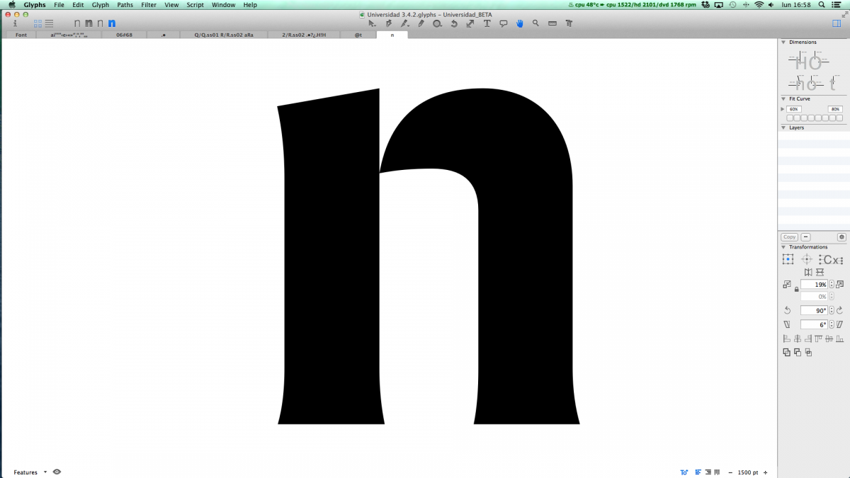
The design of Reforma
From the beginning the idea was to get a skeleton that could embody different muscles modulations. Therefore a wide range of type styles, with or without strokes contrast, with or without serifs, could be reached by basing on the same spirit. That way we could tackle versatility and diversity at the same time.
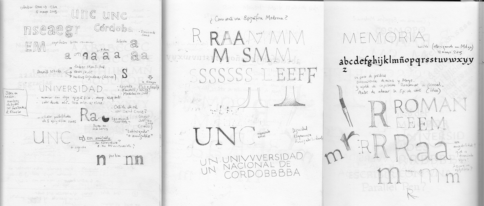
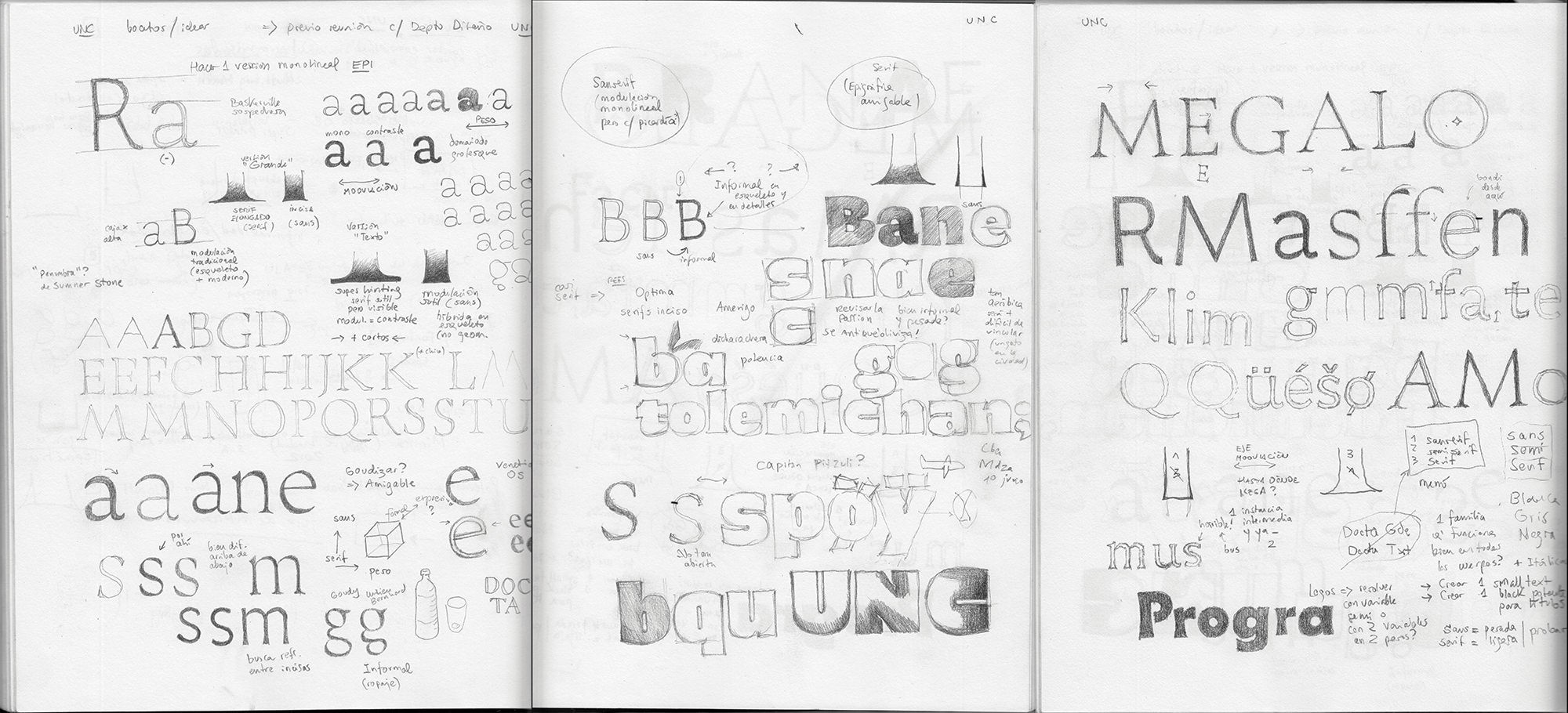
A series of early pencil sketches trying to figure out styles.
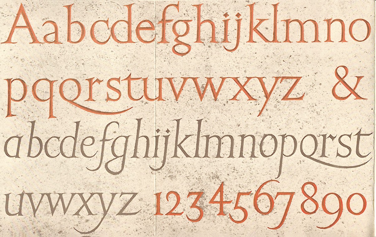
Following the decision towards styles of letterforms that could embody dignity, authority, sobriety, our natural choice favored the Roman epigraphic majuscules, from which our lowercases evolved.
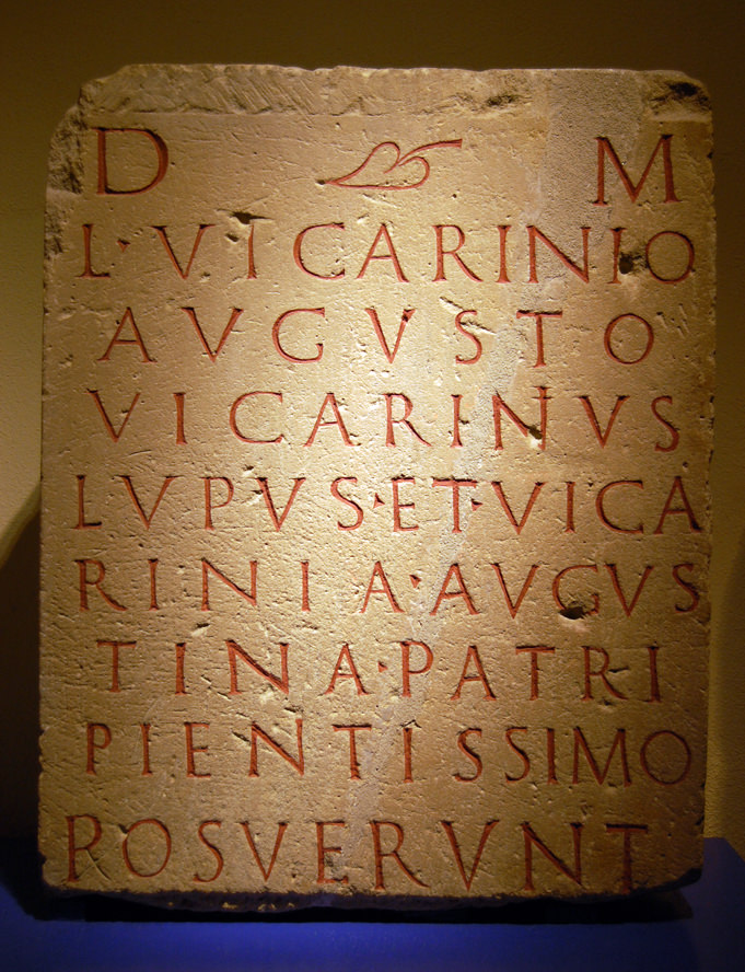
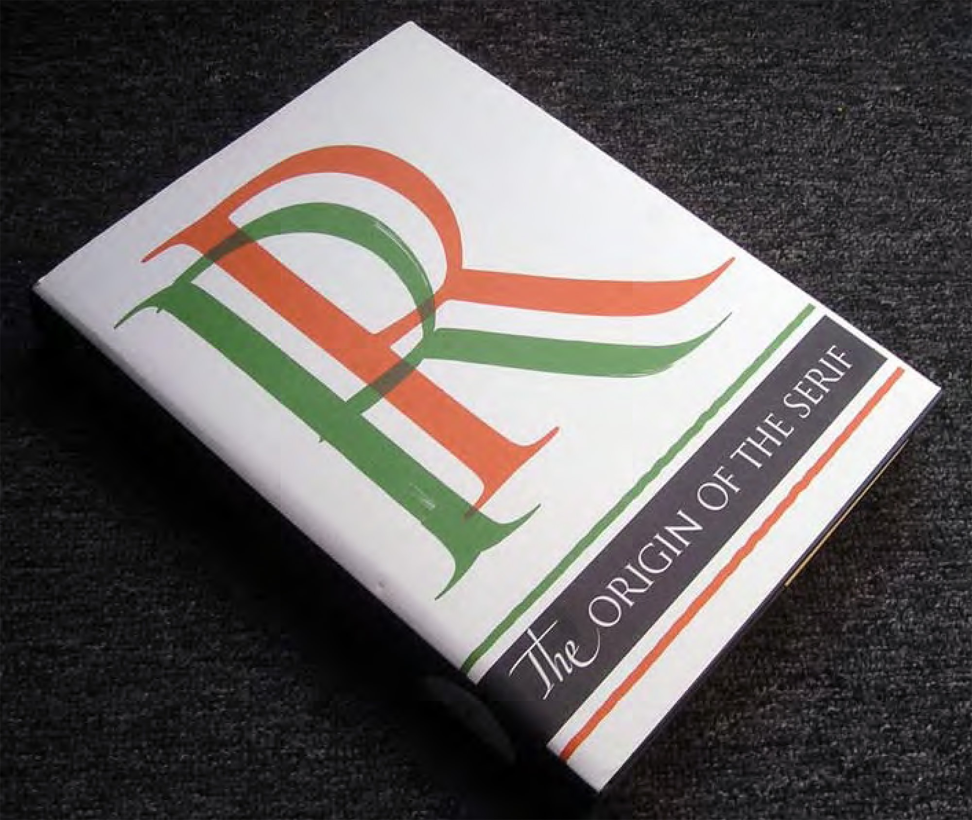
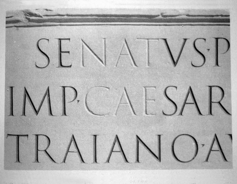
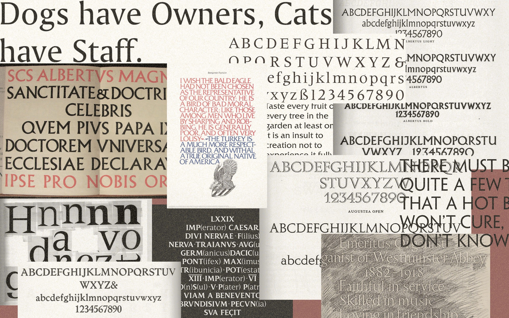
We plunged then into the Roman epigraphic letter to better understand its qualities and nuances. At the end of this article we include some reading references that seem fundamental to us. On one side is the long and important tradition in epigraphic inscriptions and on the other the interpretations that printers, designers and typographers have succesively made of them for printing. The so called «Trajan» majuscules [engraved at the base of the Trajan column in Rome] are probably the best known Roman capitals. However in the span of almost 1500 years of Roman Empire, hundreds of models succeeded. In his fundamental book The Origin of the Serif, father Edward Catich demonstrated that the employ of a flat tipped brush in the hands of Roman calligraphers originated not only the sophisticated modulation quintessence of Roman majuscules calligraphy, but also the characteristic tip endings of strokes designers call serifs.
Left image, plaster reproduction of the Trajan inscription made by Edward Catich, showing the importance of painting inside the letters, as opposed to leave them unpainted.
Balancing personality and serenity
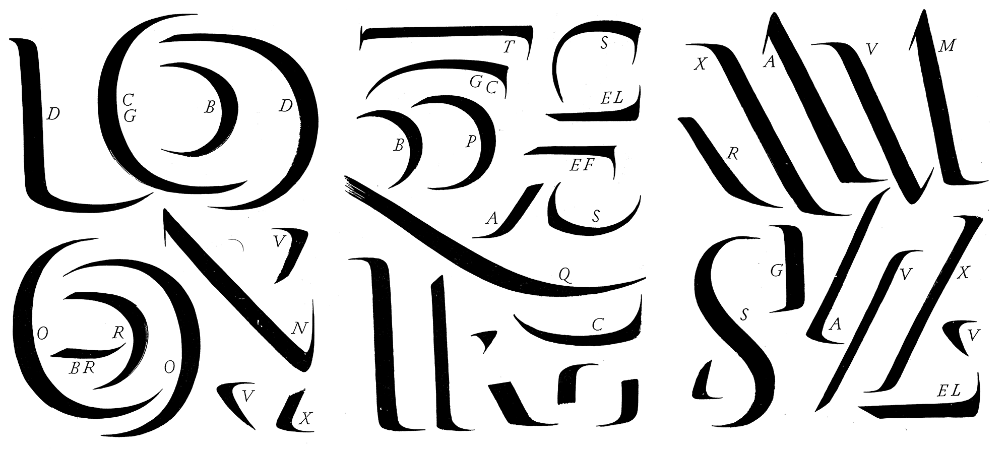
Being both a letter artist and a sculptor, Eric Gill [image below] understood wisely the principles of stone carving. However we thought that our own interpretation of Roman epigraphy had to be less whimsical, avoiding disturbing caprices, and embracing a sense of balance and calm.
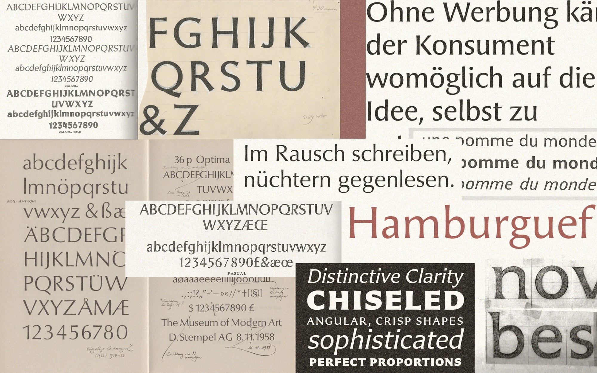
On the other hand, regarding the interpretations of majuscules into print, several reknown typefaces were analysed regarding atmosphere, proportions, structures, modulations, serif/sanserif relations. We naturally worked in our own independent path. Observing the work of other designers helps you immerse yourself in the style, without a doubt, but also forces you to avoid the solutions already found. Renewing the clothes of the alphabet in order to reach a singular spirit, every time, is a particulary hard task. It demands great creativity. And at the same time it must be invisible for the reader too! Paradoxes of this craft.
As we mentioned, some people in the UNC feared that a sense of authority could be inappropiate when associated with an institution of democratic practice. Thus we suggested to interpret the Roman epigraphic tradition with a sense of delicacy and grace. Letterforms should look friendly. We then started to draw distinctive characters, giving them features capable of further combination within the system.
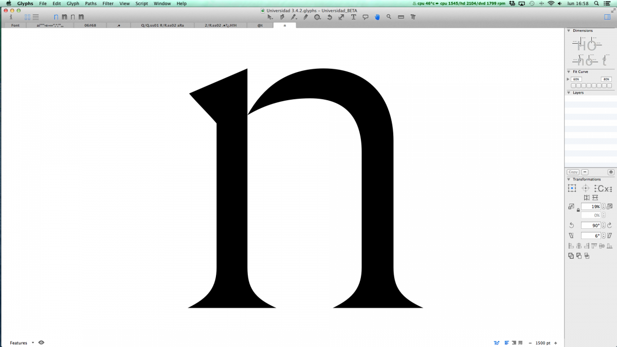
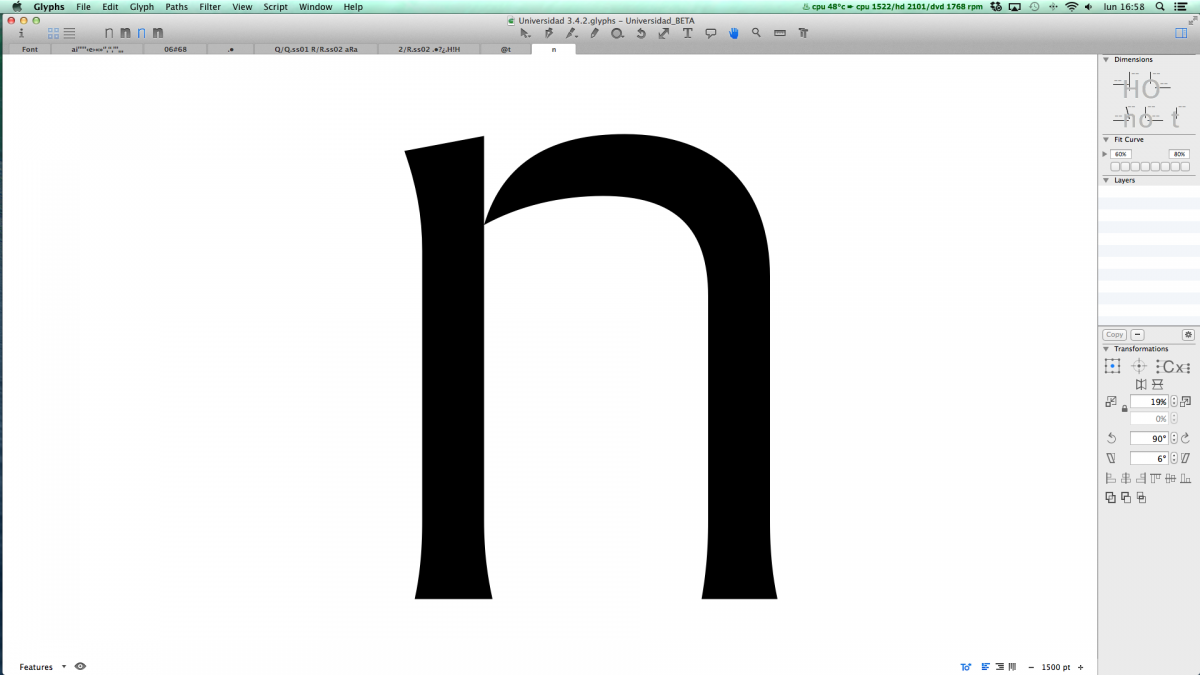
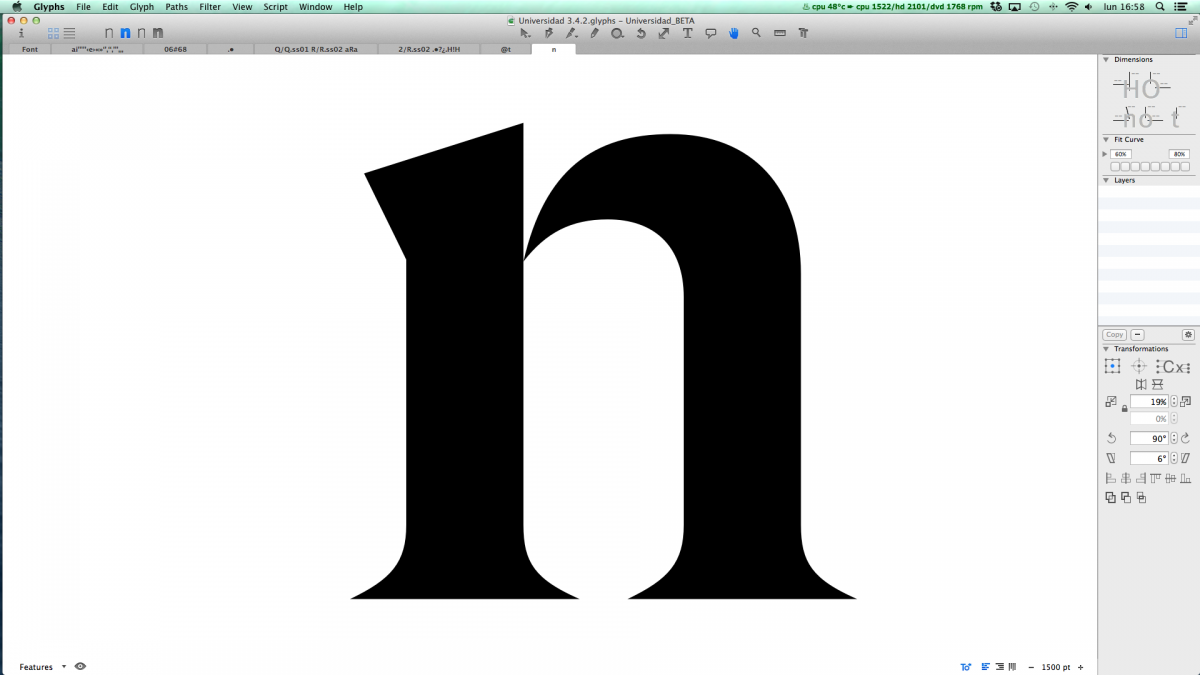
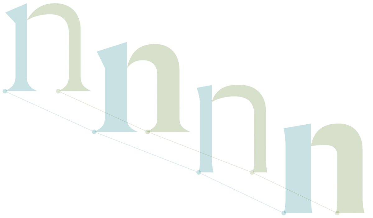
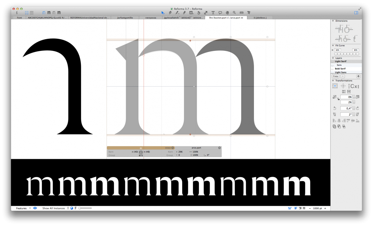
Four distinct type designs were drawn as masters, they were made compatible, balancing their differences and empathies, thus they could look harmonious without loosing their individual character. All this is a tricky task. The designer has to carefully decide on the quality of each curve in every lettershape, its overall visual coherence within each type style, and also sort out how inner and outer spaces interrelate in all directions.


As modulation and weight are two different factors that influence a font style independently, one shall reach the design in a higher level of behavior: the dimension of rhythm, where forms and counterforms need to dialogue harmoniously. That way it all feels natural when these fonts are combined together. And also, a fundamental challenge in this project was to confere minuscules the same epigraphic spirit that is natural to Roman majuscules, without betraying its own calligraphic sense.
Interpolation and interpretation
Once verified in a variety of test words that all rhythms respond well to the original design idea, the mathematical method of interpolation can be used to find intermediate weights between the lightest and the boldest, as well as explore possible intermediate designs. In the case of Reforma, it was desirable to find a third subfamily, a hybrid in the system, which was Reforma 1969. An intermediate design as a result of interpolation means that many details must be reshaped later to achieve visual coherence. So the interpolation itself is just a starting point. A process of interpretation of several details and elements allows to gain in addition to visual coherence, also independence and personality. On the other hand, following the same design method we created the characters of the cursive companion: that is, four other master drawings of each glyph, then interpolating and interpreting and as a result we had the nine companion cursive fonts.
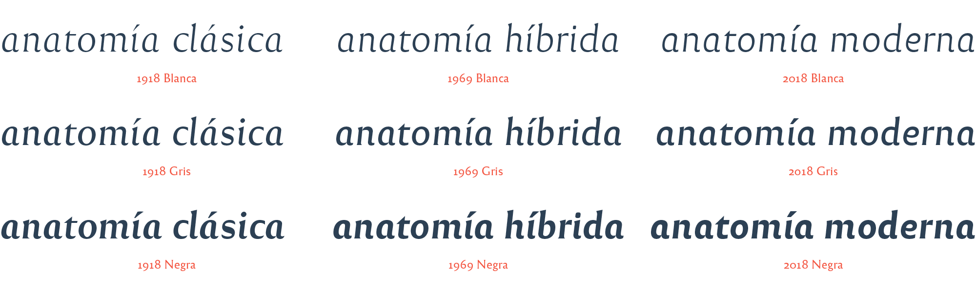

Also an important design detail for the sake of readability (and beauty) is the rhythm contrast between the romans and the italics. We wanted that contrast to be unobstrusive and gentle, so we gave the italics of Reforma a similar rhythm to that of the roman.
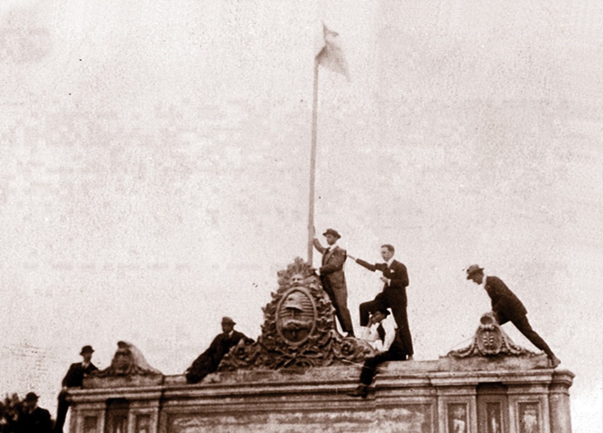
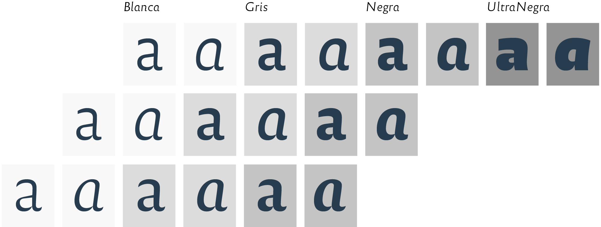
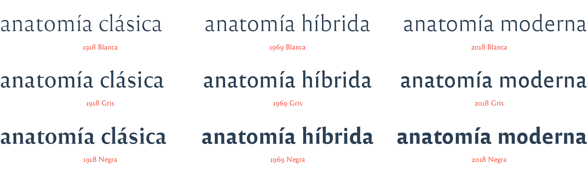
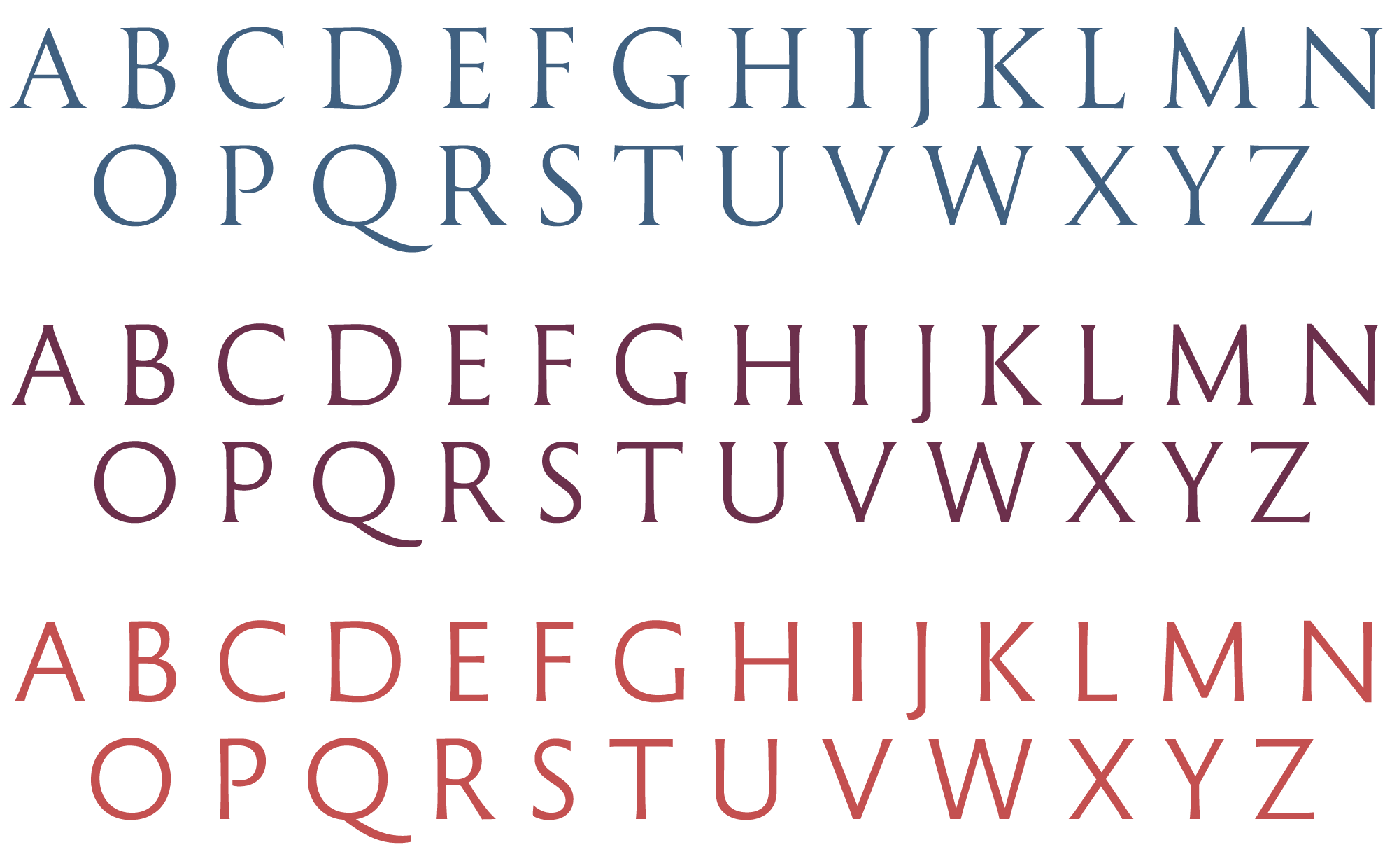
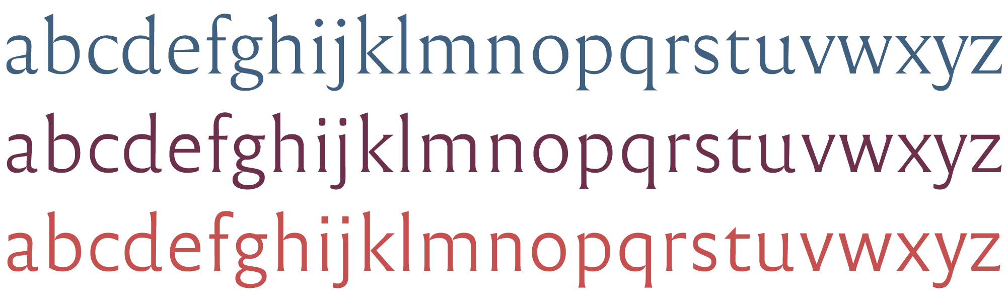
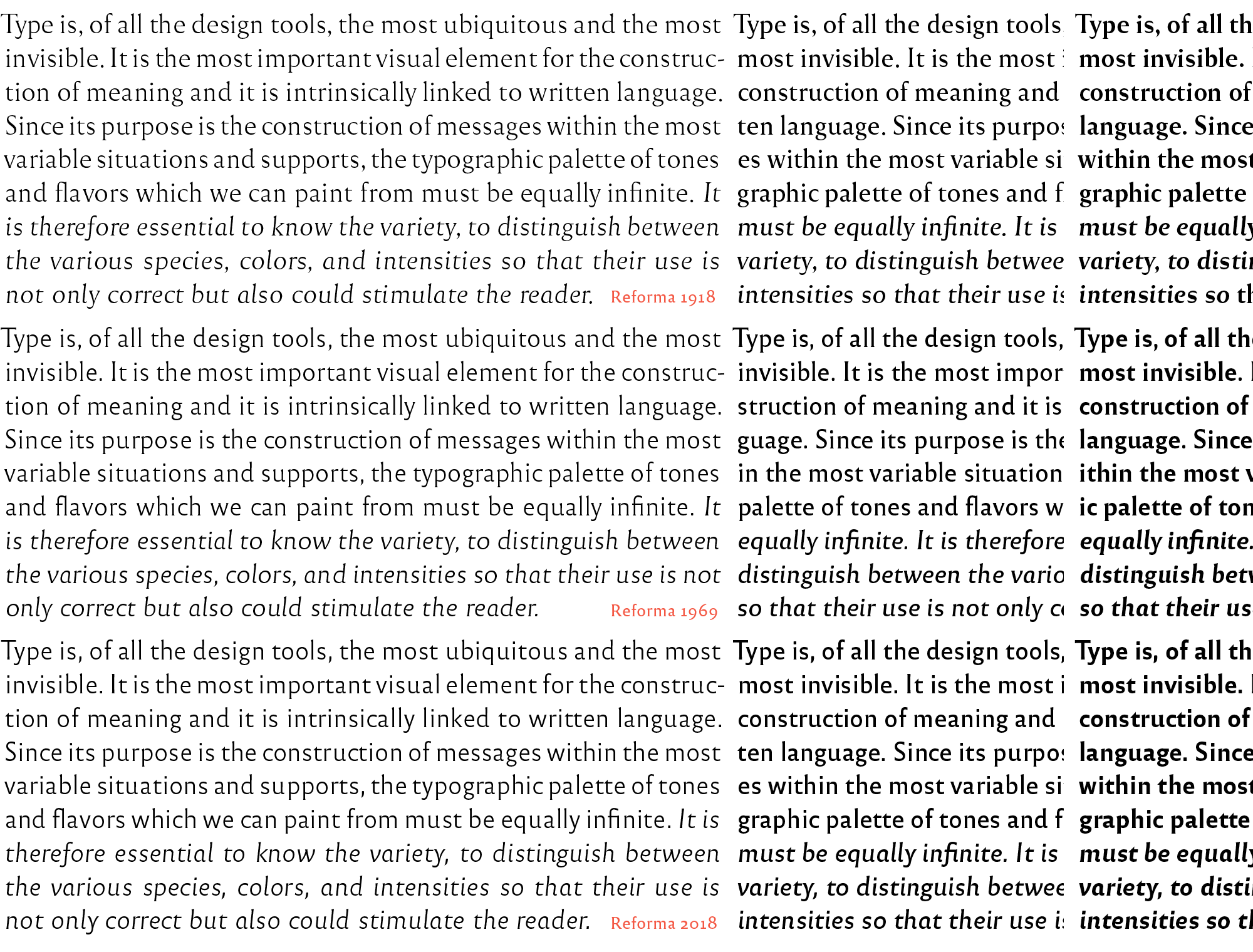
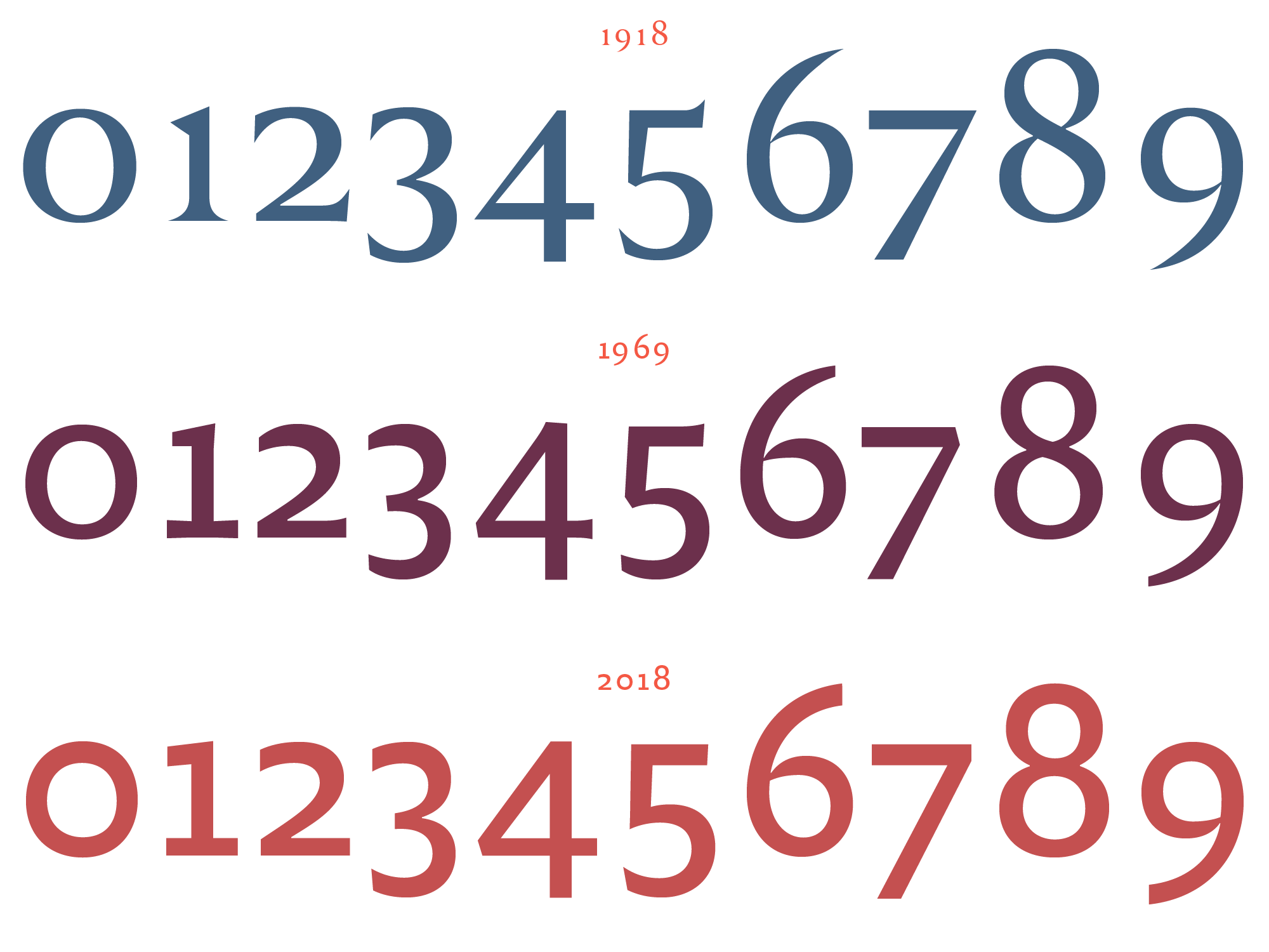
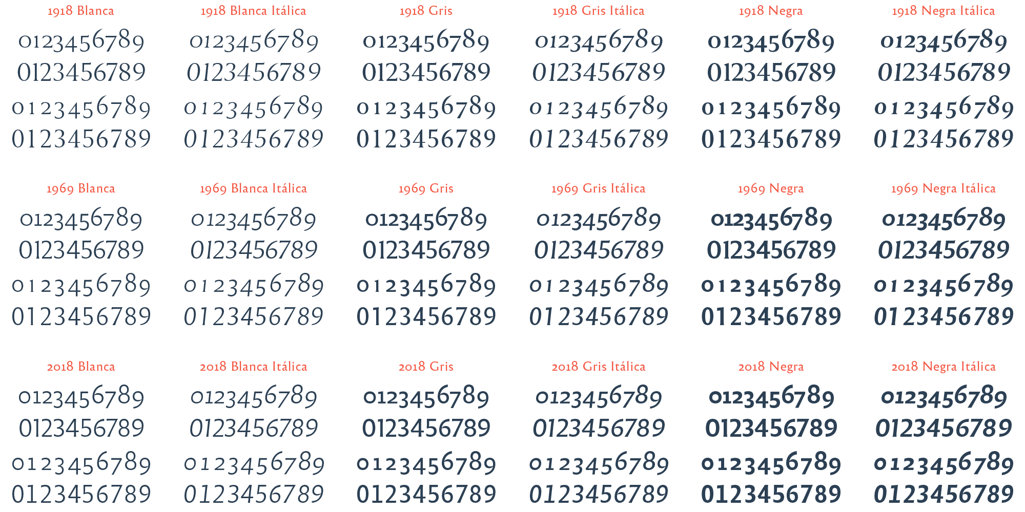
All fonts were thus grouped into three subfamilies, from classic (complete serif, old style modulation) to modern (sanserif, monoline modulation) with an intermediate hybrid style that combines the qualities of the other two (subtle modulation and flare serifs). The choice of numbers in the name (1918, 1969, 2018), suggested by the graphic design team of the UNC, responds to years that are significant in the history of both the university and the nation. 1918 is the year of the University Reform that happened in the UNC. In 1969 the Cordobazo, a civil uprising of students and workers against the military government, took place in the city of Córdoba. And 2018 is the centennial year of the Reforma.

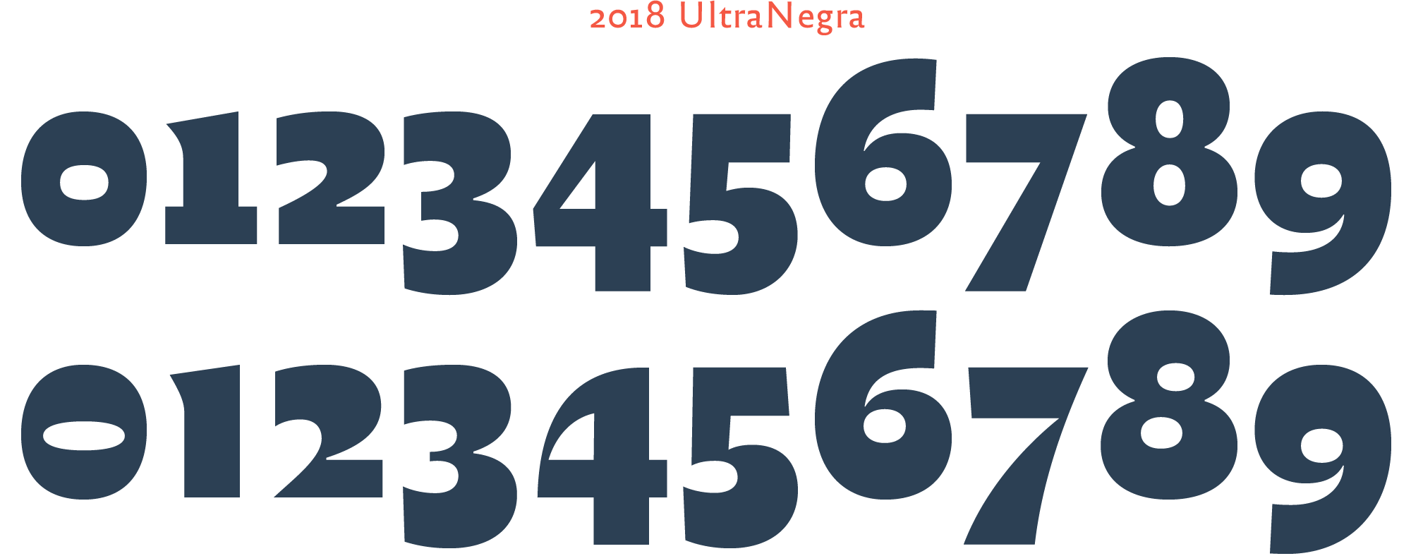
An ultra black companion set, roman & cursive, was created as a titling companion, to gain impact at headings. It was decided to give it a more relaxed voice, as a counterpart to the rest of Reforma fonts which are more sober and formal. Thus this UltraNegra set was built following its own rules, still consistent with the rest of the system, but prioritizing impact and tone singularity.
Global stylistic coherence
Integrating the two alphabets, uppercase and lowercase, the numbers to the letters, the punctuation and all, and then the different weights of each group, so that all fonts work harmonically, in big sizes and in long reading, is a pretty complex task. One should promote the best of each style without it becoming a circus, and at the same time one should avoid excessive neutralization that could make the system too anodyne or boring. We believe that Reforma reaches a good result in our attempt to balance personality and reading, tradition and novelty.

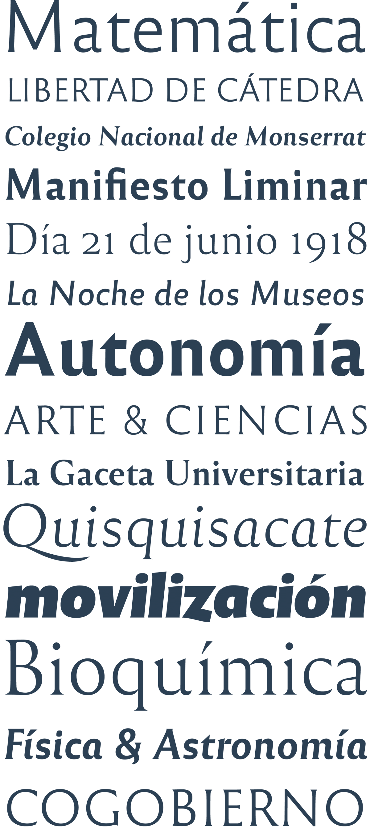
Designed for text. With the exception of UltraNegra (intended for titling), the three weights (Blanca, Gris, Negra) in both styles, roman and cursive, were designed for comfortable immersive reading. That is why the Negra weight is not so heavy, for the amplitude of its countershapes can ensure readability.
Typographic characteristics
Characters repertoires in Reforma are not particularly extensive (as they usually are within our retail typefaces), they include basic Latin. However, we think the inclusive nature of such educational institution requires an extensive language coverage, which will be tackled through future upgrades.
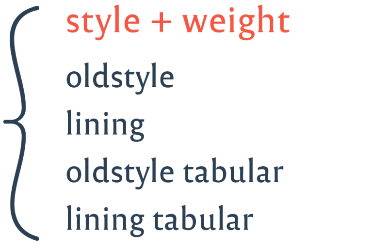
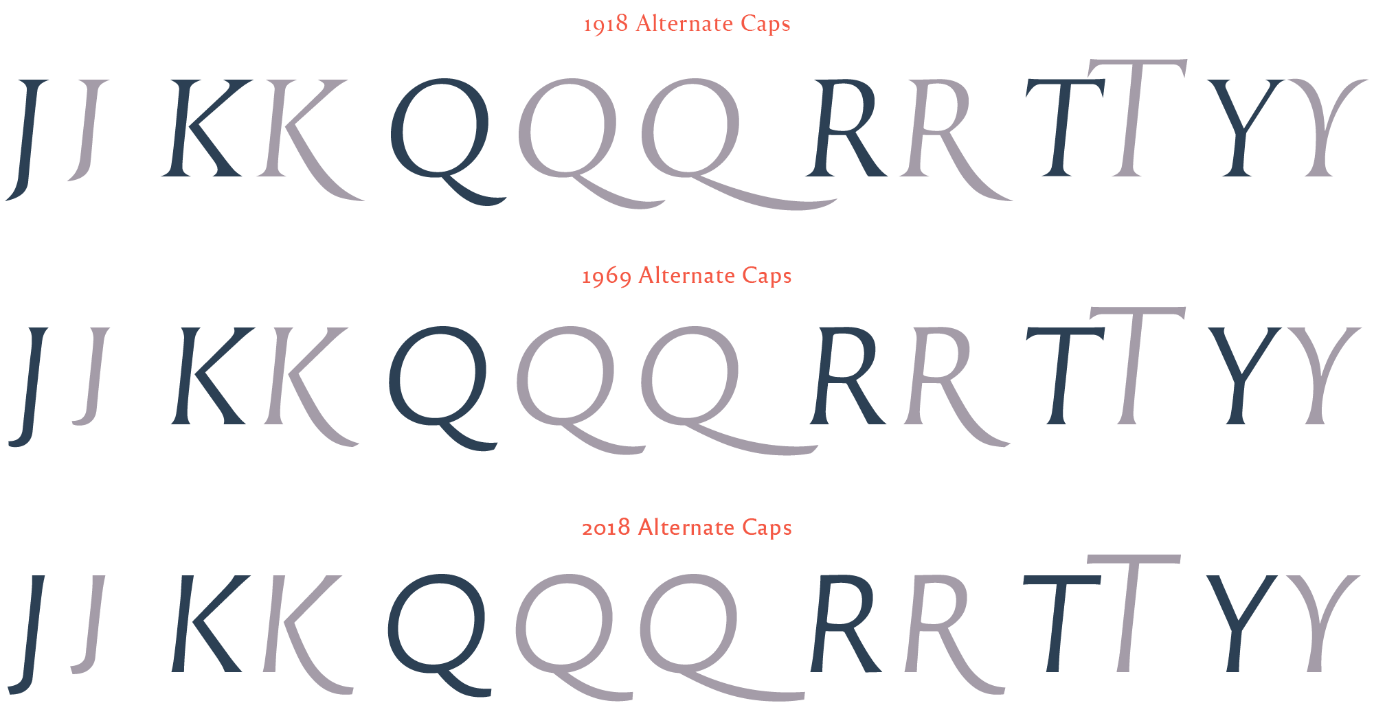
On the other hand we included in Reforma all the features that are considered basic needs in nowadays’ typographic practice, such as figures of different styles, alternate glyphs, standard and special ligatures, etc.
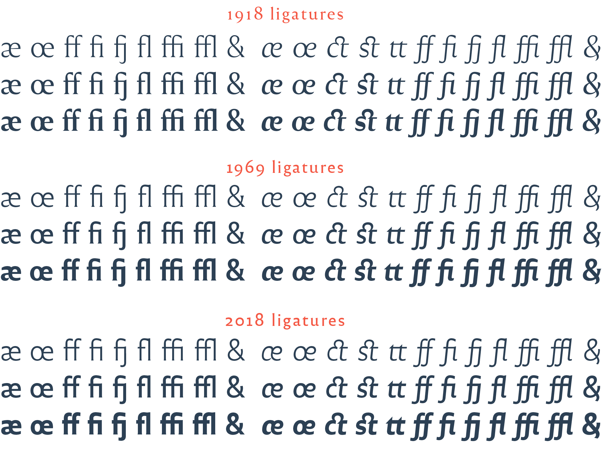
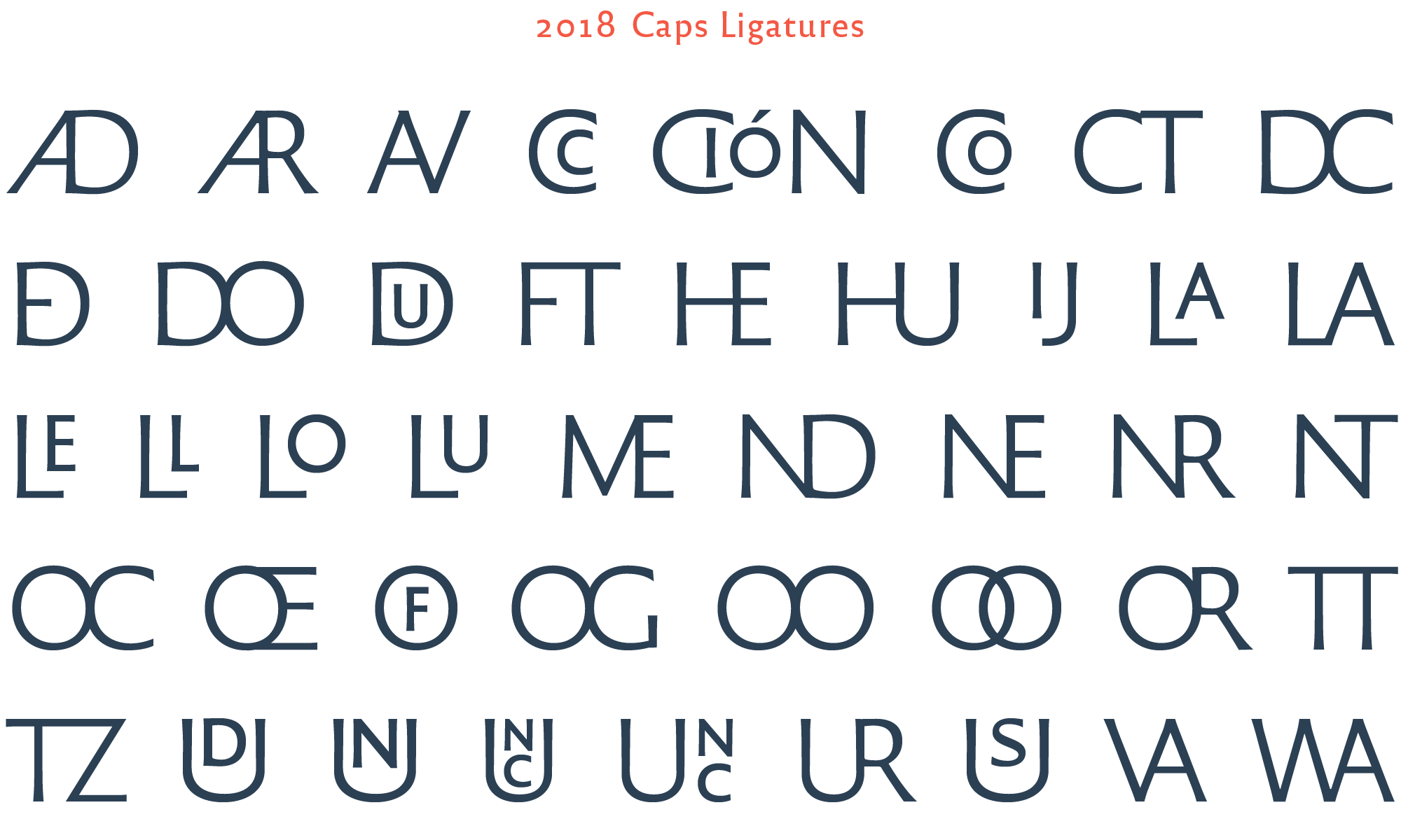
Thinking of headings and display settings, we also designed a set of ligatured caps. The idea is to extend these ligatures with more combinations and accents in future upgrades of Reforma.
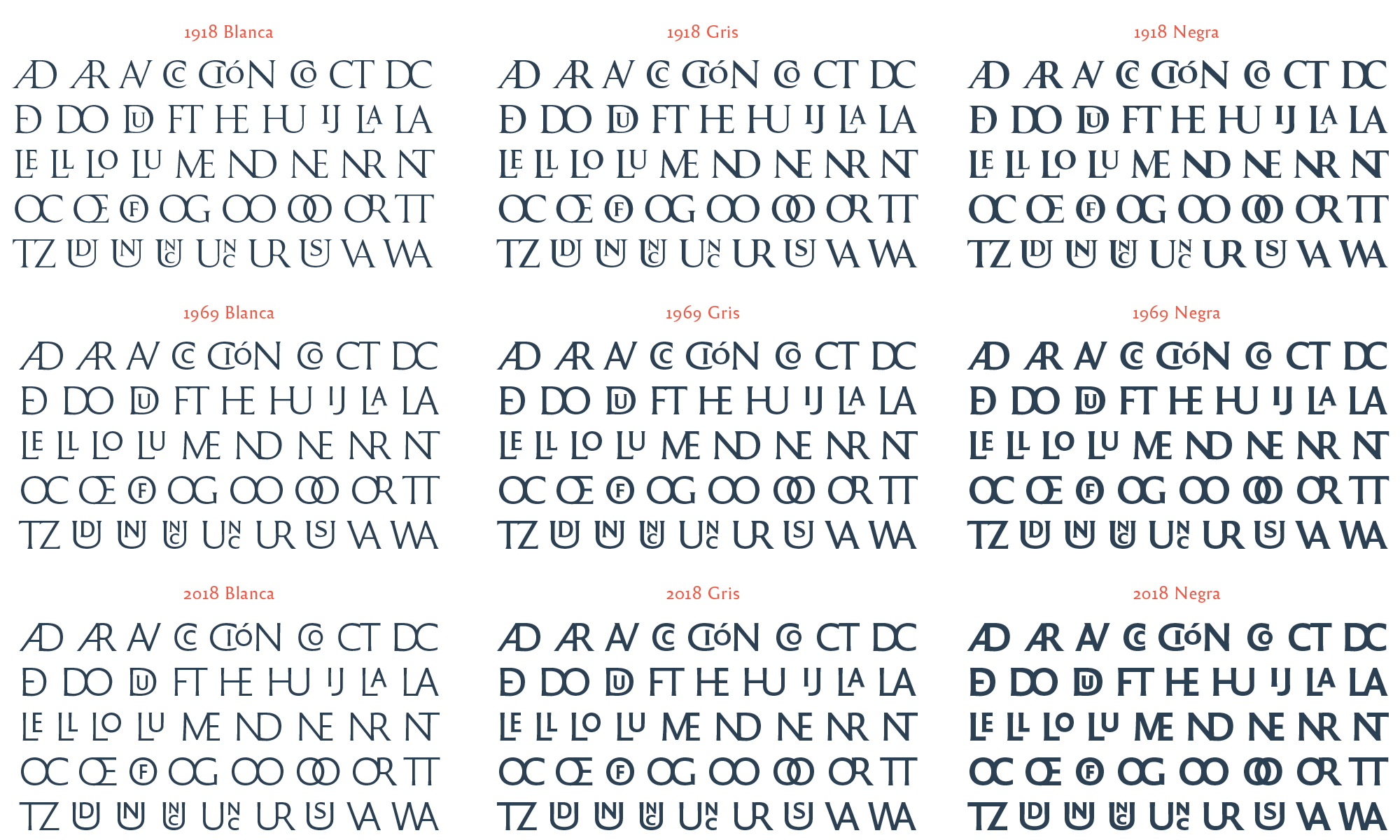
A family of 20 styles means that when you make a new glyph, it must be designed for each of the 20 styles. Without a doubt the formal coherence in typography is a lot of work. Due to the ‘graphic’ potential of uppercase ligatures, the UNC decided to keep them for their exclusive use. The same with UltraNegra. These elements were not included in the released sources.
After three years of work in this project (2015-2018) we made 20 font styles work harmoniously in real contexts. Of course additional styles in the system would help even more at enhancing its sense of diversity, by amplifying the palette of fonts choices to users. What we have completed so far is what the project has allowed us to do.
Testing and refining
Progressive, endlessly testing and refining stages are the ideal method to achieve quality where an iteration process with the users is possible. We can actually see the fonts used in real pieces, printed and on screen, long before their final release. That helps us to identify a big deal of details such as wide or narrow letter widths, missing kerning pairs, hinting troubles 4, and other tiny details that can be fixed in the next Beta upgrade, and so forth until the final release.
Official launch
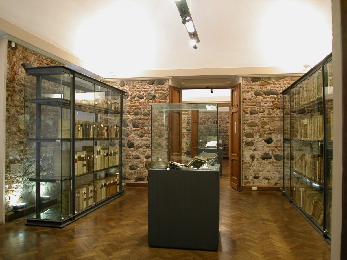
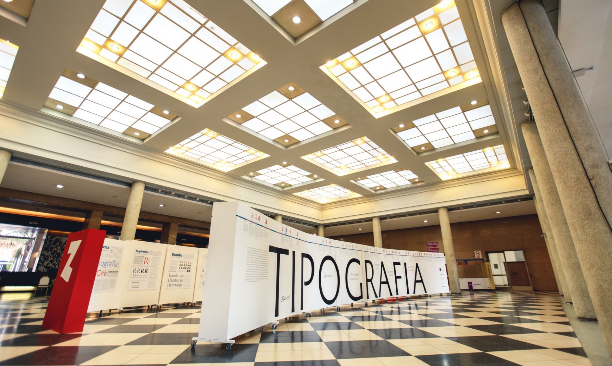
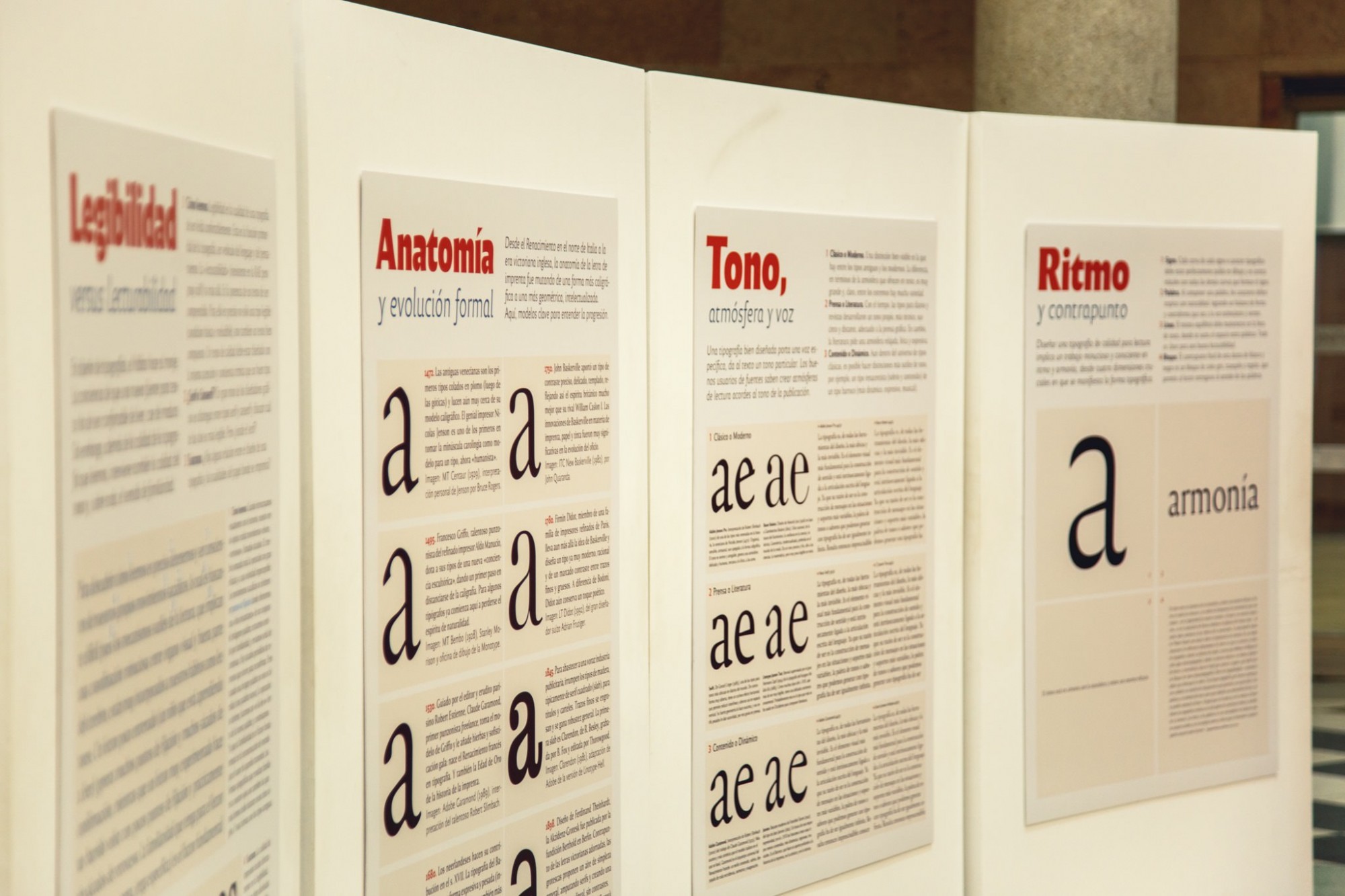
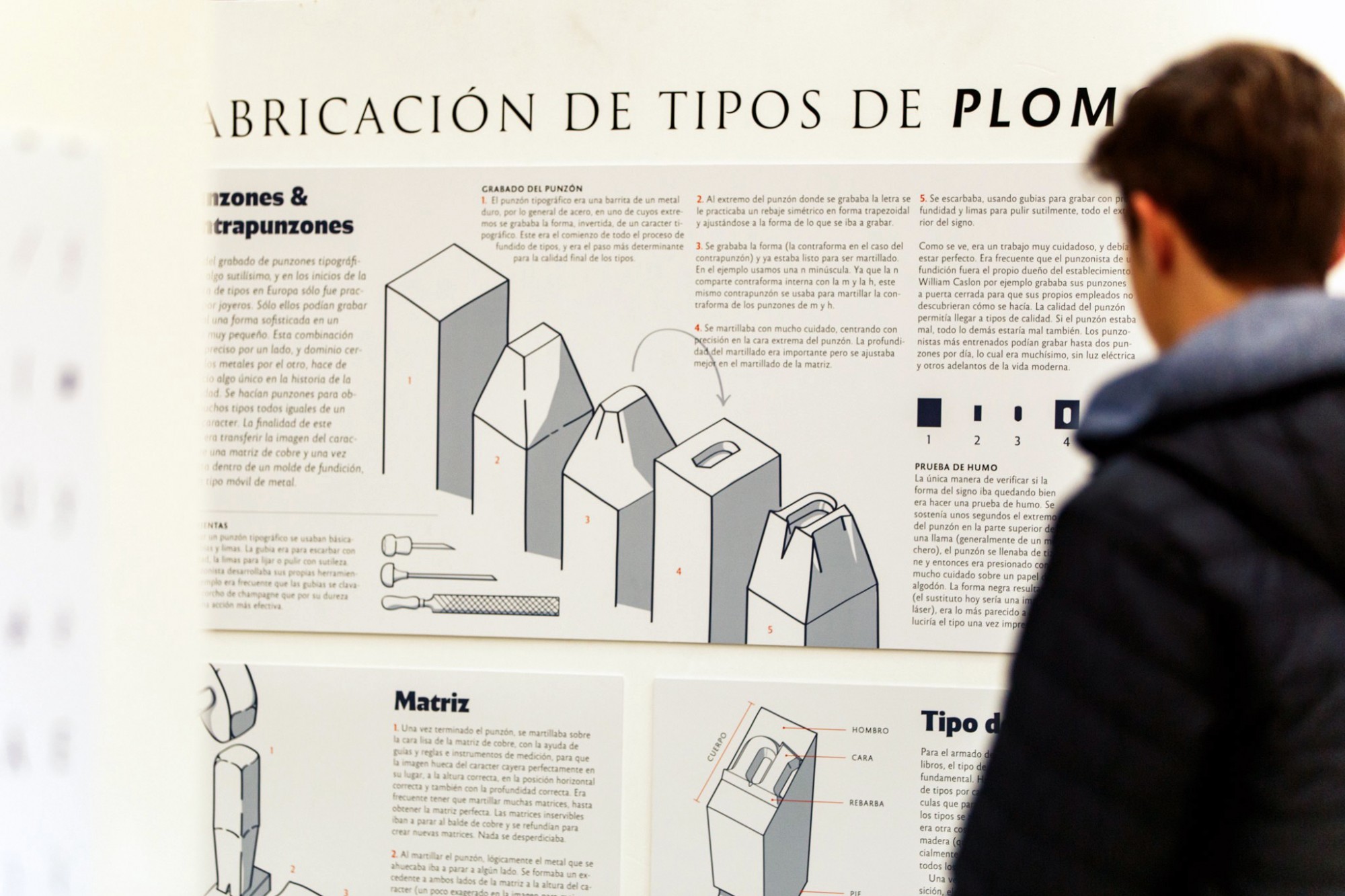
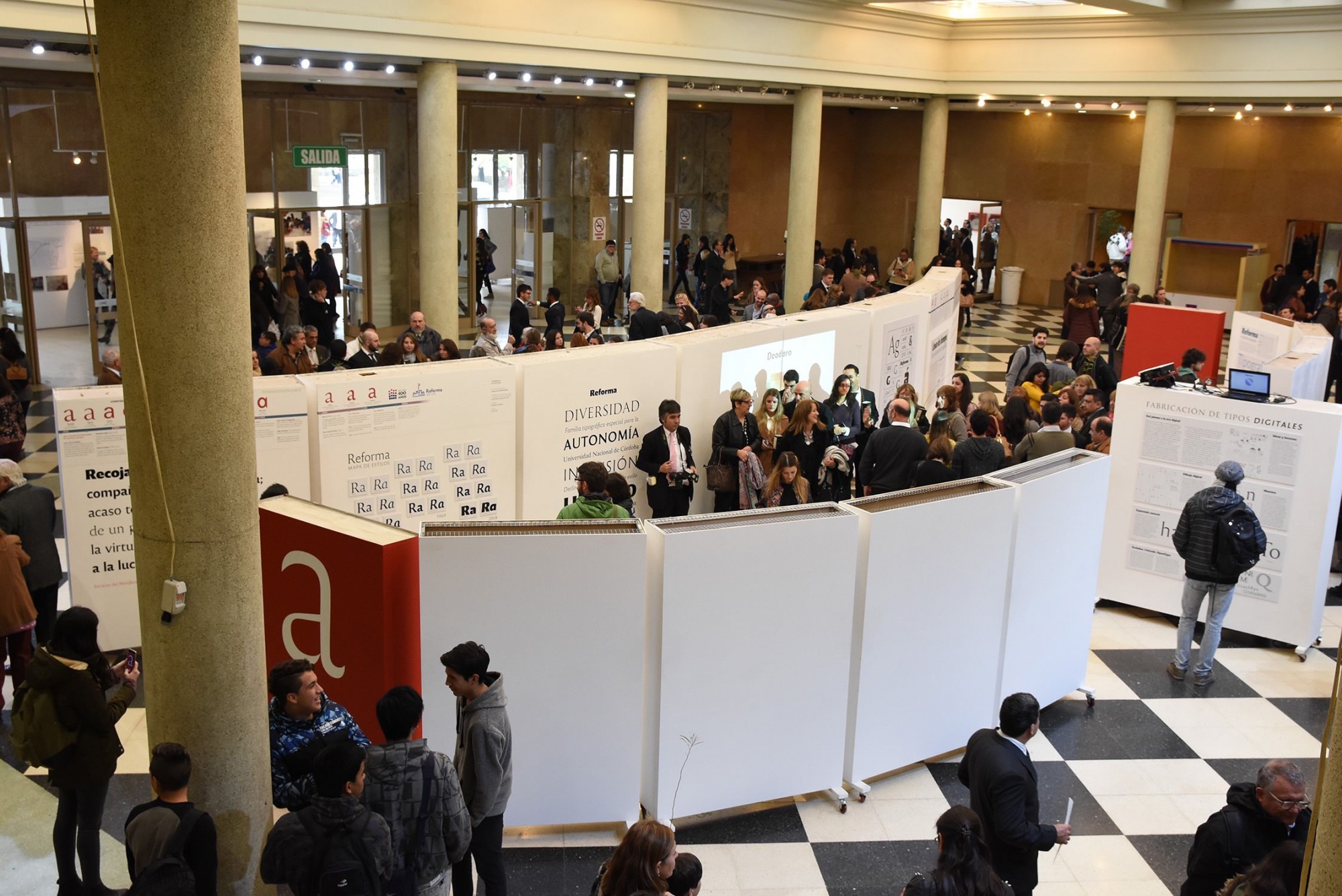
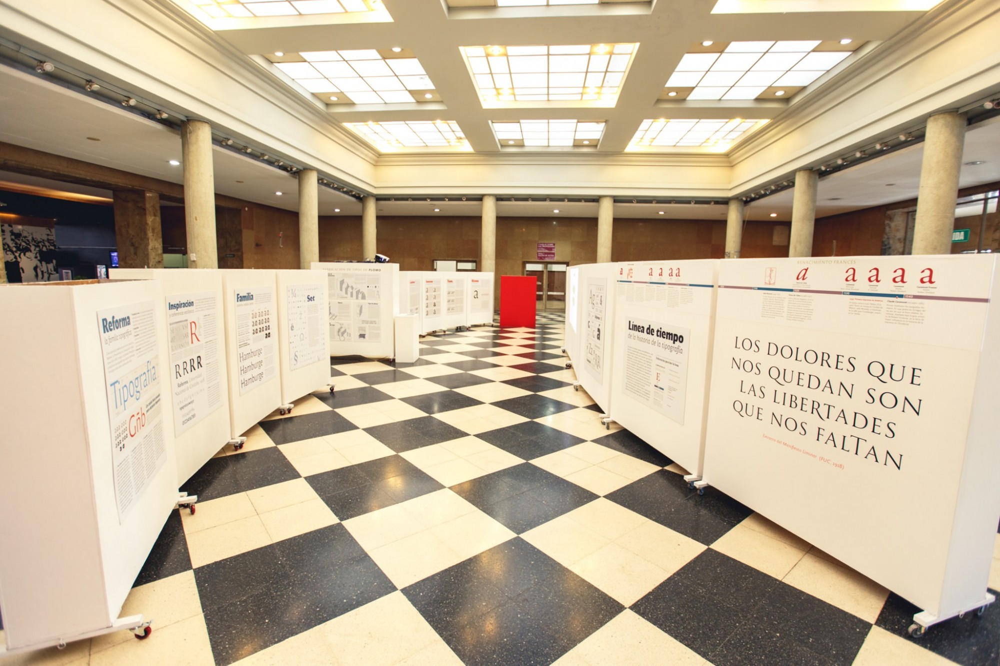
In June 2017 we gave the key talk at the official presentation with the presence of the university president and other authorities. The protocol also included the inauguration of an exhibition on typography and type design (entirely conceived, written, and designed by PampaType). This was a significant effort from our foundry to rise interest within the university community and give the project a broader visibility.
This has been an important project for us and we are satisfied with the results. We would like to express our gratitude to Gustavo Mathieu, Deputy Secretary of Institutional Communication, and to the design team at the UNC: Juan Pablo Bellini, Sergio Cuenca, and Eloísa Oliva, to facilitate the dialogue, the feedbacks, and their permanent enthusiasm.
Further reading
Donald Anderson. Calligraphy. The Art of Written Forms, Dover, NY 1969.
Edward Catich. The origin of the serif – brush writing and Roman letters, Catfish Press, Iowa, 1968 (Second ed. 1991).
Matthew Carter. “Theories of Letterform Construction. Part 1”, Printing History Society Bulletin, vol. 13/14, 1991/2, p. 3-16.
Giovanni Mardersteig. “Leon Battista Alberti e la rinascita del carattere lapidario romano nel Quatrocento”, Italia Medioevale e umanistica, 2, 1959.
James Mosley. “Giovan Francesco Cresci and the Baroque Letter in Rome”, Typography Papers 6, 2005, p. 115-155.
Paul Shaw (editor). The Eternal Letter. Two Millennia of the Classical Roman Capital (several authors), MIT Press, USA 2015.
Geofroy Tory. Champfleury (où Art et Science de la Vraie Proportion des Lettres), Paris 1529. Facsimilar edition from the Bibliothèque de l’Image, Paris 1998.
- The military dictatorship settled from 1976 to 1983 left about thirty thousand missing people and a deep abyss that still divides the whole society about how to run the destinies of the nation. Successive intellectual waves and periods of wealth from 1880s up to 1950s helped to build a national aspiration for a high place in the world concert. This has been systematically obstructed by the «international order» and the banks’ plans for keeping the developing countries dominated under their perpetual policy of credit & debt, which finds fertile ground in the corporations and in the ruling classes of the country. Since colonial times the role of Argentina was determined as a provider of food — specially grains and cow meat. Governments that have tried to change this had to face aggressive counter propaganda in worldwide media and eventually destabilizations and rapid endings. Nevertheless, all internal and external efforts to keep wounds open and thereby ensure division among people, remain an effective strategy. As Imperial Romans would put it, Dividet et imperat. ↩
- This is the kind of services that public education aim to offer in our societies. It is more than just following courses to become a professional and earn your money in life. It is a place where learning and teaching are exercized with freedom of mind and intellectual independence, where students’ minds can flourish far from private agendas and corporate interests, where individuals can reach higher states of mind and share a generous human experience. ↩
- This sound hipothesis was introduced brilliantly by Edward Catich, though some letters historians find it more believable that for instance serifs originated in the use of chisels. ↩
- Hinting is the set of instructions given to fonts to make them render better in small sizes under low-res conditions ↩