1. Introduction: defining boundaries
Like a tightrope walker on the line of technological changes, by its nature type design immediately compels us to better define the term ‘revival’, since (as usually pointed out) the whole history of typography can be seen as a series of successive and quite ephemeral adaptations to new technologies. The concept of ‘revivalism’ could be thus understood as the process of merely converting or translating one design for different, newer devices. But in fact apart from ‘revival’ some other terms have been also employed, perhaps to more clearly qualify their particular approach. Terms like imitation, inspiration, adaptation, translation, re-interpretation, redesign, echo, homage, revision, remix, restoration, recreation, rendition, resurrection, etc. could be taken as implying slightly or dramatically different attitudes facing historical models. Thus Charles Bigelow and Jonathan Seybold proposed a distinction between ‘revival’ and ‘adaptation’, saying that the Humanist revived the Roman capitals and the Carolingian script, while the first printers adapted the Humanist bookhand. Moreover, “when the model for an adaptation extends back further than the previous technological or cultural phase, then we speak of revival rather than adaptation”1 Although suggestive, this explanation seems to fall in a simplistic way by distinguishing those terms only for the amount of time between original and remake, whereas it is suspected here that those terms might imply interventions of different nature.
On the other hand a more subtle sense of ‘revival’ could also be perceived as an underlying factor in the entire history of printing: the constant process of imitation/innovation pushed by the ‘type community’ and contained by the readers’ staunch conservatism in their need of conventional and immediately recognisable typeforms, that results (at the same time) based on and cause of the perennial legacy of (say) the ‘mother’ styles. In other words, the possible aesthetic interrelations that can be sustained among the forerunner-in-style families and which constitutes the prime material of type classification. To this respect the idea of revival thought as an encounter of traditional forms with current technology seems to me a very spontaneous manner of evolving. However the word ‘revival’ will not account here for the unconsciously grown-up and collectively experienced, evolutionary process of typeforms.
It is then intended in this work a brief discussion on type ‘revivalism’, in the sense of the intentional act of recovering or reinterpreting older type designs and restore them from their ‘physical reality’ to remake their current use possible; in the belief that there would be different approaches in these interventions and that those approaches might be arguments useful for a discussion. Naturally it would have been impossible to cover all cases of type revivals in history in such a short essay, hence a selection of them has been chosen to talk about. An initial part refers some revival attempts made in the early twentieth century. Secondly, the different approaches taken in successive revivals of Griffo’s types are briefly explored. And a third part is concerned with the ‘controversy’ issue that has always surrounded the matter.
2. Revivalism in the early 20th century
It has been said that the use of the old-face of William Caslon made in the Chiswick Press during the 1840s probably is the first intended historical ‘revival’.2 The publisher William Pickering and the printer Charles Wittingham used the Caslon type to better connote the ‘literary’ atmosphere in their books, mainly concerning poetry and literature, in contrast with the scientific spirit of those days. So (it could be taken as a clue) there seems to be a ‘romantic’ spirit involved in the act of reviving something from the past. In fact it was William Morris in 1892 who ‘romantically’ attempted in the Renaissance Jenson’s style (Venice, 1470s) a robust, ‘gothic’ interpretation that became his Golden Type. As we will discuss later, only oppositions of terms like ‘imitation’ and ‘recreation’ would preliminary allow us to distinguish in some extent one approach from another. But as it is well-known the beginnings of the twentieth century were a prolific moment for revivalism in typography, although the pioneer early years of the type foundries were still signed by the need of matching the look of manual composition (like Gutenberg had to do it with mediaeval scribes’ handbook). Thus there was no need of originality, explains Christopher Burke3, for the main reason of the Lanston Monotype Corporation at that moment was to ‘adapt’ the current repertoire of hand-setting families for the machine-composition. Only two types were the exception: Imprint in 1912 (a re-interpretation of Caslon in the Old-Style-line but with a less angular italic) and Plantin in 1913 (a robust version of a Robert Granjon’s sixteenth century type for printing on art paper).4
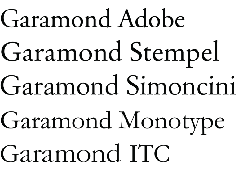
The 20th century has seen the type libraries fulfiled with remakes of Garamond, some fine tributes and some other forgettable. Here probably the most widely used: Robert Slimbach for Adobe, San Francisco 1988. Stempel foundry, Frankfurt 1924 [digitized by Linotype]. Francesco Simoncini, Simoncini foundry, Bologna 1958 [Jannon]. Fritz Max Steltzer for Monotype, Salfords 1922 [Jannon]. Tony Stan for ITC, New York 1970.
In 1914 Bruce Rogers found himself in an attempt with the Jenson style (probably the finest ever made) that was privately cut for the Metropolitan Museum of New York. With the addition of a chancery italic designed by Frederic Warde (inspired in Ludovico degli Arrighi’s typefoms of the 1520s), Centaur was released in London by the Lanston Monotype in 1929. At that moment the situation in the British company had changed. The new scholarly enthusiasm led by Stanley Morison, the influential adviser in Monotype from 1923, opened the possibility for missed old designs to see their rebirth in the hands of skillful craftsmen. Although he did not participate much in the first project (Poliphilus), Morison encouraged the following attempts: Bembo (the second approach to Francesco Griffo), Blado (an italic for Poliphilus based on the chancery forms used in Rome by Ludovico degli Arrighi), and much more expected, the revival of Garamond. Actually three versions of Garamond appeared at that time: the first one issued by the American Type Founders in 1917 (continuing its success with the revivals of Bodoni in 1910 and the Venetian Cloister Old Style in 1913, the latter based on Jenson’s roman, both cut by Morris Fuller Benton); the second Garamond cut by Frederic Goudy for the American Lanston Monotype Machine Company in 1921, and the third version by the English Monotype in 1922. All of them were based on the famous drawings of the Caractères de l’Université historically attributed to Claude Garamond and later to Jean Jannon’s imitation of the Garamond’s drawings, as Beatrice Warde revealed in The Fleuron in 1926. Natural competition between companies and different opinions in scholarliness about the right source settled the arena for a never-ending series of Garamond re-interpretations, undoubtedly the most recurrent revival in history. Some of the most successful versions were issued under other (related) names among which the highly praised Linotype Granjon (designed by the printer George W. Jones in 1928), Sabon by Jan Tshichold (firstly released by Stempel in 1964) and Linotype Galliard by Matthew Carter (1978) are probably the finest examples. In 1935 Monotype worked with Jan Van Krimpen (adviser at the Enschedé Foundry in Haarlem) toward a seventeenth-century Dutch type that was attributed to the punch-cutter Christoffel Van Dijck who had worked for the Elzevir printing house in the 1760s. In comparison to its ‘garalde’ origin the new Van Dijck resulted narrower and slightly more contrasted. On the other hand the original matrices of Anton Janson that had been acquired by the Stempel AG foundry in Frankfurt in 1919, were the source for Janson Antiqua and Janson Kursiv, still considered the most faithful redesign. In these forms were based in turn the types of Linotype (1930) and the American Monotype (1937). After the interest Morison had taken in Janson’s ‘rationalist and economic’ style, Monotype adapted the Ehrhardt specimen of 1720 (probably cut by the Hungarian Miklós T. Kis) toward a new type regularised in weight and proportion with Imprint and Plantin as models. In 1932 The Times commissioned Stanley Morison to design a type, the enormously known Times New Roman, that was executed by Victor Lardent upon a Plantin’s sixteenth century specimen under Morison’s direction. Times New Roman has been widely considered the first attempt trying to match tradition with a ‘modern’ vision. In 1939 William A. Diwiggins based his Mergenthaler’s Caledonia in the Scottish types designed by English punch-cutter Richard Austin and produced by William Martin of Glasgow in 1790. All in all, the idea of reviving classics had acquired a high reputation in the trade and the intensive demands of an already huge type-setting industry in both America and Europe turned this revisionism into a very profitable activity for type distribution companies.
Perfect imitation is impossible.
Charles Bigelow, 1981
3. A case study: Different approaches to Griffo
Among the examples useful for providing different sides for this discussion there are the successive attempts taken with the legendary types cut by the goldsmith Francesco Griffo da Bologna who worked in Venice for Aldus Manutius in the late fifteenth century. His typeforms have been said of being ‘engraved’ or ‘sculpted’ shapes, and consequently the first ones getting apart from the calligraphic tradition.
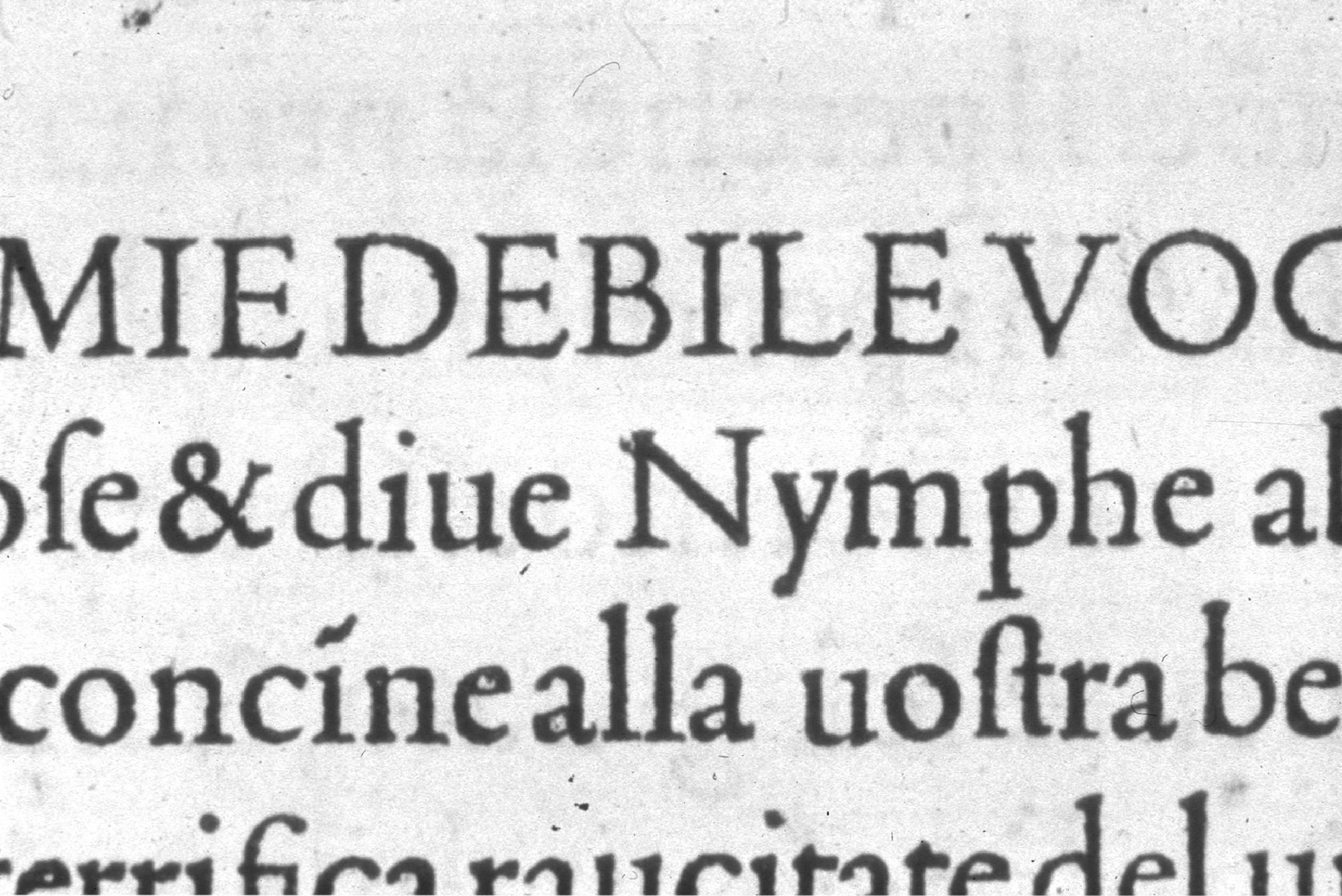
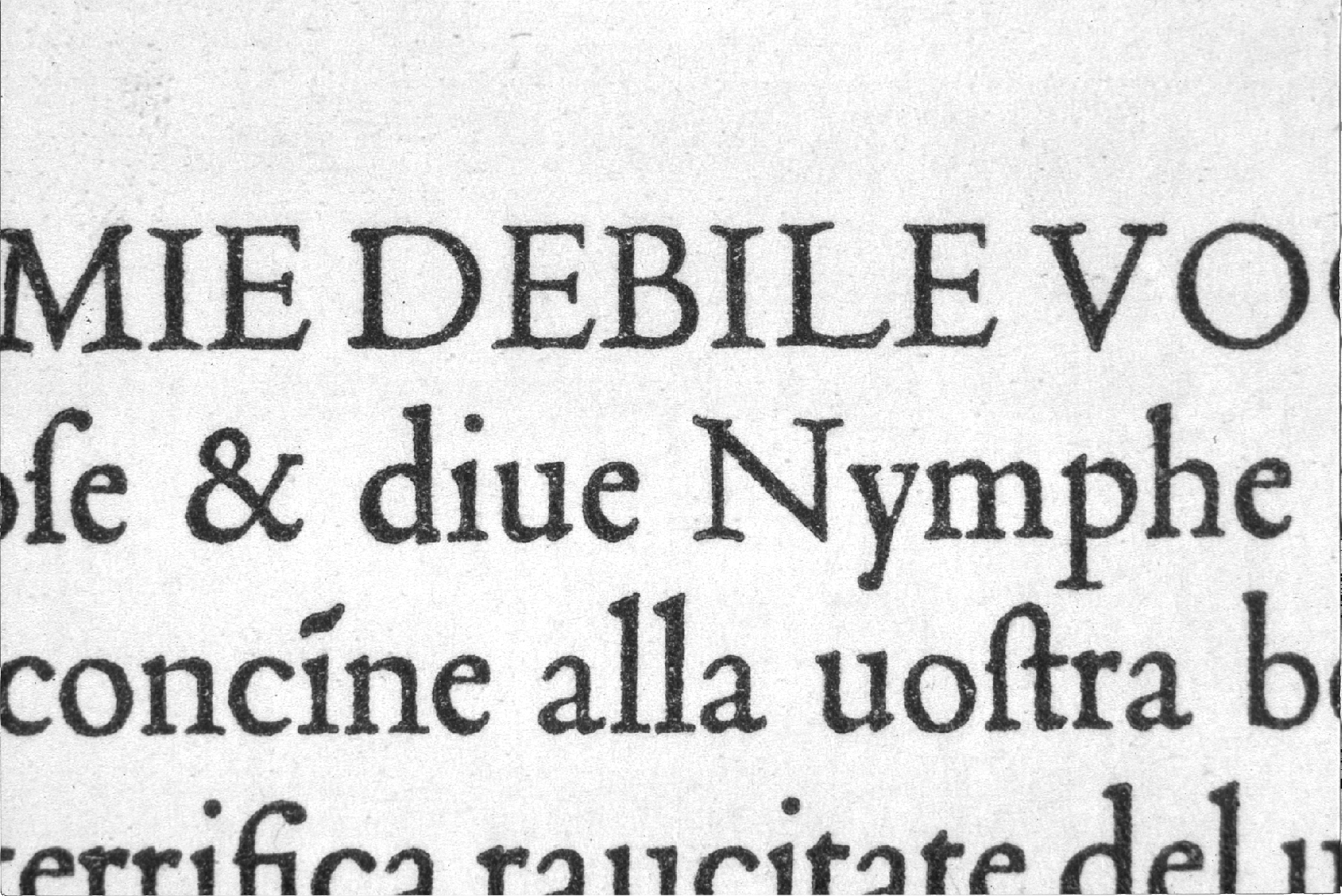
First approach: Poliphilus
In 1929 the skillful production team of Monotype, led by the Works manager Frank Hinman Pierpont, the letter draftsman Fritz Max Steltzer and the punchcutter Theodor Bisser, accepted the challenge of producing a replica of the Griffo design used in the legendary book Hypnerotomachia Poliphili of Colonna printed by Aldus in 1499. As they took a facsimile version as a source (figure 1 below), they ‘recovered’ in the face the distortions that at that time were produced by early processes of casting, inking and printing. The result was an accurate imitation that exactly matched the appearance of the original book (figure 2, below). Because of this it has been said that despite of its beauty Poliphilus was a complete failure as a type. Charles Bigelow has concluded: “Griffo’s designs are beautiful despite these flaws, not because of them”. Of course this is one of the main questions concerning the idea of faithfulness in revivals. “When the design of a type is to be imitated, the noise and the distortion must be removed and the signal restored in order to obtain the original high-quality image intended by the designer”5 But the problem is: Which is the original high-quality image intended by the designer? Considering that he developed the type to be printed under some particular printing conditions, which is now the most appropriate source? the punch, the metal type, its printed letterform? One would tend to think that as the punch-cutter would make successive smoke-proofs of the punches in process, these should be the most accurate startpoint, but this is not the case of many revivals that could only be based on old, printed books.
Second approach: Bembo
Not much pleased with the result of Poliphilus but still thinking of revivals as a promising market, Morison encouraged a second mechanical re-cutting in 1929, this time based on the face used in the Aldine edition of De Aetna of 1495 by the Humanist Cardinal Pietro Bembo. A thorough process of ‘restoration’ of forms was followed by the Monotype Works team in order to take off the noise and flaws. The new type was much sharp and clear than Poliphilus and in fact became a successful classic by itself throughout the twentieth century, though was criticised for lacking the real charm of the original. Again according to Bigelow & Seybold, the ‘cleaning’ process would have removed not only the noise but also some subtle details that made Griffo’s type so extraordinary6. (figure 3). Comparing it with its digital version ‘Monotype Bembo’ made by The Font Company in 1990 (figure 4), some differences come up: apart from a slightly lighter colour, the wider caps’ width and the shortened ascenders/descenders, small g and uppercase R are notably different.

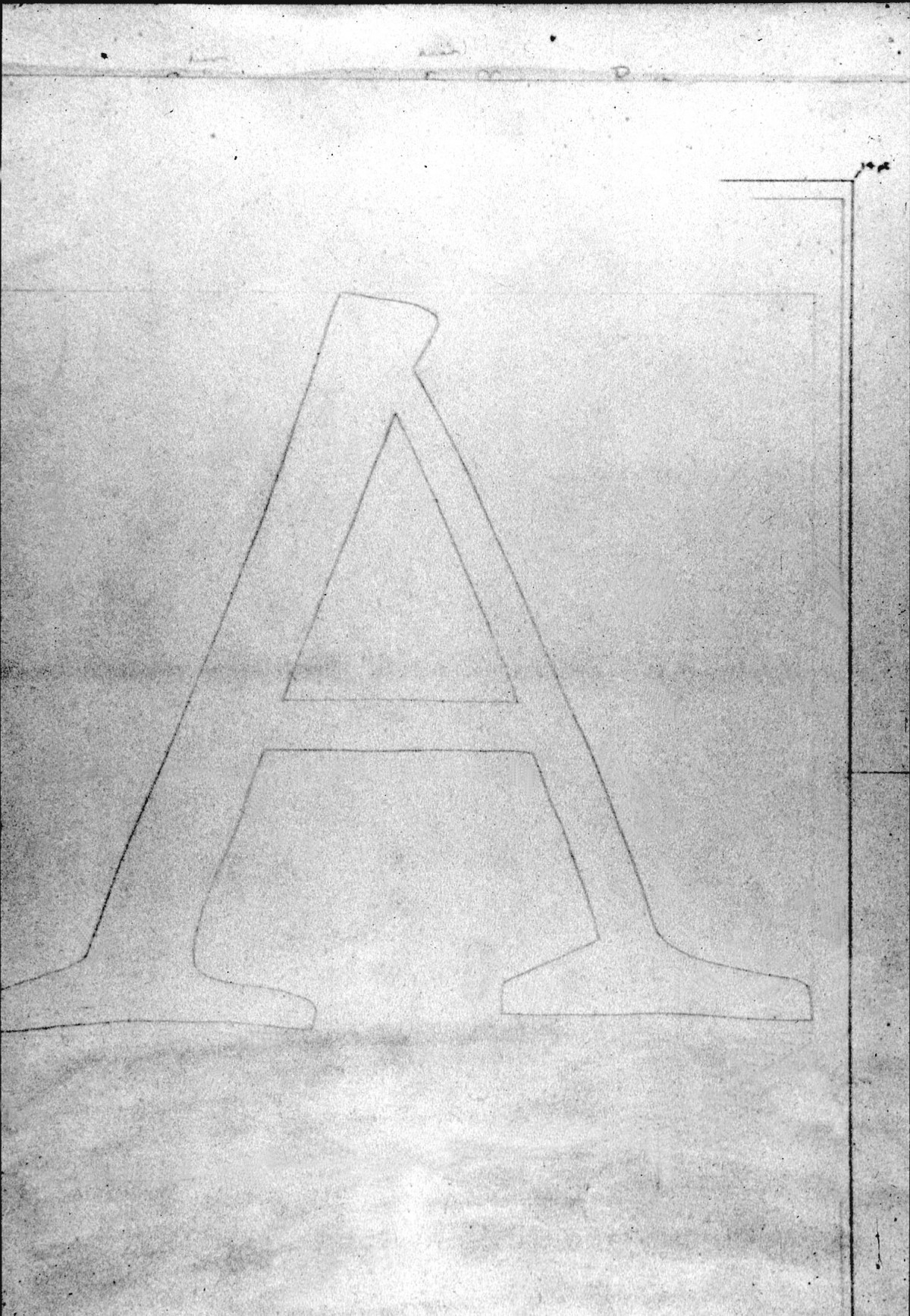
Figure 1. Source used for the type Poliphilus.

Figure 2. Poliphilus type.

Figure 3. Monotype Bembo.
Third approach: Griffo
The fine printer and typographer Giovanni Mardersteig, who set up the Officina Bodoni press at Montagnola di Lugano in 1922 and transferred it later to Verona, was encouraged in 1930 (once more by Morison) to try a remake of the type used in De Aetna edition cut by Griffo, in whom Mardersteig immediately became deeply interested. But this time the attempt would be followed in a different way: Mardersteig met the great French punch-cutter Georges Malin who had cut the trial size of Eric Gill’s Perpetua for Monotype. Designer and punch-cutter worked together for six months, making smoke-proofs of entire lines and comparing them with a copy of the De Aetna. During that process Mardersteig and Malin realised that Griffo, a Renaissance sensitive goldsmith obsessed with the idea of the liveliness of scribes’ handwriting, had cut several slightly different alternative castings of some letters in order to bring that liveliness back to the printed page. This fact had been misunderstood by the Monotype team in their Bembo revival, as they had probably thought those irregularities were expectable as a consequence of such a coarse printing7, some subtle details of letters have to be found by induction rather than with the eye. So it seems that in any case the coarse printing techniques of the past open room for uncertainty and thus many design decisions must be taken. In the case of Griffo types one of these decisions has to do with the election of one representative of all its alternative characters.]. The resulted design of the couple Mardesteig-Malin was even closer to the original type (and consequently less modern in appearance), probably due to the mastery of Malin who as a skillful craftsman could better interpret the subtleness of Griffo’s details.
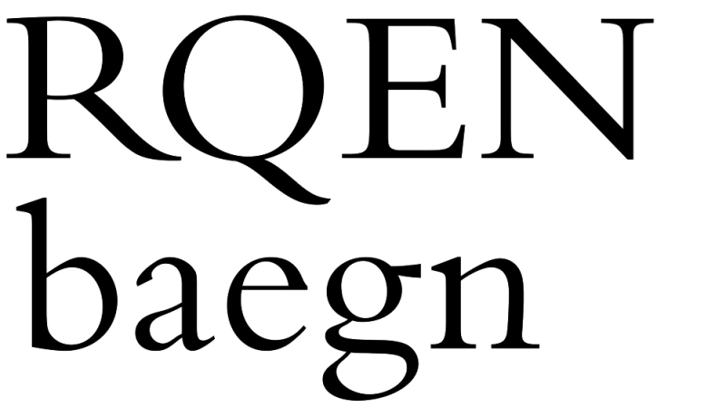
Figure 4. Monotype Bembo digitized by The Font Company, 1990.

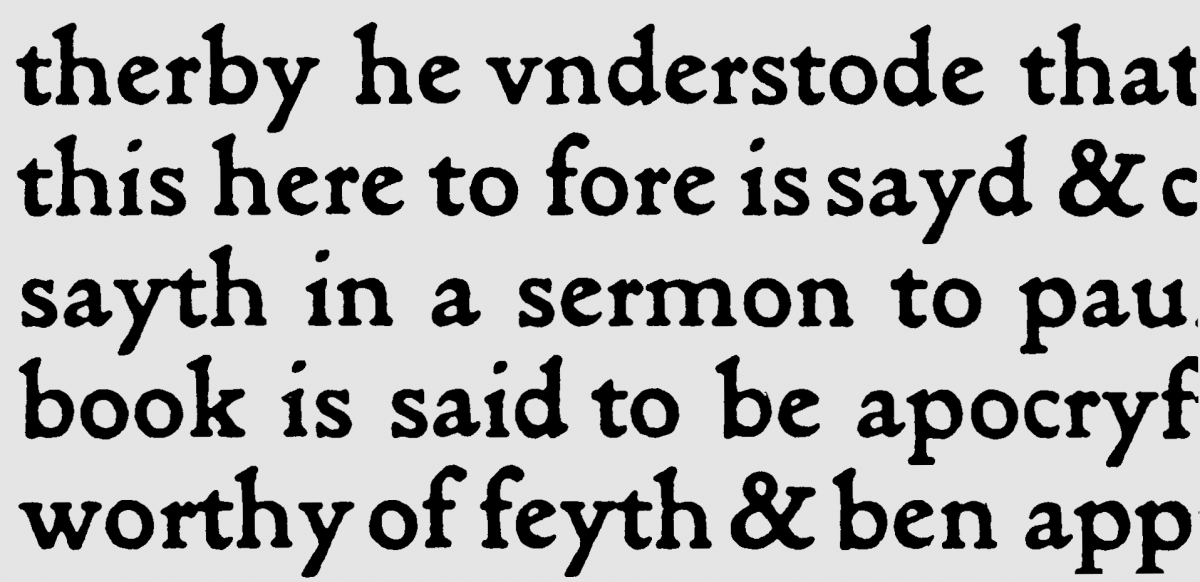
The celebrated MT Dante by Mardersteig.
Fourth approach: Dante
“A finely tooled and stately neohumanist roman coupled with a very lively and lucid italic” as Robert Bringhurst defined it8, Dante was the result of Mardersteig’s maturity in type design and (again) George Malin’s high skills in interpreting his intentions (figure 5). It has been profusely discussed whether or not Mardersteig based his new type on the Griffo style. The general opinion is that it is an original design strongly influenced by the deep knowledge he had acquired in Francesco’s life and work, but this is something difficult to conclude, even after comparison. As John Dreyfus pointed out: “The danger is that we see what we hope to find, and concentrate on what is familiar instead of what is new.”9 But of course the Mardersteig’s admiration of Griffo cannot be obviated. In Bringhurst’s opinion Dante has more Griffo’s spirit than any other typeface in the market.10 From all these approaches it is also ‘the most integral and coherent, and owes its quality to its originality’ said Bigelow.11 Malin finished the punches in 1955, one year before his death. The type became the favourite of Giovanni who used it in the Officina Bodoni for more than two dozen books in the following twenty years. Monotype made an adaptation for mechanical setting in 1957 and more recently a digital version in the 1990s.
The best types for our use must be newer letter forms based on the shapes fixed by tradition. Frederic Goudy, 1940
4. To revive or not to revive?
In any case it seems clear that the common metaphor of Gutenberg’s imitation of medieval scribes’ handbook into the incunabulae could be applied successfully in other historical cases. Similar situations can be verified in the shift from hand to mechanical composition, from linecasting machines to photo-typesetting technology and from photocomposition to the digital medium. There has been a process of technical ‘adaptation’ involved anyway. So it might be speculated there is a sort of tension or (say) ‘dance’ between type technology (all physical supports involved in production) and type aesthetics (the typeforms as visual devices) throughout the history of printing. And this double nature of typography (its cultural code versus its physical reality) would be in the heart of the trade, and in fact being object of several studies. In an enlightening article Richard Southall has emphasized the importance of the human factor in the relationship between type designer and type producer.12 On the other hand, studies like the one by André Gürtler and Christian Mengelt have pointed out the dramatic asymmetry between the enormous technical development seen in the twentieth century and the lack of a correlate research in type design.13
But these viewpoints could not neutralize the intense controversy that has surrounded the ‘revivalism’ for many decades. Walter Tracy has declared the apparent ‘gnoseologic’14 value of revivalism: “The revivals (…) are still the essential source material for the understanding and appreciation of all type designs. If they did not exist, or were discarded, there would be no standards by which to verify our ideas of what is good and bad.”15 Within a similar approach Frederic Goudy said: “(…) tradition not only teaches the best way that has been found to do it, but shows also the metes and bound of man’s endeavour reached at the moment, the walled boundaries within which the imagination of the craftsman may have full sway”.16 But it does not seem to be the case of designer Jonathan Hoefler who prefers to trust his intuition: his Historical Allsorts (a series of six historical typefaces) are “an experiment to see how successfully a typeface could be ‘resurrected’ without the influence of the designer’s ideas, instincts and biases”.17 Moreover, probably following the ‘aleatoric’ tradition inaugurated by Jan van Rossum and Eric van Blockland18 he left his ‘uninformed’ computer to take some decisions by its own: “the original sources were traced algorithmically by software” and it thus results in a “guesswork about the shape of the alphabet, though it preserves the eccentricities of their metal forbears, for better or worse”. However the revival idea has gained some radical enemies: “What a poor society this must be if it is unable to express itself and is only able to copy the past?”.19 One of the most radical critics of type ‘revivalism’ has been Hermann Zapf, who has declared himself against any kind of imitation, although he also worked in a revival of Janson.20 He argued that the ‘outline’ that some of the classic faces have been given by the hand-cutting of punches could never be copied by mechanical, photographic or digital technologies. Then: “Should we transfer all old metal typeface designs into the new technology of digitized typesetting…?”.21 This paradox seems to be in the centre of the discussion. At the same time the valuable work that has been done by some foundries in recovering classic designs all over the twentieth century cannot be judged only under the umbrella of their commercial interests. They also account for a valuable attempt to keep good type design among us and also for the necessary contact with the past, as it would be supported with fine criterion by Robert Bringhurst: “Typography is an ancient craft and an old profession as well as a constant technological frontier. (…) Maintaining the system means openness to the surprises and gifts of the future; it also means keeping the future in touch with the past. This is done by looking with equal eagerness at the old work and the new.”22
The tendency when working in the digital medium is to move toward refinement’. Robert Slimbach, 1995
But the polemic is not ended. While Gerard Unger declares himself against the ‘revivalism’: “I prefer to do my own work”23 subscribing the position sustained by Hermann Zapf24, when discussing over another Janson revival Zapf himself would however accept some kind of ‘recreation’ (though he does not specify very much how it would be possible): “Janson is a typical seventeenth century typeface and should be respected as an original design of this historic period in the Netherlands. It was created out of the spirit and artistic background of that time. The Janson is, in my opinion, not at all an expression of the alphabet in the twentieth century. (…) It is possible to design something new within the structure of the Janson, but we should leave the foundry design alone and create a new Janson, not just make an ersatz design”. His words seem to have been carefully followed by one of his admirers, the prolific type designer Robert Slimbach, who has found himself involved in the successful digital revivals of Adobe: Garamond, Minion MM25 and Jenson. “We felt it was important to offer fresh interpretations of classic types designed specifically for the current technology”.26 Slimbach always makes a preliminary drawing of the font, which naturally has to do with his skills as a calligrapher: “a set of drawings represents a starting point from which the design further evolves on the computer”. One would think that it is possible to ‘read’ in Slimbach’s designs his particular hand, though in a review of his Adobe Minion Sebastian Carter has said: “Stanley Morison would have given his seal of approval by having ‘the merit of not looking if it had been designed by somebody in particular’”.27 But it seems difficult to avoid subjectivity since a matter of taste is probably influencing these opinions. Zapf has said of Caledonia that “(it) shows Dwiggins’ hand in every detail and is his idea of how a type should look if it were designed for the twentieth century”.
Another, not less important, aspect of digital revivals was brought to the arena by the Multiple Master technology created by Adobe (unfortunately outmoded). Apart from the possibility of alternative widths and weights, it is a means (‘artificial’ for some) of respecting tradition by providing distinctive body sizes.28 It seems then reasonable to think, after mentioning these tasks, that the concept of ‘imitation’ is somewhat more complex, that lives room for variety. Dealing with the same original design, in different cases diverse sources were used for recovering the shapes; or even with the same source different methods were followed to trace the letterforms. And apart from the source and method selected, distinctive aspects of the design could also be stressed due to the different intentions of the designers. It has been quickly revised here the Griffo series. Another obvious example could be a simple comparison between Centaur and the Golden Type, both based on the same 1476 Jenson’s specimen. Bruce Rogers had remembered: “When I made the Centaur type I enlarged Jenson’s and wrote over the prints with a flat pen –just as rapidly as I could– then I selected the best (?) of my characters and touched them up with a brush and white –(no black) just about as much as a punch-cutter would do with a graver– and the type was cut from these patterns. (…) I wish now I hadn’t ‘trued’ them so much – Will one ever learn?”29 His method was very different to the one followed in 1890 by William Morris for his Golden Type. He overdrew Jenson’s letters photographically enlarged (their robust aspect caused by a printing on handmade paper). So in turn, two different approaches on the same design could result in two extremely different designs as the Golden Type and Centaur can be.
Undoubtedly another decisive factor has to do with the qualifications of the people involved in these processes. As Bigelow and Seybold have suggested: “(…) the crucial paradox of type design imitation, and the force which drives type design evolution… (is that) a designer skilled and knowledgeable enough to perceive and render all the subtle nuances of another master craftsman is really too good to do a slavish copy. A master designer will inevitably transform an imitation into a creative act, which will give the new design true individuality.”30 And as an example for this statement he remembers the case of Georges Malin, who “could not avoid” putting something of his soul into the Griffo design that he cut for Mardersteig in 1930. This kind of feeling is also visible in some other designers’ approach to classics. As Matthew Carter pointed out: “(…) the perception of style is subjective; it must be assimilated and recreated as a whole, and not defined by its eccentricities”.31 I think this is the case of Centaur, Dante, Times New Roman, Caledonia, Sabon, Galliard or the Adobe revivals, among others. As a result of a deep research a classic design sees its remake not as a mere copy but as a new, original synthesis executed by designers who managed to balance tradition and sense of future.

It might be worth to remember some Walter Tracy’s words while referring that typographers, like other ‘design-conscious people’ equally appreciate historic styles in architecture, objects and so on, and they also will ‘frown’ at copies of that (say: their ‘kitsch’). However, towards text typefaces typographers always have a completely different attitude: they would be happy to set a modern journal in a face that was designed several centuries ago. “This is a contradiction, no doubt; but it is a necessary one”.32
5. Conclusion
It seems then clear that the concept of ‘revivalism’ in type design, which would be intrinsically involved with typeforms evolution, is related to a variety of tasks that should not be dismissed. The typically controversial opinions about the revival issues appear to apparently cancel each other out, unless we look at those tasks more closely. First of all there is the designer's intention, which may (subsequently) imply the method of the approach, and finally the results obtained. To this respect some linear imitations following the idea of simply ‘restoring’ an old form show their weakness while comparing with the results of a ‘re-elaboration’, where a historically conscious designer can amalgamate in a fresh interpretation the old design with a new consistency. This quality may explain the success of some types through the long line of revival attempts registered in the twentieth century and, presumably, their condition to survive in the future. Perhaps these approaches could also be taken as a reference for judging quality in type design, even when not dealing with a ‘revival’ in the strict sense of the word, but with new typefaces. Because they will, by their nature, necessarily interact with the past.
- Charles Bigelow and Jonathan Seybold, “Technology and the aesthetics of type – maintaining the tradition in the age of electronics”, The Seybold Report, vol.10, no.24, 1981, p.5. ↩
- Monotype and Christopher Burke, Classic revivals (The Monotype Conference Exhibition 1992) – Back to basics (Stanley Morison and old face), Monotype Typography Ltd, Redhill & Chicago, 1993, p.6. ↩
- Christopher Burke, “The early years, 1900-1922” in The Monotype Recorder centenary issue “One hundred years of type making 1897-1997”, new series no.10, 1997, p.5 ↩
- Plantin, as it has been suggested by James Mosley, can be considered the first revival of the Garamond style (cited by C. Burke 1997 –note 3– from: James Mosley, “Eric Gill’s Perpetua type” in Fine Print, vol.8, no.3, 1982, p.93). ↩
- Bigelow & Seybold even suggest two different ways to restore the image of the type: one is to remove the noise from the shapes by understanding the sources of image degradation, and another to try to understand the real characteristics of the original design and get it from the noise (Bigelow 1981, p.6, note 1). It is however not very clear how both ways differ, since both seem to involve an intellectual, complementary process of subtraction and addition. ↩
- Bigelow & Seybold 1981, p.6 (note 1) ↩
- Even with more trustful photographic enlargements (as it is possible to see in Philip Gaskell, “Photographic enlargements of type forms”, Journal of the Printing Historical Society, no.7, 1971, pp.51-53 ↩
- Robert Bringhurst, The elements of typographic style, Hartley & Marks, Vancouver, 1997, p.213 ↩
- John Dreyfus, Into Print – Selected writings on printing history, typography and book production, The British Library, London, 1994, p.174. ↩
- Bringhurst 1997, p.213 (note 8). ↩
- Bigelow & Seybold 1981, p.7 (note 1). ↩
- He also referred how the distance between design and production, after the Benton’s punch-cutting machine, affected the final quality of designs. Photomatrix techniques had reduced that gap but did not allow the designer to visualise the final forms, while the digital means would finally do it thanks to its closer feedback that avoids the traditional obstacles (Richard Southall, “A survey of type design techniques before 1978”, Typography Papers, no.2, 1997, pp.31-59). ↩
- Their statement is well supported with a thorough revision of the successive technique developments in the field of newspapers. Gürtler & Mengelt, “Fundamental research methods and form innovations in type design compared to technological developments in type production”, Visible Language, vol.XIX, no.1, 1985, pp.123-147. ↩
- Gnoseologic (impromptu translation from the Spanish gnoseológico: the quality of something to stimulate our capacity of learning from it. I apologize for not finding a more appropriate word.) ↩
- Walter Tracy, Letters of credit (a view of type design), Gordon Fraser, London, 1986, p.30. ↩
- Frederic W. Goudy, Typologia, David R. Godine, Boston, 1940, p.35. ↩
- From a promotional catalogue of the The Jonathan Hoefler Type Foundry. ↩
- Let us remind this Dutch duo designed the ‘randomised’ Beowolf, manufactured by Fontshop in 1990 ↩
- Hermann Zapf, “Future tendencies in type design: the scientific approach to letterforms”, Visible Language, vol.XIX, no.1, 1985, p.31. ↩
- Zapf supplied some body sizes for the incomplete Stempel Janson, and in 1958, based on Miklós Kis’ drawings, made another redesign of it for the German Linotype. ↩
- Zapf 1985, p.25 (note 19). ↩
- Robert Bringhurst, The elements of typographic style (2nd edition), Hartley & Marks, Vancouver, 1997, p.197. ↩
- From different lectures given at the Department of Typography, University of Reading, 1999-2000. ↩
- Zapf has claimed that type designers should try to express in their works the spirit of their own times instead of repeating the past. ↩
- Multiple Master, the Adobe technology no longer supported by the time of writing this essay, though the Variable technology of 2016 seems to be bringing back the old days. ↩
- Anonymous interview: “Robert Slimbach – A type designer at the heart of technology, Baseline, no.20, 1995, p.19. ↩
- Sebastian Carter, Printing Historical Society bulletin, no.35, 1993, p.14. ↩
- This also has been done in different digital environments by other people, like Martino Mardersteig (Giovanni’s son) who during the 1990s has been adapting hot metal classics for his Stamperia Valdonega (originally settled by his father in 1948). He took some sizes (usually 8, 11, 14 and 24pt) as ‘guide sizes’ and rebuilt the characters for better suit the original shapes: Garamond, Baskerville, Imprint, Bembo and, of course, his father’s Dante. Also an important work in reviving classics is being done by Neufville Digital in Barcelona, which has acquired a collection of matrices and punches coming from the former Bauersche Giesserei, Ludwig & Meyer, Fonderie Typographique Française and Fundición Tipográfica Nacional. ↩
- Bruce Rogers quoted in Alexander Lawson, Anatomy of a typeface, David R. Godine, Boston, 1990, p.67. ↩
- Bigelow & Seybold 1981, p.7. ↩
- Matthew Carter, “Galliard: a modern revival of the types of Robert Granjon”, Visible Language, vol.XIX, no.1, 1985, p.87. ↩
- Tracy 1986, p.29 (see note 15). ↩