The inspiration: Yupanqui, the wandering poet
Héctor Roberto Chavero (1908-1992) adopted the pseudonym ‘Atahualpa Yupanqui’ in early days. A strongly minded oppositor to dictatorships in his own time, and an ideological reference for generations of intellectuals and artists, he sang all over the world leaving an indelible mark of singularity and artistic vision. Most of the beloved lyrics he sang were written by pianist and songwriter Nenette Pepín, his partner in life for 48 years.


Going beyond reverse contrast
Yupanqui was a rebel spirit. Atahualpa is also an audacious design. On one hand I looked for a perfectly legible and versatile type, apt for many different contexts from immersive reading to display uses, from sturdy to delicate atmospheres. On the other hand I knew that a reverse contrast modulation by itself would make it a singular design. I wanted it to stand out in big sizes, making it attractive for identity and branding projects. But I also wanted it to be comfortably readable in long reading. The resulting design, Atahualpa, is a spirited reverse contrast slab serif that can also embrace flair, elegance, and expression. It is ideal for slightly informal settings, where a sense of precision and authority have to be maintained. Atahualpa is declined in 6 different weights from Blanca (thin) to SúperNegra (heavy), and it includes smallcaps, real cursives, italic swashes, all styles of figures, and more typographic goodies.

Caps of classic heritage
Lowercases are versatile, as readers we are used to recognize their many possible variations in style. Caps instead are conservative. You can’t go against their sense of history, they are solid geometry cincelled on stone thousands of years ago. Their strokes, subtly modulated, were carefully handwritten by skilled calligraphers following quintessential principles of harmony and rhythm. The best one can do, if the type is intended for text, is to respect that unwritten rule of dignity that all capitals expect from the type designer.


On the other hand creating the heavy weight companions means that most design principles of the lighter weights, while your priority was dignity or sobriety, must dramatically adapt to other assumptions such as impact and punch, all that without loosing a bit of credibility! I believe that quality in drawing plays a crucial role, as it helps you achieve the visual consistency necessary to inspire that credibility.


Minuscules: A firm voice with gentle manners
Having guaranted the capitals a stable, classic design, the task of designing the lowercases in a more liberated manner was great fun. The idea was to reach an audacious form, again in a firm voice, even with a certain asperity —a wink for the countryside spirit of folk music, though still using a delicate drawing.

Digital interpolation today lets you create as many weights as you want between the lightest and the boldest drawing masters. However human eyes find it difficult to recognize between weights that are too similar. Atahualpa includes a range of six weights from thin (Blanca) to heavy (SúperNegra), all clearly distinguishable from each other.

Atahualpa is the result of a slow process of ripening forms. Its lettershapes were designed bearing in mind all readability principles: Harmonious horizontal & vertical proportions, inner & outer spaces well interrelated, overall rhythm quality, color regularity of a text block; they build a text that is comfortable to read. However if you take the characters individually, I believe they propose new forms, distinctive & original. This idea of originality, not obtrusive at reading, is one of our foundry’s main objectives.
A disgression: The idea of ‘friendliness’ in American type
The type design contribution made by Latin America to the global concert is quite recent. Latin American hands are usually less attached to European traditions, just as it was also the case of North American designers through the early 20th century — you know the biggest names: Morris Fuller Benton, Frederic W. Goudy, William Addison Dwiggins… However it was only since the access to personal computers that Latin American type designers could contribute their views to the world. Since then words like ‘friendly’, ‘relaxed’, ‘spicy’, ‘informal’ are commonly associated to the type work made by some Latin Americans — an interesting subject to be treated later. However we at PampaType believe that in regards of type, just as in life, ‘friendliness’ is to be taken seriously.
There are different sorts of ‘friendly’ tones. Even in a context of early contribution to type design, Goudy and Dwiggins were clearly aware of a sense of friendliness. In Dwiggins’ work it is more visible, while in Goudy’s work is more subtle, however in both designers originality prevails to tradition, at least in the eyes of the European taste of the époque.


That American feeling of friendliness in type reached a peak in the ninetheen seventies with the New York Pop wave. Designers such as Ed Benguiat, Herb Lubalin, Tony da Spigna, and colleagues. Not only new fonts were created under this (say) sex, drugs, rock & roll paradigm, but also audacious, fresh interpretations of European classics. Some of these are dignified designs, like the very American Caslon 224 by Ed Benguiat [1982], some other are unfortunate, like the Garamond version of Tony Stan [1975], though all of them are full of character!

Tiffany [1974] by Ed Benguiat, a sort of naive pairing of Baroque with Venetian. Below: The Garamond by Tony Stan [ITC, 1975] after the MT version [the mistaken Jean Jannon’s].


Singularity and warmth
Reaching the correct atmosphere in text, hitting the right balance of dinamism and serenity, in a way that legibility be optimum and reading effortless, though letterforms’ anatomy is not compromised in its artistic and technical dimension, is quite a big challenge. Such aim requires a significant effort in constant fine tuning and considerable amount of time for maturing the shapes and taming the rhythm they build.


I’ve tried to give Atahualpa a singular voice. I think it somehow expresses the slow process that I followed these years trying to reach typefaces whose voices show a pairing between authority and gentleness. Atahualpa’s reverse modulation, and its concentration of weight in horizontal strokes, gives it a robust slab serif appearance, which is more visible in the heavier versions. This robustness does not however impede Atahualpa to go out and flirt with other styles, and wear details usually not found in the corner of square serifs.
Linearity vs. Optical scale
The serial aspect of nowadays’ digital typeface design is very helpful (for instance it lets you easily generate mathematically interrelated weights), but it does not warrants versatility, that is the quality of adapting to different contexts of use. We found that in digital environment a criterion of linearity was desirable. That is oposed to the traditional criterion of optical scale, meaning a particular design for each body size, as it was practized all across the metal era. Following common sense, the extreme weights (the lightest and the heaviest one) should always be used only in display contexts, where details show off, and never in texts of long reading where legibility (instead of elegance) is the priority. However in the design of Atahualpa (as well as of Amster) we worked with this criterion of linearity, meaning that letterforms behave as best as possible in the widest possible range of sizes. In other words, the same design must look very elegant in big sizes as well as read very legible in immersive text.

In Atahualpa the same design concept behaves finely throughout the whole range of sizes. Naturally better use the lightest weight [Blanca] and the heaviest [SúperNegra] only at display sizes.

Complete figures
In order to address all typographic needs of the demanding designer, Atahualpa wears all sorts of figures: oldstyle, lining, and smallcap, in both proportional and tabular fits; as well as the extensive math set.


Discrete, flowing cursives
Real cursives create a natural companion to roman in both text and display environments. I hope the flowing nature of Atahualpa’s cursives add to the overall warmth of the family. However I also wanted them to match the discretion expected in a square serif design.


Alternates. Ligatures. Swashes
Alternate glyphs not only offer more diversity in text, they can also help at making a word or a logo look more beautiful, by offering just the right choice for a specific situation. Here below some alternate glyphs from Atahualpa.


Ligatures always play a significant role in how a text looks. Here some ligatures and accentuated ligatures of one single weight.

May a slab serif type wear swashes in its cursives? Why not.

Extensive Latin coverage
At PampaType we believe in inclusion, so our current Latin extended charset covers over 200 languages within the Latin alphabet. We decided to drop the usual ‘Pro vs. Std’ binomial and set a new high standard for all of our new typefaces.

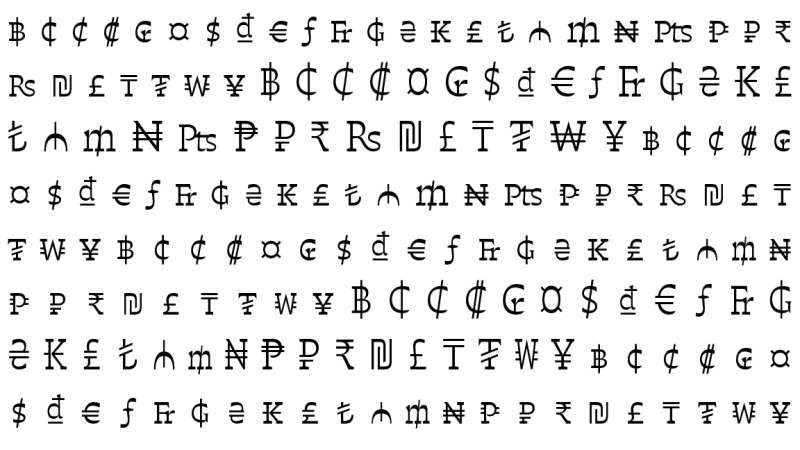
An inclusive character repertoire would not be complete without extensive money signs too. Atahualpa (and all our Latin extended types) include these money signs, developed in oldstyle, lining, or small cap form (depending on its design), in both tabular & proportional fit.

Dingbats
As usual in our fonts, Atahualpa also includes arrows and some theme icons.


