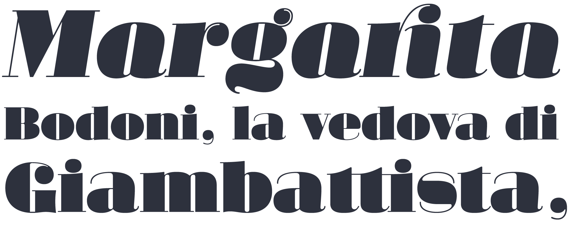
However there are many sorts of passions. You won’t see Margarita used to anounce a football match for instance. What does it make us feel that it’d be good at the menu of a Mediterranean food restaurant? Or for the titling of an opera concert? Isn’t it a little mysterious how that passionate side works? Is there any hidden meaning in its sinuous curves? Some of these questions emerged during the design process of Margarita. Some other came up years later after seeing it used in real life. Here I explore some possible answers.
fat faces: chubby cheeks, big bodies
There are several Modern fat-faces out there, that is types of high contrast designed for big sizes. This is due to the voracious appetite for new fonts that was typical of the advertising industry in Victorian times. Note: Any similarity to the present day is purely coincidental.
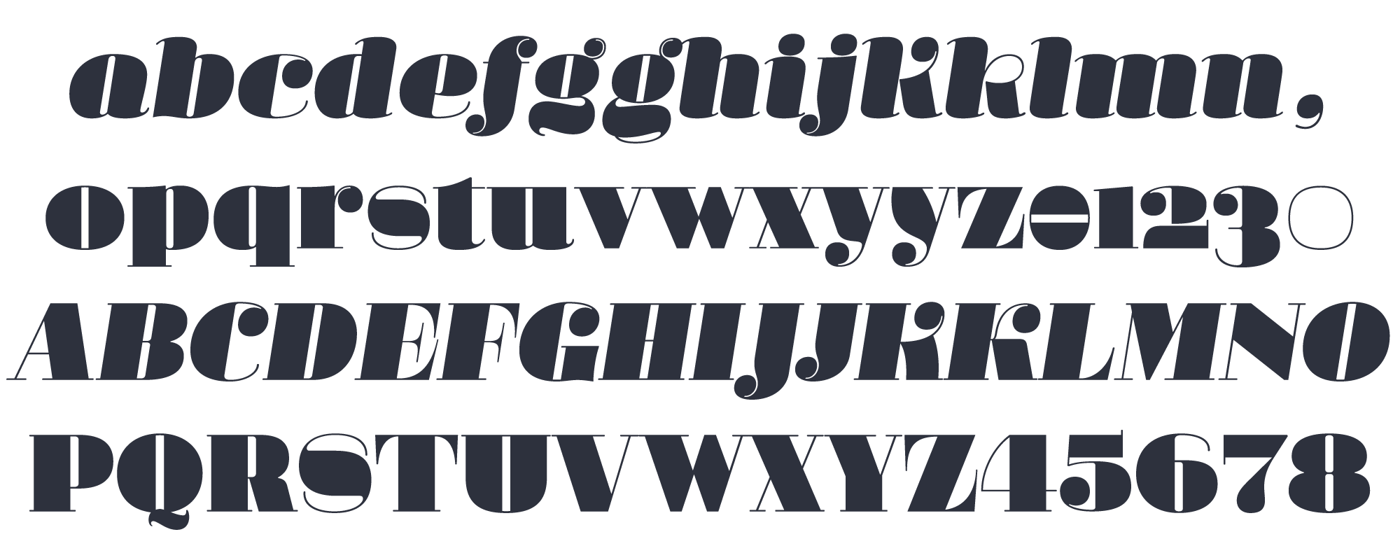
I wanted to catalize that Romantic sense in a new type by reaching the highest possible contrast, in such a way that it could only be used at huge sizes. In due course I realized that, at the same time, I also wanted the type to be sensual and delicate.
delicate geometry?
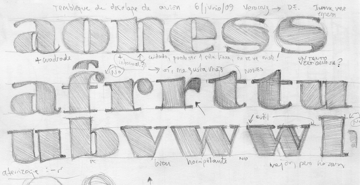
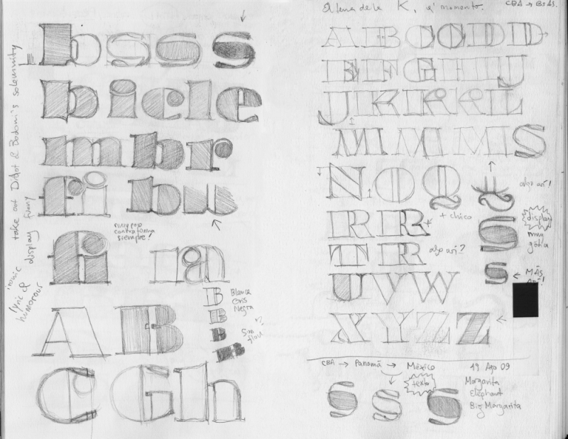
One thing is clear, you need basic geometry, very round curves and very straight lines, in order to reach that highest contrast. The problem is obvious: geometry is not delicate nor sensual, rather the opposite. You need organic shapes to communicate delicacy. So a first question arose: Is it possible by using highly geometric forms to distill some sort of sensuality? This was the starting point of the design process behind Margarita.

«letters are things». ok. and images, aren’t they things too?
A fat face is not aimed at reading on the first place, but to be seen. Actually more than seen: visually enjoyed. So Margarita grew as an intellectual thing: a type self-concious of being an object for visual pleasure. Eric Gill would argue that “letters are things, not images of things”. He forgot that images themselves are also things, but of course he meant something else and he was right. He still is. Regarding this idea of letters as intellectual things, rather than real, I believe the reasoning behind Bodoni’s and Firmin Didot’s celebrated types might have been similar. A perfect image of a letter. Geometric, pure rationality, beautiful. That was the zeigheist at the very beginning of 19th century. Their error I think was trying to force it into immersive text, where high contrast cannot survive neither the print of such thin strokes, nor our reading habits. As it usually happens in high-contrasted fonts, very thin strokes become decorative elements. But you know… decoration is a tricky concept. This is going to be tackled in another article to come. Stay tuned.
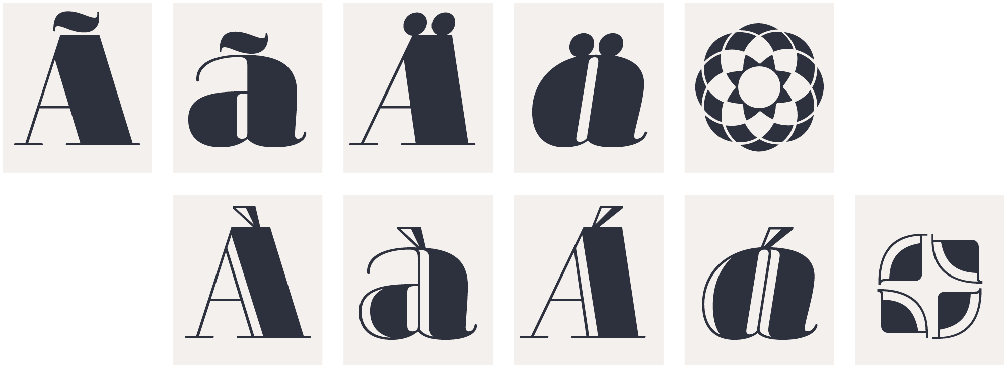
In the drawing of Margarita I found that its strong geometry could get tempered by drawing curves and countercurves with delicacy. All that passion had to be contained somehow. Subtle outer curves made the job. Countershapes, that is inner forms, work differently. They can be geometric, open, dramatic.
margarita luce
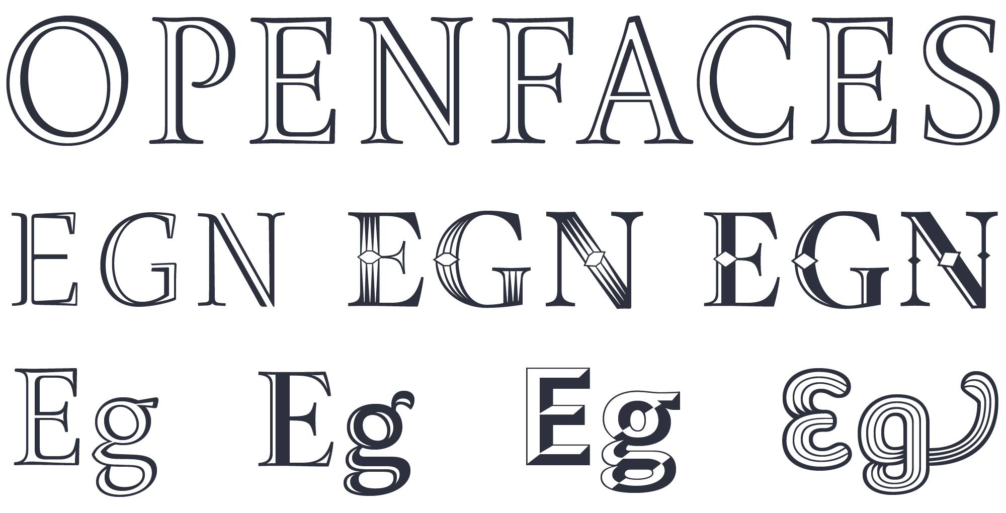
At PampaType we love openfaces. Openfaces are also known as hollow, engraved, inline fonts. Since the arrival of photocomposition and later digital tech, we miss many singular forms that were commonly used in metal. One of those forms are openfaces. I think we should create as many openfaces as we can. I’m always seeking for openface companions to my types, they are classy, they add a singular flavor to the family, and also it is a lot of fun to make them.
Rayuela Luz,
Arlt Deco 2 and Arlt Deco 1,
Borges Título Hueca,
Arlt Título Hueca,
Perec Ludique Oncle-Jacques,
Perec Scripte Deco [not yet released].
You learn a big deal when you design an openface. Besides the usual complexity of having to harmonize the inner and outer curves of a letterform, you need to sort out two additional complexities: first, you have another (white) counter that needs to be related to the whole letter; and second, the overall black-and-white rhythm gets more elements to be orchestrated. An openface is a multidimensional design. That is why they should be used with discretion. Margarita Luce (Luce is the Italian for Light) is the openface version of Margarita.

ornaments
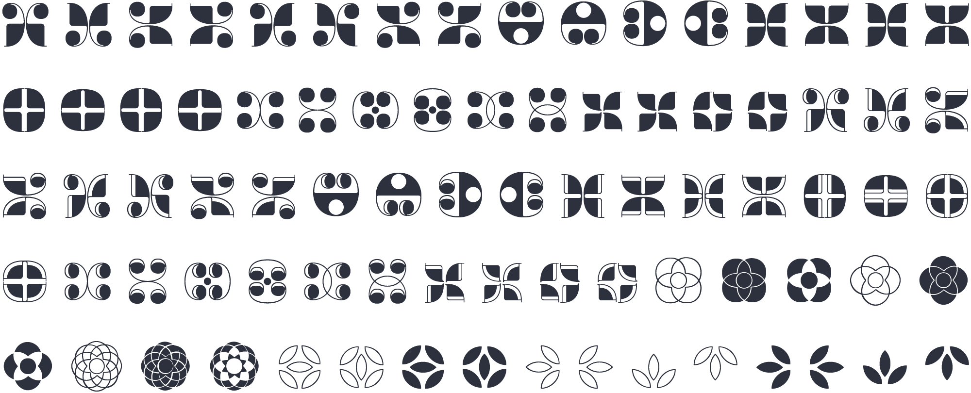
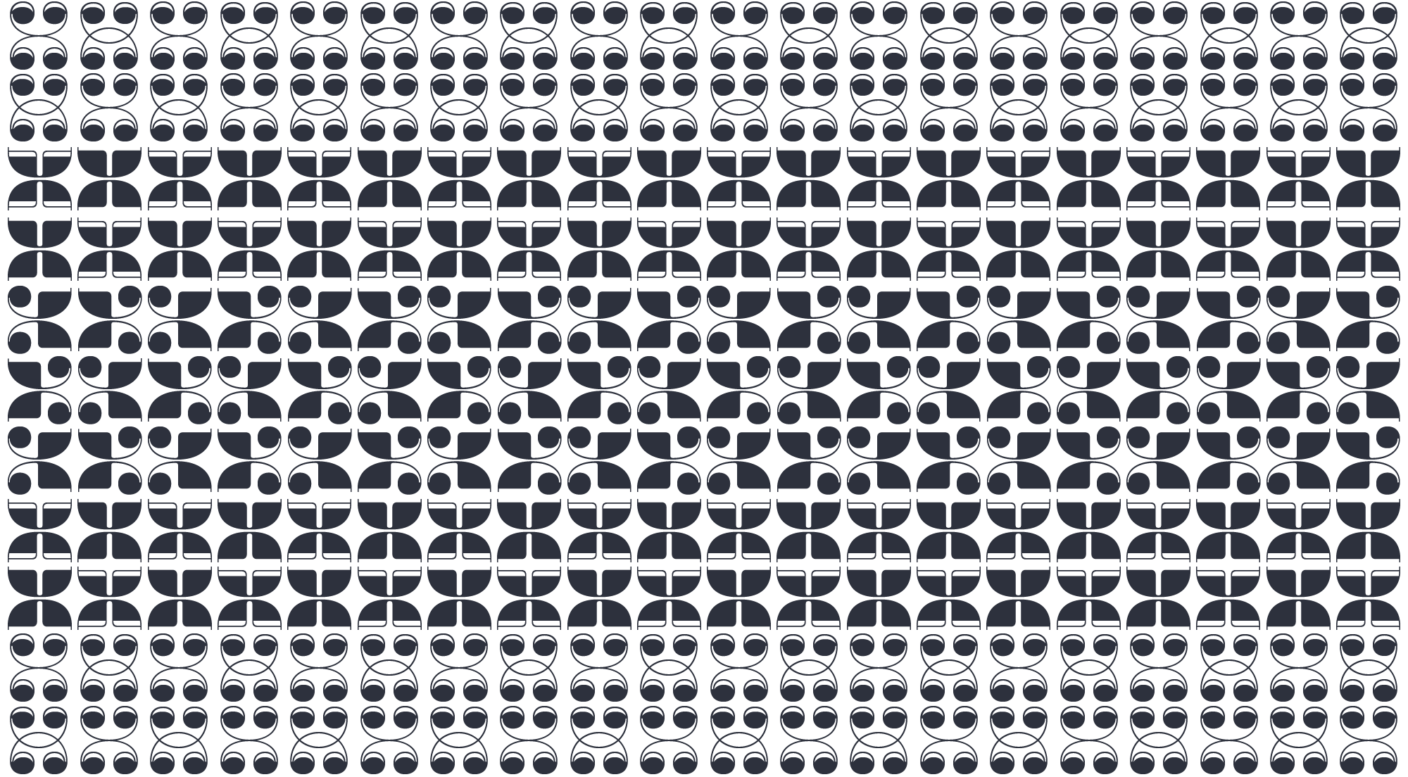
Margarita come with a set of contemporary ornaments, which can be put together to compose elegant grecas, frames, and backgrounds.
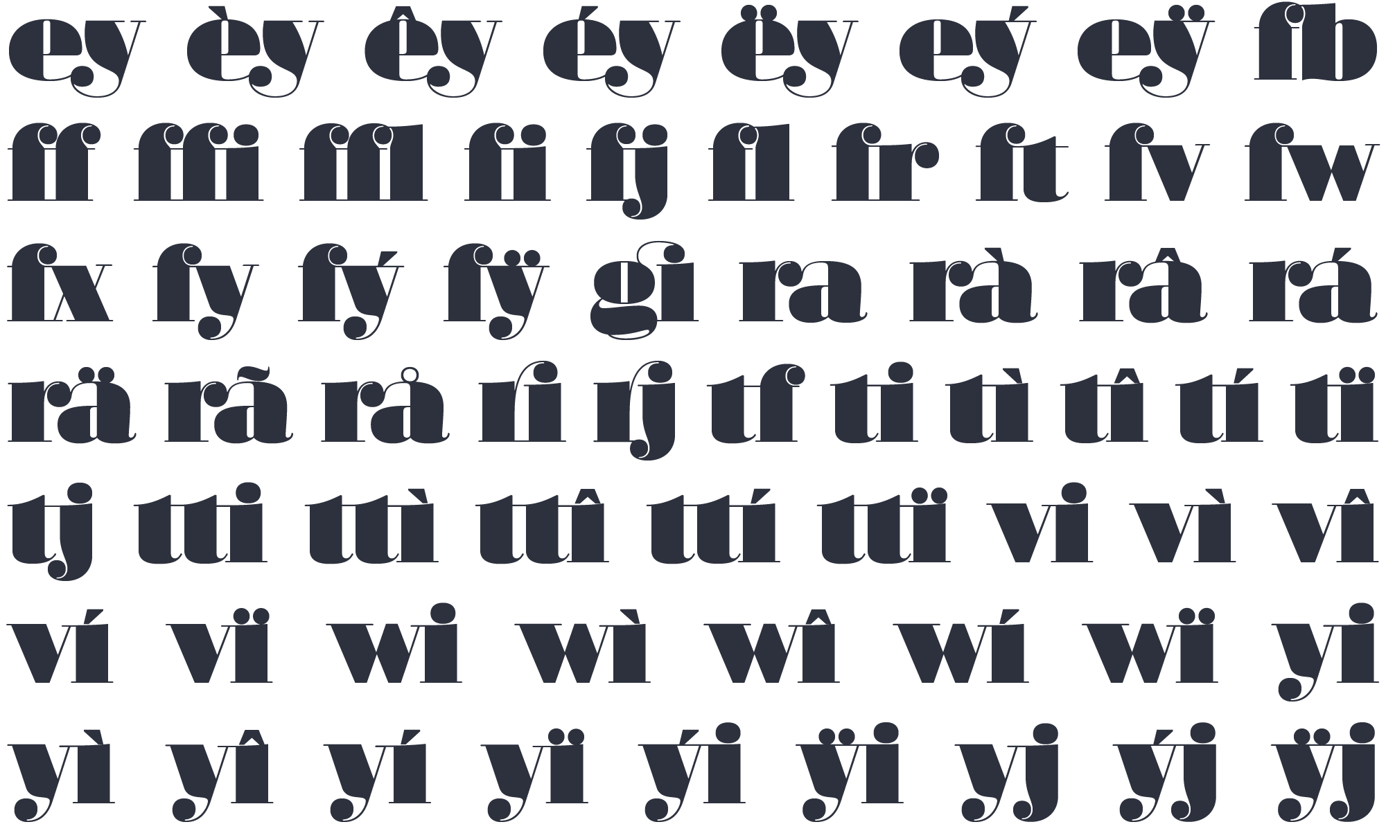
ligatures
All four Margarita fonts include several standard as well as discretionary ligatures. Discretionary means you should not use these ligatures if you want the text to remain discrete.
All in all I think Margarita is a careful design. I tried to make its curves in a way that they pair solidity and sensuality. It all resulted in a type that can give a lyric atmosphere to the page, by combining the frankness of geometry with delicacy of drawing. You are encouraged to use Margarita only at giant sizes! Bon apetito.
Margarita had a major upgrade in 2017. Find out more at the note « Margarita 2.0 released! »