
A project of slow maturation
Gorgias is not the result of a mere historical revival, but the product of a research and experimentation process of more than ten years, in search of a balance between respect for typographic heritage and adaptation to modern visual communication needs. The resulting family is composed of two well-defined styles: Solid and Deco, each declined in two weights (Regular and Black). The set has been designed with great rigor and with a clear idea of versatility for its application, incorporating style variants and ornamental resources that broaden its expressive possibilities.
These characteristics allow its use in titles and decorative compositions with a distinctive character, but without relegating its functionality in blocks of text. The result of meticulous work in the construction of its forms, endowed with a broad linguistic support and equipped with a good diversity of typographic resources, Gorgias stands out for its visual strength, its singularity and idiosyncrasy, and for its ability to be integrated into very diverse typographic contexts.
Here follow some reflections that emerge from the process of designing a blackletter or fractured type in these times.
German heritage and Mexican appropriation
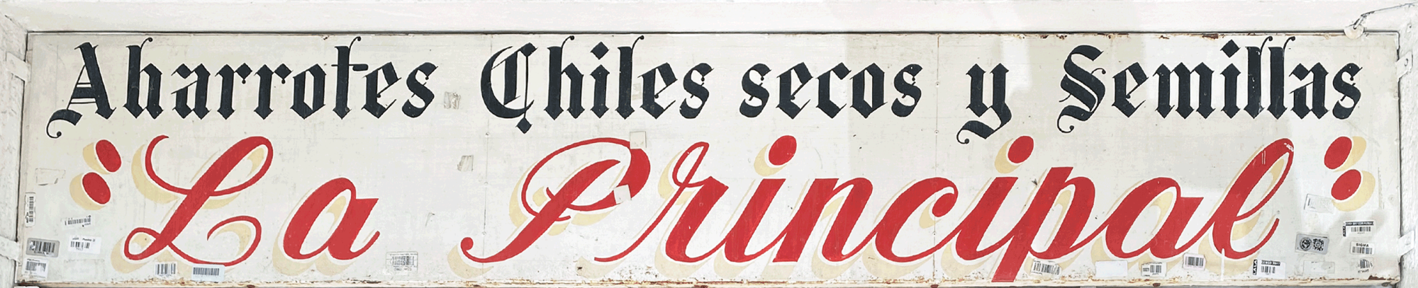
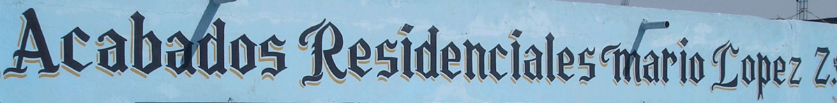
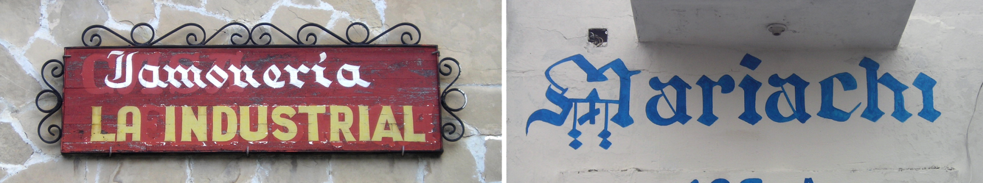
In Mexico, blackletter (or Gothic) lettering has a deep-rooted presence, more than one might expect in a country on this side of the Atlantic. Although its origin is linked to the European typographic tradition, especially German, its influence has permeated in a remarkable way in diverse areas of Mexican visual culture. This style of lettering —or its echoes, is manifested in elements as diverse as commercial brands, street signs, business signs, sports team logos and even in the lettering of religious temples.

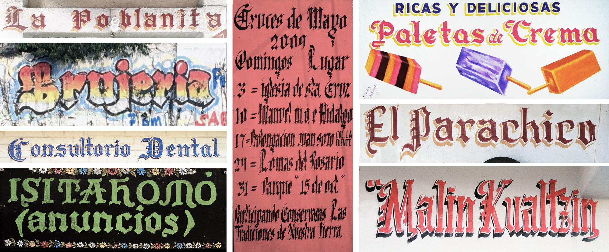
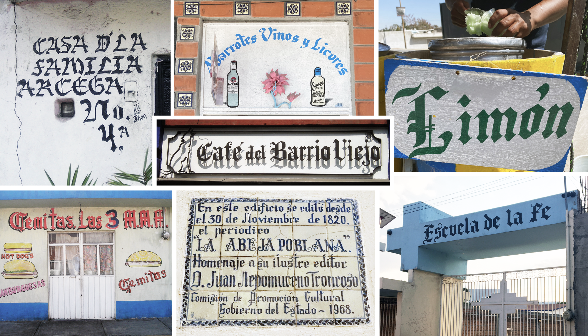
There are also important samples of the use of Gothic letters in the first American printed works, produced in Mexico, as well as in manuscripts written both in Spanish and in several native languages. Its presence is documented especially between the XVI and XVIII centuries, evidencing its roots in the written tradition of the time.

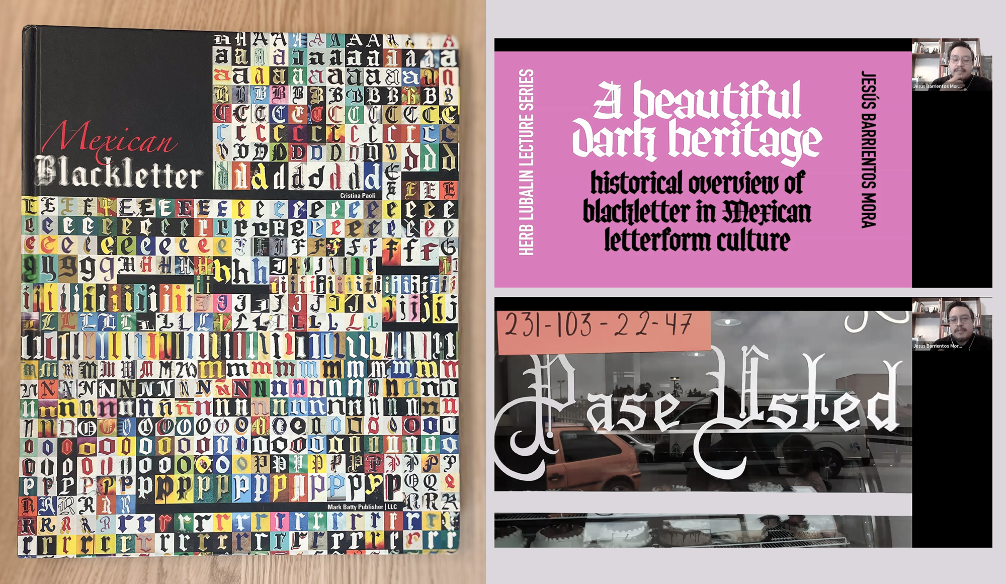
Thus, the presence of gothic lettering in Mexico, far from being anecdotal, has been the subject of study in research such as Mexican Blackletter, by Cristina Paoli, which documents its use in popular graphics, or in the conference “A Beautiful Dark Heritage” that Jesús Barrientos gave for The Cooper Union school, where he explores the roots and mutations of this style within the Mexican visual imaginary.
Blackletter letterforms have always represented for me an enigma, a visual and conceptual contrast to the classical Latin letterforms, which not only dominate traditional typographic teaching, but are also present since childhood in the learning of reading. Its formal logic, based on more abrupt contrasts and angular structures, poses a different approach to the construction of the letter and the rhythm of reading. Although in Mexico the daily presence of blackletter typography is mostly found in popular interpretations and hand lettering, the Fraktur style is not specifically the most common within this graphic panorama. However, it was precisely this absence that awakened my interest in designing a blackletter typeface that would dialogue with this tradition from a contemporary perspective. More than a simple historical recreation, this project became a formal and conceptual exploration that sought to connect with the visual richness that this style has been developing in different cultural contexts.
From the quill or from the lead
In the midst of 2025, and beyond German-speaking countries, familiarity with blackletter forms comes mainly from calligraphy. Its characteristic style, defined by fragmented and angular structures, originates from a well-defined ductus, the logic of which responds to the tool with which it is traced. However, the Fraktur style followed a different path: its consolidation was not so much determined by the quill, but by metal. Although, strictly speaking, all typographic forms evolved in metal since they became independent of the quill, the Fraktur did so as a fully typographic style, whose morphology was defined by the technical and aesthetic principles of movable type design rather than the manual gestures of writing. This transformation allowed it to acquire its own visual identity, differentiated from other blackletter of Gothic styles, and to establish a typographic tradition that lasted almost 400 years.

In many contemporary typefaces inspired by the Fraktur style, it is common to observe modulations with a horizontal axis of contrast in certain features or terminals that evoke more the expansive stroke of a flexible-tipped tool than the uniform pressure of a flat-tip pen. While the ornamental nature of the Fraktur is one of its most distinctive qualities, its expressiveness comes not from the fluidity of the ink on the parchment, but from the constraints and possibilities imposed by the metal block. Its design adapted to the limitations of the typographic system, developing formal solutions that, far from being mere transcriptions of calligraphy, consolidated a visual language of its own within the history of typography.
The source of the project
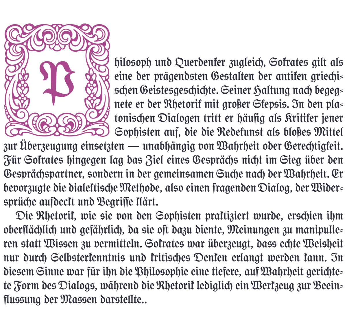
Gorgias was born from the reconstruction of a typeface found in a German book of 1911, which I found in an antiquarian bookstore in the neighborhood of Coyoacán, in Mexico City. It was an annotated edition of Plato’s Gorgias (or The Rhetoric), clearly intended for academic or scholarly use. Beyond its content, the book attracted me by its typographical composition, which presented a particular treatment of the Fraktur style. That finding aroused my curiosity to analyze and reinterpret its forms, giving rise to the development of a typeface that would recover its essence but from a contemporary perspective.
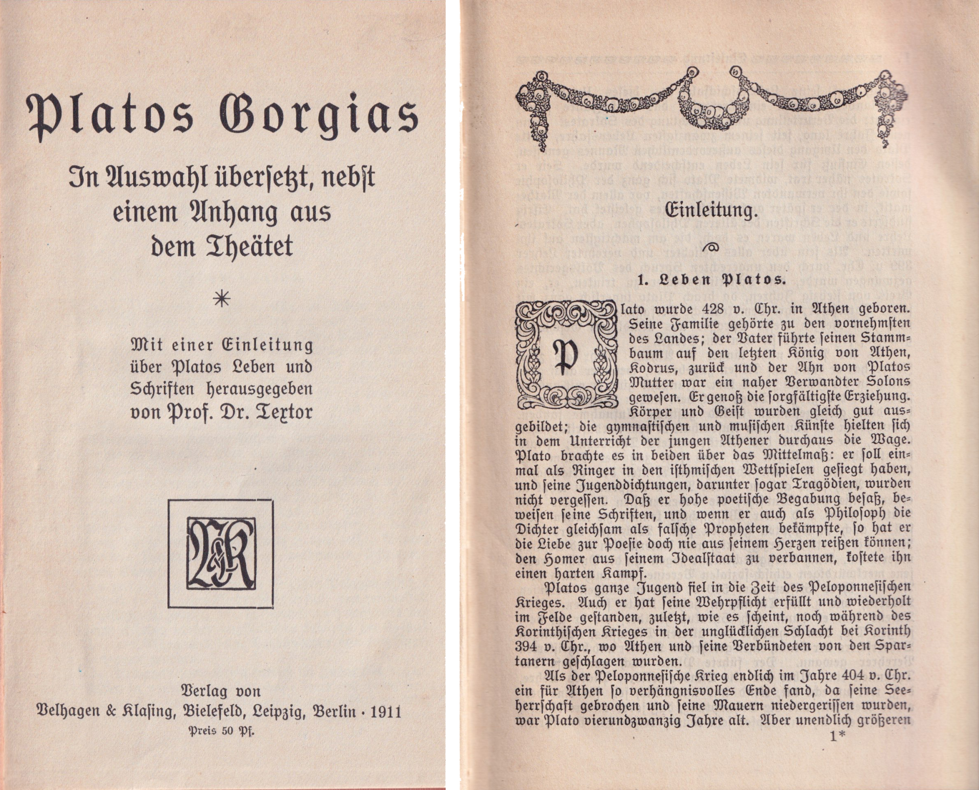

The book contains samples of a type with four light-weight fonts at 30, 18, 14 and 12 points on the title page and two 8-point fonts in two weight variants for the body text in the interiors. The typeface belongs to a style known in Germany as Schulfraktur, which we could translate as “school Fraktur” and which was widely used in academic materials and youth editions, as it toned down the ornamental and expressive character of Fraktur in favor of a simplification of the style and an austerity more appropriate for small bodies, making it suitable for the educational setting.
A rather simplistic analysis, from a point of view far removed from Germanic culture and influenced by contemporary standards of Western typography, might lead us to think that this simplification would also be due to a desire to make the Blackletter script “clearer and more legible”. However, Gothic letters proved to be very legible for the generations of Germans who used them throughout their lives. In fact, developing a typeface family like Gorgias has also been a way of challenging that prejudice around a style so significant to the history of typography.
Sensitive identities and political turmoil
This type style emerged at a time when the Blackletter typographic tradition in Germany was beginning to subtly move closer to the Roman forms prevalent in much of the world. This phenomenon was not just a stylistic issue, but reflected a cultural struggle within the country. On the one hand, there were those who saw in Gothic letters (and especially in Fraktur) a symbol of linguistic and cultural identity that should be preserved and disseminated; on the other hand, there were those who defended Roman, or Antiqua, typography, with a more cosmopolitan vision oriented towards the integration of German culture with the international typographic tradition.
In May 1911, the same year as the publication of the book that inspired Gorgias' design, this opposition even reached the political arena: In the Reichstag (the German parliament), an initiative to replace Gothic type with Roman type as the official style was debated and voted on. The debate was marked by a series of impassioned pleas from both sides and, although it came close to passing, the proposal ultimately failed by a margin of only three votes.
This struggle resulted in a desire to reconcile both worlds and led to a graphic exploration that in those years resulted in typeface designs that combined Gothic and Roman features to create hybrid forms. Outstanding examples of this movement are some typefaces by Heinz König, Otto Eckmann, Rudolf Koch, Otto Hupp and Julius Klinkhardt, among others. For further information on this subject, please consult the book Paul Renner by Christopher Burke 1 or Burke’s article “German hybrid typefaces 1900-1914” 2, as well as the proceedings of the April 2019 symposium at ANRT (gotico-antiqua.anrt-nancy.fr).
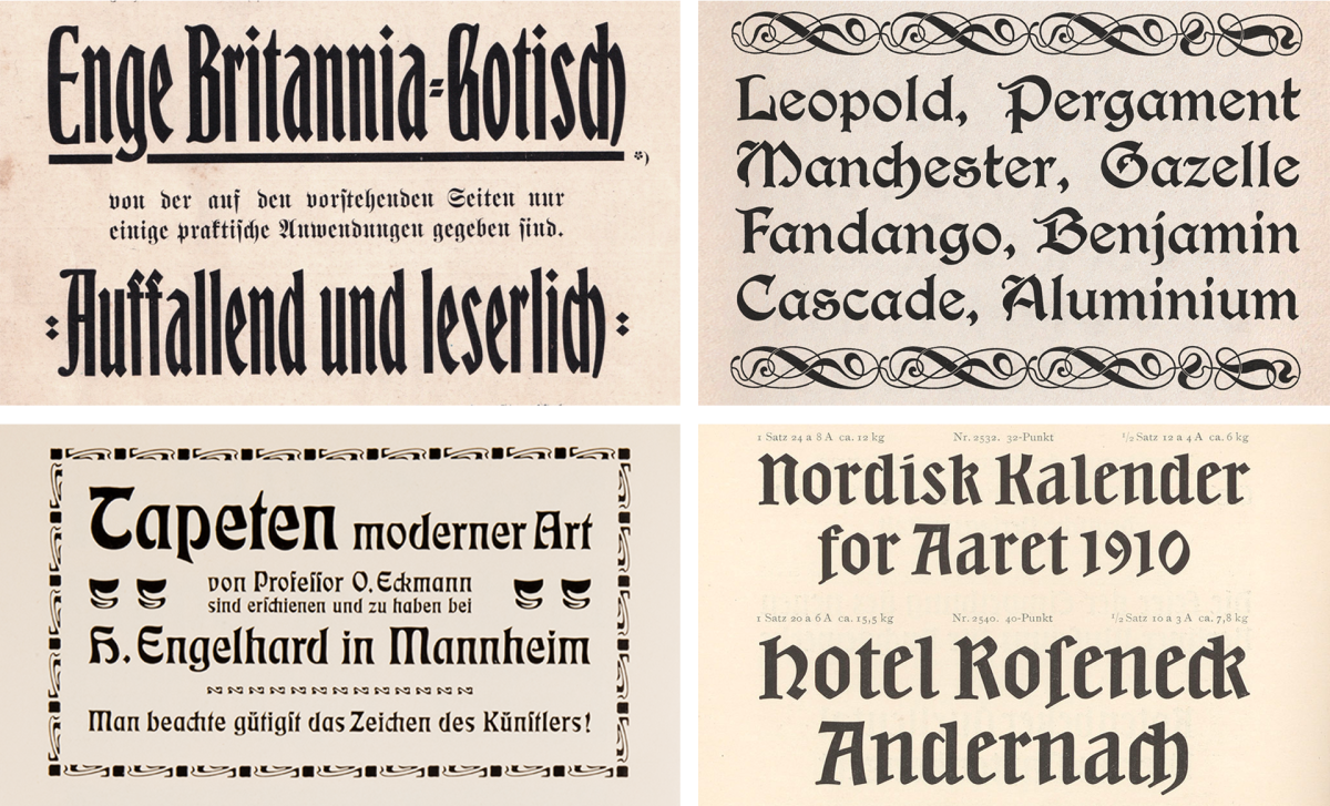
The coexistence between Fraktur, roman and hybrid continued in German typography throughout the first half of the 20th century. Despite tensions between the advocates of each style, German printed matter of the period shows a constant coexistence of these genres, each with its own niche of use. However, between 1941 and 1945, Fraktur types were officially outlawed in Germany by the regime then in power. This decision, seemingly contradictory considering the strong association of Fraktur with German identity, but which favored adaptation to a growing reading public of non-Germanic origin and therefore unaccustomed to Gothic, marked a turning point in the country's typographic history and accelerated the widespread adoption of Roman forms as the predominant typographic standard.
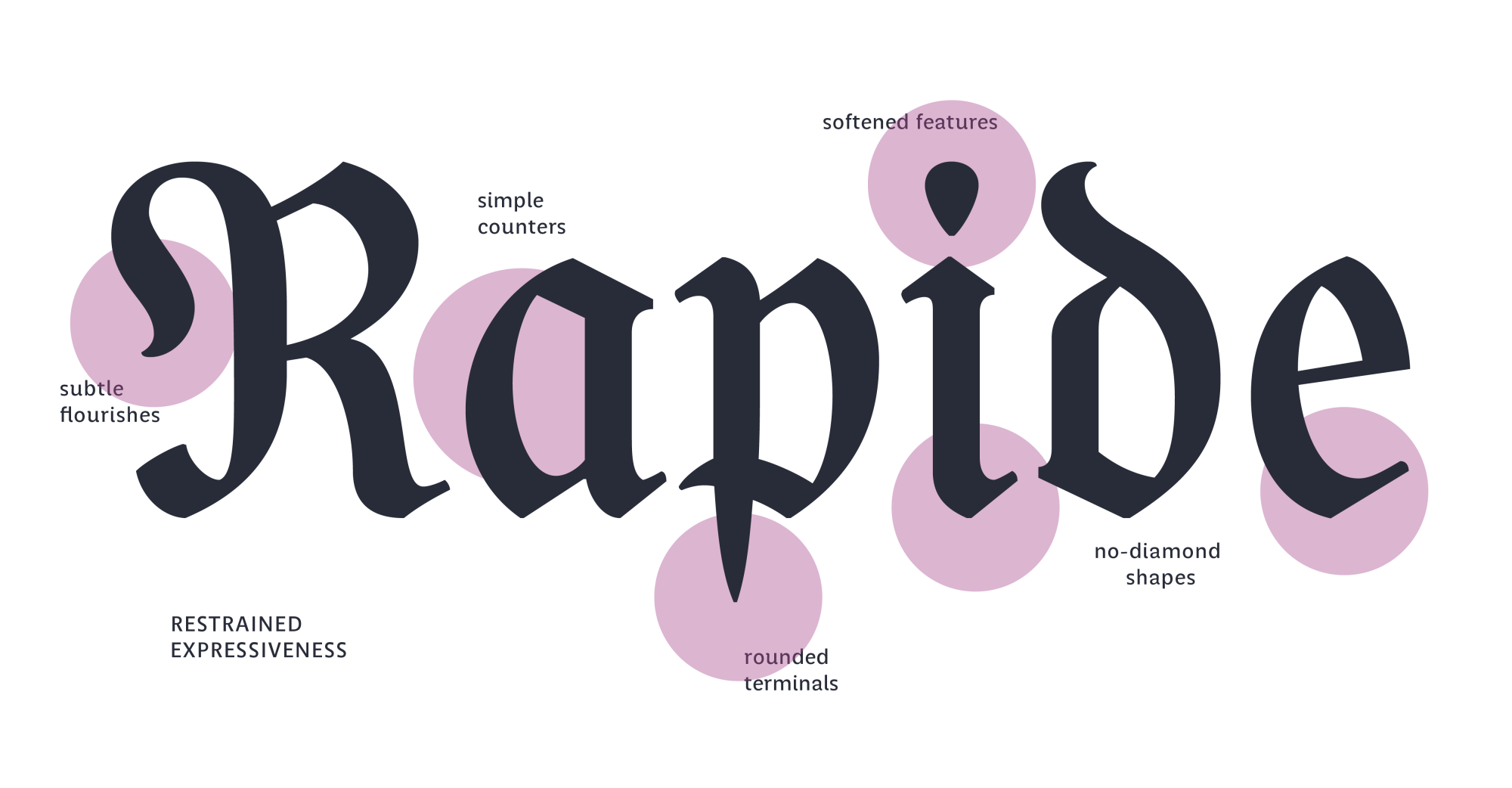
Going back a little in time, the approach of the Schulfraktur to Roman forms was more subtle than in the previous examples, but in many cases sufficient to leave aside some iconic elements of the blackletter forms. This adjustment did not involve a radical transformation, but rather an adaptation that sought familiarity with forms outside the realm of the Gothic tradition, without entirely abandoning their essence. The Schulfraktur are distinguished by a frank, discreet and restrained drawing: unlike the more traditional blackletter variants, they lighten the broken strokes, limit the flourishes —especially in the capitals, soften the diamond-shaped terminations and often have rounded or less sharp ends. In addition, they incorporate romanized forms in some letters and are combined with figures with features typical of Roman typography (we do not forget that figures are of Indo-Arabic origin of course), thus consolidating a hybrid character that made them more accessible to a public that was seeking to gradually approach Latin script.
Gorgias is an interpretation (sometimes faithful and sometimes freer) of the letters found in that book. However, its design was also enriched by documentary and visual research on the evolution of the Gothic script and its multiple forms. Although traditionally linked to the German language, these typographic forms possess a flexibility that allows them to adjust to a wider linguistic panorama, ensuring their relevance in different current contexts.
Integration of past and present
Making the right choice of default and alternative forms involved a decision-making process in which, while trying to preserve the spirit of the font, I wanted to find a middle ground between what existed in the original and the new possibilities offered by technology, right at the threshold.
This stylistic hybridization motivated me to include in Gorgias a series of alternative glyphs, sometimes for a more traditional and sometimes for a more contemporary use.
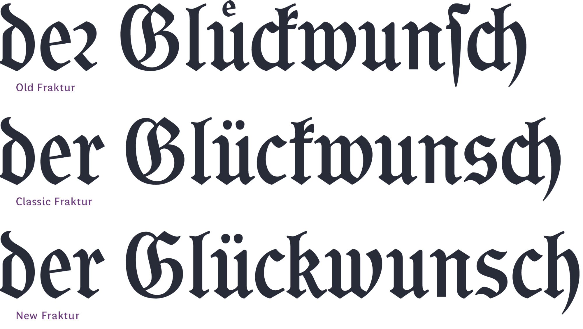
These alternatives can be chosen manually or activated by means of three stylistic sets, named Old Fraktur, Classic Fraktur and New Fraktur: For a more classical use, Classic Fraktur offers the classic form of “S”, “G” and “P”, in addition to the more traditional forms of “k”, “s”, “x”, “y” and “z” together with the closed forms of “v” and “w”. You can even opt for a more historically accurate alternative, choosing Old Fraktur to use the long “s” - which includes all its ligatures - together with the alternative form of “r” accompanying the curved forms or the alternative German vowels “ä”, “ö”, “ü”. If a more contemporary, less Germanic look is what is sought, New Fraktur can be employed, which breaks down typically German ligatures (such as “ch”), displays a less fractured “s” and a Roman-style “k”, along with the open forms of “v”, “w”, ‘x’, ‘y’ and ‘z’ and with the double-curved ‘S’ or the default ‘G’ and ‘P’ which, taken together, facilitate legibility for those not so familiar with the extravagance of traditional blackletter forms.
Furthermore, following a common practice in the fraktur style of the time where accented capitals could be presented lower, Gorgias contains a reduced version of the upper accented capitals, in case more efficient vertical spacing was needed.

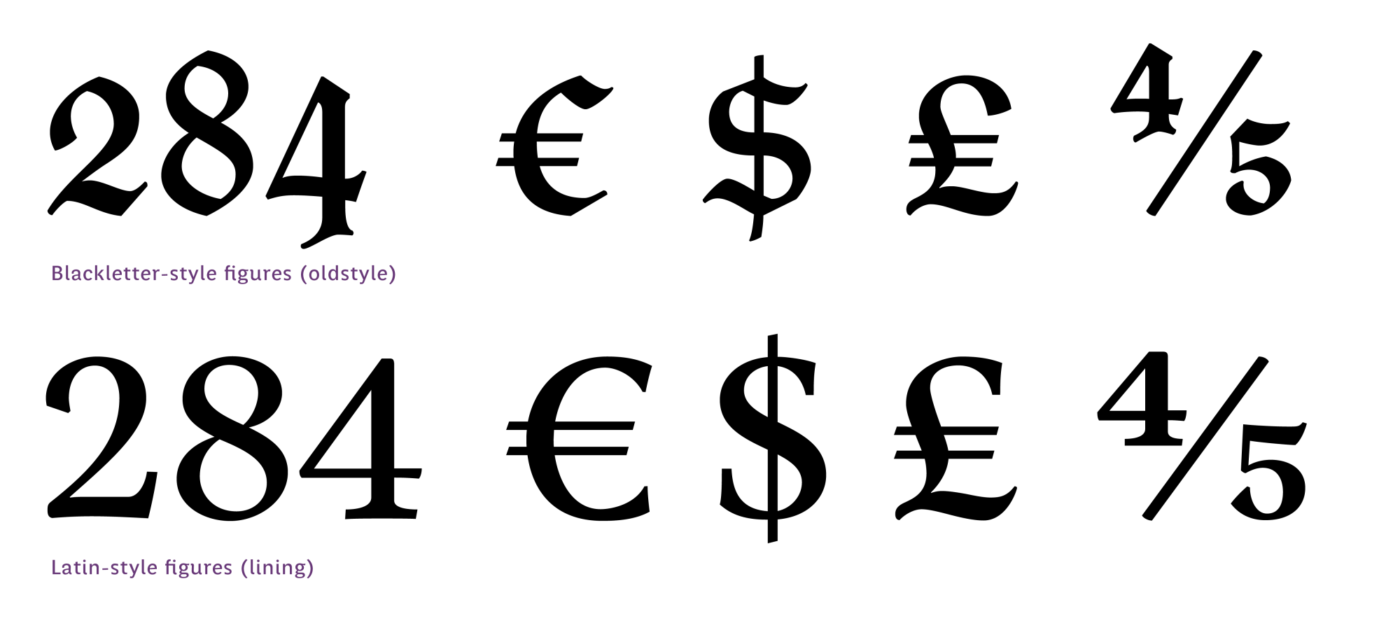
The Schulfraktur types used to employ numerals with Roman features in a modern style, as opposed to the traditional Gothic ones, which used figures with Gothic features. For Gorgias I decided to include both designs: in addition to drawing the Latin-style numerals, I designed a set of figures with Gothic features, in harmony with the alphabetic characters. At the same time, both options of figures also include their groups of monetary signs, fractions, upper and lower numbers and other symbols that are left to the user’s choice.
Another innovative feature of the fraktur that inspired Gorgias is an element that to contemporary eyes may seem banal, but in the context of the time and style is unusual: the incorporation of a heavier variant as a diacritical or emphasis element within the text.
In the Gothic typographic tradition, hierarchies and highlights were usually indicated by an opening of the space between characters, in the absence of an italic or bold variant, as in Roman. This feature is present in German typography, even in texts composed with Roman-style type. The book from which Gorgias is derived shows, however, a Black version used to mark a diacrisis in dialogues and other parts of the text where a mark of hierarchy is required.


Gorgias includes a Black weight, which picks up the features of the regular and exaggerates them, to create an accompanying style to create hierarchies or text highlights in a contemporary manner. Also, used in large bodies, it allows for a strong visual impact.

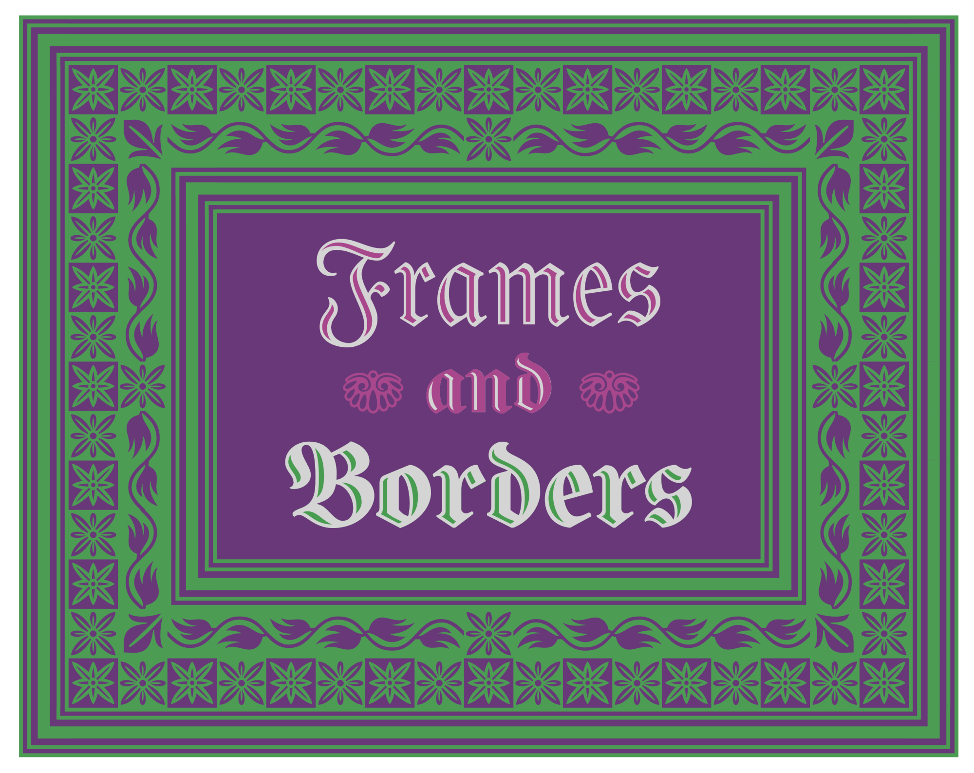
Ornaments and expressive resources
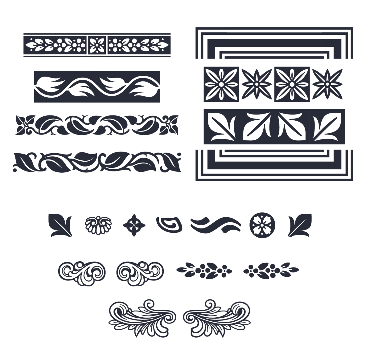
In Gorgias we can also find a set of ornaments that broaden its expressive possibilities. Some of these were designed to function as vignettes, providing small graphic accents that enrich the composition. Others are conceived as auxiliary elements to create titles, giving them a decorative tone. In addition, the family has a series of glyphs specifically for the creation of borders, which can be used both in margins and cornices as well as in text separators, evoking the ornamental richness of historical printed matter. A set of ornaments was also designed to compose frames, either small or full-page, enabling the possibility of highly ornamented compositions with an atmosphere of typographic tradition. These decorative elements reinforce the link of this font with the aesthetics of historical editions.
Gorgias also includes smart drop caps: framed capitals activated via OpenType to add elegance and hierarchy to the text. In addition to their aesthetic function, they allow you to visually structure content, highlighting section beginnings, fragments, or key moments in a text.
Deco versions: extra visual appeal
In addition to its basic styles, Gorgias has two engraved or open (Deco) variants, also in Regular and Black weights, designed to provide a more refined decorative tone, without losing coherence with the rest of the family. These were entirely hand-drawn, without the aid of algorithms or filters. The intention was to make them look captivating on large bodies. Their open anatomy generates a play of full and empty spaces that enriches the typographic texture and gives a unique character to the composition.
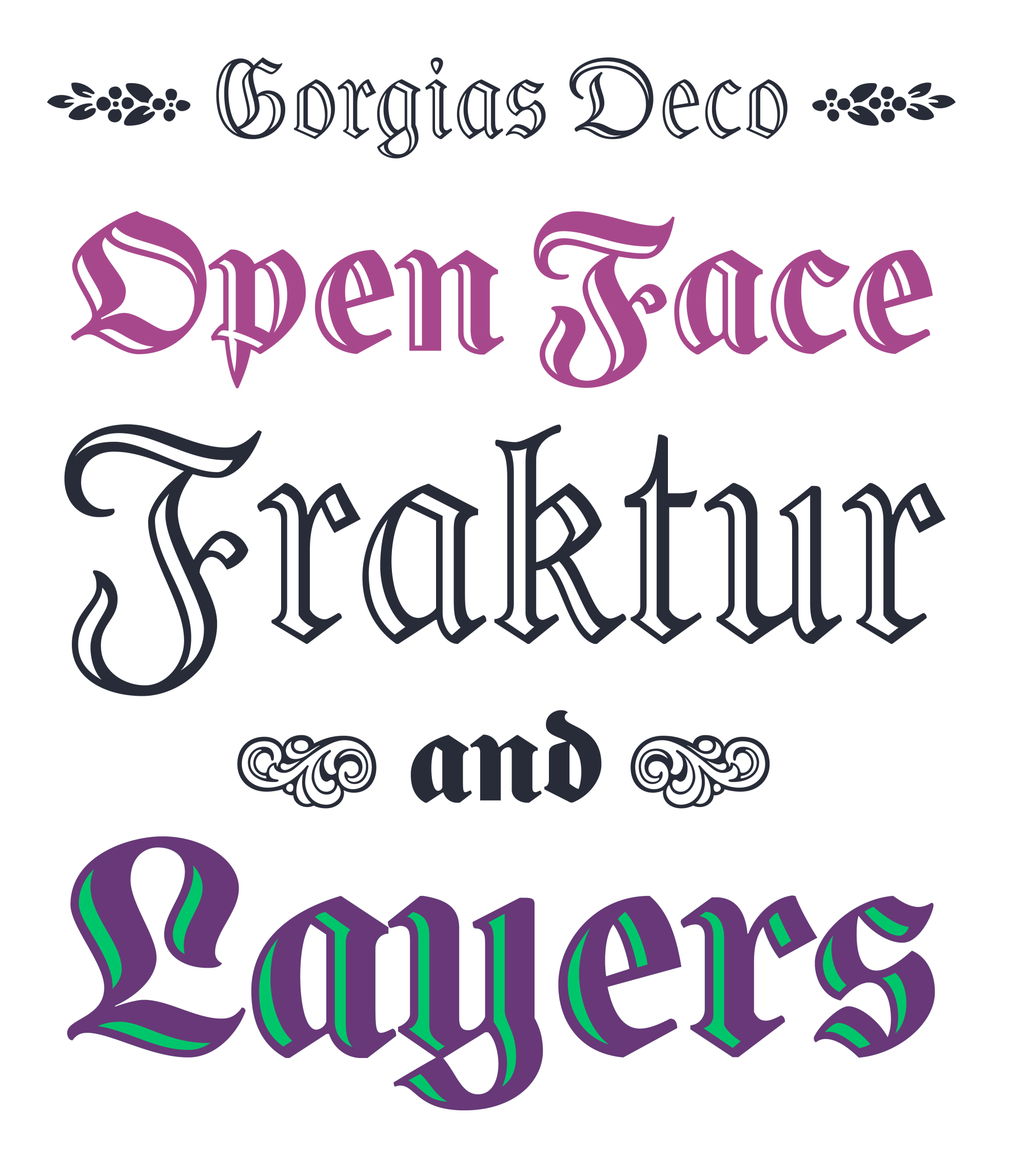
Despite their ornamental nature, the Deco variants maintain the same character repertoire and attention to detail as their solid counterparts, ensuring interchangeability of styles and functionality in any context; they also allow their use in overlapping layers for color applications. Their development involved successive stages of refinement, seeking a balance between expressiveness and legibility.
Linguistic features and type goodies
Gorgias can speak in many languages. Even if the Fraktur style today is usually associated primarily with ornamental uses or historical evocations, the four variants of the family include the extended Latin alphabet repertoire, with coverage for more than 220 languages. Completing the character set according to current typographic standards involved not only a meticulous reconstruction of the historical forms, but also the inclusion of many symbols infrequent in this style. Gorgias adds monetary, technical, editorial and commercial signs, in addition to the figures in two styles (Latin and Gothic) already mentioned.
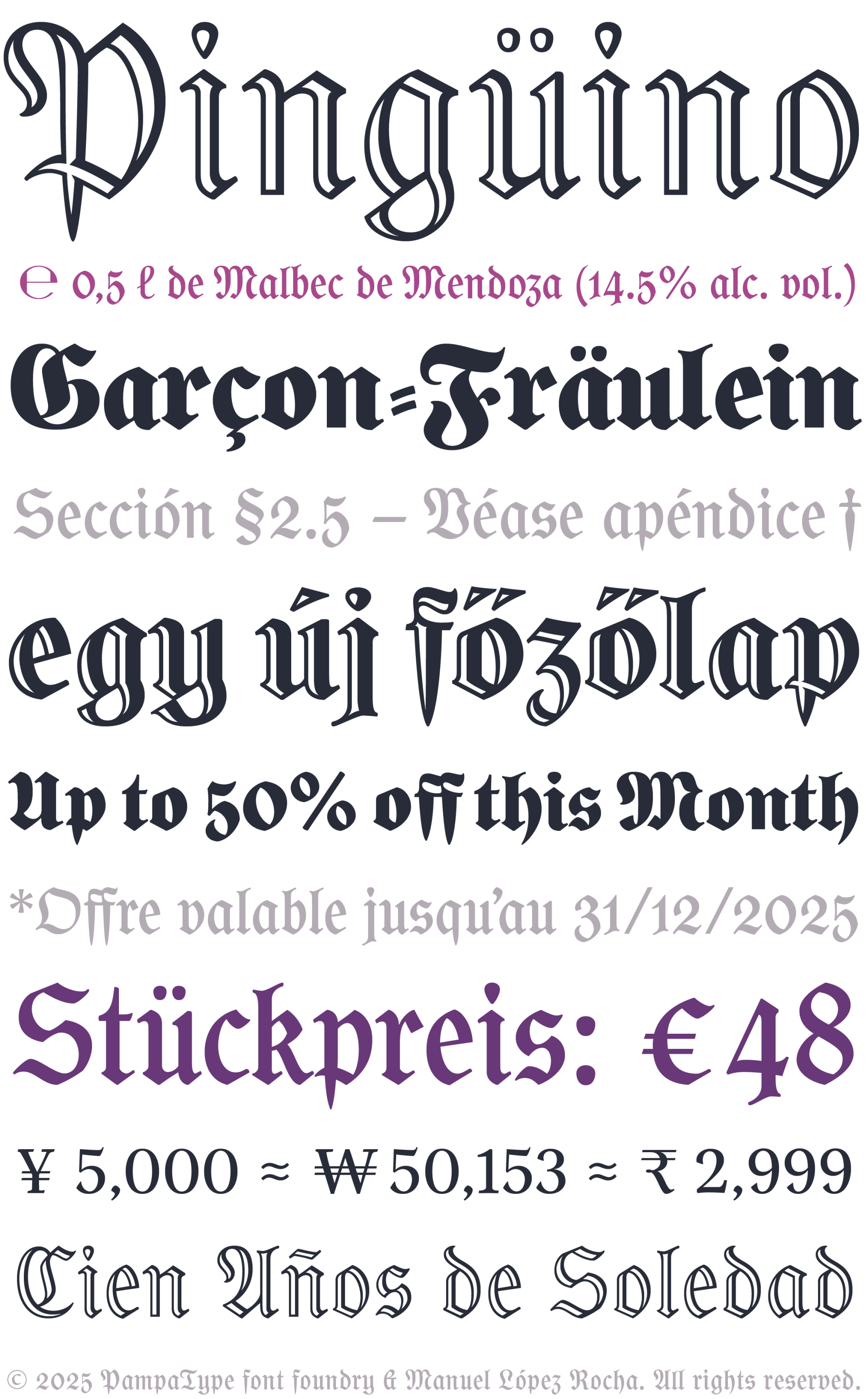
Several OpenType functions have also been integrated into Gorgias to optimize its use, allowing its multiple features to be easily activated and deactivated: ligatures, stylistic alternates, language localizations, historical forms, case-sensitive punctuation, four sets of figures (with tabular & proportional alignment), extended monetary symbols, fractions, subscripts, superscripts, complete ordinals, in addition to the ornamental resources: framed initials, vignettes, ornaments, borders and frames.
The idea of this project was to achieve a blackletter design that would allow, on the one hand, to structure headlines with character and personality, and on the other hand, to compose long texts with solidity and a certain bookish refinement, thus offering good versatility both in editorial projects and in more expressive graphic applications. Users and time will tell if we have succeeded.


References and further reading
Burke, Christopher (1998). “German hybrid typefaces 1900–1914”. In P. Shaw & P. Bain (Eds.), Blackletter: Type and national identity (pp. 32–39). New York: Cooper Union.
—Burke, Ch. (1998).Paul Renner. The Art of Typography Hyphen Press. London .
Molina, A. de. (1571). Arte de la lengua mexicana y castellana [Edición original]. México: En casa de Pedro Ocharte.
Paoli, Cristina (2006). Mexican Blackletter. New York: Mark Batty Publisher.
Platón. (1911). Platos Gorgias: In Auswahl übersetzt, nebst einem Anhang aus dem Theätet (Mit einer Einleitung über Platos Leben und Schriften, hrsg. von Prof. Dr. Textor). Leipzig: Velhagen & Klasing.
Manuel López Rocha is a graphic and type designer from Xalapa, Mexico. For several years, he has been researching and developing projects focused on typography for Indigenous languages of Mexico and the Americas. He has delivered workshops and lectures on the subject and has collaborated with speakers and linguists to create typographic solutions that address the specific needs of these languages. His work in type design has been recognized in multiple editions of the Latin American Typography Biennial Tipos Latinos (2012, 2014, 2016, and 2018). He has taught at various universities at both undergraduate and graduate levels, offering courses in typography, calligraphy, type design, and editorial design. Currently, he is a partner and designer at the studio Cuatro Ojos, a professor at Universidad Anáhuac Veracruz, and a member of the Letrástica collective.