Dry transfer lettering: Freedom and restriction
Coming after movable type and photo-type, dry transfer lettering represents a halfway point within the historical evolution of typefaces, standing between photocomposition and digital typefaces, the final analog link connecting two apparently disparate universes since it allowed both professionals and enthusiasts, for the first time, to make use of these curious stencils that ended up having a huge impact in the ever changing industry of design and the graphic arts.
The leap from one format to another has occurred with questionable rigor and many of the families that existed as dry transfer alphabet sheets suffered various losses, especially if one takes into account what had been accomplished in more than 500 years of tradition. Others were unfortunate or fortunate enough to not be part of a broader group of typographical families that comprised the existing catalogues. However, a large number of type families designed for this short-lived means of reproduction were also developed, and they were based on types of letterforms that either continued to evolve towards the digital era or remained awaiting to be the last technology to resurface from transfer sheets to Bezier curves.
At the time the format freed typefaces from some of the restrictions that limited them and this led to unexpected uses of typographical form and space, which was manifested in the use they were given while their surge lasted. Even when formally a mechanism existed that allowed a correct spacing by means of an individual letter registry system named Spacematic, additionally, and made possible via a thorough study of the alphabetic usage frequency, an optimum use of the characters of the alphabet, numbers and punctuation was guaranteed with minimum waste.
Stripes
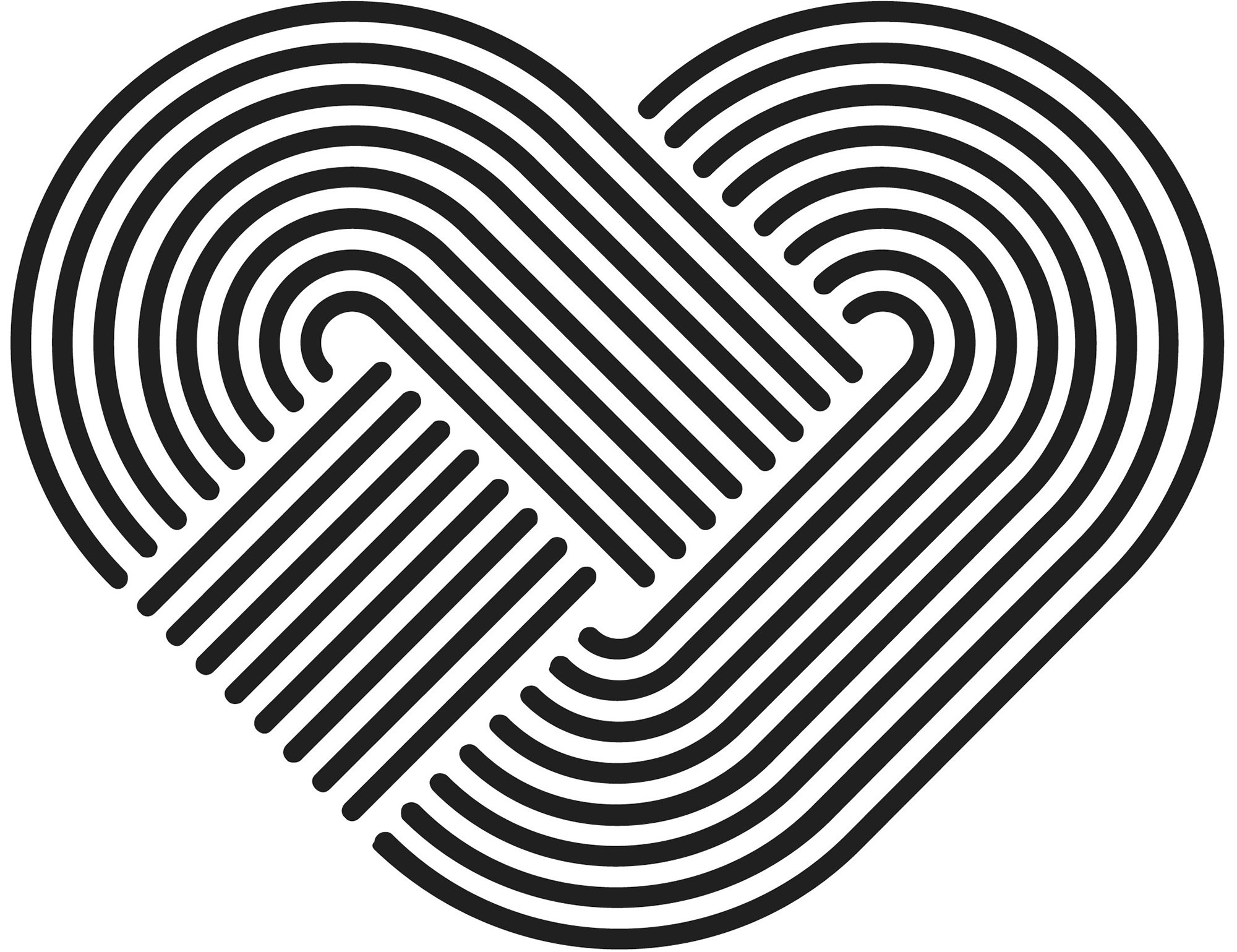
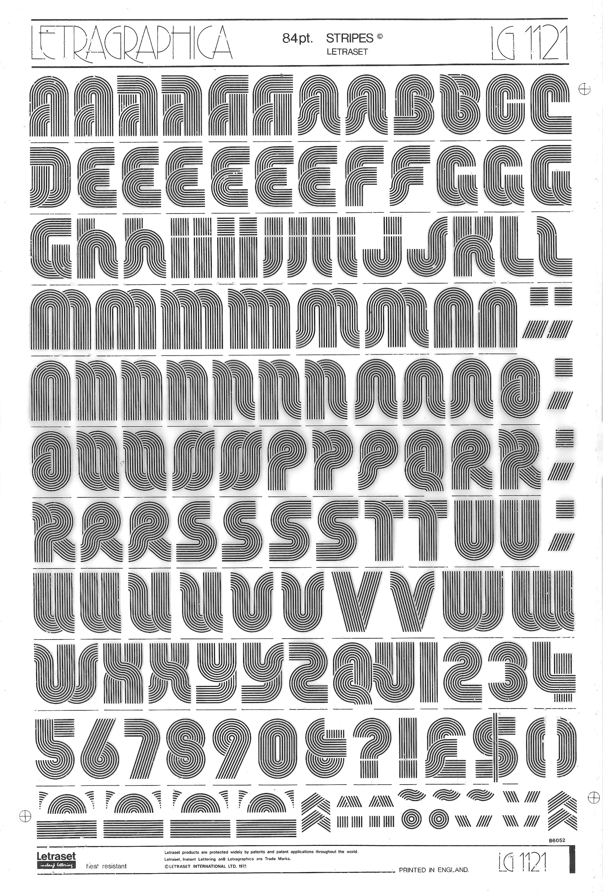
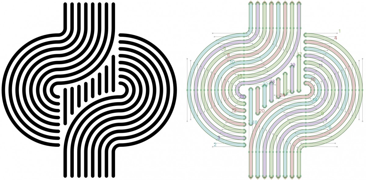
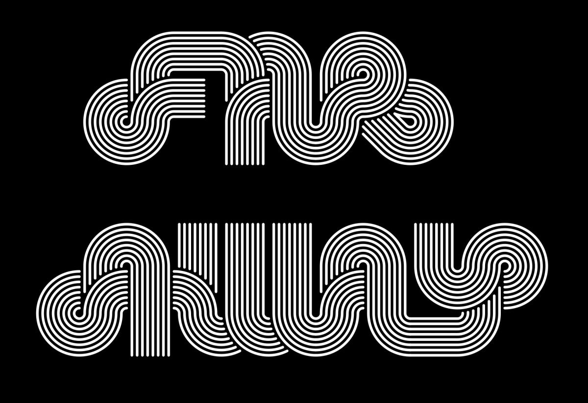
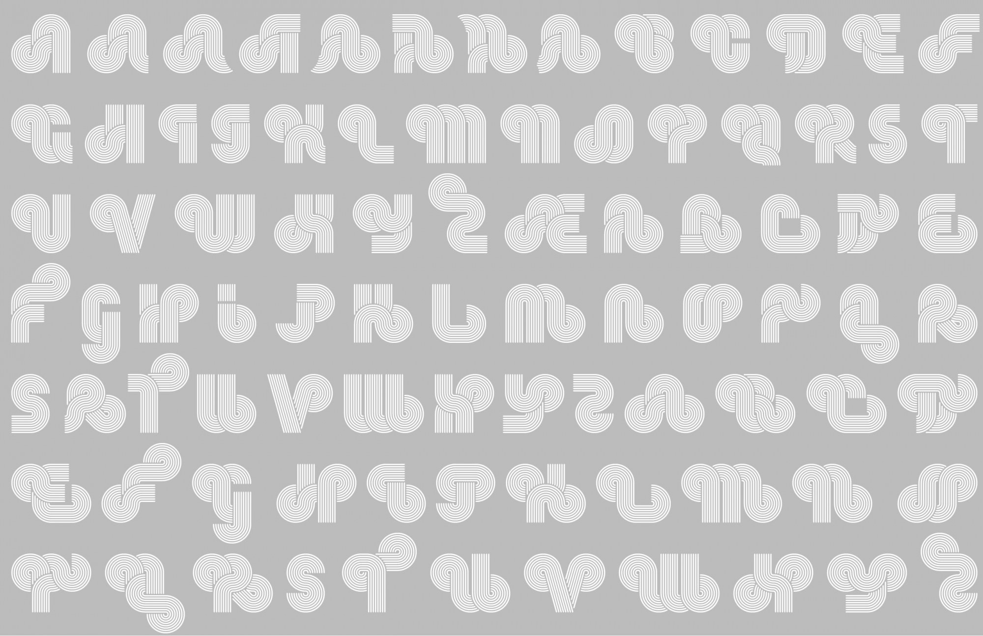
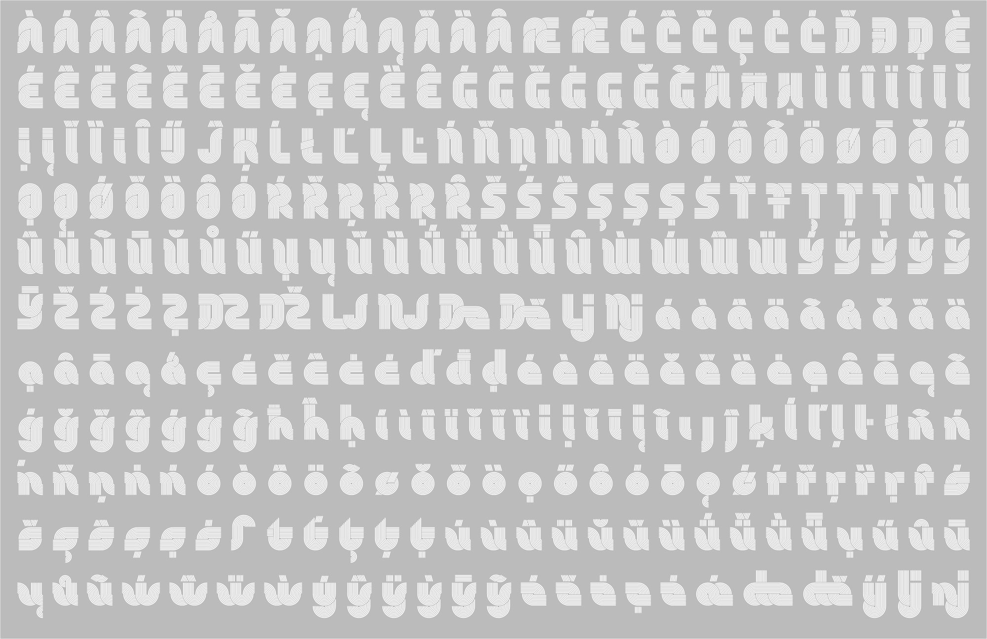
Within this nearly forgotten ensemble rests a face with great potential that hasn’t had a worthy revival so far. I’m referring to Stripes, of the currently extinct Letraset company, consisting of a geometric, multilinear letter style which has eight lines for each stroke and whose peculiarity and innovation lies in the fact that it has alternate versions for most alphabetic characters, allowing them to join with each other, creating a continuous succession of shared parts along the words one wants to give shape to. This face was included in a special collection of fonts for titlings named Letragraphica, many of which were developed for this use and some that were selected via an international contest to become a part of the next catalogue.
Due to its method of use, once a letter was transferred it couldn’t be used for another composition, which was one of the main disadvantages of the dry transfer lettering technology. Therefore when a title required additional characters, the only possible solution was to once again acquire the same sheet, which would hardly suffice for a single use and almost every time there were characters left unused, added to the fact that to set a title with Stripes an alphabetic variant that had already been used was needed, further complicating its use for more complex titles. However many skilled users of the field would resort to clippings and patches taken from other characters to form words and come up with clever ways to connect letters.
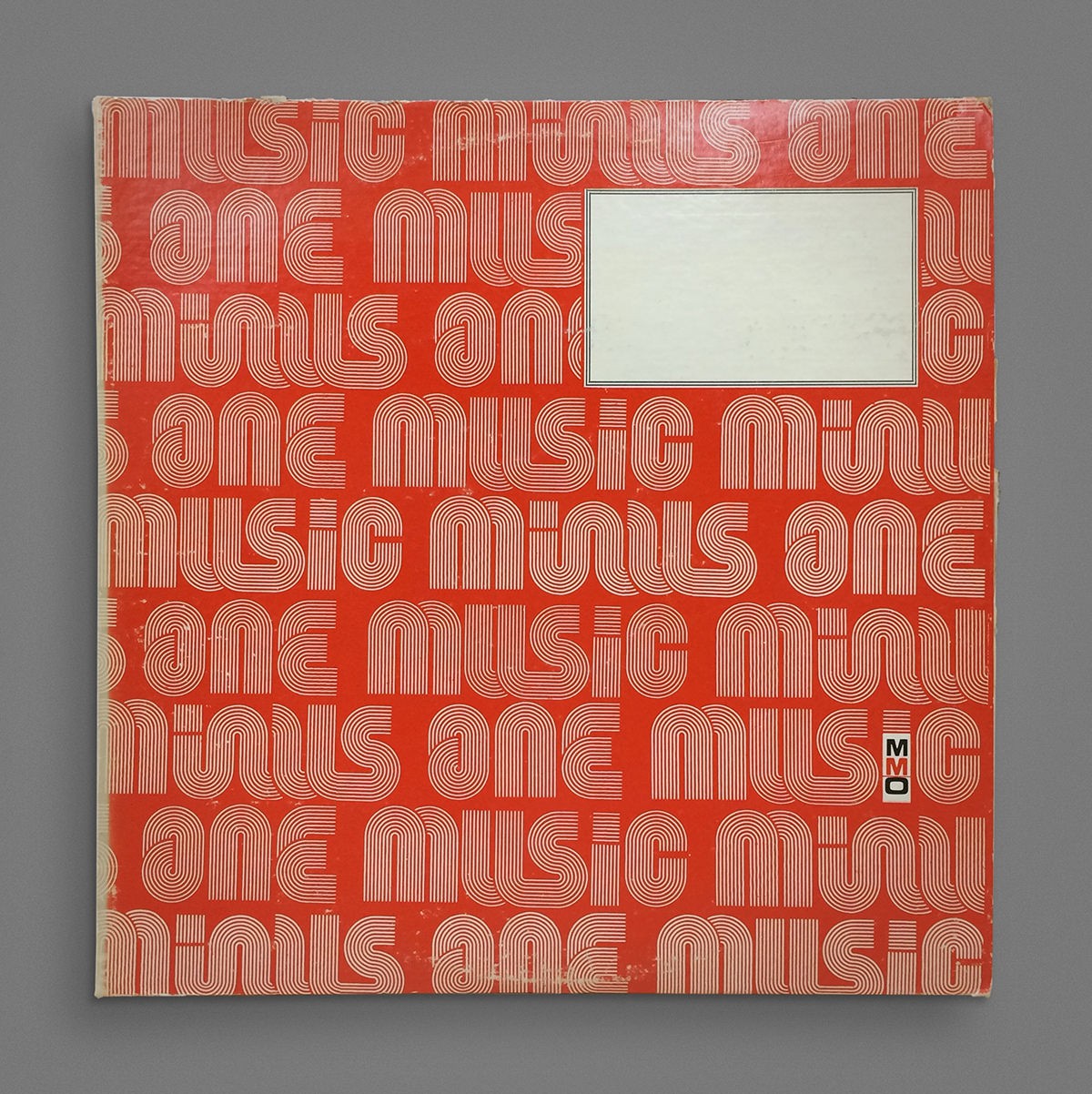
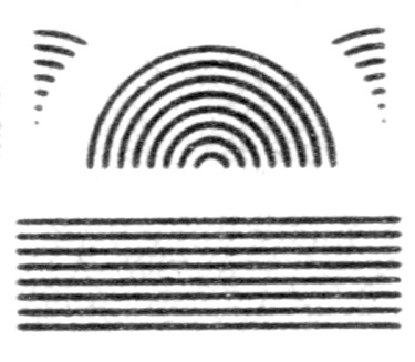
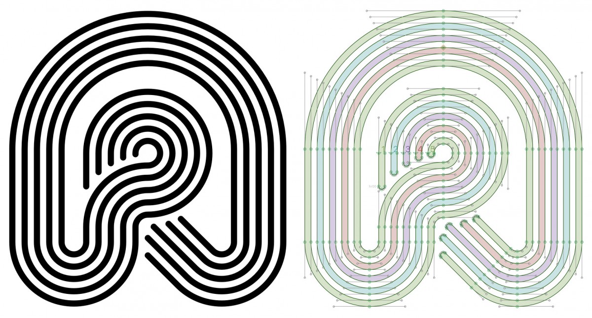
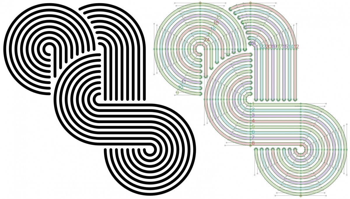
Another characteristic of this typeface that remained little explored by users was, when used for straightforward setting, the ability to alter titles generated with this system by excluding some of the lines. Also, in the case of professionals creating mechanic originals for reproduction, lines could be used independently to incorporate color in designs that pushed the boundary between typography and lettering. In some of the few cases available today the continuity of lines can still be observed in the spaces between words, and even more, if the alignment of the parts of letters would allow it, a vertical union in logotypes and visually impactful phrases.
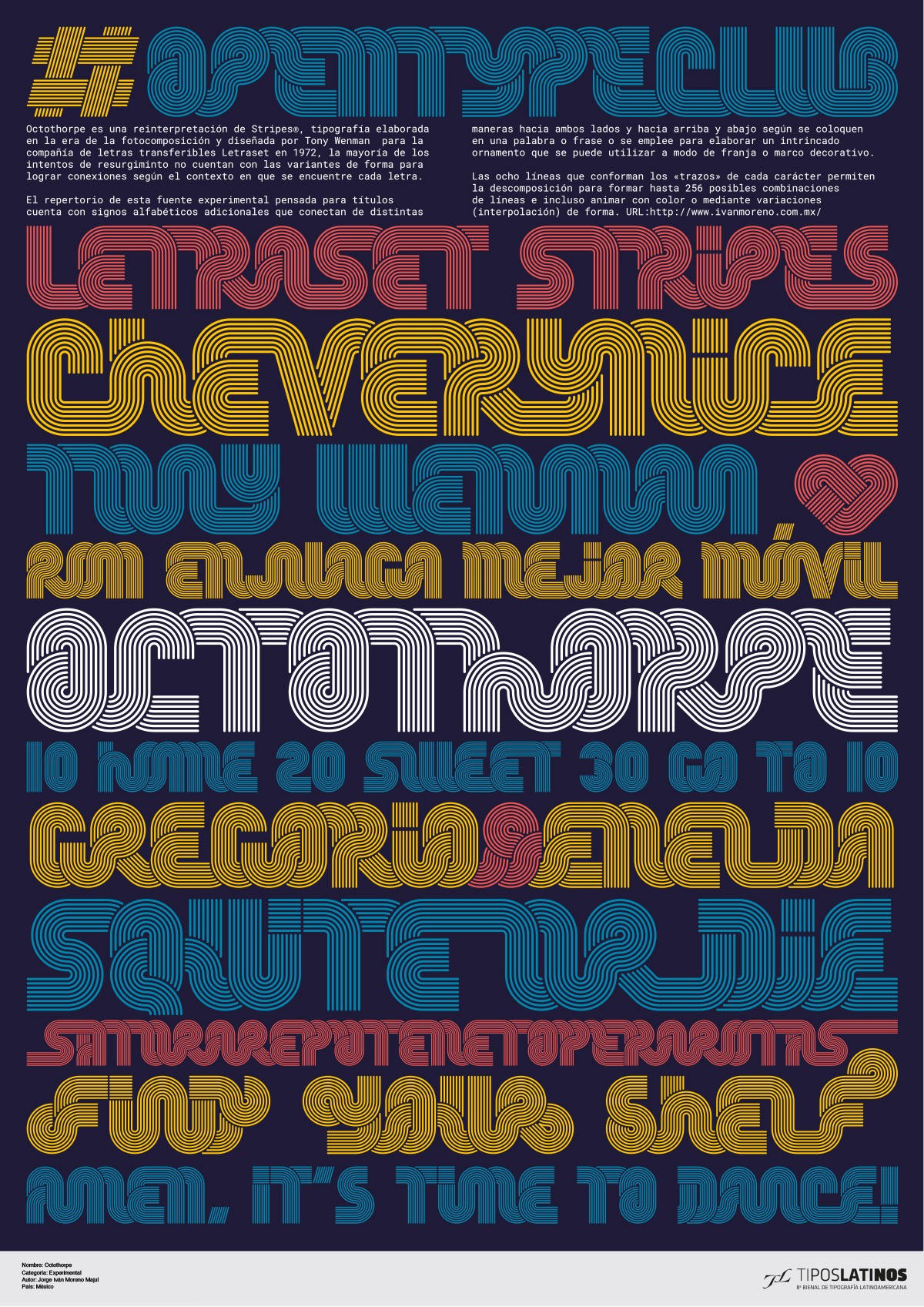
Octothorpe
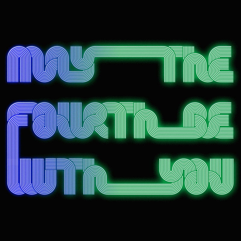
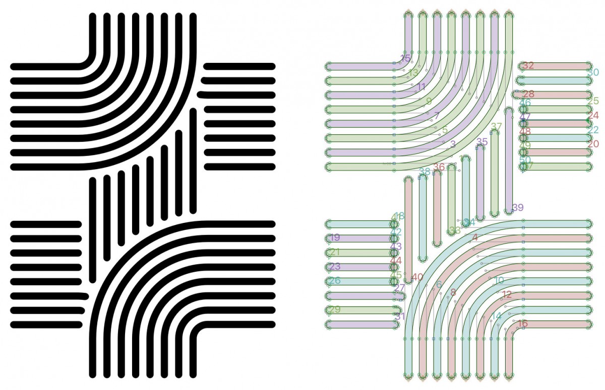
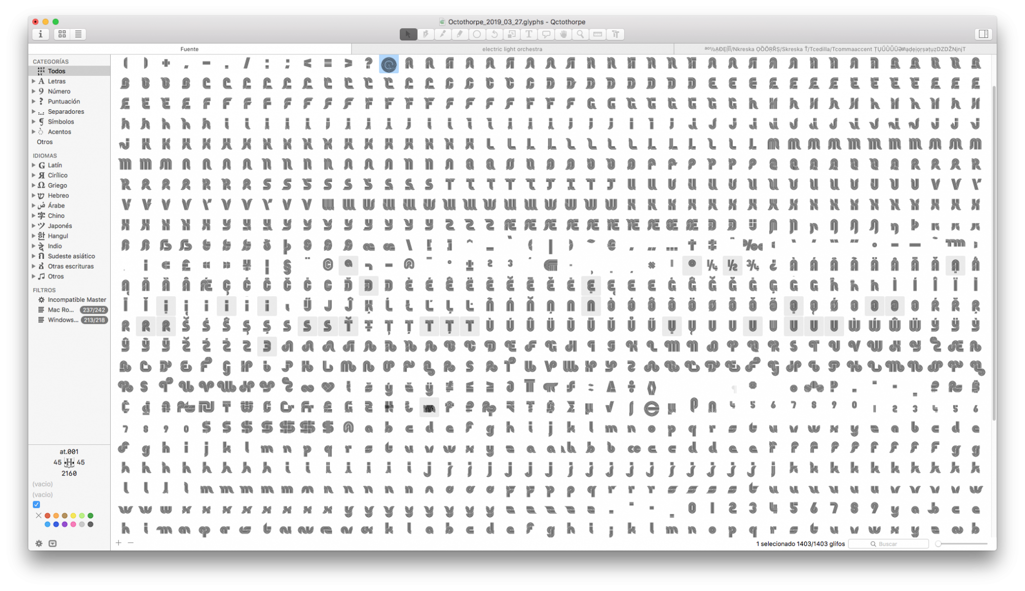
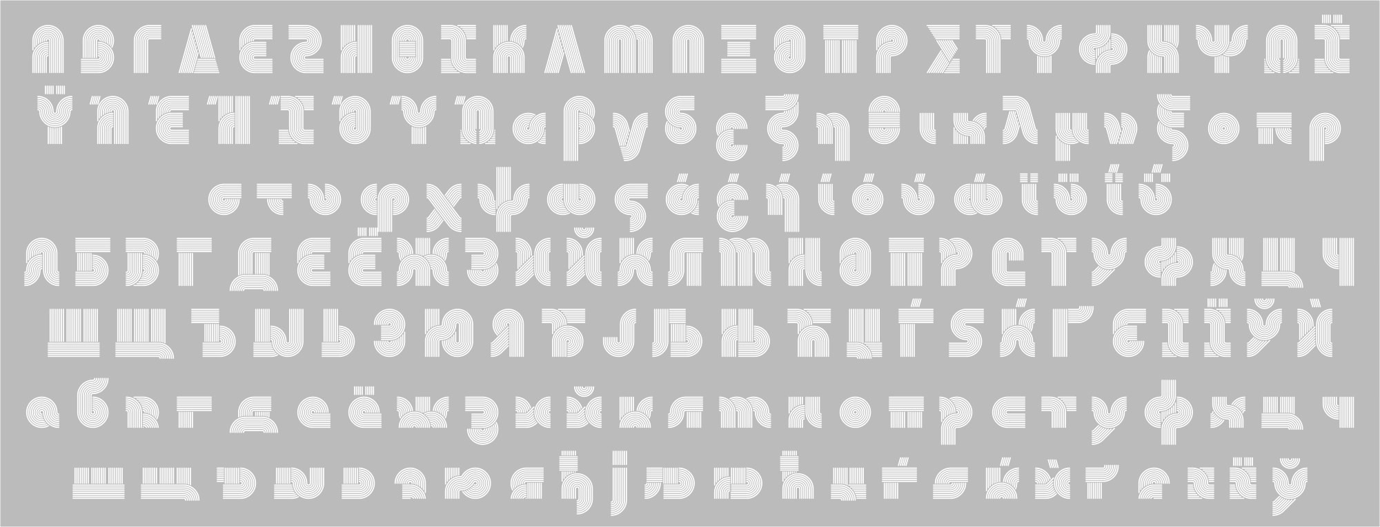
Re-emerging with the name of ‘Octothorpe’ and as a part of the process of reanimation one of the tasks performed consisted of adding characters that would complete a broader set fit for today’s standards, made possible thanks to the economy of the digital format. In order to do this, catalog specimens and in-use samples were consulted, as well as the original sheets.
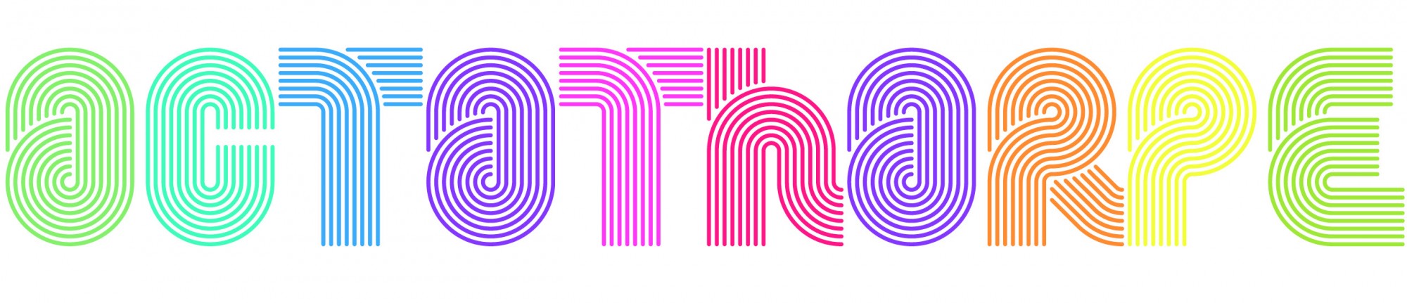
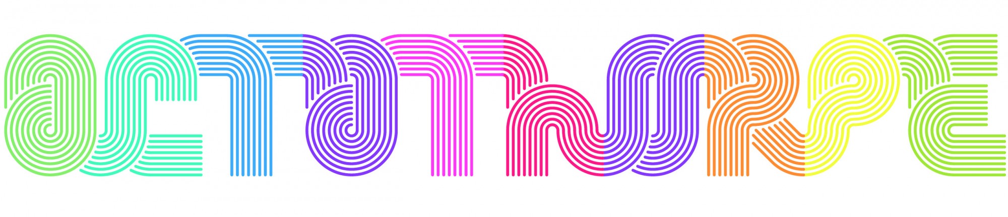
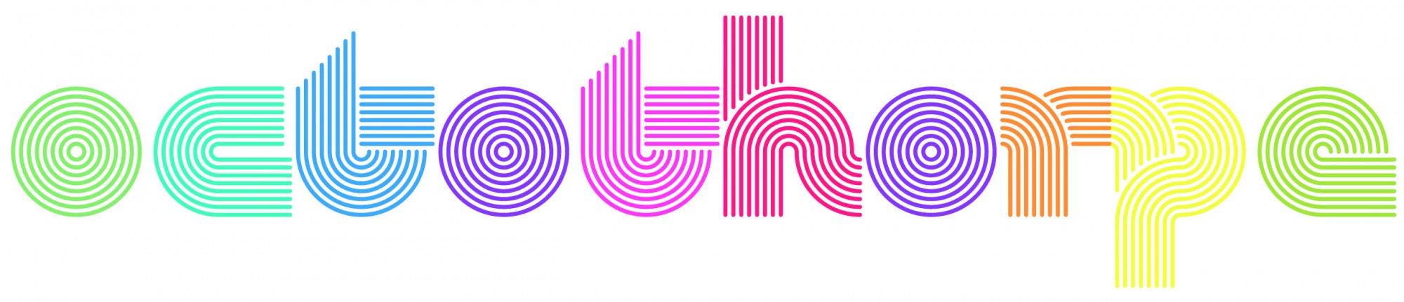
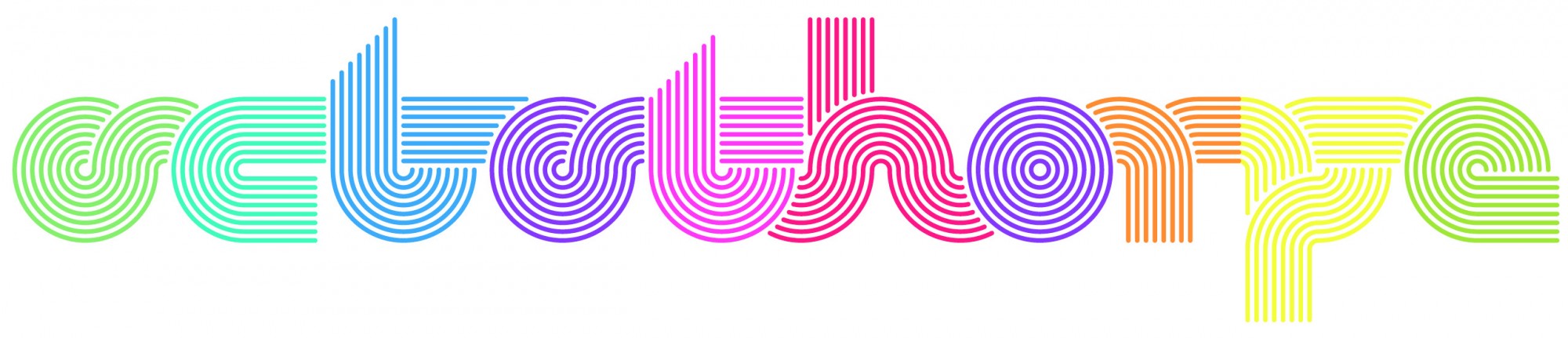
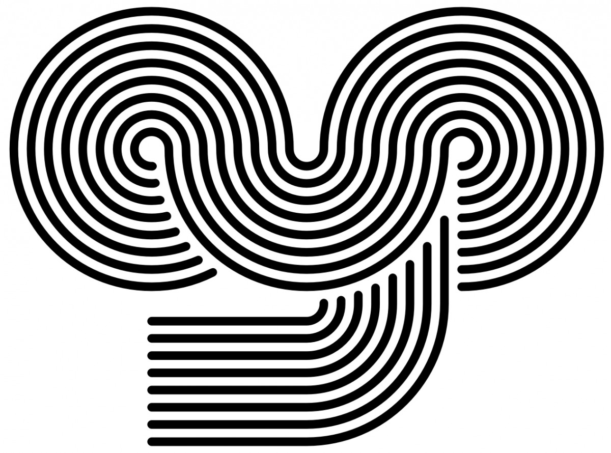
As if it were a font equipped with tentacles, the letters of Octothorpe can be linked or not to suit the user’s desire, generating a continuity of a high graphic impact.
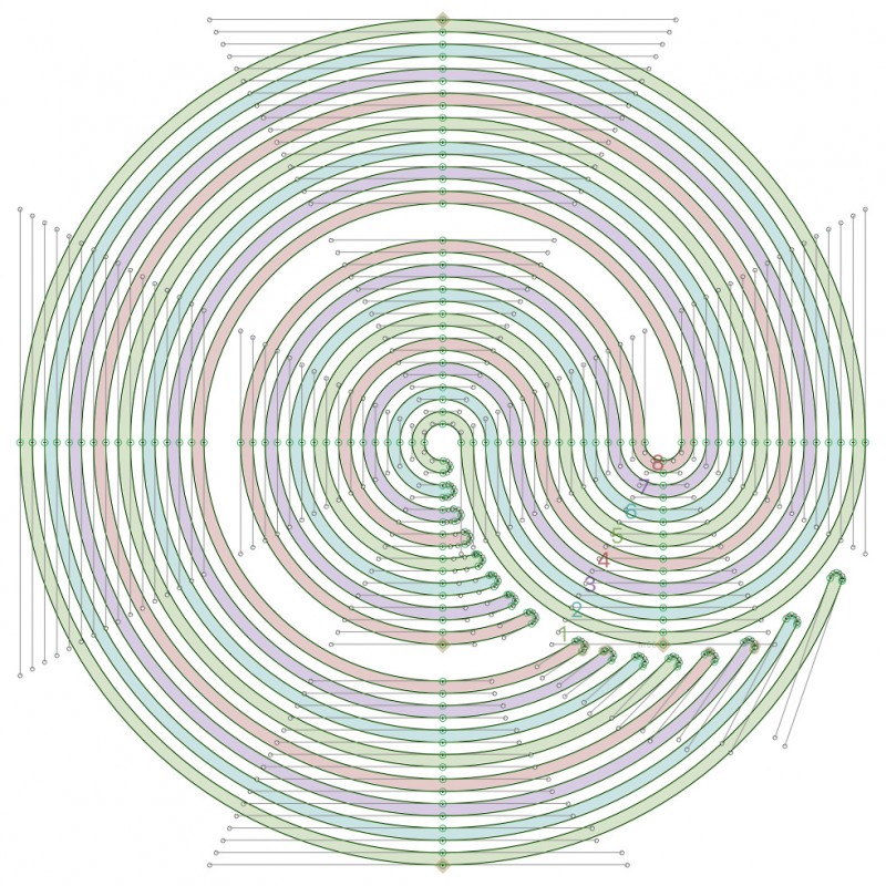
The process involved the meticulous task of manually drawing Bezier curves. Luckily some algorithms and scripts that allow you to control the drawing quality were very helpful.
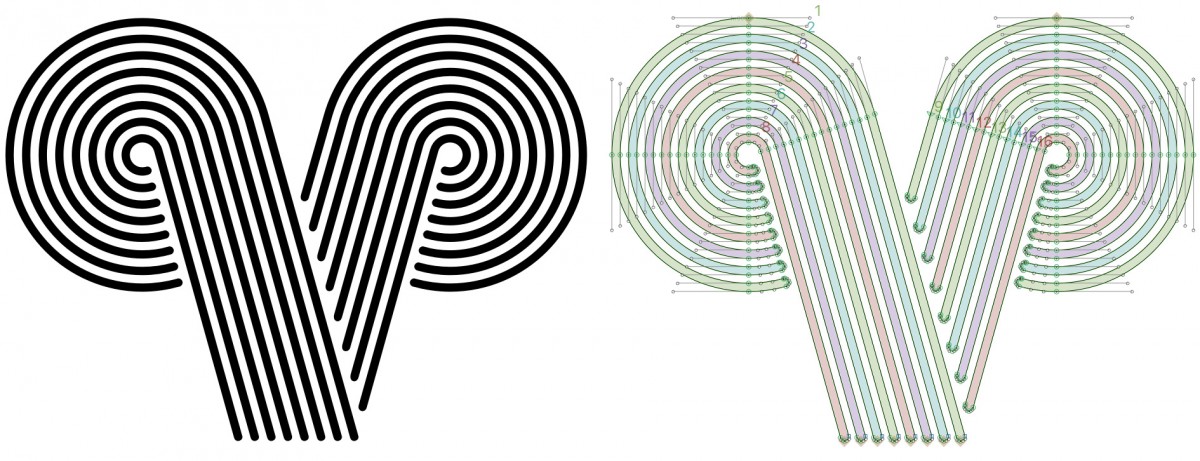
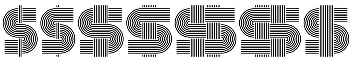
Take your pick: every possible cross-link of lines for the dollar or peso sign.
Many of the designs available for the so-called instant lettering have continued into digital typography, and in some cases remained faithful to the original. Curiously enough House Industries’ sister company Photo-Lettering operated until recent years with its logo-words (and phrases) business model, under which the user received not a font but the solicited text composed in the selected style, paying for the extension of it in a transaction that echoes that of transfer lettering.
Nowadays digital technology invites us to explore other options such as animation via the variable font format, so once again we see new possibilities arising with each new method of reproduction. We must ask ourselves what other ways of expression can be found for typefaces from the past or even what is in store for the digital format once new tools are made available to continue and expand the variety of ways in which typography manifests before our eyes.
Jorge Iván Moreno Majul is a font developer based in Veracruz, México. His type work has been selected by the Tipos Latinos international biennale. He has been the main font developer at PampaType for many years, and he has collaborated in the design and production of custom typefaces with a variety of independent foundries such as LetraCase, Branding with Type, Research Studios Barcelona, and several font designers from the Latin American scene. He was part of FontStage, a group of type designers who delivered custom projects for Google Fonts. He also gives lectures and workshops on digital type, font production, coding and the like. However what he enjoys most is putting letterforms’ nodes where they belong.