In 2022 the installation process of this project was completed. You can see some actual photos at the Fonts in Use website.
Type, the basic brick for signage design
The very first element a graphic designer faces when working on a signage project is undoubtedly typography. The selected alphabet must convey a specific formal singularity, be in harmony with the place it will dress, and install a strong identity. At the same time it must be legible in all circumstances, be space saving, and contain enough weight and glyphs to meet all possible situations in contemporary settings. Once installed, a nice signage system constitutes the voice of a building, its tool for addressing people. In this context, the typefaces associated with it must be selected with the greatest care.
Exploring the medieval epigraphy
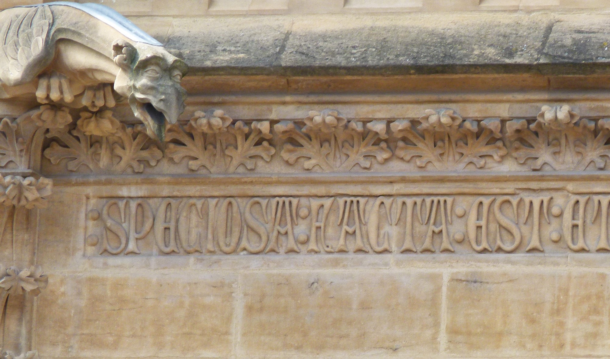
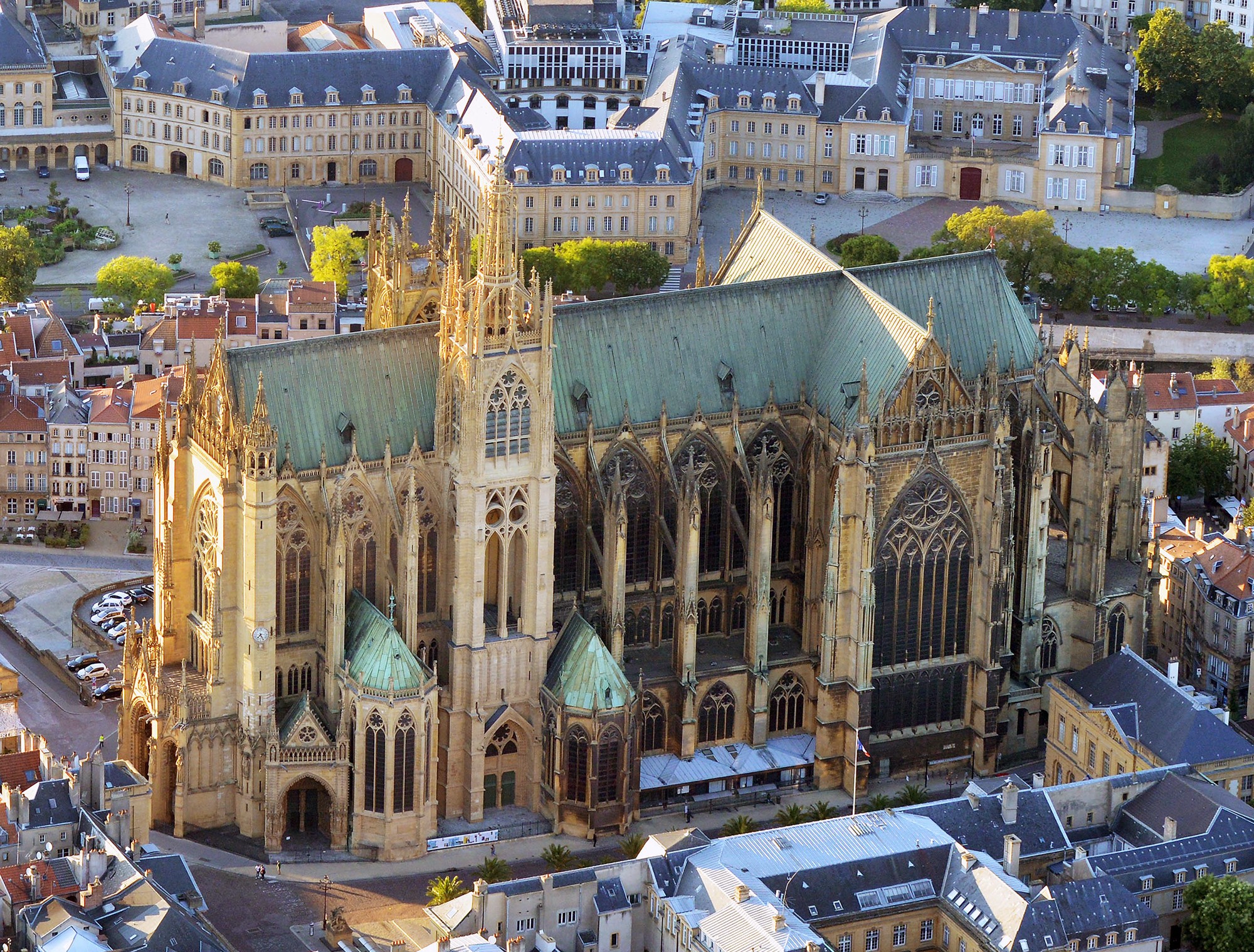
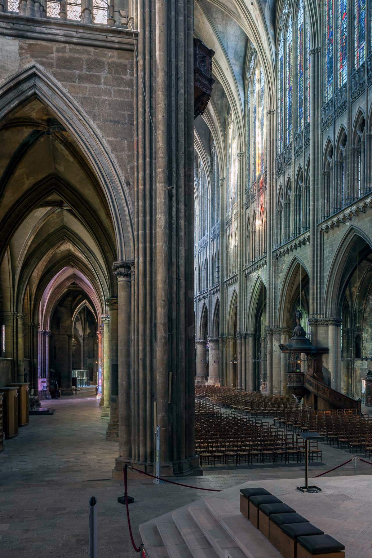
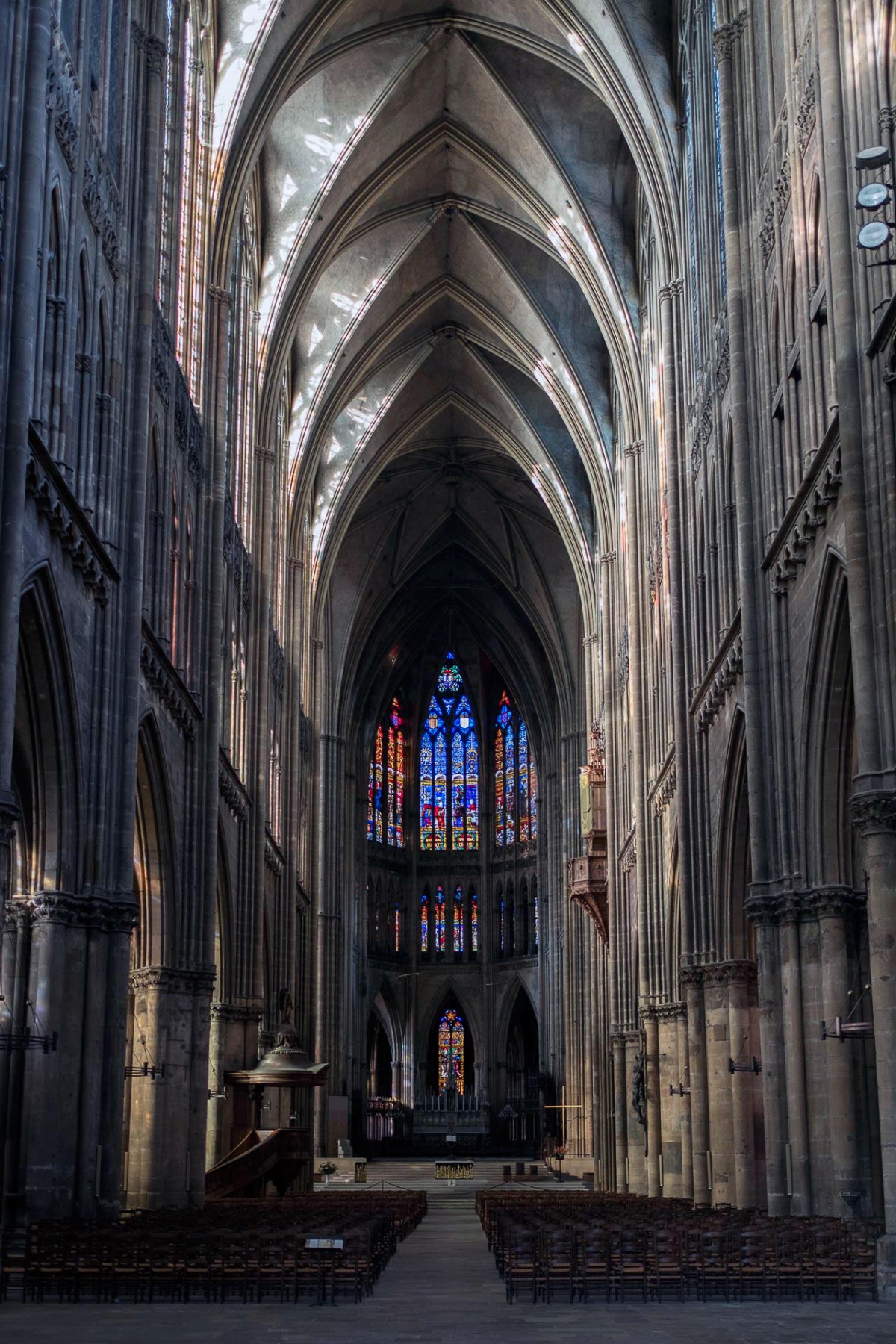
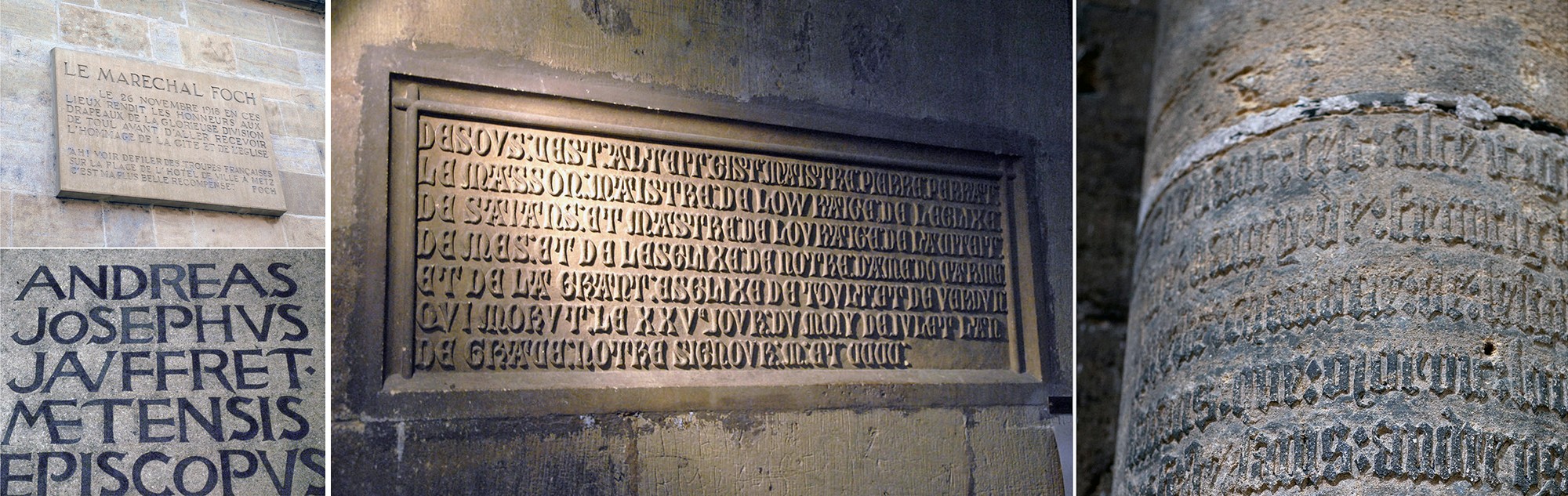
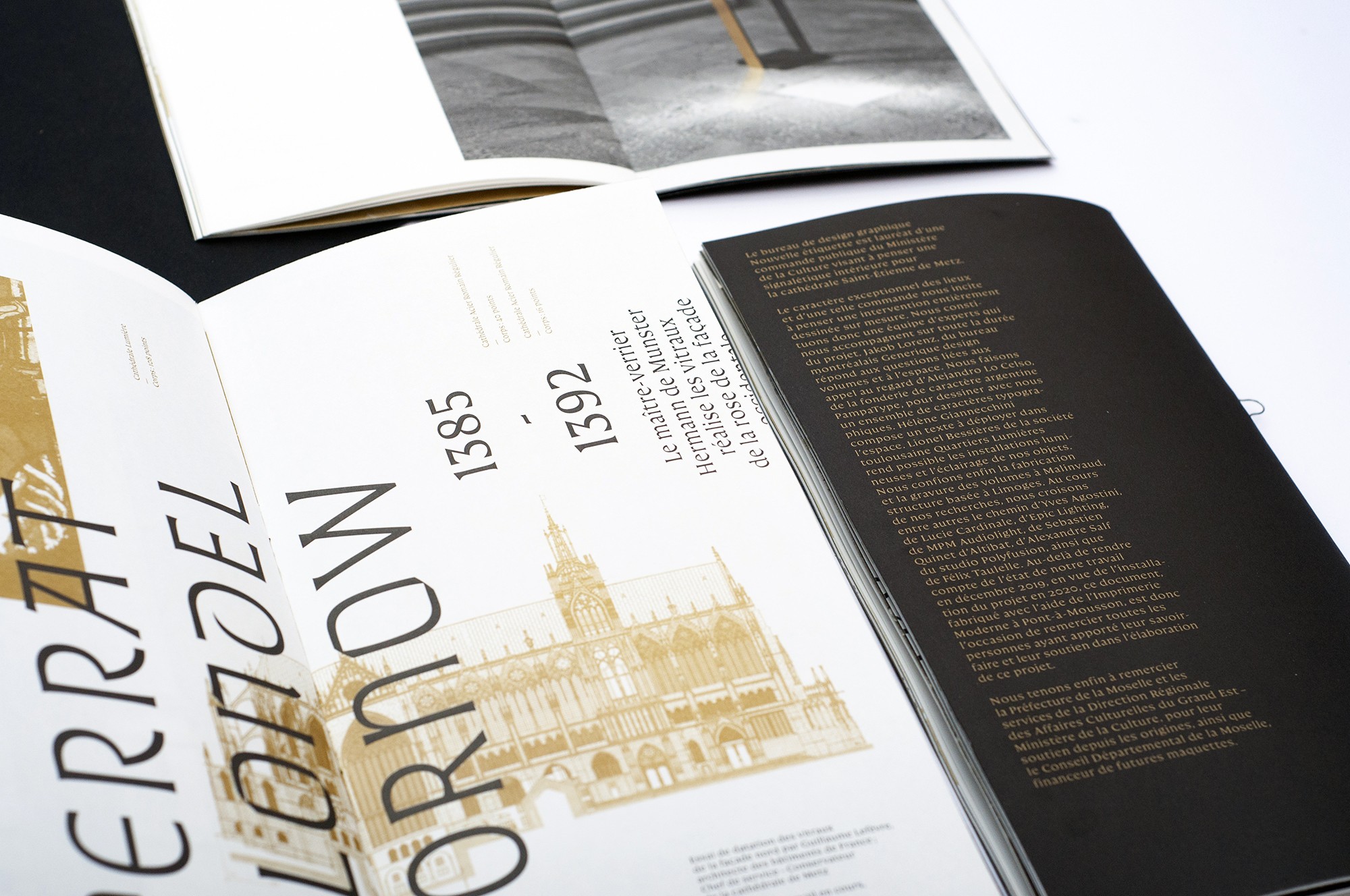
Bearing this in mind, when the French ministry of Culture asked us to design a signage system for the cathedral Saint-Étienne, we decided to base our work on a series of bespoke typefaces. The inspiration for it was natural. Medieval epigraphy is rich in alphabetical inscriptions. The Gothic period gave rise to numerous messages recorded on stone, intended for the general public. Stained-glass windows, columns and walls are full of typographic signs. Indeed, our typeface design, guided by a strong desire to be in aesthetical osmosis with the place, draw on this enormous wealth to offer its audience a contemporary interpretation of the gothic scriptural tradition.
A tailored patrimonial tool
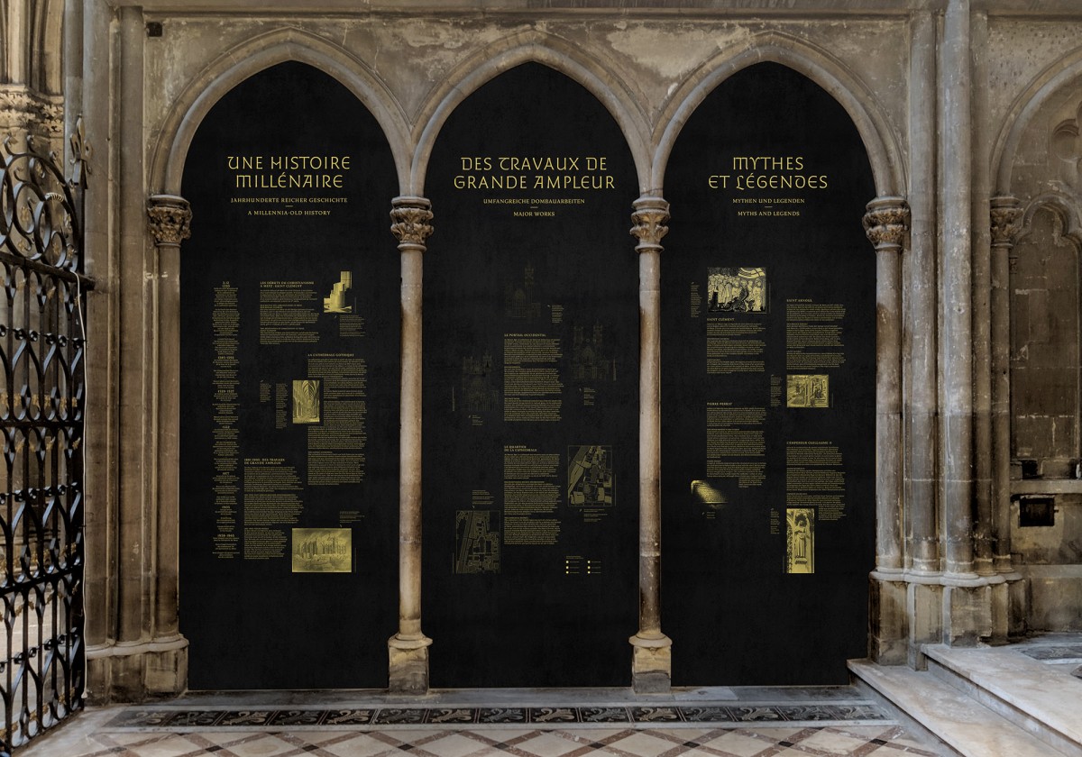
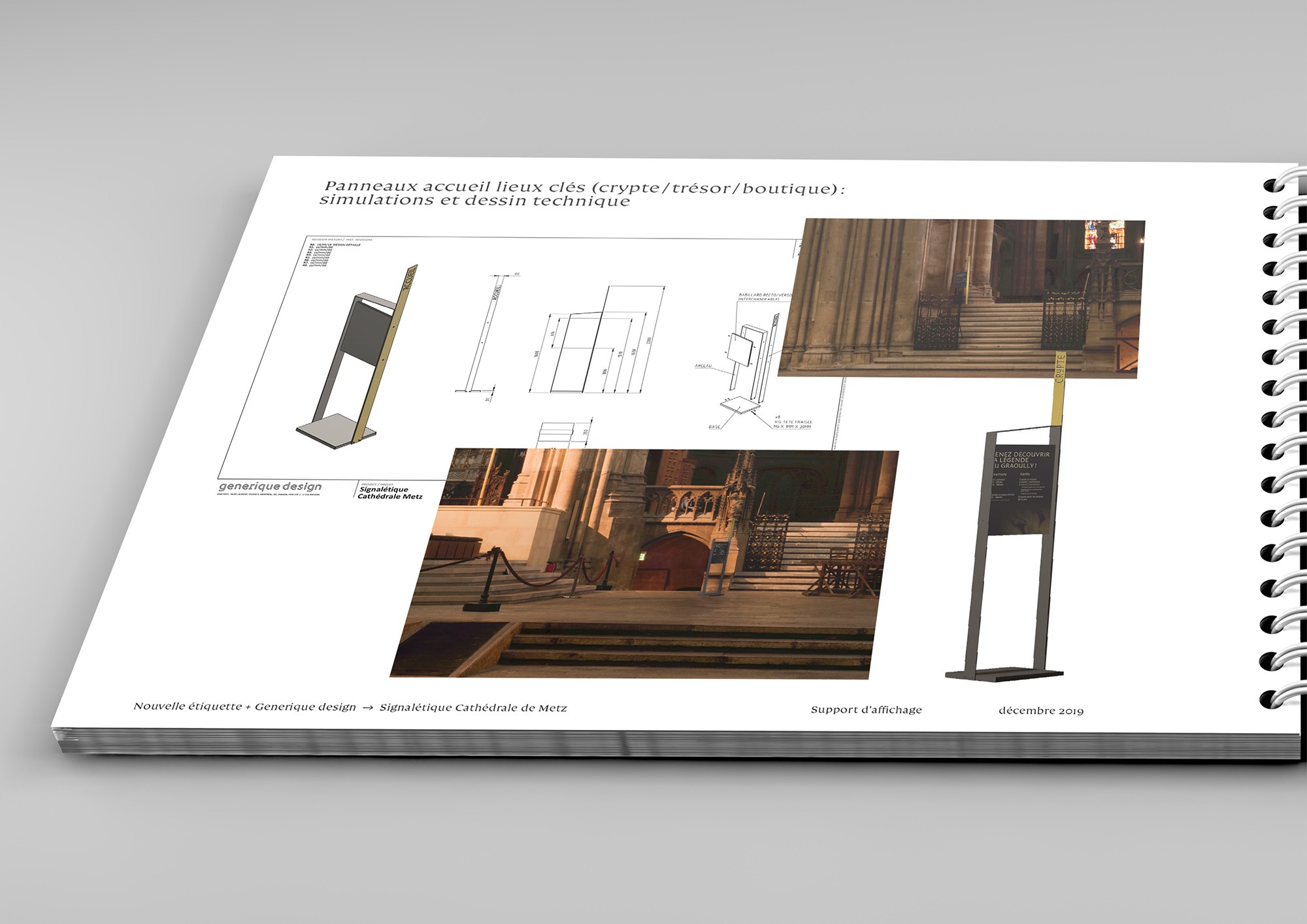
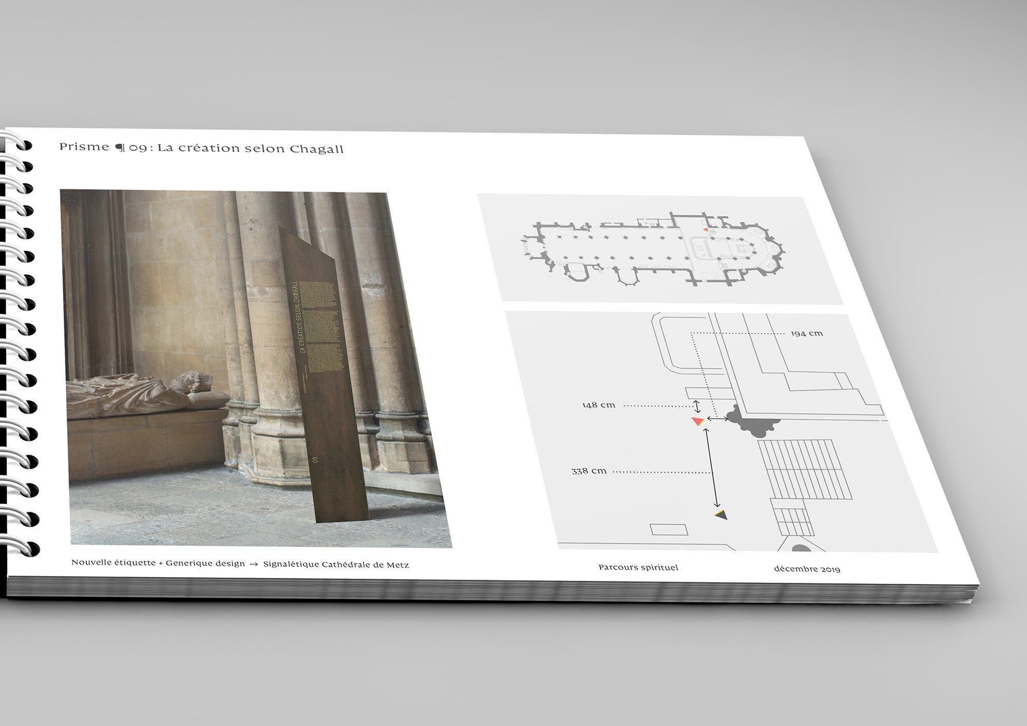
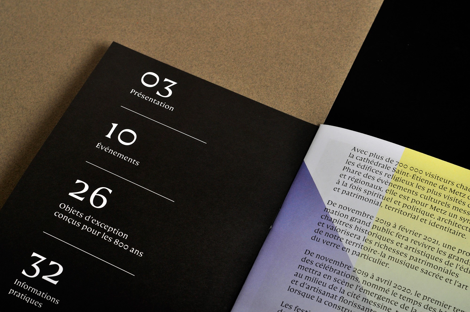
By choosing to design a specific type system for the cathedral, we created a versatile and complete graphic tool, which can respond to the particular needs of the signage project. The whole final installation — designed with Jakob Lorenz from Générique Design 1 — will consist in a light projected spiritual parcours, accompanied by 17 metallic monoliths displaying engraved texts which will describe the spiritual and artistic heritage of the cathedral. Those parcours will be completed by a few specifically designed panels intended to display temporary information. Finally, a patrimonial space will be installed in an unused chapel of the cathedral. This area will display purely patrimonial information through engraved steel panels and 3D printed models.
Built alongside with the physical and graphical productions of this project, the typefaces are therefore able to respond with unequalled precision and efficiency to its needs. Their design also inscribes the signage project in a temporality close to the one of the cathedral. Indeed, typefaces have the ability to capture the spirit of their time while settling in the long term (think of Garamond, for instance… shapes that have been designed centuries ago are still well perceived and used in our contemporary world). This patrimonial dimension of type design has been identified at the very beginning of our discussions with the project sponsors as a definite asset for this project.
After months of hard work, the typefaces are now finished, and will soon be shared with their final users: members of the chapter, volunteers from the cathedral and civil servants from the local delegation of the state. Later this year (2020), the final signage project will be installed in-situ, and the typefaces will be allowed to be used by a very restraint number of people, to bear the artistic, liturgical and patrimonial voice of the cathedral through paper, light and steel.
Cathédrale Lumière, to be projected with light
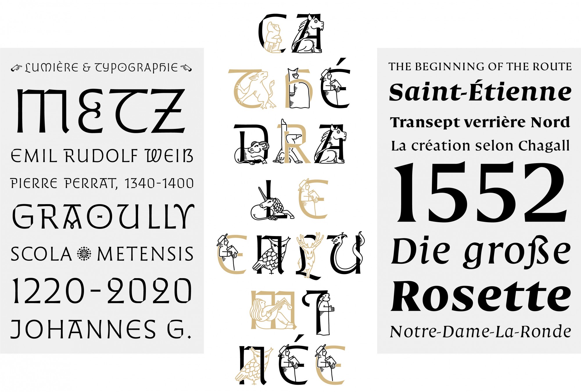
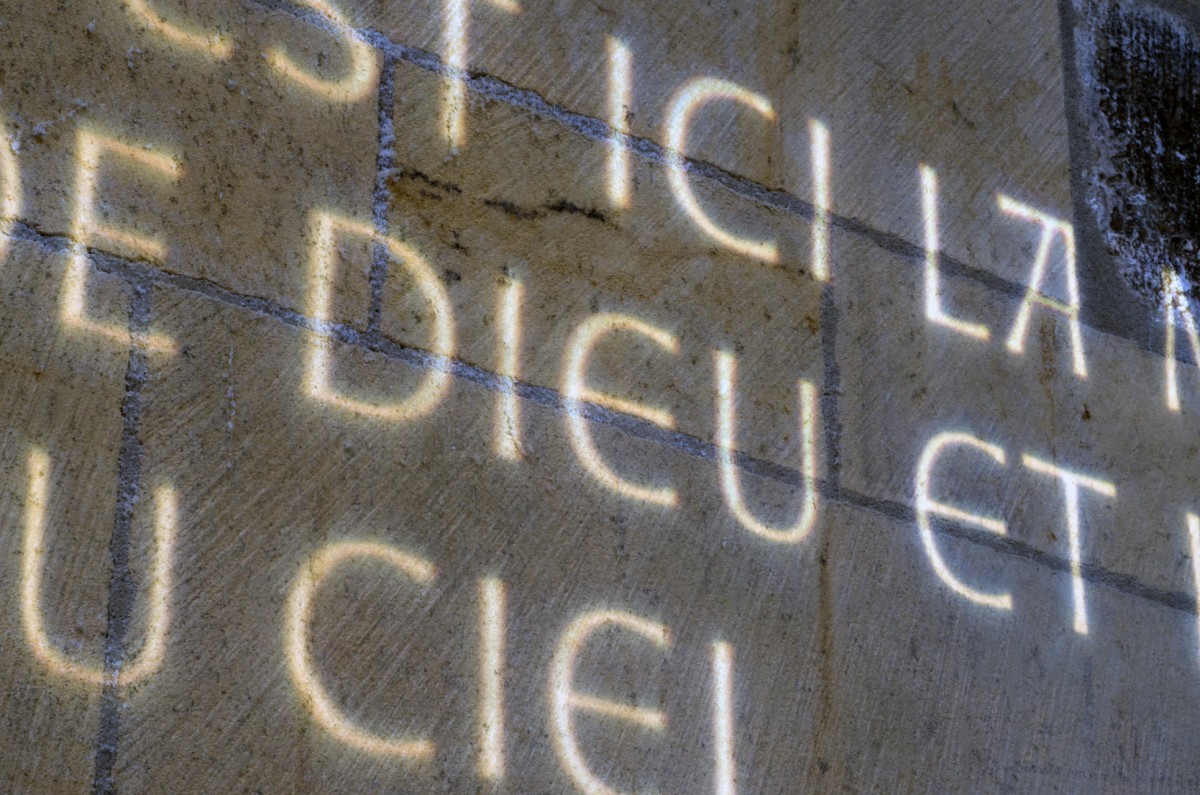
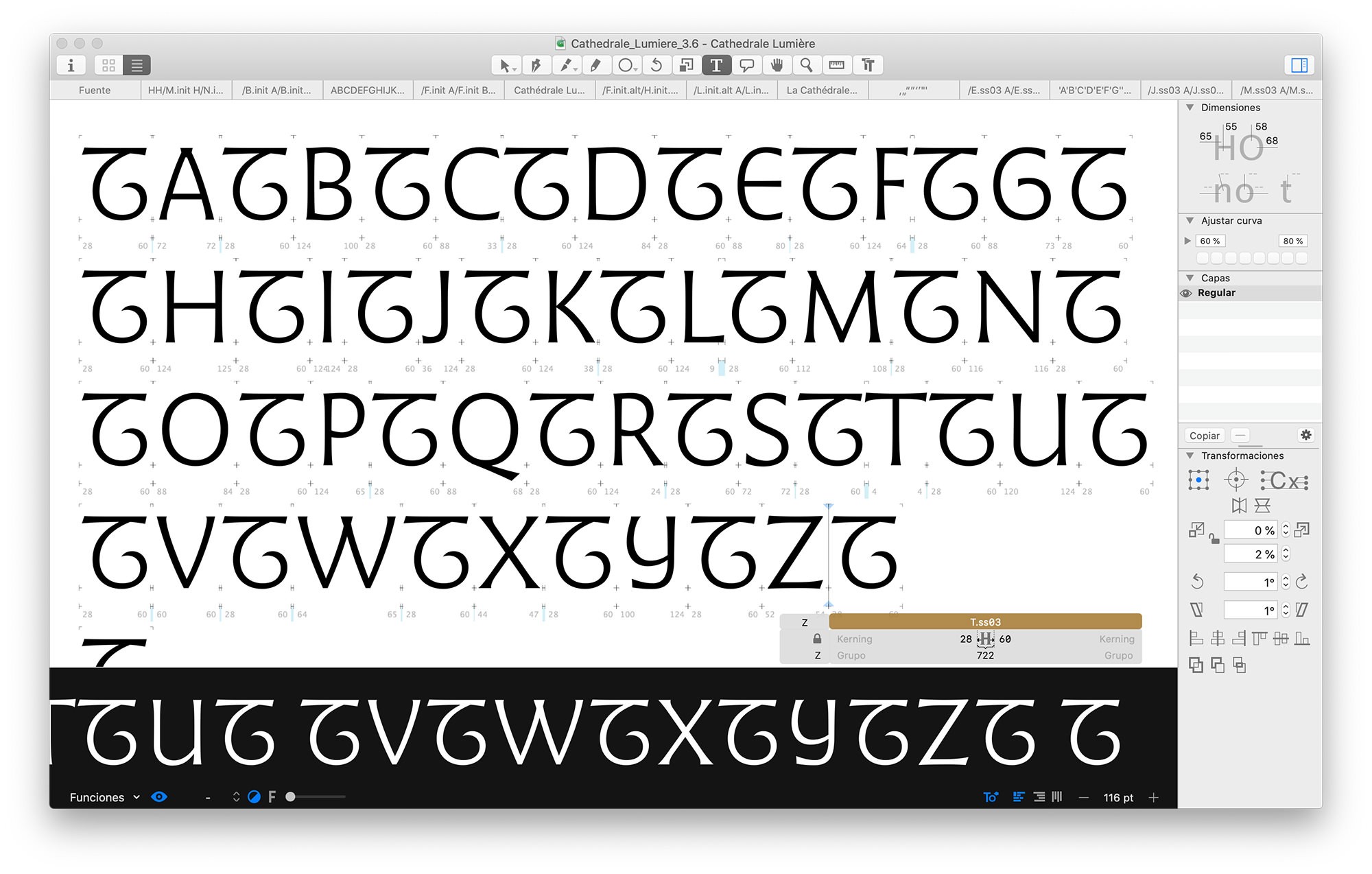
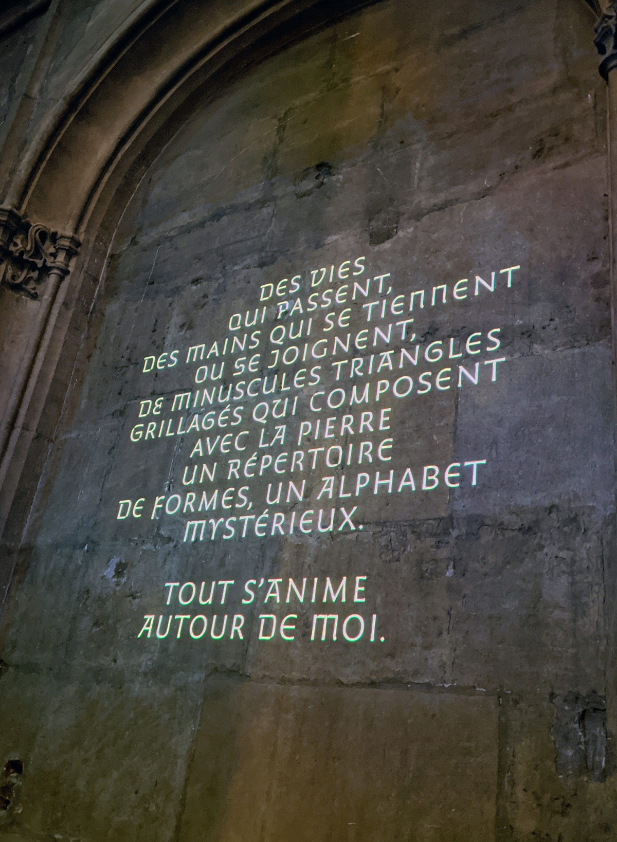
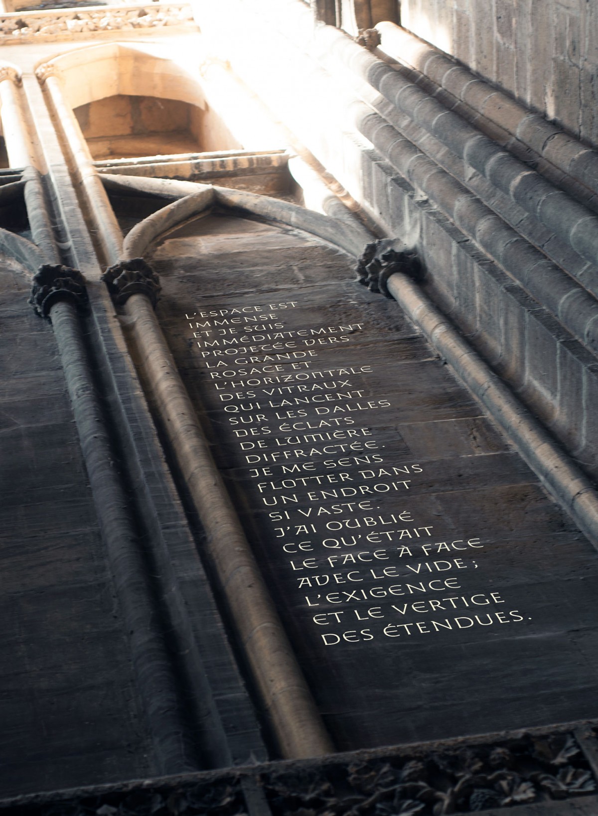
Cathédrale Lumière is an all caps typeface intended for the composition of all titles in the project. It is the most exuberant character of the system. It is also the most visible marker of the building’s visual identity. Cathédrale Lumière’s design was based on the tecnical constraints of its main mode of diffusion. Within the church, the typeface will be used to display large luminous sentences, projected on the walls using light projectors. These sentences compose the spiritual path which will accompany the visitor as well as underline the architecture of the cathedral. This specificity was incorporated from the start in the design, so that the font behaves finely in these conditions, while also allowing its use in traditional situations such as print.
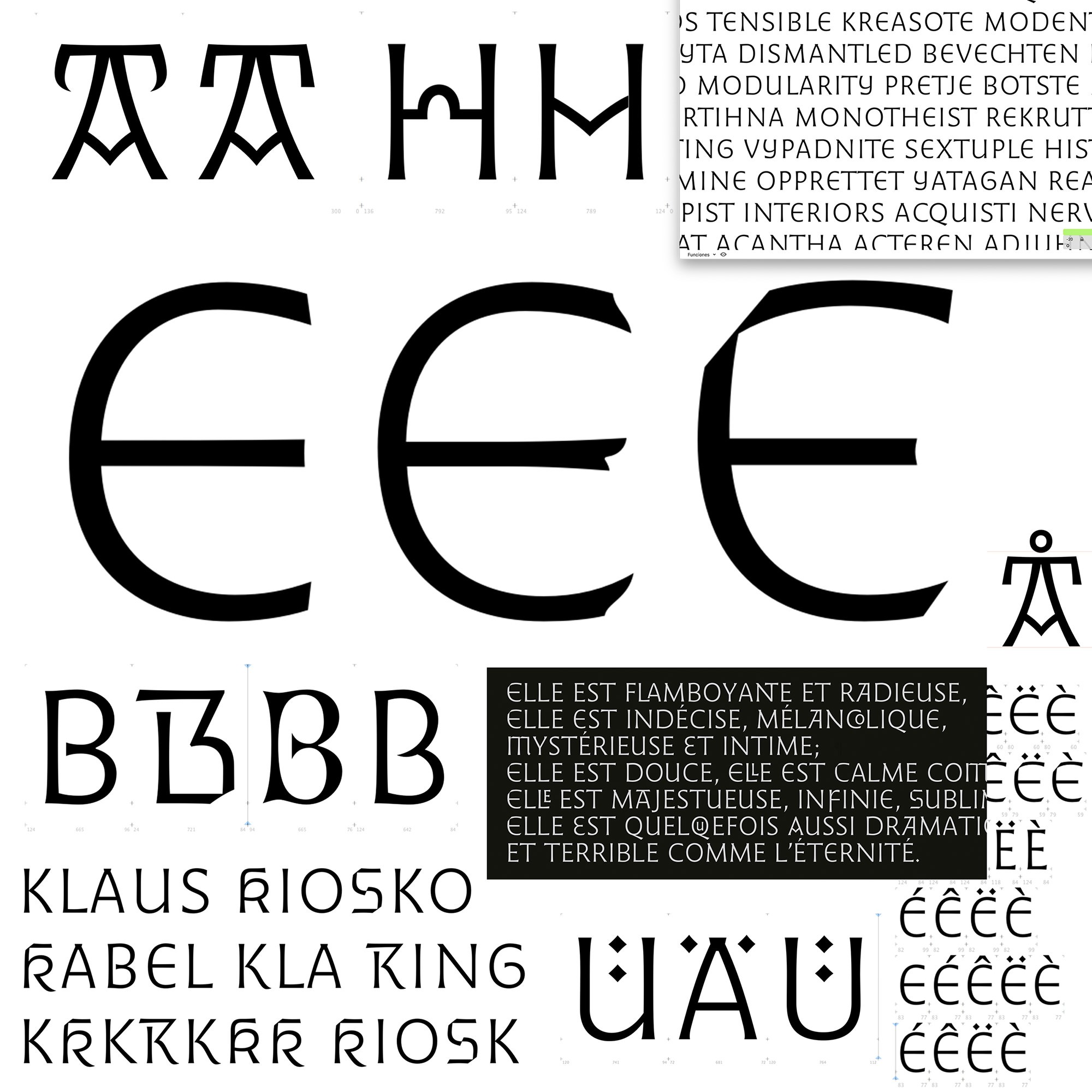
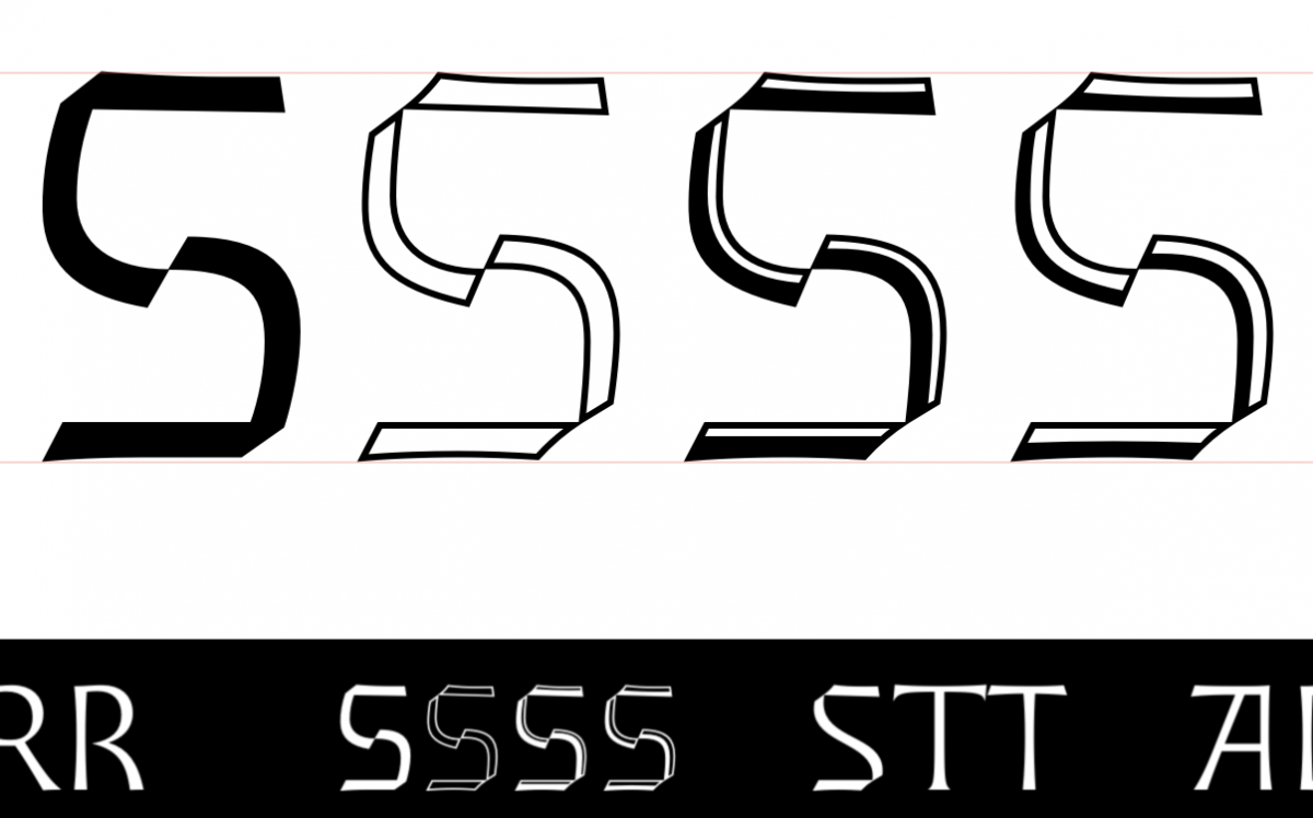
The typeface was thought to behave as a kind of digital lettering, rather than a static font. Cathédrale Lumière is a flared-serif typeface, with slight contrast, which, thanks to the design of numerous variants of letters and to the Opentype features, can compose texts with good formal diversity.
The process of designing the first of the typefaces, to be projected on the walls, was key to define the dynamic nature of the whole project. Alejandro and Francis were involved in an intensive exchange of ideas and forms through a *drive* space, and discussed more conceptual approaches in successive virtual meetings. This way the first font, Cathédrale Lumière, was rapidly defined from the beginning of the project.
A quick glimpse of the diverse letter styles included in this font. Depending on the situations, the Cathédrale Lumière can express many different tones, from very formal ones to more exuberant ones. Those letter variations can be easily activated using stylistics sets and ligatures.
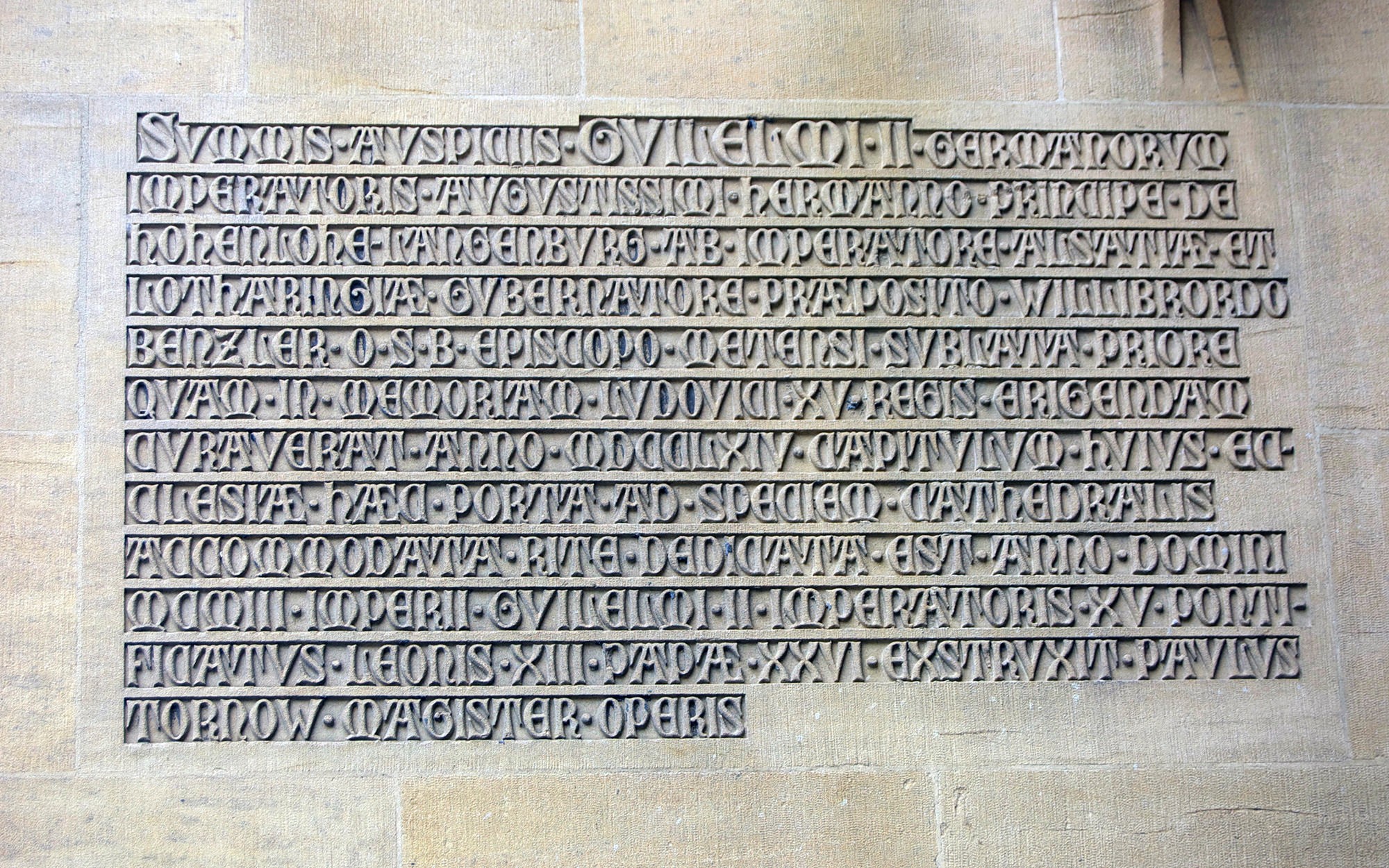
Cathédrale Métal, to be engraved on steel
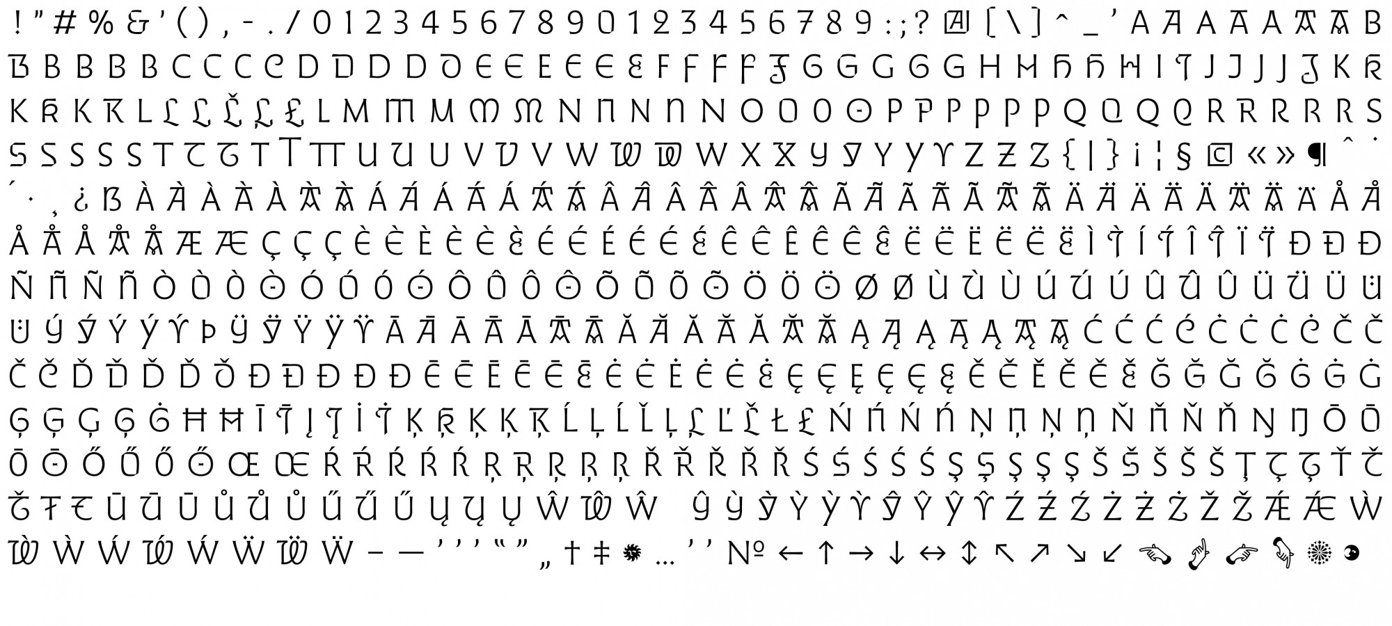
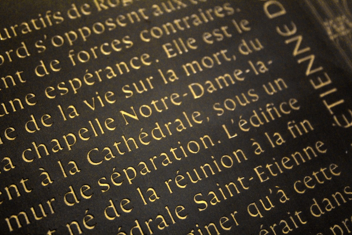
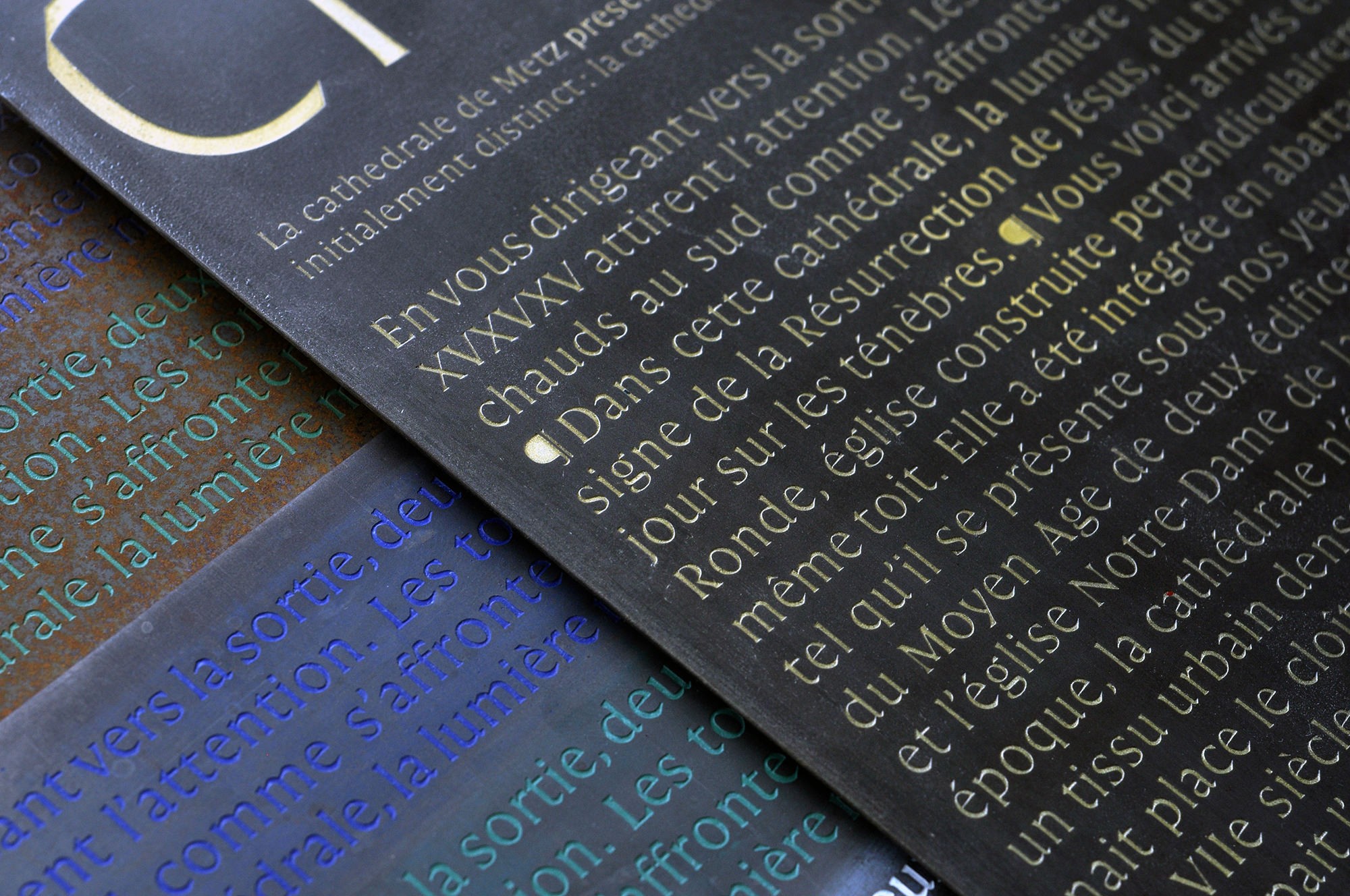
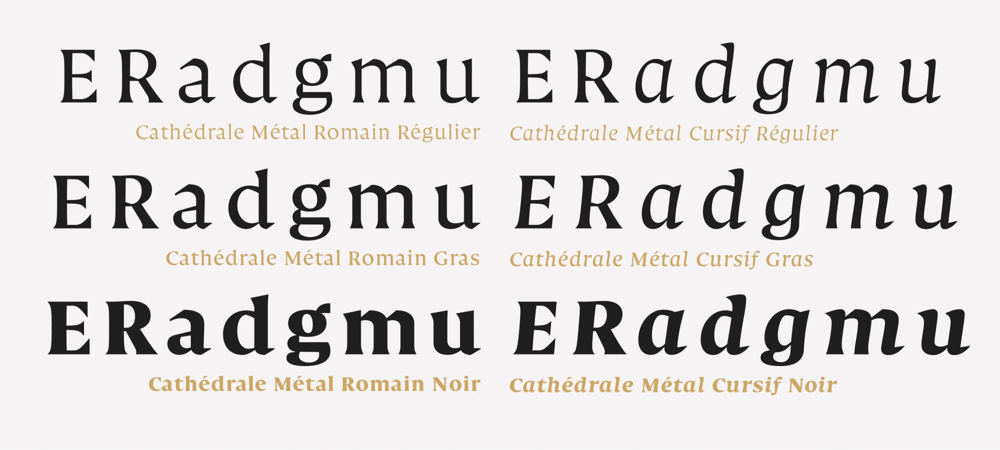
To accompany Cathédrale Lumière, we designed a type intended for immersive reading and relatively small body sizes. “Cathédrale Métal” is intended to be engraved and hand-painted in the metal objects conceived for the project. It will be also used for relatively long texts in editorial situations. The typeface therefore seeks to distil a consistent graphic identity with the project while remaining as legible as possible in all these situations.
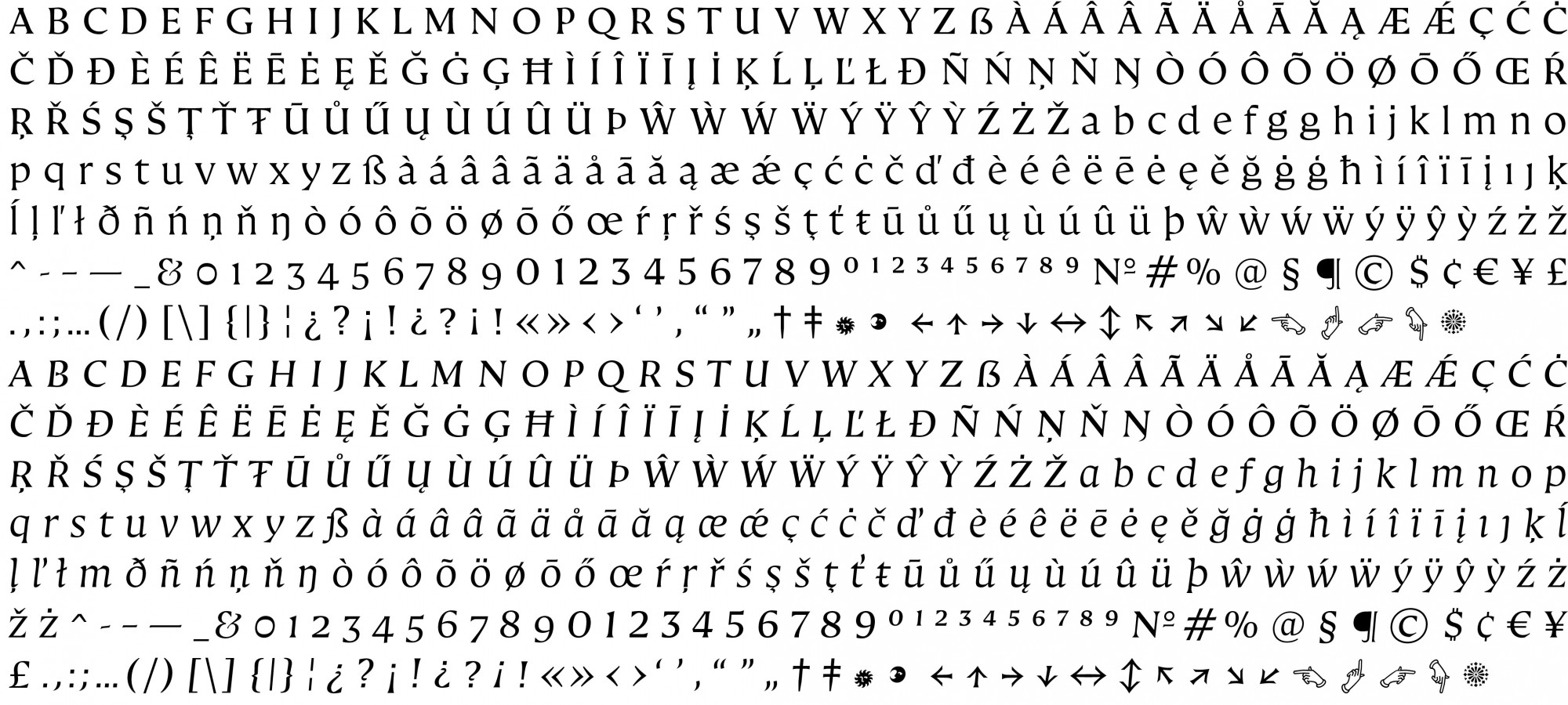
To meet this challenge, Cathédrale Métal includes three weights declined in roman and cursive. It meets the main needs of composition of long texts, thanks to a character set that covers most languages of Western Europe. Formally, these fonts incorporate elements that echo the ductus of Gothic calligraphy by importing it into a Roman logic. The alphabet has a very high x-height which allows to save vertical space, a real asset in signage conditions.
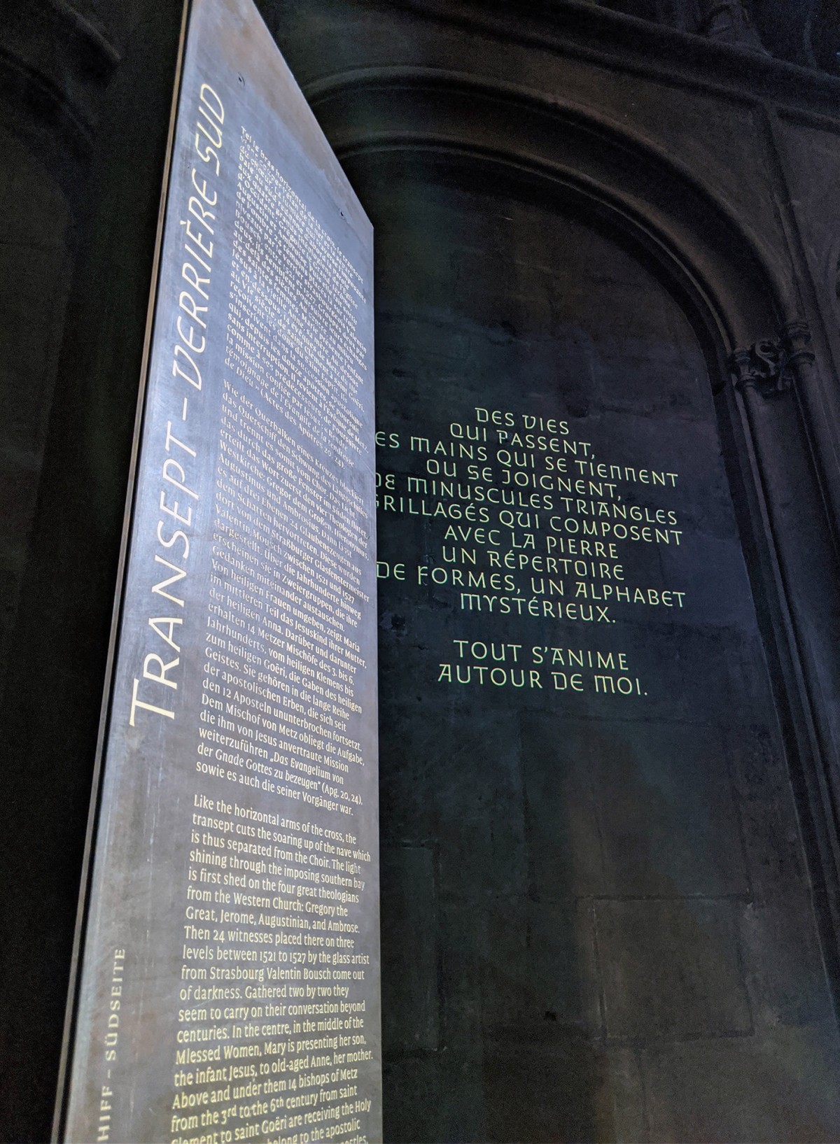
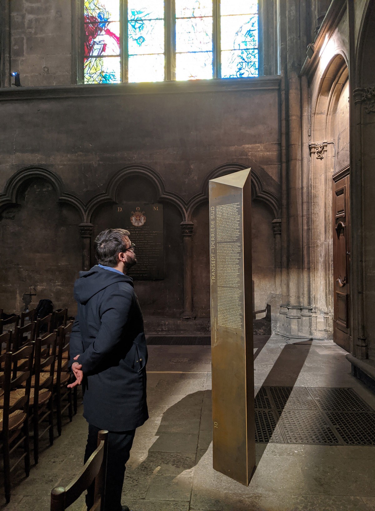
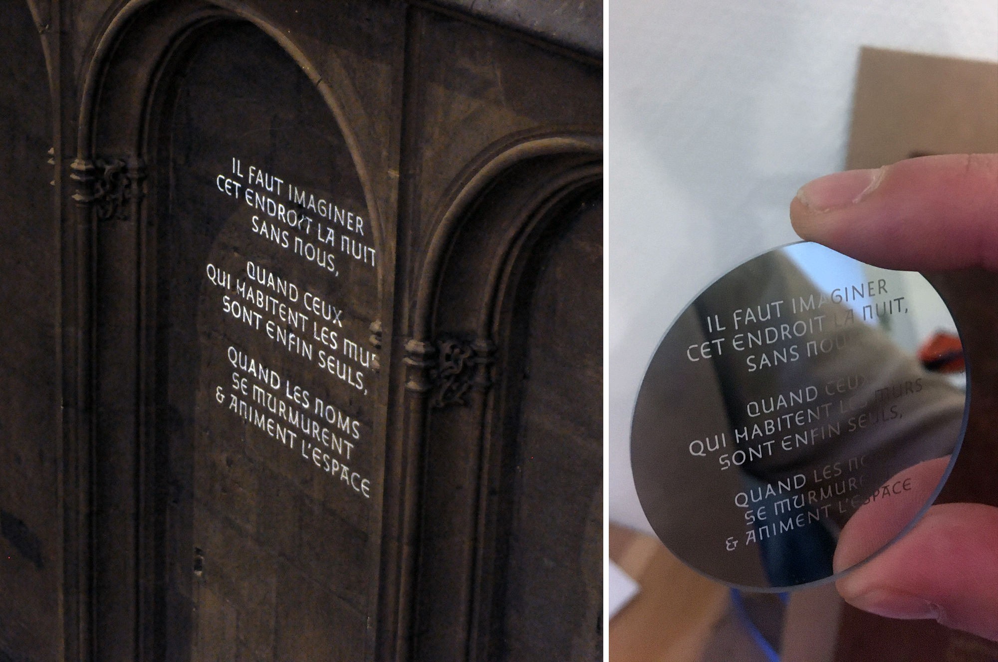
A first installation made in December 2019 displaying Cathédrale Lumière and Cathédrale Métal on the walls of the cathedral and engraved in a prototype of the final monolith designed for the project.
As we have just seen we have built the text type in close relation to the titling type. The former integrates elements of the latter, enters into dialogue with it and translates its spirit into the world of immersive reading. It also stands out from it, exploring another way of referring to the Gothic scriptural tradition adapted to a long reading situation. Our two characters correspond and sculpt each other. Together, they conform a harmonious typographic system of complementary members.
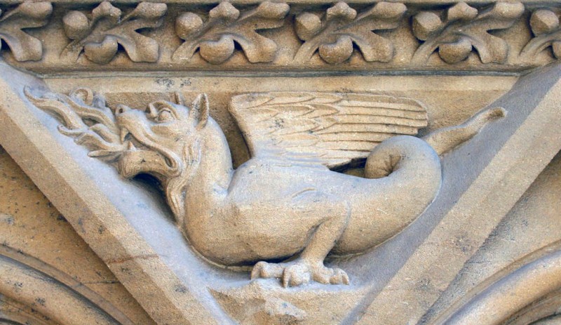
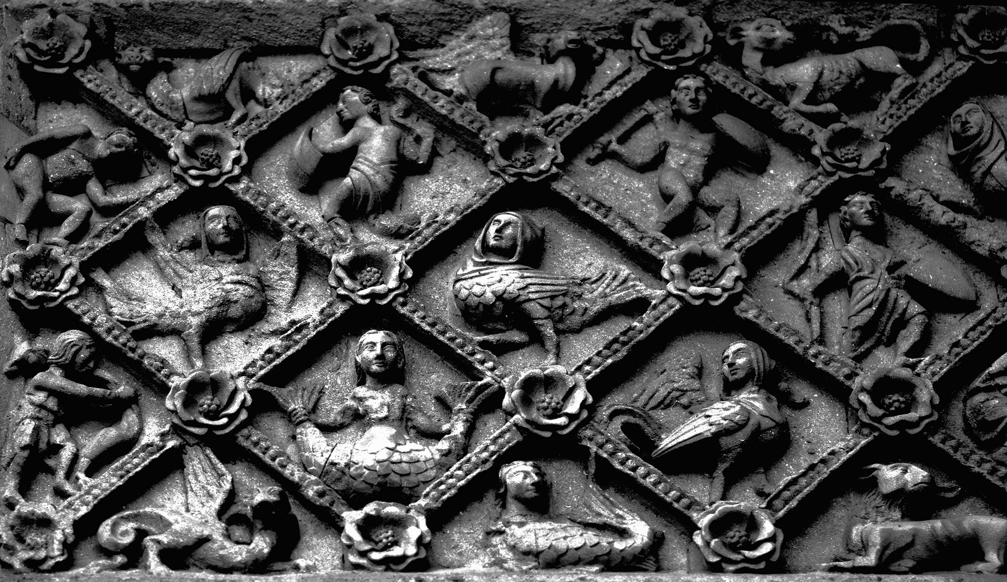
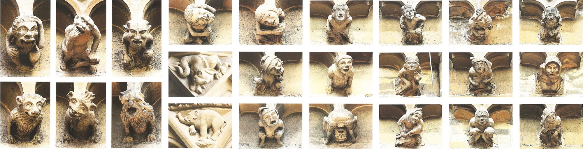
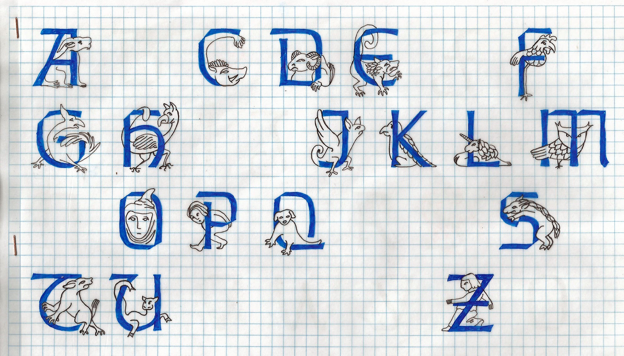
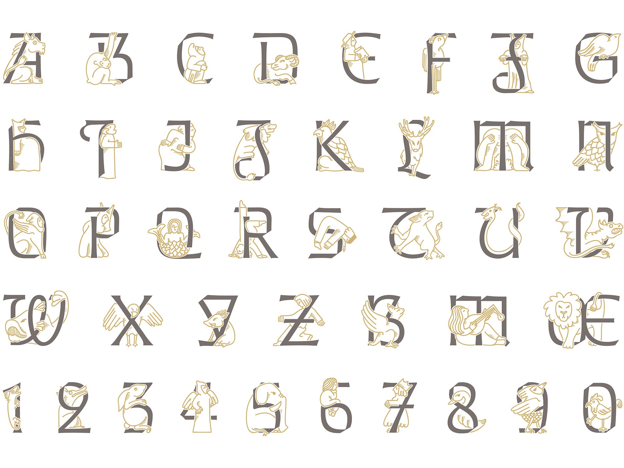
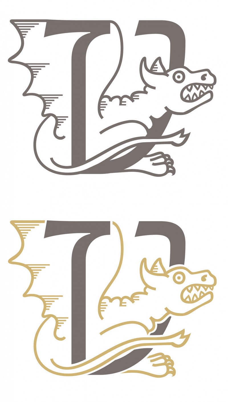
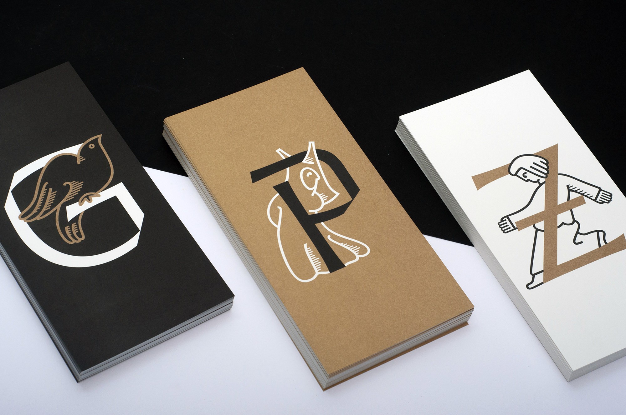
Cathédrale Enluminée: Initials, monsters and chimeras
From the beginning of this project we were tempted by the chance to somehow incorporate the magic and playfulness of the many sculpted medieval personages, monsters and chimeras one may discover everywhere on the walls of the building. Very soon, the idea to translate them into illuminated letters which could be used as initials in special texts of the cathedral rose in our minds. This is when Julie Luzoir (also a member of Nouvelle étiquette) enters the scene. Julie drew by hand a whole series of inspiring characters that managed to inject greater graphic richness into the project, adding a vernacular element that is also a significant value of the historical, artistic and architectural heritage of the cathedral.
Cathédrale Enluminée, the digital result of this work, transforms the gothic initials from Cathédrale Lumière into a full set of ornamented letters to be used in association with Cathédrale Métal, in a very classical editorial way, or in more relaxed and graphical situations, by its own or paired with Cathédrale Lumière. The font is equipped with two versions for all glyphs: The first one is intended for monochromatic uses while the second one — which can be activated via a simple OT feature — allows users to edit the colors of letter and figure independently, as well as print safely in two separate tones.
Type design at the heart of visual identity
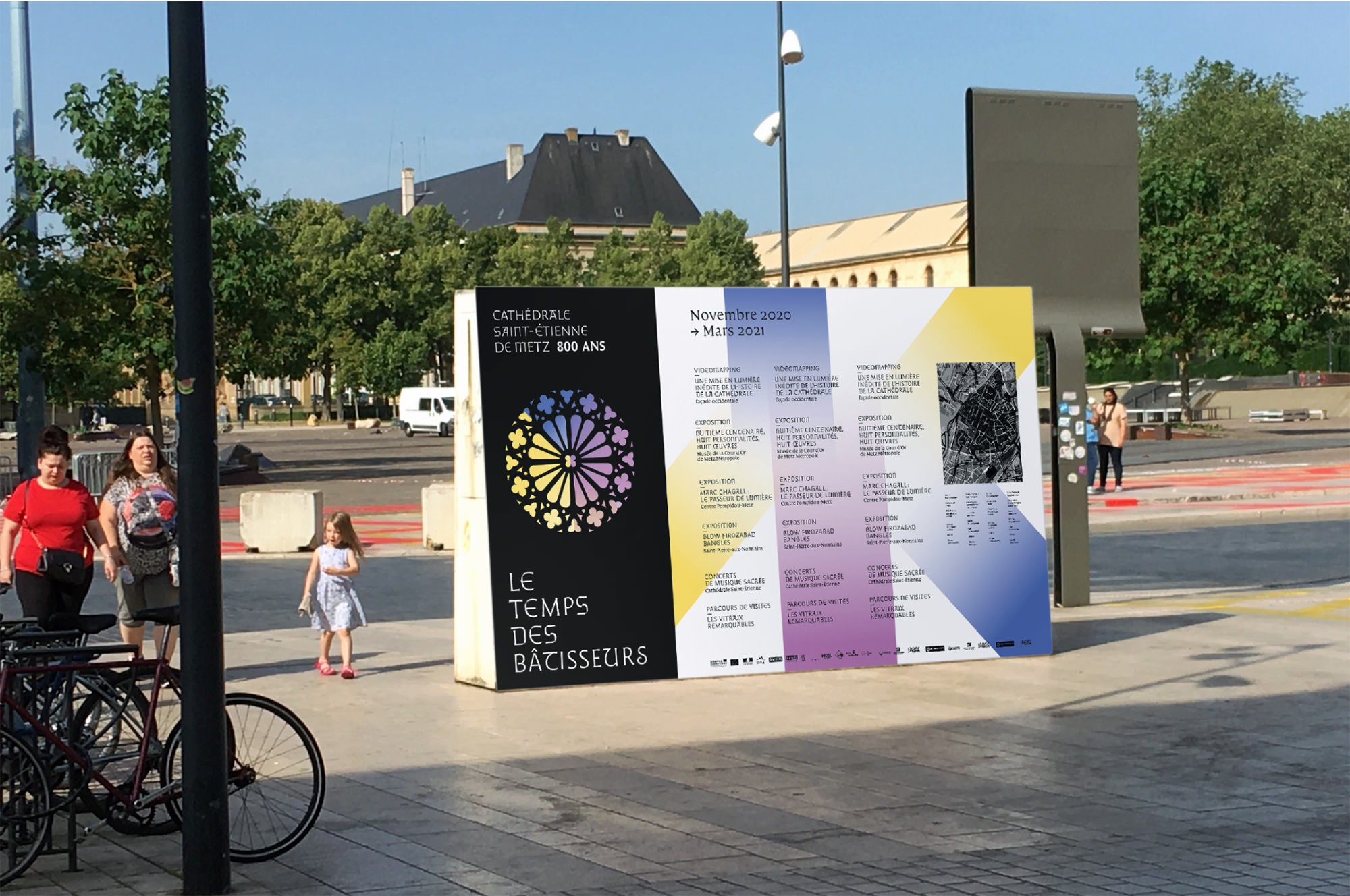
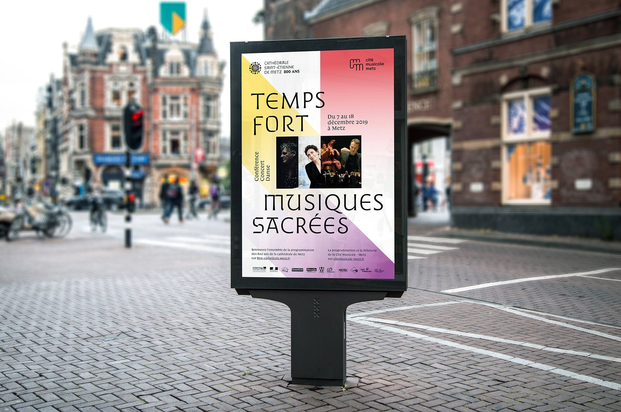
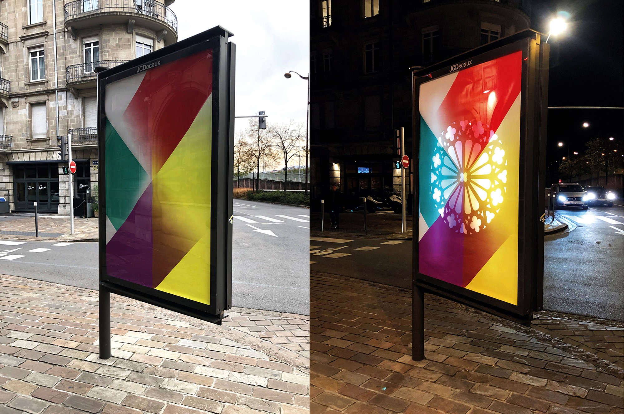
2020 is the 800th year anniversary of the Cathédrale Saint-Étienne de Metz. It is within this specific framework that the State, owner of the building, asked us to redesign the way the cathedral is addressing to its public inside its walls. The design of the typefaces created on this occasion was conducted having the specific conditions of the signage project in mind. It resulted into very singular, useful and easy to identify typefaces. Having those powerful tools in our hands, the idea to use them outside the walls came quickly to our mind.
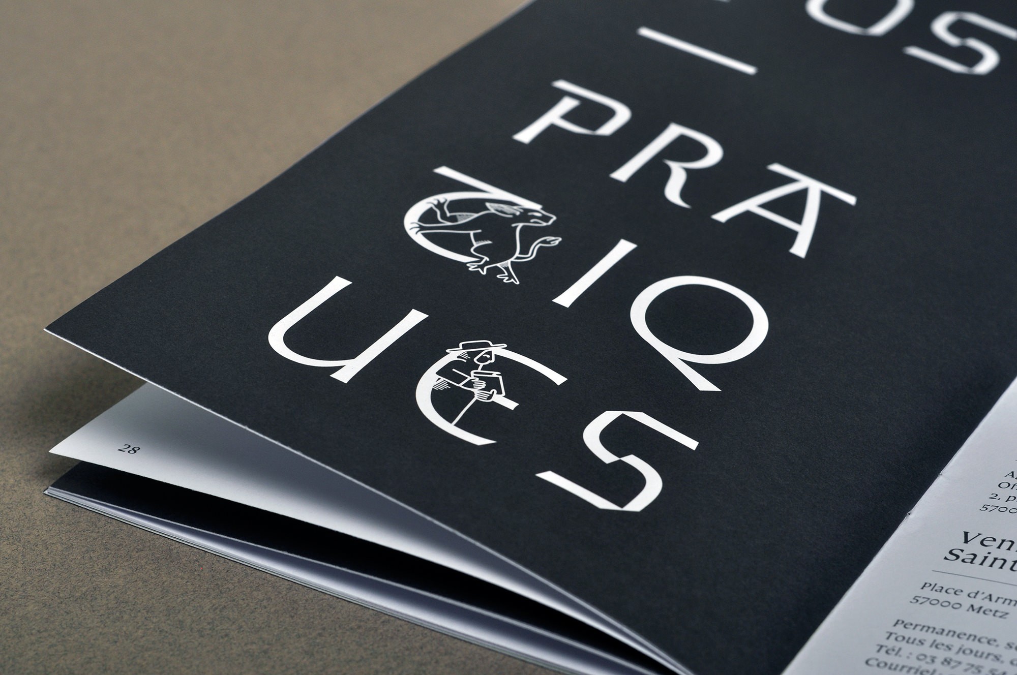
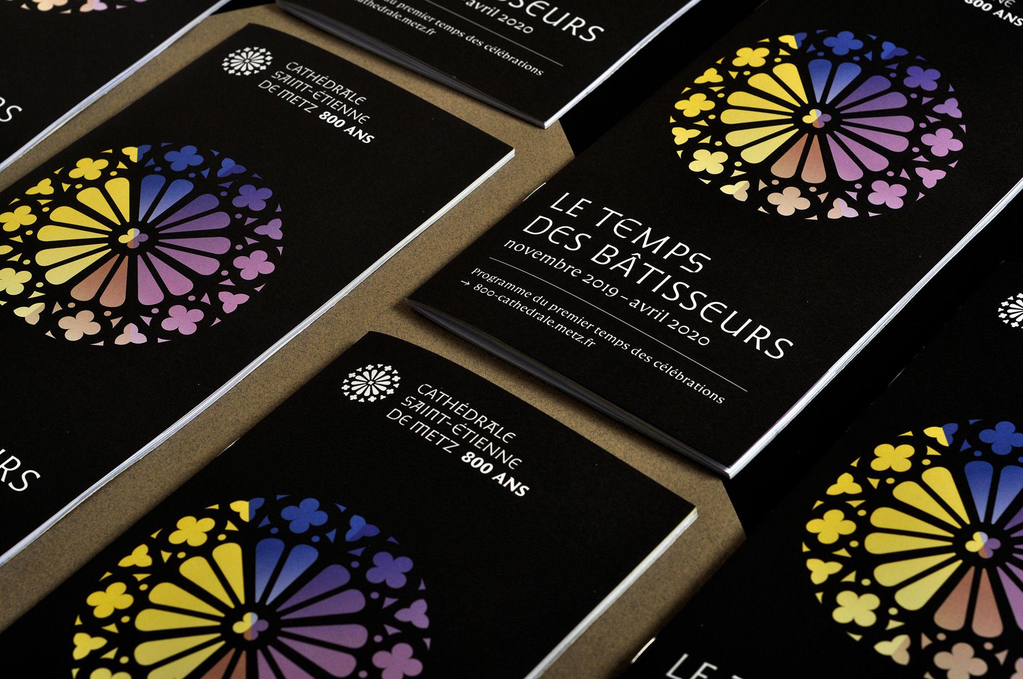
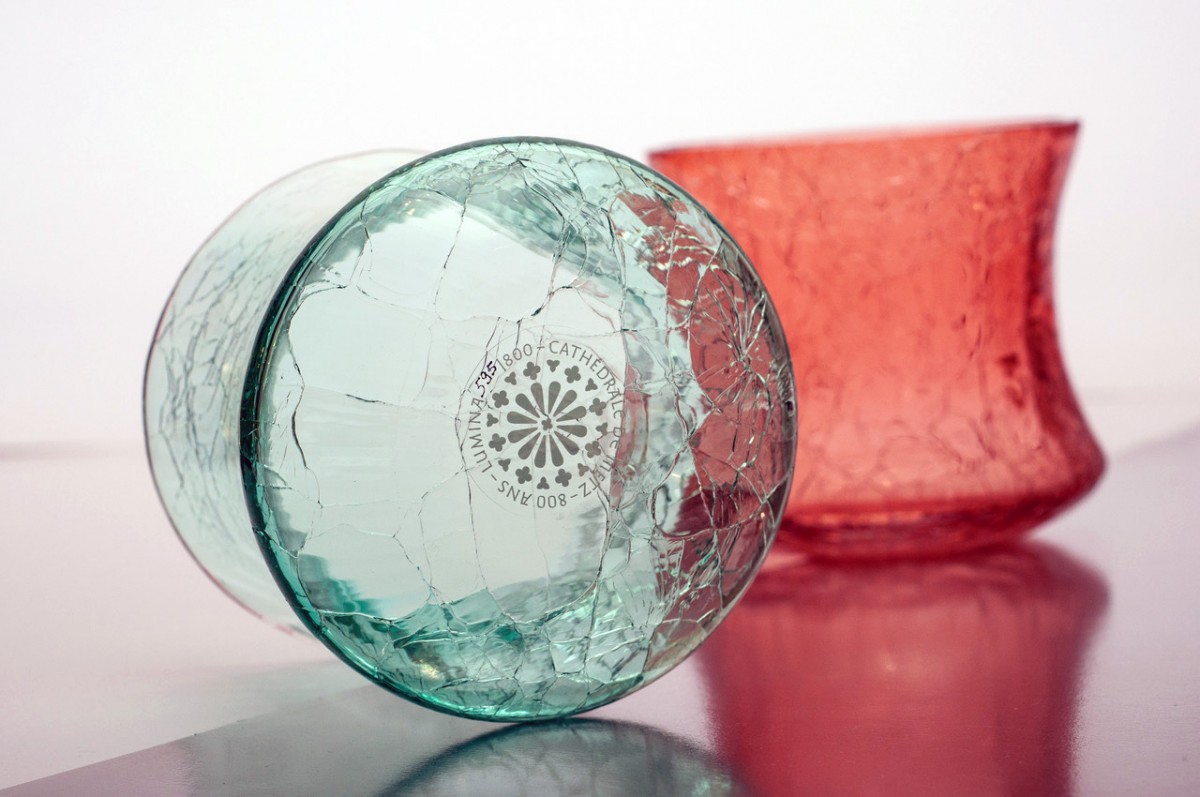
That is why we proposed to the City Council of Metz that they let us take care of the visual communication of the events related to the anniversary. Nouvelle étiquette collaborates regularly with the city council. Their trust and enthusiasm for the project allowed us to design many nice items (logotypes, brochures, flyers, posters, flags… and even a glass candle holder!) using the typefaces in various creative situations. This important campaign, art-directed by Xavier Pompelle from Nouvelle étiquette, greatly helped to spread the new visual identity of the cathedral in the imagination of citizens.
We are very thankful to all the people involved in this significant project, which lasted for no less than 3 years, and hope that the typefaces will have a long fruitful life. We are pleased to contribute this project, give the cathedral a voice to address its very eclectic audience, inside its walls, in the streets, on the internet, or through printed ephimera.
In 2022 the installation process of this project was completed. You can see some actual photos at the Fonts in Use website.
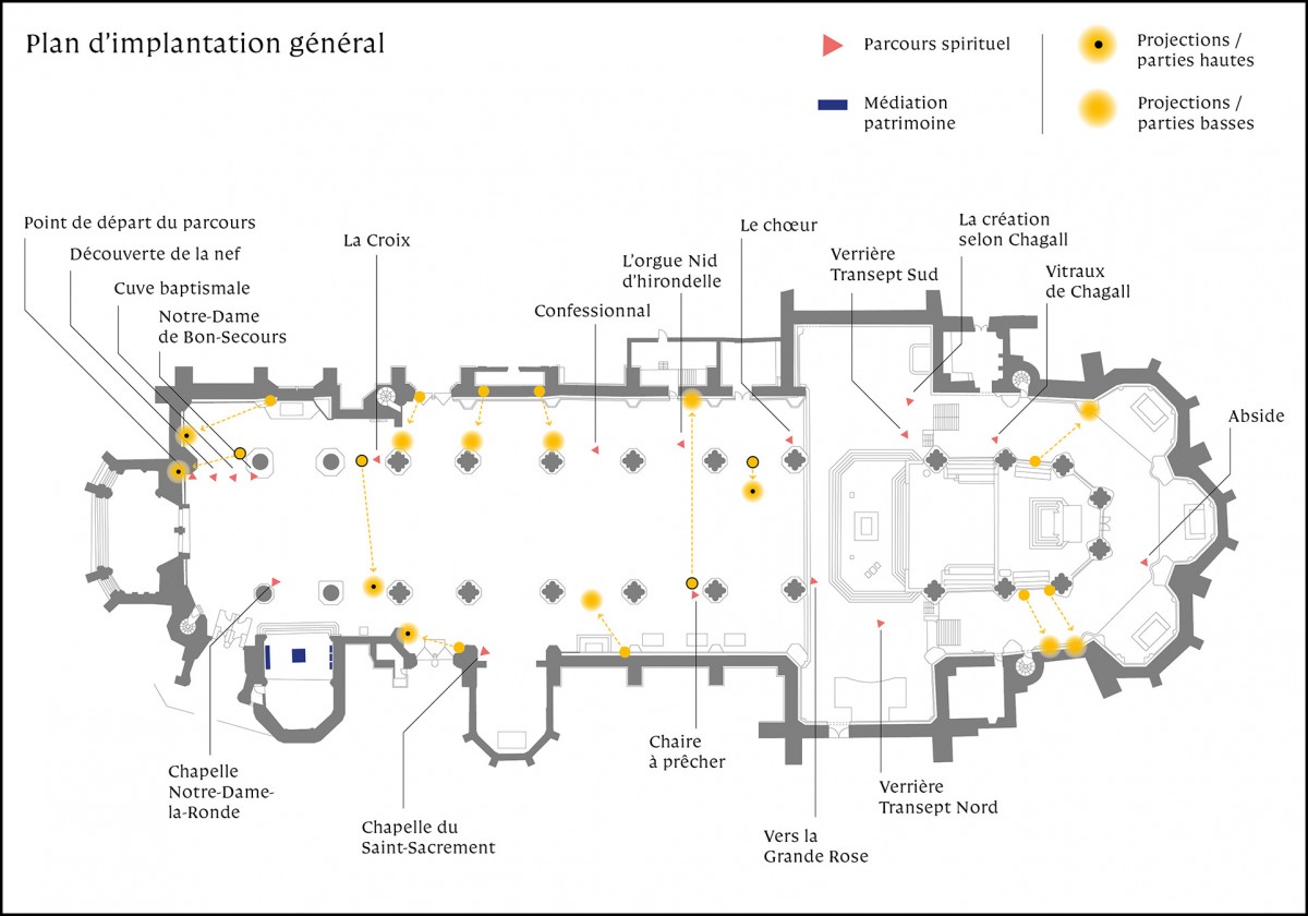
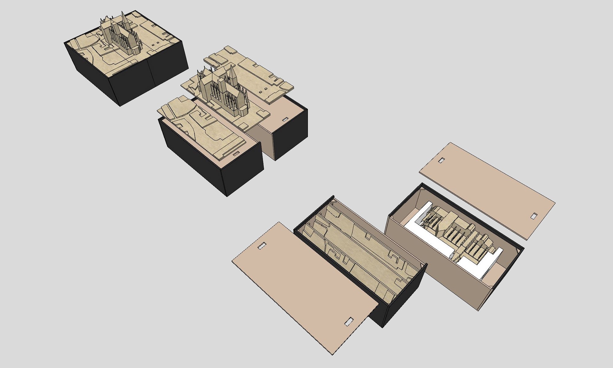
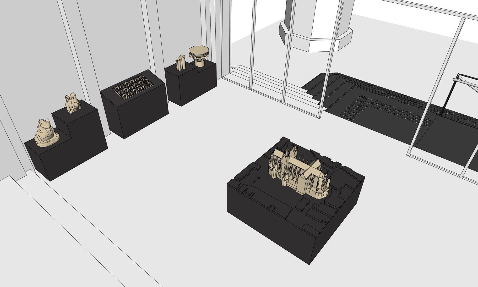
Top left: Three patrimonial panels in engraved steel inserted in ogives. Top right: Global implantation map of the signage project. Here below some sketches of the other objects designed with Générique design: A moveable 3D printed model of the cathedral, various small 3D printed models of architectural details displayed on steel pedestals and an access ramp to this “patrimonial” space.
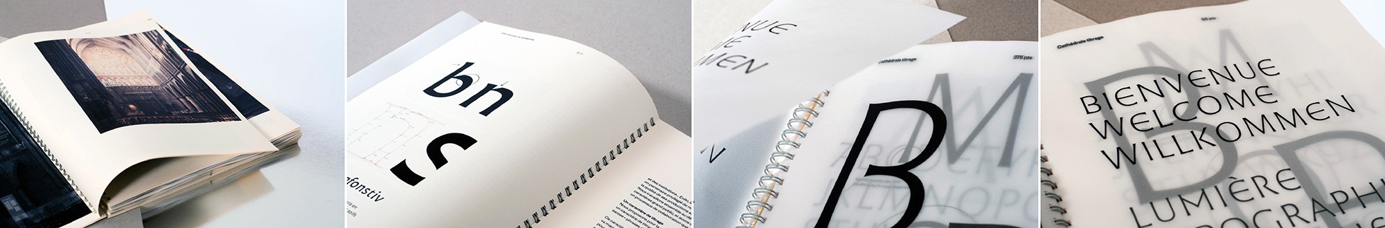
Every part of the project, from the design of the typefaces up to the construction of every object and assembly of every artifact, was thoroughly detailed by the graphic design team in a concise manual.
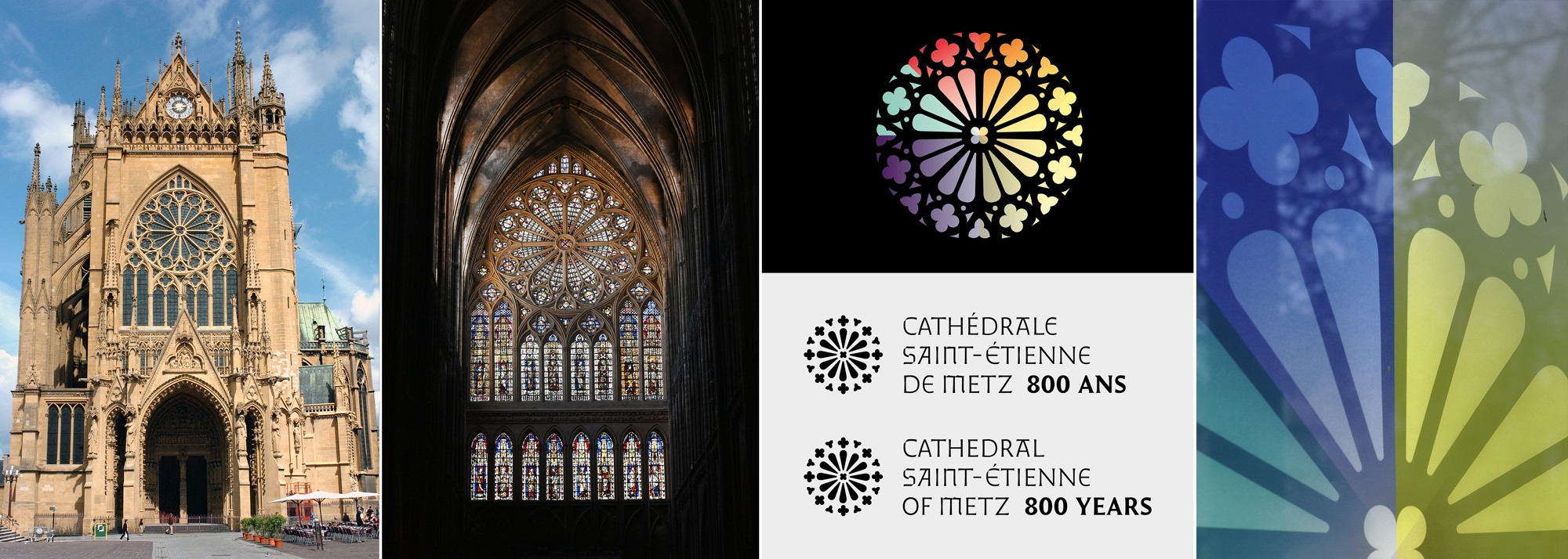
The celebrated “rosace” window from the occidental side of the building was taken as a significant element to lead the 800 year anniversary visual campaign. Photos of the cathedral by Philippe Gisselbrecht for the city of Metz.
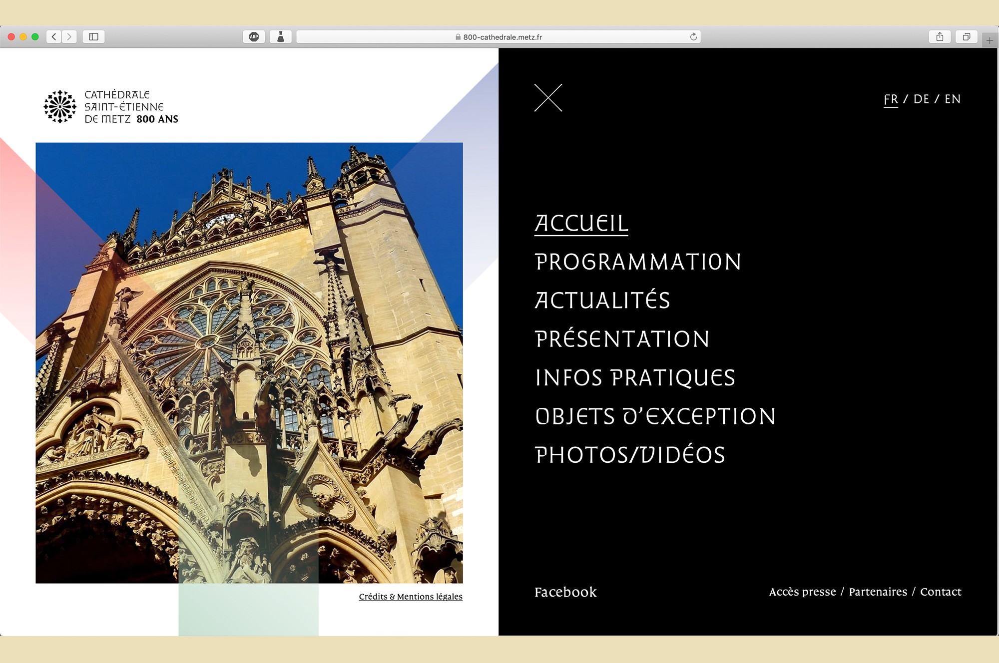
Apart from the in-situ implementation, the typefaces also serve a variety of design needs: Logotype, editorial pieces, street signage, posters, websites, informative material, greeting cards, and more.
Francis Ramel is a graphic & type designer based in Strasbourg, on the French side of the Rhine. He specializes in type design, editorial design and visual identities for cultural fields. He started his career as an editorial designer for Maison Moderne, an independent publishing house in Luxembourg where he designed magazines and brochures. In 2013 he co-founded Nouvelle étiquette, where he co-designed several projects from exhibition catalogues to complete visual identities. In 2014 he joined the ANRT, Atelier Nacional de Recherche Typographique (Nancy, FR) where he focused on the early medieval musical notations. In 2017 the research was funded by the French National Center for Visual Arts. Carolinéale, the resulting typeface of that project was published by PampaType. Francis is a contributing type designer at PampaType. Since 2016 he’s been helping to expand the character sets of the foundry’s catalogue. In collaboration with Alejandro and within Nouvelle étiquette, Francis also designed a custom type family for the Cathedral of Metz, as part of a public commission from the French Ministry of Culture. Francis continues his graphic design activity now through ramel·luzoir, a contemporary art and graphic studio ran together with Julie Luzoir.
- Générique Design is a Montréal based product design studio. More info at www.generiquedesign.com. ↩