Lire cet article dans sa version originale française.
Leer este artículo en español.
Heir of the printed page
If Jean-Luc Godard is the cinema itself, he is also heir to the printed page. Layout design, and in particular typography, is for him the privileged means of experiencing at every opportunity the paradoxical relationships of text and image. A particular facet of his graphic work concerns the use he makes of type fonts. Three stages emerge through his filmography, marked by the use of a unique typography, whose subtle choice indicates significant aesthetic and political stakes.
For the first two phases it is about the very French Antique Olive, designed by Roger Excoffon between 1965 and 1967, which was followed by the symbol of Swiss typography, Helvetica, from the 1980s to 2010. The third phase is distinguished by the use of so-called screen fonts (Tahoma or Verdana) designed by Matthew Carter. Godard uses them in his last two works to date, Adieu au langage (“Farewell to Language”, 2014) and Le Livre d’image (“The Picture Book”, 2018). If the primary function of typography is to show the text, Godard’s underlying question, whatever the medium (video, paper or film), is a painter's preoccupation: How to represent thought and what colour (political and pictorial) to give it. How to print a thought in movement and free oneself from the fixation of the text on the page? How to make a book while making a film? Typography is the privileged visual mediation through which Godard tries to put an end to the competition between text and image in the production of thought.
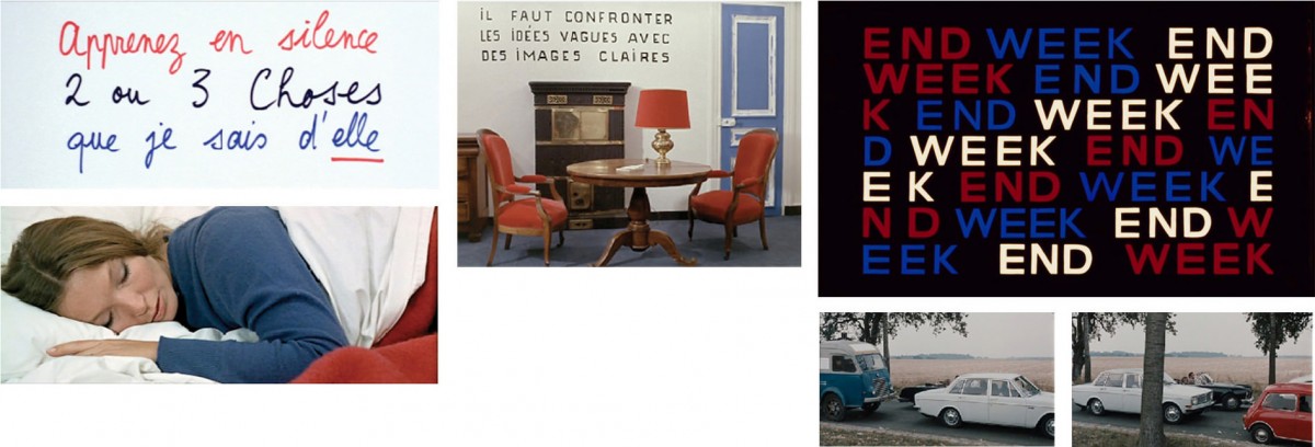
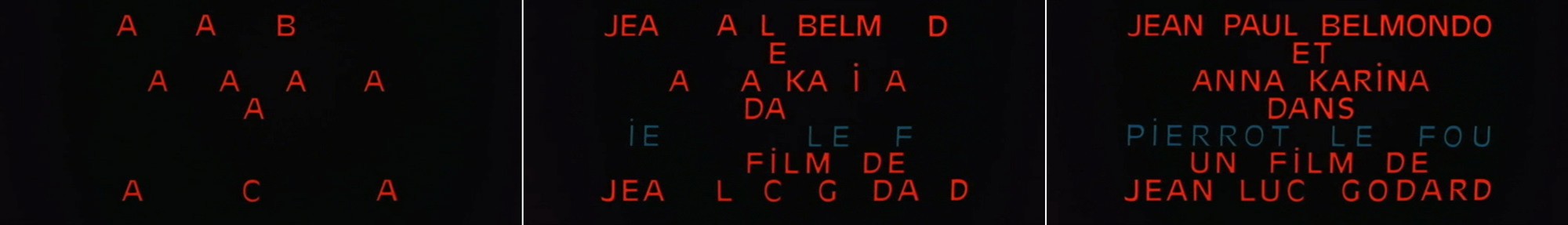
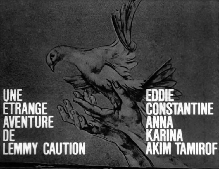
From left to right, blue-white-red cards of the films “Deux ou trois choses que je sais d’elle” (“Two or Three Things I Know About Her”, 1966); “La Chinoise” (“The Chinese”, 1967) and "Week-end" (1967), composed in Antique Olive.
First phase. Antique Olive period or the era of blue-white-red typography
In an interview with Alain Jouffroy in 1966, Godard explicitly summarized his use of blue-white-red and the significance he intended to give it: “I believe a little in nationalism, but in a nationalism of poetry, not at all political: I like that Delacroix is French and Beethoven is German…”. And “Do you believe in the soul of a people? " asks Jouffroy.“I can’t express it that way because it sounds a bit too big, but it is a bit that.” 1
Latin Graphics and Right-wing Heritage
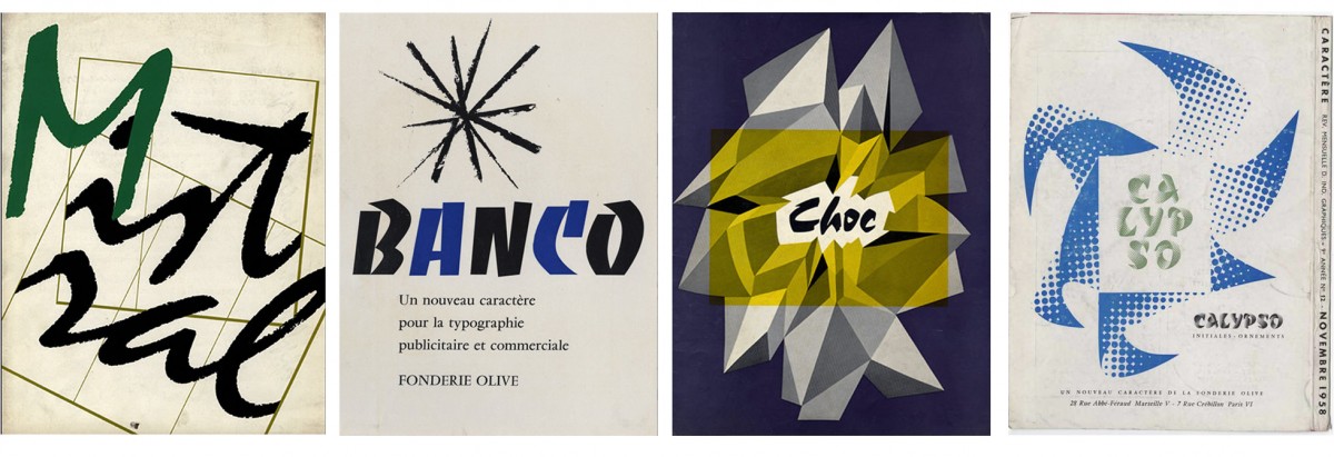
At the crossroads of complex ramifications, his recurring reference to France extends in particular to typography. Thus in the mid-sixties, Godard’s graphic compositions were distinguished by a systematic use of Antique Olive, a very French typeface. Its creator, Roger Excoffon, through the impact of his various designs on the French landscape, particularly the signs of small shops (the Mistral, the Banco, the Choc or the Calypso) shaped a visual identity specific to the country in the fifties.
Antoine de Baecque underlines a specific feature of Godard’s production in the mid-sixties, characterized by “the constant, even to the point and touching, desire to be contemporary.” 2 The typography participates in this inscription in time stated by Excoffon in his preparatory notes to present his typeface: “Forget everything that has been done and consider what the alphabet can be for us in 1956. In a way, I am looking for the archetype, the exact representation of each person’s unconscious alphabet. Synthesis of all the influencing factors, as we said, the ideal alphabet.” 3.
When it was released between 1958 and 1960, the Antique Olive was a radical novelty, which Dutch type designer Gerard Unger comments in retrospect as follows: “An Excoffon’s response to the style dominated by Swiss pragmatism and objectivity.” 4 As a sign of the filmmaker’s keen attention to typography, this sanserif commonly used in advertising is identified by Godard for its originality, and unexpectedly used in numerous screenplays that punctuate his films, among them Pierrot le fou (Pierrot the Madman, 1965); La Chinoise (1967) and Week-end (1967), which are also distinguished by the use of the colors of the flag. In its chromatic and typographic alliance, this ensemble constitutes a condensed version, here referred to as “French taste”, an expression modelled on “Dutch taste”, in reference to the classification established in Pierre-Simon Fournier's Manuel typographique (1764-1766).
In this expression, which associates the shape and style of a character with a language, the word “taste” also refers to the idea of a flavour. For his difficult exercise in defining a French typographic standard, Unger adopted precisely this bias, imaginative and evocative, in “La Frontière de la bière et du vin” (The Border of Beer and Wine). 5 Analyzing the influence of French typography on his own practice – and particularly that of Excoffon’s typefaces, the Dutch typographer frees himself from questions of identity to open up to the culinary metaphor, or analogy: “a sort of typographic equivalent of the gestures one makes to accompany a discussion, of garlic and its smell, and of the other herbs one puts in the kitchen”. 6
Finally, emphasizing the profound originality of Excoffon’s type designs – “popular and controversial”, with “striking details [that] stick to the conventional canon” and “stand the test of time” 7 Unger adds that they are the antithesis of the vision of English type designer Stanley Morison, the designer of Times: “A good type designer”, Morison says in “First Principles of Typography”, knows that for a new typeface to be successful, it must be so perfect that only very few people perceive the novelty. 8
What if, in his choice of letters, Godard went against Morison’s definition and tried to embrace details of the order of flavor? Not only was the filmmaker able to grasp the salt and singularity of the Antique Olive, but also, through its exclusive and repeated use, to experience the first radicality of this character whose ambition was to constitute a French counterweight to the regulatory and normalising influence of the international Swiss style, then in strong expansion during the sixties. The typographer and historian Roger Chatelain analyses the resistance that this current engendered in France during this period. “During the inter-war period and from the 1940s and 1950s onwards – when the new Swiss typography took off - French opposition and reticence (…) manifested itself violently. (…). The said typography, advocated and disseminated by Swiss Germans, was directly derived from the work of the Bauhaus and the theories of its followers (…). How could one have, before and very quickly after the war, praised and recommended in France graphic forms which had originated in Weimar, Dessau, Berlin… Paris was not going to find its way in the ruins left by Hitlerism!” 9
In Godard’s films, the recurrence of the tricolour combined with the use of French characters is part of a filiation that is both assumed and subterranean. First and foremost, it is a clear sign of belonging to a social milieu of origin – that of a great Protestant bourgeoisie, politically right-wing; whose heritage Godard does not deny, without however adhering to it, as his ideological positions during the 1960s show. When asked to place himself politically at that time, the filmmaker replied in 1997: “I described myself (…) as a right-wing anarchist. For me, being an anarchist meant being on the left at the time. So I was left-right, past-present.” 10
A surprising correspondence between Vox’s compositions and those of his nephew, Jean-Luc Godard. Double page of “Caractère Noël” (1954) directed by Maximilien Vox, presenting the Mistral typeface drawn by Roger Excoffon in blue-white-red on a black background and frame from “La Chinoise” (1967), using Antique Olive designed by the same typographer.
In his family’s wake, the controversial figure of Maximilien Vox, whose real name was Samuel William Monod, is nevertheless a blind spot, a clear legacy even if never openly declared. The filmmaker’s great-uncle 11, the leader of a very French graphic design style, has endeavored to promote a French typography declared “Latin graphy”. “Beware of those who privilege aesthetics to the detriment of the spiritual… Beware of the Gothic heresy!” 12 or again “It is not enough that one typeface is as legible as another for the two to be interchangeable. It must whet the appetite for reading. ” 13, states Vox in his sentences. The collaborationist moment of the typographer makes the legacy heavy to proclaim but the marked choices of the “French taste” constitute the diverted paths. Godard is at the same time the heir, the descendant and the extension of Vox. To choose this typeface in 1965 is certainly to place oneself in the spirit of the times, but it is above all to grasp the full scope of a typographic creation which, as Unger analyses, is the fruit of “the absolutely independent and original vision of a man who is a perfect master of his art.” 14
Second phase. Swiss period or the middle point of its writing
It is from the 1980s, with the exception of the film Alphaville (1965), that the use of Helvetica becomes almost constant until Film socialisme, released in 2010. This period, which includes more than ten films, is quantitatively the most important. There is a slight bifurcation, still in the Swiss bosom, for Soigne ta droite (Keep Your Right Up, 1987), with the use of the Univers typeface.
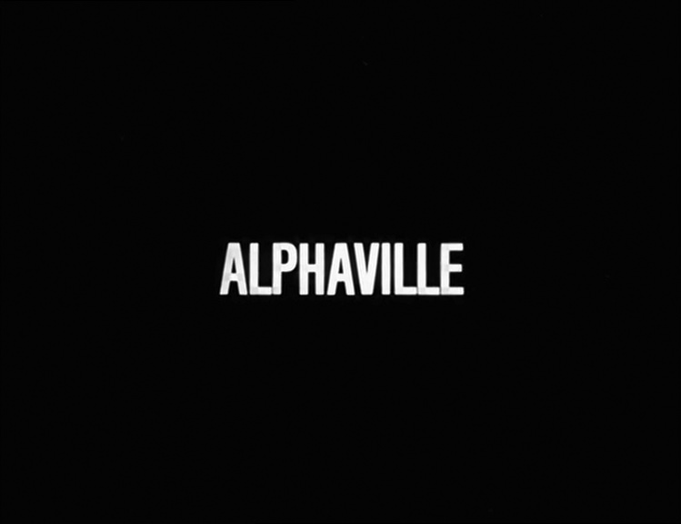
Credits of the film “Alphaville”, 1965. Video and screenshots.
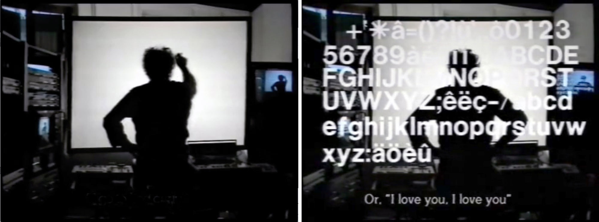
Sequence from “Scénario du film Passion” (Script of the film Passion, 1982) where an alphabet in Helvetica is superimposed on Jean-Luc Godard’s back. In this video, the filmmaker shows the creative process at work in the film “Passion” (1982).
On the left, intertitles, chapter 1B, “A Story Alone.”
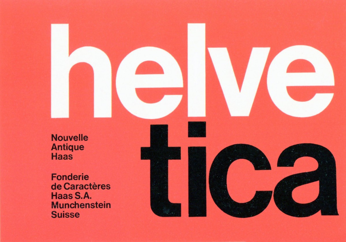
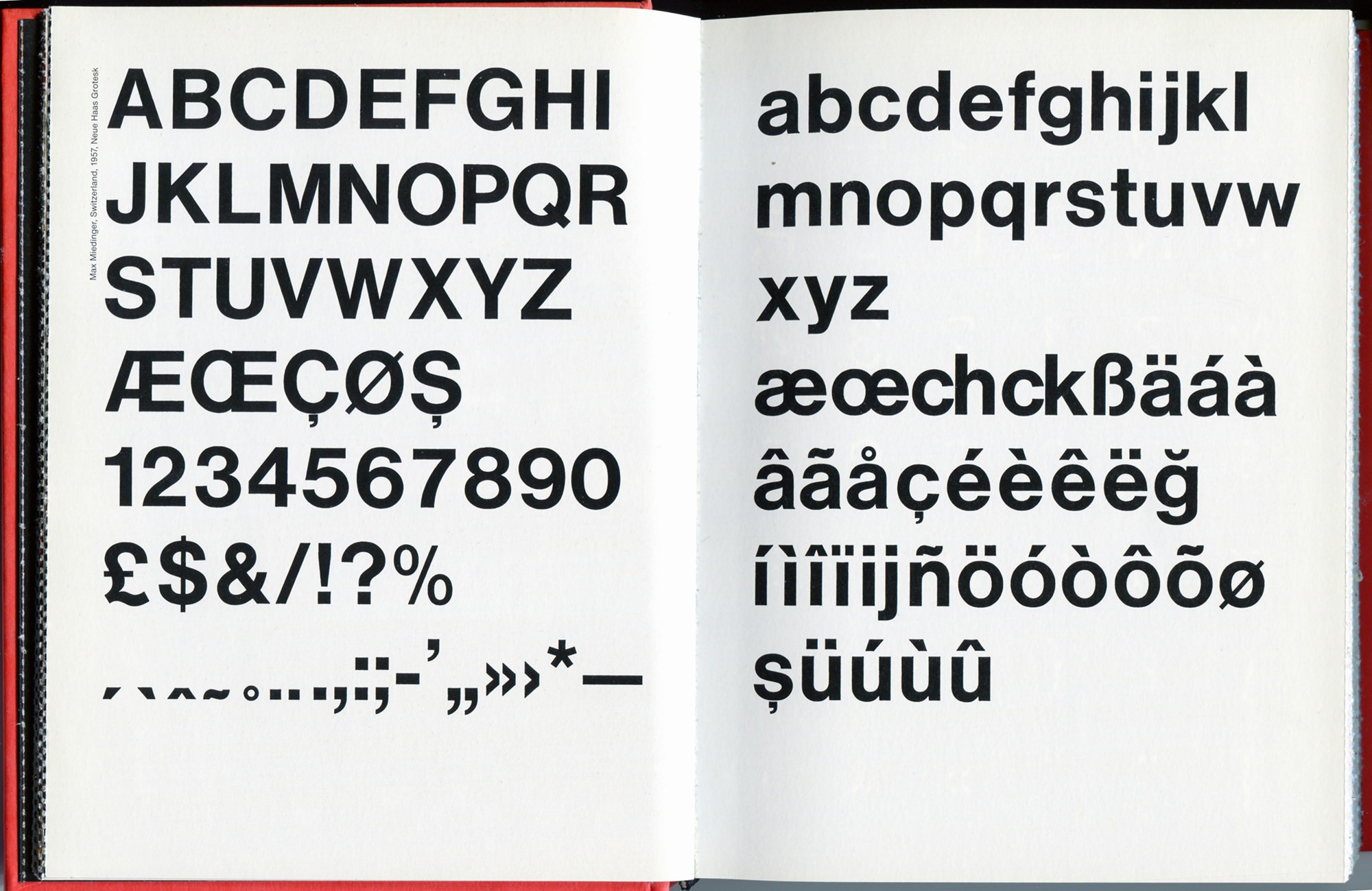
Initiated in 1956, Helvetica was born out of a collaboration between Max Miedinger and Eduard Hoffmann. A symbol of Swiss typography, Helvetica remains one of the most widely used fonts in the world. Omnipresent in everyday life (signs, logos, signage, posters, books and magazines), its imprint in contemporary visual culture is considerable.
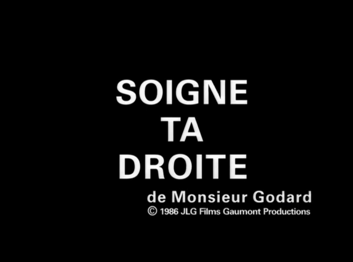
Video and screenshots from the film “Soigne ta droite” (Keep your Right Up, 1987). This film, in Godard’s so-called Swiss period, is an exception, with the use of the Universe typeface drawn by Adrian Frutiger.
Helvetica: good for everything
According to one of its fervent supporters, Massimo Vignelli, Helvetica is “pretty much good for everything. You can say ‘I love you’ in Helvetica and you can write it in Helvetica Extra Light if you want to be really chic, or in Extra Bold if it's intense and passionate, (…)! You can also say ‘I hate you’ ”. 15
In principle, Helvetica, abandoning the logic of handwriting in favour of modernist aesthetics, was designed to erase all forms of expressiveness or affects and to constitute a typeface particularly suited to corporate communication or advertising messages. Its associated attributes of rationality, whiteness, sobriety, purity of form do not exempt the typeface of ideological colour.
The imprint of the Helvetica typeface in contemporary visual culture can be measured by the importance of the editorial or audiovisual production it has generated, as in the case of “Helvetica, Homage To A Typeface” by Lars Müller (Lars Müller Publishers, 2002). Above, two double pages.
The German type designer Erik Spiekermann, for example, loathed Helvetica for its design and its extreme regulating principle. A totalitarian dimension that he denounces with conviction: “All the letters respond to a Swiss ideology, the guy who drew them tried to make them all identical. (…) It’s like what they teach you in the army, to have the same thing under the helmet, forgetting all individualism.” 16 What he finally describes in the historical evolution of the typeface is the “default setting” dimension of Helvetica following the proliferation of computers in the 1990s: “It was the default setting on the Apple Macintosh, then on Windows (…). Now we can’t do without it because it's everywhere. You have no choice, it’s like air.” 17 The font infiltrates every level of communication and insidiously acquires a status of passive omnipotence that is all the more relentlessly diffuse and everywhere present.
Neutrality in question
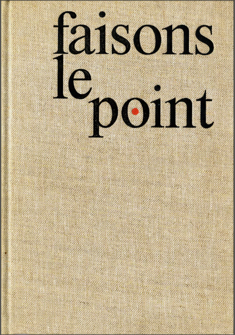
In France, the question of neutrality in typography, which is eminently ideological, pits the proponents of Latin and French typography against the followers of the international Swiss style. Thus Vox, in 1963, states in Faisons le point (Let’s take stock) what this alternative of the written word engages as a symbolic and political representation of thought: “How futile, then, are the schools which, under the pretext of functionalism and totalitarianism, would claim to restrict the typographic field to the use of a single type, a single family of typefaces! To the thousand problems and the thousand moods of the printed word, to offer only a single, prefabricated solution… To such excesses, the French spirit refuses to accept. Because legibility is a natural pleasure, it does not consider it a sin.” 18
In a similar vein, François Richaudeau questions the notion of neutrality and the relevance of this concept in relation to the printed matter, which takes objectification as an alibi: “Is there really an objectively neutral typeface? Any typography of a text (…), however simple and monotonous it may seem, is an invisible but active mood factor which, reaching the reader's subconscious, intervenes in the interpretation of the author’s message.” 19
As with all political and aesthetic issues, Godard, in his typographic choices — French versus Swiss typography — places himself at the core of a most acute debate which, beyond typefaces, questions the ways in which thought is represented.
A middle point of typographic writing
In the light of these reflections on neutrality, how should Godard’s use of Helvetica be interpreted, particularly in the period of the films concerned (1980-2010)?
In his article “La Suisse: le cinéma comme interprétation”, Alain Badiou is particularly enlightening on two points: His historical vision of Switzerland on the one hand, and his definition of Swiss art, in which he places Godard, who “hunts down on the smooth surface of the overwhelming Swiss consensus (…) the stigma of History”: “There is a particular Swiss acuity of an art that questions what it is possible to transmit. (…) Since Switzerland was neither war, nor revolution, nor colony, but only import-export, watches and capital, what can equal generations of Swiss, who succeed one another in national certainty, have to pass on?”
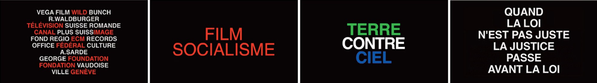
With regard to this specific period of Godard’s film production, Badiou’s observations support my analysis in interpreting the filmmaker’s exclusive recourse to a typography praised for its extreme neutrality: “Switzerland”, he says, “is that middle point from which Godard observes the world, and where nothing excessively disturbs his problem.” 20. Similarly, using Helvetica as a symbol of the “overwhelming consensus” is equivalent to adopting a middle point of typographical writing, where the filmmaker abandons all forms of graphic expressiveness for minimal and rational compositions. The inserts of Film socialisme are exemplary in this respect: black background, centred or flag composition, capital letters of the same size, colours used with measure. Where we notice that Godard abandons the blue-white-red palette.
That the filmmaker’s marked typographical options coincide with his dual geographical and family roots probably owes nothing to chance. Divided between Switzerland and France, Godard evokes his dual affiliation in ambivalent terms, suggesting both the objective part of this heritage and its latent antagonism: “I am only a hyphen, and I even have a double first name…” 21 This line of demarcation pursues him in Switzerland, which is experiencing a typographical cleavage within the country itself.
If the first period with Antique Olive directly questions the issue of heritage – be it French, family, cultural; in an ostensibly graphic and provocative way through the use of blue-white-red, staged puns and expressive typography, the Helvetica phase looks more soberly at what it is possible to transmit as Switzerland, as Badiou points out, but also as a filmmaker who is more reflexive about history.
Third phase. A ‘pasteurized’ typography
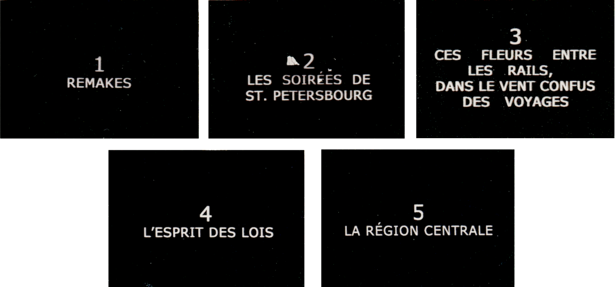
From the question of heritage to transmission issues, the typographical evolution follows the chronology of a lifetime of questioning and challenges to the different media (video, film, print). Both periods place at their centre the question of the hegemony of the text, considered by Godard as his “royal enemy”. 22 If video marks a decisive step in Godard’s way of freeing himself from text, typography, in its application, is a subtle facet of it. The last period I entitled “pasteurized”, 23 based on a term borrowed from Massin about the disappearance of lead types, corresponds to the use of so-called screen fonts, in this case Verdana or its equivalent Tahoma. The ordinary and transparent character of these fonts evokes what Massin describes in the loss of relief – which involves touch but also more symbolically the way of shaping thought; following the abandonment of letterpress printing in the sixties and seventies: “a pasteurisation, a levelling, the mark of lead is no longer inlaid on the paper”. 24 These characters are no less complex in their function of ensuring optimal legibility on the screen. Commissioned by Microsoft in 1994, their design was entrusted to Matthew Carter, a multiple award-winning type designer, who accompanied the transition from traditional to digital typography. The use of so-called screen fonts is interesting to compare with the loss of relief of the typefaces, whose expression can be understood here in its literal sense. The term “pictorial” faithfully designates the overall impression that emerges from the typographic compositions in the film Le Livre d’image (The Picture Book, 2018): they lose consistency, become rarefied, as if alongside the images, the written text, trivialized, takes a back seat and is no longer the sole guarantor of thought in the hierarchy of discourse regimes. The Swiss period with the use of Helvetica in the 1980s as a “default value” heralds this evolution of printed writing in Godard's work.
This third period is distinguished by the abandonment of the specifically typographical fact by Godard, delegated to other hands, those of Fabrice Aragno in particular. The latter, in the continuity of Adieu au langage, continued his “mission of making, treating and assembling all materials according to Godard’s models”. 25 The typographical composition becomes here one element among others made during assembly without any noticeable attention to the letter. If one examines Godard’s filmography, this detachment is a new phenomenon, which contrasts with the two main periods identified.
In these typographic choices, the filmmaker uses typefaces that are emblematic of an era, designed to respond to technological changes in printing but also to new modes of communication. Each typeface (Antique Olive, Helvetica or Verdana/Tahoma) has been tested in terms of legibility and chosen by virtue of its invisibility, its ordinary dimension, unnoticeable in its daily omnipresence.
In my title, the reference to Dziga Vertov’s film Man with a Movie Camera (1929) makes it possible to point out, by modifying one of the terms, the double historical heritage under the sign of which Godard places himself in his cinematographic way of making: on the one hand, that of a Russian cinema that affirms the primacy of editing and of “the relationship of images to the images themselves”, 26 and that of the book and the printed page, which he puts into practice and extends to cinema in various ways. The particular editorial enunciation to which Godard lends himself in his film production is a constantly repeated attempt to free himself from “the fatality of textual hegemony.” 27 Between defiance and love of words, as Philippe Dubois points out, “it is in the very body of his works (mixed films and videos) that Godard knew how to (…) use (…) “all” the figures of presentification of the text in and through images. ” 28 Typography plays a cardinal role in these ways of materializing the text. It is as a typographer-cinematographer that Jean-Luc Godard does page layout in cinema. Not only does he perpetuate the book object in his cinema and “imposes on the screen its mode of establishment and functioning” 29 but also, in his particular use of typography, creates a book specifically for cinema, of which his latest work, Le Livre d’image presents a particularly accomplished example.
[ This article was published in French in the 112th issue of the film magazine Trafic (winter 2019). ]
Paule Palacios-Dalens has a doctorate in aesthetics and history of the visual arts. Her research focuses on the relationship between cinema, books and typography. Since 2014, she has collaborated as author and graphic designer with 202 éditions, which publishes essays on cinema. In 2003, she was awarded the “Bourse Agora” design prize for a project at the ANRT, Atelier national de recherche typographique, involving the design of television subtitles for the deaf and hard-of-hearing.
- Jean Luc Godard, “Miner le terrain”, L'Œil n° 137, May 1966. ↩
- Antoine de Baecque, “Godard 66: le cinéaste contestataire”, Fabula-LhT n° 11, December 2013. ↩
- Reasoned study of the Catsilou, in Sandra Chamaret, Julien Gineste and Sébastien Morlighem, Roger Excoffon et la fonderie Olive, Ypsilon, Paris, 2010, p. 250 ↩
- Ibid. p. 14. ↩
- Gerard Unger, “La Frontière de la bière et du vin”, Lettres françaises, ATypI (Association typographique internationale) and ADPF (Association pour la diffusion de la pensée française), Paris, 1998, pp. 9-21. ↩
- Ibid. pp.9-21. ↩
- Ibid. ↩
- The Fleuron, Cambridge, Garden City, 1930, quoted in Lettres françaises, 1998, p.19. ↩
- Roger Chatelain, La Typographie suisse : du Bauhaus à Paris, Presses polytechniques et universitaires romandes, Lausanne, 2008, p. 68. ↩
- Jean-Luc Godard, “Une boucle bouclée”, in Jean-Luc Godard par Jean-Luc Godard (1984-1998), II, Éditions Cahiers du cinéma, Paris, 1998, p. 25. ↩
- Maurice Darmon, “Godard le neveu”, Blog Ralentir travaux, April 10, 2010 ↩
- Roger Chatelain, La typographie suisse : du Bauhaus à Paris, Presses polytechniques et universitaires romandes, Lausanne, 2008, p. 69 ↩
- Ibid., p. 69. ↩
- Sandra Chamaret, Julien Gineste and Sébastien Morlighem, Roger Excoffon et la fonderie Olive, Ypsilon, Paris, 2010, p. 14. ↩
- Gary Hustwit (director), Helvetica documentary, 2007. ↩
- Ibid. ↩
- Gary Hustwit (Director), documentary Helvetica, 2007. ↩
- Maximilien Vox, Faisons le point. Cent alphabets Monotype), Union Bibliophile de France, Paris, 1963, p. XV. ↩
- François Richaudeau, “Réflexions sur l'art graphique”, Planète n° 21, March/April 1965, p. 142. ↩
- Alain Badiou, Cinéma (texts collected and presented by Antoine de Baecque), Éditions Nova, 2010, p. 114 ↩
- Jean-Luc Godard (interview with Antoine Dulaure and Claire Parnet) “Dans Marie il y a aimer ”, L’Autre Journal n° 2, January 1985 ↩
- Carole Desbarats in the program “What is Zazie saying?”. Directed by Guy Saguez. Broadcast: November 4, 1998, France 3. ↩
- Massin, “On détestait le code typographique…”, La Typographie du livre français, (dir. Olivier Bessard-Banquy and Christophe Kechroud-Gibassier), Presses universitaires de Bordeaux, 2008, p. 112 ↩
- Ibid, p. 112. ↩
- Jean-Louis Boissier, “Compter sur ses doigts”, La Couleur des jours n° 28, autumn 2018 ↩
- David Faroult, “Du vertovisme du groupe Dziga Vertov. À propos d'un manifeste méconnu et d’un film inachevé (Jusqu’à la victoire)”, Jean-Luc Godard Documents, (directed by Nicole Brenez; David Faroult; Michael Temple; James Williams and Michael Witt), Centre Pompidou, Paris, May 2006, p. 134. ↩
- Anne Marquez, Godard, Le dos au musée - histoire d'une exposition, Les Presses du réel, Dijon, 2014, p. 57 ↩
- Philippe Dubois, “Jean-Luc Godard et la part maudite de l’écriture”, in La Question vidéo : entre cinéma et art contemporain, Crisnée, Yellow Now, 2011, p. 221 ↩
- Jean-Louis Boissier, “Le livre et l'écran”, L’Ecran comme mobile, Éditions Mamco, Geneva, 2016, p. 210 ↩