
Who was Francisco Otta?
It's difficult to begin to describe what it was like to work on a project as long as Otta, since it wasn't a constant development but rather an intermittent one over the years. Well, I can say that it's a long-term project that goes against all design strategies, something I appreciate at PampaType because it goes against the grain, that there is no “one” way to do this job. It began back in 2015, before applying for a state grant in Chile to update Educación tipográfica (Typographic Education), a book about typography, but which became another book... What else could be said about typography that hasn't already been written? Why did I think it was worth doing another book on typography, and with a special font for it?
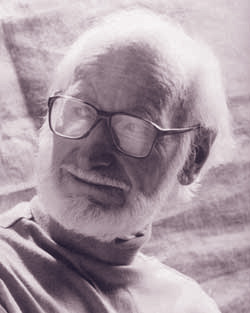
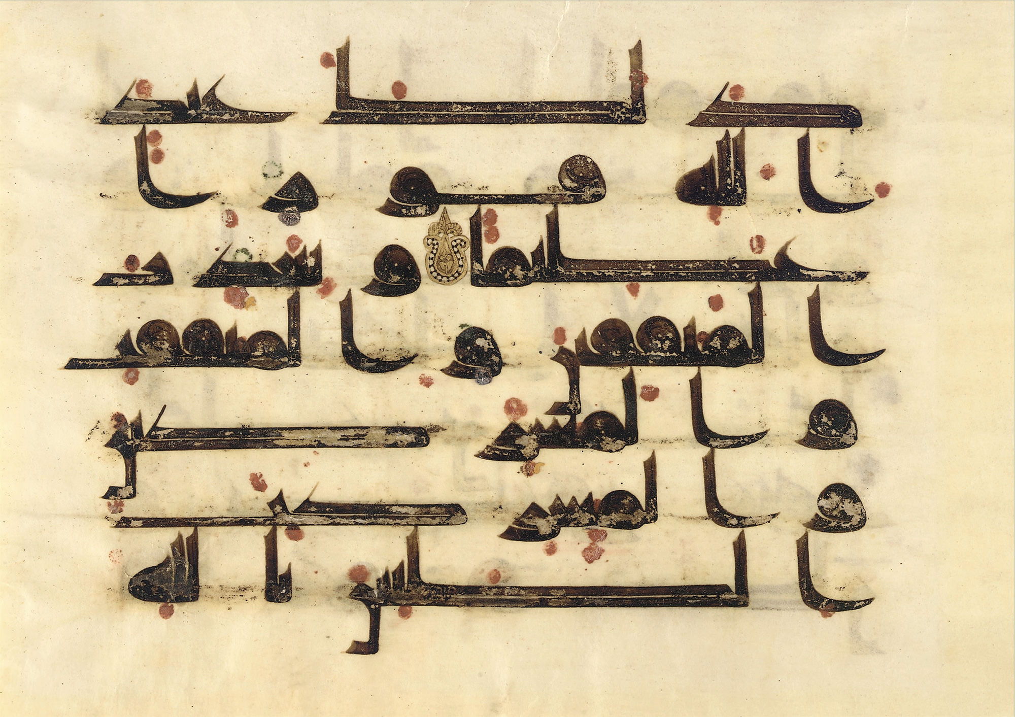
At the beginning of this century, when I was looking for books to create notes for a typography course, I discovered one that caught my attention because of the diversity of information on writing in different cultures, a book from 1974. When I discovered that book, I wondered how someone in those years could know so much; it was like a kind of paper Wikipedia on writing. The title of that book is The Alphabets of the World, published by an artist of Czechoslovakian origin (formerly Czechoslovakia, which today corresponds to the Czech Republic and Slovakia) who became a naturalized citizen in 1950. He arrived in Chile in 1940, fleeing the Nazi party because of his Jewish roots. His family died in the Auschwitz camps. 1 The city of Pilsen (in Czech, Plzeň) saw the birth in 1908 of František Otto Bergmann Troller, or Francisco Otta, as he was known in Spanish. He was a traveling artist and curious humanist. Here in Chile, he taught lettering to some friends, who later created tipografia.cl, a project to digitize the country’s vernacular scripts, in the late 1990s.
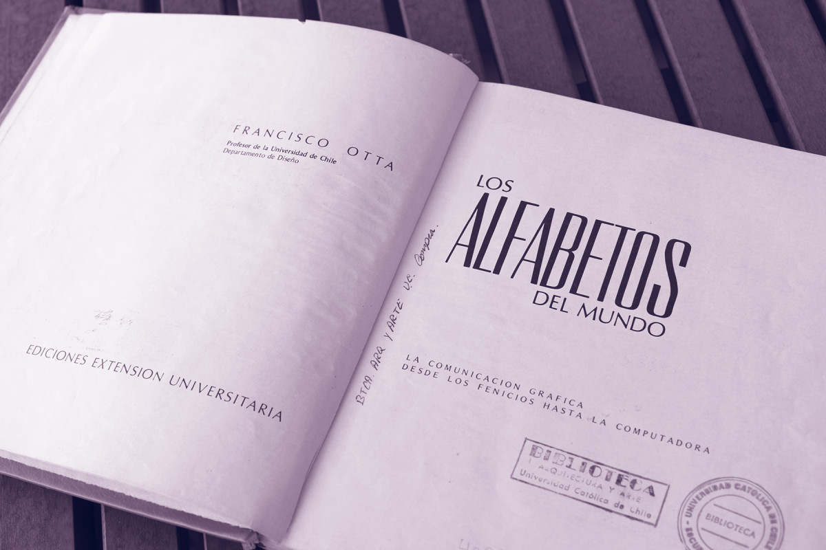
Spreads from *The Alphabets of the World* by Francisco Otta, University extension publications, University of Chile.
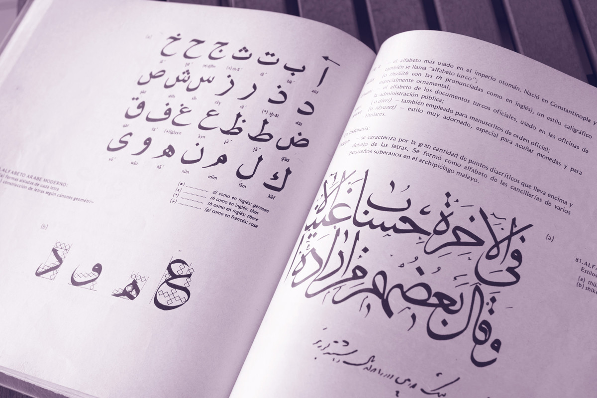
The reason this book is not well known in Chile is because it was never publicly released as a result of the coup d'état in 1973. I came across it in photocopied form, produced by an academic niche interested in letter design and typography. Perhaps very few people have an original copy. It has a subtitle that reads “Graphic Communication from the Phoenicians to the Computer” and contained samples of writing from different cultures, some of which were probably written by the author himself. I was fascinated by these unintelligible but exuberant scripts, especially the Arabic ones.
In tribute to him, I took his name for the font we are publishing here. It was also an excuse to venture into a world of writing unknown to me and, at the same time, an opportunity to design a font especially for a book that connects calligraphy, lettering, type design, and typography. Obviously, my enthusiasm prevented me from realizing at the time the abyss I was about to peer into.
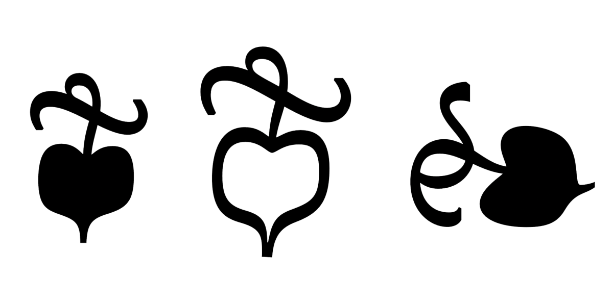
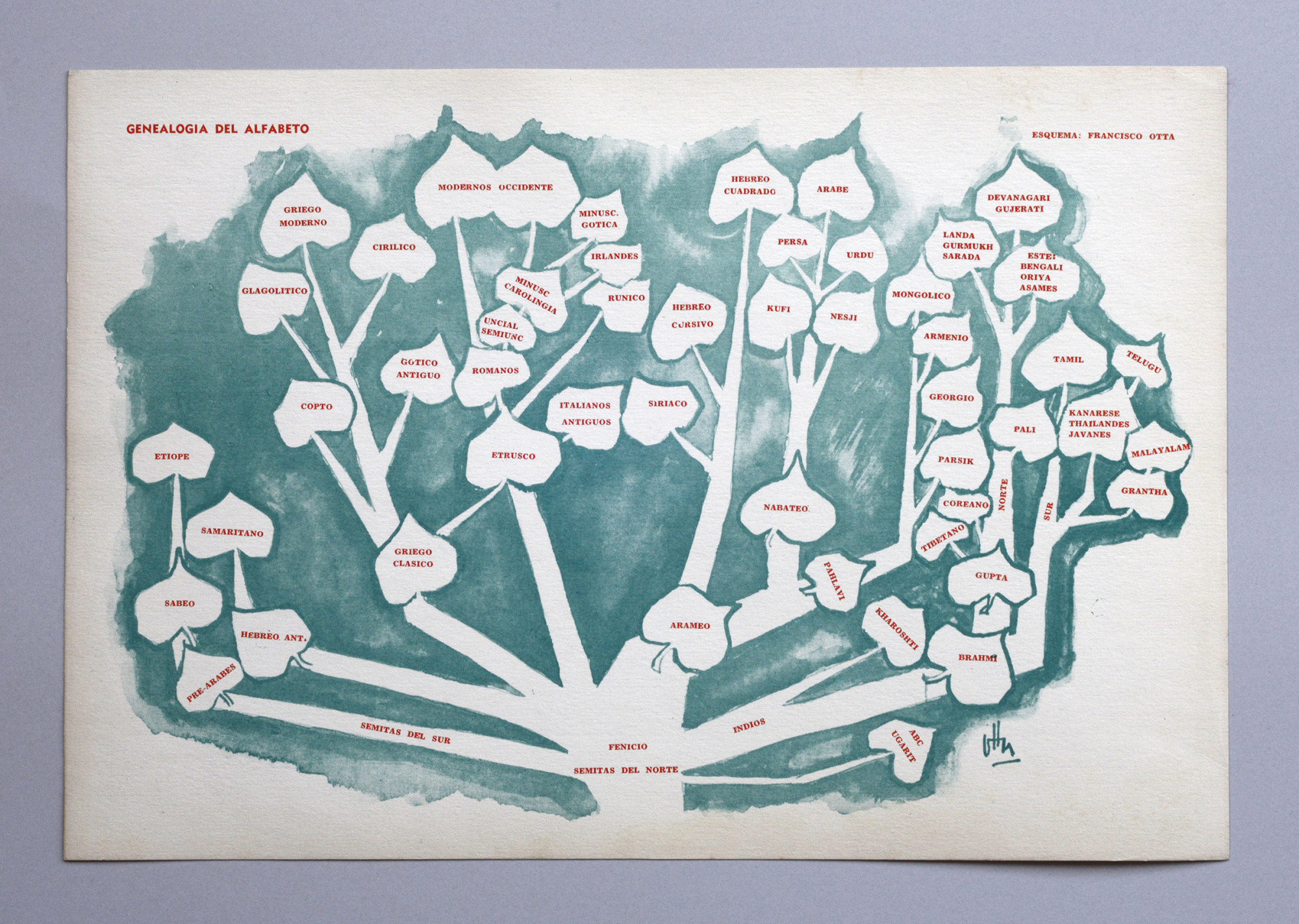
Print of a family tree of the alphabet created by Francisco Otta [undated]. Author’s collection. The leaves of this tree inspired the design of Otta’s fleurons.
The most complicated part of presenting a font for me is thinking about the accompanying text that declares the design intention. In the font marketing industry, you find that most of the time they don’t make sense, with attributes that are hard to see, almost like reading wine reviews, which seem like low-quality poetry. They’re just letters. In display fonts, it may make more sense to develop a more sophisticated idea. For prose reading fonts, the more sober the better for me; the more adjectival, the more suspicious I become. This is where I find meaning in the criticism of their incessant production, of why it is worth making a typeface when there are so many already in existence. The answer may lie in what the text that presents it says. It is enough to do a comparative exercise to corroborate the idioms and clichés that are written. I include myself in this. However, here at PampaType, there is a concern for more elaborate development, with the intention of sharing lessons learned and reflections. Not just selling.
Vector drawing that looks hand-drawn?
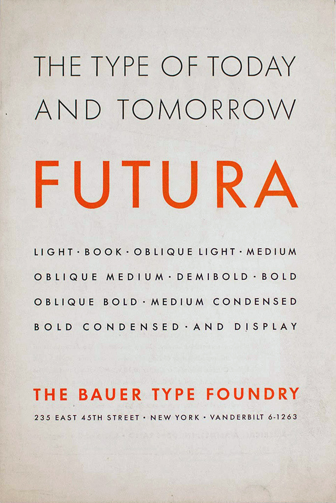
For some time now, I have observed the idealization that some people have for letterforms based on geometric figures, as if they were trying to represent perfection. This idea reached its peak in 1928 with Futura, which established a stylistic category in sans serif fonts. Poor Paul Renner could not have imagined how badly his concern for contemporary type design would age, becoming a cliché of modernity, “perfection,” and geometric balance, transformed into a sales pitch. Every year, geometric sans serif fonts are designed ad nauseam, probably because people still believe in that promise. Anyone who has tried to make letters based on regular geometry will notice that it doesn't work; it looks strange, with uneven thicknesses, even with some letters looking bigger than others, and subjecting them to a grid only makes the job of spacing them worse. The eye does not deceive, but the obsession with the grid does. To confirm what I am saying, compare the thicknesses of Futura and you will see that they are not all the same; the uniform thickness subtly disappears. Thus, with my obsessions in vector drawing, I did not want to promote that “deception” of geometric perfection and I wanted to distance myself as much as possible from it with my drawing in Otta.
The perfection of drawing vs. the typographic idea
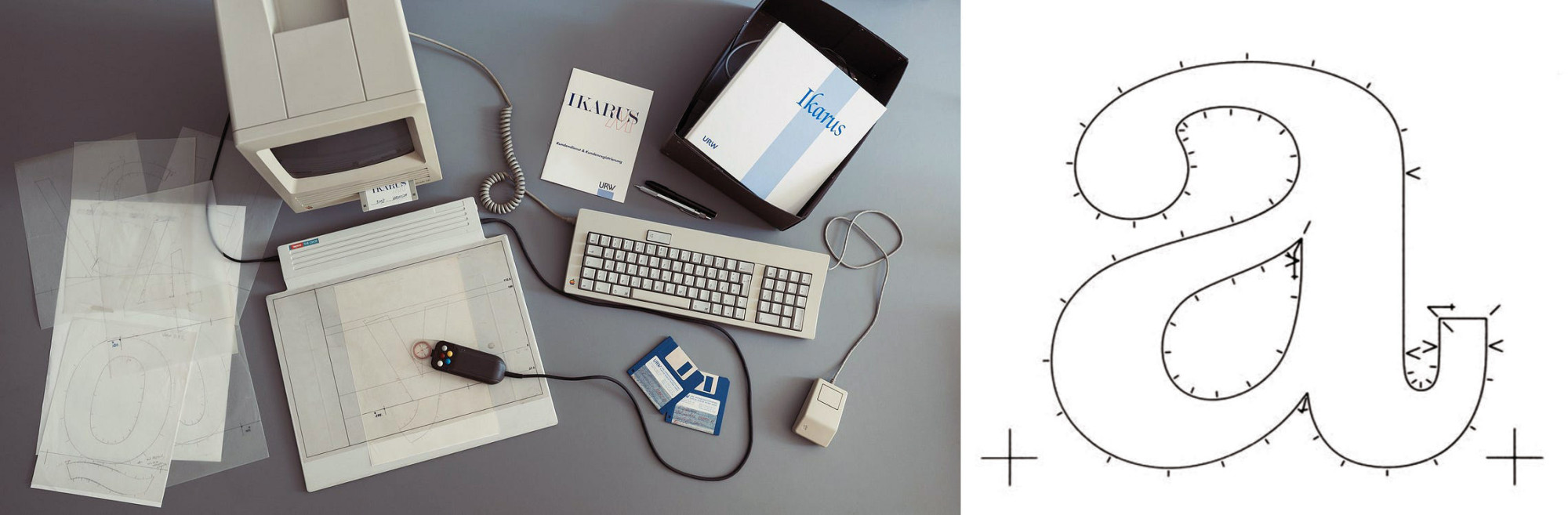
When I purchased two variants of Trinité, a font designed by Bram de Does, to use in the typography book as a worthy example to contemplate—because I find it difficult to surpass in style—I noticed that the font contained a rather austere character set compared to its high value. I understood why, because it was drawn entirely by hand and then digitized with Ikarus, a software program that used a mouse with different buttons to mark the points of the computer drawing as it traced the contours. I opened the file to review the drawing and noticed that it had a few small errors in a couple of letters. At first, I felt frustrated, because I am demanding when it comes to the drawing of my letters (which may be why I am never satisfied) and those of the students in my classes.

Trinité, epic design by Bram de Does, 1979–1982.
After a moment, I said to myself, who cares! The design of that typeface is too well done: a “calligraphic” letter in a typographic form, to consider that detail relevant. I don’t like the discourse of looking for errors in design as a human act; I think it’s complacent with mediocrity. For me, the typographic idea of composing prose text with vector letters that look handwritten is very difficult; it requires more dedication. I don’t know if I achieved it in Otta, but at least I managed to make it look non-standardized or bland. My intention with this font was to seek the irregularity of the demanding craft of hand drawing, and vector drawing is another type of drawing that has nothing to do with the analog, that’s the difficulty. To do this, I was inspired, in part, by what Gutenberg did with his project to produce handwritten books more quickly. They had to look handmade too, so he duplicated letters in metal types with slight variations so as not to be discovered. In the end, the poor guy got caught and, on top of that, he was swindled.


A plan for the calm irregularity of the text
The plan was to make the letter look “irregular” (which is not the same as messy or poorly done), making it irregular in conjunction with other letters requires several attempts. I can’t find a more accurate concept, perhaps something similar, although not the same, would be the Japanese wabi-sabi, but that has more to do with use and the passage of time. Here it is that symmetry that Walter Kaech spoke of, which is not perfect, like a person’s face.
I took advantage of OpenType technology with the Contextual Alternates feature, as well as Standard Ligatures—because they are enabled by default in design software—which allow characters to be replaced by others in specific writing situations. I made some duplicate letters, also with slight changes, so that they would infiltrate the paragraph and “de-routinize” it—if I may use the term—in its monotony, or, in other words, so that the text would remember that it is also textile, never perfectly smooth, always with small variations that reveal it as if it were woven.
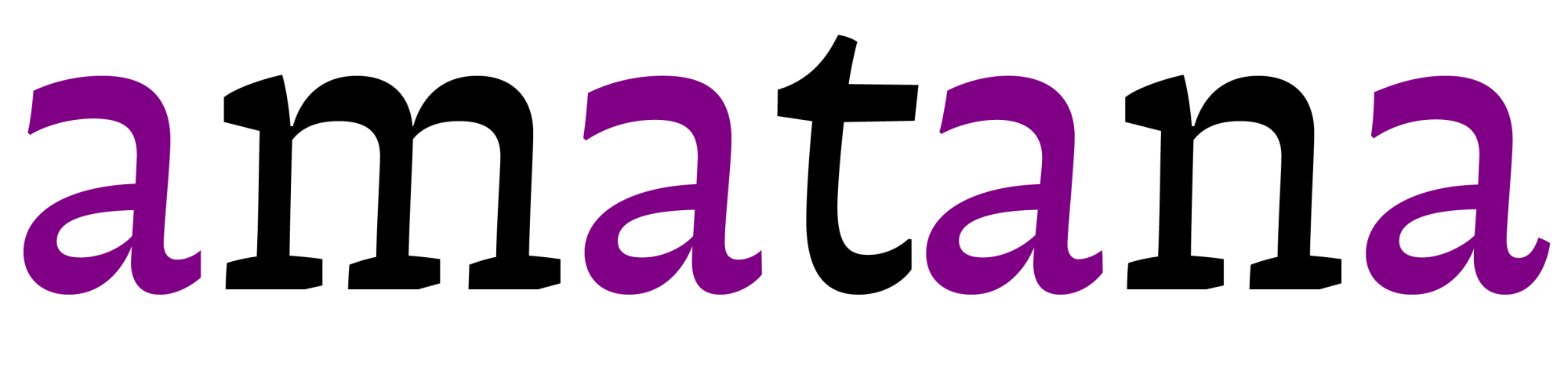
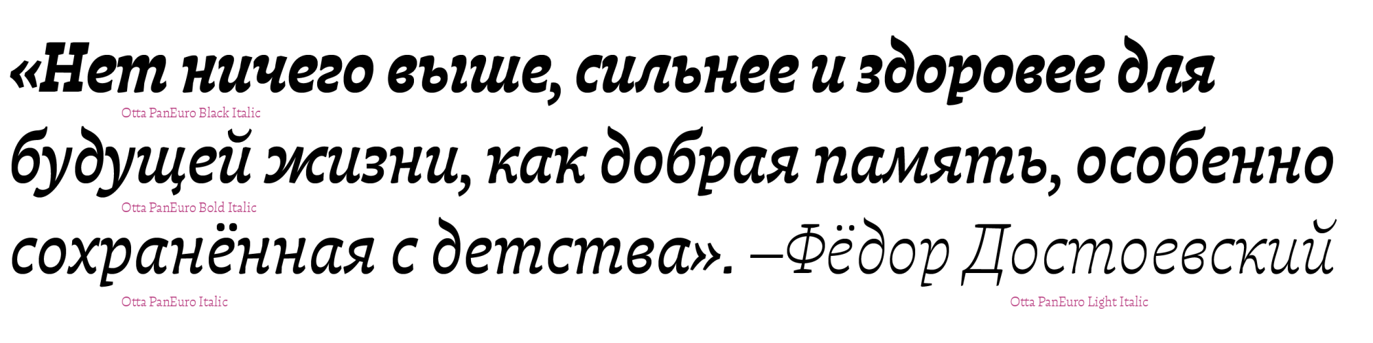
Thus, there are four letters “a”: one standard, another with a wider top stroke to combine with those that leave a little space at the top right, such as h, m, n; another with the same stroke, but shorter to face letters such as F, T, t, v, w, z; and a final one with a more curled tail to finish off at the end of words.
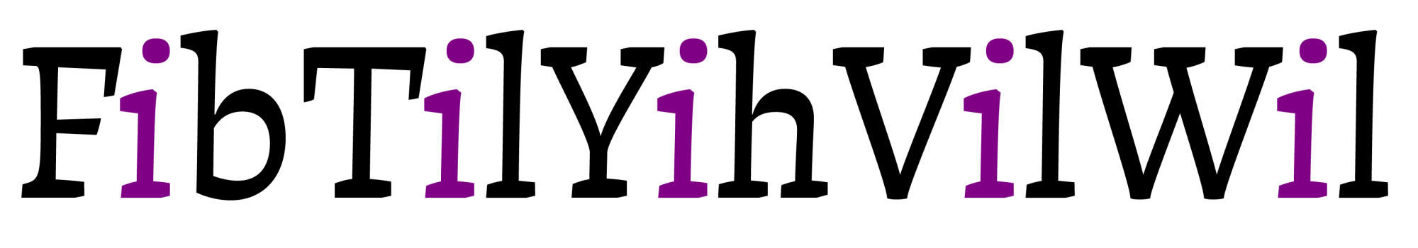
The letter i has another version with the dot offset to the right of the vertical stroke—something I didn’t invent but saw in Jenson’s prints, with those tiny dots—the same for j so that its dots don’t collide with the arms or serifs of the capital letters F, T, V, W, and Y. The idea is that the dot is centered in the space between that capital letter and, for example, the ascender of another lowercase letter on the right.
In addition, for each letter, I made its counterpart with slight changes for d, e, f, g, l, p, r, s, t, u, and z. I had never used Glyphs Smart Components before, and they helped me in two ways: to reuse parts of letters to make others, since more than 6,000 characters were too many, but also to be able to make subtle variations in the shapes. Of course, I didn’t have to draw all the characters; hundreds of them are assembled automatically.
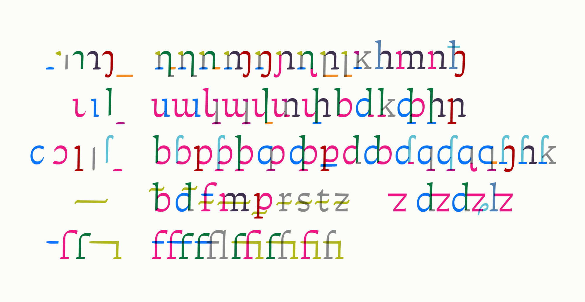
Video samples of use of smart components, the asterism [higher up] and the ligature f f i.
Ligatures to encourage writing in Spanish
The influence of English on contemporary cultures is suffocating, especially due to its technological internationalization and political influence, as well as being a practical language in writing as it does not take phonetics into account. Even laughter in Spanish is written in English (ha ha ha). Since I was a child, I have always been struck by spelling bees in American films. Something almost absurd for Spanish. The most unusual thing is that there is national pride in this, when we know that even John Baskerville and Eric Gill complained about its spelling.
I admire Peruvians and Colombians for how they speak Spanish, in general. Anyone who has visited Santiago will immediately notice what I mean by the Spanish we speak here. While I find the influence of English to be very pronounced, it is also true that influences between languages have always existed. Nor is it a question of being dogmatic or purist. Working mainly in the publishing world, I am not bothered or concerned by the way people write in chats or on social media, because it is living language, even if it is written. However, when publishing professionally or formally, I feel that Spanish, a European language inherited and appropriated in this part of the continent with great cultivators of literature and poetry, should be written more carefully. In this sense, I am concerned to see in some formal publications some poorly hyphenated words, missing accents, and the absence of initial exclamation and question marks, to mention the most frequent errors. Even in print. The Spanish language seems to be more relaxed with vowels than other languages, in which a diacritical accent completely changes the sound of a letter. My intention is not just to complain, and in a very modest way, I designed initial question marks that embrace or shake hands with some letters, noting that ligatures are appreciated by many people. In the end, it is simply a matter of finding meaning in designing fonts from Spanish, as a native language, and including most possible spellings. This involves designing different diacritics for capital letters and even some more condensed ones, such as a special diaeresis or circumflex for the letter i so that it does not collide with certain letters.
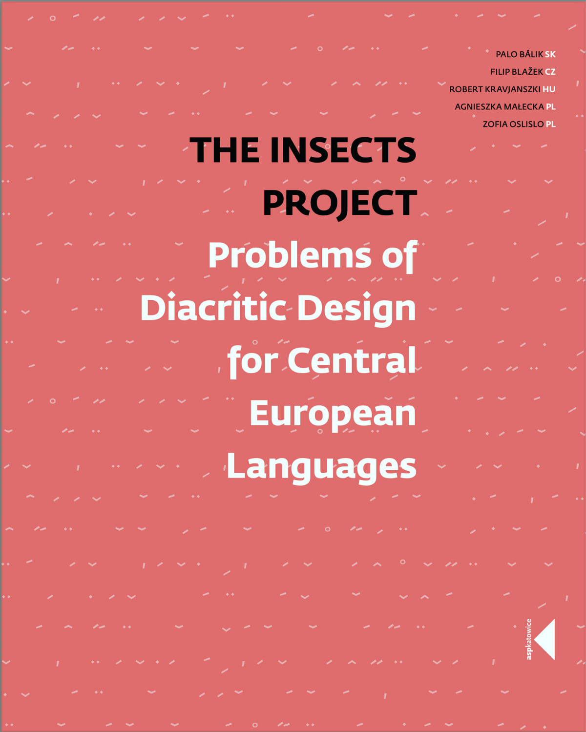
A very important lesson I learned from editor Robert Oleś, for the Polish edition Stwórz i złóż of the book Hacer y componer, was his frustration with the fact that the font market in Europe mostly contained characters and diacritics specific to Polish that were poorly designed or simply missing. It made sense to me to be stubborn about covering as much as possible, even if people who write only in English are not interested in buying a font. I asked Robert Oleś to tell me about the problems he had with those glyphs in Otta, and of course I included them. I even suggested changing the design of the mini specimens in the book that show the fonts to include characters such as ą, ł, ś, ż, but that was precisely the problem, as not all fonts include them. Fortunately, this seems to have changed in recent years. A good source of reference is the book The Insects Project, available in PDF format on the web.
The determination to develop a multi-script color
Perhaps the most difficult thing was trying to make the different scripts (Latin, Cyrillic, Greek, and Arabic) have the same color in the typographic composition. It is well known that in global communication, the idea of universality, so criticized in this day and age, still persists. Otta is not even close to such an idea; on the contrary, it does not base his entire foundation on European tradition. It is an exercise in design, in exploration from another perspective. Based on the ideas expressed by the teacher and researcher Manuel Sesma about the European point of view in typographic classifications, which groups all the “other” writing systems on the planet under the label of Non-Latin, this idea confirmed that my intention to design a typeface with horizontal contrast, that is, contrary to the traditional Latin model for prose text, was a path that made sense, at least to me, risking criticism for its unconventional form, which is more in line with the tradition of Greek and Arabic characters that were created with that type of contrast. This also includes Hebrew, and I even took it to the extreme of applying it to Japanese and Devanagari characters with quite interesting results.
For now, Kana, Hebrew, and Armenian have been designed in the Book weight only. We will publish them when they are complete.
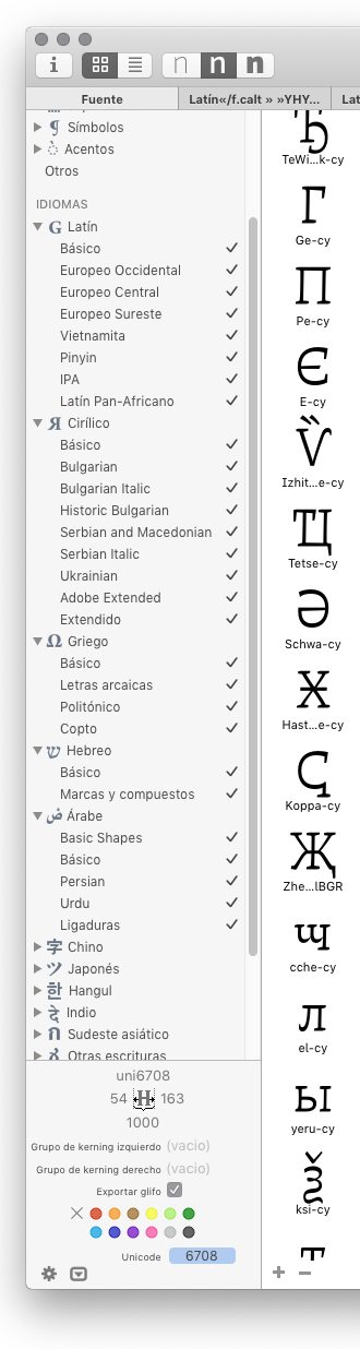
However, due to time constraints, they were left out in order to stop this snowball effect and finally bring closure to a stage. Instead of forcing Greek or Arabic into the Latin model as has been done before, Otta does the opposite. This is a feature we share with Alejandro Lo Celso in Atahualpa; unintentionally, the horizontal contrast has become a hallmark of PampaType for immersive reading fonts. Otta has more than 6,000 characters in a single file, and every time I open it in the Glyphs application, which helps me move faster in my productive work without knowing how to program, I am satisfied to see on the left side of the main window all the tickets for the scripts I have ventured into.

Everyday Greek words
Otta meant reviewing and learning several things that I had not explored in depth. The linguistic and conceptual legacy of Greek culture with its various ancient dialects is too much, that is, the fact that most of the concepts we use today were first coined there is truly extraordinary: academia, harmony, comedy, democracy, diagnosis, dialogue, epidemic, school, phenomenon, philosophy, geometry, grammar, history, idea, lyceum, mathematics, melody, method, pedagogy, poetry, politics, syntax, tactics, theater, theory, tragedy, and an endless etcetera. These are words that are overused, misused, and problematic in some cases. Even the word alphabet comes from the first two letters of the Greek alphabet. Furthermore, the pronunciation of Spanish is much closer to Greek than in other languages.
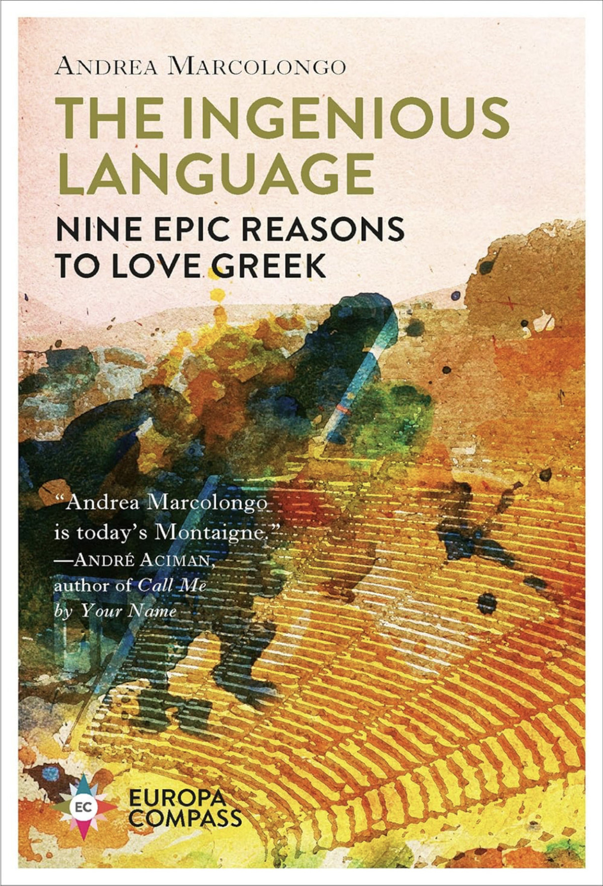
In her book The Ingenious Language (In Spanish The Language of the Gods), Andrea Marcolongo—with boundless passion and love for ancient Greek—explains that scholars debate to understand this language that no one speaks anymore and unravel the articulation of meanings that are not always fully understood, surely because words are fictions, as Montalbetti would say. Apparently, it is a language that is naturally elegant to speak, recite, and sing. Something that I have always found difficult to do with my mother tongue. I quote the author: “The gap between the meaning of a word and its interpretation grows every hour, as do misunderstandings and things left unsaid.” She failed to mention that lying, cursing, and insulting are part of the linguistic landscape. “Saying complex things with simple, true, honest words...” she adds. For her, that was ancient Greek, a language that paid no attention to time, wondering about the how of things, while we, trapped by time, wonder about the when. In short, Marcolongo explains that ancient Greek refers to the quality of the action, without situating it in time, which means that there is only a beginning and an end to things, but not to time. Nothing can be fixed in time because it always transforms into something else. I would even add that this includes what we say. We should learn something from this, as we are used to seeing everything in such a linear way. That is why clichés such as “society or the world is changing” are so exhausting.

We tend to think of language as a single entity, reducing the number of dialectal variations or accents, as is the case with most languages. This is due to typography, which “flattens” sounds, not to mention English, which gives absolutely no indication of how to pronounce words. Perhaps that is why linguists created an extensive parallel alphabet. To tackle Greek, I have used a language app, and although I am familiar with the characters, I am still not familiar with the language, much less the archaic form. You could say that one becomes a kind of “digital copyist”—like in medieval times—who, knowing a few words and not reading fluently, practices drawing the signs.

Learning by weighing-up is slow, but unbiased
I had tried to draw some Greek characters several times before; in fact, they appear on a standard keyboard. There is mu (µ), which appears as “micro,” pi (π), and omega (Ω). Pi (∏) and sigma (∑) in uppercase correspond to mathematical symbols; they are not letters for writing.
It can be intimidating to start designing diacritics for writing polytonic Greek for the first time. Knowing that there is an ancient Greek different from the current one (not only in its writing) with diacritics that fell out of general use in 1982, it is understandable that it was reduced to academic or religious circles, but that restricted use could change with new media. An ancient history professor I met in a sign language course—who had studied ancient Greek—told me that she didn't understand anything in a conversation in modern Greek and that when she visited a doctor, she asked him not to explain what was wrong with her because she understood perfectly well from the terminology he used. Of Greek origin, of course.
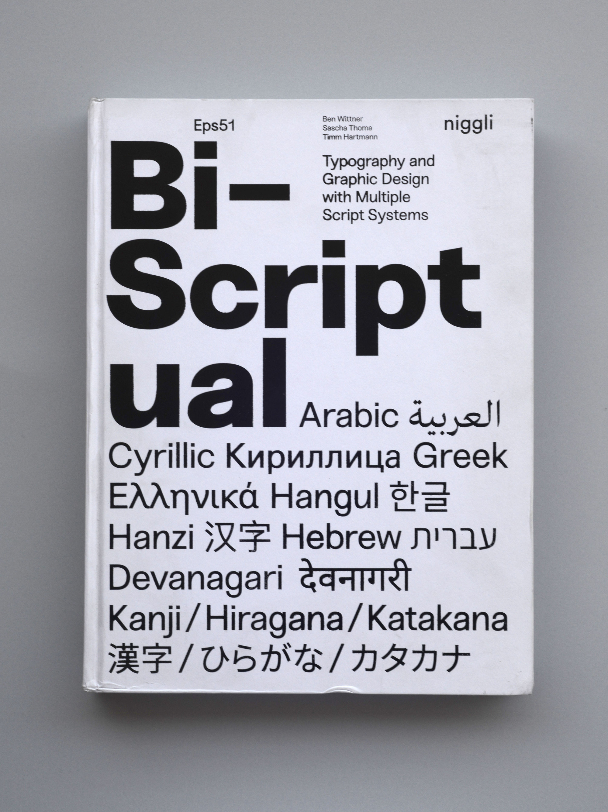
There is a very comprehensive reference on Irene Vlachou’s website for addressing Greek character design 4. The publisher Niggli also edited Bi-Scriptual: Typography and Graphic Design with Multiple Script Systems, which discusses multilingual designs that include Arabic, Cyrillic, Hebrew, and Devanagari, among others. In the Greek section, Gerry Leonidas writes that there is also a web version 5.
In my opinion, the best graphic reference is early metal type printing. It has a freshness in its texture that comes from the physical printing process, which is lost with today’s identical letters. Its graphic nature is a little more cursive—shapes that are drawn in one stroke—compared to Latin script and dozens of ligatures. Something I notice when looking at other types of writing is that one becomes a little more conservative with the shapes of the letters, because when exploring designs with strokes that are elongated or curved to escape the routine of shapes, one realizes that one is making letters that already exist in other alphabets. The idea, I suppose, is that in a multiscript design, it is better to be prudent or more restrained so as not to tread on the toes of other scripts.
I would like to comment on a few things I learned during this process of venturing into polytonic Greek for writing ancient Greek. With current typographic technology, we can include archaic forms alongside contemporary ones. The conjunction καɩ (kappa, alpha, iota), pronounced /ke/, which I did not expect to exist officially in Unicode, appears as a special character called kaiSymbol (U+03D7), a Greek ampersand, if you will, which I had seen many times but only realized its use when completing the set. Nick Nicholas has a page 6 which, although a little anachronistic in its design, contains valuable information about ancient Greek ligatures.

Perispo what?
Certainly, the hardest part is learning the names of the ancient diacritics. They must also be learned transliterated with the Latin alphabet. So, I made a table to remind myself of them every time I had to look them up or combine them, since there are arrangements that do not exist:
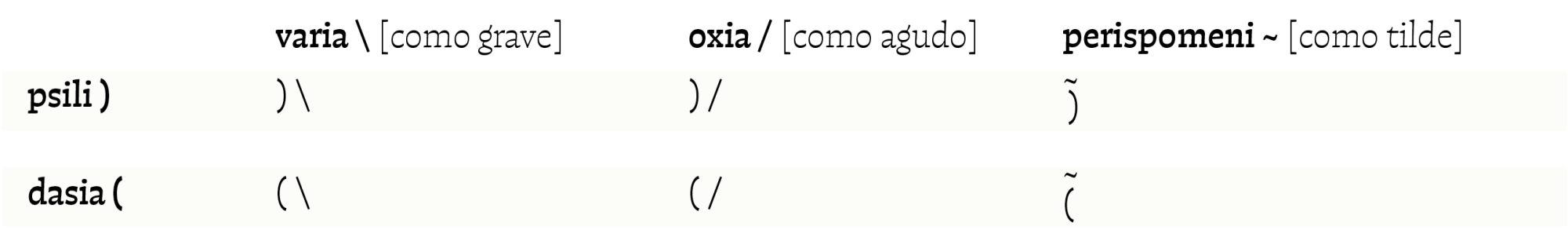
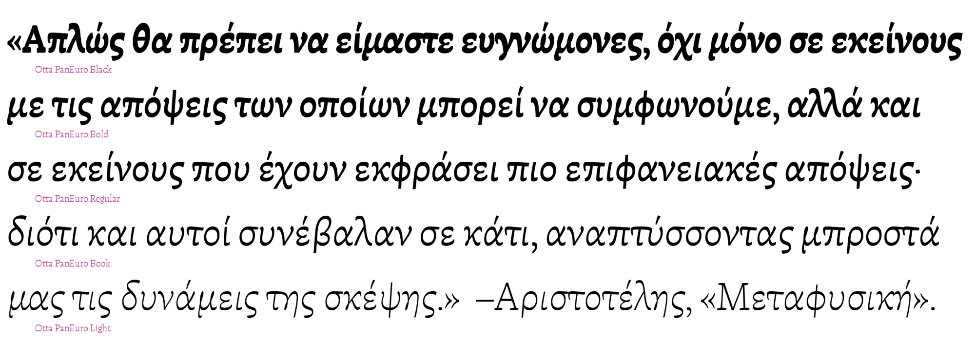
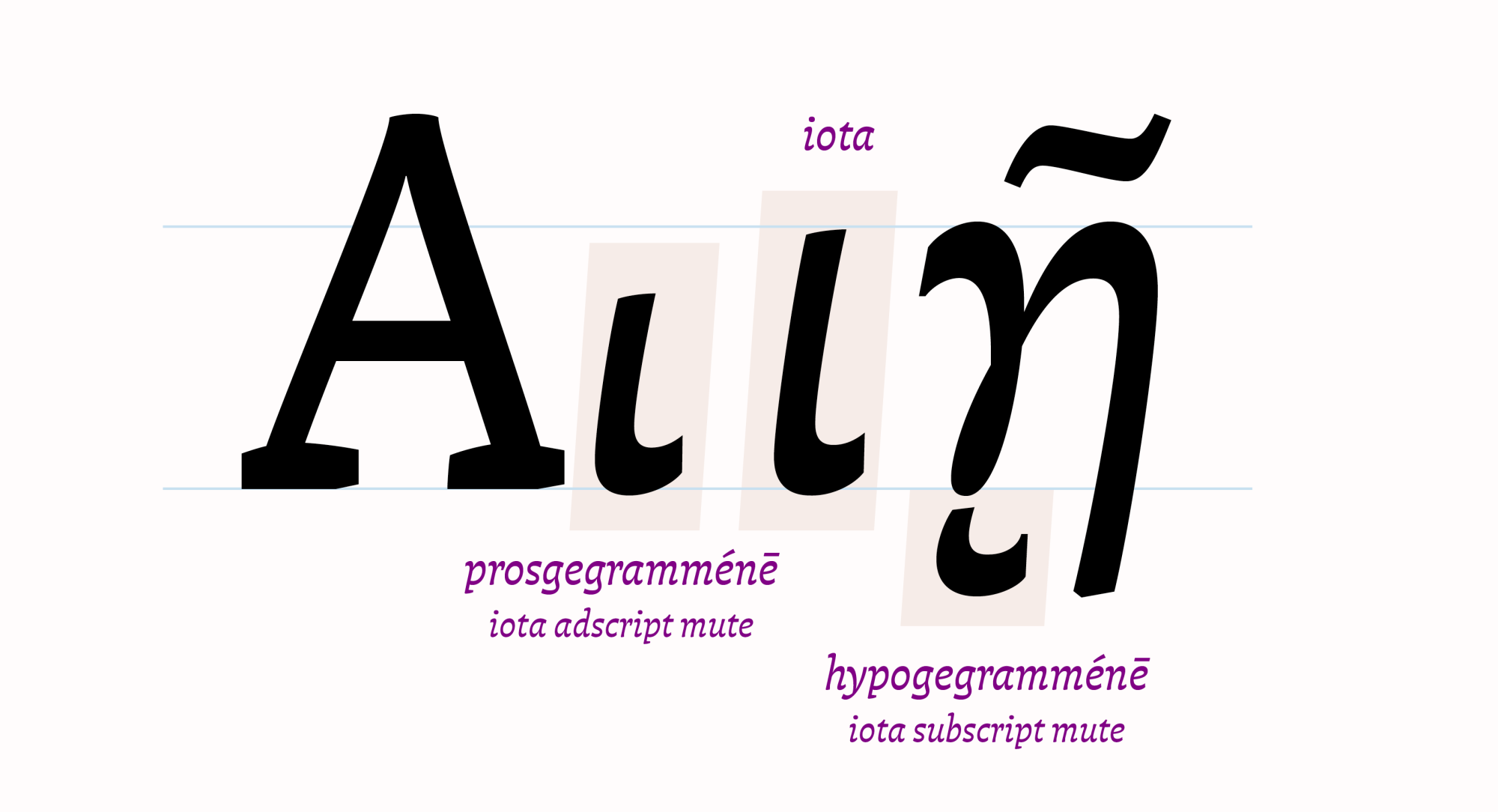
Vlachou points out that there are forms of accentuation that do not have a capitalized version, and that the use of small caps is different from that of capital letters. In capital letters, diacritics are positioned on the left side of each letter, while in lowercase letters and small caps they are placed above. Another detail she mentions is that, according to typographical tradition, the silent iota that accompanies Alpha, Eta, and Omega has two positions: on the right side (prosgegrammeni) or below the sign (ypogegrammeni), hence their names are described as adscript and subscript, respectively. In lowercase letters, it is only used as a subscript. Although the standard form of the silent iota accompanies the right side of these three uppercase Greek letters in Unicode, Vlachou explains that the natural and traditional form for Greeks is for it to go below. For Otta, it was decided to include both forms, giving priority to the silent iota below and the one on the side as a stylistic option that the person can decide where to use. This detail is explained in Otta’s screen specimen PDF.


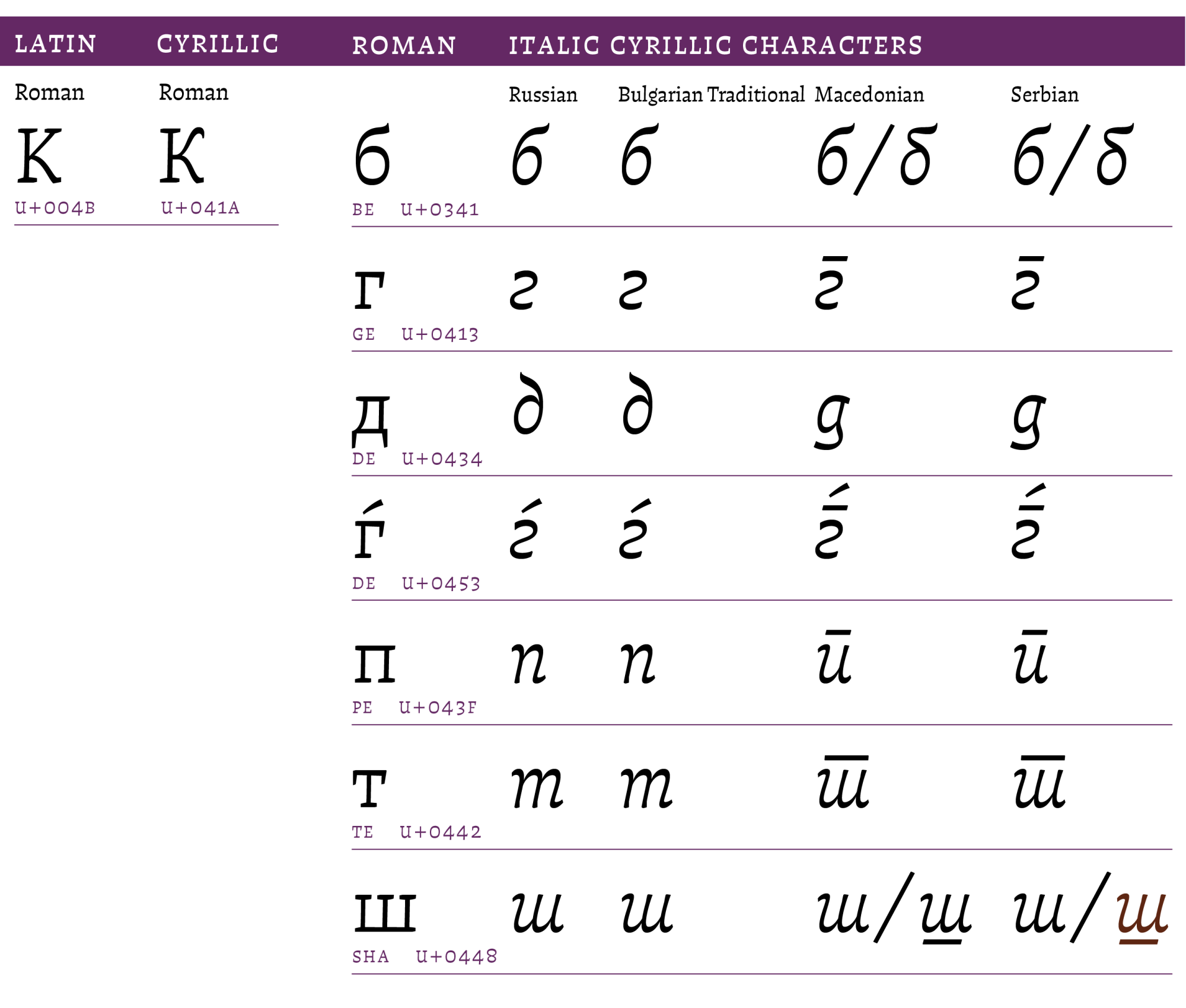
The multiple Cyrillic alphabets
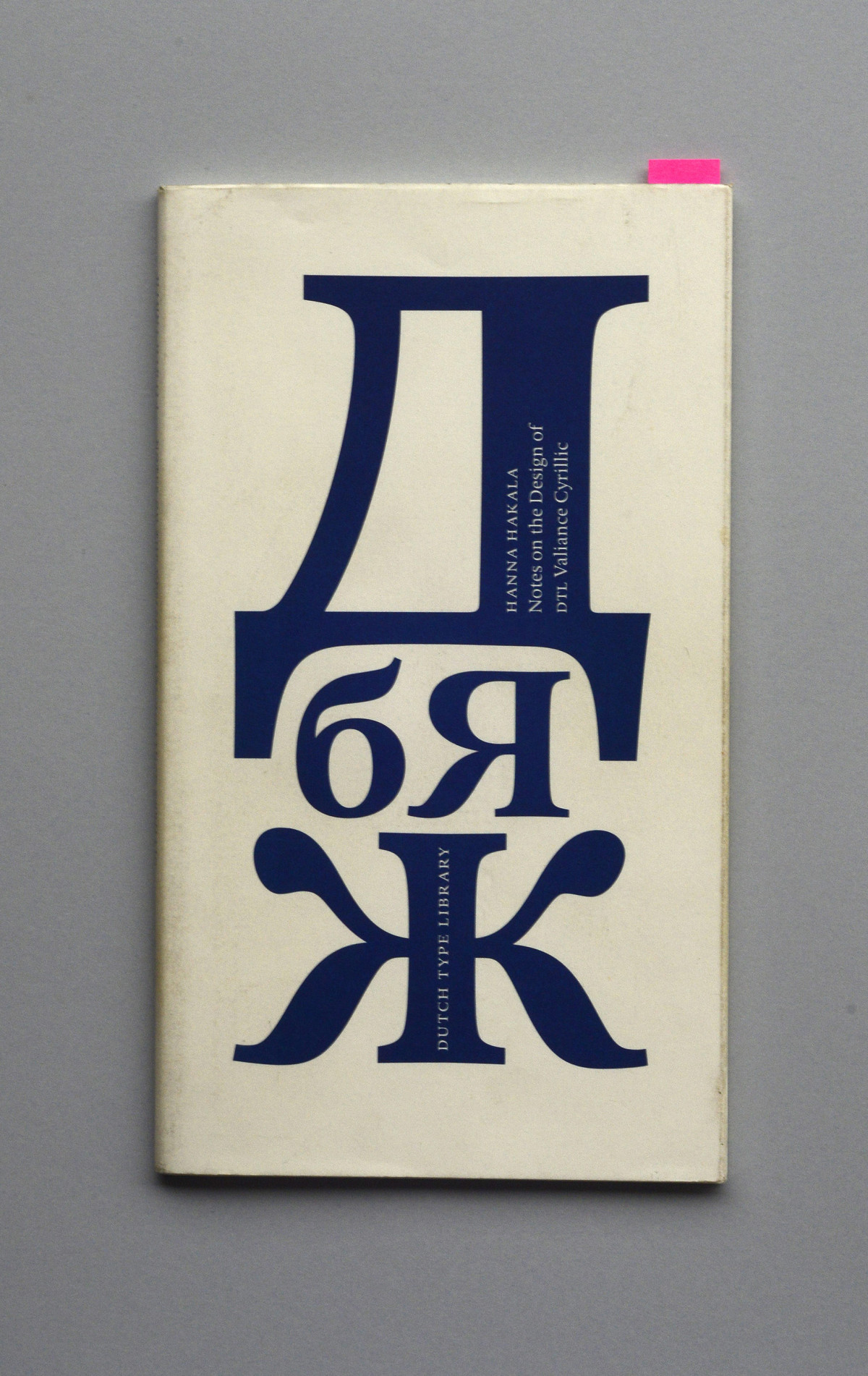
Cyrillic letters have their origins in Greek. I noticed that there are differences with the K, those with straight and curved legs, and other characters depending on the language being written: Russian, Bulgarian, Macedonian, Serbian, or Ukrainian. There is a small “booklet” by Hanna Hakala, who designed DTL Valiance Cyrillic, which presents these and other details. With the Glyphs updates, several of them have been incorporated, but not without conflict for me because I had to rename them.
I discovered several very striking historical characters, such as the Bulgarian yusbig, the Slavic yuslittle, and the four types of ocular o: monocular, double monocular, binocular, and multiocular [U+A66E], which are no longer used and appear in ancient Slavic liturgical texts. In fact, I had to correct the multiocular o because it had been misprinted with seven eyes.

Cyrillic characters. From left to right: Bulgarian yusbig and the four types of ocular o: monocular, double monocular, binocular, and multiocular.

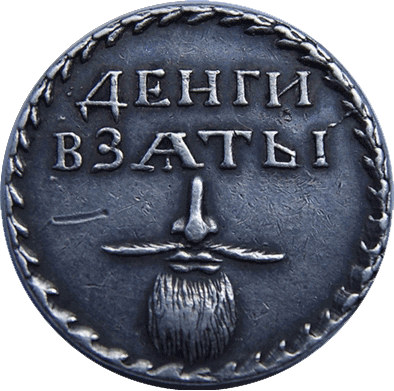
Also, while browsing the internet, I found a Russian metal tag that used the Jus Little on a nose with a mustache and beard to indicate that the tax for wearing facial hair, decreed by Peter the Great, had been paid.
The written culture of Cyrillic is fascinating and extensive. There is an important tradition in book design, and I recommend visiting a website with some digitized books on typography and calligraphy, most of which use this alphabet. 7 With such an enormous tradition, it was a great satisfaction for me to win an award at Modern Cyrillic 2019, 8 which featured fonts created between 2014 and 2019. The specimen I made for that competition features the seven-eyed multiocular o, and the Unicode correction was made in 2021, due to the warning made by linguist Michael Everson that in the 1429 manuscript the letter actually has ten eyes. Of course, Otta also updated it.

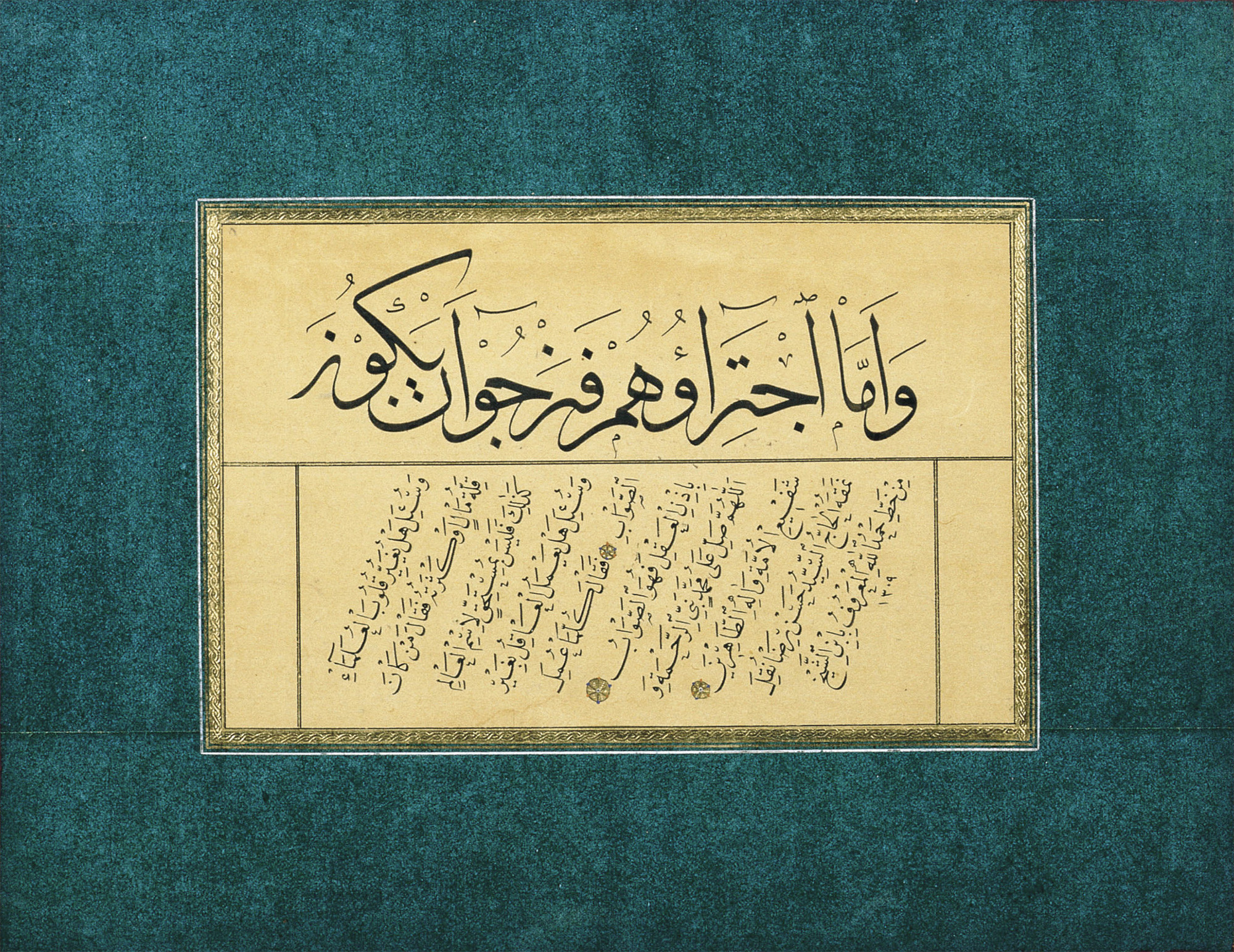
The Arabic contribution to Spanish. Its cursiveness
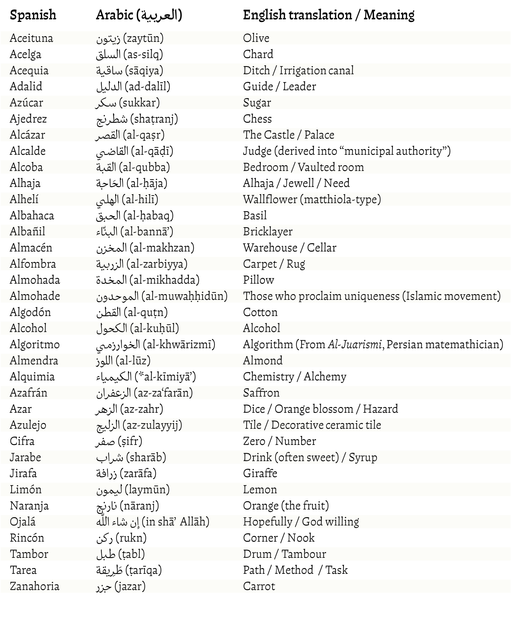
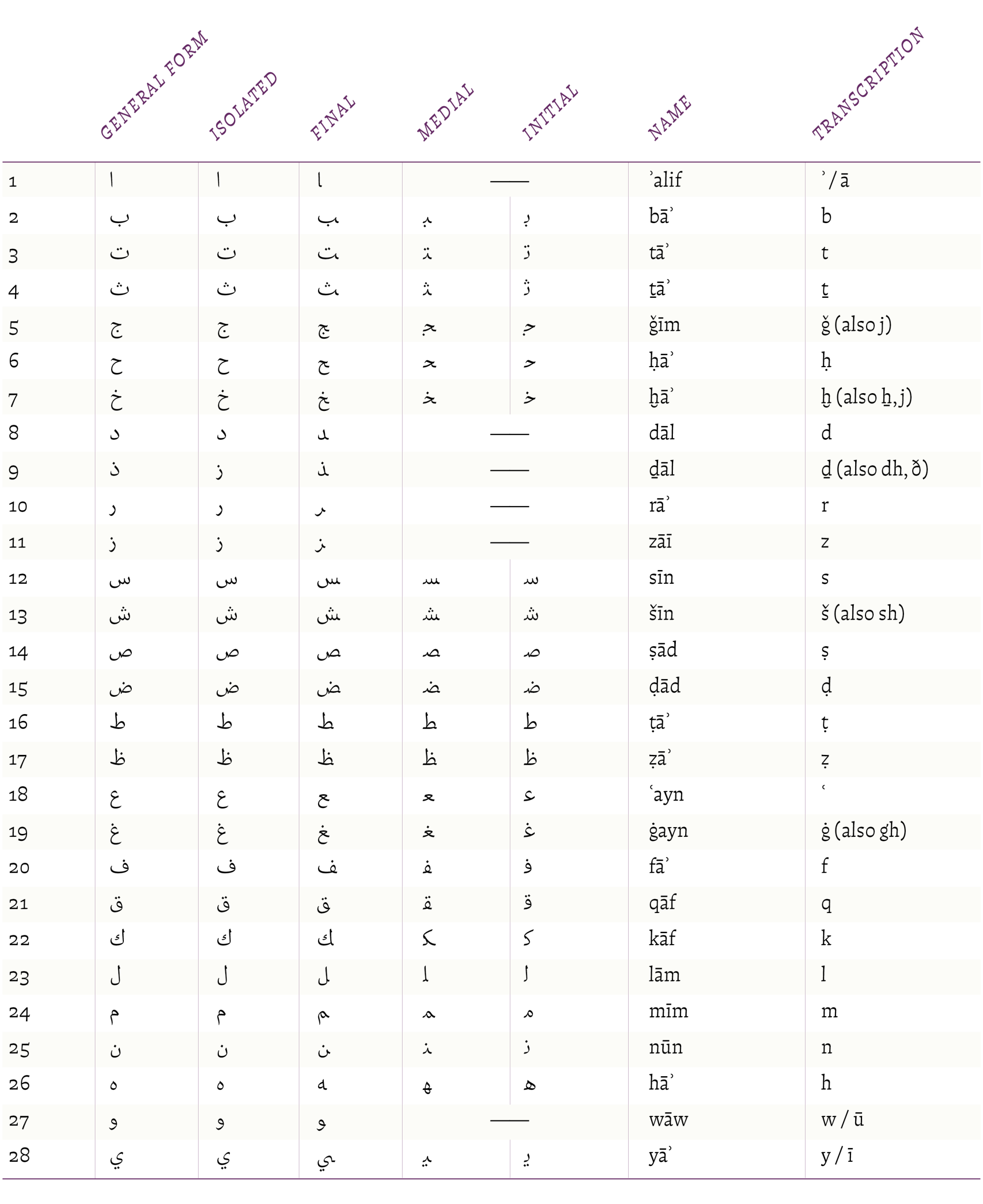
Arabic is the script that impresses me the most, along with Chinese. The second will be for another lifetime. Arabic also has a notable influence on Spanish (and in English too): the surname Medina (مدينة), which means “city”; the use of baladí (بلدي / trivial) as something commonplace, meaning “my country”; and the name Yamila (جميلة), which means “beautiful.” The list is significant, as is the case with Greek. See the following table:


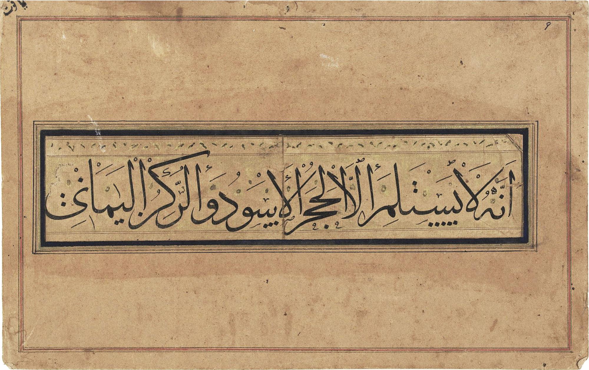
Arabic, a more calligraphic expression than cursive
Arabic script is very complex. In addition to being written from right to left, it has no capital letters. Some vowels, such as a, i, and u, are written separately, while others are marked above or below other characters, depending on their pronunciation. Consonants with the same sound, such as k or q, have several nuances, as do the s’s.

One interesting thing I discovered is that the Indo-Arabic numerals we use in the West are not used from right to left in Arabic, as one might assume when seeing them arranged in mathematics, aligned to the right in units, tens, and hundreds for addition or subtraction, but rather from left to right, as we use them on this side of the world. When using InDesign, you can move the text cursor in Arabic writing, for example to the left, in the Arabic reading direction, and when there is a number in between, the cursor jumps and moves in the opposite direction, to the right, and when it leaves the number, it moves back to the left in the text. Only Eastern Arabic numerals are used from right to left.
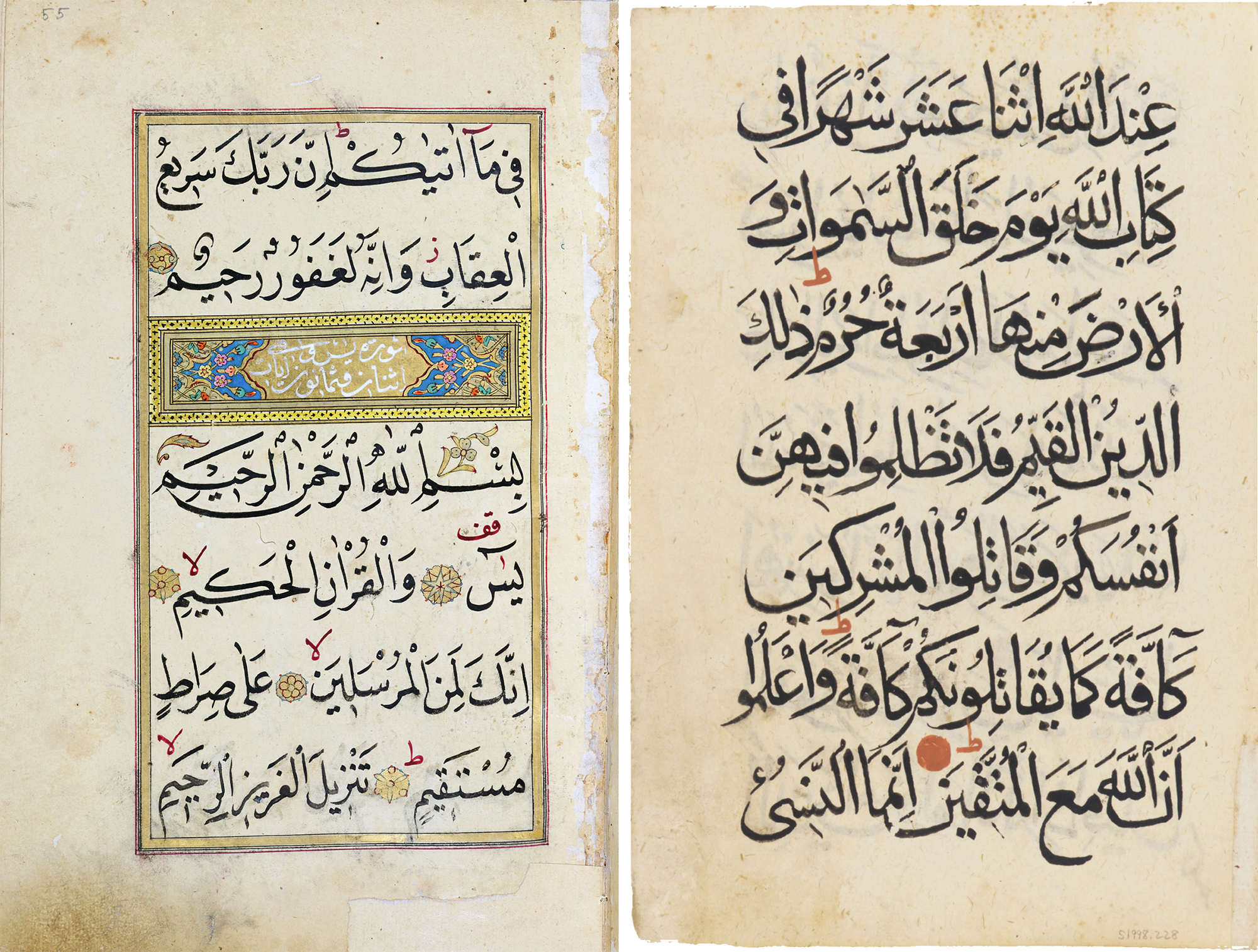
In addition, there are different styles of writing, and there is even a cultural phenomenon that I was unaware of, which is that the most widely used form of Arabic writing—Nasji or Naskh—is almost imposed on other languages such as Urdu, which use variants with a national character such as Nasta’liq. Others include Diwani, which is Ottoman; Kufic, which is similar to geometric fonts such as Futura; and Thuluth, which is the most interesting to me because it is very graphic, not typographic; these are words or phrases written in true emblems, even figurative drawings.
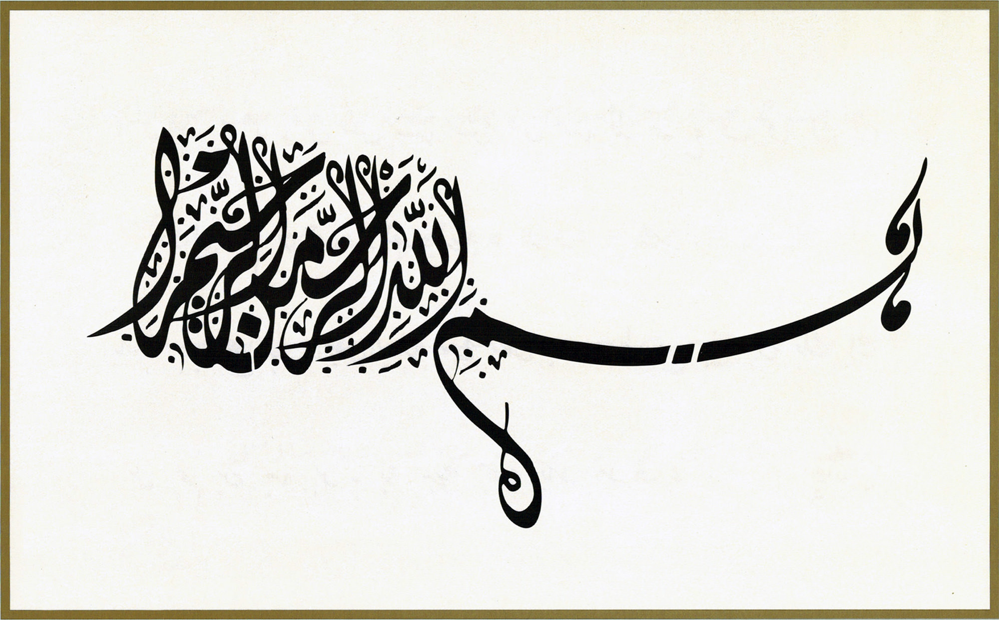
Unlike Arabic, the Latin alphabet is quite rigid and has diverged considerably from its epigraphic or calligraphic origins. Italics are considered to be the most calligraphic typographic expression of our “Western” writing; slightly slanted, with a fluidity of form in the letters that seem to be drawn in a single stroke and almost appear to connect with each other with their diagonal serifs, but the typographic system that fixes the shape of the letters and contains them within vertical rectangles prevents this naturalness of continuous stroke from being maintained. Even script fonts generally look rather monotonous. Hermann Zapf—the calligrapher and designer of Optima and Palatino, among others—already complained that typography could never resemble handwritten italics.
Digital writing indebted to various cultures
Converting Arabic calligraphy into typography was a major challenge for engravers during the Renaissance and for typographic engineers since the standardization of Unicode, as they had to incorporate them as digital drawings. Kufic and Naskh seem to be the most advanced so far, but not for Nasta’liq, which, in addition to its cursive appearance, has a diagonal descending baseline for words, following the right-to-left reading direction. This creates a visual rhythm, with letters and words organized on a slope that descends gently to the left and intermittently each time one of them is written to the right.
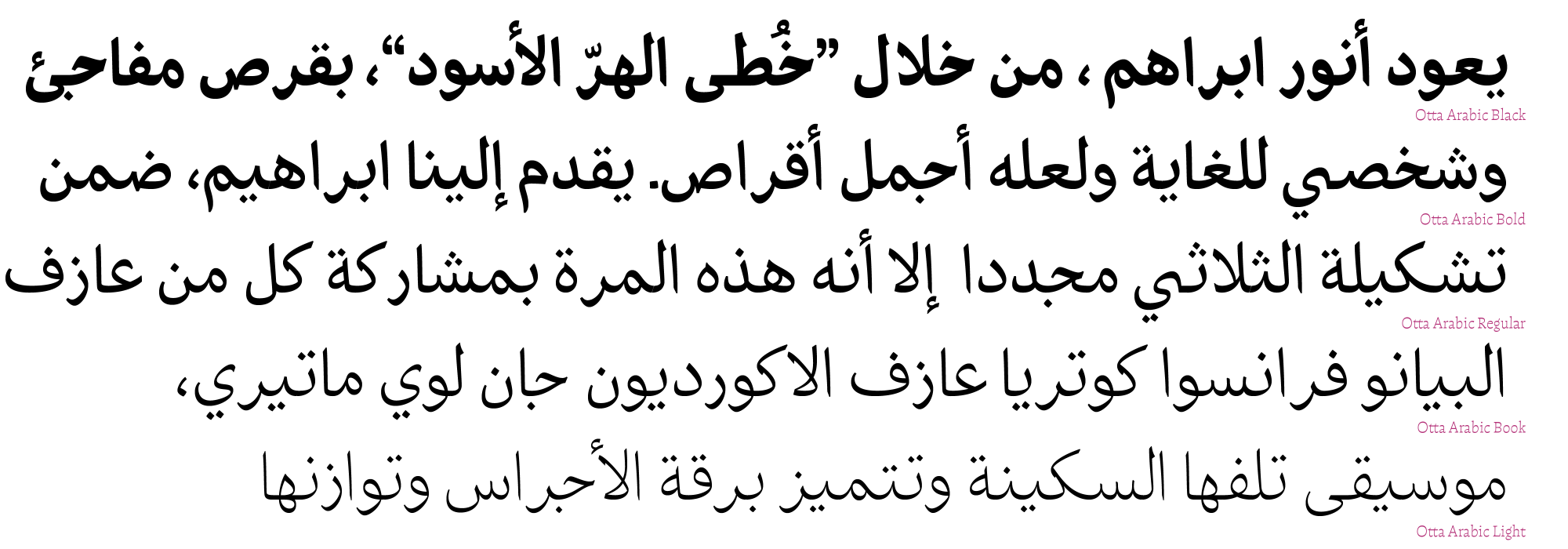
In Otta, the daring was with the standard, that is, the nasji. Each character with its four versions to write the same sound, and, not forgetting, always from right to left at the beginning, middle, or end of a word, shows how poor and atrophied our beloved italic script has become. However, the versatility in combining forms that could fulfill Zapf’s aspiration may find the way to a more human script. Returning to the initiative that Gutenberg unwittingly used for his own purposes, it regains vitality in this unbridled technological advance. And more ideas for better designs, less mechanical and less clumsy with these developments, are awakened. I even find this path more interesting than the overrated use of variable fonts today.
IPA for the study
Otta is determined to explore scripts, but it would take too long to cover Unicode, which in its latest update (16.0) has 154,998 characters, and the unified Chinese, Japanese, and Korean characters (known by the acronym CJK) alone account for 97,680, that is, almost 62% of the total, considering all other scripts registered in the world.
So, I limited myself to studying world phonetics with the IPA (International Phonetic Alphabet), mainly thinking about the precarious nature of written English and how it could help me. Perhaps it would be easier to have phonetic characters, but English has 44 sounds. That irregular spelling is difficult to learn; just think of how two letters together, such as the “o” in blood and foot, are not pronounced the same way. I don't know if spelling bees are justified; the Japanese learn 46 basic syllables.
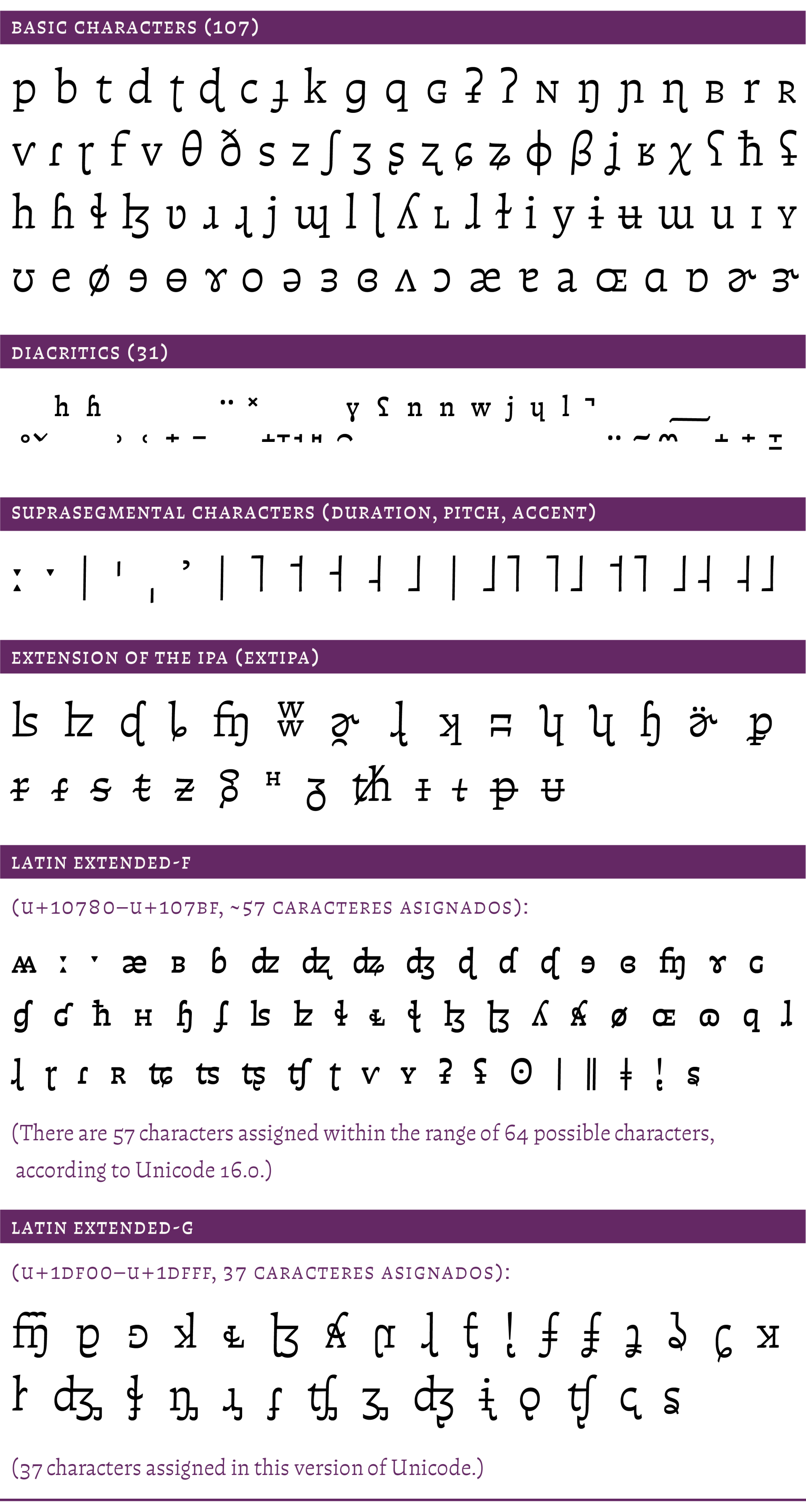
The International Phonetic Alphabet could be one way, but it is not the goal, as it contains 107 symbols, plus 31 diacritics and other symbols that are combined to indicate duration, tone, or accent in the notation of the sounds of all known languages. The best way to learn a language is to live for a time in the country where that language is spoken.

Emojis are also characters
Finally, I would like to explain the inclusion of some emojis in Otta. It is not because they are fashionable, but because I find it outrageous that typography books used to have an X over something that “should not be done” typographically speaking. It can be intimidating when you're just starting to learn about typography and you carry around a sense of shame that isn't really there. So, I decided to create happy, sad, scared, and worried faces to use instead of those X's over mistakes or things to avoid. This started to take off, and I realized that I had peered into another abyss. Thousands of emojis and increasing with each Unicode update (since they consider color variations). They are the characters that are added most in each update. Finally, we realize that the development of typography will never be complete or stop; possibly, in the future, emojis will appear that are more ideographic than pictographic, and letters may no longer be used. Who knows.

References
Palo Bálik, Filip Blažek, Robert Kravjanszki, Agnieszka Małecka, Zofia Oslislo,The Insects Project. Problems of Diacritic Design for Central European Languages. Private edition. Katowice (PL), 2016.
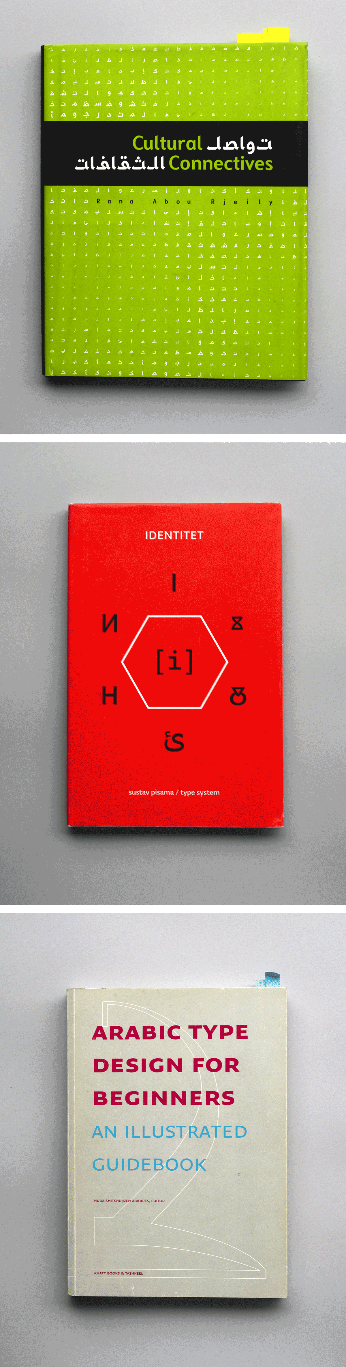
Nikola Đurek. Identitet – Sustav pisama / Type system. Publisher: Umjetnička akademija Sveučilišta u Splitu, Odsjek za dizajn vizualnih komunikacija (Academy of Art, University of Split, Department of Visual Communication Design), 2016.
Francisco Gálvez Pizarro. Hacer y componer. Una introducción a la tipografía. Ediciones UC, Universidad Católica de Chile, Santiago, 2024 (1st edition, 2018).
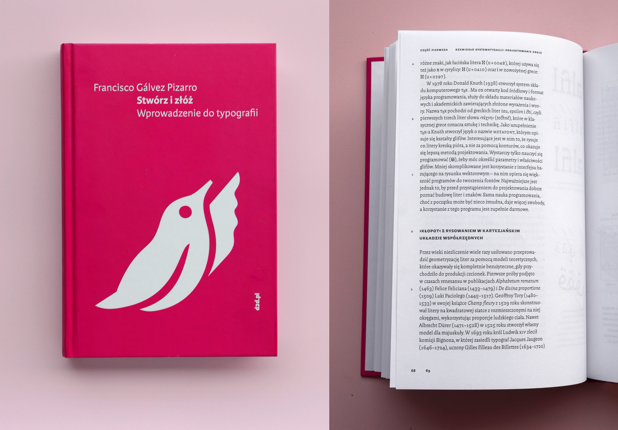
— Stwórz i złóż. Wprowadzenie do typografii. Publisher 2d2.pl. Krakow, 2019.
— Hacer y componer. Una introducción a la tipografía. Colección La biblioteca editorial, Ediciones Uniandes (Universidad de los Andes) in conjunction with Ediciones UC (Universidad Católica), Bogotá, 2019.
Andrea Marcolongo. The Ingenious Language. Nine Epic Reasons to Love Greek. Europa Compass, 2021.
Mariana Muñoz Hauer y Eduardo Castillo Espinoza. Francisco Otta. Obra gráfica. Ocho Libros publishers. Santiago de Chile, 2015.
Francisco Otta. Los alfabetos del mundo. La comunicación gráfica desde los fenicios hasta la computadora. Ediciones Extensión Universitaria. Santiago de Chile, 1974.
Rana Abou Rjeily, Cultural Connectives: Bridging the Latin and Arabic Alphabets, Mark Batty, NYC 2011.
Huda Smitshuijzen Abifares. Arabic Type Design For Beginners. An Illustrated Guidebook (English & Arabic Edition). Khatt Foundation, Amsterdam, 2013.
Ben Wittner, Sascha Thoma and Timm Hartmann [editors], Bi-Scriptual: Typography and Graphic Design with Multiple Script Systems Niggli, Sulgen (Switzerland), 2018.
Francisco Gálvez Pizarro is a Chilean graphic designer and self-taught type designer. He teaches at the Pontificia Universidad Católica de Chile and is the author of the book Hacer y componer, una introducción a la tipografía, a broadly read title in the Spanish speaking world. His typeface Australis was awarded the Gold Medal at Morisawa, Tokyo, 2002. His typeface Otta was selected at the Modern Cyrillic, 2019. His typefaces Amster and Chercán are both Typographica favorites of 2014 and 2016. Together with Rodrigo Ramírez, Francisco created bespoke fonts for national newspapers, the public transport system and the motorway signs in Chile.
- Francisco Otta. Graphic Work. Mariana Muñoz Hauer and Eduardo Castillo Espinoza. Ocho Libros publishers. Santiago, Chile, 2015. ↩
- https://articles.c-a-s-t.com/the-digital-wave-by-robin-kinross-e7d973c6806d ↩
- https://luc.devroye.org/fonts-38339.html ↩
- https://github.com/irenevlachou/Polytonic-tutorial ↩
- https://medium.com/@gerryleonidas/designing-greek-typefaces-eac0de7767cc ↩
- https://www.opoudjis.net/unicode/ligatures.html ↩
- https://bibliotekus.artlebedev.ru ↩
- https://2019.moderncyrillic.ru/en/ ↩