Why a script font?
Given the variegated nature of Georges Perec’s work, from the outset I was seduced by the idea of a family of multiple styles that, while coming from divergent typographic traditions, could be combined to enrich the same page. Stylistically extending the Perec system would not have felt complete without a script font, because a script is one of the most unlikely styles to relate to a sanserif grotesque. Paying homage to Georges Perec meant taking on the least comfortable challenges 1, such as designing a script font that could be combined in text with Perec’s other fonts with harmony and aesthetic coherence. Hopefully, that would also bring some sense of liveliness to the text. 2

Naturally, apart from the search for stylistic coherence of the new Scripte with the rest of the Perec family, this script typeface achieved its own design argument, developed as a family and earned its own place.
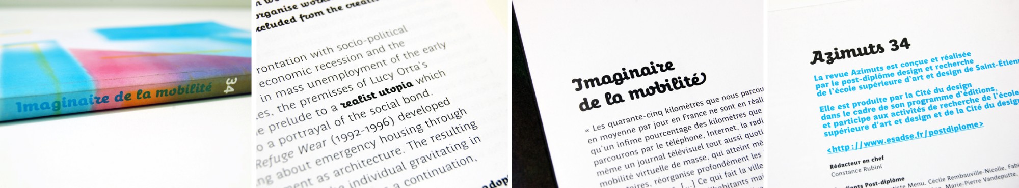
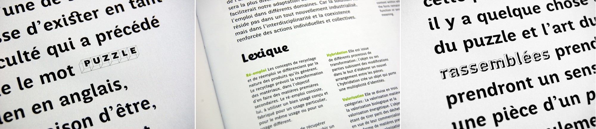
First uses and style combinations of the Perec with the Perec Ludique and the Perec Scripte, in two French magazines: Azimuts (above), made by students of the Saint-Étienne school of art and design, and Livraison (below), a contemporary art magazine from Strasbourg.
Taking a script font seriously
Handwritten fonts (wrongly called script) are a genre almost always underestimated in the field of serious typography. Some fellow designers to whom I showed my Perec Scripte progress were surprised to see that I was making a script, considered a less serious style. It is clear that their more “casual” tone makes them more suitable for ephemeral, circumstantial, informal uses, typically where a more relaxed tone is appropriate. In fact, I have always loved store signs with script style letters, especially if, while trying to evoke an existing font, it remains half hidden under the personal interpretation of the sign maker.
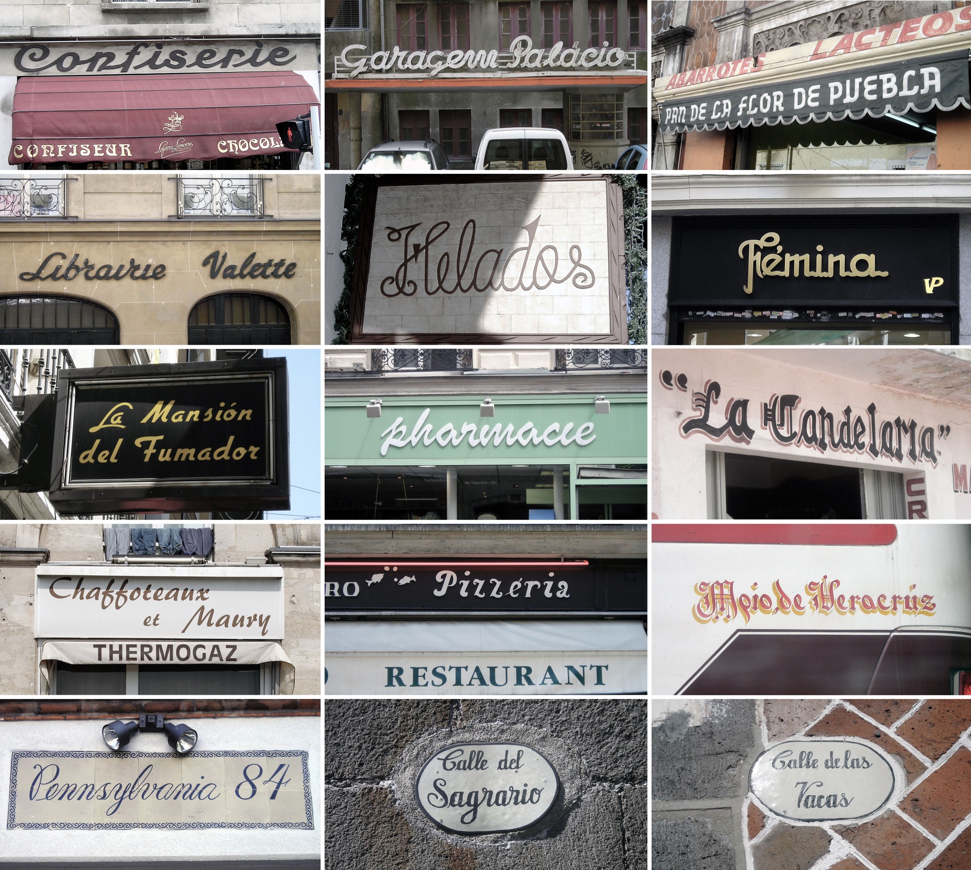
Store and street signs in script styles with personality, captured in different places in Europe and Mexico. Photos: Loche
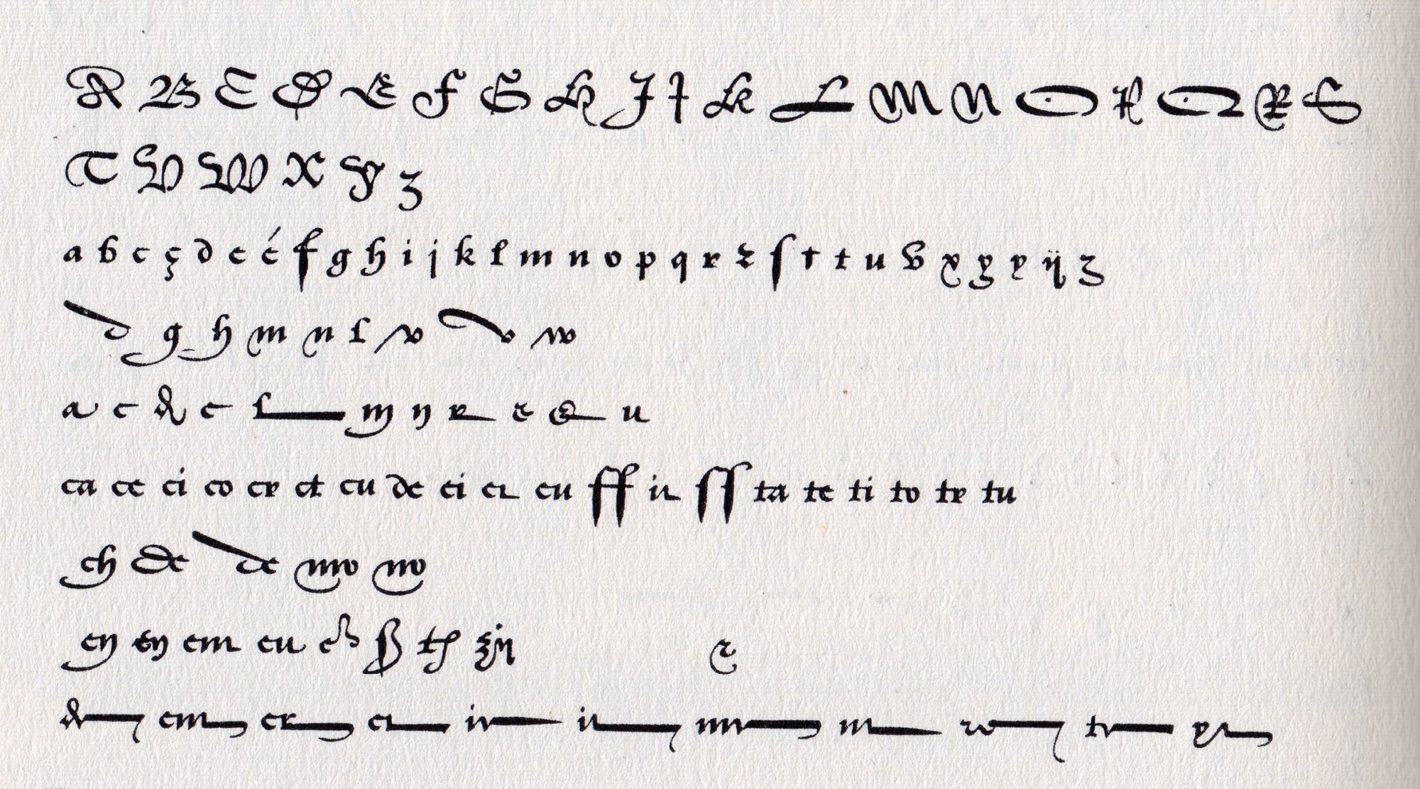
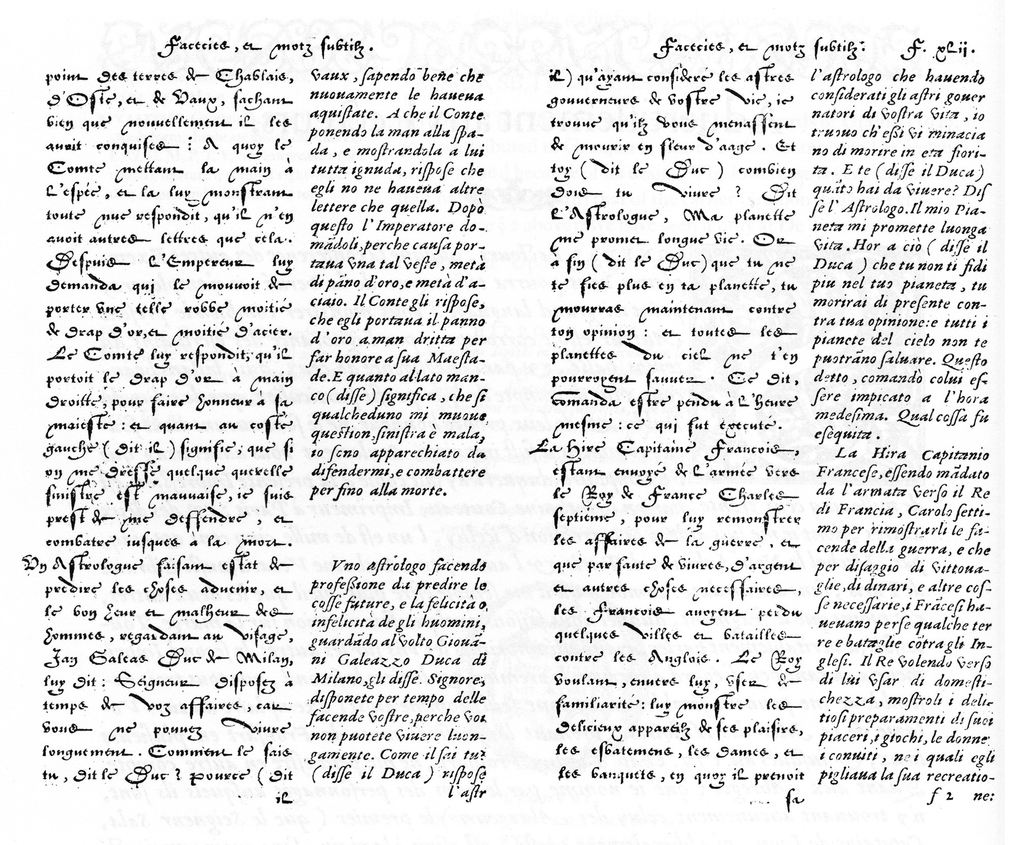
Handwritten or script typefaces are very old, perhaps the most famous (although not at all successful) is the Civilité or “lettre françoise” that Robert Granjon engraved in Lyon in 1562. Inspired by the Ronde hand of his time and with the idea of offering a supposedly “national” style as a French alternative to the Italian cursive, the Roman and the Germanic (Gothic) letters. But although the style was quickly copied by other foundries, its use did not transcend in history due to the eccentricity of its forms, which made it difficult to read. However, even being such a personal experiment, the Civilité is one of the most unique milestones in the history of typeface design. Book spreads composed with it, especially those printed by Granjon himself, are of a high artistic level. 3
Tell me which tool you use
A useful way to classify script or handwritten typefaces is according to the tool (whether real or intellectual) with which they were drawn. Thus, there are script fonts that evoke the flat-tipped pen, the brush, the copperplate burin, the ballpoint pen.

Lydian Cursive by Warren Chappell, ATF 1938.

Robert E. Smith’s well-known Brush Script, ATF 1942.

Matthew Carter’ Snell Roundhand, Linotype 1965. This etiquette font comes in three different weights but the bonding strokes are kept thin.

Well-known script fonts, whose aesthetics respond to the instruments that were used to trace them: Lydian Cursive responds to the flat-tipped pen, Brush Script to the brush, Snell Roundhand to the burin, and Justlefthand to the ballpoint pen.
Upright cursive
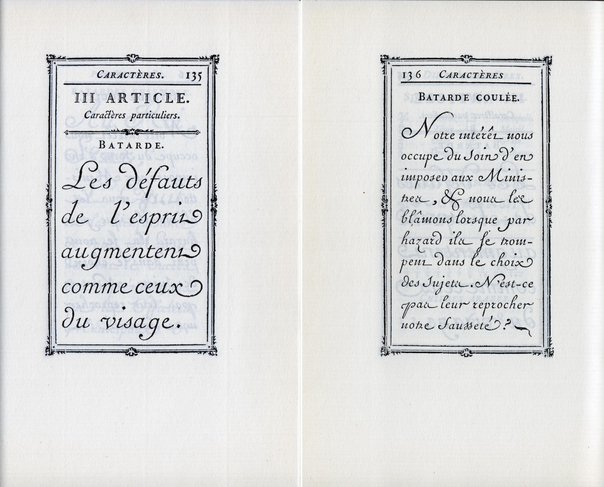
However, if my new script was to be combined in text with Perec’s original grotesque version, eccentricities and overly vernacular elements had to be set aside. The design that emerged naturally was a vertical or upright cursive, rather rounded and rather geometric. Vertical italics also have their history.


A modern upright cursive is Flora, by Gerard Unger, ITC 1984, in this case with a slight inclination with respect to the vertical axis.
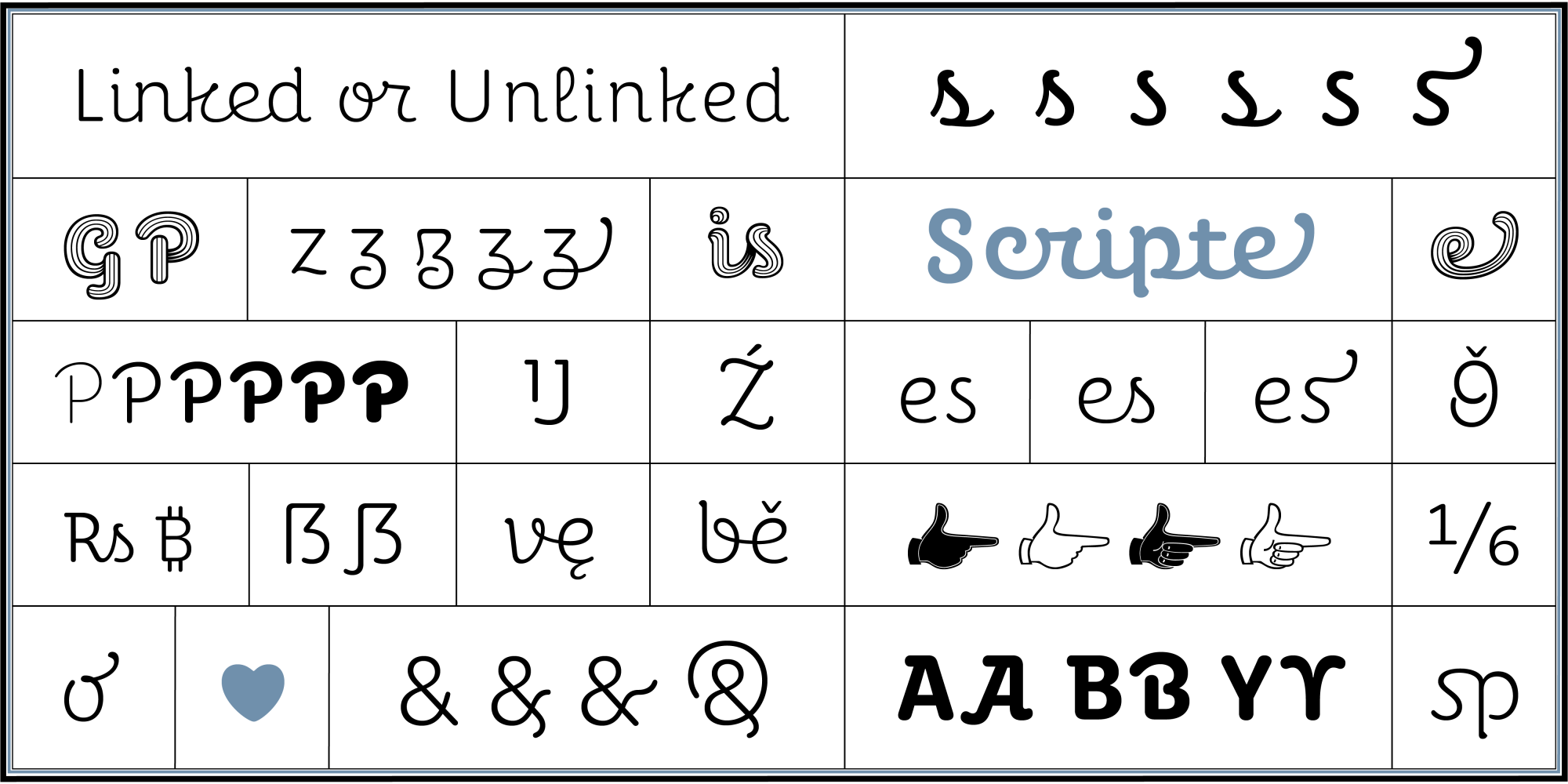
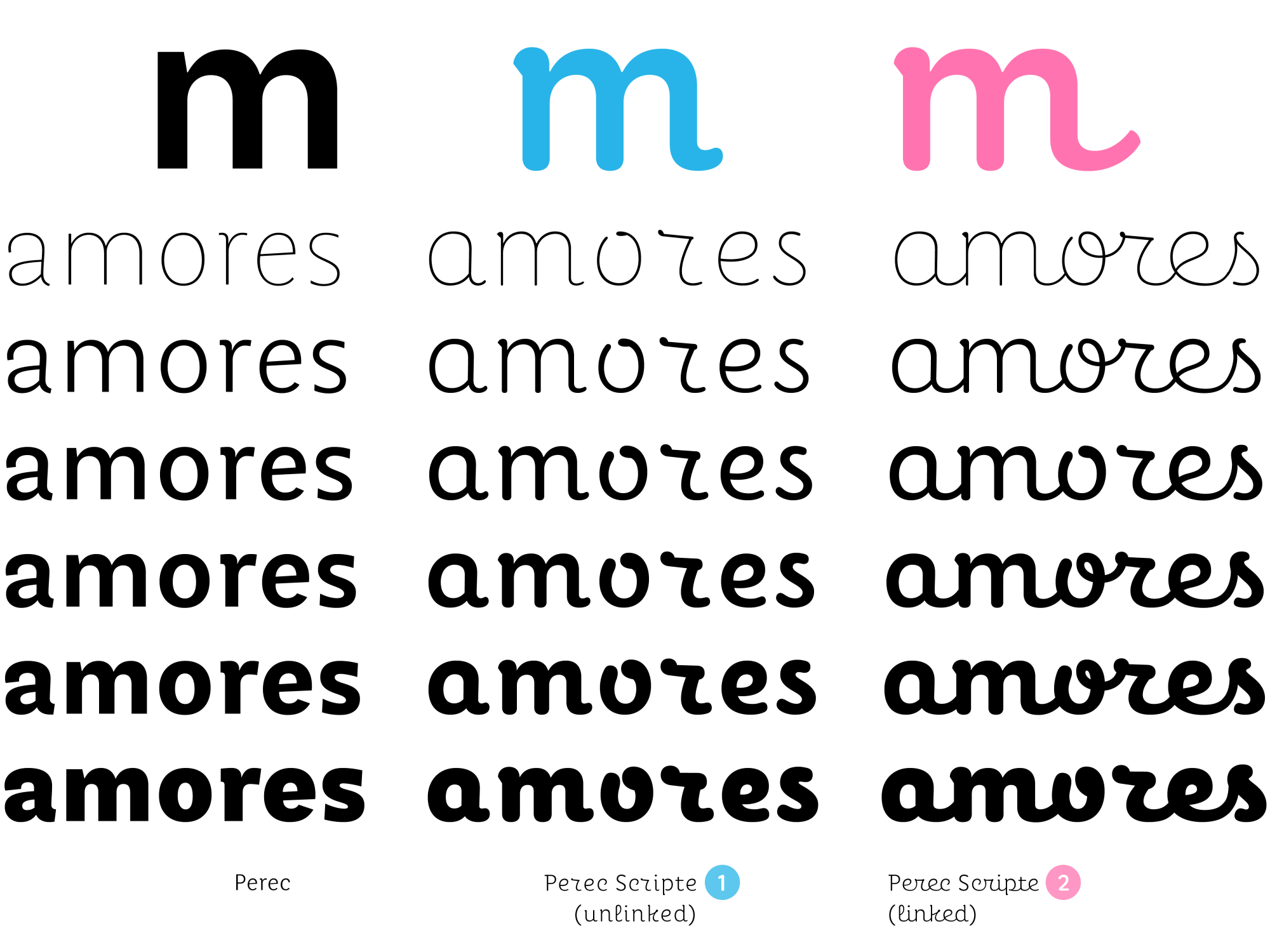
Linked and unlinked
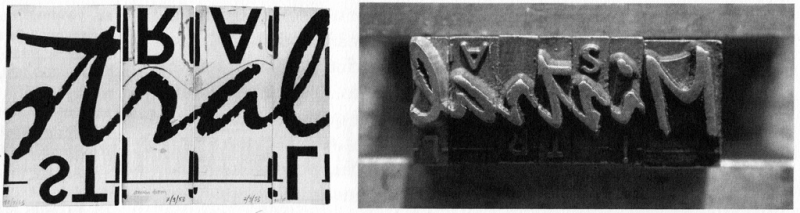
Another of the formal challenges of a script (today and always) is the possibility of linking the letterforms to each other, to better evoke handwriting. In the days of metal type, most of the fonts of this genre opted for disconnection, or for a suggested connection, so to speak, in order to avoid the problem of the connecting stroke meeting the next character.
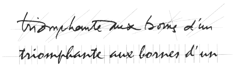
Roger Excoffon based his Mistral font (1953) on his own handwriting. In this image he compared the natural irregularity of handwriting in terms of slants of strokes and heights of joints among letters (above) with the need to order and standardize slants and joints in a typeface (below). Source: Sandra Chamaret et al, Roger Excoffon et la Fonderie Olive.
Taking the style seriously I think meant to me that every word written in this font should look like a logo, balanced, emphatic, beautiful. Indeed, “every word should look like a logo” is a basic premise of every type designer. However, when dealing with a style in which letters can actually connect or disconnect with each other, everything became much more complex. During the design process I identified about three forms of interrelationship between the signs:
—complete connection, as in a handwritten cursive;
—complete disconnection, as in a block letter, which was to offer greater legibility; and
—an intermediate style in which letterforms could automatically connect and disconnect based on a pre-written code to always achieve the best visual result. The latter required careful planning of the font’s behavior, based on a mapping of all possible letter concatenations. That was the beginning of hell.
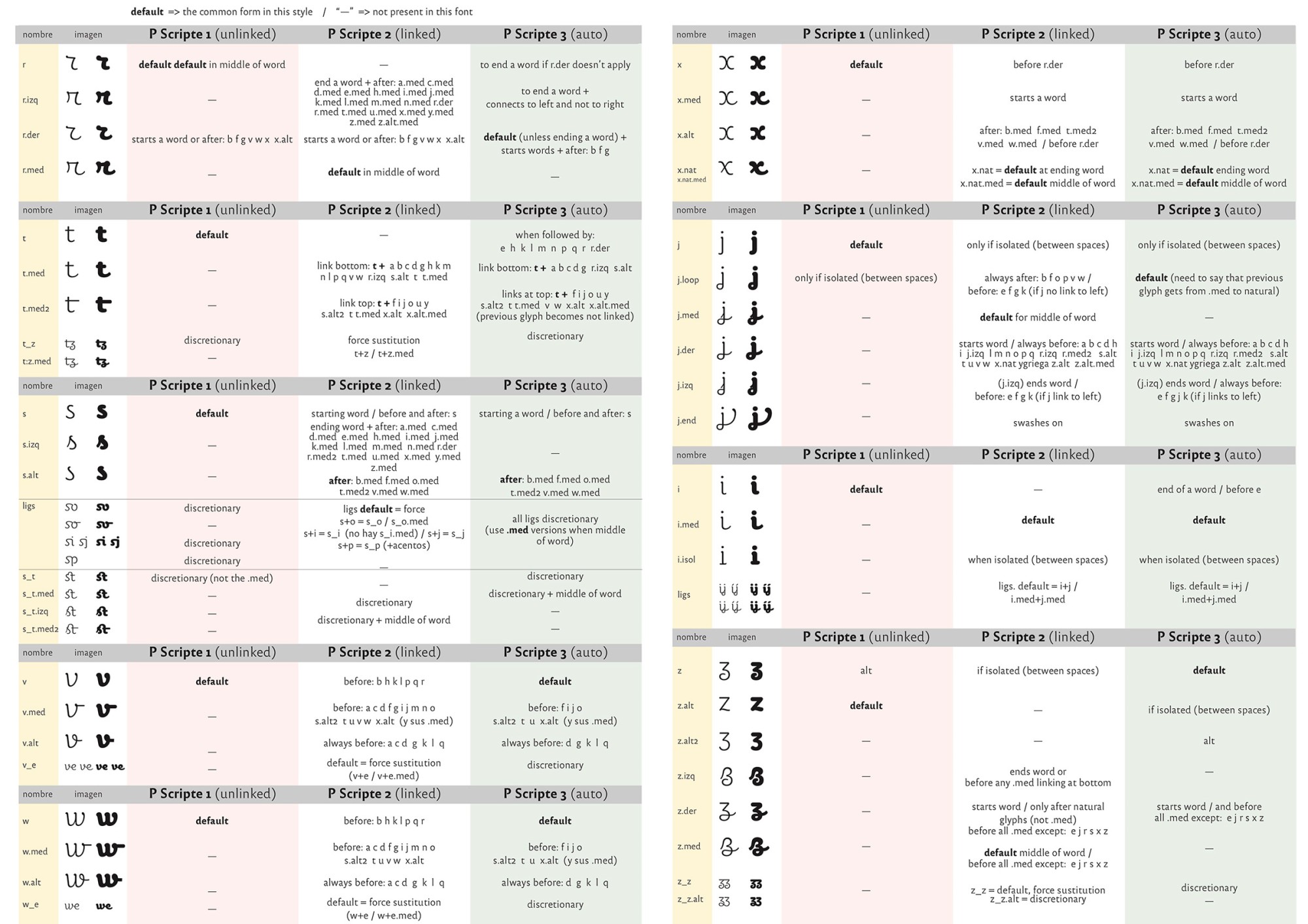
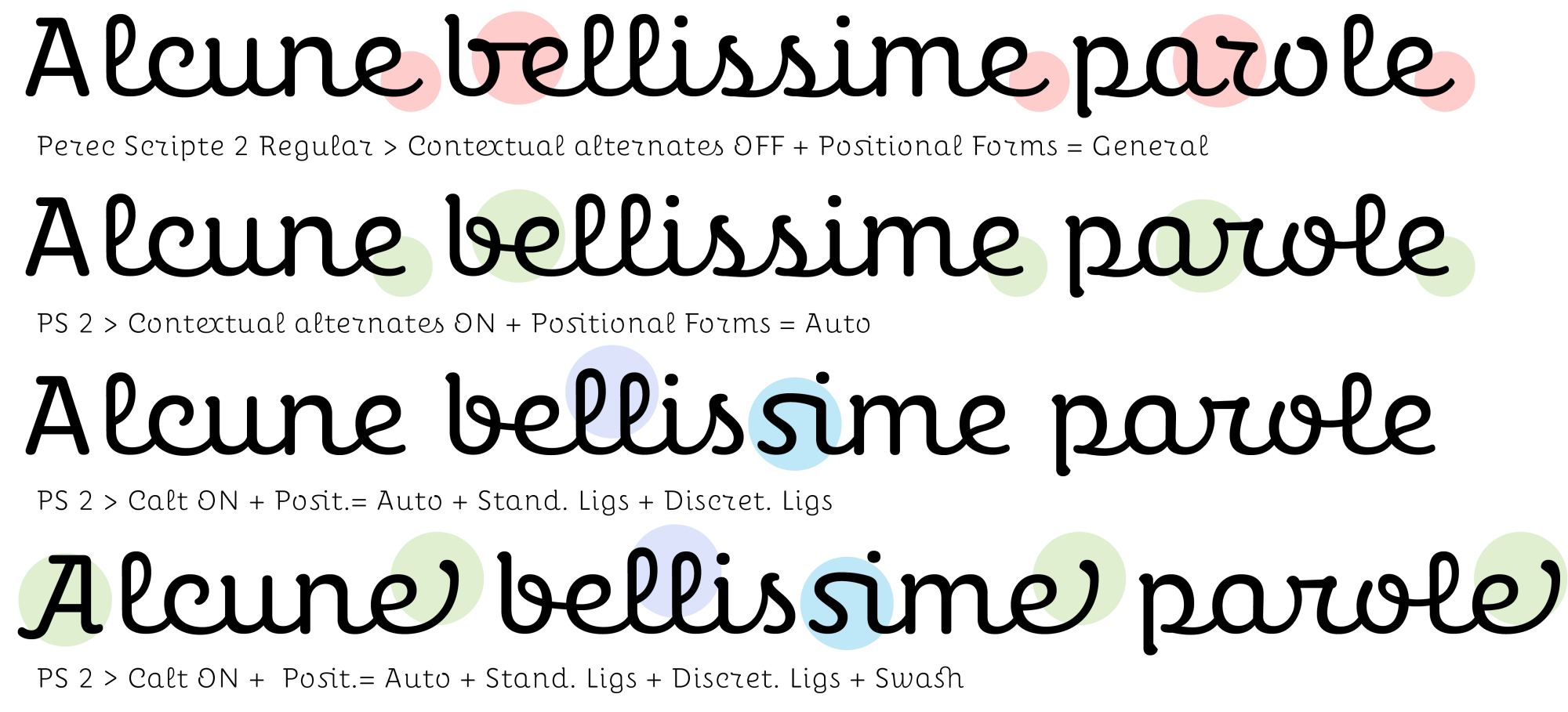
After exhaustively testing the possibilities, I concluded that the visual differences between the fully connected version and the intermediate version were too subtle, and did not justify an epic programming effort of thousands and thousands of possible contextual permutations between characters. The most reasonable approach was to reduce to two straightforward versions: linked and unlinked. The behavior programming process had to be gone through anyway, especially in the linked version, to ensure the most visually harmonious combinations, but the picture was clearer if there were only two versions instead of three.

Weights, styles, goodies
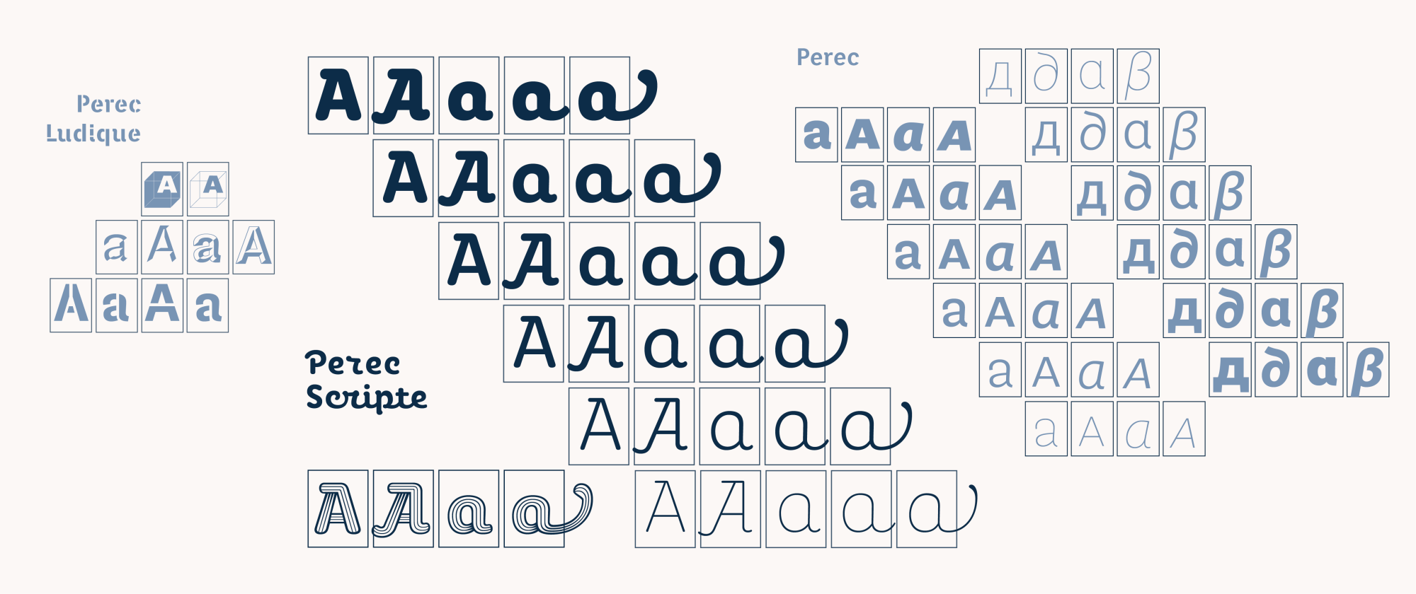
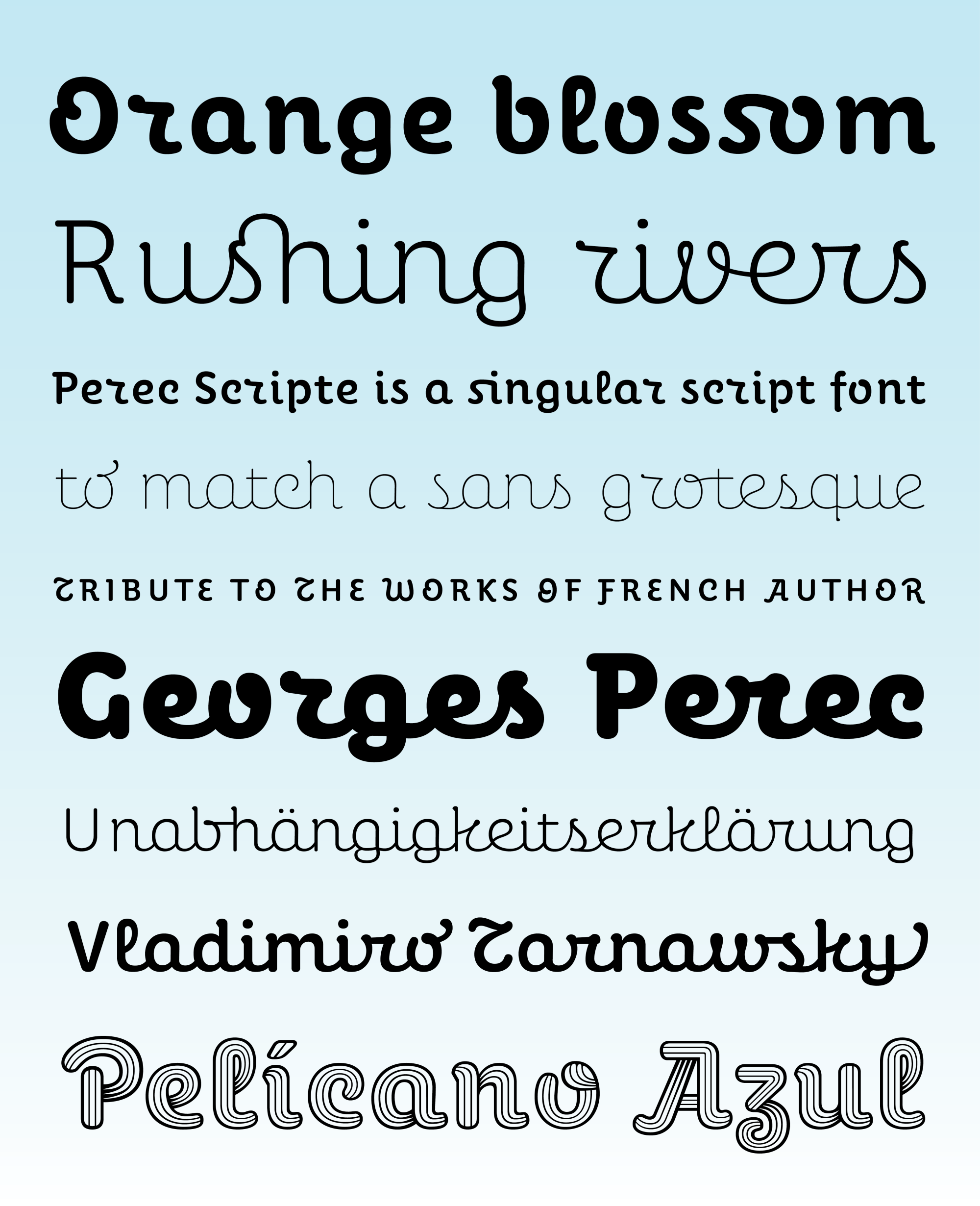
Since the idea was to be able to combine the new script style with the original Perec, the sans grotesque, I defined a structure and rhythm for all the glyphs to match harmoniously their grotesque sisters, plus it was clear that the script should also be declined in the same six weights.
Mathematical interpolation between two master drawings (such as Thin and Black) saves time by being able to generate the intermediate weights and control the details of each style from the extreme weights. At the same time, exceptions to these interpolations can also be made when one wants a different detail in one of the weights, for example the connecting curl between the o and the r which is different in Scripte 2 Black. The family is full of such tricks that help to build a more colorful ensemble.


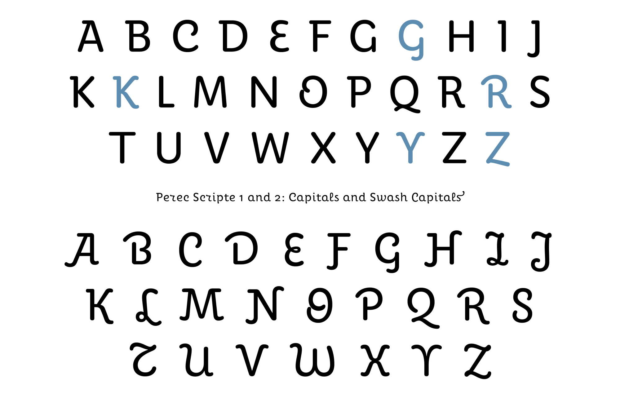
Then you have to cope with all the needs of the current professional typographic use, which is quite demanding. Perec Scripte includes a number of useful OpenType features such as language localizations, alternate glyphs, all sorts of ligatures, case-sensitive punctuation, full numeric series, extended monetaries, arbitrary fractions, superiors & inferiors, and more.
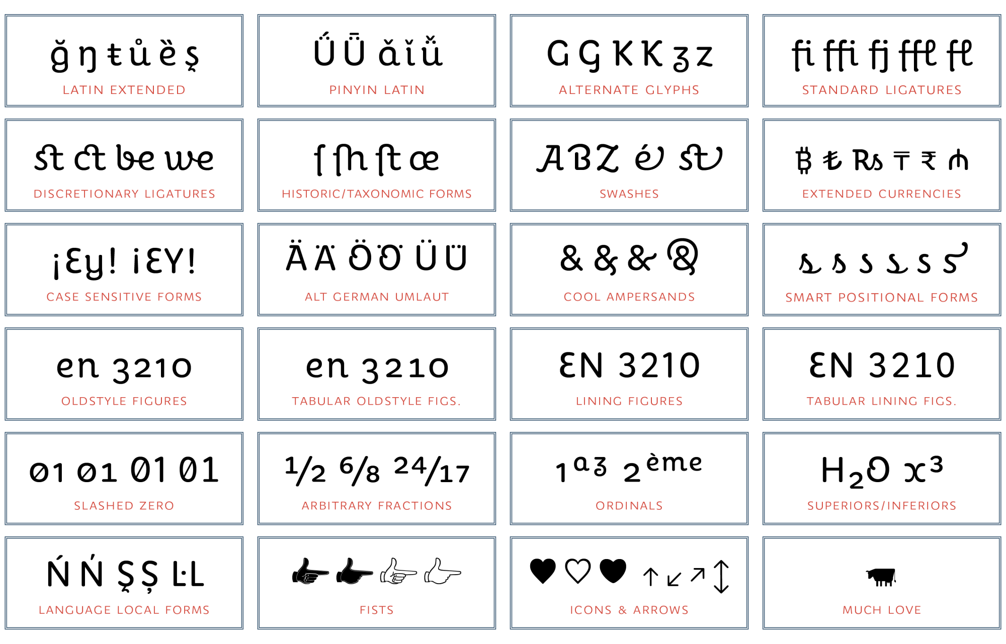
All Perec Scripte fonts include many valuable features and specials. Please check the pdf specimen for more details.


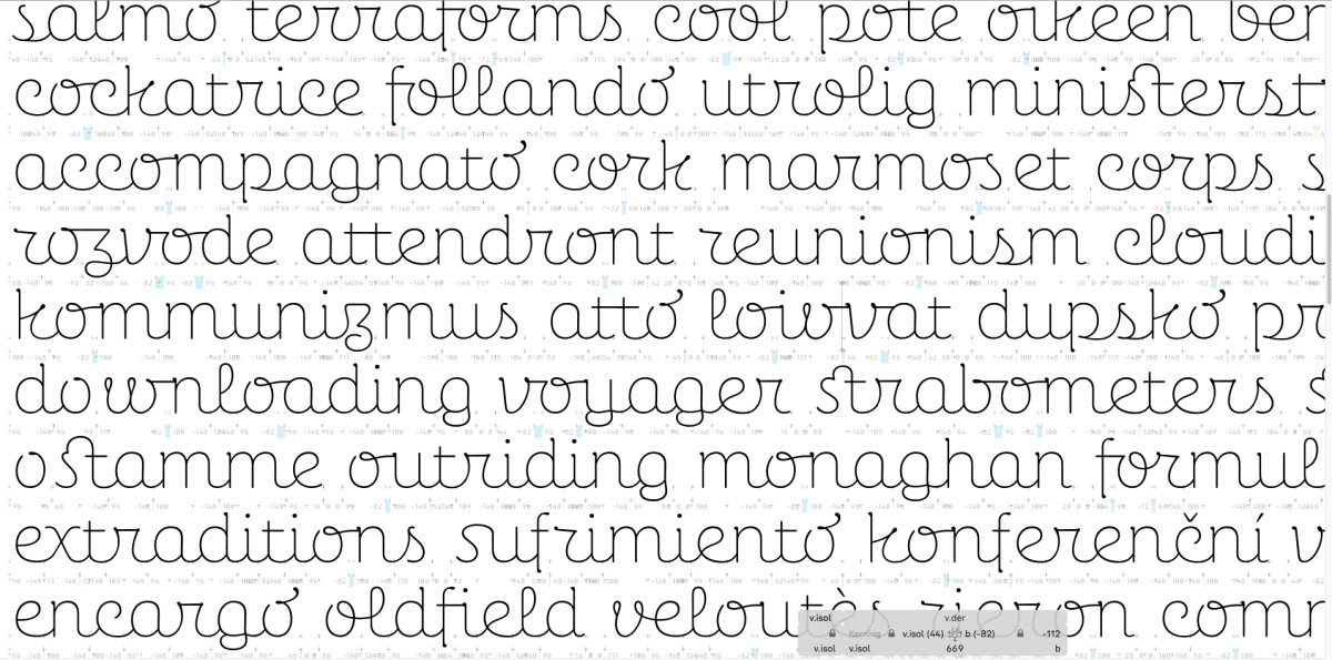
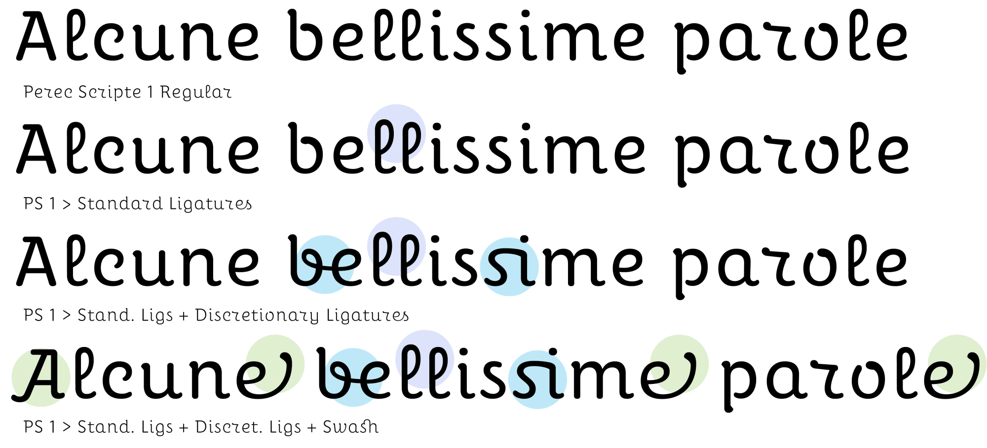
On the other hand, the maximum concentration of behavioral lookups (code) of these fonts is in the “clig” function or contextual ligatures, which allows all kinds of substitutions to modify the visual appearance of the words at will. Here are some examples.


Inclusiveness
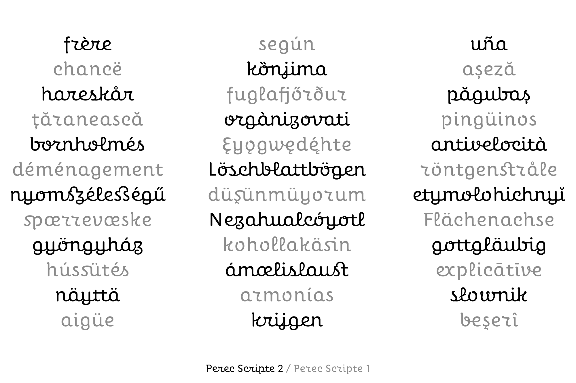
Perec Scripte includes the extended Latin repertoire as well as the other styles of the Perec family and Perec Ludique. Check the screen specimen and the print specimen for more details.
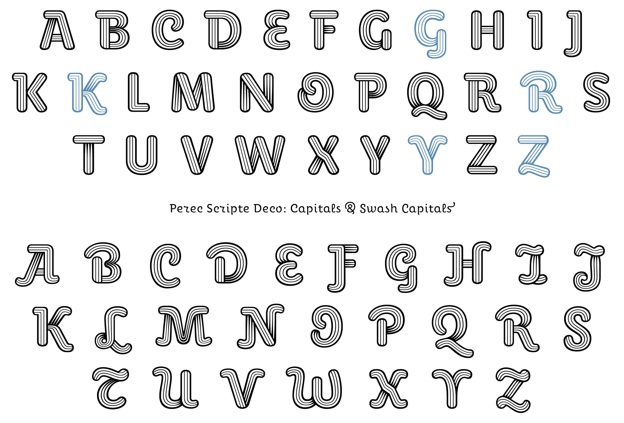
A Deco version
Also from the beginning of the process I was infatuated with a more singular decorative version that could add a certain graphic impact on large bodies. In addition to the three stripes that fill the inside of the stroke, I tried to give it a slight three-dimensional look by suggesting a ribbon passing underneath itself. Years later I took it up again, refined it and extended it to make it as complete as its other two sisters, 1 and 2. I think the result is pleasing and catches the eye.


Acknowledgments
This turned out to be an experiment of much learning in several planes of typographic design, that of readability, that of harmonization of styles not close to each other, that of expressive possibilities. During the 14 years in which these fonts were macerating, we found and resolved all their peculiarities. José Luis Acosta, a Mexican typophile and editor of mathematics books, helped me initially in the glyph survey to detect problematic encounters that needed to be addressed. Later Iván Moreno Majul took over to deepen the code model, also expanding the set of glyphs. Years later, with the technology in a better state of the art, I decided to restart everything, redoing glyphs and programming, adding the other weights, completing the character sets. At last Perec Scripte sees the light of day. We hope you find it an empathetic and stimulating type.
Explore Perec Scripte in the typeface page.
Bibliography
Harry Carter & Hendrik D.L. Vervliet, Civilité Types, GB: The Oxford Bibliographical Society, OUP 1966.
Harry Carter & James Mosley, The Manuel Typographique of Pierre-Simon Fournier le jeune. Together with Fournier on Typefounding. An English Translation of the Text by Harry Carter in Facsimile. With an introduction and Notes by James Mosley, tres volúmenes: Manuel Typographique vol. 1, 1764. Manuel Typographique vol. 2, 1766. Fournier on Typefounding, 1930. Darmstadt 1995.
Sandra Chamaret, Julien Gineste, Sébastien Morlighem, Roger Excoffon et la Fonderie Olive, Paris: Ypsilon, 2010.
Hendrik D.L. Vervliet, “The italics of Robert Granjon”, en Typography Papers nº 3, GB: Reading University Press, 1998.
Hendrik D.L. Vervliet, Robert Granjon, letter-cutter; 1513-1590: an oeuvre catalogue, New Castle USA: Oak Knoll Press, 2018.
- Contrainte, that is “constraint”, is the word used by the members of the OuLiPo, Ouvroir de Littérature Potentielle (Potential Literature Workshop), to designate a self-imposed limitation or restriction that had to be circumvented during the realization of the work. A typical example is Georges Perec’s novel A Void (1994), a novel entirely written without ever using the letter e (translated from the original French, La Disparition, 1969). Perec was a very active member of the OuLiPo, see section on OuLiPo and Perec in the initial Perec family article ↩
- Naturally, the greatest of personal challenges here would be the typographic setting of Georges Perec’s great opus: Life: A User’s Manual (La Vie Mode d'Emploi) using the Perec typefaces. ↩
- Read more about Granjon and his Civilité in John Boardley’s piece "Death of a typeface". ↩
- Harry Carter & James Mosley, The Manuel Typographique of Pierre-Simon Fournier le jeune. Together with Fournier on Typefounding. An English Translation of the Text by Harry Carter in Facsimile. With an introduction and Notes by James Mosley, three volumes: Manuel Typographique vol. 1, 1764. Manuel Typographique vol. 2, 1766. Fournier on Typefounding, 1930. Darmstadt 1995 ↩