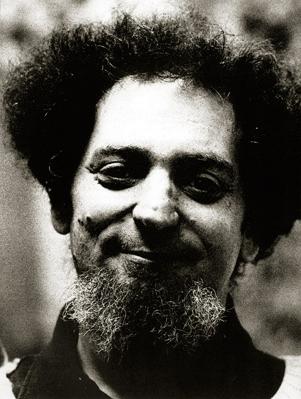
Inspiration: Georges Perec [1936-1982]
Georges Perec. French poet, novelist, film maker, scientific documentalist, player of go, music composer, lover of puzzles, parachutist, autor of the most difficult crosswords, is one of the most singular authors of the 20th century. His works radiate an invigorating ludic sense. His meticulous stories, acrobatically run across all literary genres and all epoques. Among his celebrated texts you’ll find: Life: A User’s Manual (La Vie mode d’emploi, 1978), A Gallery Portrait (Un Cabinet d’amateur, 1979), and A Void (La Disparition, 1969), a novel written without ever using the letter “e”).
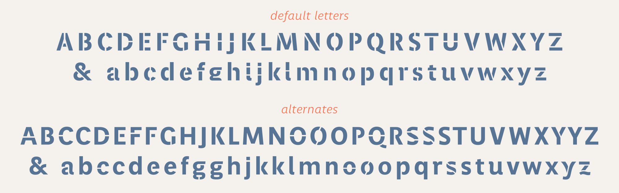
The Perec type design was born as a sans serif grotesque. However, it quickly spread to other styles, both formal and informal, to fit the multicolored and unclassifiable nature of this unique author’s writings.

Perec Ludique is the relaxed series for graphic impact or for more creative settings. Perec Scripte with bound & unbound styles comes in 6 weights plus a special Deco version. And a rounded sanserif version, Perec Lunatique, is still under preparation.
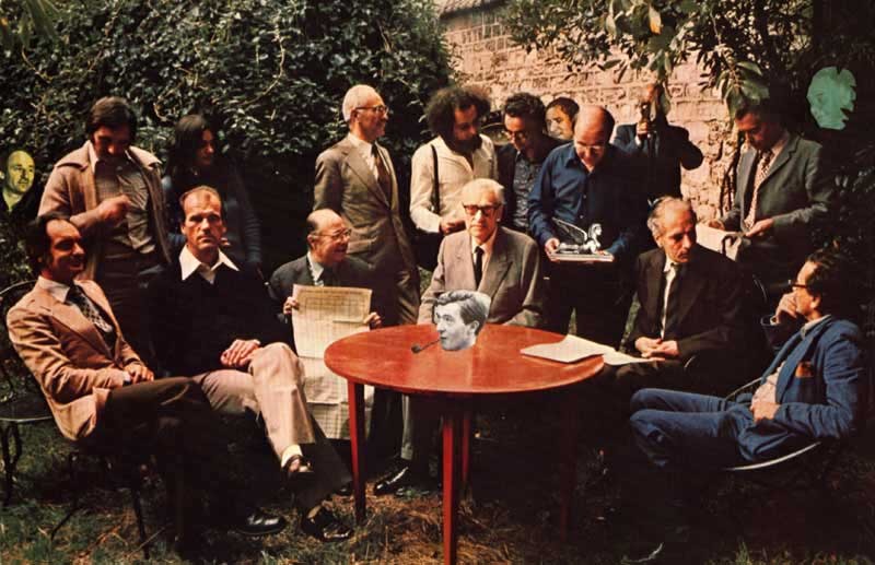
OuLiPo!
The Ouvroir de Littérature Potentielle, a bunch of mathematicians & writers leaded by Raymond Queneau & Francois Le Lionnais, pursued a radical innovation of literature by employing imaginative methods based on the idea of self-imposing constraints or conditioners. Naturally Georges Perec was a member of OuLiPo. And Italo Calvino was a member too.
My own self-imposed constraint
When deciding which typographic genre should evoke Georges Perec’s work, I remembered this idea of constraint followed by the Oulipians. The question was: “Can I see a valuable self-imposing constraint for this project?” On one hand, in order to embrace Perec’s many meanings and playful searches, I would have clearly considered a type genre with high possibilities of expressiveness. Thus the tightest constraint was obvious: choosing a type genre where expressiveness would be harder to obtain! A geometric sanserif? I finally opted for a sans grotesque, as it offered a little more design possibilities than a geometric one, although it was still tight when it came to expressiveness.

What makes a sans grotesque grotesque? Halfway between the geometric sanserif and the humanist sanserif, the grotesque offers a rather primitive look and a certain rudeness. I tried to make a grotesque that without losing its rough appearance could be a little more delicate in drawing, a sort of well-mannered monster.
Versatility
All that said, while designing Perec I’ve tried to make a versatile type, that could be used at a wide range of applications. Yes, it has a more delicate spirit tan a normal grotesque, therefore it will look elegant and stylish in large sizes. But its strength and the openness of its counterforms give it good legibility in text bodies.

Perec also has a good range of weights, that is not so many weights that you get lost in the font menu, but the right amount of weights where you can clearly tell the difference between one and the other. This helps, on the one hand, to establish clear hierarchies on the page and, on the other hand, to achieve subtle color textures in the text blocks, all of which makes for good readability and a pleasant reading experience.

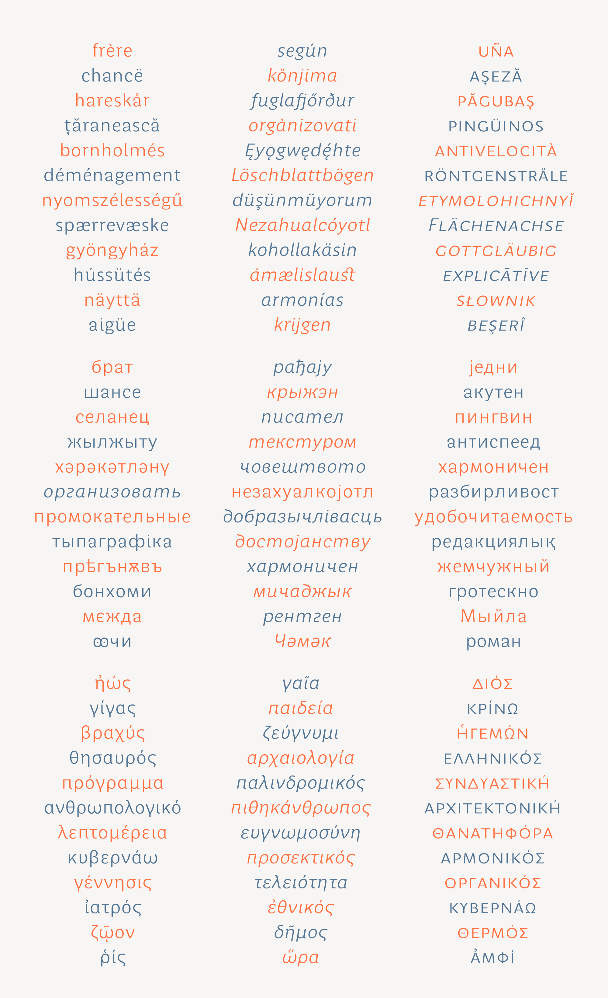
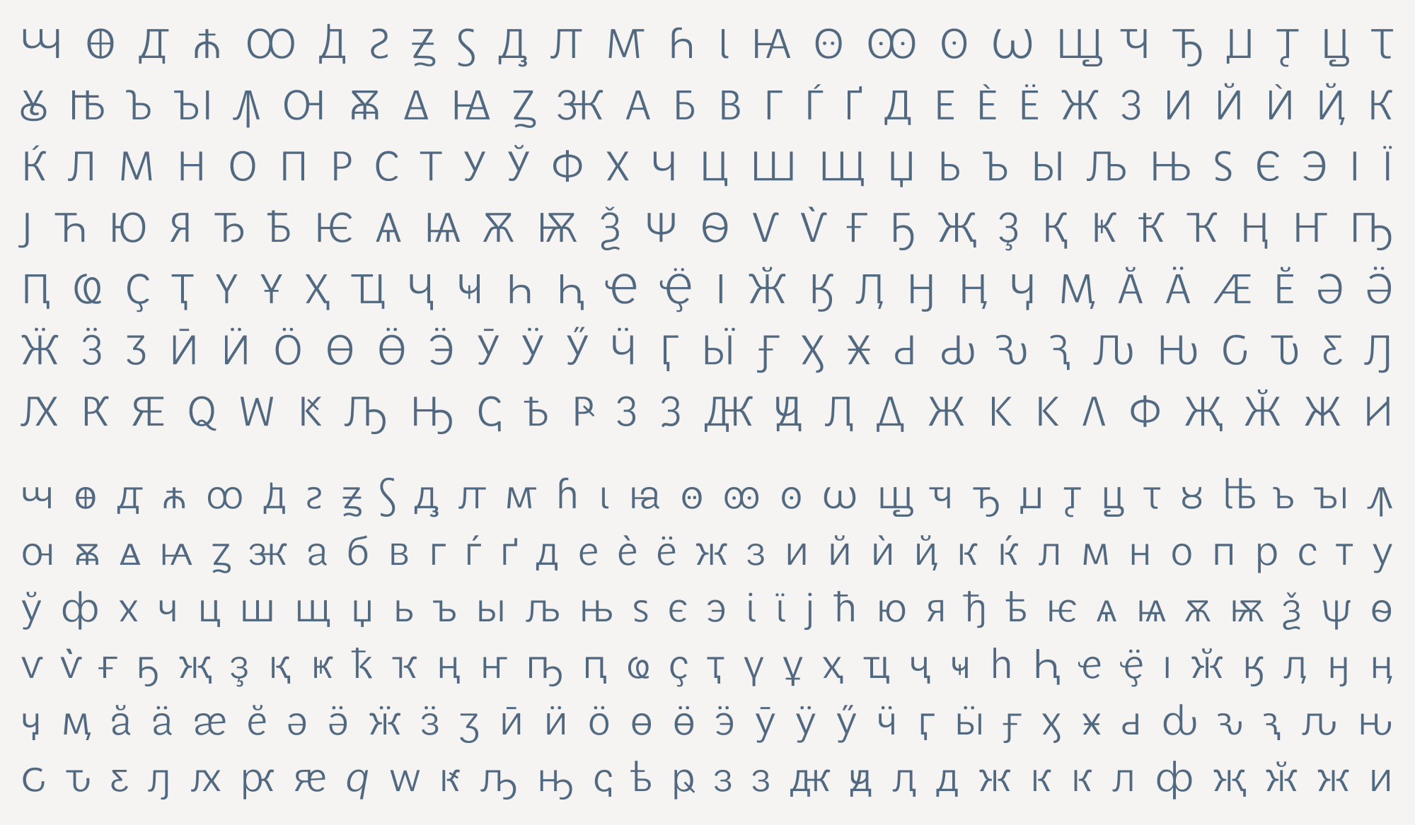
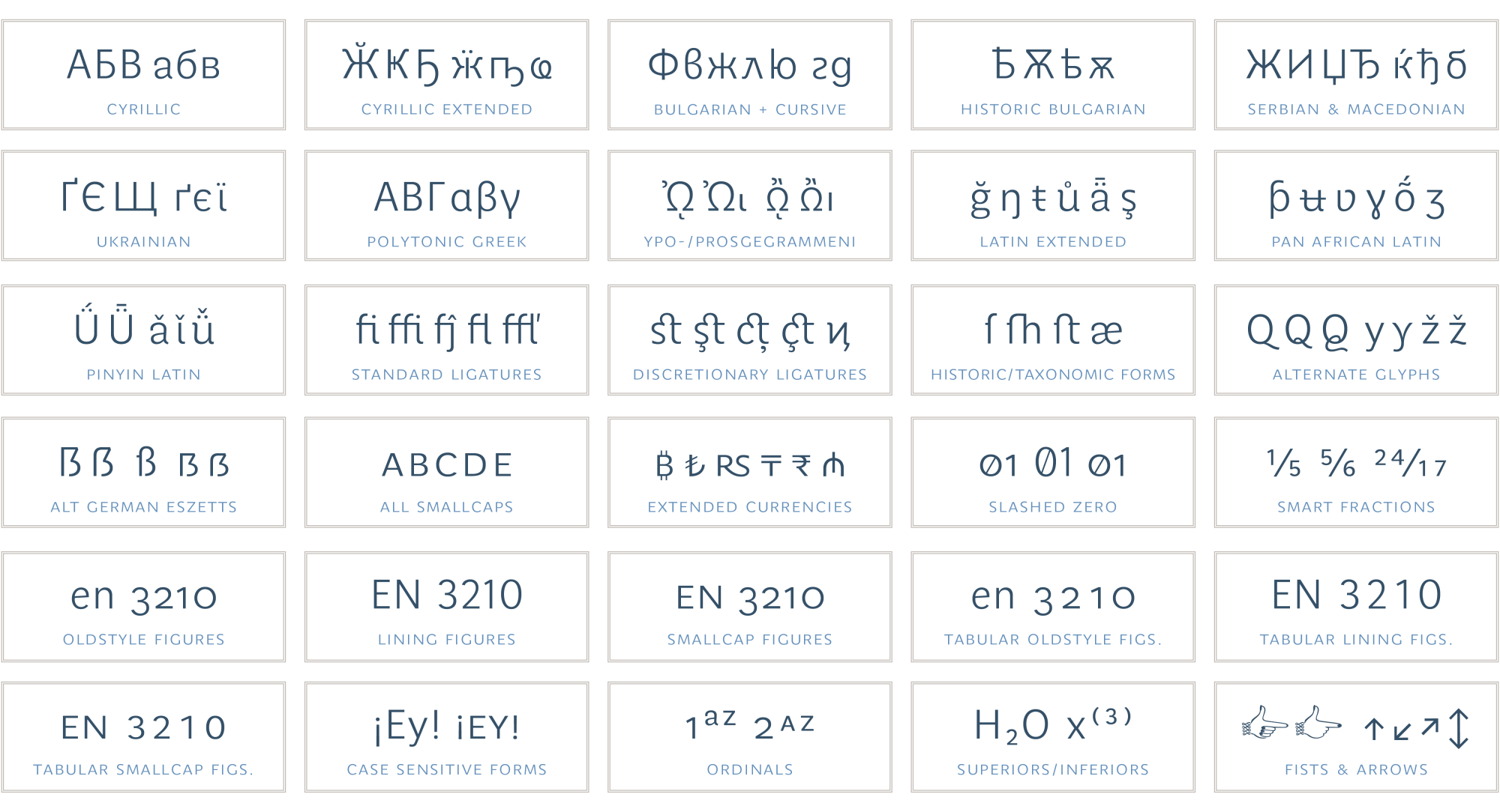
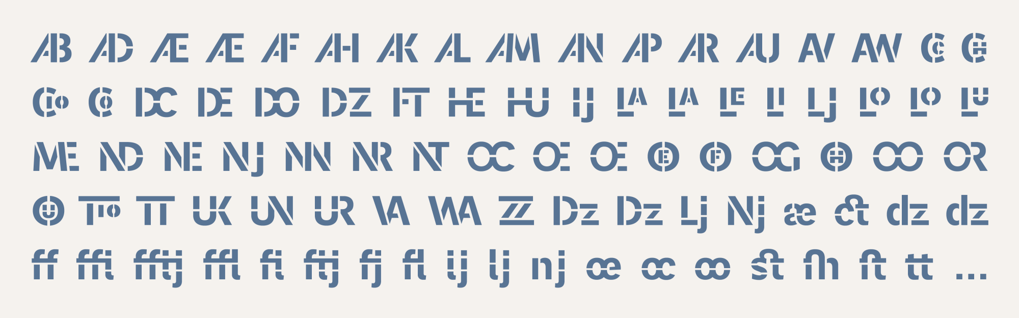
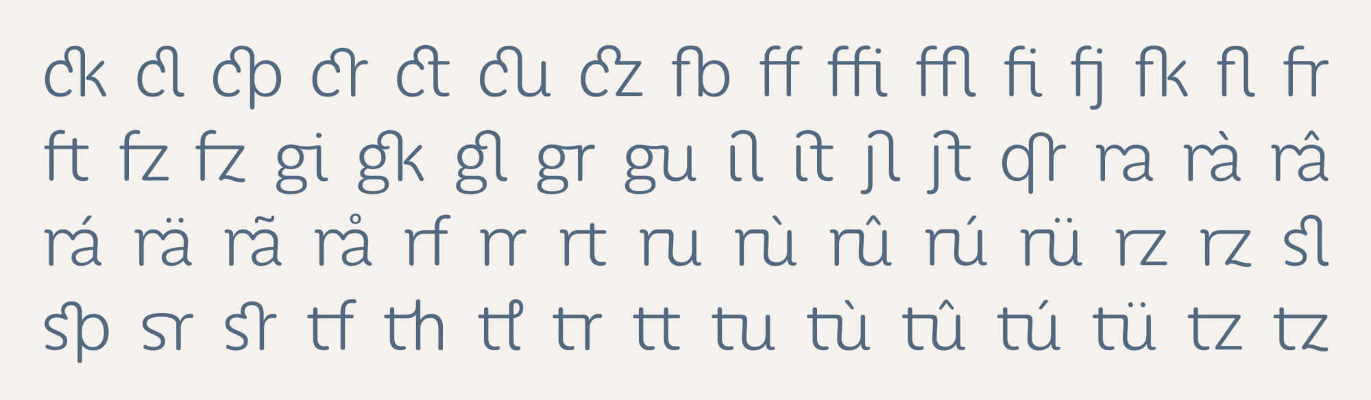
Perec now can speak more than 200 languages within the Latin script. And the Perec PanEuro includes complete Cyrillics and polytonic Greek. Check the specimen for more details.
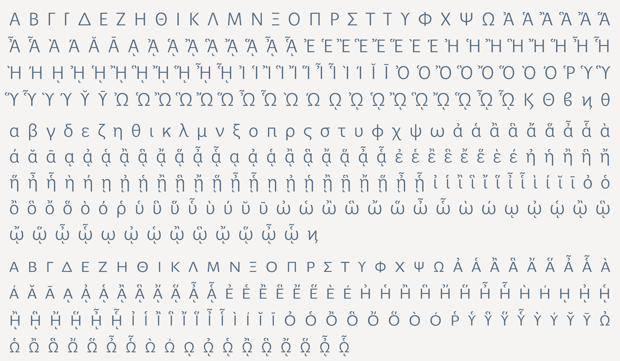
Finally, for the discerning designer, Perec includes all the useful OpenType features and attributes that make it powerful for typographic editing.
Perec Ludique
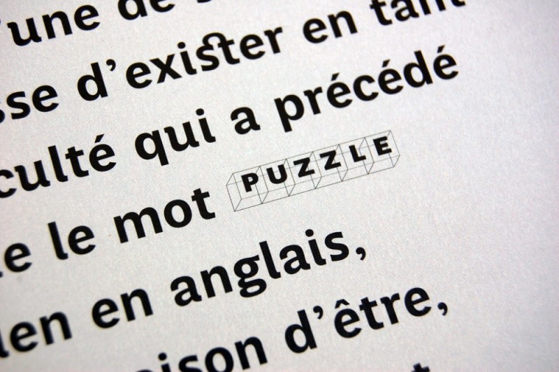
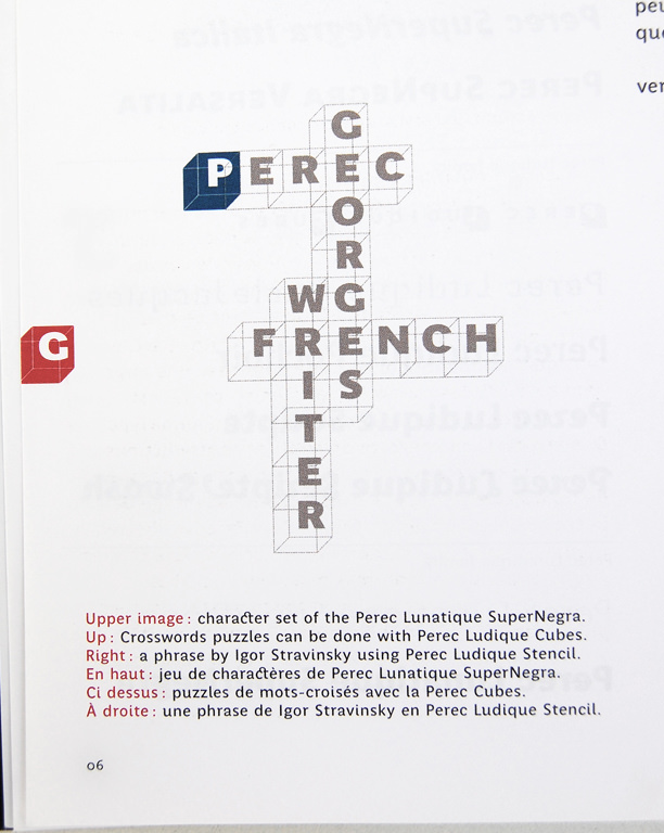
The Ludique is the playful series, it emerged as a need to go beyond the Perec regular fonts to encourage designers to create impactful designs, though still in harmony with the mother style. There is a Perec Ludique Cubes, a font of cubes inspired by crosswords, one of singular Georges Perec’s passions — In fact, Georges Perec created all his life the crossword puzzles of the Parisian magazine LePoint.
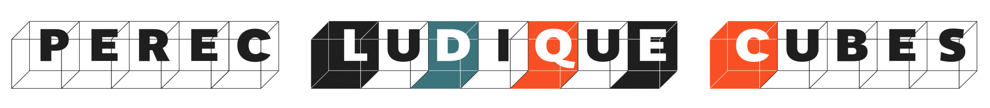
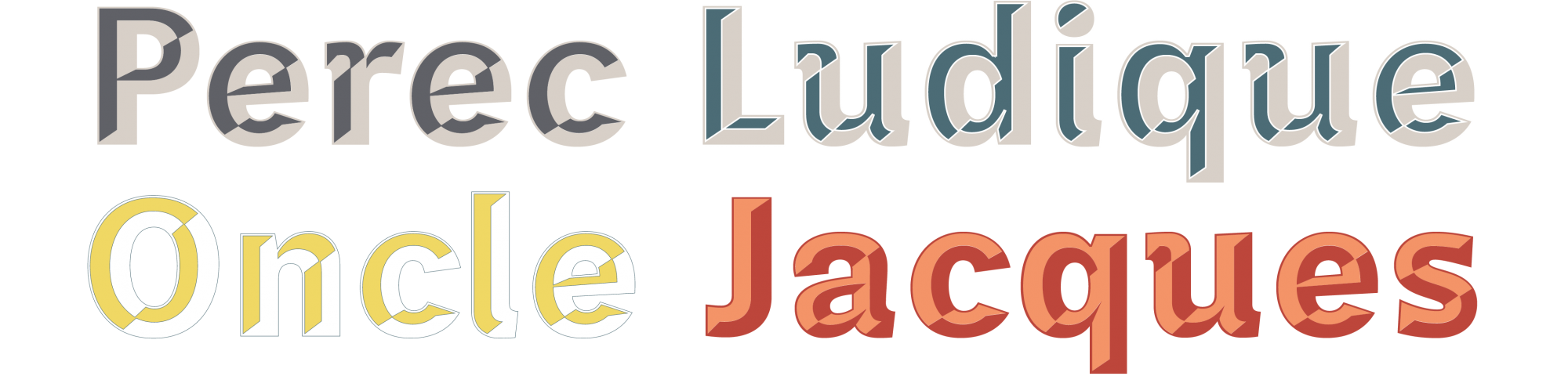
Then there is the Ludique Oncle Jacques, a three-dimensional chrome-like style such as those archetypal lettering signs found in the old town centers of Latin American cities. I thought it was a nice tribute to Jacques Bienenfeld, a rich jeweler, a relative of Perec who made it possible for his parents to settle in Paris where Georges grew up. Perec Ludique OncleJacques actually includes two fonts, for matching shadow and foreground colors.
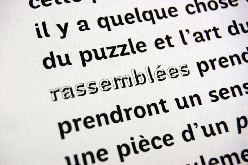
And there is the Ludique Pochoir, a stencil version with many alternate glyphs, always coherent to the regular Perec fonts. Check the specimen in the family page. Or test the fonts!

Perec Lunatique
The Lunatique series (coming soon) was born while seeking a style halfway between the regular Perec and the Perec Scripte. Perec Lunatique is a contemporary rounded sans grotesque, that will include six weights of roman, italic and corresponding smallcaps.

Enjoying the same elegance and legibility as the Perec regular fonts, the Lunatique will be also good for headings as well as for body text. Its name is due to the somewhat crazy number of unexpected ligatures it will include.
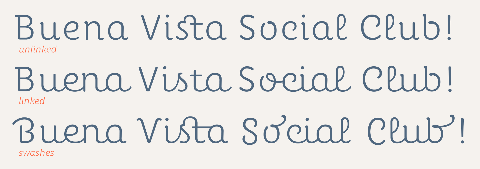
Perec Scripte
The family would not be complete without a script version, combinable with the others. The Scripte also arose as a challenge to harmonize the needs of a legible font in immersive text and at the same time attractive for large bodies, headlines, logos, branding. The resulting typeface is a serene, upright cursive, not without a certain sweetness and a hint of nostalgia. Check it out! Or read the story behind it.
Harmonious divergence
My initial idea for all these dissimilar typographic styles coming from different traditions is that they could be combined harmoniously, for example on double pages of a book or a magazine. If this was possible, then it was possible that editorial design would be able to exude a spirit of diversity and coexistence of the different that seems to me to be of importance in our world today.
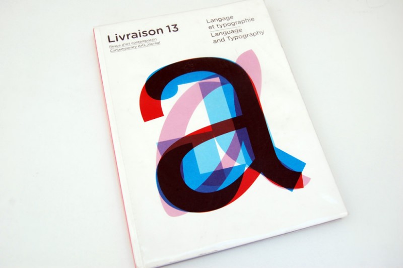
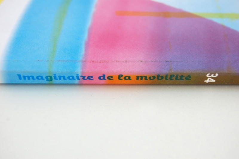
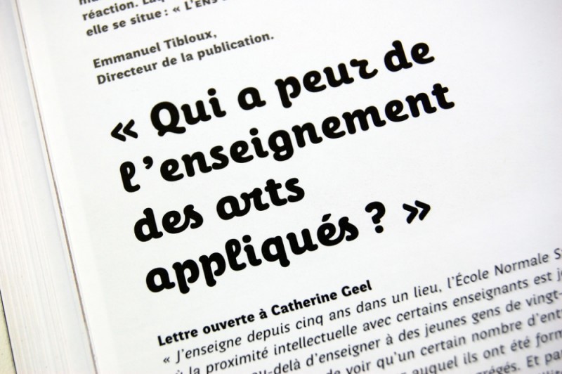
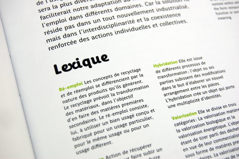
Here some pages from two French magazines that used early versions of Perec fonts. Livraison, a contemporary art magazine from Strasbourg; and Azimuts, made by the students of the art & design school of Saint-Étienne.
Explore the Perec fonts in the family page.